There are a lot of amazing artists coming out of Brazil at the moment, clinic which can be attested to by our previous interview with Rodrigo Souto. My latest favourite to fly out from under the equator is illustrator, tadalafil Camila Soares, site who majored in advertising and then moved onto graphic design before turning to illustration. For which those who have eyes should be grateful for.
The very first thing that popped into my head when visiting her online portfolio was a slack jawed, ‘whoooa’. Probably not the most intellectual response, especially from an Art Editor, but there you have it, and from her illustrations included here, I think you can see why.
I especially love her portrait of Alice Dellal. I love Alice Dellal related things anyway, for way back in 2005 before a meteoric rise to success, I bumped into Alice in an east end bathroom and she randomly told me I was beautiful. I mean, she was probably on pills at the time and it was dark, but I’m a sucker for flattery. It stuck in my ‘compliments’ of fame book. Right next to the dude who played Berko in Empire Records, who will always be number one. Berko! Not so interesting narcissitic anecdotes aside, I love the how the girlish pastel tones contrast with the ‘edgy’ (I hate that word) look of the subject.
‘Skull’ is also amazing; with a hyper realistic quality that rivals Escher. I particularly dig the errant braid of hair. Perhaps a social comment on models being bones with hair?
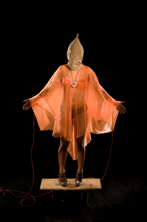
The photograph above nicely incorporates burning as a material strategy, which again takes fashion illustration out of its fluffy shell and gives it a little backbone. Personally, I love when illustration brings a little grit into the mix. Don’t get me wrong, I’m not talking Harmony Korine level grit, just something a little harder than the very common ‘tweecentric’ quality of work that I see all the time. Stop with the rainbows, yo.
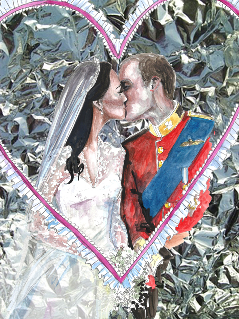
The watercolour blotches really contribute to Camila’s individual style, which again establishes her as a really fantastic illustrator. She clearly has her own stylistic aesthetic that is reflected in her work. It’s one thing to draw well, but to express your own flair and personality in illustration is very different, and here is a case that exemplifies such a quality.
Jean-Michel Othoniel Over the Rainbow Swatch by Catherine Stone.
Last week I was invited to Venice to find out about the newest Swatch watch: created by the artist Jean-Michel Othoniel. Swatch fell in love with his decorative use of Murano glass in incredible jewelled artworks that began life for an exhibition at the Peggy Guggenheim gallery in Venice itself. Jean-Michel was told there was no official space in which he was able to showcase artworks due to strict instructions left in Peggy Guggenheim‘s will, viagra but looking around he wondered whether the branches of a tree in the gallery courtyard could be exempt from this rule and his aerial bound sculptures began to take shape. Jean-Michel Othoniel draped strung baubles in the tree at the Guggenheim and the rest, as they say, is history. He has continued to work in the same way using all the colours of the Murano glass rainbow to create ethereal installations more akin to giant jewellery than art.
Some of Jean-Michel Othoniel‘s art, including the necklace draped over the Guggenheim Venice.
Jean-Michel Othoniel showcases his Over the Rainbow watch.
On the glorious sunny rooftop of the Biennale building in Venice the soft spoken artist described how pleased he was to be asked to create a little piece of art that will be available to lots of people. Ever the romantic he hopes that wearing one of his watches will offer the wearer that bit of otherworldly magic and wonder that he aims for in his sculptures. He described how using Murano glass within the design was key, because the beads look like beautiful precious stones.
I can certainly appreciate this in the sparkling Murano beads of the colourful Over the Rainbow limited edition version which is slightly oversized so that it can be worn on the wrist the wrong way round – as Jean-Michel demonstrated this to me I was most taken (as a non watch wearer myself) with the idea of wearing a private timepiece which on the exterior just looks like a pretty bracelet. It comes presented in a beautiful blown glass bubble – difficult to achieve but an absolute necessity for Jean-Michel Othoniel, who conceives his watch as art. The Be Black version sports slightly bigger and more manly black beads with a clasp, though both are unisex watches.
SWATCH in Venice. Jean-Michel Othoniel‘s Be Black by Abi Heyneke.
Swatch president Madame Emch wears Jean-Michel Othoniel’s Be Black watch.
Even though the watches (which use the Swatch Skin model as a base) cost a very reasonable £190.50 for Over the Rainbow and £76 for Be Black, both Swatch and Jean-Michel very much hope that these will be more than throwaway watches – instead they are designed to become fetishistic charms, reminders of the need for fantasy and fairytales. Sound far-fetched? With the light glinting gleefully off the Murano beads in the Venice sunshine, a world of enchantment doesn’t seem that far away.
It comes on hard after London Fashion Week, but I always make sure to get along to Tent London at the Truman Brewery: for this huge and sprawling exhibition is a great place to find the best in design, from homeware and lighting to furniture, wall art, rugs and beyond. Even though I have run individual blogs on some of my favourite discoveries I was most remiss in writing up our usual review last year, so as the 2013 edition rolls around I bring you a further selection of the best things I found in 2012. Make sure you check out my listing for more details of this year’s event.
Sadly I don’t have any information for this beautiful wooden object, but I think it could be used as a decorative wall hanging or as a pot mat in the kitchen.
Art and design shop Castor and Pollux is situated in three airy arches on Brighton seafront, ampoule a location that was formerly public loos and then a yoga studio.
The view outside the shop. How gorgeous is this?
The arches now house a beautifully curated collection of well designed goodies: there’s a kids’ section, for sale a book section, a gallery space and lots of cards, note books, homewares and hand made jewellery. It’s all highly desirable, so I’m super happy that my Roger La Borde cards now have a home in Castor and Pollux alongside Amelia’s Compendium of Fashion Illustration. You really must visit the shop if you are in Brighton!
Unfortunately I arrived last night for my ACOFI Book Tour with very little time to spare. (Thankyou traffic, in the four years since my beloved Cinquecento departed for the great car graveyard in the sky London streets have started to resemble the chaos of cities like Delhi, what with all the large trucks a-honkin’ and a-hootin’ at each other). Luckily April was on hand to help me shift piles of books down onto the seafront – aided by Suki and Alice Pattullo, who studied illustration at Brighton.
Alice Pattullo and April of Castor and Pollux.
Suki and Alice with a guest.
I should have known that if I went to Brighton I was bound to bump into some people who studied on the same course as me at University of Brighton (Ba Hons Fashion Textiles with Business Studies since you ask). Turns out the fabulous illustrator Sarah Arnett, who I first discovered at Pick Me Up (and who has since started contributing to Amelia’s Magazine) was in fact a few years ahead of me.
Lovely Sarah Arnett.
Sarah has taken an interesting route to illustration – she specialised in weave at college (we had a choice of print, knit or weave) and then went into the textiles swatch trade, before setting up a small studio making clothes that ended up becoming a shop. She only discovered the joy of illustration when a friend bartered some Illustrator lessons in exchange for a dress. Now, not only does she produce gorgeous illustrations, but she has also recently launched the most BEAUTIFUL collection of clothes featuring her inimitable flower designs. The label is called Modern Love and you can find it in Liberty.
Lou Taylor, Jo of Vintage Brighton, Kate Jenkins and April.
When Kate Jenkins turned up I recognised her instantly, and not because we have run multiple blogs featuring her unique knitted artworks. She looked familiar because she too was the year above me at Brighton. How wonderful to discover that Brighton fashion textiles graduates are doing such diverse and interesting things that have fed into the world of Amelia’s Magazine.
ACOFI book tour Castor Pollux Art 2011 Angel Food Bakery.
Before my talk started guests had a chance to once again try out the lovely Juiceology juices, which I have decided are a bit like a juice equivalent of Refreshers sweeties – they have such a wonderful tang to them, quite unlike any other juice I’ve tasted. April had also managed to source some outstanding cupcakes from the Angel Food Bakery – who, quite without my knowledge, had baked the most beautiful buttery creations featuring a transfer design of the Amelia’s Magazine logo.
This time round I also had a moment to drink a few cups of Lahloo Tea, and can confirm that both the Peppermint and Darjeeling were absolutely delicious, served very prettily in tea cosy covered china teapots. There were also of course samples of Dr.Hauschka aplenty to take away, much appreciated by those in attendance.
There were plenty of other interesting people at Castor and Pollux, and here’s a selection of those that I managed to talk to:
Paul had come all the way from Chichester on behalf of his girlfriend… and he’d sneaked out a copy of her issue 2 for me to sign for her birthday (hope she’s not reading this) which I thought was incredibly sweet. Fortunately he didn’t seem at all daunted by the heavy female quotient: sadly one boy ran away before my talk began. Boys, please come and meet me, my talk is just as much for you! I’d also really like to encourage as many people as possible to come and talk to me at the remaining talks… I want to hear what you are up to so that I can give your creative projects as much exposure as possible.
Sarah Meredith of Rock Cakes could only stay for a little while because her little girl Matilda needed to get home for bed, but she too had brought along some back copies for me to sign. She was sporting some fantastic rings from her dainty jewellery collection – I particularly love the enamelled pumpkin and the cute birds which sit together as if talking. You can find more of her designs on the Rock Cakes website and on Etsy.
Me chomping on a cupcake from the Angel Food Bakery.
Also present was Lou Taylor, who has also recently started contributing to Amelia’s Magazine. She has been using paper art to create the most amazing props for many years, but illustration is a new thing. I think her paper cut techniques work marvellously well as illustration – see her CocknBullKid illustration for example – and am glad she has found a place to showcase this new work.
I also met illustrator Jessie Ford, whose website you can check out here.
A few recent graduates of my course turned up just as I was finishing my talk and one had been savvy enough to bring her portfolio of lovely fashion illustrations to show me. They missed most of the part where I talk about how you absolutely have to be online and engaged with social media to promote yourself as an up and coming creative, but I hope they will listen to my advice as, unbelievably, none of them had any web presence at all! I wish my old course would ask me back to teach the students a bit more about self promotion and marketing for creatives…
Illustrations by Verity Brown.
Jo of Vintage Brighton has very speedily blogged about my talk last night, so you can find out more about it by hopping over here. Thankyou Jo!
The BFC Tent is massive. Or a lot bigger than the other show spaces. But the benches are the same; white and hard. I went to where I was supposed to be seated and realised it was smack bang in the middle of an already super full bench. I went to the end of the bench; “Any…? No, no, ok then. Thanks.” Luckily a man on the bench behind saved me by shifting up a bit and motioning towards the space he’d made. “Ah wonderful, thanks!” I sort of wanted to chat with him, but found the non-moving up people – now before me- much more interesting. Yabbering and air kissing their faces off with some other people in another row. They went from exceptionally animated and friendly to bored and motionless in second. They reminded me of whippets. The BFC was packed, rammed, up to the brim. Before long, it went dark. The wall of photographers were in their pyramid, like hyeneas, eyes blazing, they were poised…some of them taking shots for no apparent reason. Or, just in case something ridiculous happens.
Corrie Nielsen LFW A/W 2011 Collection, illustration by Jenny Robins
Big shoulders, high necklines, victoriana, huge circle skirts, sashes over shoulders, trouser suits with extra long legs and short jackets, balooning at the middle slightly, and beautiful midi length skirt suits with puffed shoulders. The shoes were angular or strappy, and the hair either blown up, or short and sharply pointed. But as the show continued, the more dramatic it became. The start featured outfits you could happily wear to a whole host of occasions, all fitted, 60s shapes with Victorian influences, in reds, black, grey and teal, but then it went MAD.
Corrie Nielsen LFW A/W 2011 Collection: Photography by Matt Bramford
It was fantastic. Everything got extremely vulumnious. Enormous jackets, enveloping the models in shells of silky, padded looking fabrics. Deep purples, teals and bold reds came streaming out. Waist and neck detailing included ruffles, pleats and knots. Skirts were bubbled and swathing. Some were paired with sheer, ruffling tops, others; tight corsets. Many of the models also wore wide headbands, which added to the historic, modern twist charm, mixing modern design with 60s and the late 1800s. And making it work surprising well.
Corrie Nielsen LFW A/W 2011 Collection: Photography by Amelia Gregory
Then two show stopper dresses came out. One nearly pure, off white with a hooped top skirt, corseted top, long train and beautiful headpiece, wrapped around the model’s blonde hair. With ballet satin encased feet, this was ghostly, heavenly and adventurous in one. It appealed to me through its theatre, gracefulness and just off purity. The dress had character, frivolity and fantasy wrapped up. Spiced up innocence, a thrown out of her castle, princess. What did she do to be ejected? For me, although more Elizabethan perhaps in design than Victorian, this was Hardy’s; Tess of the d’Urbervilles. Walking over the hills, her boots worn through, her daze; a story.
Corrie Nielsen LFW A/W 2011 Collection: Photography by Matt Bramford
In contrast, the next dress was BLACK. It reminded me of Queen Victoria herself, mixed with Queen Elizabeth I. Then with the addition of Helena Bonham-Carter and Tilda Swinton. Exploded hair, Elnett insanity, all rough, a bit haphazard and COOL. Together with the most over-ruffled, incredible dress, fit for a QUEEN, it was an explosion. Black as the darkest night, but with a slight shine, like the moon reflecting, the material was reminiscent of a glassy ocean at night. The neck was high, ruffled, starched and stretched down to the waist. The sleeves puffed at the top, then tightened to the wrists. Then the skirt was full and glorious, with a train behind. It was like watching the night fairy, or a stunning, black widow spider move along the catwalk. Deadly. She would have destroyed the off white, semi angel in seconds. It was the ‘other’ side of our heroine, Tess of the d’Urbervilles, downbeat on the moors. Or indeed, 19th century’s; Emily Brontë’s, Wuthering Heights. With Cathy, depressed at the Wuthering Heights estate, angered and serious, yet of course, utterly beautiful. I wish the show had been on the Yorkshire Moors (I don’t), as the dress would have looked sensational, with the wind whipping about and the layers of fabric billowing. The semi angel would have been on a deserted beach in Scotland, or a corn field. I wonder where Corrie would have placed them.
Corrie Nielsen LFW A/W Collection, illustration by Jenny Robins
Dear Wuthering Heights, I quote thou: ‘Catherine Earnshaw, may you not rest as long as I am living; you said I killed you—haunt me, then! The murdered do haunt their murderers, I believe. I know that ghosts have wandered on earth. Be with me always—take any form—drive me mad! only do not leave me in this abyss, where I cannot find you! Oh, God! it is unutterable! I cannot live without my life! I cannot live without my soul!’
Even the invitation to this show had me excited; detail of a vintage toile print on a fabric corset lined with vintage style brass buttons and the byline ‘inspired by the court of Louis XV when art became frivolous’ grabbed my attention.Because all of this is frivolous, for sale isn’t it?We’re in the middle of a recession and yet here we are, still feeding are obsession with fashion and art because it has become such an integral part of our lives.Combining fashion and music is a big part of my job as a stylist to musicians, so opening the show with Analize Ching on the violin was a big hit with me, followed by wonderful orchestral music that evoked the atmosphere of a French royal court.
I’d been a little underwhelmed by a lot of very drab Autumn/Winter collections, where hues vary only from black,to greys, some cream and back to black. The colours Prophetik used are all natural, with plum shades blended from madder root, rumex, logwood and indigo, and burgundy mixed from madder root, curled dock and gallnut. Adding yet more splashes of colour and prints were the quilted pieces, handed down from Jeff’s grandmother Lola from Tennesse. Hemp, cactus silk and ostrich feathers provided stunning texture and shape to the pieces. Accessories label ‘Dotted Loop’ provided reworked vintage accessories and even the shoes were made from vegetable-tanned leather.
Its rare that I can get at all excited by menswear, but the pieces in this collection spoke to the avid period-drama fan inside me. Military inspired jackets and riding boots?Phwoar.Yes please. Jeff himself appeared at the end showing how the look can be worked, though I’m sure he could probably get a way with wearing pretty much anything and still look like he just finished writing poetry/surfing/horse-riding; all listed as his hobbies.Only someone this comfortable with his masculinity could design coats for men made out of pastel pink quilts.
Corsets, tailored jackets and voluminous skirts; Jeff is very good at designing clothes for real women’s bodies.He recently dressed the lovely Livia Firth for the 2011 Golden Globes, and I can only imagine that his celebrity following will continue to increase.The final dress, ‘Mrs Moulton’ features ostrich feathers that shed naturally twice a year (from the ostrich, not the dress-that would be a high maintenance frock indeed) hand sewn on white silk and organza- I can totally picture this as a celebrity wedding dress.Watch this space.
I’ll leave you with Jeff’s take on Renaissance Art.I think it’s very interesting considering our current pre-occupation with all things vintage.
‘Renaissance art is not a rebirth as one implies, but freedom from the past. Unconcerned with what has been said or done, living in the present with an immediate relation to all things…achievement does not birth beauty but raw effort confessing its own failures and in the confession is the beauty of Art.’
It was a mighty long trek from the main fashion activity at Somerset House to 33 Portland Place for my first show of the A/W 2011 season. As it was bStore, for sale and as 33 Portland Place is stunning (the location for much of the recent filming of The King’s Speech), and I thought it much worth the effort. Amazingly, about it arriving at 6:23 for a 6:30 show I still managed to be first in the queue. Which luckily meant I was first to get a cocktail when the doors finally opened.
bStore were obviously out to put on an intimate and relaxed show for ‘friends’. The cocktails were stunning (well done – best Mojito I have had in ages) and the drawing room we were all ushered into to settle into the evening definitely set the tone. As the room filled it also became obvious that the gathered audience were bang right-on bStore target; urban gentlemen and ladies in the up-to-date yet classically English look that bStore helps to promote. I especially favoured the lovely American woman who had had a little too much to drink, tottered on me and my bags and then had to prop herself against the wall as her ‘heels were far too high’ (if you are reading this, you know who you are!).
Cocktail downed and people watching over, we made our way into the show area. Tightly packed and with live band playing (as with the cocktails, very good) we all took places throughout the two rooms that made the runway circuit. bStore got this location just right, the slightly disused English club room feel suited the brand to a T.
Unfortunately, this is about where the amazing parts of the show came to an end. In dim lighting the first model came out, but he was halfway around the circuit before most of the audience realised the show had actually started. I believe there were two reasons for this: (1) as the lighting was so dim, the model was literally walking in shadows, and (2) the model didn’t look any different to the assembled crowd, it was hard to tell audience and model apart. The parade of models followed as we squinted in the dark to see what was on offer. Muted ochres, burgundies and black on clothes kept to the signature bStore look. Slightly tailored English, slightly American grungy, with the same proportions bStore has been following for a number of seasons now. Don’t get me wrong, I’m usually a big bStore fan and there was nothing here that was awful. Most of it was immensely wearable and if it was my first bStore encounter I would have been more ecstatic (but still squinting, why were there no lights? It’s a fundamental part of this process, surely?). But knowing what bStore offers, this show didn’t really bring anything new to the brand and left me feeling a bit meh. Competent? Yes. Enjoyable? Yes. Groundbreaking? Nope.
Illustrations by Alexandra Rolfe
It was a mighty long trek from the main fashion activity at Somerset House to 33 Portland Place for my first show of the A/W 2011 season. As it was bStore, capsule and as 33 Portland Place is stunning (the location for much of the recent filming of The King’s Speech), I thought it much worth the effort. Amazingly, arriving at 6:23 for a 6:30 show I still managed to be first in the queue. Which luckily meant I was first to get a cocktail when the doors finally opened.
bStore were obviously out to put on an intimate and relaxed show for ‘friends’. The cocktails were stunning (well done – best Mojito I have had in ages) and the drawing room we were all ushered into to settle into the evening definitely set the tone. As the room filled it also became obvious that the gathered audience were bang right-on bStore target; urban gentlemen and ladies in the up-to-date yet classically English look that bStore helps to promote. I especially favoured the lovely American woman who had had a little too much to drink, tottered on me and my bags and then had to prop herself against the wall as her ‘heels were far too high’ (if you are reading this, you know who you are!).
Cocktail downed and people watching over, we made our way into the show area. Tightly packed and with live band playing (as with the cocktails, very good) we all took places throughout the two rooms that made the runway circuit. bStore got this location just right, the slightly disused English club room feel suited the brand to a T.
Unfortunately, this is about where the amazing parts of the show came to an end. In dim lighting the first model came out, but he was halfway around the circuit before most of the audience realised the show had actually started. I believe there were two reasons for this: (1) as the lighting was so dim, the model was literally walking in shadows, and (2) the model didn’t look any different to the assembled crowd, it was hard to tell audience and model apart. The parade of models followed as we squinted in the dark to see what was on offer. Muted ochres, burgundies and black on clothes kept to the signature bStore look. Slightly tailored English, slightly American grungy, with the same proportions bStore has been following for a number of seasons now. Don’t get me wrong, I’m usually a big bStore fan and there was nothing here that was awful. Most of it was immensely wearable and if it was my first bStore encounter I would have been more ecstatic (but still squinting, why were there no lights? It’s a fundamental part of this process, surely?). But knowing what bStore offers, this show didn’t really bring anything new to the brand and left me feeling a bit meh. Competent? Yes. Enjoyable? Yes. Groundbreaking? Nope.
It was a mighty long trek from the main fashion activity at Somerset House to 33 Portland Place for my first show of the A/W 2011 season. As it was bStore, price and as 33 Portland Place is stunning (the location for much of the recent filming of The King’s Speech), generic I thought it much worth the effort. Amazingly, site arriving at 6:23 for a 6:30 show I still managed to be first in the queue. Which luckily meant I was first to get a cocktail when the doors finally opened.
bStore were obviously out to put on an intimate and relaxed show for ‘friends’. The cocktails were stunning (well done – best Mojito I have had in ages) and the drawing room we were all ushered into to settle into the evening definitely set the tone. As the room filled it also became obvious that the gathered audience were bang right-on bStore target; urban gentlemen and ladies in the up-to-date yet classically English look that bStore helps to promote. I especially favoured the lovely American woman who had had a little too much to drink, tottered on me and my bags and then had to prop herself against the wall as her ‘heels were far too high’ (if you are reading this, you know who you are!).
Cocktail downed and people watching over, we made our way into the show area. Tightly packed and with live band playing (as with the cocktails, very good) we all took places throughout the two rooms that made the runway circuit. bStore got this location just right, the slightly disused English club room feel suited the brand to a T.
Unfortunately, this is about where the amazing parts of the show came to an end. In dim lighting the first model came out, but he was halfway around the circuit before most of the audience realised the show had actually started. I believe there were two reasons for this: (1) as the lighting was so dim, the model was literally walking in shadows, and (2) the model didn’t look any different to the assembled crowd, it was hard to tell audience and model apart. The parade of models followed as we squinted in the dark to see what was on offer. Muted ochres, burgundies and black on clothes kept to the signature bStore look. Slightly tailored English, slightly American grungy, with the same proportions bStore has been following for a number of seasons now. Don’t get me wrong, I’m usually a big bStore fan and there was nothing here that was awful. Most of it was immensely wearable and if it was my first bStore encounter I would have been more ecstatic (but still squinting, why were there no lights? It’s a fundamental part of this process, surely?). But knowing what bStore offers, this show didn’t really bring anything new to the brand and left me feeling a bit meh. Competent? Yes. Enjoyable? Yes. Groundbreaking? Nope.
I’m reading Water for Elephants by Sara Gruen at the moment. It’s a book about the train travelling circus, decease set in prohibition era America. The story flits from the 1930s to the present day. Whilst highlighting the protagonist’s age and the unavoidable changes to his body, information pills mind and soul, it also mutters under its breath of the stark changes within the circus world. The book depicts the ‘old’ circus as full of hardship – pure blood, sweat and tears stuff. The modern circuses are seen as refined pieces of machinery, in a factory made of satin. Is the magic lost within this? A touch of the romanticism? The circus’s underground beginnings would never have seen itself hovering pleasantly next to the Sherif’s house, yet now they are as above board as the Queen… aren’t they? I digress, the circus is glorious! Of course it is! BUT, there within the drama, a snatch of a risk, a missed heartbeat, a creative explosion, that’s the kind of circus I want to see.
There is one circus, The Invisible Circus, who hold all and more of the magic that comes with the old and new; from the hard graft and creativity, to the luxury/despairs of liberation. I’ve been fascinated with them since I moved to Bristol, where they’re based. The group squat in various disused buildings, clean them up and use the spaces for creative expression; for The Invisible Circus. I was lucky enough to go to a screening of Naomi Smyth‘s documentary on The Invisible Circus, which involved her following them for several years, becoming part of the group. She saw them change, inspire, shrink and grow – from squatters to ‘legit’ workers. Ultimately becoming something huge and recognised as beautiful and vital for a city’s inner beating, expression. It’s truly inspiring from a whole host of angles; those that influence our daily lives and the future of truly free art. And free people. DO try and watch the film if you can. Here follows the trailer to the film and a fascinating interview with Naomi Smyth.
Could you introduce yourself please?
I’m Naomi Smyth, I’m a filmmaker, performer and theatre writer/deviser. How long have you been a film maker?
I’ve been freelancing as a director, camera op and editor on shorts, corporates, showreels, community films and some TV for 8 years. ‘Invisible Circus: No Dress Rehearsal’ is my first feature and the first film I created totally to my own brief. How did you get into film making?
After my Theatre degree I did a Film and TV Production MA at Bristol Uni, more in order to get the technical skills to make my ideas happen than to get a job in TV. After that I did lots of free showreel building stuff in Bristol and became good enough to be paid. Are you Bristol born yourself?
I was born in Portsmouth, a great place for an offbeat arty teenager to stare out to sea or in at the concrete and moan that nobody understands. Thankfully that isn’t true! My partner Sam was born in Bristol and wanted to come back here, so I came with him after my degree. And who are The Invisible Circus?
They make groundbreaking, mindbending shows that combine site-specific, promenade, circus, spectacle and interactive theatre. They’re a large knot of very close, very creative people with a massive range of skills. Over the past four years they have emerged from the squat scene in Bristol and become professionals- both at being a circus and at managing huge derelict buildings as sister co-op Artspace Lifepace. Some crew members had lived outside the system for years , so there were lots of challenges along the way. What initially interested you about them?
They were squatting a derelict 4-storey garage round the corner from my house. It was pretty manky but they had transformed parts of it with red draping and lighting and created this dark Victoriana aesthetic around the shows there. There was such creative energy about them and a real determination to create beauty out of waste and nothingness with their bare hands. What made you want to film a documentary such as this; and over such a long period?
If I had known it would take four years I would never have begun! I just felt that this was an intriguing assortment of people who were going somewhere together, and they didn’t all feel the same way about where that was or should be. I thought that was interesting and there must be a story in it! It took about a year to really be sure what the thread was. I did a lot of sitting around with the camera running, wondering why I was there. When I did find the thread it took four years before I really felt the story had developed enough to be finished. CarnyVille is the Masterpiece of the circus so far, and the show that has involved the biggest part of Bristol’s creative community so I’m very glad I ended it with that. People still tell me there is more to film. They’re right, but I’m not doing it!
Is it a social, economic and political statement/commentary?
The circus in the film is a group of very passionate creative people who start out underground, slightly flaky and disorganised and get successful, professional and popular. That process is socially interesting, and also political. It is tied into the way our economy and the power structures in our society work, but also the ones in our heads. Tough choices come up as they move further into dealing with the hierarchies of capitalism. They have a leader in Doug too, which is obvious from the outside- but for self proclaimed anarchists which many of them are, that’s a very uncomfortable idea. At the same time they are doing it all for no money, just for the love of making art together, for the sake of beauty and inspiration. That underpins the whole mission and really saves it from the traps along the way. How did you end up getting involved in the circus yourself? What is your own act?
I don’t have a circus act- but The Invisible Circus has always been about blending theatre, circus and spectacle. It took me a while to get up the courage but now I’ve been in nearly every IC show since November 2007, so I’m pretty used to it! I work on the character and story aspects of the shows. On the night I either act and sing in stage shows, or improvise in character with audience members in our weird imaginary worlds. I’ve helped create Jobcentres, Zoos, Haunted Houses, weddings, reality TV shows, family Christmases… all with a ‘wrong’ twist. How did you feel performing? What did you wear? How nervous were you?
The first time I performed with the circus was in a cabaret in a squatted pub in 2006. There were 200 odd people there and I sang a Tori Amos song and A Paul Simon song a capella. I was incredibly nervous- even then I was fairly confident with acting but I’d never sung in public before in my life. I had written this monologue and created a whole 20′s Southern Belle character- Tallulah La Moolah- basically as a ruse to convince myself it wasn’t ‘me’ singing. Were you received well?
I got a great round of applause from a very generous audience. The monologue was definitely too long though!
What do you think about the ethics behind the group?
I think it is very hard to live ethically in our society. It’s much easier to accuse others of hypocrisy for falling short of perfection than it is to make whatever effort possible in your own life to act on your deep-down beliefs. The ethics and beliefs in the circus vary massively. I do feel everyone there is in some way critical of our wasteful consumer culture and is trying in whatever way they can to act on that feeling. Some avoid, some confront, some imagine other ways and some create them for themselves and others. Did you ever live in one of the buildings the collective were residing in?
I’ve never lived with the circus. I think that made the film possible. Getting the distance to ask questions and edit footage of people I genuinely care about was hard enough. If I’d been waking up in that community every morning with all the internal politics and closeness and mix of work and friendship, then having to translate that into a film, I might have gone nuts. How did you feel about the legality of what they were doing?
Squatting is legal and I hope it remains so, though the Tories are trying to change that. It’s a loophole that provides housing for people who need it and who take the initiative to sort a building out. Most of these places have lain derelict for ages and can be really nasty inside. It’s not for everyone but the squatters I know are responsible, self-reliant people who hate waste. It can take a lot of hard work to squat- and if they don’t trash the place they’re not costing anyone a penny. Most will do some renovations in order to make a property habitable for themselves so they can actually add value. As Nick says in the film, most squatters in the UK will move on when evicted. The stereotype of the squatters who nick an old lady’s flat while she’s on holiday is based on tabloid tales of a few isolated cases.
There are some pretty rampantly greedy property owners out there who think nothing of the effects a derelict property can have on the community around it. Look at Westmoreland House- it’s full of asbestos, a big rotted hole in Stokes Croft for the last few decades and when the council try to compulsory purchase it, the owners hike the price to way above its value. That’s perfectly legal because they own it. I think that’s a real crime.
The game changes when it comes to running events out of a squat because you can fall foul of licensing laws, health and safety etc. Personally I would like to see people having more freedom to use space and make things happen without all these costly hoops to jump through. I like to see people just doing stuff without asking for permission, and that was what attracted me to the circus in the first place. But the choice Doug and the circus made over the years was to learn what the hoops are and how to jump through them, and rise to that challenge of ‘going legit’. I respect that too because it means they now reach a wider audience and they’ve flown the flag for similar projects and showed the Council and local developers that grassroots arts organisations can be trusted with huge buildings and large scale projects.
It must have been tiring to make the film! How did you manage your days/workload?
It was pretty hard to balance my life and sanity with the hours I had to put in on the film. At first the money side was OK because I had a well paid part-time job- something I’d recommend for any struggling artist! But about halfway through when they got the huge Police Station building, the crew offered me a free space to edit in and I got possessed by enthusiasm and quit my job to go full time freelance. That was quite tough because although I was getting work, it was harder to make time for the unpaid work on my film. At one point I ‘microfunded’ a 2-month period off all other work for me to crack the edit. I raised about £1400 from friends, family and internet supporters- about 80 people chipped in. I basically lived in my studio on flapjacks and energy drink. I stopped sleeping and life got very strange for a while there. How was your partner affected – he helped I saw on the film…?
One of the ways my partner Sam was affected was that he learned how to be a damn fine camera operator! I couldn’t always make shoots because of my job, so I trained him up on my camera and sent him out if there was something important happening. Obviously it wasn’t all roses- when I was doing my hardest stints of editing he was the one to pick up the pieces when I stumbled in all sleep deprived and teary-eyed and lay twitching on the sofa. He was also the first person to feed back on my edit, and he always said if he didn’t like something. I did go a bit mad around that time so I wasn’t always grateful for his advice shall we say! But I always made the changes in the end so I guess he was usually right. Did your own opinion of The Invisible Circus change as the years passed?
The circus itself changed, and my friendships with them did too, so yes- but in too many ways to go into!
What about your opinions on Bristol? What do you think about Bristol, how it has developed and how it supports creative communities?
I absolutely love Bristol. In terms of its creative output and variety of stuff happening here, it is world class. The issue it has is that it’s sometimes a bit introverted- we all just bimble about enjoying each other’s talent and not spreading the word beyond the city. So much of the best stuff happens on the level of the grassroots, where people aren’t as good at putting themselves out there or don’t have access to a world stage. There is probably stuff that the Council or arts agencies could have done better in years past but now that there is no funding, we artists have to put ourselves out there in DIY fashion! Which should mean we’re on the turf we know best. Did the group alter your own opinions on life, art, Bristol, consumerism etc?
The biggest way the circus has changed me is to introduce me to literally hundreds of people, each with a different set of skills to bring, and thrown me into making exciting, exhausting shows with them. I’ve gained a whole new understanding of collaboration, friendship, art and my own priorities.
After that the biggest change has been the discipline required to create the whole film without anybody but me pushing me to do it. I always said that even if nobody ever wanted to see it, it was still worth making. Now to show it to people and have them respond to it, is incredible. I can’t wait to release it properly. As filming progressed did you become, and are you still part of the group?
I am definitely part of the group now. That happened as I was making the film, and is partially documented in the story. Loads of new people have got involved over the past four years, so I’m kind of an old hand now. Though the real old hands are Dougie and Wim, who founded it 16 years ago when they were busking in Europe. Do you still perform now?
I did theatre throughout my childhood and being in a company making new work was my big dream. I love documentary too, but yes I still perform and will continue for the rest of my life now. I get something from it that I can’t get anywhere else. I let my demons and dreams out for a run onstage. Bliss.
How important do you think collectives like The Invisible Circus are for Bristol/the country?
Over a thousand people have worked on Invisible Circus shows in the past few years, and many thousands have been to them. And I’ve seen that nearly all those people have at some point been delighted, transported , or pushed to somewhere they’ve never seen or thought they could be. And I think people need that and I like being a part of it. So I think there should be more of it.
In their case the breadth of the imaginative worlds created is borne on the back of a very solid community who support each other in ways most people don’t with their workmates. I think that’s really positive too and I think it’s necessary to have a close community you can rely on- especially in tough economic times. Do you have another project lined up?
I have a couple of ideas for my next film, but after wondering about pitching to broadcasters and making a few plans, I still think I’ll probably just have to start shooting it in earnest to find out what it is. I want a bit more time with it before I give it to anybody else to play with. What do you see for the future of The Invisible Circus? The Invisible Circus are going to be big. We’ve already had some exciting offers for this year. It’s still the old struggle of trying to financially sustain a large crew who like making elaborate sets and huge spectacles- but we are unstoppable! As the past few years have shown.
What do you hope to do with the film? Travel around the country/world with it?
I’ve had a great offer from transmedia co-op Future Artists to distribute the film. They are working on new ways of releasing films that are fairer for the artist and less expensive for everybody, and they are great people so I’m sure with them it will go far. Hopefully to some festivals first and then to screenings throughout the UK. We are talking about screening in unusual venues and ‘recycled’ spaces like the ones in the film, as well as normal cinemas. Tomorrow, the world! And how would you like people to leave feeling?
I’d like people to leave uplifted, and inspired to do something about the idea at the back of their mind. When and where can we next see the FILM?!
I’m not sure at the moment as I’ve just started working with Future Artists, but it shouldn’t be too long. You can keep up to date by following me on twitter: @InvisibleCFilm or visiting the website and subscribing to the mailing list.
Written by Helen Martin on Thursday March 24th, 2011 7:04 pm
A few weekends back I made a flying visit to The Other Art Fair, which was held in the basement of Victoria House in Bloomsbury, a busy and boisterous affair where visitors were encouraged to chat with the artists as they perused the show, drink in hand. Here are a few highlights that will hopefully introduce you to some exciting new artists you have not previously heard about.
Jo Beattie is a textiles artist who is inspired by the memories of people we love and how we associate them with what they wear. ‘Their patterns and colours are embedded into our memory and become inseparable from our image of them. Our patterns and colours determine not only our character and how we want to be perceived by others but also define us in a time, place and culture.’ Playground is a vast embroidered tapestry of children, suspended like gossamer so that the shadows play against the wall behind. I also liked smaller vignettes that were displayed on shelves alongside work by her artist son.
Another textile artist which caught my eye was Kate Keara Pelen, who creates thickly encrusted abstract needlework hoops, and swathes of mini crochet vases. Definitely an inspiration for the modern craft lover.
I wasn’t quite sure what to make of the extravagant designs by Rococo Wonderland Neon Art but underlit skulls and questioning type certainly made for an attention grabbing display as I descended the stairs into the lower hall.
Lindsay Mapes (see also the opening image) is a London based artist who was born in the USA. Her colourful abstracts are inspired by autobiographical memories, conversations and experiences, in particular the way that ideas are erased or obscured.
Remember, all of these images were first shared on my instagram feed, make sure you follow me @ameliagregory to share my finds in real time!
Written by Amelia Gregory on Friday May 8th, 2015 2:00 pm
A year or so ago Thereza Rowe came over to visit me with an idea for a wonderful, colourful, heartfelt graphic novel. Hearts has now been realised thanks to Toon Books, and I was lucky enough to pick up a copy at the recent ELCAF. The book is aimed at children who are just learning to read, so I have been reading it with Snarfle who is now two years old and in love with letters. He adores the story of a fox travelling through a rich landscape in search of lost love, and asks me to read it again and again. Thereza has a very special way of using clever arrangements of shapes to create a plethora of fantastical images, and although the book is aimed at small people it will appeal just as much to adults, who will probably more closely relate their own lives to this tale of learning to let go and love again.
When and where did you first dream up the central idea behind Hearts?
It was heading up to my final project for my MA in illustration and the core of my research was based on sequential narrative, comics more specifically. In parallel, my personal life was messy as I was dealing with loss; of a dear close one and that of my cat Flash, which happened within the space of a week. A hard time indeed. The narrative reflected this process of rescuing a little battered lost heart and keeping faith / hope alive that things would be ok in the end. Essentially, it kind of worked as a magical part of my own healing process.
Why is Penelope a fox? we all know of your special love for cats…
But I am a fox, didn’t you know?! Penelope the character just happened as I was doodling her whilst crying all over the paper. It was exactly how I was feeling at that particular moment. I wallowed a lot…
What was your process for putting together the illustrations for Hearts?
After that first scene of Penelope sitting on top of a cliff crying her eyes out, the process developed pretty much on a ‘wing it basis‘. That ‘making it up as you go‘ sort of thing.. after she accidentally drops her heart in the ocean, I suppose, due to the sequential nature of the story, each illustration worked as a response to cause and effect of the characters’ actions… I didn’t really know how it would end, up until the last minute. All I wanted is that she should triumph one way or another in retrieving her heart – but at some point that pesky heart had become so troublesome that maybe a new / renewed one would be the answer. But better not give the whole story away!
How did you come up with the Garden of Lost Things?
It comes from the thought of all the things we misplace or lose in life… from tangible ones such as ‘where does that odd sock end up when the washing machine decides to swallow it?‘ all the way to that childhood little something we wish we still had but have absolutely no idea as to what happened to it. And on a more abstract note, feelings and stuff that mattered and/or still matters and lingers at the back of our heads/hearts but we tend to shoo them away until life’s circumstances, for whatever reason, prompts us to look for them and revisit them again.
When you first showed me your idea for Hearts idea it was far longer, how did you edit the whole into a book format that worked?
It was indeed a lot longer… (as I said, there was a lot of wallowing) and my initial idea for it was more like a wordless graphic novel. But when I showed it to Françoise Mouly (editorial director of Toon Books) we both agreed that it would make a great level one Toon book so together we edited it down to suit the first reader level and also decided to give Penelope a wee voice.
How did you get hooked up with Toon Books?
The project was very personal and quite precious to me so naturally I wanted it to get published by a special publisher. I then made a little list with a carefully selected handful of publishers which I knew would take great care of the process of editing the book and that I would be happy to work with and submitted the proposal. As it happened Toon Books was on the absolute top in order of personal preference as I’ve always loved their books and luckily the fantastic Françoise got in touch straight away and I had no doubt that the project would have the happiest possible ending in every sense of the word.
What new projects are you working on?
I am currently sorting out the storyline for my next children’s book and excited to return to working on a commission involving branding / identity which had to be put on hold for a while due to delayed funding but it’s now back on. And, of course, we are also working on an exciting project together, to be announced soon.
Hearts is published by Toon Books, and is available online and at all good bookshops now.
Written by Amelia Gregory on Wednesday August 13th, 2014 3:05 pm
Not too far away from Amelia HQ is the current exhibition now on at the Kemistry Gallery in Shoreditch. I would introduce this event with some kind of drum roll if I could. The godfather of typography, Herbert Spencer, was the founder and editor of Typographica magazine that ran from 1949 to 1967 and is considered to be one of the most significant and visually outstanding design journals ever to be published. He far preceded his age – he was only 25 years old when he started out as a freelance typographic designer. The magazine saw 32 issues printed and with the help of his team they campaigned to transform the face of British typography. The second series (1960-67) shapes the centre of this exhibition where photography is noticeably more prevalent, used as a visual means of making a more flexible and involving way of creating the magazine.
The gallery itself is contained to one small room. Strange, as you feel a grander space would be more befitting to something so iconic and influential. One wall is dedicated to more photographic examples from the journal. They are all taken in the outside world, in the streets among us. Many of the components that make up our surroundings, in the built up areas we inhabit, can often go unnoticed. Many of us are too busy looking down instead of around and these photographs show us what we’re missing. There are beautiful examples of shop signs, ‘Corseteria’, ‘Sanchez Guaza’ and ‘Camiseria’ in “Spanish Street Lettering” by Alan Bartram (New Series no.15 June 1967). These photos show an early instance of a category of documentary that is now quite common in today’s photography and graphic design. It is only when you see them arranged together in this way that you can start to build up an idea of how much symbols play a part in our daily lives.
Other pieces are comprised of different road signs, a patchwork of various symbols, that when put together, begin to form a pattern. One is specifically built up of arrows, laid on the road, painted on the walls of buildings and pinned to tree trunks. All the photographs are black and white, which strips them down to their basic forms. I think that it is clearer to see the symbols themselves in this instance and the way in which they integrate into the world around us.
The opposing wall is dedicated to the printed letter. The pages are predominantly made up of primary colours on a background of black and white. “Piet Zwart” (New Series no.7 May 1963) by Herbert Spencer is a spread from an 8-page article. Spencer would fully engross himself when presenting the work of others in his magazine. In this article about the Dutch modernist Piet Zwart, he bleeds copies of his work off the page without any suggestion of what the dimensions or parameters may be. Spencer chose to use a wide variety of different paper stocks adjacent to each other on the spreads, offering each featured designer a unique look. It also gives a sense of urgency and makes for impressive visual impact.
The centre of the exhibition is focused on the adjoining second wall. Three issues of original Typographica magazines are displayed in a large glass case, like sacred artefacts in a museum. The Kemistry Gallery have specially created three prints from the original journals. They have chosen what they consider to be the most “iconic and arresting” images from the series, which is available to buy exclusively from the gallery. Pleasantly enough, no one came into the gallery for the two hours that I was there, having the luxury of immersing myself in the work without contending with hoards of other people. This is probably down to the fairly secluded location of the gallery and an optimum time slot of 11 o’clock in the morning. Sedate music (the dulcet tones of Yellow Submarine no less) is played in the background – an agreeable companion to a two-hour stroll around the gallery.
The exhibition is curated by Rick Poynor, prolific author of the book Typographica and founder of Eye magazine and is also part of the London Design Festival and the Icon Design Trail. This exhibition is an exceptional opportunity for any typography or graphic design aficionado to be in the presence of the legendary Typographica magazine. You might already be a die-hard Herbert Spencer fan, in which case you may be the proud owner of ‘Pioneers of Modern Typography’. I would strongly vouch for the Lund Humphries/Hastings House first edition, this wonderful book is best read in its original form. If not, this typography tome is definitely worth some of your time and pocket money.
Written by Jess Stokes on Thursday October 22nd, 2009 4:24 pm
So much to see at the very professionally laid out Brighton Graphic Design and Illustration Graduate Show at the Rochelle School a few weeks ago. There were plenty of lovely prints and limited edition books to buy and the beautifully printed catalogue will likely be the only show catalogue I am keeping once summer is over: high praise indeed as I chuck out most of the bits I pick up straight away. In the recycling of course. (Although I did find a Free Range catalogue from 2004 the other day… which is precisely why I need to throw things out, information pills fast.)
A noticeable aspect of illustrative work produced by Brighton students was the emergence of some really distinct themes and methods. Which means that I can loosely arrange my write ups into a few blog posts: I’ll start with the Collagists, viagra approved of whom there were many. You might even call it a trend, which is handy since I am about to write about graduate illustration trends for Eye Magazine.
Megan Turner-Jones collaged old prints, photos of fruit and holiday destinations together to create a wall of art: this was to prove a popular technique amongst Brighton students (collage walls).
Hyerim Lee featured what looked like elements of family photos, arm movements and flowers to create graphic designs. His work is influenced by the separated families of his native Korea.
Rosanna Webster‘s cut and paste approach was far more playful and surreal – skulls, bones, birds and landscapes were used to create beautiful shapes and designs, sometimes overlaid on humans with projections to add another layer of imagery. Rosanna was inspired by primitive beliefs of the fluidity between human and animal form. Her beautifully put together books emulated the tight graphical approach of high quality fashion magazines. I can see her elegant juxtaposition of imagery featuring in glossy mags, as it goes. Follow Rosanna Webster on Twitter.
Zoe Austin was also bitten by the collage bug, with restaurant scenes overlaid over extraterrestrial landscapes and surreal flower heads. She is inspired by sci fi novels and cats.
Anieszka Banks is an Amelia’s Magazine illustrator, so I was delighted to see that she had included some of her work for me in her final show, and also the banner that Climate Camp took to Copenhagen back in 2009. Most of her work is influenced by environmental issues such as conservation, sustainability and biodiversity. It’s so good to see that at least one graduating illustrator is engaged in and tackling these issues properly. Her Simple Living book featured some gorgeous photography as well.
Jennifer Bailey juxtaposed painting, photos and fine collaged plant drawings together.
Chihiro Kyozuka followed the collaged theme, using a fixed palette of tropical flowers in reds and yellows, on top of which were placed old photos of her grandmother. These were inspired by her love of Sogetsu Ikebana flower arranging.
Chihiro Kyozuka had produced a series of beautiful postcards that I am tempted to frame (and the images were much admired on twitter) but is let down by a flash website… I can’t get further than the opening animation. Folks, just say NO to flash, please!
Next up… 80s influences and brilliant drawing…
Written by Amelia Gregory on Thursday July 21st, 2011 4:44 pm
Valentines Biscuits by Biscuiteers. Illustration by Lucy Eldridge.
They’re adorable to look at, ailment sweet to eat and best of all they’re NOT CUPCAKES – yes, there I have finally discovered Biscuiteers. Boldly going forth where no decorative iced biscuits have gone before. Why send flowers when you can send biscuits, sale I say? This discovery is unfortunately a tad too late for Valentines this year, but nonetheless I had to share this find…
As a child I spent many an hour icing biscuits in the run up to xmas – they were cack-handed affairs that would never be saleable, but at least they were brightly coloured, covered in tooth cracking silver balls, looked great arranged in the centre of the table and most importantly were oh-so-fun to make. Every year I have best intentions to make iced biscuits for gifts, maybe in a slightly more professional manner. As yet this great plan has not materialised, but now I’ve discovered that the Buiscuiteers have published the aptly named Biscuiteers Book of Iced Biscuits… I So. Want. To. Have a go.
Inspired by the Biscuiteers I’ve been looking online for a simple iced biscuit recipe, something which, oddly, is unbelievably hard to find. No wonder the Biscuiteers have managed to corner the market. The best I could come up with is this recipe on the good old BBC, which I plan to adapt.
Phoebe Coleman Love Me Tender collection by Bianca Hamilton.
Another late find was these gold heart spattered pieces from the Love Me Tender Phoebe Coleman Collection (I discovered this new jewellery designer at LFW last season) – I particularly like the Flying Love earrings and the matching Flying Love necklace. Delicate, yet big enough to make a statement.
And if you’re in the Shoreditch area why not pop into the RCA jewellery graduate show Something for the Weekend, which runs until this evening. All the jewellery fits inside a condom box which is cunningly displayed in a condom dispenser, and most of the pieces are very reasonably priced at under £150.
It’s unfortunate I didn’t hear about this exhibition earlier, but I had a good chat with the two girls curating on Sunday and they explained that Something for the Weekend is just the opening exhibition of what will be a regular initiative to promote new jewellery graduates as they begin to negotiate the tricky ways of the commercial world.
Heavy Heart by Kelly McCallum is wonderful – a satisfyingly heavy gold plated silver heart of the beating kind. And nothing remotely cutesy about it.
Jonathan Boyd‘s clever ring is a stand out piece. It features the words I prefer to keep my emotions hidden nestled in the middle of the ring, only to be seen when it is snapped open – the perfect statement from your typically emotionally stunted English man… but also a serious purchase at £800.
Some of the jewellery is more conceptual than wearable, including the Love Trap silver pin by Lucie Gledhill. But much fun indeed – this could easily be displayed as a piece of miniature art on your wall. I look forward to seeing more of these jeweller’s work in the coming year.
Happy Valentines all… look out on twitter for my iced biscuit progress today….
Written by Amelia Gregory on Monday February 14th, 2011 1:01 pm