
Edinburgh Napier University boasted a wall of screenprinted handkerchiefs by Maria Rajka, visit this site each with imaginative new designs overlaying the traditional motifs and patterns that I remember from childhood. (Yes my mum really did try to get me to use an old fashioned hankie. Needless to say she failed.)

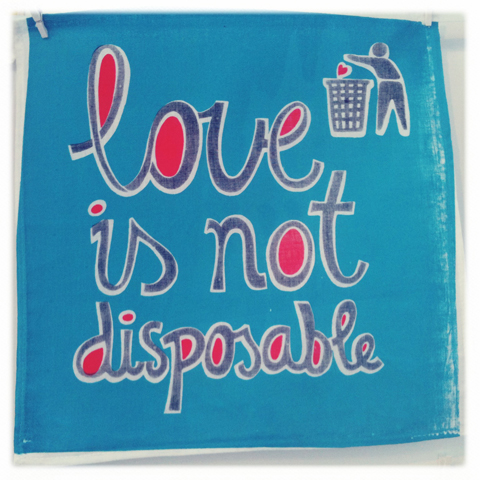


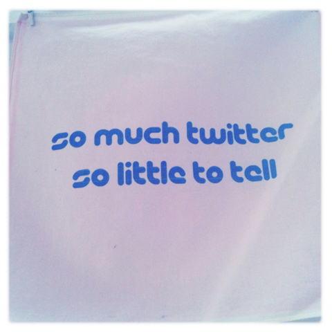
Maria believes in ‘bicycles, carrots and thoughtful design.’ Sounds good to me!


Fakery by John Ellis at Staffordshire University featured some wonderful old school usage of type, as did his record sleeve History Repeating Itself.


One Staffordshire student won the RSA Student Design Award for stamp design but had failed to pin any information near her exhibit so I had to squeeze it out of her tutor. I’ve since lost it. *update* I’ve found it! She’s Charlotte Lench.
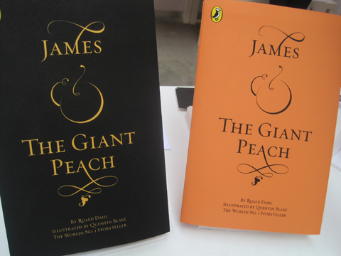
Lily Blythe envisaged the typeface for a book cover of James and the Giant Peach in beautiful calligraphic style.

Josephine Kibuka at Buckinghamshire New University also designed this popular book in a hand drawn style with a giant peach head.

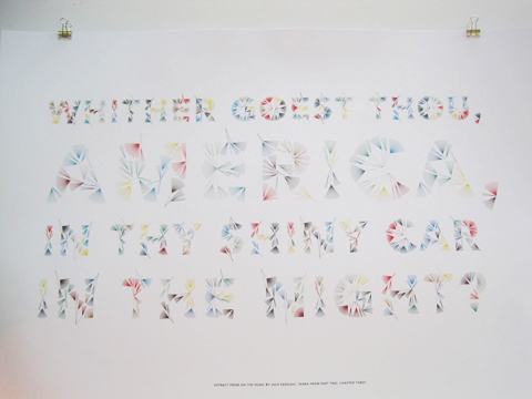
Emma King‘s delicate typography wowed at Sheffield Institute of Arts, part of Sheffield Hallam. She has been snapped up as an intern at Grafik magazine. Good choice!

Hull School of Art and Design students were particularly strong for typography; James Rogers took inspiration from the Deepwater Horizon oil spill.
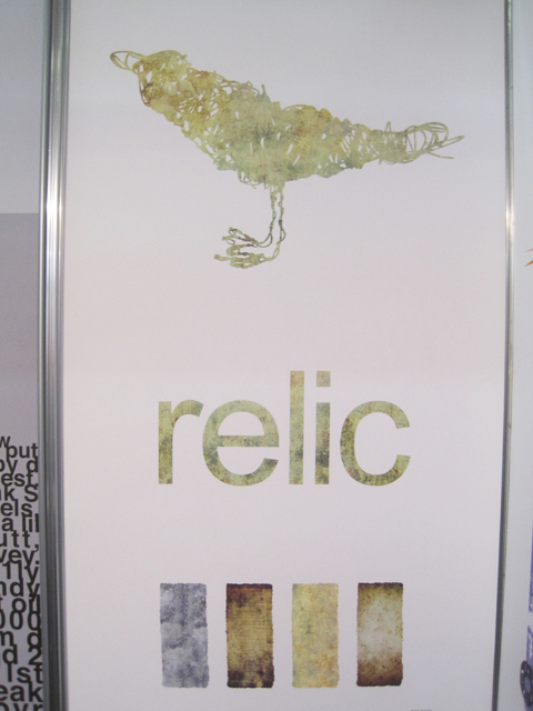
Ben Keith‘s bird is intended for a fashion label but I think it works in its own right.
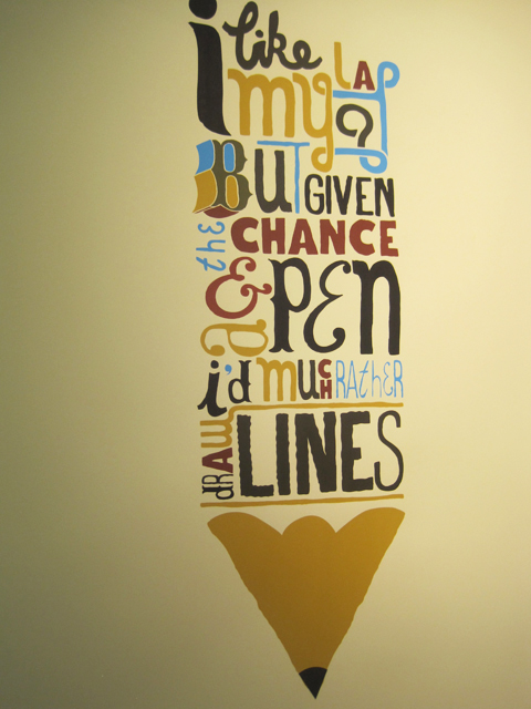
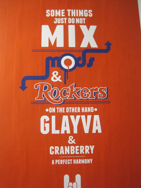
Hereford College of Art was also very strong for typography. Especially by James Watkins and Joe Stayte.
Categories ,2011, ,ames and the Giant Peach, ,Ben Keith, ,Charlotte Lench, ,D&AD, ,Emma King, ,Grafik magazine, ,Graphic Design, ,Hereford College of Art, ,History Repeating Itself, ,Hull School of Art and Design, ,James Watkins, ,Joe Stayte, ,John Ellis, ,Josephine Kibuka, ,Lily Blythe, ,Maria Rajka, ,New Blood, ,RSA award, ,Staffordshire University, ,Stamp Design, ,typography
Similar Posts:
- Best of D&AD New Blood Illustration & Graphic Design Graduates 2012: part two
- Best of D&AD New Blood Illustration & Graphic Design Graduates 2012: part three
- New Designers 2013 Surface Design Graduates – Playful Brights
- D&AD New Blood 2014 Review
- Best of D&AD New Blood Graphic Design Graduates 2011
