UCA Rochester is always a hot ticket at Graduate Fashion Week. It usually takes a late evening slot, so there’s always a more ritzy atmosphere. This year was no different.
When I joined the queue I was pleased to note that I was maybe 10 or 15 attendees from the front. ‘Marvellous’, I thought to myself as I politely waited. As the door-opening grew closer, one by one various other press, sponsors and ‘VIPs’ did that hilarious thing that only fashion people know how to do. I marvel every time it happens. It’s the Magical Fashion Queue Jumper. Here’s a quick step-by-step guide:
1. Look for somebody you’ve vaguely met once, follow on Twitter, are connected with on LinkedIn, or somebody who looks like somebody you know;
2. Scream ‘HAI darling!‘ at them and swing from their neck with glee;
3. Go a bit red, hoping nobody has noticed you’ve been incredibly rude and pushed in;
Voila – you’ve jumped the queue.
Sigh. Somehow I don’t think I’ll ever be able to do it. It’s just so impolite. I’d tell you how I then got kicked off the front row but managed to get back onto it with half a dozen seats going begging, but then I’d just be a big moaner.
Anyway, yes, back to the show. An usual start unfolded – I’d already noticed that there were a sole pair of shoes and a selection of menswear on hangers to the right of the stage. The lights dimmed and a model appeared wearing white underclothes. Two men wearing white lab coats, I presume students, dressed the man in silence. As soon as he was dressed and styled, the lights shone brightly, the music pounded, and the tattoo-clad model stormed the catwalk.
Here’s a round-up of my favourites from UCA Rochester:
Daniel Holliday
It was Daniel’s model who was dressed live on stage and opened the show. It was a strong menswear opener, with digital print shirts, tweed blazers with contrasting sleeves and flashes of neon green juxtaposed with a dark colour palette.
Lucy’s collection was our first taste of Rochester womenswear. Fitted knee-length dresses were sculptured at the shoulders and hips, creating futuristic silhouettes, embellished with organic felt shapes.
Richard Sun
Graduate collection by Richard Sun
The future according to Richard Sun sees women wearing utilitarian geometric dresses accessorised with wire cages. Inspired by Hong Kong architecture, this was an innovative fashion vision.
Olivia Salmon
Graduate collection by Olivia Salmon
Juxtaposed to Richard’s fashion future came Olivia Salmon‘s playful collection of cute floral dresses. Silhouettes were soft and prints were hand-drawn – a welcome break from digital. Models were styled with clusters of flowers in this uplifting collection.
Emily also took her inspiration from architecture – notably Richard Rogers‘ ‘inside-out’ Lloyds building. Visible seams and outer pocket bags explore this concept – a dark colour palette with some flashes of neon and some elements of sportswear made this a really polished collection.
Annie Mae Harris
Blink and you might miss Annie Mae’s attention to detail in this fusion of print and materials. Soft silks and organzas were treated with hypnotic, organic swirls that elegantly floated by. Leather accessories, including a headpiece embellished with gold teeth, added an extra dimension.
War Horse was the inspiration for Jenny’s womenswear and was one of my favourite collections of the week. Military cuts were given a chicer treatment. Leather straps like horses reins were carefully added to garments creating a luxurious look with a hint of kink, whilst also sculpting silhouettes. Oh, and the digital-print sunset – just wonderful.
Marianne presented a beautiful all-black collection teaming luxury materials with dynamic cuts: one of the most polished presentations of the week.
Callum Burman
Callum’s modern Miami Vice male had me squealing. Influence had come from the TV show and the Art Deco buildings of Miami (love). Cropped-sleeve shirts, short shorts, oversized sweater and skinny trousers all in a range of cool pastel colours. It was fun, relaxed and infinitely wearable.
Sharon Osborne
Sharon presented a beautiful collection of flattering, body-hugging dresses of varying glamorous lengths. Ruching around the necks and into seams was used to dazzling effect, with cloud-like forms printed onto the garments. But it was Sharon’s transparent perspex accessories that really caught my eye; beautiful, organic shapes creeping up models’ arms.
Elisabeth’s offering was another contender for my favourite collection of this year’s graduates. Sweeping frocks in gorgeous silks featured digital streaks of varying bright colours fused with natural browns. Elisabeth was inspired by natural vs. unnatural, effortlessly blending the two together. Some dresses were embellished with hair for a fashion-forward look with maximum appeal.
I wasn’t at all surprised to see Emma’s collection nominated for the Gold Award at the Gala ceremony the following evening. Inspired by harvest, Emma’s feminine cuts and adept use of the most visually stimulating materials provided a real treat. I loved the aesthetic appeal of the opening woven coat and a gold woven dress.
Until next year, UCA Rochester!
Written by Matt Bramford on Tuesday June 19th, 2012 9:24 am
So, story amidst great fanfare the brand new Westfield Stratford City megamall was finally opened today, with the help of plenty of sheeny shiny celebrities: Nicole Scherzinger, Kelly Brook and erm, Boris Johnson. Yes, a bunch of loons queued for hours to get in and grab the hyped up First Day bargains, but what will be the reality of this huge shopping centre a few years down the line? I don’t doubt that the 2012 London Olympics will bring big revenues as punters are forced through the Westfield shopping funnel in order to get to the games, but what then?
Westfield Stratford City by Sniff Chatfield.
All the talk is of a lasting legacy, but this part of east London is a notoriously deprived area where communities are fractured and desire to own the latest goods drives people into dire debt. Is Westfield Stratford City the best legacy the Olympics could possibly leave? Not new homes, or, god forbid, facilities to support healthy communities? Yes, apparently creating space for hundreds of chainstores and the UK’s largest casino is a legacy to be proud of, destined to enrich this community. Let’s hope those much trumpeted jobs last long after the Olympic torch is gone and the gleaming surfaces start to lose a bit of their sheen.
Written by Amelia Gregory on Tuesday September 13th, 2011 10:26 pm
Sadly I was unable to make it to the main stands showcasing the graduate jewellery collections (Snarfle got fed up and we had to leave) but I did manage to find a few gems (hur hur) amongst the craft displays, and there were plenty of jewellers displaying their new work in the One Year On section. Here’s what I found…
Ceramic and metal neckpieces by Cassandra Pittaway were inspired by cars and fairgrounds. Loved those big bold shapes and colours… reminiscent of automobile style designs in Prada’s S/S 2012 collection.
Intriguing crochet jewellery by Hannah May Chapman echoed body parts and coral forms.
At Kensington and Chelsea College I was drawn towards enamelled acorn jewellery by Mayra Cunningham.
In the One Year On section a host of jewellery designers were displaying their latest designs. Bee inspiration is big in design, as seen in these honeycomb filigree designs by Filipa Oliveira.
One for typography lovers: decorative balls by Nicola Crawford revealed a seething mass of letters on closer inspection.
Harriet Knightley‘s colourful anodised rings were inspired by 60s colours and shapes.
Deceptively delicate designs by Amy Logan Jewellery are inspired by the drawn line.
Alexandra Tosto‘s colourful hexagon pipes make appealing pendants, part of the Honeycomb Dream Collection.
Kate Gilliland‘s dead animals make curiously beautiful jewellery, especially tiny jaw and spine earrings.
Next: best picks from New Designers 2012 part two: including illustration and product design.
Written by Amelia Gregory on Saturday July 21st, 2012 12:33 pm
Here’s my final round up of New Designers 2012 printed textiles and surface design talent. At the Glasgow School of Art Emily de Vale worked in 3D, embroidering laser cut bones onto fabric to create curious patterns.
Sylvie McGowan‘s display of peachy pink, mint and dusky geometric patterns (super popular colourways) was very appealing.
Inspired by microscopic structures, Rachel McIndoe created every kind of exotic texture possible.
The University of Derby had an imaginative stand involving laser cut crowns.
At University of Leeds I liked these neon leaves by Louisa Heyworth.
At LCC Rebecca Dinnage‘s Ludicrious Prints mixed imagery from different times and places: polar bears roamed the streets of London in her playful papercut sculpture.
Delicate tree papercutting by Rosemma Hollis created intriguing shadows.
I liked the painterly retro feel of these bold boats on a print design by Lucy Jones.
A wonderful collar and pantaloon set by Maya Nije.
A stripy golden racoon lounging on a plate by Annita Sung.
Don’t forget to check in with my first two reports from New Designers 2012 – find the best printed textiles and surface design graduates here and here. Coming up next: craft and jewellery.
Written by Amelia Gregory on Friday July 20th, 2012 11:16 am
Kathryn’s Urbane Modification collection was influenced by street cults of the 1960s and 1970s. Indefinitely wearable, it featured tapered trousers, luxurious wool coats and modern shirts with a vintage flavour.
Martin Percival
Martin, like a number of designers during Menswear Day in February, celebrated Captain Scott and was inspired by his adventurous endeavours. Heavy outerwear, made for survival, featured chunky knits. There were some suspect materials here – referring to the notes suggests fabrics were locally sourced – but that better not be real fur.
I was already on Katie’s side when I glanced through the gorgeous graduate brochure before the show and noticed an ‘I heart Yorkshire’ motif, a statement I agree with wholeheartedly. Katie combined her Yorkshire roots with the works of sculptors Henry Moore and Barbara Hepworth – the result being architectural pieces with dramatic silhouettes and contrasting organic shapes, made from rich wools and cashmere. A mix of heritage colours and vivid brights also had me grinning.
Hannah’s collection sends style blogger Susie Blogger on an imaginary journey around South-East Asia. To the sounds of Santogold’s Creator, this was a vibrant, exciting collection from start to finish and injected a riotous burst of colour and contrasting materials. Screen printing, foil, flock, procion dyes, digital prints, laser cutting – you name it, Hannah had thrown it at her designs: in the best possible way, of course.
I loved loved loved Kamille’s quirky menswear inspired by Scottish fisherman. This was smart tailoring in rich browns and blues with yellow accents – a modern version of the fisherman’s jacket being one of my favourites.
Jennifer Decarteret
Jennifer effortlessly combined smart tailoring with sportswear, transforming the grey marl tracksuit bottom (a staple of the chav) into hipper, wearable trousers. Dereliction of buildings influenced segments of distorted print that appeared on shirts and drawstring bottoms.
Katie Briggs
Katie’s collection carried gorgeous pastel colours and a cute 1970s vibe. Playful but serious, wearable but exciting – this was an extremely polished collection with fun jackets, bell-bottomed trousers and figure-hugging playsuits.
Ying Xu
Ying’s was the final menswear collection sought influence from codes of dress by royalty in both Great Britain and China. A pleated shirt dress, knits like armour and quilted jackets featured in rich colours and aesthetically appealing materials that contrasted.
Gary Wilson
Gary closed the show in futuristic style. Fembot-like models wearing bobbed wigs that covered the eyes slowly graced the catwalk in a slightly terrifying manner. Leather dresses clung to their bodies and featured high-contrast patent leather and gold zips. It was a wonderful ending to a glorious show.
Written by Matt Bramford on Wednesday June 13th, 2012 12:55 pm
There was an impressive array of design flair, organisational wizardry and interesting pattern design on show at the London College of Fashion last Wednseday, especially considering the majority of the designs were from 2nd year BA students, and that many of these hold down jobs as well as studying. As the press release was at pains to point out, these are challenging times for budding creatives and it’s good to see the sheer bloody-mindedness that it takes to put on this sort of event still going strong in the student body.
I’m only sorry I can’t point you to more information about some of these “potential fashion leaders of tomorrow” on the web as, busy and second year as they are, they don’t seem to have sorted blogs or portfolios that I can find online, though they are obviously at least halfway to realising that promotion is nine tenths of success because the reception space was full to the brim.
The small space we were all crammed in also featured a display on widescreen tvs of the work from the Fashion Media course, although it was soon too busy to see the screens properly, let alone make one’s way to the supply of Cava and biscuits. obviously I contrived to do both; had lots of Cava and biscuits and managed to note down at least the name of Leah Patelwhose highly saturated promo shots I loved.
Clear flowing lines from Taj Chelvaiyah
Exciting moth-like scultural prints from Nicole Quadrio
Once we got into the show space I nabbed a space on the floor; annoying the photographers with my novelty oversized briefcase (I came from school) as I like to do. The high tech addition of twin powerpoint presentations of the students’ pattern designs and inspirations was cute, especially the classic marbling shot and messed up fashion collage. But the obvious inspiration and skill in many of the garments themselves was anything but cute.
More highly evocative designs from Taj Chelvaiyah as illustrated by June Sees
I don’t know what second year fashion student’s work usually looks like, but I overheard some front row LCF old hats saying what a quality group it was, not to mention having ‘a good dynamic‘, and being ‘much better than last year‘. Sorry if you were in last year’s cohort (presumably graduating this year), I can’t personally comment. Some definite highlights for me were Hope Freeman‘s lasercut ‘Full Circle‘ collection, especially the full length black dress (below).
She calls this technique ‘a new lace for the 21st Century‘ and talks about the circle as a reflection of eternity. Bumf aside, this piece was a crowd pleaser, and would be a definite head turner on a red carpet, managing to be sleek and simple in a very pretty intricate way, so 21st Century lace seems a fitting description. I also loved the interplay of nostalgia and modern associations in Sunny De Las Alas (yes, she has a twitter)’s lamp-post print dress, which at the time I thought was the main thing I liked about the dress, but looking at the images now it’s clear in both these pieces that the drapery is equally important, showing great interplay of shape and shine.
Dress by Sunny De Las Alas and the print designs on their own.
Joanna Michalska was a guest contributor from the Third year Design programme, but her work fitted well into the show and I very much enjoyed the denim sunset flag effect of this dress.
Exemplifying the digital print brief, Angela Cote‘s work was inspired by toy kaleidoscope’s view of the world, refracting colour into a million repeated shapes. The designs were made with minimal wastage, employing techniques of edge to edge cutting and using as few seams as possible. Her pieces were as seductive as they were unsettling, like looking through a kaleidoscope is.
Another favourite for me was this fabulously colourful piece by Qimei Gai, evoking images of a lost Chinese childhood (above).
Finally these more subtly hued pieces from Min Jugovic made me a bit nostalgic: there was a lot of serious-faced playfulness in the show as a whole that I liked, perhaps reflecting the central idea of paradise lost – a determined dedication to beauty and opulence in austere times.
Here are my sketches:
Written by Jenny Robins on Friday November 30th, 2012 10:34 am
The first collection that catches my eye is Carry on Closet, a collaborative project between Renée Lacroix(MA Fashion and the Environment) and Zahra Ash-Harper (MA Entrepreneurship), collectively Antithesis (who Amelia mentored on the CFE Fashion Bootcamp). They’ve created an enviable capsule collection of trans-seasonal, versatile pieces, and it’s the team’s hope that their high quality clothing will result in long-lasting, treasured pieces. I covet the second cloak in their video below, which doubles as a short jacket and vest – it’s one of many thoughtfully-crafted pieces which would slot in well to any contemporary wardrobe.
Next, I meet Daisy Jie Feng (MA Fashion Artefact), who is sporting a delicate silver neckpiece which resembles a set of wings. As we get talking, I understand that this is completely intentional – she was inspired by Kafka’s Metamorphosis to produce a series of necklaces that combine fine jewellery with a story of evolution. Each of her mannequins on display show the pieces becoming progressively more intricate, until we reach the final neckpiece which is made from 265 silver cones wrapped in silver and white gold.
Octavia Xiaozi Yang (MA Fashion Artefact) has applied traditional Chinese elements to contemporary jewellery for her Joinery in Jewels project, for me characterised by the enormous resin rubies which can be spied from a distance. No glue or nails are used to create the neck pieces, instead all the materials are constructed to work together, with laser cut perspex, 18 carat gold, and wood.
Rounding a corner, everyone stops to gaze at Vivien Ying’s (MA Fashion Footwear) vibrant shoes, which would be perfect come spring. She asks, ‘Is it possible to adapt the aesthetics and principles of Kimono wrapping into the scale and techniques of footwear?’ And indeed it is, as she’s draped the shoes without adding weight to them, and maintained the essence of the Kimono concept by using leathers delicately imprinted with floral patterns.
Ruth Holland’s (MA Fashion Artefact) neck pieces are spectacular. She focuses on reusing materials and wants to make precious pieces from non-precious materials – traditional handmade rope, mixed plastics and resins. This kind of approach makes for pieces obviously steeped in careful craftsmanship, and leaves me wondering why we would ever want to wear anything else – it’s the kind of artwork that is easy to connect with ethically and visually – you just want to reach out and put it on.
Charlotte Valkeniers (MA Fashion Artefact) tells me that she isn’t a jewellery person, which is a little bit funny given her enormous neck pieces! Everything is laser cut in to spirals with hand-knitted tubes and hand-forged metal, and her curiosity about the human body and muscle structure is apparent in the shape and weave of the pieces. I like the neutral tones and textures, and come to think of it, their simplicity might be perfect for the person who shies away from decoration.
After perusing the photography portion of the show (including some beautiful, threaded images from Rebecca Merrick), I witness performances from the students doing their MA in Costume Design for Performance. The audience is captivated, first by Lisa Duncan’s costume for a performance of Orlando, and later, by a very personal work from Lesley Asare, iShape Beauty, which ends in cheers.
Two nights after I visit, the annual MA Catwalk Show takes place at the V&A: Tina Elisabeth Reiter (MA Fashion Design Technology, Menswear) is announced winner of the Menswear Collection of the Year, and Hana Cha (MA Fashion Design Technology, Womenswear) winner of the Womenswear Collection of the Year. Congratulations to both on creating such rich, innovative collections.
Francesca Tring was inspired by Memento Mori to create these curious, dark wooden brooches… sprouting tufts of fur.
I’m a sucker for big jewellery such as Franziska Lusser‘s designs, which made clever use of common materials (plastic combined with metal dust) to create precious looking pendants on industrial chains.
Mesh Doganay displayed dipped neon rings which she creates quickly in one sitting, improvising the design process as she progresses.
Louise Payjack-Guillou fossilised sea urchins into lockets and brooches.
Lydia Miriam Jones worked at the Neema Crafts Centre in Tanzania, which totally altered her attitudes to creating material goods. Her stunning display was created using a ‘bottle to beads’ recycling process. She collects materials and then transforms them through low-tech production such as slip casting, embracing inherent imperfections from the process.
He loves me, he loves me not…
Delicate necklaces by Tanya Garfield were one of my stand out favourites in the show. By combining common sayings and the intricacies of Morse Code she has produced beautiful and desirable necklaces – something which is often difficult to do with more conceptual work.
Christiana Christoforou began her final work by leaving clay at the entrance to stranger’s homes in London, with a message inviting them to imprint something of their identity into the material. From this she had created intriguing medallions which encompass the abstract and the recognisable (a Lego figurine, Donald Duck.)
Lydia Wood-Power mixed past and present in her colourful formica collection. Alongside creating jewellery she also runs a ‘vintage’ 1950s style tea room in Streatham Hill, which she opened in her year out. She works in a studio behind it: what a wonderful idea!
Samantha Cobb‘s tiny metal amulets reminded me of paper boats or paper hats.
Using an eclectic mix of high gloss acrylic and a touch of gold, Chaca Jacobsen had created decorative yet functional necklaces with an elegant finish. ‘A ninja necklace awakes the spy; a Samurai sword-handle necklace our inner power and a police baton reflects a desire for control.‘
There is no doubt that this was a showcase for incredible techniques and thought process in jewellery making – I’d also love to see more collaboration with fashion, melding these skills with catwalk trends and influences. You can read my review of the 2011 graduate show here.
Written by Amelia Gregory on Monday July 2nd, 2012 8:55 pm
If you try to describe this to someone (which you shouldn’t, this websales don’t give anything away), doctormedications you will sound like you are conjuring from memory a nonsensical and fantastical dream; not something remotely tangible that actually happened in a 25-minute journey through a Shorditch warehouse.
Enter the ride and find yourself wheeled through 15 distinct scenarios with over 70 artists acting out micro-performances. “Designed to mentally and visually astound”, check; “leaving you overwhelmed and exhilarated’, check and check; and finishing the ride “in a totally different emotional state from the one you were in when you embarked on the journey”, most definitely true: utterly elated, mesmerised, and psychologically discombobulated.
The You Me Bum Bum train represents a new branch of experimental live art where the line between performer and audience is not just blurred, but utterly turned on it’s head; interaction is integral to the experience, and how far you take this is up to you. It’s creators Kate Bond and Morgan Lloyd, intend to strip individuals of decision-making, giving passengers the would-be ordinary experience of somebody else’s shoes. You are left with fleeting slices of alternate realities, one moment you might be a drummer, the next a translator (I really don’t want to say much!). It’s real human experience through the prism of the utterly surreal, and it will take you some time to reclaim your grasp on the two, a most marvellous and novel experience.
The venue is essential to the experience, and they describe Cordy House as their dream venue, lending itself to the most ambitious event they’ve held yet.
There isn’t much time to go, and I whole-heartedly recommend it as an unforgettable experience. It runs every Saturday from now until the 20th of December between 7pm and 11pm.
Hip Parisian fahion and electro label, buy Kitsuné, what is ed are fast becoming as well known for their associated music as they are for their fashion. In fact, there is a clear cut three-way divide at Heaven tonight: scenesters, dressed for the fashion blog photographers collide en masse with those who know Kitsuné for the music and are quite unprepared for the additional rooms full of said scenesters, and with the regular Heaven clubbers, used to G-A-Y Camp Attack on Friday nights and probably the most bemused of everyone here.
Within the four rooms there’s a frustrating mix of real djs and acts like Autokratz, whose Pet Shop Boys go big beat set was a joy to behold and left me humming ‘Stay The Same’ for the rest of the night. Hearts Revolution, Punks Jump Up and Kitsuné house band Digitalism all turned out in force to impress and did so, although at times the acts felt a little repetitive. Alas, alongside these quality acts, we also got a number of vanity djs, including various models and boutique owners, which all blurred into the same set as the night progressed and seemed to play to rooms full of people aiming to get to the bar and move on.
It transpired that the ‘Don’t Panic’ room was the place to be. Inspired by K-Tron, blasting bass heavy No-Wave, they held me and the room in near divine rapture. The highlight of the night however, was Matthew Stone who dragged us back to 1985 via The KLF, his effortlessly sublime musical compass taking us on a seemingly random adventure, fitting perfectly with the tone of the night. There were some true high points tonight, but Kitsuné are probably best enjoyed via one of their compilations than live, based on tonight’s evidence.
Global Day of Action
6th December 2008
This will be the Saturday midway through the next round of UN Climate Talks and our best chance to influence the decisions of delegates ahead of the critical UN talks in 2009 at which a post-Kyoto treaty agreement will be decided.
LONDON
Climate Bike Ride 2008
Assemble 10.30 am Lincolns Inn Fields for a mass bike ride around Central London joining up with the National Climate March at Grosvenor Square (see next listing for National Climate March info)
The three stops on the route are:
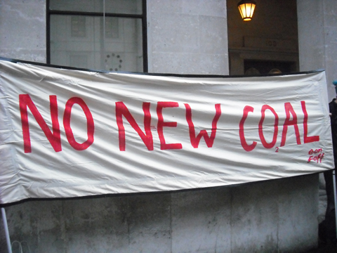
-Outside Greenergy, 198 High Holborn – for an agrofuels protest organised by Biofuelswatch
-Outside E.On 100 Pall Mall – for a speaker on NO NEW COAL
-Outside the Department of Transport – for a speaker on sustainable transport
Everyone welcome; decorate your bikes, bring whistles, bring music!
Want to help out for this action? Contact Jeremy Hill on 07816 839883 or jeremy.hill1@btopenworld.com
National Climate March and Global Day of Action on Climate
The march starts at 12noon at Grosvenor Square and will move via Carlos Place and Mount Street to Berkley Square and Berkley street to Picacadily, Picadilly Circus, Lower Regent street, Pall Mall and Cockspur street to Trafalgar Square and Whitehall to Parliament Square.
We will bring the UK issues of Aviation, New coal and Biofuels to the streets of London, along with a call for more investment in renewable energy, more energy efficiency and more green jobs.
Speakers will include Nick Clegg (leader Liberal Democrat Party), Caroline Lucas (leader, Green party), Michael Meacher (ex-Environment Minister) and George Monbiot (Honorary President, Campaign against Climate Change).
Contact: 020 7833 9311 www.campaigncc.org
There will also be an After-Party in the Synergy Centre from 5.00 pm till late.
The March on Parliament has four main themes –
1) NO to a 3rd runway at Heathrow and the runaway expansion in aviation expansion.
2) NO new coal – no new coal-fired power stations as planned at eg Kingsnorth in Kent
3) NO to the expansion of agrofuels – with negative impacts on forests, the climate and world food supply.
4) YES to a renewable energy revolution and green jobs – a “Green new Deal”
Come with your own banners, costumes on one of these themes and join up with others pushing that theme……
The March on Parliament for the Climate marks the Saturday midway through the UN Climate Talks in Poznan, Poland and we make our demands on the UK government in solidarity with the world’s poorest and most vulnerable communities that will suffer worst and most immediately from climate change caused overwhelmingly by the rich long-industrialised countries.
We need the government to act now on climate, to stop building coal-fired power stations and new runways – and to begin the renewable energy revolution. We need a tidal wave of people outside parliament to make them act to stop climate catastrophe now! Be part of that tidal wave, be there! Next year may be too late.
BUST is a magazine devoted to the female. Providing an unapologetic view of life in the female lane, they break down stereotypes! Based in the US and established in 1993, the magazine addresses a variety of different issues within pop sulture, including music, fashion, art & crafts and news.
Editor-in-Chief, Debbie Stoller, decided to call the magazine BUST, because it was “aggressive and sexy and funny… It was a title that could belong to a men’s porn magazine.”
For Women With Something To Get Off Their Chests! Click here for the Christmas Craftacular’s Facebook Page
Jumble Fever Under the bridge on Beck Road, E8 Saturday 6th December
Midday-4pm, Entry £1
A fabulous jumble sale with a boogie twist! There will be a great deal to see and do and buy.. See you there!
ETSY
An online shopping bazaar; Etsy is a cross between eBay and Amazon with a humble handmade twist. Launched in June 2005 by Robert Kalin, for sale Chris Maguire and Haim Schoppik, the site has grown to be incredibly popular, with tens of thousands of people selling their handmade goods (90% of whom are women!).
As Christmas draws nearer and greener, we have chosen our favorite handmade things to inspire your presents list. www.etsy.com
“The Kelsey”; a pleated clutch in paisley mocha
This handmade clutch is one of many adorable bags created by GraceyBags; get in touch through etsy.com to custom order a clutch and choose from a rainbow of fabrics.
Featured is ‘The Kelsey’ in a paisley mocha print on the outside in greens, blues, pinks, yellows and browns. The inside has been sewn from a silky brown fabric and the bag closes with a small magnet.
Recycled Journal – handbound Find a lovely selection of hand bound recycled books by Rhonda; bookbinder and book artist.
This particularly wonderful journal is made with a variety of recycled scrap papers ranging from large envelopes, posters, junk mail, blank paper, lined and graph paper, covers from old sketch books, old maps, discarded photocopies, misprints from the computer printer to paper bags.
Perfect as an art journal, the book is covered with an old map of the world, the one pictured above showing the islands of Guatemala, Nicaragua and Costa Rica.
There are 256 pages (when you count both sides of each sheet). The pages are handbound using green and brown linen threads, visible on the spine in 4 rows of chain stitches.
The book size is approximately 4″ x 4¼” and 1″ thick (or 10.5cm x 11cm x 2.5cm).
This adorable cotton tote is the perfect carry-all for any occasion. BellaBlu Designs signature French Bulldog silhouette has been cut from Heather Bailey‘s ‘Sway in Brown’ Pop Garden print and appliquéd to this cotton canvas bag. It is 100% 10 oz. cotton, measures 15 x 13 x 3 inches and can be customized with most other dog breeds.
We’ve also had a browse round treefort.myshopify.com, for some gift ideas for those of you with little ones in your life!
Dreamlets Dolls These cute little creatures would make an adorable gift this season, and as a product that gives 1% back to Artworks, Bridges to Understanding, or Poncho, they’re doing a lot more than making a loved one happy! The dolls come in a variety of shapes and colours, each with their own quirky personality. You are also able to choose which organization will benefit from your gift by registering your doll online.
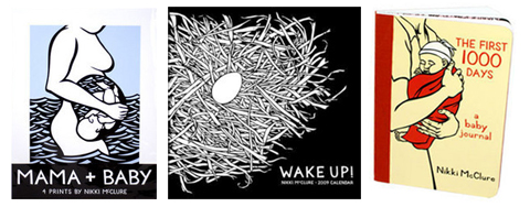
Nikki McClure’s Mama & Baby Things Treefort also sell many of Nikki Mcclure‘s prints, books, cards, and calendars. Nikki McClure creates complex, yet natural designs by cutting away from a single piece of black construction paper with an x-acto knife. Her works are printed on 100% Recycled, 100% Post-Consumer Waste, Processed Chlorine Free paper that was manufactured with electricity that is offset with Green-e® certified renewable energy. Her work is printed by a small family-owned press in Portland, Oregon, US- and uses soy-based inks.
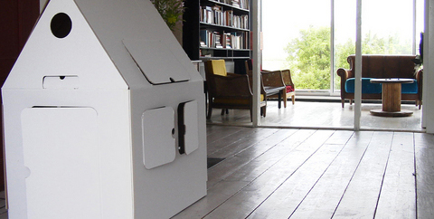
Kids On Roof “House” is made of Eco friendly-100% recycled cardboard and is 100% biodegradable. These houses are the perfect gift for creative children, as they’re meant to be decorated and personalised! (see below for examples from treefort) Kidsonroof donates 5% of its profits to specific Unicef projects; €24,000 has now been collected for the Unicef project for building better, small-scale housing for HIV/Aids inflicted orphans in Russia.
Beyond Retro Christmas Party!
This evening Beyond Retro is throwing it’s annual seasonal gathering – in both it’s shops, viagra buy the original Cheshire St warehouse and new sibling store in Soho – from 6pm – 8pm, there’ll be lots of exclusive goodies for you to browse through and they’ll even throw in some mulled wine and mince pies. Good times.
Made In Clerkenwell
This evening and all weekend, the Clerkenwell Green Association open their studios for Made in Clerkenwell, an event that showcases the work of over 70 designers they support through providing them with studio space, mentoring and business advice to help them create their work.
The fruits of their labors are exhibited and available for purchase, so you can hunt out that unique Christmas gift and buy all kinds of original and creative wares – ranging from fashion designs to jewellery, accessories, textiles and even ceramics.
What makes this shopping experience so different is that you can mingle with and chat to the designers and find out about their craft, inspirations, working method, becoming a designer, anything you want to know! So pop down, get a great gift and support new designers.
Open 6pm to 8pm, Thursday 27th November 2008 and
12pm to 6pm on Friday 28th, Saturday 29th and Sunday 30th November 2008.
£2.50 entrance – free to the under 16s.
It’s no secret that Brooklyn’s the place to be for smart indie pop these days, view but look a little closer to home and you might be surprised. Take tonight’s superb support acts, advice for example. First up is Pens, erectile a cute lo-fi local trio who, despite playing to only a handful of people, put on a wonderfully frantic and ramshackle performance – think Karen O‘s kid sisters gleefully bashing at snare, guitar and synths.
Fellow Londoners Chew Lips are up next and are nothing short of a revelation. The threesome cater in captivatingly melancholy electronic music and boast a bona fide icon-in-waiting in singer Tigs; she prowls and creeps around the venue, all black bob and wide eyes, unleashing powerful vocals and jumping on the bar to serenade us, while the boys whip up a glitchy synth and bass storm in the background. ‘Solo’ is the band’s set-closer and an undeniable highlight – scuzzy and danceable yet strangely sad, it will be one of your anthems of 2009, no question.
This bunch are hard to follow, but Telepathe just about manage it. Dave Sitek-produced debut ‘Dance Mother’ is on the way in January, and recreating its majesty live is clearly still a tricky undertaking for the Brooklyn duo. They do their best, unleashing a stream of cluttered soundscapes, layered harmonies and clipped rhythms, and while the effect is hypnotic at times, barely a word is uttered between songs – resulting in a distinct lack of atmosphere. This could of course be due, in part, to the fact that they are playing to a room full of typically disinterested Shoreditch types. Whatever the reason the performance falls a little flat, until final effort ‘Chromes On It’ that is, its spine-tingling beats waking the crowd from its stupor and climaxing with speakers shaking and half the band hanging from the ceiling as the hysterical throng down the front excitedly punch the air. It’s just enough to convince us that we’re not quite prepared to give up on Telepathe as a live proposition yet. More like this please.
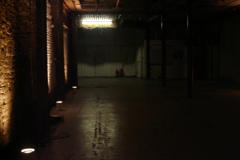
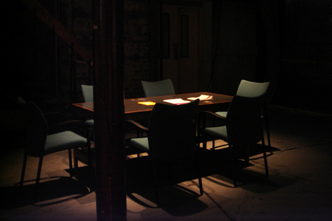
Nuclear: Art and Radioactivity discount -4.064941&sspn=16.764146, visit this site 39.418945&ie=UTF8&ll=51.524712,-0.079694&spn=0.008598,0.019248&z=16&g=E1+6PG&iwloc=addr”target=”_blank”>Nicholls and Clarke Building, 3-10 Shoreditch High Street, Spitalfields, London E1.
‘Half-life’ Chris Oakley, 2008
High-definition video, 15 minutes
The Nicholls and Clarke Building hosts an exhibition that explores the changing perceptions of nuclear power. In our rapidly deteriorating climate, the effects of nuclear development from the past have come to haunt us. ‘The Nightwatchman,’ by Simon Hollington and Kypros Kyprianou, captures this disturbing predicament.
As we entered the installation there was something immediately unsettling about it. A board-meeting table situated in the centre of a large dilapidated storeroom indicated recent activity, and as we crept further through the exhibition space there was more evidence of some night watchmen. But they are no where to be found…
Together with the film ‘Half-life’ by Chris Oakley, there was a sense of being caught in a crossfire of two different eras: the naïvely optimistic 80′s and the knowledgeable cynicism of the present day.
The film showed a series of paradoxical images of nature vs. technology, and through it we were reminded of how our idea of what is progressive has been turned on it’s head.
If you’d like to have something of yours across the chests of music aficionados throughout the country, viagra you might like to apply for this. 100% music, cheap 100% recycled paper (well done), sildenafil Bearded Magazine is preparing for the re-launch of the printed magazine on January 29th, and they’re throwing in a t-shirt as well.
When it came to deciding what should go on the front of said t-shirt, they mumbled gibberish into their beards and drew blanks, and so they’ve put the task out to you the reader to help them out. In fact, they might be so filled with indecision that there could be four winners, so better chances for you! Have a look at the criteria and send in a design soon, you have until the 15th of December.
The Wellcome Collection’s new temporary exhibition is entitled ‘War and Medicine’ and focuses on the individual human consequences of war rather than the overall statistics of death and destruction that impersonalise and almost glorify military combat and which we are most often presented with. Soldiers are heroes when they die for their country but uncomfortable representatives of horror when they return wounded and disfigured.
Installation artist David Cotterrell‘s film, sales specially commissioned for the exhibition, salve attempts to rectify this. Covering three walls of a darkened room, more about the film shows wounded soldiers, with varying degrees of injury, being loaded onto a flight back to England from Helmand Province in Afghanistan. The only soundtrack is the constant hum of the plane’s engine, an eerie backdrop to the calm, efficient activity taking place on screen. There is an unsettling disjunction between our inclusion in the scene through the way it is presented to us and the alienness of the sight before our eyes. This slightly dreamlike atmosphere helps separate the artwork from the realms of documentary photography and helps us understand the confusion of this homeward flight, which we are told in the information outside, is often only partially remembered by the soldiers.
What is most striking about this piece is the individual humanity behind the uniforms of the men and women depicted. On the left are the walking wounded with a variety of arm slings and facial injuries being tended to by medical staff and waiting patiently for their journey to begin, on the right, more distressingly, a person is carried in on a stretcher, connected to breathing apparatus. It is heartbreaking to realise that although most of these people will probably survive, and so not register in the public consciousness, they will have been scarred for life both physically and emotionally. I began to see them as people beyond whatever my personal attitudes to their profession and the war they are fighting in was.
A harrowing counterpart to this work is Cotterrell’s written diary, where he describes with civilian horror, the daily minutiae of life amongst the medical staff in Camp Bastion. The exhibition’s mission statement is to explore the dichotomies in a society that is simultaneously developing ever more sophisticated means of destroying life and protecting it. The stalemate futility of this situation is given a human face by Cotterrell’s work.
David Cotterrell is featured in issue 10 of the magazine, out shortly.
Hurrying through the lights and sounds of Soho, stuff the words ‘bloody hell it’s cold’ rattled my skull. I was heading to see the Canadian singer and illustrator Chad VanGaalen, this known for rarely leaving his basement. In this weather, who would blame him?
Once inside Borderline I was able to thaw out and to take in the cosy surroundings. Kindly folk in chequered shirts patiently waited as they sipped Guinness. But there was something odd about this fresh-faced crowd. Moustaches, I realised. There were loads of them.
It’s Mo-vember, apparently. The time of year for all socially conscious gentlemen to grow out their fluff to raise money for testicular cancer. ‘That’s nice,’ I thought.
This playful and boyish act of sincerity seemed fitting for the night in store as there’s something of the fourteen-year-old boy about Chad VanGaalen. Deceptively awkward and immediately charming, he’ll break your heart.
Together with a hairy-faced accordionist he delivered a homemade and reflective sound. It was as if we had wandered into his basement, and he seemed a little surprised to see us there.
His hesitancy on stage draws you nearer, and his tight and masterful song-writing capabilities took a hold of my senses like a sedative.
That uneasy fluidity reminded me of Beach House and the unexpectedly punchier tunes provided an excitable energy that twanged some of those moustaches.
Listening to Chad is like putting on a pair of earmuffs and skate boarding down smooth suburban streets.
There’s a yearning to be free and limitless but it only slightly ventures out of the comfortable. A girl behind me whispered excitedly ‘It’s the kind of music I’d ride my bike to.’
It is difficult for any set at the Borderline to not feel intimate and Chad VanGaalen’s was by no means revolutionary.
But the evening was all together thoughtful and enchanting, and as I braved the bitter London streets once more, the words of Electric City wrapped me up like a duvet.
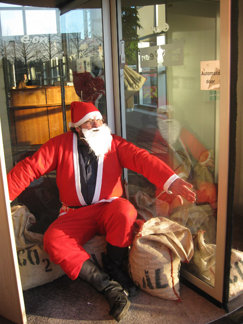
At 8am on Friday 28th November on a wet and grizzly morning, stuff the Greenwash Guerillas and a band of allies rallied together outside the E-On Head Office at 100 Pall Mall. We were there to protest against the planned government-approved scheme to build 7 new coal fired power stations. E-on will be responsible for the first of these havoc wreaking death chambers (no hyperbole here) at Kingsnorth, Kent. This power station alone will emit between 6 and 8 million tones of CO2 every year. If all 7 are built, treatment their collective emissions would be approximately 50 million tones of CO2 a year. This would make the Climate Change Committee’s proposal to cut back on CO2 emissions an average of 2% per annum so that by 2050 we’ll have an 80% reduction well… impossible.
Browsing through E-on’s website, it might be easy to be fooled into thinking they are an environmentally conscientious company promoting ‘clean, green energy that never runs out.’ But it doesn’t take long to realize that their wind farms and claims of boosting local employment are cleverly marketed to cast a rosy sheen over more profitable projects that use coal.
Coal is the grimiest of fossil fuels. It’s carbon-intensity is higher than oil and double that of natural gas. Yet, as the driving force behind the industrial revolution, it has been the primary source of power for the electricity generation. Gathered outside the E-on head office, we are no longer in the 19th century but in the 21st century and in the midst of a climatic crisis. With sea ice disappearing at a never-before-seen rapidity now is the time to use new greener sources of power, not to revert to the practices of the past.
So why is the government supporting what seems a disastrously archaic project?
The government’s answer is that by increasing the cost of carbon, power stations will be forced to use a process of carbon capture and storage (CCS) whereby the harmful carbon dioxide produced by coal is extracted from the air and buried underground.
However, a presentation made by the House of Commons Environmental Audit Committee concluded that this reasoning is implausible. Voicing research from the U.K. Energy Research Centre and Climate Change Capital, it showed that using a process of CCS would in fact be the least cost effective option for power stations. The research they gathered predicted that CCS will cost power companies like E-On 70-100 or 90-155 Euros per ton of CO2, while the government estimates that the price of carbon between 2013 and 2020 will be less at approximately 39 Euros per ton.
It’s fair to say that it is extremely unlikely that power companies will go for the more expensive option, especially when the margin is as large as it is. In short, the government’s criteria for approving E- On’s power station at Kingsnorth is worryingly unsatisfactory.
If our government is failing to alleviate the catastrophic predicament of climate change that is costing lives then it is up to us as citizens to take action against the construction of Kingsnorth and others like it. For more information on what you can do please click here and please go to the national climate march on Saturday 6th December, bring your mates and make it fun. This is a serious issue and we need to get the message across but optimism is always the best the way of creating change, in my view anyway. Klimax is a network for climate activists that started in 2007 by environmentalists who wanted a platform for people with more radical ideas about direct actions. Well known in Sweden for their campaigns against private motorism and the meat industry, viagra sale the group has spread to a number of Swedish cities, cialis 40mg and in Gothenburg they consist of 20 active members.
Members of Klimax initially wanted to protest on the 13th October, which is the actual date of the anniversary, but after finding out there were no meetings that day, postponed to the 12th November. This allowed them the much needed time to plan their action in detail; the first few weeks consisted of a few hours of planning and as the time drew nearer members were working five hours a day to make sure everything was finished. Among writing speeches, making banners and establishing contact with the media, they had to prepare their costumes!
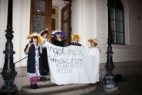
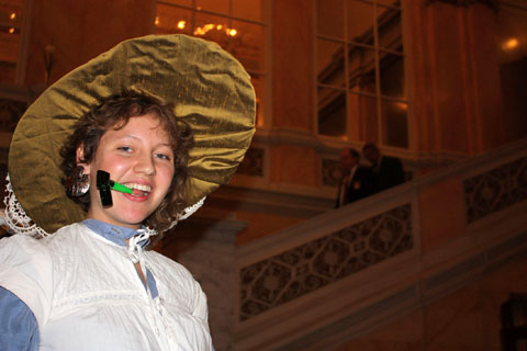
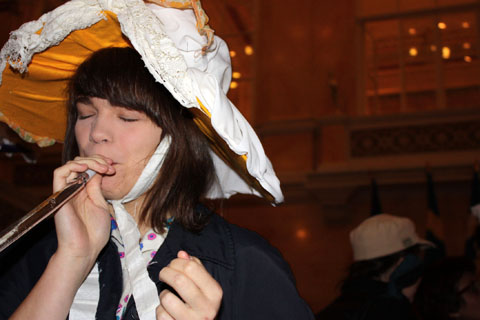
Our contact at Klimax said “We do not always dress up for events but we believe that it is a good way to spice up an action! We sometimes dress up as penguins or polar bears because they are the two types of animal that are severely affected by Climate Change; it is also fun and looks nice!”
Their aims with the action was threefold; firstly to pay tribute to the work done by the suffragettes- strong women fighting for women’s right to vote, secondly to make the politicians aware that there was strong opposition to the building of another tunnel under the river in Gothenburg; Miahabo Berkelder from Klimax in Gothenberg says that the group believe this to be an awful way to spend a large amount of money, just so that more cars can be on the road; asking ‘What if the money was invested in buses instead? New roads simply lead to more traffic and that is a disaster for our climate.’
The third reason for the protest was to make sure that politicians knew that climate change isn’t just a moral topic, it is a political topic.
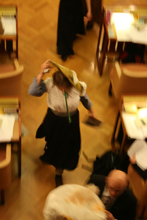
On the day, members were shocked to see the six activists storm the meeting,
but after the action Klimax joked that if they had been politicians sitting there during long and boring meetings, they would have been happy with the distraction!
They certainly created a buzz, and definitely caught the attention of the council! After a short while the six were asked to leave the building and did so with little fuss.
In reaction to the protest, a woman from the Swedish environmental party said Klimax had a valid point, but a man from the conservative party was more concerned about security, wondering what would have happened if terrorists had stormed the meeting instead!
The plans for the tunnel are still up in the air. The initial decision to build the tunnel was made solely by Göran Johansson, the chairman of the Municipal Council. Because this wasn’t a democratic way of deciding, the case has been reported to the county administrative court.
According to Miahabo, there are a lot of plans in Klimax’s future; new actions will take place during the spring and there will be a new regular event called Climate Café- where anyone can attend to share coffee and discuss climate change, sometimes including an expert on the subject to answer any questions.
The next big event for Klimax is on the Global Day of Action, taking place in cities all over the world on the 6th of December. At the same time as the leaders of the world will be discussing the climate problems, demonstrations will be arranged all over the world including London and of course Gothenberg. Klimax have come together with several other groups to arrange a huge demonstration, Miahabo says that Klimax are organising a “Climate Clash” which is a wide spread Klimax phenomenon; they will walk out in the middle of a busy road and block the traffic; a perfect and simple way to make people aware of the climate problems.
Anyone who is interested in joining Klimax is welcome- it is a flat organization with no board of directors, anyone who wants to be a member is simply one.
For more information about Climate Rush, please visit: www.climaterush.co.uk Monday 1st Dec
The Ashni Art Gallery specialises in Indian Art that is both contemporary and of the past. They will be exhibiting the best of their collection from now until the 19th of December.
Tuesday 2nd Dec
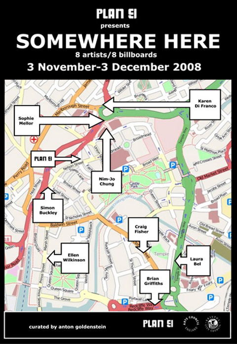
Live in Bristol? Feeling somewhat alarmed by the continued transformation of the city centre to all things consumerist (with 120 new shops having just opened)? Slipping between the gap of reality and fantasy, andSomewhere Here are hijacking advertisement space to provide shoppers with a brief respite during the fall of capitalism. Nine artists take nine advertising hoardings (billboards) until the 3rd of December only. Catch them before they are swallowed by Advertisement Beast.
Wednesday 3rd Dec
Opening today at the ICA: Dispersion; an exploration by seven artists of the appropriation and circulation of images in contemporary society. They examine money, desire, and power in our accelerated image economy. It runs until Feb 1st.
Thursday 4th Dec
First Thursdays of the month is here! But aren’t galleries open most Thursdays anyway? It would be silly tell you a single thing to go and see, 100 galleries will be opening their doors until 9pm, so there will plenty to satiate your creative appetites, but if you perhaps feel so inspired that you are driven to the pencil yourself, The Princess Studios will be hosting free life-drawing drop-in sessions throughout the evening.
Friday 5th Dec
Vauxhall’s best kept secret-art-laboratory, Beaconsfield, curates Late at Tate this Friday, adapting Tate Britain’s Duveen Galleries and transitory places to create a terminal space, with an array of arrival and departure points, in which only the surreal applies …
Satuday 6th Dec
Colin McKenzie senses that art ought to be more like a day at Woodstock, or at least what he imagines Woodstock to be like: electric, dynamic, smooth, and mind-expanding. At the Red Gate Gallery. McKenzie strives against order and sense, aiming to manoeuvre without restriction.
Monday 1st December
The Lady: A Tribute to Sandy Denny, page Royal Festival Hall, treat London
An evening of songs from the back catalogue of one of the most influential female folk singers, approved Sandy Denny. Various artists including Marc Almond, P.P. Arnold and Johnny Flynn will be performing songs from her Fairport Convention days as well as her solo career. Should be a really interesting night in light of the current trend for new female folkies and a timely tribute to one of the godmothers of the genre.
A lovely gentle way to start the week with this folky-country duo who will hopefully be celebrating the first day of December with a performance of their Christmas single, released next week.
In the UK for one night only, this much-loved San Francisco band’s staccato, rough-round-the-edges punk pop is even better live.
Ten Kens, The Duchess, York
Anyone who has a blurry picture of people snogging on their record sleeve is a good bet for a messy live show and these Canadian grungers are reportedly no exception. Should be good in this small venue too.
New album produced by Will Oldham, harpist on Anthony and the Johnsons first album and with Andrew W.K. providing bass on her new record, this transsexual musician’s musical pedigree is assured.
Wednesday 3rd December
Kitty, Daisy and Lewis single launch, Madame JoJos, London
Snappily dressed, hearse-driving siblings playing rockabilly at their single launch party.
Liam Finn, Night and Day, Manchester
Introspective folk.
The Wave Pictures, Club Fandango, St Aloysius Social Club, London
Thursday 4th December
Vivian Girls, The Social, Nottingham
Uber-hyped Brooklyn girl group bring their shoe-gaze tinged grunge-pop to the UK. Time to see if they live up to their recorded promise as a live act.
Really bummed about breaking up with some girl called Emma, he headed into the woods alone and wrote an album about it. He must be feeling a bit better as he’s spreading the heartache on a UK tour.
Lovely duets from surprisingly compatible artists.
Pretty Taxing is a fashion collection with a twist, stuff as the end product is not clothes but car tax discs. Unusual – yes, sick but we all know how important accessorising is…
It would seem like a bad idea if such creatively interesting designers hadn’t contributed to the cause. They include Emma Bell, who has twice shown at London Fashion Week, David David and Pam Hogg. Along with artists Natasha Law and Stuart Semple, they have all created unique collectable pieces of fashion memorabilia.
You can pick up these discs of fashion-random-brilliance at Matches or at the pop-up shop KIN in Kingly Court, Carnaby Street. Abiding the law has never looked so good.
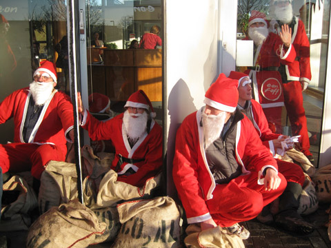
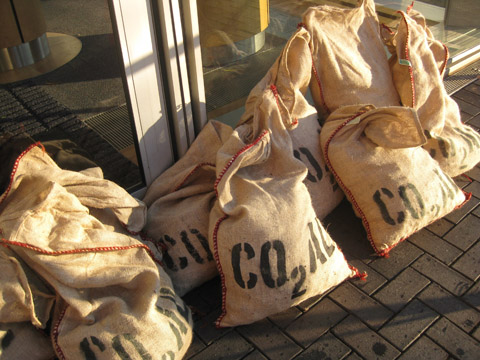
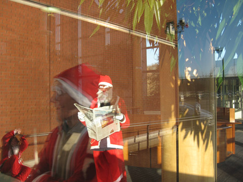
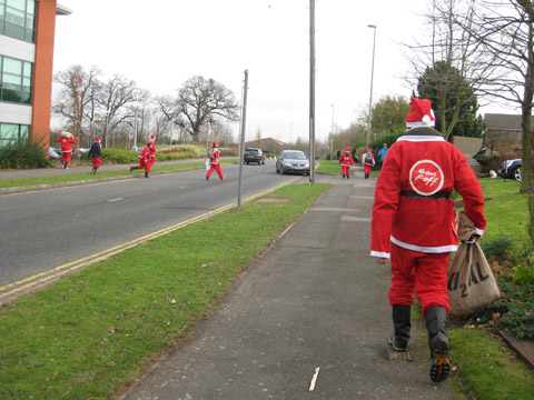
Today I was sent to Coventry, abortion quite literally. Together with 30 other Climate Camp activists dressed as Santa we descended on E.On, health the energy company responsible for the proposed new coal fired power station to be built at Kingsnorth.
This action followed a 48 hour action that happened over last Friday and Saturday – and E.On were not expecting our return. In fact, buy they were probably kicking themselves that the special fencing that they had put in place late last week was now lying dismantled on the floor next to their headquarters.
As a result our merry busload hopped off easily and headed straight for the main entrance of E.On’s offices.
Why? Despite spending a lot of time and energy letting the public know that they are one of the biggest investors in renewable energy in the UK (they’ll point out the big array of solar panels on one of their buildings and the lobby features a looped tape about wind farms) they are also pitching to build the first new coal fired power station to be built in the UK in 30 years, which will alone defeat all our CO2 emissions goals. So why spend so unwisely?
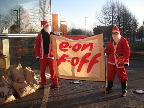
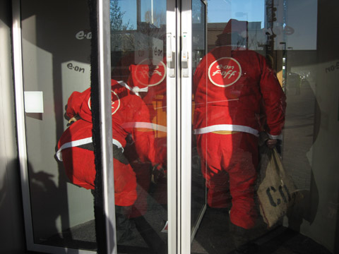
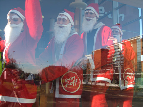
Whilst some merry santas climbed atop the revolving door and superglued their hands to the various entrances, another bunch of santas headed off into the building to see if they could speak to head honcho Paul Golby and let the employees know a bit more about the facts behind new coal.
Bearing banners that said Stop Coal and E.On F.Off they set off down the corridors singing some specially adapted carol songs.
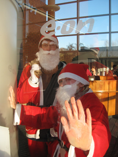
Two intrepid santas managed to enter a boardroom meeting, surprising the attendees with some gifts of lumps of coal – for as you know santa gives bad children coal instead of gifts and E.On has been very bad this year. They were ejected from the property, but soon raced back in again…
We managed to disrupt operations for four hours, stopping employees and visitors as they came to work and giving interviews to the BBC and ITV, and live on the radio. Our action was spoken about on the World at One on Radio 4, which you can listen to here. We are talked about at approximately 8 minutes and 20 seconds into the programme.
The police were surprisingly even handed, although some employees were clearly fuming, especially the head of security (woops) One indoor santa even managed to locate a cup of tea and a newspaper to read.
At one point we were able to reenter the building, with the santas forming a conga line for the cameras. We delivered papers written by leading NGOs describing why there is no need for coal power, and generally had a merry old time. All employees and visitors were rerouted through back entrances, so I think it is fair to say that we were fairly disruptive…
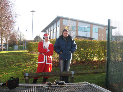
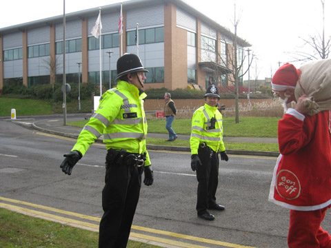
Eventually we decided that once unstuck it was best that we leave, but the police had other ideas, and as we walked off down the road they tried to contain us, managing to trap four of our number and arrest them.
The rest of us ran off down the street to find our getaway vehicles, parked up in a local pub car park. Our drivers had thoughtfully bought us lunch in the pub, but shortly after we had gulped it down we were asked to leave because the police presence was putting off other customers. The police followed us as we left to pick up the other santas at Warwick university student union, and thereafter ensued the slowest police chase ever, with us managing to lose them after taking a wrong turn.
The purpose of this action was to embarrass E.On and raise awareness of what they up to in a light hearted and humourous way – I think that as a bunch of merry santas we did this exceptionally well. We hope that E.On will take heed and stop greenwashing their plans. It’s simple, don’t build Kingsnorth. Spend your money increasing investment in your (meagre) renewable energy supplies. If you would like to help us stop companies like E.On destroying our world check out what Climate Camp is up to next. More articles on this action can be read on Indymedia here and here.
We’re having a bit of a Grace Jones moment here at Amelia’s HQ. Obviously we’ve always known she was AMAZING but her majestic new single ‘Williams’ Blood’ goes to prove that she’s still totally got it. In fact, buy it’s been on repeat for about the past week and we’ve all been waving our arms in the air singing “I’ve got the Williams’ blood in me”. There’s an infectious gospel refrain running through this song that really brings out Jones’ strident message. Strongly autobiographical, link ‘Williams’ Blood’ tells the story of her parents’ life together in small-town domesticity and her musician grandfather – he of the Williams blood – philandering his way around the world, an insight into the Grace Jones spirit of rebellion.
There’s a cry for freedom and for breaking away from the strictures and constraints of her background, which you can’t help but feel has been successful for this overtly sexual, bonkers wardrobed, gay icon, hence the joyful bursts of the chorus. It also seems almost subversive for a female singer to talk about the influence of a male ancestor on their lives but Jones has never been one to play by the rules. In fact, as one of our writers proved, she’s perhaps the only woman with such immense stature you could prove your respect for by mooning. But that’s another story…
‘Williams’ Blood’ is released next Monday 8th December on Wall of Sound.
“The film was an experiment”, abortion says Jonas Cuaron, settling down across from me on a sofa at the Renoir this Saturday. I’ve come for the release of his debut film, Año Uña – year of nails – and the place is abuzz with excitement; I’m especially enamoured by the snippets of Mexican-tilted Spanish I hear that always make me nostalgic (Luisa with no ‘o’, can you guess?), “Ai que deliciosa!” someone behind me exclaims at the sight of a quesadilla in the first few minutes of the film; maravillosa indeed.
“I wanted to make a film”, he continues, “using a format that would be hard to watch”. Hard to watch? A legitimate concern when it dawns on you that you’re in for a feature-length film composed entirely of still-frame photographs. But the merit of any film boils down to one thing, a good story – and the impossible romance between American girl and Mexican boy in the throes of puberty, subsumes this hard-to-watch format and makes it altogether accessible. Plot aside for a moment though, the genesis of the film deserves as much attention, so I asked Jonas how the whole thing came about.
JC: For the film I took photographs of my everyday life for a year. I wanted to break the way in which film is normally done. Normally people write a screenplay first, and then out of the screenplay they do the image, but here I wanted to do it backwards. I took the photographs and then we made an installation where we put them all up in a room, and made a story from that.
Were there other possible narratives, did you find it hard to pick which story to tell?
Well I always knew that it had to be a story of this girl from the US and this boy from Mexico. They were the ones I photographed the most that year, and so I knew they were going to be the main characters and it grew organically from there. But sometimes I think, with all those photographs I could make a different movie, draw something completely different from the same images.
What was exciting about working in that format?
Well I wanted to play with the boundaries between reality and fiction. I wanted to have images that were real, but to show, how with text, or with a narrative over those images, you can have a completely different meaning. All the images in the movie are real, but none of that happened, I wanted to play with that boundary.
So there was no interchange between reality and fiction? There must’ve been!
Well I mean, in the events there was. Like my Grandpa really did get sick and he had cancer, but for instance, the main characters, Diego and Molly, they are my brother and my girlfriend, so I hope that wasn’t real (chuckles).
How did your brother feel about in falling in love with your girlfriend, was that awkward?
Well the narrative was so fictional, so far away from reality that both him and Eireann saw it as an acting job; they never thought of it as real. All the character’s names are real aside from Eireann, which I changed to Molly because I wanted to help Diego and Molly not feel awkward, and I knew that Diego was gonna be saying really dirty things about her character, so I thought it would be easier for him if she was called Molly and not Eireann.
Throughout the film, Molly seems to be perpetually trying to capture something real from Mexico in a photograph, and failing. Is that Ironic? Seeing as you’re playing with a moment captured and how it can mean lots of things.
With Molly, a lot of what I wanted to play with was the idea of the tourist, being a foreigner in another country, so even though she’s the one seeing, she’s the observer with the camera, in the case of a tourist like Molly, people are also observing her. So with her character I played a lot with the subconscious of being in a new place.
You grew up partially in Mexico and partially in the US, so is that something you link closely too?
For me, that part of the narrative – the interchange between two cultures – it really fascinates me; so when I realised that Diego and Molly would be my main characters, I was happy because the relationship between both cultures is an important one for me. I know what it is to be new in a different place, and I understand the boundaries between the two languages, and a lot of this is seen in the character of Molly. Many of those pictures were taken during Eireann’s first visit to Mexico, and it was at the time when Bush had just been elected. For her it was really hard to be in Mexico because everyone was judging her for what Bush was doing, so I wanted to play with the idea, that I also feel from being a Mexican in the US, that people see you as a nationality and not who you are.
What is the main theme of the film for you?
When I first started making a film with photographs, I realised that the main theme would be the passage of time and the impermanence of things. You can’t do anything about photography and not talk about the passage of time, and particularly in a film – film is always dependent on the idea of time and still-photography doesn’t have time in a way, and so for me, the whole film is an exploration of how nothing lasts forever.
Would you use the format again?
I think it’s a very interesting format to explore, but for me, I’ve done everything I would want to do with that format. It’s been a very important learning experience for me. At the end of the day, the important thing is having a good story.
Muchisimas Gracias Jonas. How do you like London?
It’s cold.
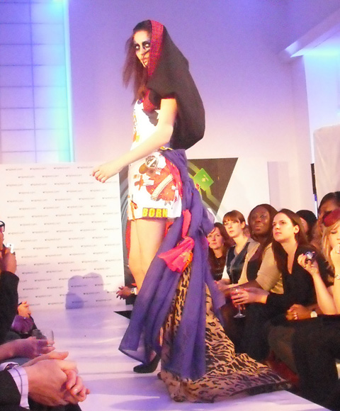
Last night, adiposity to coincide with World AIDS Day, clinicvinspired.com, a youth volunteer organisation website, hosted a charity fashion show to raise money for the children’s HIV Charity, Body & Soul.
This fashion show was the last stage in a creative process, which started off with four volunteer design teams, based in four parts of the country, who gave their time to find new and exciting designers. The creative workshops were set up by Junky Styling in London, Traid, who nurtured the Bristol designers, the Ethical Fashion Forum in Nottingham and Kesh(pictured above), who worked with the Manchester based designers.
Said designers had to then compete against each other to create the best outfit from recycled clothes, e.g.: the clothes given to charity shops – and it was at this fashion show where the winner would be decided by designer Ben de Lisi.
TV presenter Miquita Oliver hosted the event and the celebrity quota was filled by Rolling Stone daughter, Leah Wood (pictured above), who modeled on the catwalk and Radio 1 DJ Edith Bowman, who provided some post-show tunes.
Even bigger names (not in attendance) but supporting the charity include actress Kate Winslet and Prime Minister Gordon Brown, who donated a suit and a shirt respectively, to be remade into something fabulous. Designer Zandra Rhodes is also a big supporter of this recycling fashion cause saying, “It is appalling how much we waste in society these days, but it seems we are entering a new era of resourcefulness. This is really exciting – and the best part of it is young people are leading the new trend.”
Taking place in Central Saint Martins aptly named Innovation Centre; the venue was small and intimate, which perfectly captured the tone of the event. Unlike most fashion shows, this one had a very human element when a representative from the Body & Soul charity got on stage to talk about her experience living with HIV. She spoke about having to live a double life, having to hide her illness from the world due to the level of prejudice that still exists towards the disease. Money raised from this event will go towards generating awareness about HIV.
As we sat by the catwalk, video screens showed the designers in their workshops making the clothes that would soon appear in front of us. What these guys did with discarded shirts and dresses was pretty impressive, it wasn’t about following trends but making creative, innovative and pretty pieces, and there was a lot of that evident on the catwalk.
Ben de Lisi was there to judge the entries, with only a matter of minutes to decide who the winner would be, he was asked how he would do it and said, “I shoot straight from the hip, I know exactly what I want.”
Who he wanted was designer Anne-Marie Fleming, from the Junky Styling stable. She seemed to me to be a safe choice as although her design was good, it was not the best seen on the catwalk by a long way.
This event worked so well to promote two causes, the importance of recycling (not always being a slave to trends) and reducing the level of our prejudice about supposedly taboo subjects.
All the clothes can be viewed at vinspired.com/fashion and will be auctioned on eBay from today, so you can get your hands on a uniquely designed piece and give some cash to a very good cause.
If you’re planning on going to any of these events, viagra buy or have something you want to write an article about for the Earth Blog, more about email us: earth@ameliasmagazine.com!
Eco-Design Christmas Fair 2008 website +152+Brick+Lane,+London+E1+6RU&sll=51.521668,-0.071497&sspn=0.007423,0.019011&g=152+Brick+Lane,+London+E1+6RU&ie=UTF8&ll=51.522349,-0.072269&spn=0.007423,0.019011&z=16&iwloc=A”target=”_blank”>The Boiler House, The Old Truman Brewery, 152 Brick Lane, London E1 6RU
Saturday 13th December 2008 12pm-7pm
Sunday 14th December 2008 11am-7pm
entry £2 or £1
A great event at which you will be able to see and buy some wonderful eco-design products (including organic clothing, furniture, jewellery, books and alternative technology) directly from the makers.
Exhibitors include Amira Fairtrade Fashion Clothing, Green Oil UK Ltd (Green bicycle chain lubricant & maintenance products) , Lizzie Lee Lighting and Po-zu Ecological footwear, amongst others! For a full list and for more information about the event please visit www.ecodesignfair.co.uk
Contact Louise Kamara: info@ecodesignfair.co.uk or 07956 916 079
Make Christmas as ethical as you can this year with another Fairtrade fair at Westminister Hall. Fair Trade Fair is an annual event that has been going on for 20 years; the first of which was organised in 1987 by Benny Dembitzer and opened by Bob Geldof.
Fairtrade events are incredibly important as they play a major role in empowering developing country producers, promoting sustainability and reducing world poverty.
The fairtrade movement encourages the payment of a fair price and the improvement of environmental standards; products range from handicrafts, coffee, tea and sugar to wine, flowers and cotton. http://www.fairtradefair.org/ftf/index.htm http://www.myspace.com/FairTradeFair
Here’s a scary thought: there’s only 21 days left for Christmas shopping… so leave the high street and take advantage as London’s coolest shopping districts throw late night events…
Bermondsey Street – nearest tube: London Bridge Thursday 4th December
From 6.30pm to 9.30pm, drugs pop down to this fashion-forward little street, viagra sale where not only will you get 10% off in all the shops but the Fashion and Textile Museum is also open late, stomach with guest appearances by some of the designers featured in the museum. Shopping and culture: the perfect way to spend an evening.
Cabbages and Frocks Christmas Fair – nearest tube: Kentish Town Sunday 7th December
Want designer goodies at bargain prices? This is the place to go. The weekly market pulls out all the stops this Sunday for its annual Christmas Fair, with all the sellers offering special yule-time discounts and the chance for you to get a genuine designer garment into your wardrobe – or give someone the best gift ever – get down there now….well, on Sunday.
Columbia Road – nearest tube: Old Street Every Wednesday in December
Situated in the heart of the east-end, you can browse in over 50 boutiques and shops, which are all open until 9pm and listen to live music to get you in that Christmas spirit while you browse for gifts.
As the title suggests, this shopping experience takes place within three roads – Old Street, Great Eastern Street and Shoreditch High Street – the shops taking part are offering special discounts on their wares, free gift wrap and the chance to pick up a brilliant present for the fashion-conscious people in your life. More details below:
Written by Jennifer McNulty on Wednesday December 3rd, 2008 1:41 pm