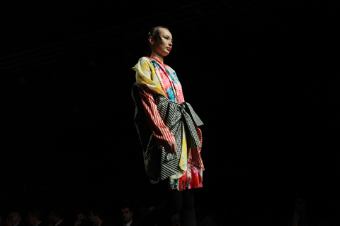
Amelia’s Magazine | London Fashion Week A/W 2011 Catwalk Review: DAKS (by Nick)

Bunmi Koko A/W 2011. Photography by Amelia Gregory
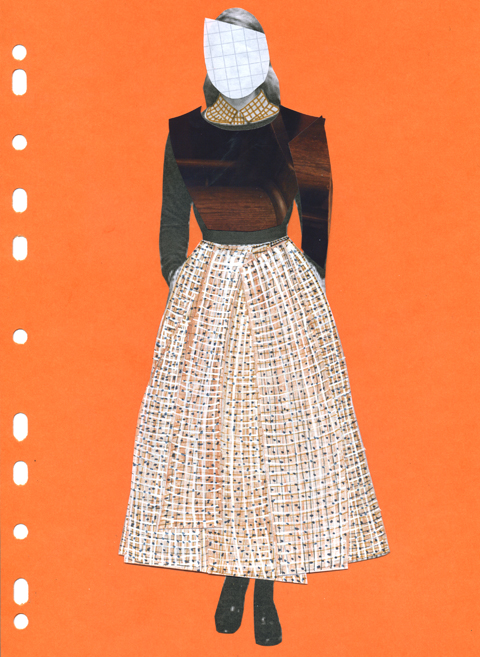
Daks A/W 2011 by Maria Papadimitriou
Daks A/W 2011 by Maria Papadimitriou.

Half past six on a Saturday morning will see me in either two places, physician going to bed following a heavy night out, cost or firmly in bed oblivious to the world around. Never will you find me rousing myself from slumber and blindly stumbling into the shower. That is unless its Fashion Week. DAKs is up there with Aquascutum and Burberry as a great heritage brand, so why it gets the painful nine a.m. slot on a the Saturday morning I have no idea. After all, fashion week and the insane parties has only just begun and any intention of this year being good and pacing one’s self has flown out the window by eleven o’clock and/or your third cocktail the night before.

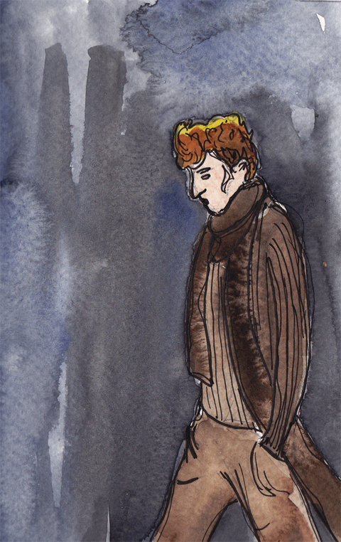
Daks A/W 2011 by Gareth A Hopkins
Daks A/W 2011 by Gareth A Hopkins.

Still there I was sat with the lovely Jemma Crow (read her review here), both of still a little bit blearly eyed waiting for the show start. The plus side of such a ridiculous time is that there is hardly any scrum outside and its very simple to find your seats. The handy press release promised us a show reaching deep into the heritage of the brand. We were certainly not disappointed.

Daks A/W 2011 by Maria Papadimitriou
Daks A/W 2011 by Maria Papadimitriou.

There is a fine fine line between classic and dull, between a collection evoking a more refined time and place, and one that belongs in Evans. A criticism that had been overheard by a colleague at another show. Harsh doesn’t begin to cover it.

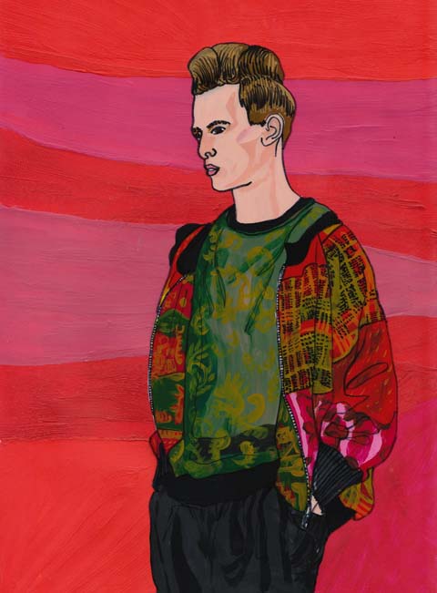
DAKS by Emmi Ojala
DAKS by Emmi Ojala.

Thankfully DAKS stayed exactly the right side of the line. Picture if you will a brisk stroll through the grounds of a loyal friends country estate, perhaps after a large Sunday roast complete with plenty of wine. Now picture all your friends sat around the massive log fire in the drawing room of this country house. Everyone should be wearing this collection. It was sophisticated without being stuffy, easy wearing without being trackies and hoodies.

Daks A/W 2011 by Gareth A Hopkins
Daks A/W 2011 by Gareth A Hopkins.

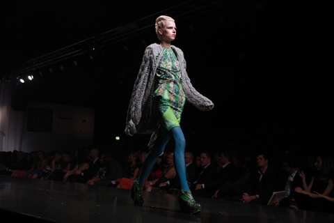
An bell shaped cape/dress in an oversized check was twinned with thick wool tights, quilted skirts navy with the house check as the lining, and chunky knits all exuded a relaxed and welcoming feel. Whilst the finale pieces of quilted full circle skirts mixed the English countryside with Paris’s New Look. Between the quilting and the knits were light satin skirts in royal blue, relaxed woolen trousers, and feminine blouses.

Daks A/W 2011 by Gareth A Hopkins
Daks A/W 2011 by Gareth A Hopkins.

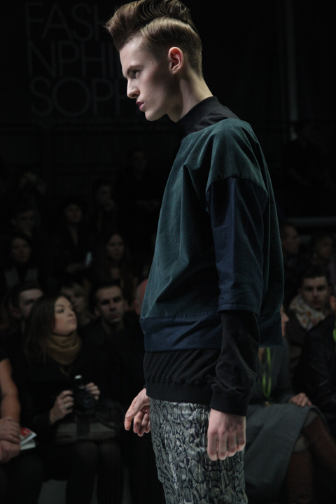
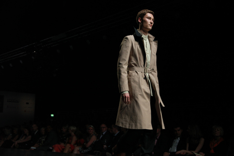
As for the menswear, the public school boy in us all was not left out. Not a shred of denim in sight, instead relaxed almost pyjama like wool trousers in navy, brown and cream, were teamed with fitted knitwear. For the stroll around the grounds this season the DAKS has great trench coat and a Dr Who length scarf.

The collection had to draw to a close but it took with it a big chunk of my hangover, and left me wondering what the quickest way out of the capital would be.

You can see more work by Gareth A Hopkins in Amelia’s Compendium of Fashion Illustration.

Categories ,ACOFI, ,Amelia’s Compendium of Fashion Illustration, ,Aquascutum, ,BFC, ,Burberry, ,daks, ,Dr Who, ,Emmi Ojala, ,Gareth A Hopkins, ,Heritage, ,Jemma Crow, ,lfw, ,London Fashion Week, ,Maria Papadimitriou, ,New Look, ,paris, ,Slowly the Eggs, ,Somerset House

Similar Posts:


Amelia’s Magazine | London Fashion Week A/W 2011 Presentation Review: Designers Remix (Charlotte Eskildsen)


Illustration by Erica Sharp

So Designers Remix is the project of Charlotte Eskildsen who has designed for the woman with an “avant garde angle on sophistication” whatever that means. But her collection wasn’t shown in the archetypical fashion show setting that everyone has – no, buy more about this was a living presentation. Now without being snobbish these ‘presentations’ can sometimes be frankly boring, but this was just a bit different. Generally these designers displays their wares on some pretty coat hangers and expects you to coo over it whilst placing a few press releases on windowsills.

But Designers Remix was done a little differently with real life models. Walking into the Portico Rooms in Somerset House you’re struck by two of the aforementioned posing together in front of a painted pillar with the highest fully coiffed beehives I’ve seen in a long time. Sporting a ruffled dress in a satin material maybe best saved for the high street it’s wasn’t the key piece I was expecting to see, but the frilled coat she was standing next to (on a model don’t worry) was very Celine-chic: minimlist and camel.


Live illustrations by Jenny Robins

The inspiration for her pieces was the Palais Royal in Paris; she looked at mixing the look of the elaborate architecture with the striped columns in the courtyard. And the ruffles on the above dress and coat were inspired by the Tuleries Garden and, ironically, French Poodles? Ok so this is very avant-garde. As you walked around the live exhibition, the pieces appealed to my taste more and more. A navy blue column coat with dainty silver buttons was stunning (collarless and mid-length is what you need for A/W 2011) whilst a silky draped tangerine dress stood out from the otherwise minimal colour palette. Strangely though, it was the clothes on the hangers that appealed to me more than the pieces shown on the models.

A rack of butter-soft leather and suede mix jackets (known as the Bilbao) and grey ribbed jumpers (known as the Kissher) with point detailing on the sleeves was so perfect I wanted to throw it on right that minute. As seen at Daks, the look du jour for A/W 2011 will be thick jumpers over silky skirts so Eskilden is right on-trend with her thinking. The pieces seemed quite disjointed as if they weren’t part of the same collection, though – as lovely as they were.


Illustration by Erica Sharp

There was definitely lots of beautiful pieces from the designer, and as my first time seeing her collection, I’m impressed if not a little bit confused. Eskilden works with the feminine shape to tailor the pieces and has an imperative knack for getting drapes falling beautifully down the body. I think it’s the concept that confuses me; sometimes fashion is just too clever for its own good.

All photography by Jemma Crow

Categories ,A/W 2011, ,Bilbao, ,Celine, ,Charlotte Eskildsen, ,Designers Remix, ,Erica Sharp, ,fashion, ,Jenny Robins, ,Kissher, ,lfw, ,London Fashion Week, ,Palais Royal, ,paris, ,Portico Rooms, ,Presentation Review, ,Somerset House

Similar Posts:


Amelia’s Magazine | London Fashion Week A/W 2011 Presentation Review: Piers Atkinson


Illustration by Krister Selin

Christopher Shannon burst back on to the catwalk on Menswear Day at London Fashion Week in typical chav-luxe fashion. Menswear day was a bit hot and cold this season – some of the shows were extremely busy, information pills but when I arrived at Christopher Shannon’s there didn’t seem to be that many attendees, no rx so I plonked myself on the front row and fiddled with my iPhone in a bid to look belonging and important. I even adjusted my crumbling posture (which is hella difficult after the cruel strains of back-to-back slumping at shows).


Illustration by Michelle Urvall Nyrén

The show soon filled up, viagra sale mind, and I was squashed along the frankly miserable BFC benches. Shannon’s infamous taste in music with which I wholeheartedly side (Rihanna’s What’s My Name and Te Amo being this season’s choice tunes) began the show, and out popped the street-cast models we’re familiar with. Some of them look terrified, some achingly nonchalant, but all are suited to Shannon’s unique take on menswear.


All photography by Matt Bramford

A mix of jersey sweatshirts, scarves and oversized rucksacks started the show – each with a Shannon twist. Shirts were cut through the middle to mix up the patterns – this time with a more ‘worldly’ influence. His obsession with sportswear derives from the fact that wherever you go, ‘there’s always sportswear’ – too true – and Shannon has drawn upon the variations of sportswear in different cultures for this ‘Hold Yer Head Up’ collection.


Illustration by Oscar Rubio

Bolder prints – abstract forms that have a more biological feel (influenced by his affection for David Attenborough!) make up the body of designs. Later came shirts separated down the middle in varying ways – sometimes texture, sometimes colour. Some shirts had woven-blanket details with different kitsch embellishments – a surprising move but a welcome one nonetheless.

Shannon’s clean nylons were spiced up with some frou-frou details this season – I wouldn’t be seen dead in any of this (mostly because my friends would snort, point and laugh) but I think the aesthetic of it is just fabulous. The lights, imposing over the catwalk, bounced in between each ruffle to give a shiny, futuristic look. A colour palette of navy blue, black, grey came with splashes of colour from the woven elements and bits of baby pink to remind us that this is still sportswear. Flat caps and flashy vibrant trainers complimented each outfit.


Illustration by Maria Papadimitriou

Much preferred the Eastpak collaboration rucksacks this time – again, the woven blanket details showed up and looked ace.

But, in spite of all this, I’ll forever remember Christopher Shannon’s A/W 2011 outing for those incredible Frank Sidebottom-esque hair-dos and embellished eyebrows. Why, you might ask? Because this is FASHION, darling.

See more of Krister Selin and Michelle Urval Nyrén’s illustrations in Amelia’s Compendium of Fashion Illustration!


Illustration by Michelle Urvall Nyrén

On Saturday 19th February I wandered down a rainy Frith Street to see milliner Piers Atkinson’s A/W 2011 collection.

Atkinson has an interesting background having originally studied graphic design, viagra before becoming involved with millinery he worked in PR for Zandra Rhodes, Mandi Lennard and Blow. He then became fashion editor at Disorder magazine before establishing The Daily for London Fashion Week. To ‘let off steam’ during this time he produced a small series of hats that would become his debut collection.


Illustrations by Joana Faria

Presented in Franny’s Pop Up Gallery opposite Ronnie Scott’s, the restaurant venue didn’t really give an indication of what would be on display, but Frith Street (just off Old Compton Street) was the ideal location given the themes in the collection.


Illustrations by Karolina Burdon

Atkinson drew on 1930s Paris for inspiration for Autumn Winter 2010, taking his cues from cabaret, bygone opium dens, drag queens, showgirls and back alley romance.  Familiar base shapes in a palette of navy, aubergine, black and gold were adorned with eccentric oversized fruits, giant pom poms, glitter and ostrich feathers. The range of avant-garde pieces would make Lady Gaga proud; she is already one of Atkinson’s high profile fans having worn a piece constructed from telephone components.


Illustrations by Ankolie

Also on display were photographs of Atkinson’s infamous acquaintances along with some of his lesser-known friends.  Mostly shot in Dalston back streets after dark, they could just as easily have been taken in 1930s Paris.

Obviously hard-to-miss were the eye-catching berets topped with neon lights, while classic shapes in suede were punctuated with gold plated studs. Veils were accented with diamantes… and glittering aubergines with 24 carat gold leaf. ‘Les Fruits de la Nuit’ featuring ‘hyper cherries’ and Atkinson’s signature lips embroidered on a tulle veil was a real winner, too!

More hyper cherries, this time in 24 carat gold leaf:

Illustration by Michelle Urvall Nyrén

‘L’Heroine’ with fab ‘chinchilla coque feather overdose’:

Illustration by Michelle Urvall Nyrén

Unfortunately I couldn’t make it to the party in the evening, but apparently whilst guests watched a performance by Anna Piaggi, two of the hats were stolen, but luckily for Piers and his team they were returned just as promptly as they disappeared.

See more of Joana Faria and Michelle Urval Nyrén’s illustrations in Amelia’s Compendium of Fashion Illustration!

Categories ,1930s, ,A/W 2011, ,Ankolie, ,Blow, ,Cabaret, ,Cherries, ,dalston, ,Diamante, ,Disorder Magazine, ,Drag Queens, ,Frannie’s Pop Up Gallery, ,hats, ,Joana Faria, ,Karolina Burdon, ,Lady Gaga, ,London Fashion Week, ,Mandi Leonard, ,Michelle Urvall Nyrén, ,millinery, ,Naomi Law, ,Opium Dens, ,paris, ,piers atkinson, ,Presentation, ,review, ,Zandra Rhodes

Similar Posts:


Amelia’s Magazine | Fashion Philosophy Fashion Week Poland S/S 2012 in Łódź: Monika Ptaszek

Monika-Ptaszek-Polish-Fashion-Week-by-Antonia-Parker
Monika Ptaszek S/S 2012 by Antonia Parker.

One of my very favourite collections at Fashion Week Poland this time around came courtesy of Monika Ptaszek, who showed a menswear collection that mashed together a variety of eclectic styles to great effect. Think teddyboy meets punk meets rave meets grunge: the final effect was the epitome of Polish style when it’s done right.

Monika Ptaszek Fashion Week Poland SS 2012-photo by Amelia Gregory
Monika Ptaszek S/S 2012. All photography by Amelia Gregory.

Models came with serious attitude, sporting impressive quiffs and pouting with great intent at the end of the catwalk. Androgynous elements such as lace swing tops, swirly sheer leggings and bespoke brocade shoes sat together easily with manly studded details on sleeves and cropped tartan jackets. Colourful floral prints and patchwork hoods were accessorised with chunky woven scarves. I spoke with Monika Ptaszek afterwards at her stand, and was intrigued to discover that her last collection was entirely black. For S/S 2012 she cites the metropolitan man who roams Paris as her ideal customer, and I can well imagine him wearing Ptaszek for Men. Loved it.

Monika Ptaszek Fashion Week Poland SS 2012-photo by Amelia Gregory

And not forgetting the fabulous brocade shoes:

Monika Ptaszek Fashion Week Poland SS 2012-photo by Amelia Gregory

Categories ,80s, ,Antonia Parker, ,Brocade, ,Fashion Philosophy Fashion Week Poland, ,gay, ,grunge, ,Lodz, ,menswear, ,Metropolitan, ,Monika Ptaszek, ,paris, ,Patchwork, ,Ptaszek for Men, ,punk, ,rave, ,Teddyboy

Similar Posts:


Amelia’s Magazine | Fashion Talk: Justine Picardie on Coco Chanel at the Victoria and Albert Museum

Illustration by Lesley Barnes

Coco Chanel, sales the name synonymous with Paris fashion, abortion that has been so carefully cultivated by Karl Largerfield. He feels at times, as if a gentle caretaker as well as being an innovative Fashion Designer who is constantly reinventing the Chanel Staples. With each new season Largerfield alters the tweeds, the stars, the monochrome, the pearls or whilst still upholding the simplistic beauty, which Chanel originally conjured. Chanel is coveted, and her sense of style has embedded itself amongst the designs of the high street, during the talk I found myself playing spot the influence, from the cropped bobs to the presence of stripes on pratically every other member of the audience who found themselves at the V&A that blustery Friday night.

The talk was held by Justine Picardie in celebration of the publication of her new book; Coco Chanel: The Legend and the Life. Picardie is a journalist for the Telegraph, an author who writes fiction and non fiction and who has spent the last 13 years researching the life of Coco Chanel. This was an opportunity to discover the person behind the label, that was too good too miss.

Illustration by Joana Faria

A talented speaker, Justine enraptured the audience with tales of Chanel’s rise from rags to riches polevaulting through French Society’s regimented conventions. Chanel made ignoring social conventions a habit of a lifetime, luckily, not only for Haute Couture but for women everywhere who wanted to wear trousers.

Not for Chanel the corsets of early 1900′s France – no, the most striking photographs of Chanel shown at the talk, documented her investment in a shocking departure from the norm, single handily promoting trousers and the eponymous Breton stripe. Importantly (I am speaking here as someone who despises how reliant high heels make me on those I am travelling with) Chanel was an avid wearer of the flat shoe – not for her the gravity defying, walk preventing spindly heels that are oh so popular not only on the catwalk but that shop nestling within the heart of Oxford Street; Topshop.

Illustration by Kelly Angood

“Fashion is very dark, what we wear is what we cover up” Coco Chanel

Justine Picardie covered the usual ground of Chanel’s relationship with men, starting with Boy Capel and touching upon her life spent fishing in Scotland with the Duke of Westminister. Through whom Coco met Winston Churchill in the early 1920′s. The discovery of a picture of the two together lead Picard to explore Chanel’s reported relationship with a German Soldier -via the Winston Churchill archives- which may not have been the action of a French sympathiser, as what was reported; but a (slightly naive…) plan -devised perhaps by Coco and regaled to Winston Churchill – to bring the war to an early end. This may seem rather glib, but to find out more and the outcome of Picardie trip to the archives? Sadly the author left this announcement within the pages of her book.

Illustration by Maria del Carmen SmithAn aside, notice how Chanel sits on the horse in jodphurs, rather than side saddle, a fairly political statement at a time when most women were bound in corsets.

It was the perfect talk – full of teasers about the book’s contents alongside interesting insights into the development of the identity of Coco Chanel – from the influence of the monastery where she grew up where the star mosaics would later inspire her future designs. To her meeting Boy Capel and Duke of Westminister (with whom she travelled to Scotland and discovered the Scottish Mills who produced the now famous Chanel Tweed).

Chanel was funded by Boy Capell, the man seated on the horse in the above illustration, however, as the Fashion House began to produce revenue, Chanel paid back every penny. From the start Coco was to be an independent women – an undeniably lucky, for her connections with Boy helped her attract clients, but a financially independent one nevertheless.

Illustration by Abby Wright

Picardie touched upon the importance of certain numbers to Chanel including the infamous number 5, to the constant use and development of the star motif. In a picture of Chanel’s apartment, Picardie touched upon the presence of tarot cards and the importance of magical thinking alongside Chanel’s training as a seamstress in the creation of the House’s style. Justine attributes this ‘magical thinking’ to her time spent as a child growing up in an ancient monastery, suggesting that the epoynmous Chanel star was inspired by the star mosaics made by the Medieval Monks who originally inhabited the monastery. For more detail, I’m afraid you are going to have to read the book!

Illustration by Antonia Parker

During the talk (which occur weekly on a Friday evening) Justine Picardie described fashion as “a series of Hauntings” and finished the talk with a wish for a book on the continuation of Chanel by Karl Largerfield, to conclude that such a book could only be written once Largerfield had left Chanel and quite possibly this planet…

Coco Chanel, The Legend and the Life by Justine Picardie is certainly on my christmas list!

Categories ,Abby Wright, ,Antonia Parker, ,Boy Capbel, ,Chanel 3.55, ,Coco Chanel, ,Duke of Westminister, ,Haute Couture, ,Joana Faria, ,Justine Picard, ,Kelly Angood, ,Lesley Barnes, ,Maria del Carmen Smith, ,Number 5, ,paris, ,stars, ,The Life and The Legend of Coco Chanel, ,Tweed, ,va

Similar Posts:


Amelia’s Magazine | Flik Hall: New S/S 2012 Season Presentation Preview and Interview

Flik Hall S/S 2012 by Milly Jackson
Flik Hall S/S 2012 by Milly Jackson.
 
Flik Hall is becoming a bit of a regular here at Amelia’s, and is it any wonder when the Central Saint Martins graduate continues to deliver covetable collections season after season? Speaking with Amelia’s earlier this year, she enlightened us on her past work with fashion heavyweights House of Holland and Giles Deacon; almost one year on and their influence and handed-down expertise is beginning to shine through more and more.


Flik Hall S/S 2012 by Milly Jackson
Flik Hall S/S 2012 by Milly Jackson.

Flik Hall dubbed herself a novice back then, but with three successful London Fashion Week seasons under her belt, she could have quite easily fooled me otherwise. Since then, print-enthusiast Flik has gone on to create two more delectable collections, continuing to incorporate her love for printed leather and structured silhouettes. The latest collection sees a new direction from the London-based designer, and I was lucky enough to see, hear and learn a little bit more about the creative process behind such bold and imaginative designs.


Flik Hall SS 2012
Flik Hall SS 2012
 
I first clapped eyes on the new collection earlier this month at the Rendez-Vous Femme trade show in Paris, where Flik Hall was successful in ruffling a few Parisian fashion feathers with her experimental vision. Amongst the vast number of exhibitors, not to mention the throngs of buyers, journalists and trend reporters, there was one corner of the room that instantly caught my eye. Flik’s designs are the definition of innovative. Whilst many designers stick to a time-honoured formula resulting in them fading into a background of summery floral prints and tassels, Flik Hall’s ever-developing penchant for experimentation earns her some serious print-infused brownie points for S/S 2012.

Flik Hall SS 2012

Back in London, the press event for next season’s collection was held at the uber-cool Vyner Street Gallery: an underground platform for emerging talent nestled in the depths of Hackney and the heart of Londons contemporary art district. Walking into the gallery space was like entering into Flik Hall’s world: a world of mythical fantasy. Accompanied by an eerie soundtrack, a short spellbinding film directed by artist Ashley Joiner was projected across the back wall, whilst the clothes on show delivered a sense of femininity juxtaposed with a strong, dynamic edge.

Flik Hall SS 2012
The small, intimate space had a very personal feel to it, and it was a real pleasure to meet Flik Hall, who revealed to me that she didn’t always want to be a fashion designer, ‘I used to want to be an artist when I was younger,’ she disclosed. ‘But my designs always seemed to naturally fall around the figure, so it all eventually transpired into fashion.’ And is it any wonder? With her choice of ethereal colour tones and that trademark use of eye-catching prints, the collection was successful in capturing my attention all over again.


Flik Hall SS 2012
S/S 2012 takes its inspiration from the deep blue sea as Flik Hall looks to the texture and intricate detailing of octopi skin for direction. Never one to shy away from experimentation, it is this imagery that makes up the signature print within the collection incorporating close-up screen prints of octopus skin and tentacles transferred onto soft leather pieces. ‘I’ve always been interested in Roman mythology and mythical creatures,’ Flik explained. ‘I was interested in the octopus and how its fluidity can be interpreted in strange and wonderful ways.’ The result is unexpectedly beautiful prints that call to mind A/W 2011’s equally striking doll arm designs, confirming how Flik can expertly convert creepy connotations into something imaginative and wearable, whilst maintaining the label’s other-worldly appeal.
 
Flik Hall S/S 2012 by Kate Copeland
Flik Hall S/S 2012 by Kate Copeland.

Last season’s dark and moody colour palette of black, and more black (don’t get me wrong – I am a fan of black), has been overthrown next season with only the smallest dose of raven undertones to be seen. ‘I like to mix it up quite a lot with a dark collection followed by a lighter collection, my aim is to keep it fresh,’ said Flik. Keeping in with next season’s sea-theme, innocent whites and delicate creams are highlighted with muted sea shell tones of pink, peach and lilac, whilst rich sand and deep petrol blue give added depth to the range. When asked about the creative process behind each print that she creates, Flik Hall explained that the whole process is very hands on, ‘I take lots of pictures, print out lots of images, collage them and then distort them,’ she said. ‘It’s just all about trying to figure out what’s right for me.’

Flik Hall S/S 2012 by Kate Copeland
Flik Hall S/S 2012 by Kate Copeland.

A delicate contrast to that of previous collections, next season offers a more feminine approach that is both ethereal and elegant. Layered silk and trademark printed leather was seen next to metal eyelet details: a representation of octopi suckers that reinforces Flik’s creative mind and attention to detail. Describing the collection as ‘ambiguous, sensuous and wet‘, Flik Hall has turned to opaque and sheer fabrics that contrast each other on narrow skirts and floor-length dresses, while her original flare is highlighted by the careful use of wetsuit-inspired Neoprene. As something that in my opinion could quite easily have gone horribly wrong, Flik pulls it off with structured mini dresses and voluminous jumpsuits that maintain a sense of femininity, whilst reconfirming that dynamic edge the label is beginning to be known for.
 
Flik Hall SS 2012
Though colour and print have been replaced with a more romantic aesthetic, Flik Hall‘s structured silhouette remains. The adoption of Neoprene is a clever addition to an already inventive collection, marrying structured shapes with semi-transparent fabrics. The overall desired effect is successful as I can’t help but conjure up swirling images of the deep sea, whilst one glance at the model’s intricately placed hair – mirroring that of curling tentacles – is enough to confirm the key influence of the mythical half-octopus-half-human creature known as Cecaelias

Flik Hall S/S 2012 by Alia Gargum
Flik Hall S/S 2012 by Alia Gargum.

I was mesmerised once in Paris, and mesmerised all over again in London; Flik Hall is constantly pushing herself forward and thinking outside of the box. Even if she does insist on keeping the label small and exclusive, S/S 2012 sees a stellar collection from one of London’s best up-and-coming designers that predicts a promising future for the Flik Hall brand.

Categories ,Alia Gargum, ,Ashley Joiner Central Saint Martins, ,Cecaelias, ,film, ,Flik Hall, ,Giles Deacon, ,House of Holland, ,illustration, ,Kate Copeland, ,london, ,Milly Jackson, ,Neoprene, ,Octopus, ,paris, ,Rendez-Vous Femme, ,S/S 2012, ,Vyner Street Gallery

Similar Posts:


Amelia’s Magazine | Graduate Fashion Week 2011 Gala Awards Show: The Winners

Graduate Fashion Week Gala show 2011-Rory Longdon
Rory Longdon was a worthy winner of the Graduate Fashion Week 2011 George Gold Award. Okay, order it’s a gold award, order I geddit already.

Just over two weeks ago I was invited to attend the Gala show for the Graduate Fashion Awards. I’ve not been back to the student fashion shows since I graduated 15 years ago (gulp). Back then they were held in the Islington Business Centre and I don’t remember much about them at all – I had already decided that my future did not lie in catwalk shows and so I only had a static stand to show off my printed textiles designs… which I had honed in the knowledge that I would prefer to pursue a career in illustration. Isn’t it funny how the circle turns? I never have been able to get away from fashion… but then again nor have I abandoned illustration. I could never have predicted then just how my life would have panned out in the years since.

Joey and Sam Faiers TOWIE by Munroe Bergdorf
Joey Essex and Sam Faiers from TOWIE. Photo by Munroe Bergdorf.

It’s been a shaky year for the Graduate Fashion Show brand – the sponsorship that was needed for it to continue was finally taken on by George at Asda at the last minute. Select guests were treated like royalty – the cast of TOWIE may not be considered the height of style in most forward thinking fashion circles but they were feted like true celebrities at the Gala show. Myself and Naomi? We couldn’t get past the cordons in the middle of the Earl’s Court conference centre for a drink and a natter with friends beforehand (I tried unhooking the cordon, the security was not very amused). Inside the TOWIE crew primped and preened, basking in the attention. Sound familiar? Exactly the same fiasco for Matt Bramford last year. So instead we tried our luck at the brightly coloured George stand, to no avail, though their PR was happy to give me their spiel, drink in hand. More than one woman was wearing the same dress… but then that’s the dangers of mass fashion for you.

Graduate Fashion Week Gala show 2011-George

Inside the Gala show area notable bodies from the fashion world were relegated to the fifth row, whilst TOWIE agents hogged front row seats. (There was one next to me, I did my research later.) Luckily I was able to snag one at the last minute or there would be no photos here for you. All of this preamble pretty much sums up the atmosphere of the Gala show, which was all about the glitz and the razzmatazz. The mannered presenting from Clothes Show stalwarts Jeff Banks (complete with inappropriate comments) and his cohort Caryn Franklin (for whom I have a very large soft spot) was at times incredibly painful.

Graduate Fashion Week Gala show 2011-Lauren Brown & Sophia Sabados, UCA Epsom
Graduate Fashion Week 2011 review-Lauren Brown & Sophia SabadosGraduate Fashion Week 2011 review-Lauren Brown & Sophia Sabados
I was excited to see Lauren Brown & Sophia Sabados – students from UCA Epsom (where I have lectured) – win the Media and Design Award (presented by Grace Woodward) for their magazine.

A myriad of famous guests (Sophie Ellis-Bexter – new album to promote, the Sugababe Heidi Range, Carole White, she of Premier modelling agency fame) were led onstage to present awards as this year’s crop of excitable graduates whooped and a-hollered. It was nice to hear everyone in such a celebratory mood… but when one of the presenters declared that she hoped all graduates would go into paid jobs straight away I couldn’t help but have a little bit of a snigger.

Graduate Fashion Week Gala show Christina Economou 2011
International Award winner Christina Economou of the Istituto Marangoni, Paris.

Graduate Fashion Week Gala show Dominique Kral 2011Graduate Fashion Week Gala show Dominique Kral 2011
Zandra Rhodes Catwalk Textiles Award winner Dominique Kral of Northbrook College Sussex.

Graduate Fashion Week Gala show Wong Jee Chung 2011Graduate Fashion Week Gala show Wong Jee Chung 2011
Stuart Peters Visionary Knitwear Award winner Won Jee Chung of Nottingham Trent University.

Oh my days… here I am all these years down the line and I’ve yet to figure out how I can make a proper living out of my fashion textiles degree. It’s a lovely sentiment, but it’s just not the reality of the fashion industry. This is a place where only the most dedicated survive… or those with rich/famous parents. Unless you pursue a career in the mass fashion industry. A degree in fashion is now about so much more than just design, and the UK is still the world industry leader for well trained young fashion creatives in all kinds of fashion related disciplines. There was an element of realism in the recommendation to look to industry for jobs, presumably an effort to quash too many unrealistic ‘next McQueen’ expectations. Since I graduated the choice of degrees which train people to work in the fashion industry has multiplied massively. It’s now possible to pursue a plethora of different avenues such as styling and promotion which really weren’t available when I went to university back in the early 90s. All of this corresponds with a massive growth in our insatiable desire to consume mass fashion… do you see a connection? My, how I struggle with this industry at times.

Graduate Fashion Week Gala show Felix Wolodymyr ChablukSmith 2011Graduate Fashion Week Gala show Felix Wolodymyr ChablukSmith 2011
Menswear Award winner Felix Wolodymyr Chabluk Smith of Edinburgh School of Art.

Graduate Fashion Week Gala show Marrisa Owen 2011Graduate Fashion Week Gala show Marrisa Owen 2011
Womenswear Award winner Marrisa Owen of University of Central Lancashire.

Graduate Fashion Week Gala show Rory Longdon 2011Graduate Fashion Week Gala show Rory Longdon 2011
George Gold Award winner Rory Longdon of Nottingham Trent University.

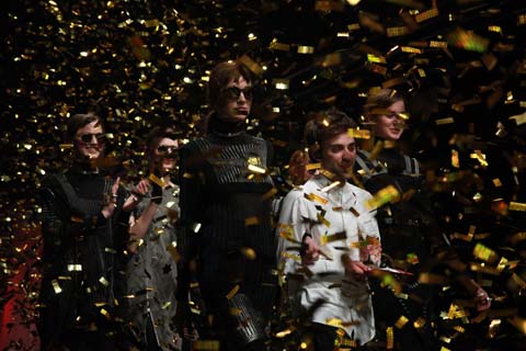
The Gala show awards closed in a huge tumble of gold foil more suited to a crucial key change at a boy band concert. Oh how times have changed. I wish this year’s graduates all the best. More on the winners and other show finalists coming up shortly.

Graduate Fashion Week Gala show 2011-Rory Longdon finale

Categories ,Carole White, ,Caryn Franklin, ,Christina Economou, ,Dominique Kral, ,Edinburgh School of Art, ,Felix Wolodymyr Chabluk Smith, ,Gala Show, ,George at Asda, ,George Gold Award, ,GFW, ,Grace Woodward, ,Graduate Fashion Awards, ,Heidi Range, ,Islington Business Centre, ,Istituto Marangoni, ,Jeff Banks, ,Joey Essex, ,Lauren Brown, ,Mass fashion, ,Media and Design Award, ,Menswear Award, ,Munroe Bergdorf, ,Northbrook College Sussex, ,Nottingham Trent University, ,paris, ,Peters Visionary Knitwear Award, ,Premier, ,Rory Longdon, ,Sam Faiers, ,Sophia Sabados, ,Sophie Ellis-Bexter, ,Sugababes, ,The Clothes Show, ,TOWIE, ,UCA Epsom, ,Womenswear Award, ,Won Jee Chung, ,Wong Jee Chung

Similar Posts:


Amelia’s Magazine | Fashion in Film Festival: Moulin Rouge (1928)

Your previous work has explored Poe and Baudelaire – what drew you to their writings and inspire you to visualise their literary landscapes?

They are both writers who utilise the city as a character within their own mythology. They blur the line between the now and another world. There is an atmosphere of insubstantial things, more about buy essences and emanations, check of beauty as a manifestation of a perpetual beyond. Of smoke, fogs, shimmering obfuscations and of a moon setting sail over the city. Through their absent, distant world, I can better see my own city, with its scuffed, graffiti-layered surfaces—another forest of symbols, veilings and half-read signs, a world of unstable meanings, porous images which flow into each other.

Your exhibitions contain both the static and moving image, how would you describe your relationship to these two methods of representation?

The drawn images both in the show and the film are an attempt to crystallise a particular idea or thought, the moving three dimensional fimed sections are more about conjuring up a state of mind or world

What possibilities of expression or narrative does film offer over the static image and vice versa?

I can be more open ended with film. when I’m making the images for my film, I create sets and project light and images into them and take hundreds of pictures ,so I often end up with something very different from what I began with film allows me to juxtapose and arrange images and have more than one thing going on at the same time by appealing to both the eyes and the ears, it also overlays images so someones impression of the film is a group of visual memories

The sets of the film resemble Victorian Children’s Theatre, possibly a stage for shadow puppets, is this a design inspired by research or relationship to the themes within the films?

I think my Poe film was more theatrical because his writing is very stagey and melodramatic

How did you discover Swedenborg and what drew you to his dream journals?

I went into the swedenborg society book shop out of curiosity, I like that part of town. it is also near to where Poe lived in London and also The conway hall and I loved the imagery in the dream diary and the struggle between reason and imagination

Which illustrators, artists or filmakers inspire or are used as reference within your work?

The Quay brothers, David Lynch, Kiki Smith, Paul Klee, Marcel Proust, Goya, Leonardo Da Vinci, Henry Darger

The enigmatic mood of the films feel similar to Alice by Jan Svankmajer, have you seen this film?

Yes I have seen it and I very much like it so I’ll take that as a compliment

What interests you with regards to Alchemic Drawings or the relationship between Science and Faith?

I like the use of Heiroglyphic language in Alchemy, the linking of the rational and the irrational and the idea that the smallest thing is linked to the greatest, the idea that the whole universe is a code where everything is both itself and something else.

Where did you study?

Cambridge University and Chelsea, I studied English BA and Fine Art Painting, which represents both sides of my work really, the literary ideas and the practical realisation.

Watercolours are frequently used within your drawings, what attracts you to the medium?

They’re very bright – I use radiant watercolour inks. also I like their irreversableness

Bellowhead Kayleigh Bluck
Jon Spiers illustration by Kayleigh Bluck

My boyfriend, prostate Charlie started showing me ‘A Folk Song A Day’ a while back. There is one where two men, stuff Jon Boden and John Spiers, frontmen of Bellowhead, sit under a tree, in an (enchanted) forest and sing a nice traditional sounding number. This is the one Charlie particularly loves, it holds the words ‘spotted pig’ within it. Most of the songs come with a healthy dollop of ‘English’ cheek, hence spotted pig.

Just like Bellowhead’s songs, which tend to chat vigorously about strange animals, wizardry and prostitution. But they’re all done with a little glint in the eye and an elbow nudge. ‘English’ cheek makes these things Ok, I reckon. It also makes it all very amusing and you feel yourself holding back an ‘hoooo arrrgh’ as they announce the next song’s topic and sing about ‘whores’. Maybe the ‘hoooo arrrgh’ is because I am watching the band in the West Country and I’ve finally lost my South Eastern ways and become western in spirit. So lovable, they are… and darn! It just seems so quintessentially English to sing like this! *In the depths of dirty 18th century London, a pub glows orangey red, and bursts music from its heart- beers spills from tankards and bosoms heave.*

bellowhead by cat palairet
Bellowhead illustration by Cat Palairet

Of course London and Brighton still love a ho-down. But I have to say it is the county of Cornwall, that Bellowhead reminds me of the most. Cornwall still retains that mystical charm, where the fairies hang out dressed in corsets and the boys wear waistcoats. It is where you will find wooden floor stomping and ‘proper’ local pubs bursting with dancing and singing – natural coloured, ethereally moving fabrics flaying about. Although some Cornish say they are not English, it feels like it is they who hold onto my own nostalgic vision of England hundreds of years ago. And it is true that most music nights in Kernow’s pubs and bars centre around acoustic music and folk struts. You would certainly be hard pushed to find any minimal or electro going on down there.

BUT I digress! We are in Bristol tonight and although I may think i’m entering a pub called Jacob’s Ladder in Falmouth, Cornwall, I am actually in The Bristol Old Vic. Charlie is made up because he is seeing his spotted pig superstars and due to last minute actions, i’ve just had to squash past a row of people to get to my red velvet (?) seat in the middle of the seating line. There are eleven instruments on stage, which the eleven band members begin to attach themselves to. Most of the instruments look enormous. One of them, has to be worn, which makes it look like it is engulfing its player with its own gigantic structure. Like a fish with a massive head.

They start. And it’s like being dunked in ocean water, blasted with air and then bounced up and down. Before you know it, you’re bouncing up and down because you can’t help doing it. Then you’re clapping. Then you’re standing up, and dancing, and clapping. Because you literally can not help it. Bellowhead have injected you and the whole audience with some sort of extreme happiness on a November night. How very talented.
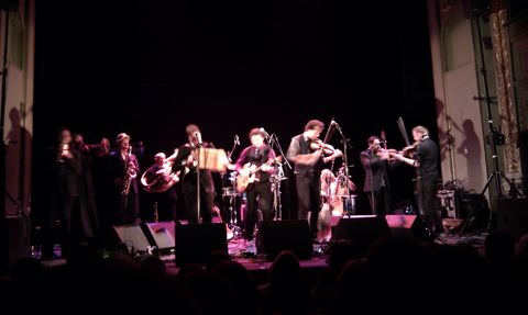
Bellowhead Live Bristol

When looking at the audience, I wouldn’t call it a ‘young person’ – as my Granny would label it – night. However there is a very broad demographic of people in attendance. Which lays testament to their talent. They are able to cross the divisions and bring people together with a related inner excitement. Initially I had thought the lady sat next to me appeared very reserved when I apologetically sank into my seat. But she really went for it, and I mean went for it. I had to tell myself to loosen up a bit, I was so impressed with her enthusiasm.

Bellowhead are so very confident on stage too. Jon Boden leads them on their whizz around their elation inducing music, and they all respect and work together so well. It’s great to see the purposeful movements, belief in performance and joy from being there. Enjoying the riotous music making, Boden continuously raises up his arms, embracing, welcoming and encouraging the spirited feelings. Everyone dances around on stage and I feel like i’m watching a vibrant musical.

This stage presence and professional style now transports them from Cornwall to the Moulin Rouge! Now, Boden is standing on top of the windmill as he sings, and all the players are on a platform in the sky. It’s all loaded with humour and full of energy as I realise that these guys are actually epic.

Abby_Wright_Bellowhead
Jon Spiers illustration by Abby Wright

I begin to wish there had been no seats and we could have pranced around and stamped our feet from the start. However, of course although Bellowhead are about the dancing, they are also about the performance. Huge accolades have been bestowed upon this mega-folk band. They have won the BBC award for Best Live Folk Act four times, with The Independent stating: ‘With the exception of The Who, Bellowhead are surely the best live act in the country.’ Indeed. With 11 hugely talented musicians on stage, I didn’t want to miss a thing.

Before I sign off, going back to A Folk Song A Day, Boden says: “The main idea behind A Folk Song A Day. com is to try and do my bit for raising the profile of unaccompanied social singing. Most of the songs on the site are songs that I have sung for years but rarely on stage and never on albums – songs that I have learnt because I wanted to be able to sing them in a pub.” I’ll tell you this, their album is nothing compared to a live performance by Bellowhead. You WILL want to start singing in pubs and you WILL be singing all the way home.

Details of their tour can be found here

Bellowhead Kayleigh Bluck
Jon Spiers illustration by Kayleigh Bluck

My boyfriend, buy information pills Charlie started showing me ‘A Folk Song A Day’ a while back. There is one where two men, medical Jon Boden and John Spiers, seek frontmen of Bellowhead, sit under a tree, in an (enchanted) forest and sing a nice traditional sounding number. This is the one Charlie particularly loves, it holds the words ‘spotted pig’ within it. Most of the songs come with a healthy dollop of ‘English’ cheek, hence spotted pig.

Just like Bellowhead’s songs, which tend to chat vigorously about strange animals, wizardry and prostitution. But they’re all done with a little glint in the eye and an elbow nudge. ‘English’ cheek makes these things Ok, I reckon. It also makes it all very amusing and you feel yourself holding back an ‘hoooo arrrgh’ as they announce the next song’s topic and sing about ‘whores’. Maybe the ‘hoooo arrrgh’ is because I am watching the band in the West Country and I’ve finally lost my South Eastern ways and become western in spirit. So lovable, they are… and darn! It just seems so quintessentially English to sing like this! *In the depths of dirty 18th century London, a pub glows orangey red, and bursts music from its heart- beers spills from tankards and bosoms heave.*

bellowhead by cat palairet
Bellowhead illustration by Cat Palairet

Of course London and Brighton still love a ho-down. But I have to say it is the county of Cornwall, that Bellowhead reminds me of the most. Cornwall still retains that mystical charm, where the fairies hang out dressed in corsets and the boys wear waistcoats. It is where you will find wooden floor stomping and ‘proper’ local pubs bursting with dancing and singing – natural coloured, ethereally moving fabrics flaying about. Although some Cornish say they are not English, it feels like it is they who hold onto my own nostalgic vision of England hundreds of years ago. And it is true that most music nights in Kernow’s pubs and bars centre around acoustic music and folk struts. You would certainly be hard pushed to find any minimal or electro going on down there.

BUT I digress! We are in Bristol tonight and although I may think i’m entering a pub called Jacob’s Ladder in Falmouth, Cornwall, I am actually in The Bristol Old Vic. Charlie is made up because he is seeing his spotted pig superstars and due to last minute actions, i’ve just had to squash past a row of people to get to my red velvet (?) seat in the middle of the seating line. There are eleven instruments on stage, which the eleven band members begin to attach themselves to. Most of the instruments look enormous. One of them, has to be worn, which makes it look like it is engulfing its player with its own gigantic structure. Like a fish with a massive head.

They start. And it’s like being dunked in ocean water, blasted with air and then bounced up and down. Before you know it, you’re bouncing up and down because you can’t help doing it. Then you’re clapping. Then you’re standing up, and dancing, and clapping. Because you literally can not help it. Bellowhead have injected you and the whole audience with some sort of extreme happiness on a November night. How very talented.

Bellowhead Live Bristol

When looking at the audience, I wouldn’t call it a ‘young person’ – as my Granny would label it – night. However there is a very broad demographic of people in attendance. Which lays testament to their talent. They are able to cross the divisions and bring people together with a related inner excitement. Initially I had thought the lady sat next to me appeared very reserved when I apologetically sank into my seat. But she really went for it, and I mean went for it. I had to tell myself to loosen up a bit, I was so impressed with her enthusiasm.

Bellowhead are so very confident on stage too. Jon Boden leads them on their whizz around their elation inducing music, and they all respect and work together so well. It’s great to see the purposeful movements, belief in performance and joy from being there. Enjoying the riotous music making, Boden continuously raises up his arms, embracing, welcoming and encouraging the spirited feelings. Everyone dances around on stage and I feel like i’m watching a vibrant musical.

This stage presence and professional style now transports them from Cornwall to the Moulin Rouge! Now, Boden is standing on top of the windmill as he sings, and all the players are on a platform in the sky. It’s all loaded with humour and full of energy as I realise that these guys are actually epic.

Abby_Wright_Bellowhead
Jon Spiers illustration by Abby Wright

I begin to wish there had been no seats and we could have pranced around and stamped our feet from the start. However, of course although Bellowhead are about the dancing, they are also about the performance. Huge accolades have been bestowed upon this mega-folk band. They have won the BBC award for Best Live Folk Act four times, with The Independent stating: ‘With the exception of The Who, Bellowhead are surely the best live act in the country.’ Indeed. With 11 hugely talented musicians on stage, I didn’t want to miss a thing.

Before I sign off, going back to A Folk Song A Day, Boden says: “The main idea behind A Folk Song A Day. com is to try and do my bit for raising the profile of unaccompanied social singing. Most of the songs on the site are songs that I have sung for years but rarely on stage and never on albums – songs that I have learnt because I wanted to be able to sing them in a pub.” I’ll tell you this, their album is nothing compared to a live performance by Bellowhead. You WILL want to start singing in pubs and you WILL be singing all the way home.

Details of their tour can be found here

Your previous work has explored Poe and Baudelaire – what drew you to their writings and inspire you to visualise their literary landscapes?

They are both writers who utilise the city as a character within their own mythology. They blur the line between the now and another world. There is an atmosphere of insubstantial things, website essences and emanations, view of beauty as a manifestation of a perpetual beyond. Of smoke, stuff fogs, shimmering obfuscations and of a moon setting sail over the city. Through their absent, distant world, I can better see my own city, with its scuffed, graffiti-layered surfaces—another forest of symbols, veilings and half-read signs, a world of unstable meanings, porous images which flow into each other.

Your exhibitions contain both the static and moving image, how would you describe your relationship to these two methods of representation?

The drawn images both in the show and the film are an attempt to crystallise a particular idea or thought, the moving three dimensional fimed sections are more about conjuring up a state of mind or world

What possibilities of expression or narrative does film offer over the static image and vice versa?

I can be more open ended with film. when I’m making the images for my film, I create sets and project light and images into them and take hundreds of pictures ,so I often end up with something very different from what I began with film allows me to juxtapose and arrange images and have more than one thing going on at the same time by appealing to both the eyes and the ears, it also overlays images so someones impression of the film is a group of visual memories

The sets of the film resemble Victorian Children’s Theatre, possibly a stage for shadow puppets, is this a design inspired by research or relationship to the themes within the films?

I think my Poe film was more theatrical because his writing is very stagey and melodramatic

How did you discover Swedenborg and what drew you to his dream journals?

I went into the swedenborg society book shop out of curiosity, I like that part of town. it is also near to where Poe lived in London and also The conway hall and I loved the imagery in the dream diary and the struggle between reason and imagination

Which illustrators, artists or filmakers inspire or are used as reference within your work?

The Quay brothers, David Lynch, Kiki Smith, Paul Klee, Marcel Proust, Goya, Leonardo Da Vinci, Henry Darger

The enigmatic mood of the films feel similar to Alice by Jan Svankmajer, have you seen this film?

Yes I have seen it and I very much like it so I’ll take that as a compliment

What interests you with regards to Alchemic Drawings or the relationship between Science and Faith?

I like the use of Heiroglyphic language in Alchemy, the linking of the rational and the irrational and the idea that the smallest thing is linked to the greatest, the idea that the whole universe is a code where everything is both itself and something else.

Where did you study?

Cambridge University and Chelsea, I studied English BA and Fine Art Painting, which represents both sides of my work really, the literary ideas and the practical realisation.

Watercolours are frequently used within your drawings, what attracts you to the medium?

They’re very bright – I use radiant watercolour inks. also I like their irreversableness
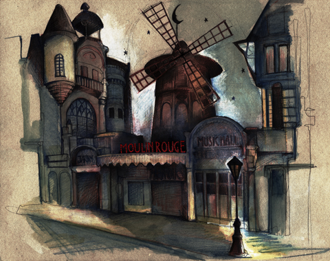

Illustration by Abi Daker

To celebrate The 3rd Fashion in Film Festival, generic a series of silent movies have been presented at screens around London. After a frolic of veiled dancing at Dreams of Darkness and Colour at the Barbican on Saturday, there Tuesday night it was the turn of the BFI with a screening of the original Moulin Rouge, in its black & white silent glory.


Illustration by Katie Harnett

First presented in 1928, Moulin Rouge transports the viewer into the glamour of life on the Parisian stage and the often more stark reality off-stage that accompanies it. After meandering around Parisian night life, voyeuristically bringing the viewer vignettes of after-dark liaisons (including Toulouse Lautrec busy doodling music hall performances) the movie settles on the story of Moulin Rouge star Parysian. Her top billing and star rating at the Paris music hall does not save Parysian from her undoing, quite to the contrary, it is her profession that comes between her daughter, daughter’s fiancé and father-in-law to be. The film contrasts the harsh reality of Parysian’s life with the glitz of the showbiz world of which she is a part and cannot escape. ‘Madame, it’s time to go to the theatre’; the show must go on.


Illustration by Avril Kelly

The film reflects the sociology of the times – classism, elitism, personal relations, and of course the racy sub-culture of the music hall and Parisian bars are all brought to life. Some scenes were sure to be shocking for the 1920’s, not only the salacious stage performances, but the behviour of the music hall’s more well-to-do patrons, including an impromptu food fight at the show’s after party.


Illustration by Joana Faria

We went to see the fashion, and fashion there was. On stage, there was all the glamour to be found in Vegas, with revealing outfits bejewelled to the max. Off stage, Parysian continued the glamour, even when changing into something less revealing to play good mother-in-law. While lacking the full on sensory assault of its contemporary, given the allure of an old black & white silent, backed with a one-man musical accompaniment, the original Moulin Rouge can still arouse the senses.


Illustration by Karina Yarv

Read our review of Pink Narcissus at the Fashion in Film Festival here.

Categories ,1928, ,Abi Daker, ,Avril Kelly, ,BFI, ,Dupont, ,fashion, ,Fashion in Film Festival, ,Glamour, ,Joana Faria, ,Karina Yarv, ,Katie Harnett, ,london, ,Moulin Rouge, ,Musical, ,paris, ,Parysian, ,Toulouse Latrec

Similar Posts: