Amelia’s Magazine | Pick Me Up Graphic Arts Festival 2013: Pick Me Up Selects Review

Pick Me Up London 2013 review-MaricorMaricar donut
Banana vs Donut by MaricorMaricar.

Each year I look forward to exploring new graphic art and illustration talent at Pick Me Up, and so it was that I trundled along to Somerset House this Sunday, skirting the Marathon on the Embankment to enjoy a relatively quiet visit. First up, some of my favourite pieces from Pick Me Up Selects, the opening section where new talent is given a brilliant showcase.

Pick Me Up London 2013 review-MaricorMaricar banana
MaricorMaricar are twins who work out of Sydney in Australia – I loved their beautiful typography created with delicate embroidery, but my favourite pieces had to be their tiny artworks featuring surreal images and puns. A banana doing a somersault through a donut? Why not?!

Pick Me Up London 2013 review-Tom Edwards lion
University of Brighton graduate Tom Edwards displayed a whole wall of domestic cats and wildcats – a big hit with Snarfle, who likes to growl at anything that could potentially be a lion.

Pick Me Up London 2013 review-Katie Scott Snake
I instantly recognised the intricate work of Katie Scott, who I first spotted at her graduate show in 2011 – she makes delicate patterned artworks that remind me of old fashioned classroom anatomical aids. I’m glad to see she’s had a busy few years, creating artwork for the likes of New York Times and Phaidon.

Pick Me Up London 2013 review- Malarky
Malarky is an interesting choice for Pick Me Up, best known to many as a street artist who paints bright big toothed animals all over walls and shop fronts in east London. We couldn’t resist a little print titled Hotpot Snottini, which features one of his beasties inside a 70s casserole dish. Strange and wonderful.

Pick Me Up London 2013 review- PingsZoo
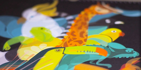
Ping Zhu goes by the very apt moniker Ping’s Zoo – loved this jungle scene, erupting with animal activity. As a follower mentioned on instagram, I love how you don’t see all the beasties straight away.

Pick Me Up London 2013 review- Hattie Stewart
We will be posting an exclusive interview with self confessed professional doodler Hattie Stewart shortly. Hattie channels the spirit of pop artists such as Keith Haring to transform glossy high fashion magazine. The likes of Vogue, Pop and Love are given outrageous makeovers, the models acquiring colourful leopard print skin and cartoonish eyes.

Pick Me Up London 2013 review- Daniel Frost
I was struck by a wall of marvellous miniatures by RCA graduate Daniel Frost, who works his stick figures in bold primary colours. Each little vignette and model is a part of his imaginary Frostville, where the strangeness of everyday life is celebrated.

Pick Me Up London 2013 review- William Goldsmith
Delicate watercolour people populate narrative illustrations by the Glasgow based William Goldsmith – these are a sneak peak at pages which feature in his upcoming graphic novel The Bind.

Pick Me Up London 2013 review-Rob Flowers squid king
The popularity of risograph prints shows no sign of waning, and their instantly recognisable muted neon colour palette was present throughout Pick Me Up. We were so smitten with this Squid King that we bought him, a bargain at £10. Rob Flowers (above and below) is inspired by mythology, folklore, early fast food merchandising and the surreal. His wall was a riot of monsters and mushrooms in a zingy range of colours.

Pick Me Up London 2013 review- Rob Flowers mushroom
Above I have covered the artists whose artworks I captured reasonably well in photos (not easy, when trying to carry a squealing baby at the same time, I’ve discovered), but there are many more of mention: fabulous Kama Sutra inspired typography by Malika Favre, surreal 3D installations by Anna Lomax, brilliant crayon portraits by Damien Florébert Cuypers, stunning retro style minimalist art inspired by everyday activities (such as painting toenails) from Sarah Vanbelle and delicate dreamlike fantasy environments by You Byun. Coming soon: my round up of the best of the rest of Pick Me Up. Make sure you catch the last few days if you haven’t already been: full listing hereRead last year’s review of Pick Me Up Selects here.

Categories ,Anna Lomax, ,Damien Florébert Cuypers, ,Daniel Frost, ,Frostville, ,Graphic Art, ,Hattie Stewart, ,Hotpot Snottini, ,illustration, ,Kama Sutra, ,Katie Scott, ,keith haring, ,Malarky, ,Malika Favre, ,MaricorMaricar, ,New York Times, ,phaidon, ,Pick Me Up, ,Pick Me Up Selects, ,Ping Zhu, ,Pings Zoo, ,rca, ,Risograph, ,Rob Flowers, ,Sarah Vanbelle, ,Snarfle, ,Somerset House, ,Squid King, ,sydney, ,The Bind, ,Tom Edwards, ,University of Brighton, ,William Goldsmith, ,You Byun

Similar Posts:


Amelia’s Magazine | Made You Look Kickstarter Campaign

Made you Look-Work by Anthony Burrill 5
Made You Look is a documentary about the contemporary DIY graphic arts scene in the UK, lovingly put together by Anthony Peters of Imeus Design. Via candid interviews with top British creatives, publishers and agency owners the film explores how people are turning towards analogue means of creating things, even though we are living at the height of the digital era. The film is due for limited theatrical release in 2015 and will be premiered at a major UK Arts festival. I asked Anthony to write me an exclusive piece about his project, so read on, be inspired, and back the project here: this is a film that deserves to do well.

Made You Look is a documentary that began life in mid 2013 as a film about the DIY scene in UK graphic design and illustration. We take the rich graphic arts scene for-granted now but back in the early 2000’s there were very few key figures, and many of those people are now held in high regard.

Made you Look-Work by Ben The Illustrator 2
Ben The Illustrator.

Made you Look-Work by Anthony Burrill4
Made you Look-Work by Anthony Burrill stickers
Anthony Burrill.

Made you Look-Work by Nobrow Books
Nobrow Books.

Along the way a different story began to emerge, there seemed to be an unusually large amount of artists using traditional methods of making things. Letterpress, linocuts, screenprinting, live drawing, riso, papercraft… all these methods and many more were now increasingly popular.

Made you Look-Work by Helen Musselwhite
Helen Musselwhite.

Made you Look-Work by Ed Cheverton
Ed Cheverton.

Made you Look-Work by Brecht Vandenbroucke print for Nobrow
Brecht Vandenbroucke print for Nobrow.

So our subtext became our core story, and using candid interviews with artists such as Anthony Burrill, Hattie Stewart, Helen Musselwhite, members of Peepshow collective, Ian Stevenson, Ben O’ Brien and Kate Moross we managed to create a story which discusses the perils and pitfalls of creativity in the digital age.

Made you Look-Work by Andrew Rae
Made you Look-Andrew Rae
Andrew Rae.

Made you Look-Print Club London 2
Print Club London.

So many of us are living our lives skipping from screen to screen, viewing the world through a pixelated filter, creating things that only ever exist on hard drives. It’s the height of the digital era, yet many cultural movements are taking things back to basics, we have slow culture movements and craft based movements popping up all over the place. These movements aren’t really about nostalgia, rather a way to stay connected to the tactile, real world that exists beyond the screen.

Made you Look-Will Hudson It's Nice That
Will Hudson, It’s Nice That.

Made you Look-Pete Fowler
Pete Fowler.

We do live in an incredible age. Regardless of what medium an artist uses, its fair to say that very few contemporary creatives could have a career without the trappings of the internet, and this is where the tension lies in the film.

Made you Look-L&Y 2004
Look & Yes 2004.

Made you Look-kate Moross
Kate Moross.

Its beautiful to hear the surprising responses from some artists when asked seemingly naïve questions such as ‘how would you feel if the internet was switched off forever tomorrow?

But of course we won’t spoil the film by sharing any of these answers yet!

Made you Look-Hattie Stewart
Hattie Stewart.

Made you Look-Ben The Illustrator
Ben The Illustrator.

We have had an incredible response to our trailer, with over 30,000 views, and have had invitations to film festivals and to educational Q&A screenings across the globe.

We are now running a Kickstarter campaign to be able to find the resources to finish the film. We have a few final bits of filming to do, plus post production tasks like Grading and audio post work. We would also love to be able to license music from artists like Bibio, CFCF, ISAN & Zoon Van Snook as well as having a score composed by Mathieu Karsenti.

Look us up if you would like to be part of the film!

Made you Look-Anthony Burrill _ Adams of Rye 2
Anthony Burrill, Adams of Rye.

Made you Look-Adrian-Johnson
Adrian Johnson.

So what are you waiting for? Get involved and help make Anthony’s film a great one.

Categories ,Adrian Johnson, ,Andrew Rae, ,Anthony Burrill, ,Anthony Peters, ,Ben O’ Brien, ,Ben the Illustrator, ,Bibio, ,Brecht Vandenbroucke, ,CFCF, ,Creativity, ,diy, ,documentary, ,Ed Cheverton, ,film, ,Hattie Stewart, ,Helen Musselwhite, ,Ian Stevenson, ,Imeus Design, ,ISAN, ,It’s Nice That, ,Kate Moross, ,Kickstarter, ,Kickstarter Campaign, ,Look & Yes, ,Made You Look, ,Mathieu Karsenti, ,Nobrow Books, ,Peepshow, ,Pete Fowler, ,Print Club London, ,Will Hudson, ,Zoon Van Snook

Similar Posts:


Amelia’s Magazine | Behind the Scenes at Print Club London: an interview with Kate Newbold Higginson

Print Club London interview-wall

I first met Kate Newbold Higginson when she was just setting up Print Club London and only had a pop-up shop on Brick Lane. Since then, the collective have gone on to great things, with a huge screen printing workshop in East London as well as their new gallery and workspace, Millers Junction. Artists like Bob Gill, Kate Moross and James Joyce call the studio home, and every year the fantastic Blisters exhibition showcases their talents alongside that of unknown newcomers. I caught up with Kate to look back at the studio’s success story, and to find out what it’s like screenprinting bags for Stella McCartney and throwing parties for Pinterest.

Print Club London interview-Fred Higginson, Rose Stallard, Kate Newbold

Fred Higginson, Rose Stallard, Kate Newbold

Tell us about how you and your husband Fred set up Print Club London; artist Rose Stallard is involved too, isn’t she?

About 10 years ago Fred set up Absorb Arts which is a fine art charity based initially in a church in Norwich that he converted into studios. Then he came to London and we did the same in London. Rose Stallard, our Creative Director, knew Fred from Norwich University of the Arts and rented space from us. One day she asked Fred if he would consider setting up some screenprinting studios as she couldn’t find anywhere suitable and thought that lots of other people would want space too. She wanted it to be like a gym with open access where you could rock up on your BMX (this was Rose’s main aim, there had to be BMXs!) and screenprint all night and day. And so Print Club was born; Fred set it up with Rose’s creative help and screenprinting know-how and it went from there. I joined a year into the saga after leaving my job in film. Fred and Rose were great at the creative side of things, producing amazing artwork and getting artists on board, but they were pretty bad at actually managing a business, so I set about ensuring we had clients, members and could feasibly run as a studios. The fun stuff, no less!

Print Club London interview-joanna ham

You have lots of other established artists under your roof, like Bob Gill, Kate Moross, James Joyce and Margot Bowman. Who are the rising stars whose work we should be snapping up now?
Joanna Ham (above) works on these amazing fashion pictograms! And her bunnies are uber cool and popular. She produces two very different styles, both incredibly successful Rosie Emerson works with very interesting techniques, and again, is often influences by the fashion world.

Print Club London interview-EGG-AND-SOLDIERS

Claudia Borfiga is one of my techncians and a genius! She’s very witty and that comes through in her illustrations: the one above is titled Egg and Soldiers.

Print Club London interview-MEOW Cassandra Yap

Cassandra Yap draws lots of naked women and has a taste for fetish; her work sells very well!

Print Club London-Reiner

Johnathan Reiner is a doctor by day and print maker by night!

Print Club London interview-Desk-space-London-Millers-Junction-01 (1)

As well as screenprinters, you have lots of illustrators working in Millers Junction- can you tell us a bit about this space?
This space is our most recent addition to the print club warehouse. I was actually renting office space with a previous company in Shoreditch and it was pretty basic, all in separate rooms. There was no camaraderie, no tea meetings and most importantly no shared jobs or feedback on work which is hugely important when you are freelance and work alone or in small teams. You really want to talk about your work, pass jobs around and get ideas from others. I noticed how many people in Dalston sat in cafes with laptops so when we took over the final space it seemed obvious to me to set up an open plan deskspace for creatives.

The idea is 39 desks are rented out and we provide you with all you internet needs, tea, coffee, bike storage, dog storage (we have a few hounds here) cake, meeting room, gallery hire, free use of the print club and a workshop. Plus lovely extras like events – in December Jameson Whiskey came in to give everyone a whiskey tasting event, Gü Puds brought in cakes and then there are less exciting but useful events like a VAT talk for small businesses from our accountants. The idea is that we support small businesses and individuals so that they look from the outside to their client like a bigger more professional company. We also do stuff like sign for courier deliveries – it’s a basic thing but in my old office nobody would do it! When you work alone it’s a basic requirement that someone can sign for your deliveries. And we try to achieve these little details in everything we offer at Millers Junction, it’s important to us that people here love it and we provide one of the best and more affordable deskspaces in east London. You can find out more about our studio space here.

Print Club London interview-Blisters 2

You also print for clients like Stella McCartney and even Facebook and Twitter- do you think screenprinting has become ‘cool’ again because of the backlash against the digital age? I suppose this could apply to the rise in popularity of illustrations over photographs too…
Yes, we are super lucky. We print beautiful bags for Stella McCartney, her ethos is very green and ethical which makes us a good fit. Everything here is waterbased and the energy costs for manufacture are low as its hand made. So we can produce bespoke initial bags easily and very well- it’s a lovely commission. Likewise we have been doing workshops and events for Pinterest to get bloggers into the studios with some great people like Jo Robinson and Hattie Stewart. Facebook invited us in to give a screenprinting workshop too.

People want to manufacture again, it’s what Britain was so great at and I guess people are realising that not only is digital not always so exciting but that we are brilliant at making things. And screenprinting is just one of the products we are fortunate in the UK to have not only great artists to produce work but also now great facilities like ours. We bought our warehouse two years ago so luckily we won’t be priced out of Dalston! Its one of the few remaining commercial factories in the area, lots are now flats so it was important to us and the previous owner, whose father ran it as a sewing factory, that it stayed commercial and a manufacturing hub- which it most certainly is. We have 50 fine artists upstairs, 70 print makers a month in print club and 39 designers and illustrators in Millers Junction. We are literally churning out work. Although I’m sure much less than the sewing factory did in 1910! But we will get there.

Print Club London-WORKSHOP

How can people get involved with Print Club London?
Do a workshop and join up! It’s easy. You don’t need to know how to print, we can teach you everything in our workshop, and then you can become a member. We assist you in learning the ropes and producing new work and once it’s up to a level thats sellable- and this can take time for some and not for others- then we sell the work online in our gallery.

Or you can join our deskspace in Millers Junction – its £220pcm and you get free use of print club in that so its really cost effective for designers who want to do a little print making on the side.

Print Club London interview-Blisters

And lastly you can be part of our shows. Every year we commission artists to take part in BLISTERS our annual screenprint event. Its open submission so anyone can take part. Previous shows have included Eine, Jamie Reid, Kate Moross, Mr Bingo, lots of well known people! But also newbies or people still in college. We choose work based on merit not who you are.

Categories ,Absorb Arts, ,Blisters, ,BMX, ,Bob Gill, ,Brick Lane, ,Cassandra Yap, ,Claudia Borfiga, ,dalston, ,East London, ,Egg and Soldiers, ,Eine, ,Fred Higginson, ,Gü Puds, ,Hattie Stewart, ,interview, ,James Joyce, ,Jameson Whiskey, ,Jamie Reid, ,Jo Robinson, ,Joanna Ham, ,Johnathan Reiner, ,Kate Moross, ,Kate Newbold Higginson, ,Meow, ,Millers Junction, ,Mr Bingo, ,Norwich University of the Arts, ,Pinterest, ,Print Club London, ,Rose Stallard, ,Rosie Emerson, ,shoreditch, ,Stella McCartney, ,VAT talk

Similar Posts:


Amelia’s Magazine | An Interview with illustrator Hattie Stewart

Hattie Stewart

London-based Hattie Stewart, a ‘professional doodler’, originally from Essex, is taking the fashion world by storm with her ‘doodle-bombed’ magazine covers. Not just limited to putting her mark on mags, she’s also done a whole range of stuff from shop-fronts to call-girl cards. Youthful, quirky and comic book-esque, Hattie pens a place where all things happy, cartooney, dark and urban make an appearance. This exuberance with a tint of dark humour reminds me a little of Bart‘s beloved Itchy & Scratchy. Bold colours, unique characters, a wink and some swag all form part of her signature style. She’s a busy girl and Amelia recently mentioned Hattie in a review of Pick Me Up Graphic Arts Festival 2013.

Hattie Stewart

Having graduated from Kingston University, Hattie Stewart has worked on projects with House Of Holland, Marc Jacobs and Adidas to name a few. Her work is proving popular across the globe and has been exhibited in Miami, New York, Berlin and London. I spoke to this young illustration idol about graduation, her personal pen preference and how doodling her mark on the world is getting her eye-marked for great things to come.

Hattie Stewart

How do you get the ideas for your doodles?
I have no idea! Sometimes I like to pore over copies of Craphound to get ideas for motifs, but mostly I just start drawing. The best ideas always come from practice and the simple act of just drawing.

Do you feel like London is tied to your identity as an illustrator?
I guess so, I think the fun-loving attitude of my work with certain levels of underlying sarcasm is definitely an identity I would characterise with London.

Hattie Stewart
Hattie Stewart

Your style has a comic book feel, what comics did you read as a kid?
I was obsessed with Dandy and Beano comics but especially Beryl the Peril. She ruled. My interest in strong comic book styles and larger than life characters definitely began at a young age. My uncle’s always drawn comic book characters and taught me a lot about developing a style.

How did the reality of life after graduation compare to your expectations?
It kind of went more or less as I’d imagined. I knew work wasn’t necessarily going to happen straight after uni and I’d have to work really hard and have many part-time jobs before things started kicking off. Because I’ve been fortunate in that I’ve always wanted to draw, I had a feeling that if I worked as hard as I could and tried to maintain a good attitude things would eventually happen for me. It’s wasn’t easy and I definitely kept looking for many different opportunities and work.

Hattie Stewart
Hattie Stewart

Do you think your degree was an important part of your development as an illustrator?
Yes, definitely. It taught me what I wanted as an artist and who I wanted to be and the people I met helped form my character and became so valuable to me. I do think it’s an experience everyone should have – sometimes defining your character helps develop your work, and then you have an amazing wealth of facilities and experienced tutors to help your work grow. You definitely have to have faith in yourself though and listen to yourself and follow your instincts as much as you listen to and accept the advice offered, there always needs to be a balance.

Hattie Stewart

Hattie Stewart

Hattie Stewart

How did you get the idea to start doodling on mag covers?
I was watching telly and a copy of Dazed and Confused was sat in front of me. Like so many people I just started aimlessly doodling on the cover and when I’d finished thought it looked pretty cool – it all developed from there!

You’ve had some big clients, like Urban Outfitters, Luella, Diesel and Adidas, are there any big names you really want to work with in the future?
I’m not sure really. I know I’d love to do some set design and big 3D set pieces/ props! There are so many things I want to do with my work it really depends on who will let me do it rather than who it is I do it for.

Hattie Stewart
Hattie Stewart

I saw that you did an awesome project for Soda Pop illustrating call girl cards, how did this come about?
There is a magazine called Gypse Eyes and they were excepting contributions for their ‘Food + Sex’ issue, then the idea of the call girl cards popped into my head! My friend Jessica Abou Nassar who runs Soda Pop and the amazing Ghetto Nailz wanted to collab with me and I suggested using these – she agreed and the t-shirts were created! It was a great project.

Hattie Stewart
Hattie Stewart

You describe your style as ‘cheeky’, do you think that you like to take risks as an illustrator?
Absolutely. It’s important taking risks in all sides of life – How else does anything change? All the best ideas and opportunities come from moving outside of your comfort zone and as an artist that is extremely important.

Colour is an important feature of your work, what are your favourite shades?
Pink, especially fluro pink. In fact anything fluro. Right now though I’m loving primary colours! Especially red, always red.

Hattie Stewart
Hattie Stewart

What type of pen do you use?
Posca! The only pens I use and they go on every surface. I would never recommend any other but then again that’s just my preference.

Do you think the internet has made visual culture a vital part of everyday life?
Oh absolutely. It’s also made things move and grow very quickly, which can be thrilling but also exhausting. Trying to make and keep yourself relevant and motivated when there is so much talent and ideas constantly on show in front of you, it can be inspiring and demoralising at the same time. Ultimately though knowledge and learning and the immediacy of connecting to people you wouldn’t otherwise be able to contact is amazing.

Hattie Stewart

All the images in this post were provided by Hattie Stewart. You can see more of Hattie’s work on her portfolio and you can find her on Tumblr and Twitter too.

Categories ,Adidas, ,Beano, ,Beryl the Peril, ,cartoons, ,cheeky, ,comic books, ,Craphound, ,Dandy, ,Dazed and Confused, ,Diesel, ,doodle, ,doodle-bomb, ,draw, ,drawing, ,Gypse Eyes, ,Hattie Stewart, ,House of Holland, ,Jessica Abou Nassar, ,jessicasrcook, ,Kingston University, ,london, ,Luella, ,Marc Jacobs, ,Neon, ,pens, ,pink, ,Posca, ,Soda Pop, ,Urban Outfitters

Similar Posts:


Amelia’s Magazine | An Interview with Illustrator Jordan Andrew Carter

Jordan Carter

A self-proclaimed ‘illustrational hustler/graphical wizard’, Jordan Andrew Carter uses detailed pencil drawings and contrasting block shapes to ‘mystify and amaze your human see-globes’. This rising star graduated from Norwich University of the Arts last year and has just started to pencil a name for himself in the biz. While illustration is one of his big life aims, he also mentions his other aspirations: ‘my current life goal is to own a pug and live near the sea. I also have a HUGE weakness for biscuits, and believe if you replaced money with biscuits the world would be a happier place.’ Dividing his time between ‘Northamptonshire’ and Essex, pencils and Poscas are his ‘weapons of choice’.

Jordan Carter

Jordan paints what can only be described as ‘fairytales high on Posca fumes’. His detailed wildlife pencil drawings (which remind me of the work of Ohh Deer’s Jamie Mitchell ) are mixed with bright, block colours. Delightfully over the top and topped off with a sprinkling of humour, Jordan‘s illustrations are visual jokes with lashings of both elegance and fun. There’s a touch of Discworld in there too, in the sense that worlds that are balanced on top of animals crop up more than once. There’s even a smidge of Narnia in another of his drawings. Whether it’s a whale with the weight of the world on his shoulders, an orangutan on a pink bicycle, or a leopard wearing a headdress, the images all bring to mind a fantasy land with a dash of urban life. I can’t help but think that stories would have been much more fun when I was a kid if Jordan was involved. I spoke to this new kid on the block about his latest projects and love of desk clutter.

Jordan Carter

What kind of projects have you worked on recently?
I recently took part in Inkygoodness and Ammo Magazine‘s beermat character/ Poop Deck Exhibition at the Coningsby Gallery in London which was amazing. It was pretty awesome to take part and exhibit alongside some of the illustrators that I really admire like Hattie Stewart, Yema Yema and James Burlinson. I did a piece for Creative England‘s One Thing I Know publication which sold out last week! I’m also working on creating my own clothing shop/ brand called Woodless.

Jordan Carter

There’s a definite storytelling element to your work, were you a big reader as a kid?
As a kid I preferred to be outside causing havoc like a little ruffian rather than sitting inside reading. I’m one of those people that need visual stimulation so I don’t really read a lot. If a book doesn’t have copious amounts of imagery then my mind wanders so I tend to stick to magazines. Articles are usually short and sweet with killer images, which is perfect for me.

Does what’s happening in your life affect your illustration?
In terms of inspiration: definitely not. When I sit down to draw it’s a getaway for my brain so I would rather focus on anything except what’s happening in my life. Time and money are the things that affect it most; I can’t currently spend all day everyday drawing even though I would love to so it’s just a night-time pursuit at the moment.

Jordan Carter

Is there a singular moment that sums up why you decided to become an illustrator?
Originally I wanted to become a Fireman until I realised I was scared of heights and my dreams were dashed. I don’t think there was a specific moment when I knew I wanted to become an illustrator. I’m not really a planner, I studied Fine Art at college and then Games Art at university so I guess I only knew I wanted to be an Illustrator when people started calling me it. It’s something I’ve always done and enjoyed so I’ve kind of naturally fallen into being an Illustrator.

Jordan Carter

You use mixed-media a lot in your art, is there something that compels you to mix-it up a little?
I’ve always been able to sort of adequately draw things and people but I became a massive fan-boy of various print processes and anything hand printed when I met my Graphic Designer girlfriend at university. My abilities and influences just seem to lend themselves to creating something that is a blend of everything I know or have learnt; also, it stops me getting bored because I can play about with more ways of making an image.

Jordan Carter

There’s a lot of humour in your work, do you think funniness is important in contemporary illustration?
For sure! I think if you can make someone smile, then you’re really connecting with them, so I would rather do that as opposed to just creating something that looks nice. Humour is one of the most important things in life, I think it naturally filters through into your work if you want it to or not.

Jordan Carter

What is your dream commission?
I’d love to do some larger scale mural work in a shop!

Do you really enjoy long starlit walks along the soggy shoreline and apple bobbing in baskets of kittens?
Don’t tell PETA, all the kittens consented.

Jordan Carter

Describe your desk
My desk is pretty standard to be honest, it’s white and surrounded by clutter and illustrative trinkets. There are shelves next to it filled with cardboard elephant heads, vinyl toys, paper toys, books, a skull, Lego people, zones and vintage illustrations. There is also a cube man called Earnesto Cubeman the First that sits on top of my iMac.

Jordan Carter

Jordan Carter

What’s your strangest influence?
Anything on the dark side of Youtube, if you just keep clicking you will eventually come out the other end feeling weird and questioning what you just watched. One time I spent an hour flicking through videos of hornets fighting wasps…

Is there a font you love to hate?
There are a lot of fonts I hate but none that I love to hate. I’m a huge sucker for pretty much anything hand-drawn, it all looks so fresh and natural.

Jordan Carter

All illustrations courtesy of Jordan Carter. You can view his portfolio here www.jordanandrewcarter.co.uk/

Categories ,Ammo magazine, ,art, ,artist, ,Coningsby Gallery, ,Creative England, ,graphic designe, ,hand drawn, ,Hattie Stewart, ,illustration, ,illustraton, ,inkygoodness, ,James Burlinson, ,Jordan Carter, ,newcomer, ,Ohh Deer, ,Poop Deck, ,Woodless, ,Yema Yema

Similar Posts: