
Illustration by Gemma Randall
Christopher Shannon burst onto the catwalk in true and typical chavvy style to launch menswear day, see for me at least, more about on Wednesday. His wasn’t the first show; we didn’t get tickets for Lou Dalton (a real shame, as I was really looking forward to that one) or Topman Design (meh). There’s a strange feeling in the air on LFW’s Wednesday – it’s eerily quiet, people are more relaxed and you could actually swing a cat around in the press room, should you desire, for the first time in five days.
Shannon showed alongside JW Anderson in the BFC space, but even with these two heavyweights of menswear design presenting back to back, the venue still wasn’t full. It’s a shame that there isn’t as much interest in menswear, but the editors had all shipped off to Milan, I guess…
Shannon was up first and his show featured some of my favourite guilty pleasure tracks – Blu Cantrell, for instance. Tune! This kind of music sits hand in hand with his unique blend of street-inspired sportswear and edgy, boyish tailoring. The first looks were all crisp white numbers, featuring engineered t-shirts with geometric holes, multi-pocketed shorts and bucket hats, followed by sweaters with mesh details. I like Shannon’s fancy-free approach to menswear – it’s for young, hip individuals who care about style but not about stuffy suits.
Progressing into outerwear, the collection bore sports-luxe jackets, more mesh, and shorter shorts. Shannon’s garish but great rucksacks, a long-term callabo with Eastpak, made an appearance in similar tones as last season – pale greys and baby blues.

Illustration by Gemma Randall
Further in, Shannon’s signature camo-graffiti prints showed up, bringing a welcomed burst of colour in the form of pale blues. I like this print A LOT – it works on padded puffas, shorts and even bucket hats (although I doubt I’ll be seen in the entire get up – the pattern is intense and it needs breaking up a little, I think).
His scally charm shone through on more printed numbers, where sections had been cut away, and the reappearing camo print. Panelled trousers, though, displayed the menswear designer’s continual progression – sand chinos displayed oblong sections in luscious pastel colours made the move from teenage fashion. Vibrant yellows hinted at that ballsy appeal many of us were looking for.
Faces were painted like colloquial masks, apparently inspired by longing for a holiday, but I’m going to ignore this literal influence — as much as it looked fun, it fought to distract from some pretty sophisticated tailoring. All in all, a toned-down collection compared to what we are used to. As the chavvy charmer continues to grow up, so will – I hope – his collections.
All photography by Matt Bramford

Illustration by Gemma Randall
Christopher Shannon burst onto the catwalk in true and typical chavvy style to launch menswear day, find for me at least, on Wednesday. His wasn’t the first show; we didn’t get tickets for Lou Dalton (a real shame, as I was really looking forward to that one) or Topman Design (meh). There’s a strange feeling in the air on LFW’s Wednesday – it’s eerily quiet, people are more relaxed and you could actually swing a cat around in the press room, should you desire, for the first time in five days.
Shannon showed alongside JW Anderson in the BFC space, but even with these two heavyweights of menswear design presenting back to back, the venue still wasn’t full. It’s a shame that there isn’t as much interest in menswear, but the editors had all shipped off to Milan, I guess…
Shannon was up first and his show featured some of my favourite guilty pleasure tracks – Blu Cantrell, for instance. Tune! This kind of music sits hand in hand with his unique blend of street-inspired sportswear and edgy, boyish tailoring. The first looks were all crisp white numbers, featuring engineered t-shirts with geometric holes, multi-pocketed shorts and bucket hats, followed by sweaters with mesh details. I like Shannon’s fancy-free approach to menswear – it’s for young, hip individuals who care about style but not about stuffy suits.
Progressing into outerwear, the collection bore sports-luxe jackets, more mesh, and shorter shorts. Shannon’s garish but great rucksacks, a long-term callabo with Eastpak, made an appearance in similar tones as last season – pale greys and baby blues.

Illustration by Gemma Randall
Further in, Shannon’s signature camo-graffiti prints showed up, bringing a welcomed burst of colour in the form of pale blues. I like this print A LOT – it works on padded puffas, shorts and even bucket hats (although I doubt I’ll be seen in the entire get up – the pattern is intense and it needs breaking up a little, I think).
His scally charm shone through on more printed numbers, where sections had been cut away, and the reappearing camo print. Panelled trousers, though, displayed the menswear designer’s continual progression – sand chinos displayed oblong sections in luscious pastel colours made the move from teenage fashion. Vibrant yellows hinted at that ballsy appeal many of us were looking for.
Faces were painted like colloquial masks, apparently inspired by longing for a holiday, but I’m going to ignore this literal influence — as much as it looked fun, it fought to distract from some pretty sophisticated tailoring. All in all, a toned-down collection compared to what we are used to. As the chavvy charmer continues to grow up, so will – I hope – his collections.
All photography by Matt Bramford

Holly Fulton by Kayleigh Bluck.
For S/S 2011 Holly Fulton took inspiration from Joan Collins and 60s cruise wear as her “ladies” went on a fantastical tour of luxury living in all the most chic resorts: Monaco, order Egypt, ed Brazil, Hollywood. If this woman exists in reality she would surely be the most shallow creature on the planet, but such is the way of fashion: it thrives on escapism.


All photography by Amelia Gregory.

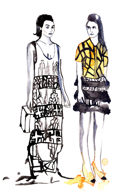
Holly Fulton by Michelle Urvall Nyrén.
This was the first Holly Fulton catwalk show I’ve attended, and being a fan I was intrigued to see how her aesthetic has held up in a year when her influence on the high street has been massive – particularly where large jewellery is concerned.
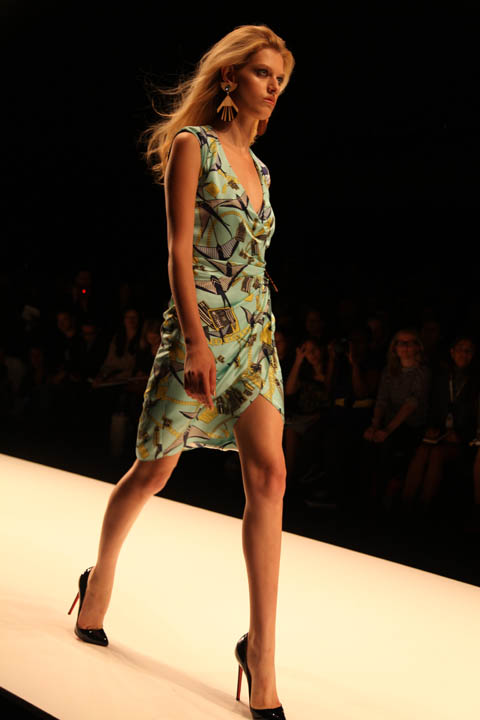
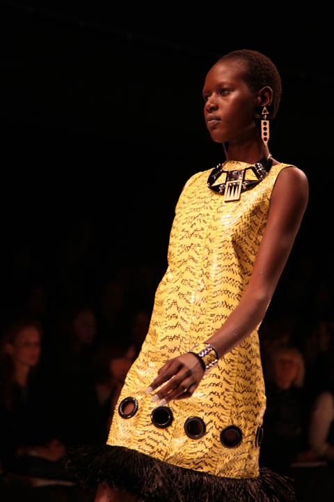
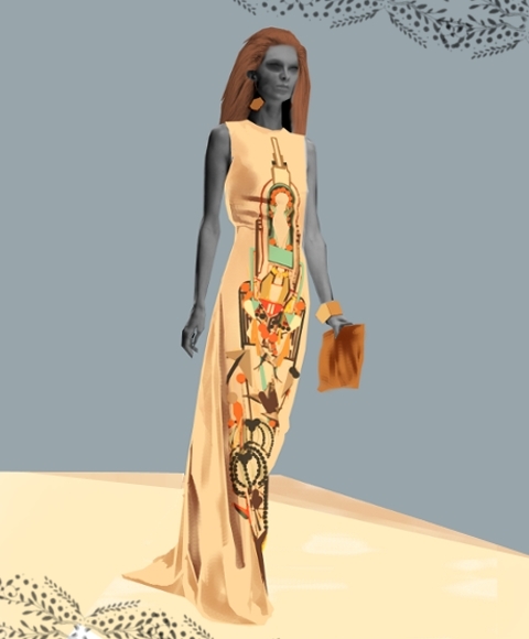
Holly Fulton by Aniela Murphy.
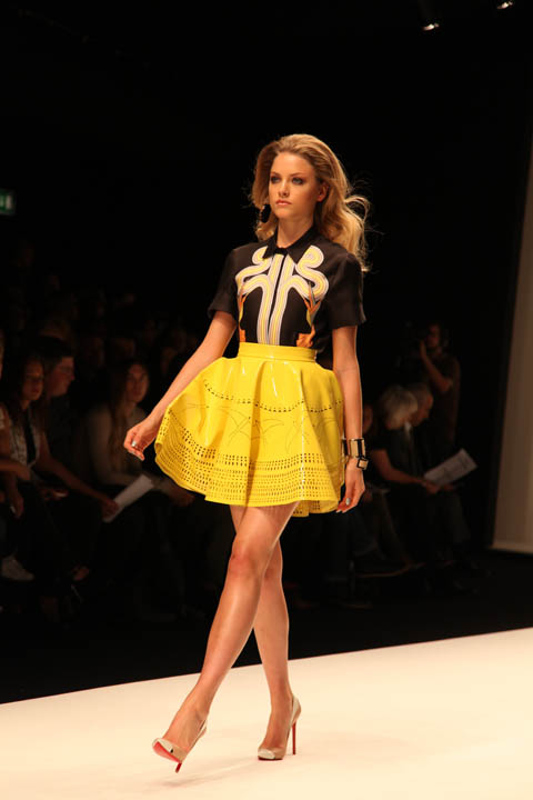
The show started strongly with a bright orange cracked paving print blouse atop a tiered fringed pencil skirt before giving way to a look that I would say took as much inspiration from the flared shapes of the 70s as it did the decade before. Yellow skater style flared skirts featured laser cut cocktail patterns. Heels were so high one model was forced to remove hers for the finale.


Holly Fulton by Kayleigh Bluck.
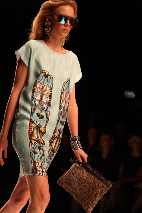
Holly is at her strongest when she puts together Aztec, Aboriginal and Memphis School inspired appliques on the front of long panels. Flares, shift dresses and maxi skirts provided ample opportunity for this, accessorised with the usual fabulous necklaces and decorated clutch bags. They were accompanied by suitably luxe big earrings and big hair.


The collection only started to falter once towards the end, when Holly sent a few dresses down the runway that seemed obviously tacked on to appease sponsors Swarovski. Goodness knows why she decided to finish on these less polished numbers, instead of interspersing them through the whole show.


Holly Fulton by Aniela Murphy.
Like David Koma before her Holly used python, this time in its natural colouring as part of heavily textured patterning so that it was less obvious from afar. Maybe a luxury feel demands some kind of obvious domination over the rest of the world, but I’m not sure I like this new trend towards exotic animal skins (see my David Koma blog for more on my thoughts). Other than this blip she remains an innovative and individual designer who’s very definitely one step ahead of her imitators.

Categories ,1960s, ,1970s, ,Aboriginal, ,Aniela Murphy, ,Aztec, ,BFC Tent, ,David Koma, ,Holly Fulton, ,Joan Collins, ,Kayleigh Bluck, ,lfw, ,London Fashion Week, ,Memphis School, ,Michelle Urvall Nyrén, ,Python skin, ,Swarovski
Similar Posts:
- London Fashion Week A/W 2010: Holly Fulton
- Holly Fulton: London Fashion Week S/S 2014 Catwalk Review
- London Fashion Week S/S 2011 Catwalk Review: Holly Fulton (reprise)
- London Fashion Week S/S 2011 Catwalk Review: David Koma (Reprise)
- London Fashion Week S/S 2011 Catwalk Review: David Koma


