Meet designer Ornan Rotem of specialist art book publishers Sylph Editions. Over the last five years he has worked on a series of upscale book and brochure design projects with high quality lithographic printers Principal Colour of Paddock Wood, Kent. I spoke with him to find out more about how this relationship works, and what it takes to produce something wonderful in print.

A Labour of Moles, The Cahier Series by Sylph Editions.
What dictates your choice of paper and print? And how important is fine quality in a publication – what decides this do you think?
In all of our of publications, paper and printing technique is paramount. It seems to me that the more people rely on the web the more the nature of printed material will be positively affected. A lot of printed material can look mundane and outdated compared with its web counterpart. Gradually, the web will take over and its printed sibling will either be marginalised or become redundant, like the telephone book. At the same time the computer screen is a great leveller: everything ends up being seen through the glassy filter of monitors of varying quality. This gives a new lease of life for books if they offer a satisfying physical or tactile experience, if they are publications that are a pleasure to behold. I would even go so far as to say that the ubiquity of the web creates an unprecedented quest for good quality printing. Our goal is to match the look of a publication with its content so that they enhance each other. This seems to me to be crucial: it isn’t just about finding pretty paper or getting it to look nice, it is about the ability to make use of the unique possibilities that the printed medium offers in order to enhance and bolster the content. For example, if I want to convey to you that a text is meant to be read, it has to be conveyed through its physical qualities; that is to say: legibility-driven of typography, paper that isn’t too bright and that doesn’t have any reflections, proportions and sizes that relate to the human body, etc.

In the Thick of Things, The Cahier Series by Sylph Editions.
You have been working with Principal Colour for awhile now – how did that relationship start and what has been the best aspect of this relationship?
We have been working with Principal Colour continuously for the last 5 years. Not only that, but we have been working on a vast array of projects: from simple A5 leaflets to limited edition books – and everything in between. The way it began is typical of Principal Colour. I designed a very intricate calendar that had to be finished a few weeks before Christmas. I engaged one of the better known UK printers (who have since gone bust) and initially everything was going fine. One day, I ring up to make sure we are on course only to be told that they simply won’t be able to do it before January. Needless to say I was appalled by this callousness. I asked Justin Hobson of Fenner Paper if he could think of some other printer who could save the day (and my reputation too). Alan and Martin called me up and I drove out that to see them after a brief introduction. They began working on the job straight away. They had to work weekends and do some of the binding in house so as to meet the deadline. I was so impressed by this kind of dedication and the quality of their work that we have been working ever since. This, I must say, was not a one-off event: it has been characteristic of everything we have done over the past years. You ask what the best aspect of the relationship is? It is the feeling that I am not just handing over a job, but that we are doing it together, that they care about it as much as I do, whether its a leaflet or a book. This is something quite commendable.


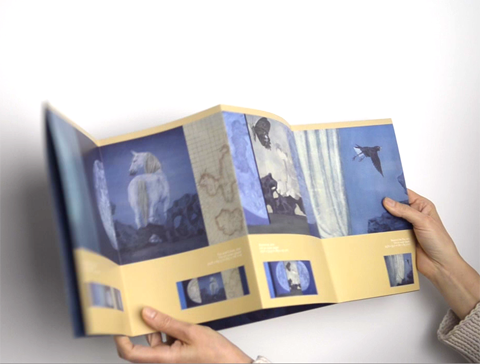
The Xu Lei exhibition brochure is very unique and interesting – can you tell us a bit more about the design and production of it?
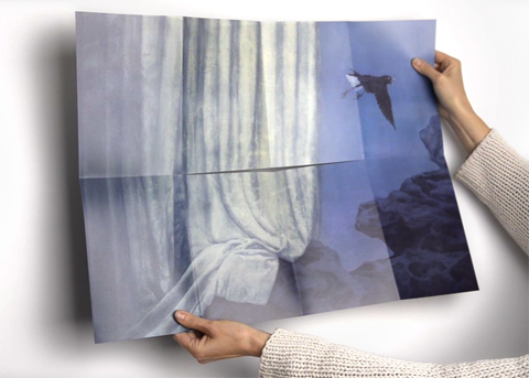
I was asked to do a brochure that will celebrate this much feted Chinese artist. The brief was do to something that would not only be informative, but also covey the richness and special qualities of his art. I was looking into different kinds of folds: there is Trish Witkowski‘s encyclopaedic Fold Factory where one is spoilt for choice, in fact, completely spoilt. At around the same time I met a very talented young designer, George Hadley, who showed me a leaflet he had produced using this fold and I felt it just made perfect sense because this fold would allow me to create a brochure that functions both as a booklet and a poster. However, working out the mechanical details wasn’t that simple and we had to make several dummies (with Fenner Paper) to try it out before it actually worked. It can easily go wrong if the paper is not the right stock or the right weight, and the die must be serious precision work. Armed with his endless and unwavering patience, Alan worked out the details and we created what I think is a marvellous publication.

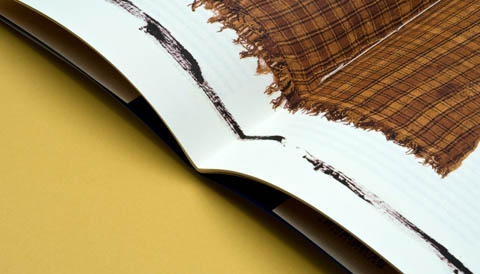
Text on Textile, The Cahier Series by Sylph Editions.
I understand you have also been printing the Cahiers Series at Principal Colour: 16 editions over 4 years. How did this series come about and what paper and print techniques are used?
The Cahier Series was set up jointly by Sylph Editions and The Center for Writers and Translators at the American University of Paris. The underlying idea was to set up a publication series dedicated to translating and writing. It is a natural collaboration, since we have the production and publishing capabilities as well as being very interested in literature and more specifically in translated literature. The university, on the other hand, sits at the hub of intellectual activity with far-reaching ties and commands the respect from many notable figures. From a material point of view, all the editions are identical: they are between 40 to 44 pages, always printed on Neptune Unique Soft White 105gsm with a ColorSet cover and dust jacket printed on the beautiful Cordenons Chagall (all supplied by Fenner). They are always three-hole-sewn and always have a fifth colour to identify them. So the format is a very closed format; on the other hand, the actual printing and the printing techniques is like a showcase of current techniques. We use single gatefolds, double gatefolds, metallic colours, duotones, tritones, spot varnish, tip ins, bellybands – you name we do it. I very much like this idea of expressing oneself within the confines of a strict and closed framework.
Hop on over to the Principal Colour tumblr to read the rest of this interview with Ornan Rotem, including what he considers the best advice for anyone working with print design production and two exclusive videos that show in detail how the Xu Lei brochure folds…
Categories ,Alan Flack, ,Art Books, ,Bellybands, ,Booklets, ,Brochures, ,Colorset, ,Cordenons Chagall, ,Double Gatefolds, ,Duotones, ,exhibition, ,Fenner Paper, ,Fold Factory, ,Justin Hobson, ,Lithographic Print, ,Martin Darby, ,Metallic Colours, ,Neptune Unique Soft White, ,Ornan Rotem, ,Print Design, ,Print Production, ,publishing, ,Single Gatefolds, ,Specialist, ,Spot varnish, ,Sylph Editions, ,The Cahier Series, ,The Center for Writers and Translators at the American University of Paris, ,Tip ins, ,Trish Witkowski, ,Tritones, ,typography, ,Xu Lei
Similar Posts:
- An interview with Pretty Green Look Book designer Dave Uprichard of One Big Company
- Introducing the printers of Amelia’s Magazine: Principal Colour
- Amelia’s Magazine 10th Anniversary Kickstarter Campaign: That Which We Do Not Understand
- People of Print present Print Isn’t Dead Element #002: Kickstarter Campaign
- That Which We Do Not Understand: Amelia’s Magazine 10th Anniversary Open Brief for Artists and Writers
