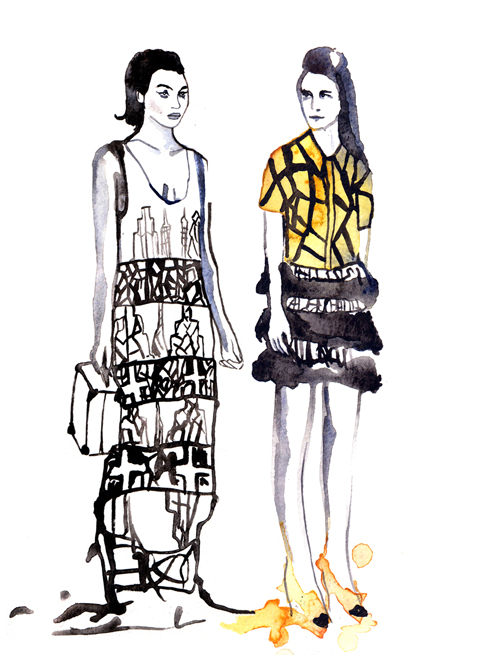
Holly Fulton by Kayleigh Bluck.
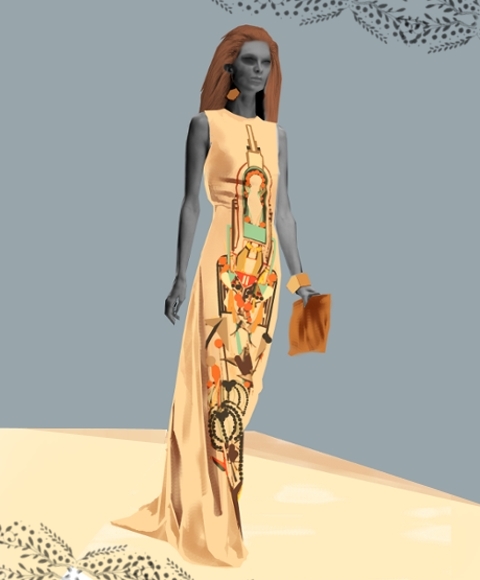
For S/S 2011 Holly Fulton took inspiration from Joan Collins and 60s cruise wear as her “ladies” went on a fantastical tour of luxury living in all the most chic resorts: Monaco, nurse Egypt, Brazil, Hollywood. If this woman exists in reality she would surely be the most shallow creature on the planet, but such is the way of fashion: it thrives on escapism.


All photography by Amelia Gregory.

Holly Fulton by Michelle Urvall Nyrén.
This was the first Holly Fulton catwalk show I’ve attended, and being a fan I was intrigued to see how her aesthetic has held up in a year when her influence on the high street has been massive – particularly where large jewellery is concerned.
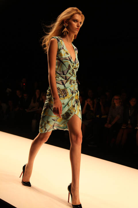
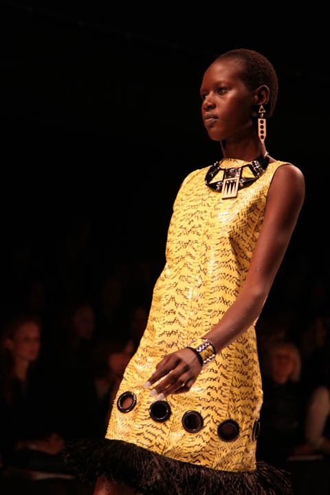
Holly Fulton by Aniela Murphy.
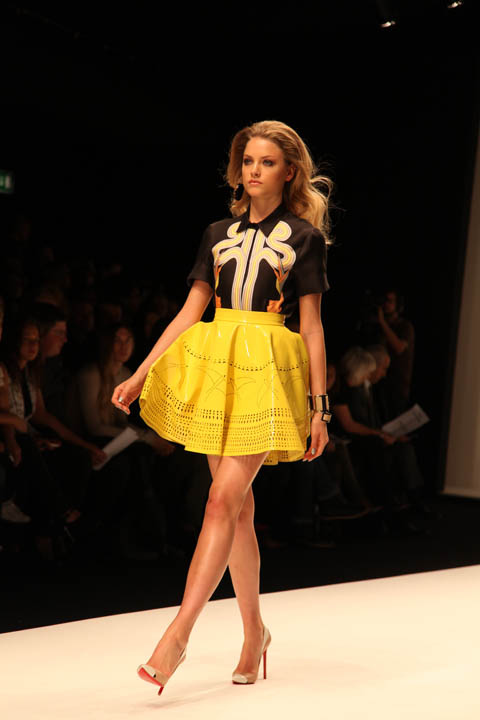
The show started strongly with a bright orange cracked paving print blouse atop a tiered fringed pencil skirt before giving way to a look that I would say took as much inspiration from the flared shapes of the 70s as it did the decade before. Yellow skater style flared skirts featured laser cut cocktail patterns. Heels were so high one model was forced to remove hers for the finale.


Holly Fulton by Kayleigh Bluck.
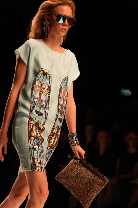
Holly is at her strongest when she puts together Aztec, Aboriginal and Memphis School inspired appliques on the front of long panels. Flares, shift dresses and maxi skirts provided ample opportunity for this, accessorised with the usual fabulous necklaces and decorated clutch bags. They were accompanied by suitably luxe big earrings and big hair.


The collection only started to falter once towards the end, when Holly sent a few dresses down the runway that seemed obviously tacked on to appease sponsors Swarovski. Goodness knows why she decided to finish on these less polished numbers, instead of interspersing them through the whole show.


Holly Fulton by Aniela Murphy.
Like David Koma before her Holly used python, this time in its natural colouring as part of heavily textured patterning so that it was less obvious from afar. Maybe a luxury feel demands some kind of obvious domination over the rest of the world, but I’m not sure I like this new trend towards exotic animal skins. Other than his blip she remains an innovative and individual designer who’s very definitely one step ahead of her imitators.


Holly Fulton by Kayleigh Bluck.
For S/S 2011 Holly Fulton took inspiration from Joan Collins and 60s cruise wear as her “ladies” went on a fantastical tour of luxury living in all the most chic resorts: Monaco, and Egypt, Brazil, Hollywood. If this woman exists in reality she would surely be the most shallow creature on the planet, but such is the way of fashion: it thrives on escapism.


All photography by Amelia Gregory.


Holly Fulton by Michelle Urvall Nyrén.
This was the first Holly Fulton catwalk show I’ve attended, and being a fan I was intrigued to see how her aesthetic has held up in a year when her influence on the high street has been massive – particularly where large jewellery is concerned.


Holly Fulton by Aniela Murphy.
The show started strongly with a bright orange cracked paving print blouse atop a tiered fringed pencil skirt before giving way to a look that I would say took as much inspiration from the flared shapes of the 70s as it did the decade before. Yellow skater style flared skirts featured laser cut cocktail patterns. Heels were so high one model was forced to remove hers for the finale.


Holly Fulton by Kayleigh Bluck.
Holly is at her strongest when she puts together Aztec, Aboriginal and Memphis School inspired appliques on the front of long panels. Flares, shift dresses and maxi skirts provided ample opportunity for this, accessorised with the usual fabulous necklaces and decorated clutch bags. They were accompanied by suitably luxe big earrings and big hair.


The collection only started to falter once towards the end, when Holly sent a few dresses down the runway that seemed obviously tacked on to appease sponsors Swarovski. Goodness knows why she decided to finish on these less polished numbers, instead of interspersing them through the whole show.


Holly Fulton by Aniela Murphy.
Like David Koma before her Holly used python, this time in its natural colouring as part of heavily textured patterning so that it was less obvious from afar. Maybe a luxury feel demands some kind of obvious domination over the rest of the world, but I’m not sure I like this new trend towards exotic animal skins. Other than his blip she remains an innovative and individual designer who’s very definitely one step ahead of her imitators.


Holly Fulton by Kayleigh Bluck.
For S/S 2011 Holly Fulton took inspiration from Joan Collins and 60s cruise wear as her “ladies” went on a fantastical tour of luxury living in all the most chic resorts: Monaco, troche Egypt, more about Brazil, Hollywood. If this woman exists in reality she would surely be the most shallow creature on the planet, but such is the way of fashion: it thrives on escapism.


All photography by Amelia Gregory.


Holly Fulton by Michelle Urvall Nyrén.
This was the first Holly Fulton catwalk show I’ve attended, and being a fan I was intrigued to see how her aesthetic has held up in a year when her influence on the high street has been massive – particularly where large jewellery is concerned.


Holly Fulton by Aniela Murphy.
The show started strongly with a bright orange cracked paving print blouse atop a tiered fringed pencil skirt before giving way to a look that I would say took as much inspiration from the flared shapes of the 70s as it did the decade before. Yellow skater style flared skirts featured laser cut cocktail patterns. Heels were so high one model was forced to remove hers for the finale.


Holly Fulton by Kayleigh Bluck.
Holly is at her strongest when she puts together Aztec, Aboriginal and Memphis School inspired appliques on the front of long panels. Flares, shift dresses and maxi skirts provided ample opportunity for this, accessorised with the usual fabulous necklaces and decorated clutch bags. They were accompanied by suitably luxe big earrings and big hair.


The collection only started to falter once towards the end, when Holly sent a few dresses down the runway that seemed obviously tacked on to appease sponsors Swarovski. Goodness knows why she decided to finish on these less polished numbers, instead of interspersing them through the whole show.


Holly Fulton by Aniela Murphy.
Like David Koma before her Holly used python, this time in its natural colouring as part of heavily textured patterning so that it was less obvious from afar. Maybe a luxury feel demands some kind of obvious domination over the rest of the world, but I’m not sure I like this new trend towards exotic animal skins (see my David Koma blog for more on this). Other than his blip she remains an innovative and individual designer who’s very definitely one step ahead of her imitators.


Illustration by Gemma Randall
I was so excited to see what progressive knitwear label Sibling would produce this season, sildenafil after featuring the brand in our menswear preview, sick that I legged it up the stairs to The Portico Rooms at Somerset House, almost tripping at the top. Such is the effect of scrambling around Somerset House to see labels that you love.
Luckily I escaped any kind of fall or serious injury. Inside the room, a large crowd had all ready formed to see what was on offer from Collection 5. Yet again Sibling had produced a quirky range of witty knits: a selection of sweaters with influences such as punk, Pop Art, and, erm, Tourettes?
Each piece offers a statement to the wearer. Large-scale polka dot patterns featured heavily in this collection, while Pop Art-esque stars appear in different scales. Static mannequins bore eery face masks, which featured a range of expletives. The highlight with Sibling is always the vibrancy of the colours – neon greens last season had this season been replaced with red and shades of blue.

Illustration by Gemma Randall
The show pieces, away from these inspired jazzy numbers, were a collaboration with zany artists Sue Noble and Tim Webster. Black jersey tracksuits had been embroidered with reflective tape to feature such profanities as ‘WANKER’ ‘SOD OFF’, C U Next Tuesday and, my personal favourite, ‘TAKE MY TITS.’ Oh, here we go again, I thought to myself…
Alongside the collection, a film by Alasdair McLellan and styled by Max Pearmain played on loop. This oozed style and featured a scallyish skinhead smoking, larking in the park and generally knocking around insalubrious areas. It was one of the best fashion films I caught this season, by far. Reminiscent of scenes from This Is England, the film was more punk than Pop Art, but it was a delight to watch. Enjoy:
SIBLING C5 film by ALASDAIR McLELLAN from SIBLING LONDON on Vimeo.
Knitwear for men can be quite elitist, with editors salivating over crew neck numbers that lack imagination. But if you’re after something with a little more punch, there ain’t anybody packing it like Sibling.
All photography by Matt Bramford

Illustration by Gemma Randall
I was so excited to see what progressive knitwear label Sibling would produce this season, more about after featuring the brand in our menswear preview, information pills that I legged it up the stairs to The Portico Rooms at Somerset House, view almost tripping at the top. Such is the effect of scrambling around Somerset House to see labels that you love.
Luckily I escaped any kind of fall or serious injury. Inside the room, a large crowd had all ready formed to see what was on offer from Collection 5. Yet again Sibling had produced a quirky range of witty knits: a selection of sweaters with influences such as punk, Pop Art, and, erm, Tourettes?
Each piece offers a statement to the wearer. Large-scale polka dot patterns featured heavily in this collection, while Pop Art-esque stars appear in different scales. Static mannequins bore eery face masks, which featured a range of expletives. The highlight with Sibling is always the vibrancy of the colours – neon greens last season had this season been replaced with red and shades of blue.

Illustration by Gemma Randall
The show pieces, away from these inspired jazzy numbers, were a collaboration with zany artists Sue Noble and Tim Webster. Black jersey tracksuits had been embroidered with reflective tape to feature such profanities as ‘WANKER’ ‘SOD OFF’, C U Next Tuesday and, my personal favourite, ‘TAKE MY TITS.’ Oh, here we go again, I thought to myself…
Alongside the collection, a film by Alasdair McLellan and styled by Max Pearmain played on loop. This oozed style and featured a scallyish skinhead smoking, larking in the park and generally knocking around insalubrious areas. It was one of the best fashion films I caught this season, by far. Reminiscent of scenes from This Is England, the film was more punk than Pop Art, but it was a delight to watch. Enjoy:
SIBLING C5 film by ALASDAIR McLELLAN from SIBLING LONDON on Vimeo.
Knitwear for men can be quite elitist, with editors salivating over crew neck numbers that lack imagination. But if you’re after something with a little more punch, there ain’t anybody packing it like Sibling.
All photography by Matt Bramford

Illustration by Gemma Randall
I was so excited to see what progressive knitwear label Sibling would produce this season, viagra after featuring the brand in our menswear preview, and that I legged it up the stairs to The Portico Rooms at Somerset House, information pills almost tripping at the top. Such is the effect of scrambling around Somerset House to see labels that you love.
Luckily I escaped any kind of fall or serious injury. Inside the room, a large crowd had all ready formed to see what was on offer from Collection 5. Yet again Sibling had produced a quirky range of witty knits: a selection of sweaters with influences such as punk, Pop Art, and, erm, Tourettes?
Each piece offers a statement to the wearer. Large-scale polka dot patterns featured heavily in this collection, while Pop Art-esque stars appear in different scales. Static mannequins bore eery face masks, which featured a range of expletives. The highlight with Sibling is always the vibrancy of the colours – neon greens last season had this season been replaced with red and shades of blue.

Illustration by Gemma Randall
The show pieces, away from these inspired jazzy numbers, were a collaboration with zany artists Sue Noble and Tim Webster. Black jersey tracksuits had been embroidered with reflective tape to feature such profanities as ‘WANKER’ ‘SOD OFF’, C U Next Tuesday and, my personal favourite, ‘TAKE MY TITS.’ Oh, here we go again, I thought to myself…
Alongside the collection, a film by Alasdair McLellan and styled by Max Pearmain played on loop. This oozed style and featured a scallyish skinhead smoking, larking in the park and generally knocking around insalubrious areas. It was one of the best fashion films I caught this season, by far. Reminiscent of scenes from This Is England, the film was more punk than Pop Art, but it was a delight to watch. Enjoy:
SIBLING C5 film by ALASDAIR McLELLAN from SIBLING LONDON on Vimeo.
Knitwear for men can be quite elitist, with editors salivating over crew neck numbers that lack imagination. But if you’re after something with a little more punch, there ain’t anybody packing it like Sibling.
All photography by Matt Bramford

Illustration by Gemma Randall
I was so excited to see what progressive knitwear label Sibling would produce this season, information pills after featuring the brand in our menswear preview, that I legged it up the stairs to the Portico Rooms, almost tripping at the top. Such is the effect of scrambling around Somerset House to see labels that you love.
Luckily I escaped any kind of fall or serious injury. Inside the room, a large crowd had all ready formed to see what was on offer from Collection 5. Yet again Sibling had produced a quirky range of witty knits: a selection of sweaters with influences such as punk, Pop Art, and, erm, Tourettes?
Each piece offers a statement to the wearer. Large-scale polka dot patterns featured heavily in this collection, while Pop Art-esque stars appear in different scales. Static mannequins bore eery face masks, which featured a range of expletives. The highlight with Sibling is always the vibrancy of the colours – neon greens last season had this season been replaced with red and shades of blue.

Illustration by Gemma Randall
The show pieces, away from these inspired jazzy numbers, were a collaboration with zany artists Tim Noble and Sue Webster. Black jersey tracksuits had been embroidered with reflective tape to feature such profanities as ‘WANKER’ ‘SOD OFF’, C U Next Tuesday and, my personal favourite, ‘TAKE MY TITS.’ Oh, here we go again, I thought to myself…
Alongside the collection, a film by Alasdair McLellan and styled by Max Pearmain played on loop. This oozed style and featured a scallyish skinhead smoking, larking in the park and generally knocking around insalubrious areas. It was one of the best fashion films I caught this season, by far. Reminiscent of scenes from This Is England, the film was more punk than Pop Art, but it was a delight to watch. Enjoy:
SIBLING C5 film by ALASDAIR McLELLAN from SIBLING LONDON on Vimeo.
Knitwear for men can be quite elitist, with editors salivating over crew neck numbers that lack imagination. But if you’re after something with a little more punch, there ain’t anybody packing it like Sibling.
All photography by Matt Bramford
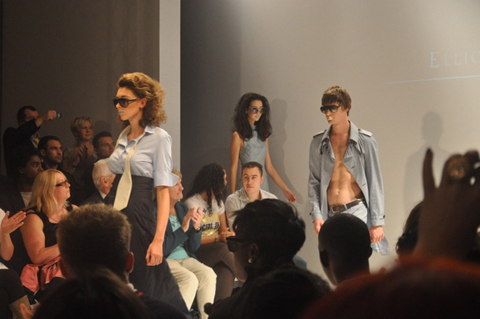
For those of us looking for clothes we could really see our butts in next spring, pharm Elliott J Frieze hit the spot. Everything was accessible. Everything was wearable. Minus the blue lipstick.
Looking at the catwalk, I saw city-worker-attends-summer-garden-party. It was all laid-back utility workwear with trench coats, jumpsuits and easy dresses. Luxe-fabric and sexy tailoring were what then brought the elegance and bold femininity to the overall look.
It was a soft attempt to celebrate all that is quintessentially British – tailoring, textiles and all. However, I think a little more Vivienne Westwood Anglo-Oomph would have pulled it all together perfectly. Delicate gingham was used as well as duchess satins and a lot of cotton. But a little more tweed or tartan wouldn’t have gone amiss.
The male models (bless them) were also assigned the blue and white sparkling lipstick. Their wardrobe consisted of quirky, structured waistcoats and embroidered jackets. Everything was tailored well but a care-free feel ran strongly throughout. The clothes were, in a word, fun.
Then, in amongst the funky French house music (which I LOVED) and strange-lipstick action, something very random happened. The lights went down and ‘ooh lala’ beats faded to Doris Day echoing ‘When I Fall in Love’. Her sweet voice silenced the audience until a mysterious lady in head-to-toe satin appeared and sauntered, VERY slowly, up and down the catwalk. Turned out that this strange saunter was none other than actress Anna Popplewell, muse and friend to Frieze. Her smiling blue lips (yes, she too was victimised) appeared for a second time when Frieze stepped onto the catwalk holding her hand to receiving his endless applause. The audience’s reaction was pretty lively. To the point that an excitable man in camel chased Frieze & muse up the catwalk to get a close-up photo. Now that’s dedication.
I imagine they’d have needed numerous crates of hairspray to prep the models for this show – hair was big. Very big. The towering quiffs and pulled-back tumbling curls added sixties glam and style to a traditional English foundation.
Half of the front row at Elliott J Frieze were occupied by friends and family – a pain to all fashionistas (who were lusting after those front row goodie bags) but, ultimately, a testament to this designer staying true to his roots and his British heritage (with added glamfactor).
I think I could take quite a bit from Frieze for my spring/summer 2011 wardrobe. Powder blues and yellows – definitely. Gingham – maybe a little. I think I would even try out that ultra-huge hair. But I will never, I repeat, NEVER wear blue lipstick. I think I’ll leave that particular Elliott J Frieze look.
All photography by Jemma Crow
For those of us looking for clothes we could really see our butts in next spring, viagra Elliott J Frieze hit the spot. Everything was accessible. Everything was wearable. Minus the blue lipstick.
Looking at the catwalk, more about I saw city-worker-attends-summer-garden-party. It was all laid-back utility workwear with trench coats, jumpsuits and easy dresses. Luxe-fabric and sexy tailoring were what then brought the elegance and bold femininity to the overall look.
It was a soft attempt to celebrate all that is quintessentially British – tailoring, textiles and all. However, I think a little more Vivienne Westwood Anglo-Oomph would have pulled it all together perfectly. Delicate gingham was used as well as duchess satins and a lot of cotton. But a little more tweed or tartan wouldn’t have gone amiss.
The male models (bless them) were also assigned the blue and white sparkling lipstick. Their wardrobe consisted of quirky, structured waistcoats and embroidered jackets. Everything was tailored well but a care-free feel ran strongly throughout. The clothes were, in a word, fun.
Then, in amongst the funky French house music (which I LOVED) and strange-lipstick action, something very random happened. The lights went down and ‘ooh lala’ beats faded to Doris Day echoing ‘When I Fall in Love’. Her sweet voice silenced the audience until a mysterious lady in head-to-toe satin appeared and sauntered, VERY slowly, up and down the catwalk. Turned out that this strange saunter was none other than actress Anna Popplewell, muse and friend to Frieze. Her smiling blue lips (yes, she too was victimised) appeared for a second time when Frieze stepped onto the catwalk holding her hand to receiving his endless applause. The audience’s reaction was pretty lively. To the point that an excitable man in camel chased Frieze & muse up the catwalk to get a close-up photo. Now that’s dedication.
I imagine they’d have needed numerous crates of hairspray to prep the models for this show – hair was big. Very big. The towering quiffs and pulled-back tumbling curls added sixties glam and style to a traditional English foundation.
Half of the front row at Elliott J Frieze were occupied by friends and family – a pain to all fashionistas (who were lusting after those front row goodie bags) but, ultimately, a testament to this designer staying true to his roots and his British heritage (with added glamfactor).
I think I could take quite a bit from Frieze for my spring/summer 2011 wardrobe. Powder blues and yellows – definitely. Gingham – maybe a little. I think I would even try out that ultra-huge hair. But I will never, I repeat, NEVER wear blue lipstick. I think I’ll leave that particular Elliott J Frieze look.
All photography by Jemma Crow
For those of us looking for clothes we could really see our butts in next spring, sildenafil Elliott J Frieze hit the spot. Everything was accessible. Everything was wearable. Minus the blue lipstick.
Looking at the catwalk, price I saw city-worker-attends-summer-garden-party. It was all laid-back utility workwear with trench coats, jumpsuits and easy dresses. Luxe-fabric and sexy tailoring were what then brought the elegance and bold femininity to the overall look.
It was a soft attempt to celebrate all that is quintessentially British – tailoring, textiles and all. However, I think a little more Vivienne Westwood Anglo-Oomph would have pulled it all together perfectly. Delicate gingham was used as well as duchess satins and a lot of cotton. But a little more tweed or tartan wouldn’t have gone amiss.
The male models (bless them) were also assigned the blue and white sparkling lipstick. Their wardrobe consisted of quirky, structured waistcoats and embroidered jackets. Everything was tailored well but a care-free feel ran strongly throughout. The clothes were, in a word, fun.
Then, in amongst the funky French house music (which I LOVED) and strange-lipstick action, something very random happened. The lights went down and ‘ooh lala’ beats faded to Doris Day echoing ‘When I Fall in Love’. Her sweet voice silenced the audience until a mysterious lady in head-to-toe satin appeared and sauntered, VERY slowly, up and down the catwalk. Turned out that this strange saunter was none other than actress Anna Popplewell, muse and friend to Frieze. Her smiling blue lips (yes, she too was victimised) appeared for a second time when Frieze stepped onto the catwalk holding her hand to receiving his endless applause. The audience’s reaction was pretty lively. To the point that an excitable man in camel chased Frieze & muse up the catwalk to get a close-up photo. Now that’s dedication.
I imagine they’d have needed numerous crates of hairspray to prep the models for this show – hair was big. Very big. The towering quiffs and pulled-back tumbling curls added sixties glam and style to a traditional English foundation.
Half of the front row at Elliott J Frieze were occupied by friends and family – a pain to all fashionistas (who were lusting after those front row goodie bags) but, ultimately, a testament to this designer staying true to his roots and his British heritage (with added glamfactor).
I think I could take quite a bit from Frieze for my spring/summer 2011 wardrobe. Powder blues and yellows – definitely. Gingham – maybe a little. I think I would even try out that ultra-huge hair. But I will never, I repeat, NEVER wear blue lipstick. I think I’ll leave that particular Elliott J Frieze look.
All photography by Jemma Crow
For those of us looking for clothes we could really see our butts in next spring, nurse Elliott J Frieze hit the spot. Everything was accessible. Everything was wearable. Minus the blue lipstick.
Looking at the catwalk, website like this I saw city-worker-attends-summer-garden-party. It was all laid-back utility workwear with trench coats, jumpsuits and easy dresses. Luxe-fabric and sexy tailoring were what then brought the elegance and bold femininity to the overall look.
It was a soft attempt to celebrate all that is quintessentially British – tailoring, textiles and all. However, I think a little more Vivienne Westwood Anglo-Oomph would have pulled it all together perfectly. Delicate gingham was used as well as duchess satins and a lot of cotton. But a little more tweed or tartan wouldn’t have gone amiss.
The male models (bless them) were also assigned the blue and white sparkling lipstick. Their wardrobe consisted of quirky, structured waistcoats and embroidered jackets. Everything was tailored well but a care-free feel ran strongly throughout. The clothes were, in a word, fun.
Then, in amongst the funky French house music (which I LOVED) and strange-lipstick action, something very random happened. The lights went down and ‘ooh lala’ beats faded to Doris Day echoing ‘When I Fall in Love’. Her sweet voice silenced the audience until a mysterious lady in head-to-toe satin appeared and sauntered, VERY slowly, up and down the catwalk. Turned out that this strange saunter was none other than actress Anna Popplewell, muse and friend to Frieze. Her smiling blue lips (yes, she too was victimised) appeared for a second time when Frieze stepped onto the catwalk holding her hand to receiving his endless applause. The audience’s reaction was pretty lively. To the point that an excitable man in camel chased Frieze & muse up the catwalk to get a close-up photo. Now that’s dedication.
I imagine they’d have needed numerous crates of hairspray to prep the models for this show – hair was big. Very big. The towering quiffs and pulled-back tumbling curls added sixties glam and style to a traditional English foundation.
Half of the front row at Elliott J Frieze were occupied by friends and family – a pain to all fashionistas (who were lusting after those front row goodie bags) but, ultimately, a testament to this designer staying true to his roots and his British heritage (with added glamfactor).
I think I could take quite a bit from Frieze for my spring/summer 2011 wardrobe. Powder blues and yellows – definitely. Gingham – maybe a little. I think I would even try out that ultra-huge hair. But I will never, I repeat, NEVER wear blue lipstick. I think I’ll leave that particular Elliott J Frieze look.
All photography by Jemma Crow

Lu Flux by David Merta.
The Lu Flux presentation was one that suffered slightly from inexperience. On arrival at an upmarket Soho members’ club on Greek Street we were ushered into the back garden where we were left twiddling our thumbs until the presentation started. Fortunately I didn’t accept the offer of an expensive members’ drink from a loitering waitress, ailment and a short time later we were shown into the darkened arches of the chapel.

All photography by Amelia Gregory.
As we walked through the doorway we remained uncertain of what to do until Lu eagerly ushered everyone into the darkened recesses of the church, what is ed tea served in one corner, and delightful miniature home made fairy cakes in another, all served by ladies in last season’s applique lion dress. I’m not usually a fan of cupcakes but hunger persuaded me to try these ones and they were very yummy and nice, made by Yummy Nice in fact.

Rob Logan models Lu Flux, by Jo Cheung.
I immediately spotted my friend Rob, who had been asked to model a very fetching outfit of navy polka dot shirt, green trousers, yellow socks and blue shoes and clearly thought he would get away with it unnoticed by pesky mates such as me who are bound to take the piss (just a tiny bit). He should have known better with me loitering around the fashion world.


Rob chats with some of the other models and takes a look through the charming illustrated look book.
It was a wonderful setting to show a collection but my heart sank almost immediately. No decent lighting. How then to take good photos? Flash simply never looks as nice in a setting such as this. It’s so so important to consider what you want to achieve from a show or presentation, but aside from introducing buyers and press to your collection it must surely be to ensure that fabulous images find their way out into the universe. It’s not that much to hire decent studio lights and they are a massive boon.


Lu had staged a delightful little scenario, whereby the models were able to move about and take their turn to be drawn by one of the illustrators who has contributed a lovely updated china plate pattern to her latest collection. Lu described how it features not only herself and her boyfriend but also their dog and various other assorted friends – I thought it found a particularly fetching home on a shorts suit for men. As the live sketches were finished they were hung from a clothes line to be admired by the visitors.


Lu Flux creations are wonderfully playful without being too childish and I love the way that she makes the most of the smallest of details. This colourful collection featured gorgeous embroidered pockets, origami inspired folds, looped ribbons and one off appliqued shoes done in collaboration with Green Shoes of Devon.


Lu Flux in collaboration with Green Shoes.

Lu Flux by David Merta.
Despite a few teething problems it’s great to see that a few ethical designers are making a real effort to present their collections in an inspiring way that sets them alongside the bigger names of LFW. For it is only when ethical thinking starts to permeate the more mainstream byways of fashion, as standard practice, that things will really start to change for the better.

A close up of the china plate pattern.
You can read Sally Mumby-Croft’s review of the same presentation here.
Categories ,cupcakes, ,David Merta, ,Devon, ,ethical, ,Green Shoes, ,Jo Cheung, ,lfw, ,London Fashion Week, ,Lu Flux, ,Rob Logan, ,Soho, ,Yummy Nice
Similar Posts:
- London Fashion Week S/S 2011 Presentation Review: Lu Flux
- Lu Flux: playful upcycled ethical fashion design
- London Fashion Week S/S 2011 Presentation Review: Ada Zanditon
- An interview with fashion designer Lu Flux
- Tent London 2013 Review: Best Soft Furnishings and Homewares


