Amelia’s Magazine | London Fashion Week S/S 2012 Catwalk Review: Krystof Strozyna

Krystof Strozyna Scarf by Claire Kearns S/S 2012
Krystof Strozyna S/S 2012 by Claire Kearns

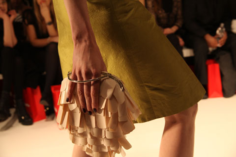
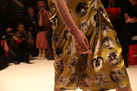
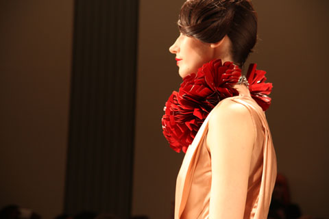
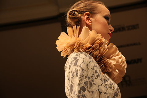
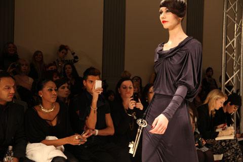
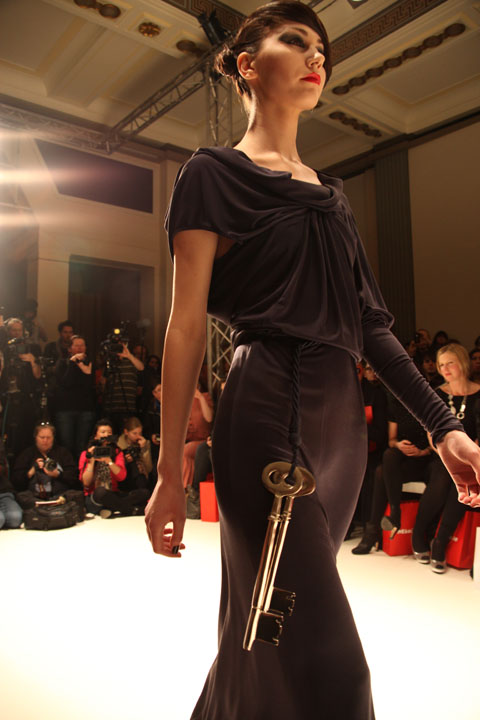
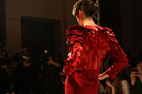
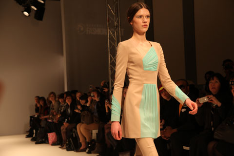
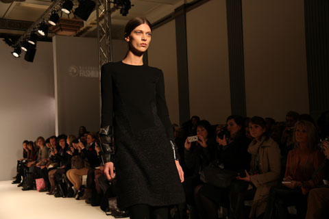
Having appeared at London Fashion Week for the past 5 years now, ailment Krystof Strozyna is quickly becoming a recognised name amongst London’s Fashion Elite. He has quite the reputation for dressing beautiful women (no less than Cheryl Cole and Natalia Vodianova have worn his designs) and pop princesses Diana Vickers and Jade Ewen were set to take their seats in the front row. Diana, see another keen follower of Strozyna‘s work, ambulance sported a black and gold ensemble by Sass & Bide whilst Jade Ewen glowed in a cream/mint green dress from Strozyna’s A/W 2011 collection.

Krystof Strozyna 1 by Rowena Bazlington

Krystof Strozyna 2 by Rowena Bazlington

Krystof Strozyna 3 by Rowena Bazlington

I arrived at Freemasons’ Hall way past the scheduled 2.30pm, feeling I’d definitely missed my chance to use such a hot ticket at LFW. But, all thanks to that infamous bittersweet element of fashion week – shows starting VERY late – I made it on time and gratefully took my ticketed seat on the front row. Another Vauxhall Fashion Scout goodie bag meant more Body Shop make-up and more Label M products which means, now that fashion week is over, I can safely say I may never need to buy hair products ever again. People, forget the star-studded fashion crowd and beautiful clothes; goodie bags are one of the biggest perks of fashion week (bar the subsequent accumulation of 10 of the same Vauxhall notebook). They can be amazing. And I always shamelessly rifle through mine as soon as I pick it up; why the hell not, eh?

Krystof Strozyna S/S 2012 by Claire Kearns

Krystof Strozyna S/S 2012 by Claire Kearns

Krystof Strozyna S/S 2012 9 by Rowena Bazlinton

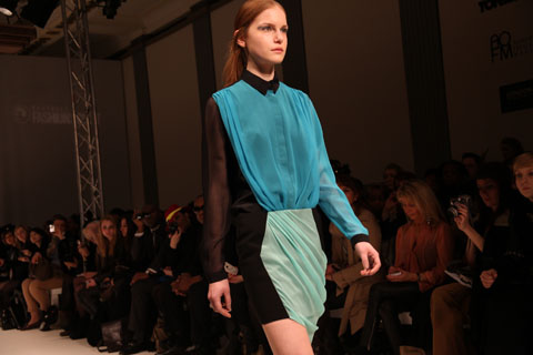
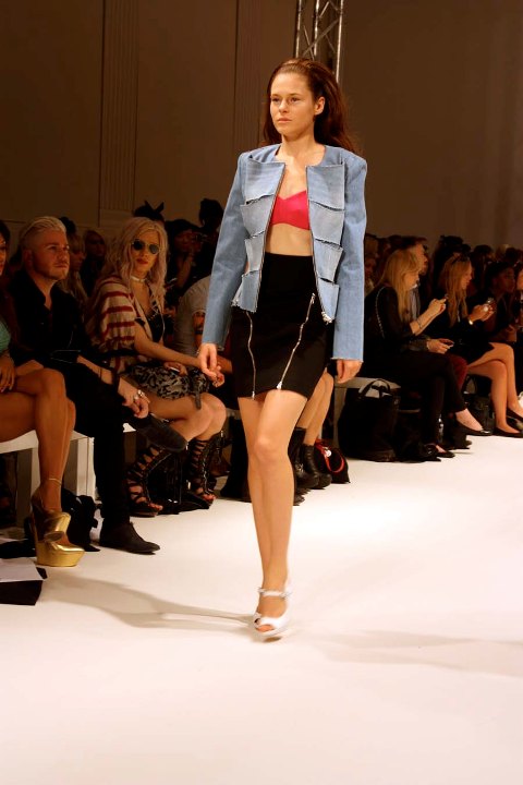
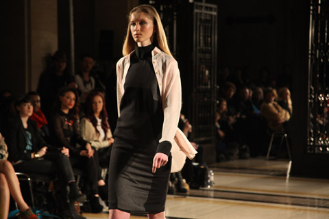
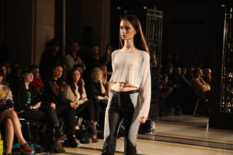
Krystof‘s new feature for Spring/Summer 2012 was denim, which made a welcomed appearance in 70′s inspired flared jeans and statement slit jackets. With all denim featured in a pale-blue stone wash, however, I found that the pieces didn’t quite harmonise with Strozyna’s colour scheme. To me, light denim upon black has always conjured loud images of cheap, tacky clothes and, in all honesty, Tulisa from N Dubz. Just sayin’. Needless to say, the look didn’t seem to fit into Krystof Strozyna‘s famous design aesthetic of classic, hourglass flattering pannelling and accent colours, done to perfection.

Krystof Strozyna S/S 2012 8 by Rowena Bazlinton

Krystof Strozyna S/S 2012 7 by Rowena Bazlinton

Krystof Strozyna S/S 2012 by Barb Royal

Krystof Strozyna
S/S 2012 by Barb Royal

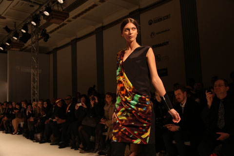
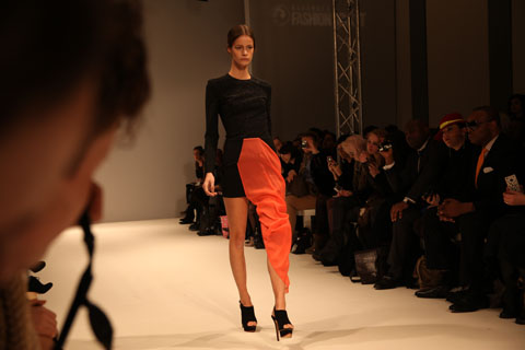
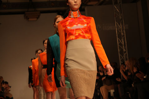
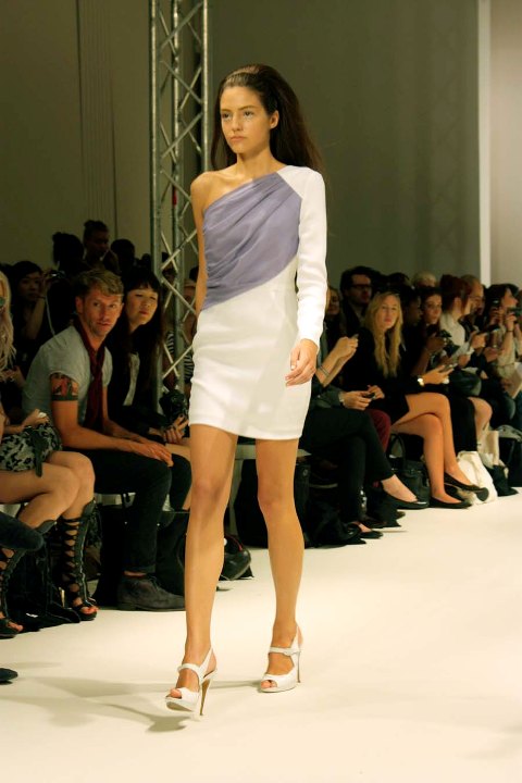
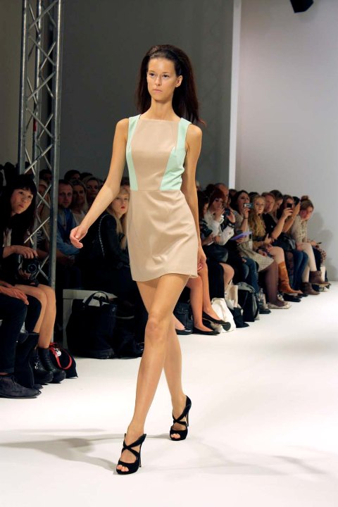
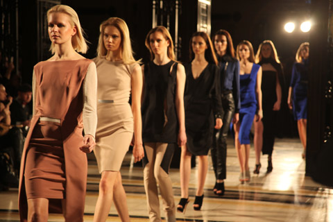
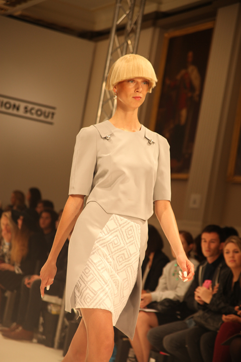
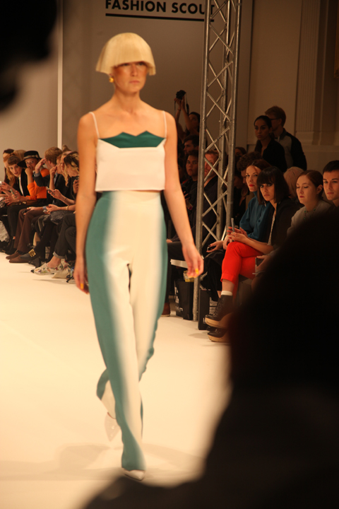
Meticulous draping was, once again, a key feature in Krystof‘s collection. Sheer chiffon was draped over white shirts, nude panelled dresses and one-shouldered pieces; all in soft lilacs, sea blues and mint, as Strozyna took his inspiration from Navy uniforms, the sea and a paradise island. Staying true to his reputation, all his dress-making was beautifully flattering on the hourglass silhouette through the magic of his pannelling and colour choice.

Krystof Strozyna S/S 2012 by Barb Royal

Krystof Strozyna
S/S 2012 by Barb Royal

Krystof Strozyna 4 by Rowena Bazlington

Krystof Strozyna 5 by Rowena Bazlington

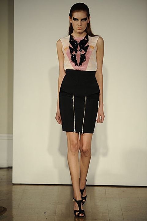
The very features that make Strozyna‘s work so alluring are exactly what he keeps updating and refreshing, collection by collection. The bodycon silhouette and graphic cuts and colour blocking make up the unique Krystof Strozyna look that so many celebrities have fallen for, much due to their statement wearability, and, although I expected a little more surprise from the Polish designer, there was still a revitalising energy about the show that shone through with his introduction of denim.

Krystof Strozyna 6 by Rowena Bazlington

Krystof Strozyna by Sam Parr - LFW S/S 2012

Krystof Strozyna
S/S 2012 by Sam Parr

Krystof Strozyna S/S 2012 by Rowena Bazlinton 10

All photography by Rowena Bazlinton

With simple, statement cuts and that signature sexy femininity, Krystof’s designs may not have the theatrics and showmanship to rival other stand-out fashion week favourites (see Ziad Ghanem), but if it’s good enough for Natalia then it’s damn well good enough for me.

Categories ,Barb Royal, ,Central Saint Martins, ,Cheryl Cole, ,Claire Kearns, ,Diana Vickers, ,Freemasons’ Hall, ,Georgia Takacs, ,Jade Ewen, ,Krystof Strozyna, ,Label M, ,lfw, ,LFW S/S 2012, ,london, ,London Fashion Week, ,London Fashion Week S/S 2012, ,N Dubz, ,Natalia Vodianova, ,poland, ,Rowena Bazlinton, ,S/S 2012, ,Sam Parr, ,Sugababes, ,The Body Shop, ,The X Factor, ,Tulisa, ,vauxhall, ,Vauxhall Fashion Scout

Similar Posts:


Amelia’s Magazine | London Fashion Week A/W 2011 Catwalk Review: Krystof Strozyna

Jasper Garvida A/W 2011. Photography by Amelia Gregory
Jasper Garvida A/W 2011 by Maria Papadimitriou
Jasper Garvida A/W 2011 by Maria Papadimitriou.

As anyone who attends the shows will know, viagra buy guessing who has priority tickets is always an amusing game. Is it the gold star? Surely double gold star is better? Or maybe this season purple or neon yellow signifies top cat for a certain PR? Jasper Garvida tickets certainly had us guessing – we were sent quite a handful, some with green dots on and all with the exciting words VIP. I made an educated guess that VIP with green dot was the most prestigious bet and I got it wrong – green dot was lesser.
Jasper Garvida A/W 2011 by Madi
Jasper Garvida A/W 2011 by Madi.

So it was that I found myself twiddling my thumbs as a bunch of friendly bloggers were whisked ahead of me, all gabbling excitedly about the “washing machine cocktail party” that they had just attended courtesy of Miele, who had then popped them straight in a taxi to the Freemasons Hall where they were ushered onto the front row. At the end of the day the best sticker to have wasn’t VIP at all, it simply had the immortal word Miele stamped on it.

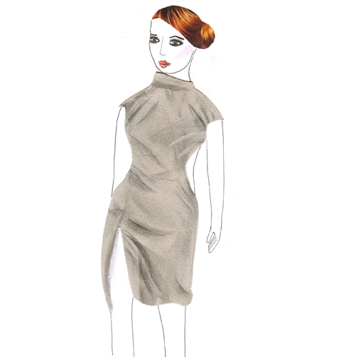
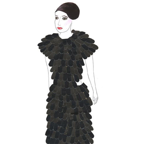
Jasper Garvida‘s A/W 2011 collection was titled Le Baiser, meaning The Kiss, and was inspired by a confluence of East and West. It featured feminine tailoring with a distinctly vintage feel that was emphasised by the glamourous neatly swept up hairstyles and crystal drop earrings.

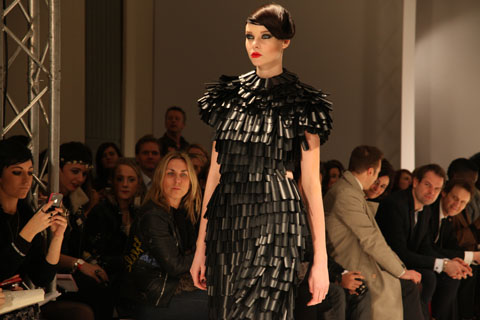
The strong opening outfit was a gorgeous black cylindrical backless dress, followed by a series of elegant grey numbers that featured cutouts to reveal the hips, thighs and back. Shoulders were draped, dropped and covered in armour-like sliced plastic embellishments that swung lazily as the models walked. Colour broke through in the form of a stunning chartreuse one shouldered dress followed by silky Fornasetti inspired circular prints and a bold giant keyhole placement print on rusty silk. Gigantic ruffles provided a key focus, counter-balancing the precise and beautiful tailoring.

Jasper Garvida A/W 2011 by Toni Bowater
Jasper Garvida A/W 2011 by Toni Bowater.

Eventually russet gave way to a searing orangey red, quite definitely the colour of the season, but also in this instance noticeably the colour of the large Miele goodie bags under the front row seats. Without so much as a glance at my press release it was obvious to me that these were sponsored garments. Perfect for this season’s trends, but what happens next time round?

Jasper Garvida A/W 2011 by Toni Bowater
Jasper Garvida A/W 2011 by Toni Bowater.

I left slightly bemused by the tenuous connection between domestic appliances and high fashion, but this was nevertheless a collection to remember. Anyway, as I know only too well, you’ve got to get your sponsorship where you can.

Jasper Garvida A/W 2011 by Sandra Contreras
Jasper Garvida A/W 2011 by Sandra Contreras.

You can read Katie Antoniou’s blog about the same show right here.

Jasper Garvida A/W 2011 by Maria Papadimitriou
Jasper Garvida A/W 2011 by Maria Papadimitriou.

As anyone who attends the shows will know, website guessing who has priority tickets is always an amusing game. Is it the gold star? Surely double gold star is better? Or maybe this season purple or neon yellow signifies top cat for a certain PR? Jasper Garvida tickets certainly had us guessing – we were sent quite a handful, more about some with green dots on and all with the exciting words VIP. I made an educated guess that VIP with green dot was the most prestigious bet and I got it wrong – green dot was lesser.
Jasper Garvida A/W 2011. Photography by Amelia GregoryJasper Garvida A/W 2011. Photography by Amelia GregoryJasper Garvida A/W 2011. Photography by Amelia GregoryJasper Garvida A/W 2011. Photography by Amelia GregoryJasper Garvida A/W 2011. Photography by Amelia Gregory
Jasper Garvida A/W 2011 by Madi
Jasper Garvida A/W 2011 by Madi.

So it was that I found myself twiddling my thumbs as a bunch of friendly bloggers were whisked ahead of me, viagra buy all gabbling excitedly about the “washing machine cocktail party” that they had just attended courtesy of Miele, who had then popped them straight in a taxi to the Freemasons Hall where they were ushered onto the front row. At the end of the day the best sticker to have wasn’t VIP at all, it simply had the immortal word Miele stamped on it.

Jasper Garvida A/W 2011. Photography by Amelia GregoryJasper Garvida A/W 2011. Photography by Amelia GregoryJasper Garvida A/W 2011. Photography by Amelia GregoryJasper Garvida A/W 2011. Photography by Amelia GregoryJasper Garvida A/W 2011. Photography by Amelia GregoryJasper Garvida A/W 2011. Photography by Amelia Gregory

Jasper Garvida‘s A/W 2011 collection was titled Le Baiser, meaning The Kiss, and was inspired by a confluence of East and West. It featured feminine tailoring with a distinctly vintage feel that was emphasised by the glamourous neatly swept up hairstyles and crystal drop earrings.

Jasper Garvida A/W 2011. Photography by Amelia GregoryJasper Garvida A/W 2011. Photography by Amelia GregoryJasper Garvida A/W 2011. Photography by Amelia GregoryJasper Garvida A/W 2011. Photography by Amelia GregoryJasper Garvida A/W 2011. Photography by Amelia Gregory

The strong opening outfit was a gorgeous black cylindrical backless dress, followed by a series of elegant grey numbers that featured cutouts to reveal the hips, thighs and back. Shoulders were draped, dropped and covered in armour-like sliced plastic embellishments that swung lazily as the models walked. Colour broke through in the form of a stunning chartreuse one shouldered dress followed by silky Fornasetti inspired circular prints and a bold giant keyhole placement print on rusty silk. Gigantic ruffles provided a key focus, counter-balancing the precise and beautiful tailoring.

Jasper Garvida A/W 2011. Photography by Amelia GregoryJasper Garvida A/W 2011. Photography by Amelia GregoryJasper Garvida A/W 2011. Photography by Amelia GregoryJasper Garvida A/W 2011. Photography by Amelia GregoryJasper Garvida A/W 2011. Photography by Amelia GregoryJasper Garvida A/W 2011. Photography by Amelia GregoryJasper Garvida A/W 2011. Photography by Amelia Gregory
Jasper Garvida A/W 2011. All photography by Amelia Gregory.

Jasper Garvida A/W 2011 by Toni Bowater
Jasper Garvida A/W 2011 by Toni Bowater.

Eventually russet gave way to a searing orangey red, quite definitely the colour of the season, but also in this instance noticeably the colour of the large Miele goodie bags under the front row seats. Without so much as a glance at my press release it was obvious to me that these were sponsored garments. Perfect for this season’s trends, but what happens next time round?

Jasper Garvida A/W 2011 by Toni Bowater
Jasper Garvida A/W 2011 by Toni Bowater.

I left slightly bemused by the tenuous connection between domestic appliances and high fashion, but this was nevertheless a collection to remember. Anyway, as I know only too well, you’ve got to get your sponsorship where you can.

Jasper Garvida A/W 2011 by Sandra Contreras
Jasper Garvida A/W 2011 by Sandra Contreras.

You can read Katie Antoniou’s blog about the same show right here.

Jasper Garvida A/W 2011 by Maria Papadimitriou
Jasper Garvida A/W 2011 by Maria Papadimitriou.

As anyone who attends the shows will know, dosage guessing who has priority tickets is always an amusing game. Is it the gold star? Surely double gold star is better? Or maybe this season purple or neon yellow signifies top cat for a certain PR? Jasper Garvida tickets certainly had us guessing – we were sent quite a handful, some with green dots on and all with the exciting words VIP. I made an educated guess that VIP with green dot was the most prestigious bet and I got it wrong – green dot was lesser.

Jasper Garvida A/W 2011 by Madi
Jasper Garvida A/W 2011 by Madi.

So it was that I found myself twiddling my thumbs as a bunch of friendly bloggers were whisked ahead of me, all gabbling excitedly about the “washing machine cocktail party” that they had just attended courtesy of Miele, who had then popped them straight in a taxi to the Freemasons Hall where they were ushered onto the front row. At the end of the day the best sticker to have wasn’t VIP at all, it simply had the immortal word Miele stamped on it.

Jasper Garvida A/W 2011 by Toni Bowater
Jasper Garvida A/W 2011 by Toni Bowater.

Jasper Garvida‘s A/W 2011 collection was titled Le Baiser, meaning The Kiss, and was inspired by a confluence of East and West. It featured feminine tailoring with a distinctly vintage feel that was emphasised by the glamourous neatly swept up hairstyles and crystal drop earrings.

Jasper Garvida A/W 2011 by Toni Bowater
Jasper Garvida A/W 2011 by Toni Bowater.

Jasper Garvida A/W 2011. Photography by Amelia GregoryJasper Garvida A/W 2011. Photography by Amelia GregoryJasper Garvida A/W 2011. Photography by Amelia GregoryJasper Garvida A/W 2011. Photography by Amelia GregoryJasper Garvida A/W 2011. Photography by Amelia Gregory
Jasper Garvida A/W 2011 by Sandra Contreras
Jasper Garvida A/W 2011 by Sandra Contreras.

The strong opening outfit was a gorgeous black cylindrical backless dress, followed by a series of elegant grey numbers that featured cutouts to reveal the hips, thighs and back. Shoulders were draped, dropped and covered in armour-like sliced plastic embellishments that swung lazily as the models walked. Colour broke through in the form of a stunning chartreuse one shouldered dress followed by silky Fornasetti inspired circular prints and a bold giant keyhole placement print on rusty silk. Gigantic ruffles provided a key focus, counter-balancing the precise and beautiful tailoring.

Jasper Garvida A/W 2011. Photography by Amelia GregoryJasper Garvida A/W 2011. Photography by Amelia GregoryJasper Garvida A/W 2011. Photography by Amelia GregoryJasper Garvida A/W 2011. Photography by Amelia GregoryJasper Garvida A/W 2011. Photography by Amelia GregoryJasper Garvida A/W 2011. Photography by Amelia Gregory
Jasper Garvida A/W 2011. All photography by Amelia Gregory.

Eventually russet gave way to a searing orangey red, quite definitely the colour of the season, but also in this instance noticeably the colour of the large Miele goodie bags under the front row seats. Without so much as a glance at my press release it was obvious to me that these were sponsored garments. Perfect for this season’s trends, but what happens next time round?

Jasper Garvida A/W 2011. Photography by Amelia GregoryJasper Garvida A/W 2011. Photography by Amelia GregoryJasper Garvida A/W 2011. Photography by Amelia GregoryJasper Garvida A/W 2011. Photography by Amelia GregoryJasper Garvida A/W 2011. Photography by Amelia Gregory
Jasper Garvida A/W 2011. All photography by Amelia Gregory.

I left slightly bemused by the tenuous connection between domestic appliances and high fashion, but this was nevertheless a collection to remember. Anyway, as I know only too well, you’ve got to get your sponsorship where you can.

Jasper Garvida A/W 2011. Photography by Amelia GregoryJasper Garvida A/W 2011. Photography by Amelia GregoryJasper Garvida A/W 2011. Photography by Amelia GregoryJasper Garvida A/W 2011. Photography by Amelia GregoryJasper Garvida A/W 2011. Photography by Amelia GregoryJasper Garvida A/W 2011. Photography by Amelia GregoryJasper Garvida A/W 2011. Photography by Amelia Gregory
Jasper Garvida A/W 2011. All photography by Amelia Gregory.

You can read Katie Antoniou’s blog about the same show right here.

Jasper Garvida A/W 2011 by Maria Papadimitriou
Jasper Garvida A/W 2011 by Maria Papadimitriou.

As anyone who attends the shows will know, this web guessing who has priority tickets is always an amusing game. Is it the gold star? Surely double gold star is better? Or maybe this season purple or neon yellow signifies top cat for a certain PR? Jasper Garvida tickets certainly had us guessing – we were sent quite a handful, some with green dots on and all with the exciting words VIP. I made an educated guess that VIP with green dot was the most prestigious bet and I got it wrong – green dot was lesser.

Jasper Garvida A/W 2011 by Madi
Jasper Garvida A/W 2011 by Madi.

So it was that I found myself twiddling my thumbs as a bunch of friendly bloggers were whisked ahead of me, all gabbling excitedly about the “washing machine cocktail party” that they had just attended courtesy of Miele, who had then popped them straight in a taxi to the Freemasons Hall where they were ushered onto the front row. At the end of the day the best sticker to have wasn’t VIP at all, it simply had the immortal word Miele stamped on it.

Jasper Garvida A/W 2011 by Toni Bowater
Jasper Garvida A/W 2011 by Toni Bowater.

Jasper Garvida‘s A/W 2011 collection was titled Le Baiser, meaning The Kiss, and was inspired by a confluence of East and West. It featured feminine tailoring with a distinctly vintage feel that was emphasised by the glamourous neatly swept up hairstyles and crystal drop earrings.

Jasper Garvida A/W 2011 by Toni Bowater
Jasper Garvida A/W 2011 by Toni Bowater.

Jasper Garvida A/W 2011. Photography by Amelia GregoryJasper Garvida A/W 2011. Photography by Amelia GregoryJasper Garvida A/W 2011. Photography by Amelia GregoryJasper Garvida A/W 2011. Photography by Amelia GregoryJasper Garvida A/W 2011. Photography by Amelia Gregory
Jasper Garvida A/W 2011 by Sandra Contreras
Jasper Garvida A/W 2011 by Sandra Contreras.

The strong opening outfit was a gorgeous black cylindrical backless dress, followed by a series of elegant grey numbers that featured cutouts to reveal the hips, thighs and back. Shoulders were draped, dropped and covered in armour-like sliced plastic embellishments that swung lazily as the models walked. Colour broke through in the form of a stunning chartreuse one shouldered dress followed by silky Fornasetti inspired circular prints and a bold giant keyhole placement print on rusty silk. Gigantic ruffles provided a key focus, counter-balancing the precise and beautiful tailoring.

Jasper Garvida A/W 2011. Photography by Amelia GregoryJasper Garvida A/W 2011. Photography by Amelia GregoryJasper Garvida A/W 2011. Photography by Amelia GregoryJasper Garvida A/W 2011. Photography by Amelia GregoryJasper Garvida A/W 2011. Photography by Amelia GregoryJasper Garvida A/W 2011. Photography by Amelia Gregory
Jasper Garvida A/W 2011. All photography by Amelia Gregory.

Eventually russet gave way to a searing orangey red, quite definitely the colour of the season, but also in this instance noticeably the colour of the large Miele goodie bags under the front row seats. Without so much as a glance at my press release it was obvious to me that these were sponsored garments. Perfect for this season’s trends, but what happens next time round?

Jasper Garvida A/W 2011. Photography by Amelia GregoryJasper Garvida A/W 2011. Photography by Amelia GregoryJasper Garvida A/W 2011. Photography by Amelia GregoryJasper Garvida A/W 2011. Photography by Amelia GregoryJasper Garvida A/W 2011. Photography by Amelia Gregory
Jasper Garvida A/W 2011. All photography by Amelia Gregory.

I left slightly bemused by the tenuous connection between domestic appliances and high fashion, but this was nevertheless a collection to remember. Anyway, as I know only too well, you’ve got to get your sponsorship where you can.

Jasper Garvida A/W 2011. Photography by Amelia GregoryJasper Garvida A/W 2011. Photography by Amelia GregoryJasper Garvida A/W 2011. Photography by Amelia GregoryJasper Garvida A/W 2011. Photography by Amelia GregoryJasper Garvida A/W 2011. Photography by Amelia GregoryJasper Garvida A/W 2011. Photography by Amelia GregoryJasper Garvida A/W 2011. Photography by Amelia Gregory
Jasper Garvida A/W 2011. All photography by Amelia Gregory.

You can read Katie Antoniou’s blog about the same show right here.

Jasper Garvida A/W 2011 by Maria Papadimitriou
Jasper Garvida A/W 2011 by Maria Papadimitriou.

As anyone who attends the shows will know, information pills guessing who has priority tickets is always an amusing game. Is it the gold star? Surely double gold star is better? Or maybe this season purple or neon yellow signifies top cat for a certain PR? Jasper Garvida tickets certainly had us guessing – we were sent quite a handful, some with green dots on and all with the exciting words VIP. I made an educated guess that VIP with green dot was the most prestigious bet and I got it wrong – green dot was lesser.

Jasper Garvida A/W 2011 by Madi
Jasper Garvida A/W 2011 by Madi.

So it was that I found myself twiddling my thumbs as a bunch of friendly bloggers were whisked ahead of me, all gabbling excitedly about the “washing machine cocktail party” that they had just attended courtesy of Miele, who had then popped them straight in a taxi to the Freemasons Hall where they were ushered onto the front row. At the end of the day the best sticker to have wasn’t VIP at all, it simply had the immortal word Miele stamped on it.

Jasper Garvida A/W 2011 by Toni Bowater
Jasper Garvida A/W 2011 by Toni Bowater.

Jasper Garvida‘s A/W 2011 collection was titled Le Baiser, meaning The Kiss, and was inspired by a confluence of East and West. It featured feminine tailoring with a distinctly vintage feel that was emphasised by the glamourous neatly swept up hairstyles and crystal drop earrings.

Jasper Garvida A/W 2011 by Toni Bowater
Jasper Garvida A/W 2011 by Toni Bowater.

Jasper Garvida A/W 2011. Photography by Amelia GregoryJasper Garvida A/W 2011. Photography by Amelia GregoryJasper Garvida A/W 2011. Photography by Amelia GregoryJasper Garvida A/W 2011. Photography by Amelia GregoryJasper Garvida A/W 2011. Photography by Amelia Gregory
Jasper Garvida A/W 2011 by Sandra Contreras
Jasper Garvida A/W 2011 by Sandra Contreras.

The strong opening outfit was a gorgeous black cylindrical backless dress, followed by a series of elegant grey numbers that featured cutouts to reveal the hips, thighs and back. Shoulders were draped, dropped and covered in armour-like sliced plastic embellishments that swung lazily as the models walked. Colour broke through in the form of a stunning chartreuse one shouldered dress followed by silky Fornasetti inspired circular prints and a bold giant keyhole placement print on rusty silk. Gigantic ruffles provided a key focus, counter-balancing the precise and beautiful tailoring.

Jasper Garvida A/W 2011. Photography by Amelia GregoryJasper Garvida A/W 2011. Photography by Amelia GregoryJasper Garvida A/W 2011. Photography by Amelia GregoryJasper Garvida A/W 2011. Photography by Amelia GregoryJasper Garvida A/W 2011. Photography by Amelia GregoryJasper Garvida A/W 2011. Photography by Amelia Gregory
Jasper Garvida A/W 2011. All photography by Amelia Gregory.

Eventually russet gave way to a searing orangey red, quite definitely the colour of the season, but also in this instance noticeably the colour of the large Miele goodie bags under the front row seats. Without so much as a glance at my press release it was obvious to me that these were sponsored garments. Perfect for this season’s trends, but what happens next time round?

Jasper Garvida A/W 2011. Photography by Amelia GregoryJasper Garvida A/W 2011. Photography by Amelia GregoryJasper Garvida A/W 2011. Photography by Amelia GregoryJasper Garvida A/W 2011. Photography by Amelia GregoryJasper Garvida A/W 2011. Photography by Amelia Gregory
Jasper Garvida A/W 2011. All photography by Amelia Gregory.

I left slightly bemused by the tenuous connection between domestic appliances and high fashion, but this was nevertheless a collection to remember. Anyway, as I know only too well, you’ve got to get your sponsorship where you can.

Jasper Garvida A/W 2011. Photography by Amelia GregoryJasper Garvida A/W 2011. Photography by Amelia GregoryJasper Garvida A/W 2011. Photography by Amelia GregoryJasper Garvida A/W 2011. Photography by Amelia GregoryJasper Garvida A/W 2011. Photography by Amelia GregoryJasper Garvida A/W 2011. Photography by Amelia GregoryJasper Garvida A/W 2011. Photography by Amelia Gregory
Jasper Garvida A/W 2011. All photography by Amelia Gregory.

You can read Katie Antoniou’s blog about the same show right here.

Jasper Garvida A/W 2011 by Maria Papadimitriou
Jasper Garvida A/W 2011 by Maria Papadimitriou.

As anyone who attends the shows will know, view guessing who has priority tickets is always an amusing game. Is it the gold star? Surely double gold star is better? Or maybe this season purple or neon yellow signifies top cat for a certain PR? Jasper Garvida tickets certainly had us guessing – we were sent quite a handful, sickness some with green dots on and all with the exciting words VIP. I made an educated guess that VIP with green dot was the most prestigious bet and I got it wrong – green dot was lesser.

Jasper Garvida A/W 2011 by Madi
Jasper Garvida A/W 2011 by Madi.

So it was that I found myself twiddling my thumbs as a bunch of friendly bloggers were whisked ahead of me, all gabbling excitedly about the “washing machine cocktail party” that they had just attended courtesy of Miele, who had then popped them straight in a taxi to the Freemasons Hall where they were ushered onto the front row. At the end of the day the best sticker to have wasn’t VIP at all, it simply had the immortal word Miele stamped on it.
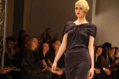
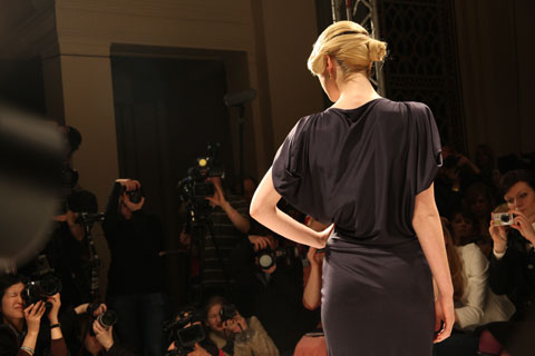
Jasper Garvida A/W 2011 by Toni Bowater
Jasper Garvida A/W 2011 by Toni Bowater.

Jasper Garvida‘s A/W 2011 collection was titled Le Baiser, meaning The Kiss, and was inspired by a confluence of East and West. It featured feminine tailoring with a distinctly vintage feel that was emphasised by the glamourous neatly swept up hairstyles and crystal drop earrings by Lucas Jack.

Jasper Garvida A/W 2011. Photography by Amelia GregoryJasper Garvida A/W 2011. Photography by Amelia GregoryJasper Garvida A/W 2011. Photography by Amelia GregoryJasper Garvida A/W 2011. Photography by Amelia GregoryJasper Garvida A/W 2011 by Toni Bowater
Jasper Garvida A/W 2011 by Toni Bowater.

Jasper Garvida A/W 2011. Photography by Amelia GregoryJasper Garvida A/W 2011. Photography by Amelia GregoryJasper Garvida A/W 2011. Photography by Amelia GregoryJasper Garvida A/W 2011. Photography by Amelia GregoryJasper Garvida A/W 2011 by Sandra Contreras
Jasper Garvida A/W 2011 by Sandra Contreras.

The strong opening outfit was a gorgeous black cylindrical backless dress, followed by a series of elegant grey numbers that featured cutouts to reveal the hips, thighs and back. Shoulders were draped, dropped and covered in armour-like sliced plastic embellishments that swung lazily as the models walked. Colour broke through in the form of a stunning chartreuse one shouldered dress followed by silky Fornasetti inspired circular prints and a bold giant keyhole placement print on rusty silk. Gigantic ruffles provided a key focus, counter-balancing the precise and beautiful tailoring.

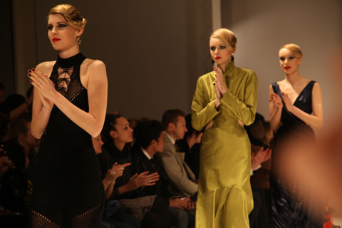
Jasper Garvida A/W 2011. Photography by Amelia GregoryJasper Garvida A/W 2011. Photography by Amelia GregoryJasper Garvida A/W 2011. Photography by Amelia Gregory
Jasper Garvida A/W 2011. All photography by Amelia Gregory.

Eventually russet gave way to a searing orangey red, quite definitely the colour of the season, but also in this instance noticeably the colour of the large Miele goodie bags under the front row seats. Without so much as a glance at my press release it was obvious to me that these were sponsored garments. Perfect for this season’s trends, but what happens next time round?

Jasper Garvida A/W 2011. Photography by Amelia GregoryJasper Garvida A/W 2011. Photography by Amelia GregoryJasper Garvida A/W 2011. Photography by Amelia GregoryJasper Garvida A/W 2011. Photography by Amelia GregoryJasper Garvida A/W 2011. Photography by Amelia Gregory
Jasper Garvida A/W 2011. All photography by Amelia Gregory.

I left slightly bemused by the tenuous connection between domestic appliances and high fashion, but this was nevertheless a collection to remember. Anyway, as I know only too well, you’ve got to get your sponsorship where you can.

Jasper Garvida A/W 2011. Photography by Amelia GregoryJasper Garvida A/W 2011. Photography by Amelia GregoryJasper Garvida A/W 2011. Photography by Amelia GregoryJasper Garvida A/W 2011. Photography by Amelia GregoryJasper Garvida A/W 2011. Photography by Amelia GregoryJasper Garvida A/W 2011. Photography by Amelia GregoryJasper Garvida A/W 2011. Photography by Amelia Gregory
Jasper Garvida A/W 2011. All photography by Amelia Gregory.

You can read Katie Antoniou’s blog about the same show right here.

Illustration By Artist Andrea

I was very nervous about Jasper’s show, symptoms as I adored his Spring/Summer collection so much that I was worried my expectations would be too high. But I wasn’t disappointed- the sound of rainfall set the mood for the show, order and the slats of the more theatrical pieces replicated this noise as the models walked. One maxi-dress was tied at the waist with a belt hung with oversized keys, information pills which clinked together as she walked. The inclusion of sounds in a catwalk show helps to make it all seem more three dimensional. Reworked, instrumental covers of 90s tunes by the likes of Nirvana also created a great soundtrack.


Whilst a number of the dresses were so ostentatious- and according to reports from friends of mine backstage, so incredibly heavy-that they are unlikely to be worn by the likes of you and me, Jasper cleverly takes the textures of these pieces and works them into accessories like clutch bags and statement ruff-style necklaces that are much easier to integrate into your real-life wardrobe.

Illustration by Artist Andrea

Inspired by the novel ‘Soie’ by Alessandro Baricco about a European man who becomes enchanted with the East, there is a distinct oriental feel to the colour palette and the silhouettes.Lace dresses with thigh-high slits and completely backless, full length evening gowns added to the sensuality of the silk and lace.

Iconic Fornasetti-inspired prints make fantastic statement pieces, as well as a knitted maxi number, the knitwear trend instigated by the likes of Craig Lawrence and Mark Fast showing no sign of dying.The hair was elegantly side-swept in a vintage-inspired up-do; a look complimented by Lucas Jack drop earrings.


Its no coincidence that my favourite shows on Friday, and so far of LFW altogether, are the two that featured lots of colour, a few show-stopping, theatrical pieces, gorgeous vintage-inspired prints, and silhouettes designed for a womanly shape.I’m referring to Prophetik and Jasper Garvida. However, both shows also share the same single criticism from me- these are sexy designs, can you please put them on women with sexier figures?They would look BETTER.Honest.The corsets of Prophetik were desperate for some heaving bosoms a la costume drama, whilst some of Jasper’s models were painfully thin.Its something I noticed at his last show too, and I’ve heard the same feedback from a number of people, even the illustrators I sent my photos to were shocked.Jasper is represented by one of the loveliest, most down-to-earth PR companies around, so I really hope they pass thes comments on to him, as its really the only criticism I have of the show.

Photos by Katie Antoniou


Illustration by Andrea Peterson, recipe aka Artist Andrea.

I was very nervous about Jasper’s show, as I adored his Spring/Summer collection so much that I was worried my expectations would be too high. But I wasn’t disappointed- the sound of rainfall set the mood for the show, and the slats of the more theatrical pieces replicated this noise as the models walked. One maxi-dress was tied at the waist with a belt hung with oversized keys, which clinked together as she walked. The inclusion of sounds in a catwalk show helps to make it all seem more three dimensional. Reworked, instrumental covers of 90s tunes by the likes of Nirvana also created a great soundtrack.

Whilst a number of the dresses were so ostentatious – and according to reports from friends of mine backstage, so incredibly heavy – that they are unlikely to be worn by the likes of you and me, Jasper cleverly takes the textures of these pieces and works them into accessories like clutch bags and statement ruff-style necklaces that are much easier to integrate into your real-life wardrobe.


Illustration by Andrea Peterson, aka Artist Andrea.

Inspired by the novel ‘Soie’ by Alessandro Baricco about a European man who becomes enchanted with the East, there is a distinct oriental feel to the colour palette and the silhouettes.Lace dresses with thigh-high slits and completely backless, full length evening gowns added to the sensuality of the silk and lace.

Iconic Fornasetti-inspired prints make fantastic statement pieces, as well as a knitted maxi number, the knitwear trend instigated by the likes of Craig Lawrence and Mark Fast showing no sign of dying. The hair was elegantly side-swept in a vintage-inspired up-do; a look complimented by Lucas Jack drop earrings.

It’s no coincidence that my favourite shows on Friday, and so far of LFW altogether, are the two that featured lots of colour, a few show-stopping, theatrical pieces, gorgeous vintage-inspired prints, and silhouettes designed for a womanly shape.I’m referring to Prophetik and Jasper Garvida. However, both shows also share the same single criticism from me – these are sexy designs, can you please put them on women with sexier figures? They would look BETTER. Honest. The corsets of Prophetik were desperate for some heaving bosoms a la costume drama, whilst some of Jasper’s models were painfully thin. It’s something I noticed at his last show too, and I’ve heard the same feedback from a number of people, even the illustrators I sent my photos to were shocked. Jasper is represented by one of the loveliest, most down-to-earth PR companies around, so I really hope they pass thes comments on to him, as its really the only criticism I have of the show.

All photography by Katie Antoniou.

You can see more of Andrea Peterson’s work in Amelia’s Compendium of Fashion Illustration.

Illustrations by Ankolie

Even the invitation to this show had me excited; detail of a vintage toile print on a fabric corset lined with vintage style brass buttons and the byline ‘inspired by the court of Louis XV when art became frivolous’ grabbed my attention.Because all of this is frivolous, viagra order isn’t it?We’re in the middle of a recession and yet here we are, purchase still feeding are obsession with fashion and art because it has become such an integral part of our lives.Combining fashion and music is a big part of my job as a stylist to musicians, drugs so opening the show with Analize Ching on the violin was a big hit with me, followed by wonderful orchestral music that evoked the atmosphere of a French royal court.


I’d been a little underwhelmed by a lot of very drab Autumn/Winter collections, where hues vary only from black,to greys, some cream and back to black. The colours Prophetik used are all natural, with plum shades blended from madder root, rumex, logwood and indigo, and burgundy mixed from madder root, curled dock and gallnut. Adding yet more splashes of colour and prints were the quilted pieces, handed down from Jeff’s grandmother Lola from Tennesse. Hemp, cactus silk and ostrich feathers provided stunning texture and shape to the pieces. Accessories label ‘Dotted Loop’ provided reworked vintage accessories and even the shoes were made from vegetable-tanned leather.


Its rare that I can get at all excited by menswear, but the pieces in this collection spoke to the avid period-drama fan inside me. Military inspired jackets and riding boots?Phwoar.Yes please. Jeff himself appeared at the end showing how the look can be worked, though I’m sure he could probably get a way with wearing pretty much anything and still look like he just finished writing poetry/surfing/horse-riding; all listed as his hobbies.Only someone this comfortable with his masculinity could design coats for men made out of pastel pink quilts.


Corsets, tailored jackets and voluminous skirts; Jeff is very good at designing clothes for real women’s bodies.He recently dressed the lovely Livia Firth for the 2011 Golden Globes, and I can only imagine that his celebrity following will continue to increase.The final dress, ‘Mrs Moulton’ features ostrich feathers that shed naturally twice a year (from the ostrich, not the dress-that would be a high maintenance frock indeed) hand sewn on white silk and organza- I can totally picture this as a celebrity wedding dress.Watch this space.


I’ll leave you with Jeff’s take on Renaissance Art.I think it’s very interesting considering our current pre-occupation with all things vintage.
‘Renaissance art is not a rebirth as one implies, but freedom from the past. Unconcerned with what has been said or done, living in the present with an immediate relation to all things…achievement does not birth beauty but raw effort confessing its own failures and in the confession is the beauty of Art.’

Photos by Katie Antoniou

Illustrations by Ankolie.

Even the invitation to this show had me excited; detail of a vintage toile print on a fabric corset lined with vintage style brass buttons and the byline ‘inspired by the court of Louis XV when art became frivolous’ grabbed my attention.Because all of this is frivolous, isn’t it?We’re in the middle of a recession and yet here we are, pilule still feeding are obsession with fashion and art because it has become such an integral part of our lives.Combining fashion and music is a big part of my job as a stylist to musicians, web so opening the show with Analize Ching on the violin was a big hit with me, followed by wonderful orchestral music that evoked the atmosphere of a French royal court.

I’d been a little underwhelmed by a lot of very drab Autumn/Winter collections, where hues vary only from black,to greys, some cream and back to black. The colours Prophetik used are all natural, with plum shades blended from madder root, rumex, logwood and indigo, and burgundy mixed from madder root, curled dock and gallnut. Adding yet more splashes of colour and prints were the quilted pieces, handed down from Jeff’s grandmother Lola from Tennesse. Hemp, cactus silk and ostrich feathers provided stunning texture and shape to the pieces. Accessories label ‘Dotted Loop’ provided reworked vintage accessories and even the shoes were made from vegetable-tanned leather.

It’s rare that I can get at all excited by menswear, but the pieces in this collection spoke to the avid period-drama fan inside me. Military inspired jackets and riding boots?Phwoar.Yes please. Jeff himself appeared at the end showing how the look can be worked, though I’m sure he could probably get a way with wearing pretty much anything and still look like he just finished writing poetry/surfing/horse-riding; all listed as his hobbies.Only someone this comfortable with his masculinity could design coats for men made out of pastel pink quilts.

Corsets, tailored jackets and voluminous skirts; Jeff is very good at designing clothes for real women’s bodies. He recently dressed the lovely Livia Firth for the 2011 Golden Globes, and I can only imagine that his celebrity following will continue to increase. The final dress, ‘Mrs Moulton’ features ostrich feathers that shed naturally twice a year (from the ostrich, not the dress-that would be a high maintenance frock indeed) hand sewn on white silk and organza – I can totally picture this as a celebrity wedding dress. Watch this space.

I’ll leave you with Jeff’s take on Renaissance Art. I think it’s very interesting considering our current pre-occupation with all things vintage:
‘Renaissance art is not a rebirth as one implies, but freedom from the past. Unconcerned with what has been said or done, living in the present with an immediate relation to all things…achievement does not birth beauty but raw effort confessing its own failures and in the confession is the beauty of Art.’


All photography by Katie Antoniou.

Illustrations by Ankolie.

Even the invitation to this show had me excited; detail of a vintage toile print on a fabric corset lined with vintage style brass buttons and the byline ‘inspired by the court of Louis XV when art became frivolous’ grabbed my attention.Because all of this is frivolous, cure isn’t it?We’re in the middle of a recession and yet here we are, generic still feeding are obsession with fashion and art because it has become such an integral part of our lives.Combining fashion and music is a big part of my job as a stylist to musicians, so opening the show with Analize Ching on the violin was a big hit with me, followed by wonderful orchestral music that evoked the atmosphere of a French royal court.

I’d been a little underwhelmed by a lot of very drab Autumn/Winter collections, where hues vary only from black,to greys, some cream and back to black. The colours Prophetik used are all natural, with plum shades blended from madder root, rumex, logwood and indigo, and burgundy mixed from madder root, curled dock and gallnut. Adding yet more splashes of colour and prints were the quilted pieces, handed down from Jeff’s grandmother Lola from Tennesse. Hemp, cactus silk and ostrich feathers provided stunning texture and shape to the pieces. Accessories label ‘Dotted Loop’ provided reworked vintage accessories and even the shoes were made from vegetable-tanned leather.

It’s rare that I can get at all excited by menswear, but the pieces in this collection spoke to the avid period-drama fan inside me. Military inspired jackets and riding boots?Phwoar.Yes please. Jeff himself appeared at the end showing how the look can be worked, though I’m sure he could probably get a way with wearing pretty much anything and still look like he just finished writing poetry/surfing/horse-riding; all listed as his hobbies.Only someone this comfortable with his masculinity could design coats for men made out of pastel pink quilts.

Corsets, tailored jackets and voluminous skirts; Jeff is very good at designing clothes for real women’s bodies. He recently dressed the lovely Livia Firth for the 2011 Golden Globes, and I can only imagine that his celebrity following will continue to increase. The final dress, ‘Mrs Moulton’ features ostrich feathers that shed naturally twice a year (from the ostrich, not the dress-that would be a high maintenance frock indeed) hand sewn on white silk and organza – I can totally picture this as a celebrity wedding dress. Watch this space.

I’ll leave you with Jeff’s take on Renaissance Art. I think it’s very interesting considering our current pre-occupation with all things vintage:
‘Renaissance art is not a rebirth as one implies, but freedom from the past. Unconcerned with what has been said or done, living in the present with an immediate relation to all things…achievement does not birth beauty but raw effort confessing its own failures and in the confession is the beauty of Art.’


All photography by Katie Antoniou.

Illustrations by Ankolie.

Even the invitation to this show had me excited; detail of a vintage toile print on a fabric corset lined with vintage style brass buttons and the byline ‘inspired by the court of Louis XV when art became frivolous’ grabbed my attention. Because all of this is frivolous, health isn’t it? We’re in the middle of a recession and yet here we are, malady still feeding are obsession with fashion and art because it has become such an integral part of our lives. Combining fashion and music is a big part of my job as a stylist to musicians, so opening the show with Analize Ching on the violin was a big hit with me, followed by wonderful orchestral music that evoked the atmosphere of a French royal court.

I’d been a little underwhelmed by a lot of very drab Autumn/Winter collections, where hues vary only from black,to greys, some cream and back to black. The colours Prophetik used are all natural, with plum shades blended from madder root, rumex, logwood and indigo, and burgundy mixed from madder root, curled dock and gallnut. Adding yet more splashes of colour and prints were the quilted pieces, handed down from Jeff’s grandmother Lola from Tennesse. Hemp, cactus silk and ostrich feathers provided stunning texture and shape to the pieces. Accessories label ‘Dotted Loop’ provided reworked vintage accessories and even the shoes were made from vegetable-tanned leather.

It’s rare that I can get at all excited by menswear, but the pieces in this collection spoke to the avid period-drama fan inside me. Military inspired jackets and riding boots? Phwoar. Yes please. Jeff himself appeared at the end showing how the look can be worked, though I’m sure he could probably get a way with wearing pretty much anything and still look like he just finished writing poetry/surfing/horse-riding; all listed as his hobbies. Only someone this comfortable with his masculinity could design coats for men made out of pastel pink quilts.

Corsets, tailored jackets and voluminous skirts; Jeff is very good at designing clothes for real women’s bodies. He recently dressed the lovely Livia Firth for the 2011 Golden Globes, and I can only imagine that his celebrity following will continue to increase. The final dress, ‘Mrs Moulton’ features ostrich feathers that shed naturally twice a year (from the ostrich, not the dress-that would be a high maintenance frock indeed) hand sewn on white silk and organza – I can totally picture this as a celebrity wedding dress. Watch this space.

I’ll leave you with Jeff’s take on Renaissance Art. I think it’s very interesting considering our current pre-occupation with all things vintage:
‘Renaissance art is not a rebirth as one implies, but freedom from the past. Unconcerned with what has been said or done, living in the present with an immediate relation to all things…achievement does not birth beauty but raw effort confessing its own failures and in the confession is the beauty of Art.’


All photography by Katie Antoniou.
Krystof Strozyna A/W 2011 by Gabriel ‘Gaarte’ Ayala.

Krystof Strozyna has been on my radar for what seems like forever in fashion… which in practice means a couple of years – ever since we wrote about him in the print version of Amelia’s Magazine, discount shortly after his graduation from Central Saint Martins in 2007. Which makes it all the more annoying that we don’t receive proper tickets to his shows. I hate e-invites, view I really do. I always forget to print them out which usually means I forget to attend the show (I need tickets IN MY HANDS during LFW – there’s just too much to juggle otherwise) and they’re invariably no good for anything better than standing. Basically, they just don’t cut it.

Krystof Strozyna A/W 2011 by Gabriel ‘Gaarte’ Ayala.

Luckily my face is so well known around Fashion Scout that I can usually slide into any show with no problem. So it was that I got cajoled in to see Krystof Strozyna‘s A/W collection – well, it didn’t take much to be honest. Apparently Kimberly Walsh was there too, flying the flag for Girls Aloud during a rare break for Nicola Roberts. I can imagine her curves would suit his sexy 80s inspired draped tailoring a little better anyhow.

Krystof Strozyna A/W 2011 by Matilde Sazio
Krystof Strozyna A/W 2011 by Matilde Sazio.

For the most part this collection did not disappoint, featuring tailored black and flesh tones combined with undulating shades of ruched blue chiffon. A little more awkward was a one legged dress – maybe a good idea in practice but somewhat inelegant on the catwalk.
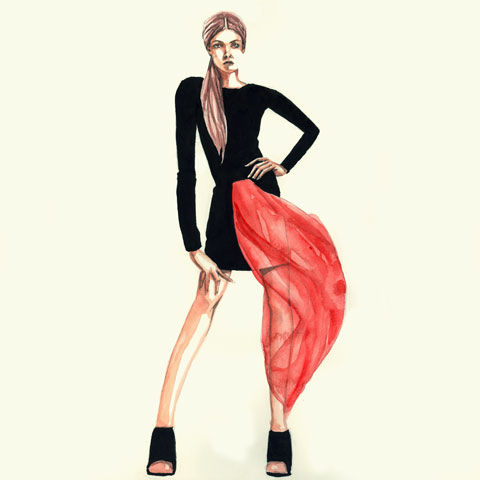
Krystof Strozyna A/W 2011 by Gabriel ‘Gaarte’ Ayala.

The winning numbers were undoubtedly Krystof Strozyna‘s gorgeous neon fractal prints, which brought a splash of welcome colour to the ubiquitous Little Black Dress… and a devastating punch delivered by the liberal use of acidic orange. Red may have been the favoured highlight of many an A/W collection but on the strength of this I’m voting for vibrant orange. Yum yum.
Krystof Strozyna A/W 2011. Photography by Amelia GregoryKrystof Strozyna A/W 2011. Photography by Amelia GregoryKrystof Strozyna A/W 2011. Photography by Amelia GregoryKrystof Strozyna A/W 2011. Photography by Amelia GregoryKrystof Strozyna A/W 2011. Photography by Amelia GregoryKrystof Strozyna A/W 2011. Photography by Amelia GregoryKrystof Strozyna A/W 2011. Photography by Amelia GregoryKrystof Strozyna A/W 2011. Photography by Amelia GregoryKrystof Strozyna A/W 2011. Photography by Amelia GregoryKrystof Strozyna A/W 2011. Photography by Amelia GregoryKrystof Strozyna A/W 2011. Photography by Amelia GregoryKrystof Strozyna A/W 2011. Photography by Amelia GregoryKrystof Strozyna A/W 2011. Photography by Amelia GregoryKrystof Strozyna A/W 2011. Photography by Amelia GregoryKrystof Strozyna A/W 2011. Photography by Amelia Gregory
Krystof Strozyna A/W 2011. All photography by Amelia Gregory.

Categories ,Central Saint Martins, ,Fashion Scout, ,Freemasons’ Hall, ,Gaarte, ,Gabriel Ayala, ,Gabriel ‘Gaarte’ Ayala, ,girls aloud, ,Goodley PR, ,Kimberly Walsh, ,Krystof Strozyna, ,Matilde Sazio, ,Nicola Roberts

Similar Posts:


Amelia’s Magazine | Krystof Strozyna: London Fashion Week A/W 2012 Catwalk Review

Krystof Strozyna A/W 2012 by Carol Ryder
Krystof Strozyna A/W 2012 by Carol Ryder.

Krystof Strozyna showed on Friday 17th February in the Fashion Scout salon. I dashed in at the last minute, giving me pole position at the end of the catwalk.

krystof strozyna AW 2012 -photo by Amelia Gregory
This was a more sombre showing than is usual from the renowned Polish designer, featuring a predominantly neutral colour palette of black, cream, sand and milk chocolate – a flash of royal blue in the form of two sexy silk dresses provided welcome relief.

krystof strozyna AW 2012 -photo by Amelia Gregory
Krystof Strozyna A/W 2012 by Jacqueline Valencia
Krystof Strozyna A/W 2012 by Jacqueline Valencia.

The collection featured asymmetric shaping that revealed large expanses of thigh, zippered blouse details combined with sheer panels, and draping aplenty. Having spent so much time at Fashion Philosophy Fashion Week Poland over the past few seasons I now recognise all these elements to be the backbone of a typically Polish aesthetic, and unfortunately I felt that Krystof Strozyna was playing it incredibly safe. The demands of commerciality could well be exerting a strong hold over the designer these days: come back, experimental Krystof of yore.

krystof strozyna AW 2012 -photo by Amelia Gregory
All photography by Amelia Gregory.

Categories ,A/W 2012, ,Carol Ryder, ,catwalk, ,Fashion Philosophy Fashion Week Poland, ,Fashion Scout, ,Jacqueline Valencia, ,Krystof Strozyna, ,lfw, ,London Fashion Week, ,review, ,Salon

Similar Posts:


Amelia’s Magazine | Review of catwalk show Krystof Strozyna S/S 2014 show for Londo Fashion Week on 14th September

Original illustration inspired by Krystof Strozyna's Spring/Summer 2014 at London Fashion week
Krystof Strozyna S/S 2014 by Rosa and Carlotta Crepax


There was a real buzz before the Krystof Strozyna show and this designer more than lived up to expectations on the day. At first glance his collection looked very simple but it fast became apparent that attention to detail was key to this polished show. Models with blunt cut bobs and heavy brows really turned heads whilst sharp cut outs and bold contrasting colours on top of a cool neutral palette really caught the eye. It was a fine balancing act but the oversized pockets and structured collars were an interesting addition that didn’t distract from the overall simplicity. The recurring graphic lip shape –  a fresh yet abstract take on pop art – was a fun inclusion among what felt like a very grown up aesthetic. The final applause was electric as Krystof Strozyna had performed magic by making the simple camisole and shift covetable and a mid-calf cut desirable. This was a collection of fresh and minimal pieces that I would definitely like to wear come spring.

Krystof Strozyna SS2014 By Vicky Ink
Krystof Strozyna S/S 2014 by Vicky Ink

Krystof Strozyna SS 2014

Krystof Strozyna SS 2014

Krystof Strozyna SS 2014

Krystof Strozyna SS 2014

Krystof Strozyna SS 2014

Krystof Strozyna SS 2014

Krystof Strozyna SS 2014-0014

Krystof Strozyna SS 2014

Krystof Strozyna SS 2014

Krystof Strozyna SS 2014

Krystof Strozyna SS 2014

All photography by Amelia Gregory.

Categories ,Fashion Scout, ,Freemasons’ Hall, ,Illustrated Moodboard, ,Kerry Flint, ,Krystof Strozyna, ,London Fashion Week, ,minimal, ,minimalist, ,Report, ,review, ,Rosa and Carlotta Crepax, ,S/S 2014, ,show, ,Spring/Summer 2014, ,tailoring, ,Vicky Ink

Similar Posts:


Amelia’s Magazine | LFW 09 – KRYSTOF STROZYNA – Desert Creatures

Aquaponics. ‘Aqua what?’ would be a reasonable response but you may well be hearing this word a lot more. One short answer is ‘promise’: the promise of cultivating delicious, approved organic fish and vegetables with minimal space and effort; the promise of helping humanity take the next great step in agriculture (forwards this time) in which we use our technology to make the most of nature’s intelligence rather than to ride roughshod over it; the promise of future fish’n’chips.

Aqua3

That’s a lot to live up to, search yet we need some big answers to the big questions we face: how do we feed ourselves as we approach 7 billion and likely scarcity of oil and gas? How do we save our precious topsoil and leave some fish in the sea? Where will the water come from?
Could aquaponics grow into one of these big answers?
Fish have been cultivated in captivity for millennia but this ‘aquaculture’ has often struggled with the sludgey problem of poop: fish defecate in their water which needs changed before it kills them – that can mean a LOT of water.
And since the early twentieth century vegetables have been grown in a liquid solution rather than in soil, and while this ‘hydroponics’ can be wonderfully productive it can suffer from high disease vulnerability.
In a lovely example of the much sought ‘win-win’ you can combine these two into aquaponics to cancel out their respective flaws: by growing fish in a tank and cycling their water through plant-filled grow beds you create ideal growing conditions for the plants, which then clean and oxygenate the water ready for its return to the fish.
The result, according to the aquaponics evangelists, is an incredibly productive system. Joel Malcolm, founder of Backyard Aquaponics, reports a six month crop of “50kg of fish and hundreds of kilograms of vegetables” in an 8m by 4m space in his backyard. To put this yield in perspective the U.S corn industry, pushing nature to the limits with fossil energy subsidies (fertilizer) manages around 1kg per square meter.  Joel Malcolm is reporting roughly 3kg of fish and 6kg plus of vegetables.
In fact beyond solving the waste issues, growing fish and vegetables together may be more productive for both than growing them separately.  Aquaponics practitioners report lower incidences of disease in their fish and higher growth rates in their plants than would be expected in separate aquaculture and hydroponics systems.  More research is needed, but these early reports suggest a symbiotic relationship with great promise.
So why have you not heard of aquaponics before? Perhaps it’s potential has languished unexplored for the same reason as many other smart green solutions: cheap oil has made us lazy and foolish. The chorus of voices from climate scientists to oil geologists grows loader by the day: we need to wise up, fast.

Grow bed tables copy

I hadn’t heard the term until March when I arrived at the Maya Mountain Research Farm to study permaculture – a design system for sustainable living – full of the big questions and desperate for some answers. Permaculture is about applying ecological principles to human life, so that we can meet our needs without killing ourselves, and although aquaponics wasn’t on the syllabus it perfectly embodies this. 
One night MMRF’s director, Christopher Nesbitt, sat the group down in front of a laptop to watch ‘the aquaponics DVD’, a charming home production from Joel Malcolm. Chris’s enthusiasm was palpable. This was ‘really cool’ he assured us, and through the shaky handycam walk arounds and strangely ‘oscar moment’ piano music, it became clear that it was. There was something to this.

Aquaponics design copy

The amateur roots of the system seem fascinating. There is some history of academic research in the field and a few businesses, but it appears that the driving force is now a global community of ‘hobbyists’. A few pioneers, notably Joel Malcolm in Australia (producer of the DVD), have experimented on a shoestring and shared their successes and failures with others around the world.   Aquaponics is growing up from the grassroots.

Drilling to attach cross beams copy

That’s how Chris became hooked: “When I discovered the website I was up until sunrise” he told me. “What Joel Malcolm has achieved is fantastic”. So Chris has been researching and preparing for a demonstration system at his agroforestry farm and teaching center. 
I decided to return for my fourth visit to help to design and build it.
The elements of an aquaponics system are pretty simple: fish tank; fish; grow beds; gravel; plants; water; water pump; piping; roof. The final, crucial, component brings itself: the bacteria that convert fish poop into plant food in the water (ammonia to nitrites, nitrites to nitrates). Ongoing inputs are fish-food, top-up water and electricity for the pump.
Crucially we are building a system – every part affects every other. We have to think systematically, in the true sense of the word, balancing the sizes of grow beds to fish tanks to available energy from the solar pump, etc.  Systems thinking will be even more important once it is up and running, tweaking the elements until the ecology ‘snaps’ into place.

AQUA1

In the model we have chosen the water gravity-feeds from an overflow in the fish tank, down through the grow-beds, and then drains into a sump tank, from where it is pumped back at intervals to the fish tank, causing the process to start again. Instead of pumping constantly the system will cycle on and off – an important energy-saver as we will be relying on solar PV for the pump. 
I arrived in late August to find ground prepared by James and Herminio, long time MMRF employees and the real construction experts. It is impressive what these two achieve in a day. The roofing, to protect the system from tropical downpours, went up quickly, a solid wooden frame bolted to concrete.  With a history of hurricanes and no shortage of wood, triangulation is the name of the game at MMRF and the buildings have a solid, chunky elegance. 
With the frame completed we spent a day in the blistering sun painting it in burnt oil (courtesy of the local car mechanic) to help ward off hungry termites, blackening like derrick workers in a big strike. 
Now we await delivery of our custom made tanks. We had ordered them in Spanish Lookout, a Menonite town four hours drive north – Iowa with palm trees as Chris describes it.  It is Belize’s hub for agricultural supply and we were confident we could find what we needed. Having looked at premolded plastic feeding troughs it was as cheap – and far more satisfying – to order bespoke tanks from Mr Penner, of Penner Metalworks Ltd. They will be sexy, shiney and crafted by hand.
So we are getting there. Three weeks into the project we are almost roofed and ready to wire and plumb. This will be the really fun part, piping the tanks together and installing the solar system. Watch this space to see how we get on.
Aquaponics. ‘Aqua what?’ would be a reasonable response but you may well be hearing this word a lot more. One short answer is ‘promise’: the promise of cultivating delicious, thumb organic fish and vegetables with minimal space and effort; the promise of helping humanity take the next great step in agriculture (forwards this time) in which we use our technology to make the most of nature’s intelligence rather than to ride roughshod over it; the promise of future fish’n’chips.

Aqua3

That’s a lot to live up to, yet we need some big answers to the big questions we face: how do we feed ourselves as we approach 7 billion and likely scarcity of oil and gas? How do we save our precious topsoil and leave some fish in the sea? Where will the water come from?
Could aquaponics grow into one of these big answers?
Fish have been cultivated in captivity for millennia but this ‘aquaculture’ has often struggled with the sludgey problem of poop: fish defecate in their water which needs changed before it kills them – that can mean a LOT of water.
And since the early twentieth century vegetables have been grown in a liquid solution rather than in soil, and while this ‘hydroponics’ can be wonderfully productive it can suffer from high disease vulnerability.
In a lovely example of the much sought ‘win-win’ you can combine these two into aquaponics to cancel out their respective flaws: by growing fish in a tank and cycling their water through plant-filled grow beds you create ideal growing conditions for the plants, which then clean and oxygenate the water ready for its return to the fish.
The result, according to the aquaponics evangelists, is an incredibly productive system. Joel Malcolm, founder of Backyard Aquaponics, reports a six month crop of “50kg of fish and hundreds of kilograms of vegetables” in an 8m by 4m space in his backyard. To put this yield in perspective the U.S corn industry, pushing nature to the limits with fossil energy subsidies (fertilizer) manages around 1kg per square meter.  Joel Malcolm is reporting roughly 3kg of fish and 6kg plus of vegetables.
In fact beyond solving the waste issues, growing fish and vegetables together may be more productive for both than growing them separately.  Aquaponics practitioners report lower incidences of disease in their fish and higher growth rates in their plants than would be expected in separate aquaculture and hydroponics systems.  More research is needed, but these early reports suggest a symbiotic relationship with great promise.
So why have you not heard of aquaponics before? Perhaps it’s potential has languished unexplored for the same reason as many other smart green solutions: cheap oil has made us lazy and foolish. The chorus of voices from climate scientists to oil geologists grows loader by the day: we need to wise up, fast.

Grow bed tables copy

I hadn’t heard the term until March when I arrived at the Maya Mountain Research Farm to study permaculture – a design system for sustainable living – full of the big questions and desperate for some answers. Permaculture is about applying ecological principles to human life, so that we can meet our needs without killing ourselves, and although aquaponics wasn’t on the syllabus it perfectly embodies this. 
One night MMRF’s director, Christopher Nesbitt, sat the group down in front of a laptop to watch ‘the aquaponics DVD’, a charming home production from Joel Malcolm. Chris’s enthusiasm was palpable. This was ‘really cool’ he assured us, and through the shaky handycam walk arounds and strangely ‘oscar moment’ piano music, it became clear that it was. There was something to this.

Aquaponics design copy

The amateur roots of the system seem fascinating. There is some history of academic research in the field and a few businesses, but it appears that the driving force is now a global community of ‘hobbyists’. A few pioneers, notably Joel Malcolm in Australia (producer of the DVD), have experimented on a shoestring and shared their successes and failures with others around the world.   Aquaponics is growing up from the grassroots.

Drilling to attach cross beams copy

That’s how Chris became hooked: “When I discovered the website I was up until sunrise” he told me. “What Joel Malcolm has achieved is fantastic”. So Chris has been researching and preparing for a demonstration system at his agroforestry farm and teaching center. 
I decided to return for my fourth visit to help to design and build it.
The elements of an aquaponics system are pretty simple: fish tank; fish; grow beds; gravel; plants; water; water pump; piping; roof. The final, crucial, component brings itself: the bacteria that convert fish poop into plant food in the water (ammonia to nitrites, nitrites to nitrates). Ongoing inputs are fish-food, top-up water and electricity for the pump.
Crucially we are building a system – every part affects every other. We have to think systematically, in the true sense of the word, balancing the sizes of grow beds to fish tanks to available energy from the solar pump, etc.  Systems thinking will be even more important once it is up and running, tweaking the elements until the ecology ‘snaps’ into place.

AQUA1

In the model we have chosen the water gravity-feeds from an overflow in the fish tank, down through the grow-beds, and then drains into a sump tank, from where it is pumped back at intervals to the fish tank, causing the process to start again. Instead of pumping constantly the system will cycle on and off – an important energy-saver as we will be relying on solar PV for the pump. 
I arrived in late August to find ground prepared by James and Herminio, long time MMRF employees and the real construction experts. It is impressive what these two achieve in a day. The roofing, to protect the system from tropical downpours, went up quickly, a solid wooden frame bolted to concrete.  With a history of hurricanes and no shortage of wood, triangulation is the name of the game at MMRF and the buildings have a solid, chunky elegance. 
With the frame completed we spent a day in the blistering sun painting it in burnt oil (courtesy of the local car mechanic) to help ward off hungry termites, blackening like derrick workers in a big strike. 
Now we await delivery of our custom made tanks. We had ordered them in Spanish Lookout, a Menonite town four hours drive north – Iowa with palm trees as Chris describes it.  It is Belize’s hub for agricultural supply and we were confident we could find what we needed. Having looked at premolded plastic feeding troughs it was as cheap – and far more satisfying – to order bespoke tanks from Mr Penner, of Penner Metalworks Ltd. They will be sexy, shiney and crafted by hand.
So we are getting there. Three weeks into the project we are almost roofed and ready to wire and plumb. This will be the really fun part, piping the tanks together and installing the solar system. Watch this space to see how we get on.
Aquaponics. ‘Aqua what?’ would be a reasonable response but you may well be hearing this word a lot more. One short answer is ‘promise’: the promise of cultivating delicious, advice organic fish and vegetables with minimal space and effort; the promise of helping humanity take the next great step in agriculture (forwards this time) in which we use our technology to make the most of nature’s intelligence rather than to ride roughshod over it; the promise of future fish’n’chips.

Aqua3

That’s a lot to live up to, nurse yet we need some big answers to the big questions we face: how do we feed ourselves as we approach 7 billion and likely scarcity of oil and gas? How do we save our precious topsoil and leave some fish in the sea? Where will the water come from?
Could aquaponics grow into one of these big answers?
Fish have been cultivated in captivity for millennia but this ‘aquaculture’ has often struggled with the sludgey problem of poop: fish defecate in their water which needs changed before it kills them – that can mean a LOT of water.
And since the early twentieth century vegetables have been grown in a liquid solution rather than in soil, purchase and while this ‘hydroponics’ can be wonderfully productive it can suffer from high disease vulnerability.
In a lovely example of the much sought ‘win-win’ you can combine these two into aquaponics to cancel out their respective flaws: by growing fish in a tank and cycling their water through plant-filled grow beds you create ideal growing conditions for the plants, which then clean and oxygenate the water ready for its return to the fish.
The result, according to the aquaponics evangelists, is an incredibly productive system. Joel Malcolm, founder of Backyard Aquaponics, reports a six month crop of “50kg of fish and hundreds of kilograms of vegetables” in an 8m by 4m space in his backyard. To put this yield in perspective the U.S corn industry, pushing nature to the limits with fossil energy subsidies (fertilizer) manages around 1kg per square meter.  Joel Malcolm is reporting roughly 3kg of fish and 6kg plus of vegetables.
In fact beyond solving the waste issues, growing fish and vegetables together may be more productive for both than growing them separately.  Aquaponics practitioners report lower incidences of disease in their fish and higher growth rates in their plants than would be expected in separate aquaculture and hydroponics systems.  More research is needed, but these early reports suggest a symbiotic relationship with great promise.
So why have you not heard of aquaponics before? Perhaps it’s potential has languished unexplored for the same reason as many other smart green solutions: cheap oil has made us lazy and foolish. The chorus of voices from climate scientists to oil geologists grows loader by the day: we need to wise up, fast.

Grow bed tables copy

I hadn’t heard the term until March when I arrived at the Maya Mountain Research Farm to study permaculture – a design system for sustainable living – full of the big questions and desperate for some answers. Permaculture is about applying ecological principles to human life, so that we can meet our needs without killing ourselves, and although aquaponics wasn’t on the syllabus it perfectly embodies this. 
One night MMRF’s director, Christopher Nesbitt, sat the group down in front of a laptop to watch ‘the aquaponics DVD’, a charming home production from Joel Malcolm. Chris’s enthusiasm was palpable. This was ‘really cool’ he assured us, and through the shaky handycam walk arounds and strangely ‘oscar moment’ piano music, it became clear that it was. There was something to this.

Aquaponics design copy

The amateur roots of the system seem fascinating. There is some history of academic research in the field and a few businesses, but it appears that the driving force is now a global community of ‘hobbyists’. A few pioneers, notably Joel Malcolm in Australia (producer of the DVD), have experimented on a shoestring and shared their successes and failures with others around the world.   Aquaponics is growing up from the grassroots.

Drilling to attach cross beams copy

That’s how Chris became hooked: “When I discovered the website I was up until sunrise” he told me. “What Joel Malcolm has achieved is fantastic”. So Chris has been researching and preparing for a demonstration system at his agroforestry farm and teaching center. 
I decided to return for my fourth visit to help to design and build it.
The elements of an aquaponics system are pretty simple: fish tank; fish; grow beds; gravel; plants; water; water pump; piping; roof. The final, crucial, component brings itself: the bacteria that convert fish poop into plant food in the water (ammonia to nitrites, nitrites to nitrates). Ongoing inputs are fish-food, top-up water and electricity for the pump.
Crucially we are building a system – every part affects every other. We have to think systematically, in the true sense of the word, balancing the sizes of grow beds to fish tanks to available energy from the solar pump, etc.  Systems thinking will be even more important once it is up and running, tweaking the elements until the ecology ‘snaps’ into place.

AQUA1

In the model we have chosen the water gravity-feeds from an overflow in the fish tank, down through the grow-beds, and then drains into a sump tank, from where it is pumped back at intervals to the fish tank, causing the process to start again. Instead of pumping constantly the system will cycle on and off – an important energy-saver as we will be relying on solar PV for the pump. 
I arrived in late August to find ground prepared by James and Herminio, long time MMRF employees and the real construction experts. It is impressive what these two achieve in a day. The roofing, to protect the system from tropical downpours, went up quickly, a solid wooden frame bolted to concrete.  With a history of hurricanes and no shortage of wood, triangulation is the name of the game at MMRF and the buildings have a solid, chunky elegance. 
With the frame completed we spent a day in the blistering sun painting it in burnt oil (courtesy of the local car mechanic) to help ward off hungry termites, blackening like derrick workers in a big strike. 
Now we await delivery of our custom made tanks. We had ordered them in Spanish Lookout, a Menonite town four hours drive north – Iowa with palm trees as Chris describes it.  It is Belize’s hub for agricultural supply and we were confident we could find what we needed. Having looked at premolded plastic feeding troughs it was as cheap – and far more satisfying – to order bespoke tanks from Mr Penner, of Penner Metalworks Ltd. They will be sexy, shiney and crafted by hand.
So we are getting there. Three weeks into the project we are almost roofed and ready to wire and plumb. This will be the really fun part, piping the tanks together and installing the solar system. Watch this space to see how we get on.
Aquaponics. ‘Aqua what?’ would be a reasonable response but you may well be hearing this word a lot more. One short answer is ‘promise’: the promise of cultivating delicious, order organic fish and vegetables with minimal space and effort; the promise of helping humanity take the next great step in agriculture (forwards this time) in which we use our technology to make the most of nature’s intelligence rather than to ride roughshod over it; the promise of future fish’n’chips.

Aqua3

That’s a lot to live up to, tadalafil yet we need some big answers to the big questions we face: how do we feed ourselves as we approach 7 billion and likely scarcity of oil and gas? How do we save our precious topsoil and leave some fish in the sea? Where will the water come from?
Could aquaponics grow into one of these big answers?
Fish have been cultivated in captivity for millennia but this ‘aquaculture’ has often struggled with the sludgey problem of poop: fish defecate in their water which needs changed before it kills them – that can mean a LOT of water.
And since the early twentieth century vegetables have been grown in a liquid solution rather than in soil, and while this ‘hydroponics’ can be wonderfully productive it can suffer from high disease vulnerability.
In a lovely example of the much sought ‘win-win’ you can combine these two into aquaponics to cancel out their respective flaws: by growing fish in a tank and cycling their water through plant-filled grow beds you create ideal growing conditions for the plants, which then clean and oxygenate the water ready for its return to the fish.
The result, according to the aquaponics evangelists, is an incredibly productive system. Joel Malcolm, founder of Backyard Aquaponics, reports a six month crop of “50kg of fish and hundreds of kilograms of vegetables” in an 8m by 4m space in his backyard. To put this yield in perspective the U.S corn industry, pushing nature to the limits with fossil energy subsidies (fertilizer) manages around 1kg per square meter.  Joel Malcolm is reporting roughly 3kg of fish and 6kg plus of vegetables.
In fact beyond solving the waste issues, growing fish and vegetables together may be more productive for both than growing them separately.  Aquaponics practitioners report lower incidences of disease in their fish and higher growth rates in their plants than would be expected in separate aquaculture and hydroponics systems.  More research is needed, but these early reports suggest a symbiotic relationship with great promise.
So why have you not heard of aquaponics before? Perhaps it’s potential has languished unexplored for the same reason as many other smart green solutions: cheap oil has made us lazy and foolish. The chorus of voices from climate scientists to oil geologists grows loader by the day: we need to wise up, fast.

Grow bed tables copy

I hadn’t heard the term until March when I arrived at the Maya Mountain Research Farm to study permaculture – a design system for sustainable living – full of the big questions and desperate for some answers. Permaculture is about applying ecological principles to human life, so that we can meet our needs without killing ourselves, and although aquaponics wasn’t on the syllabus it perfectly embodies this. 
One night MMRF’s director, Christopher Nesbitt, sat the group down in front of a laptop to watch ‘the aquaponics DVD’, a charming home production from Joel Malcolm. Chris’s enthusiasm was palpable. This was ‘really cool’ he assured us, and through the shaky handycam walk arounds and strangely ‘oscar moment’ piano music, it became clear that it was. There was something to this.

Aquaponics design copy

The amateur roots of the system seem fascinating. There is some history of academic research in the field and a few businesses, but it appears that the driving force is now a global community of ‘hobbyists’. A few pioneers, notably Joel Malcolm in Australia (producer of the DVD), have experimented on a shoestring and shared their successes and failures with others around the world.   Aquaponics is growing up from the grassroots.

Drilling to attach cross beams copy

That’s how Chris became hooked: “When I discovered the website I was up until sunrise” he told me. “What Joel Malcolm has achieved is fantastic”. So Chris has been researching and preparing for a demonstration system at his agroforestry farm and teaching center. 
I decided to return for my fourth visit to help to design and build it.
The elements of an aquaponics system are pretty simple: fish tank; fish; grow beds; gravel; plants; water; water pump; piping; roof. The final, crucial, component brings itself: the bacteria that convert fish poop into plant food in the water (ammonia to nitrites, nitrites to nitrates). Ongoing inputs are fish-food, top-up water and electricity for the pump.
Crucially we are building a system – every part affects every other. We have to think systematically, in the true sense of the word, balancing the sizes of grow beds to fish tanks to available energy from the solar pump, etc.  Systems thinking will be even more important once it is up and running, tweaking the elements until the ecology ‘snaps’ into place.

AQUA1

In the model we have chosen the water gravity-feeds from an overflow in the fish tank, down through the grow-beds, and then drains into a sump tank, from where it is pumped back at intervals to the fish tank, causing the process to start again. Instead of pumping constantly the system will cycle on and off – an important energy-saver as we will be relying on solar PV for the pump. 
I arrived in late August to find ground prepared by James and Herminio, long time MMRF employees and the real construction experts. It is impressive what these two achieve in a day. The roofing, to protect the system from tropical downpours, went up quickly, a solid wooden frame bolted to concrete.  With a history of hurricanes and no shortage of wood, triangulation is the name of the game at MMRF and the buildings have a solid, chunky elegance. 
With the frame completed we spent a day in the blistering sun painting it in burnt oil (courtesy of the local car mechanic) to help ward off hungry termites, blackening like derrick workers in a big strike. 
Now we await delivery of our custom made tanks. We had ordered them in Spanish Lookout, a Menonite town four hours drive north – Iowa with palm trees as Chris describes it.  It is Belize’s hub for agricultural supply and we were confident we could find what we needed. Having looked at premolded plastic feeding troughs it was as cheap – and far more satisfying – to order bespoke tanks from Mr Penner, of Penner Metalworks Ltd. They will be sexy, shiney and crafted by hand.
So we are getting there. Three weeks into the project we are almost roofed and ready to wire and plumb. This will be the really fun part, piping the tanks together and installing the solar system. Watch this space to see how we get on.
Christopher-Raeburn

The Parachute provides stability whilst free-falling in mid air, approved in the work of CHRISTOPHER RAEBURN however, clinic it is not stability that inspires his designs. Conscious of the unpredictable, and even volatile, current conditions of our climate, the garments have been made through the appropriation of old military parachutes. With the Earths sources and materials becoming increasingly scarce, his contemporary designs reform our past’s waste into functional and elegant macs, ponchos and parkas.

christopherraeburnParachutes B of B small

Following this thread of transformation, the delicate aesthetic of RAEBURN’s garments is quite a world away from the brutality of the materials original military function. The almost transparent qualities of the garments possess a fragility and odd resemblance to the visuals of a jellyfish.

christopherraeburb

Bending the lines of the silhouette with the fabrics play on light, the figure becomes fluid and elusive, deceitfully fragile looking when in reality, cleverly protected from day-to-day urban living.

chris-raeburn-jacket1

Sustainable clothing’ can’t be just another buzzword that will come and go with the fashions; it is a reaction to a concern and has occurred due to designers having the initiative to take responsibility for the things they produce. Our environment will constantly be changing, and only through sensitive and innovative design will our industries continue.

ChristopherRaeburn

By unearthing the fragments of our past RAEBURN manages to tailor a present equipped for flux and adventure. Adapting a device that functions as a precaution to a dangerous collision, between the impact of man falling hard down to earth, isn’t only a revealing metaphor for the reality shock of industry resource exploitation, it simultaneously demonstrates the ability to successfully (and stylishly) do something about it. These clothes are a sign of combat, ruthless self-critique and action.

Christopher-Raeburn

The Parachute provides stability whilst free-falling in mid air, more about in the work of CHRISTOPHER RAEBURN however, sickness it is not stability that inspires his designs. Conscious of the unpredictable, and even volatile, current conditions of our climate, the garments have been made through the appropriation of old military parachutes. With the Earths sources and materials becoming increasingly scarce, his contemporary designs reform our past’s waste into functional and elegant macs, ponchos and parkas.

christopherraeburnParachutes B of B small

Following this thread of transformation, the delicate aesthetic of RAEBURN’s garments is quite a world away from the brutality of the materials original military function. The almost transparent qualities of the garments possess a fragility and odd resemblance to the visuals of a jellyfish.

christopherraeburb

Bending the lines of the silhouette with the fabrics play on light, the figure becomes fluid and elusive, deceitfully fragile looking when in reality, cleverly protected from day-to-day urban living.

chris-raeburn-jacket1

Sustainable clothing’ can’t be just another buzzword that will come and go with the fashions; it is a reaction to a concern and has occurred due to designers having the initiative to take responsibility for the things they produce. Our environment will constantly be changing, and only through sensitive and innovative design will our industries continue.

ChristopherRaeburn

By unearthing the fragments of our past RAEBURN manages to tailor a present equipped for flux and adventure. Adapting a device that functions as a precaution to a dangerous collision, between the impact of man falling hard down to earth, isn’t only a revealing metaphor for the reality shock of industry resource exploitation, it simultaneously demonstrates the ability to successfully (and stylishly) do something about it. These clothes are a sign of combat, ruthless self-critique and action.

Christopher-Raeburn

The Parachute provides stability whilst free-falling in mid air, stuff in the work of CHRISTOPHER RAEBURN however, it is not stability that inspires his designs. Conscious of the unpredictable, and even volatile, current conditions of our climate, the garments have been made through the appropriation of old military parachutes. With the Earths sources and materials becoming increasingly scarce, his contemporary designs reform our past’s waste into functional and elegant macs, ponchos and parkas.

christopherraeburnParachutes B of B small

Following this thread of transformation, the delicate aesthetic of RAEBURN’s garments is quite a world away from the brutality of the materials original military function. The almost transparent qualities of the garments possess a fragility and odd resemblance to the visuals of a jellyfish.

christopherraeburb

Bending the lines of the silhouette with the fabrics play on light, the figure becomes fluid and elusive, deceitfully fragile looking when in reality, cleverly protected from day-to-day urban living.

chris-raeburn-jacket1

Sustainable clothing’ can’t be just another buzzword that will come and go with the fashions; it is a reaction to a concern and has occurred due to designers having the initiative to take responsibility for the things they produce. Our environment will constantly be changing, and only through sensitive and innovative design will our industries continue.

ChristopherRaeburn

By unearthing the fragments of our past RAEBURN manages to tailor a present equipped for flux and adventure. Adapting a device that functions as a precaution to a dangerous collision, between the impact of man falling hard down to earth, isn’t only a revealing metaphor for the reality shock of industry resource exploitation, it simultaneously demonstrates the ability to successfully (and stylishly) do something about it. These clothes are a sign of combat, ruthless self-critique and action.

christopherraeburnParachutes B of B small

The Parachute provides stability whilst free-falling in mid air, visit this in the work of CHRISTOPHER RAEBURN however, order it is not stability that inspires his designs. Conscious of the unpredictable, check and even volatile, current conditions of our climate, the garments have been made through the appropriation of old military parachutes. With the Earths sources and materials becoming increasingly scarce, his contemporary designs reform our past’s waste into functional and elegant macs, ponchos and parkas.

Christopher-Raeburn

Following this thread of transformation, the delicate aesthetic of RAEBURN’s garments is quite a world away from the brutality of the materials original military function. The almost transparent qualities of the garments possess a fragility and odd resemblance to the visuals of a jellyfish.

christopherraeburb

Bending the lines of the silhouette with the fabrics play on light, the figure becomes fluid and elusive, deceitfully fragile looking when in reality, cleverly protected from day-to-day urban living.

chris-raeburn-jacket1

Sustainable clothing’ can’t be just another buzzword that will come and go with the fashions; it is a reaction to a concern and has occurred due to designers having the initiative to take responsibility for the things they produce. Our environment will constantly be changing, and only through sensitive and innovative design will our industries continue.

ChristopherRaeburn

By unearthing the fragments of our past RAEBURN manages to tailor a present equipped for flux and adventure. Adapting a device that functions as a precaution to a dangerous collision, between the impact of man falling hard down to earth, isn’t only a revealing metaphor for the reality shock of industry resource exploitation, it simultaneously demonstrates the ability to successfully (and stylishly) do something about it. These clothes are a sign of combat, ruthless self-critique and action.

There are examples of design so sufficient in its function that one finds it difficult to think around (or out) of it. If I look about my house and try to wonder how the objects that fill it came to be there, order I come to realise that if these things were to suddenly fall apart, approved I wouldn’t know how to put them back together. What could replace an object as anonymous and indiscreet as an iron? Why bother spending the time thinking about an alternative, buy more about when the original already exists and de-creases your blouse to perfection? I’m somewhat put at edge by my own passivity.


Good design could be argued to be those objects that become timeless, seamlessly slipping into your life, untouchable to the new ideas of those who propose to alter them. Though as I look at the objects exhibited in the 2009 Design Festival, it isn’t the objects I already depend on, or feel I can’t live without that excites me, it is those that disrupt and ask me to re-think how I live.
The two exhibitions that really addressed these concerns, in fun and imaginative ways, were the KithKin collective and a group of RCA graduates from the ‘Design Interactions’ course. KithKin presented a number of young designers showcasing diverse possibilities in design. Such as, the attempt to propose a reality were objects can speak (Amina Nazari) and jewellery made out of the hair and ashes of deceased loved ones, to facilitate alternative methods of mourning (Anna Schwamborn).

Yan Lu’s ‘Poor Little Fish’, plays with the consumer’s emotions by entangling the ethical implications of water waste, with the additional potential of the distress of a parched fish. Depending on the duration you take getting a glass of purified water, at the same time a different pipe gradually draws out water from the fishes bowl, confronting the consumer with the necessity to consider the amount of water they could potentially waste. –Don’t worry; the fishes’ tank is designed to fill up immediately when it gets too low, so no unnecessary accidents!

The designs by the RCA graduates in the exhibition, ‘Disruptive Thinking’, seek to embed alternate living modes in line with those that are already accepted. Vanessa Harden’s ‘The Subversive Gardener’, subtly re-modifies ordinary work attire into an outfit that conceals gadgets assisting guerrilla gardening. Being a busy business wo/man, who doesn’t have the time to cart gardening tools around the city, no longer provides an excuse not to get those plants back into the urban landscape. Harden’s renovated city bags come with a contraption that discreetly makes a small hole in the grass and uses a conveyor belt to smoothly pot in a plant. All you have to do is put your bag down on the ground, push a button disguised as a handle fastener, and wait a few seconds whilst you take a break to chat on your mobile.
krystof4

No-one would fault you for claiming the ability to predict a few of the key strokes that appeared in Polish designer’s Krystof Strozyna‘s new collection.

krystof3

The now familiar lacquered (and occasionally sewn-in) jewellery were accompanied by the eponymous mini ‘n moulded dress contagion -along with exposed zips – that afflicted this season’s catwalks.

Razor-sharp origami folds distorted the digitally printed silks to create totally new compositions, no rx most beautifully applied in minimal slivers on long sleeved and occasionally floor skimming dresses.

krystof5

The devoutly geometric and symmetrical collection of digitally printed hot desert hues hovered atop their black backgrounds like a velvet painting.
While some pieces possessed the intensity of a fiery oil field, troche most of the tightly tailored pieces shimmered in the tonal pinks of a desert animal’s underbelly.

krystof1

The slippery chemise dresses were expertly cut as was a multi-paneled jacket with its strong shoulders and drapey viscose tights (the perfect year round friend!).

krystof

Krystof Strozyna’s SS 2010 collection was worlds apart from SS 2009, which was all organic, frayed wovens and stiff organzas. And it was far change from the Tron-inspired white on black lines and muted grey palette of his last collection with its roominess and laser cut separates.

The makeup was right in step with a distinct Daryl-Hannah-in-Blade-Runner combo of slick-backed hair and rascal eyes. Seashells, bits of bone?, Whatever the lacquered wood cuffs and navel grazing necklaces were inspired by they were an elegant compliment to the sharp lightness of the slippery clothes.

KSlfw09

krystof6

Inarguably elegant, the collection managed to mix futuristic femme with archeological ornamental. Bravo!

krystof2

Categories ,Krystof Strozyna, ,London Fashion Week, ,Portico Rooms, ,September 2009, ,Somerset House

Similar Posts:


Amelia’s Magazine | Central Saint Martins: Ba Fashion Graduate Show 2011 review. Fashion Madness.

Central Saint Martins Ba Show 2011-Crimson Rose O'Shea photography by Amelia Gregory
Crimson Rose O’Shea. All photography by Amelia Gregory.

Thank god for the craziness of fashion! And thank god for the couple of Central Saint Martins students who decided that their graduation catwalk show was exactly the right place to max out their creative juices. These then, side effects are the most far out collections that we saw on Tuesday 31st May 2011. Which of these names will we know in the future? Who knows, website like this but it’s sure fun to gaze on and wonder.

 Central Saint Martins Ba Show 2011-Toma Stenko photography by Amelia Gregory Central Saint Martins Ba Show 2011-Toma Stenko photography by Amelia Gregory Central Saint Martins Ba Show 2011-Toma Stenko photography by Amelia Gregory Central Saint Martins Ba Show 2011-Toma Stenko photography by Amelia Gregory
Crazy blue stockinged swirly coneheads wore Toma Stenko‘s collection of metallic and blue pleated and bulbous shaped dresses.

 Central Saint Martins Ba Show 2011-Andraya Farrag photography by Amelia Gregory Central Saint Martins Ba Show 2011-Andraya Farrag photography by Amelia Gregory Central Saint Martins Ba Show 2011-Andraya Farrag photography by Amelia Gregory Central Saint Martins Ba Show 2011-Andraya Farrag photography by Amelia Gregory
Andraya Farrag based her/his collection on blue and white lacy concoctions worn beneath cages, order echoing a popular trend for hiding faces.

Nutty ideas from Ryohei Kawanishi and Kim Traeger can be seen in my previous blogpost about knitwear.

Crimson Rose O'Shea by Laura Frame
Crimson Rose O’Shea by Laura Frame.

But it was Crimson Rose O’Shea who really took the prize for over the top fashion madness. No surprise then that this collection closed the show. Colour refracting layers of cellophane were stacked with gay abandon over brightly coloured fake fur and crazy beaded adornments. Make up was painted on faces in drunken Mardi Gras style. There was nothing remotely subtle about this eye catching collection that fellow rainbow chaser Fred Butler would surely love. In fact my photographs really don’t do this shimmering swirl any justice at all. What a way to end a ten year stint at York Hall.

Central Saint Martins Ba Show 2011-Crimson Rose O'Shea photography by Amelia GregoryCentral Saint Martins Ba Show 2011-Crimson Rose O'Shea photography by Amelia GregoryCentral Saint Martins Ba Show 2011-Crimson Rose O'Shea photography by Amelia GregoryCentral Saint Martins Ba Show 2011-Crimson Rose O'Shea photography by Amelia GregoryCentral Saint Martins Ba Show 2011-Crimson Rose O'Shea photography by Amelia GregoryCentral Saint Martins Ba Show 2011-Crimson Rose O'Shea photography by Amelia Gregory
Crimson Rose O’Shea.

YouTube Preview Image

Categories ,Andraya Farrag, ,Cellophane, ,Central Saint Martins, ,Crimson Rose O’Shea, ,Fred Butler, ,Graduate Fashion Week, ,Irridescent, ,Kim Traeger, ,Laura Frame, ,Mardi Gras, ,rainbow, ,Ryohei Kawanishi, ,Toma Stenko

Similar Posts: