Sketch of Quentin Blake at the Royal Festival Hall by Jenny Robins. All images below copyright Quentin Blake.
As one of the most iconic and respected artists of line drawing the world has ever seen, Quentin Blake is in a unique position to explore the possibilities of what can be done with drawing. And I think drawing is the key word here – as we were guided through examples of work that Blake has produced for galleries, hospitals, building projects and charities. Despite being recontextualised on walls, on giant billboards and awnings there was still no doubt that these were drawings not murals.

Awning to cover up building work at St Pancras Station.
The work originally done on a small scale on paper and then blown up to huge proportions or printed on transparent acetate to be transferred to walls, of course keeps that energy and spontaneity that makes them so very Quentin Blake. In this way he can hang on to his strong identity as an illustrator working in many contexts – providing an example for the exciting possibilities that new technology provides for illustrators – Blake says that illustration has ‘inherited what art used to do’ – to enhance and decorate and communicate informally.


Work for a Maternity Ward
In looking at how his various projects have been matched and created for different medical and mental health locations – Blake also gave insight into both illustrators’ instinct for this kind of informal communication – and into the great therapeutic effects the right picture can have in times of stress and pain. Working primarily with the Nightingale Project which works to place music and pictures into hospitals, Quentin’s artworks can teach us a lot about how people are represented in pictures, and what effect that can have on the viewer, whether well or ill. Here’s what I took from this very interesting and informative talk:
* Authenticity and Spontaneity – although happy and eloquent in his analysis of his hospital work now, Blake was fast to point out that he did not plan them meticulously – several series he said came about by accident – and he almost never uses a visual reference – he makes his characters up as he goes along. He is a lesson to developing illustrators to trust their instincts as this is where your most vibrant work comes from.

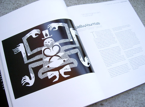
Work for an Adult Mental Heath Centre
* Fantasy – for a children’s hospital Blake drew fantastical creatures and creations interacting with sick or injured children and doctors – reframing the problems faced by his viewers in a safe and imaginary setting. This is another thing that illustration excels at – combatting the troubles of reality by providing fantastical parallels.

Work for a Children’s Hospital with The Nightingale Project
* Metaphor – similarly Blake’s illustrations of old people climbing trees and getting up to unrealistic mischief for an elderly care centre, and his pictures of people swimming fully clothed for an adult mental health centre reframed the issues faced by his audience metaphorically. For Gordon Hospital, the swimming characters are clearly going about their business, interacting with swimming fish and animals and getting on with life despite being underwater – a perfect fit for mental health as they show ordinary people in extraordinary circumstances – but coping with them.

Work for an Elderly Care Home
* Reality – In contrast the work produced for an eating disorders unit was totally based in reality. As the people who end up there have enough trouble with fantasy and distortion of facts, Quentin said a parallel universe was not useful here. Instead his characters in these pictures try on dresses, feed pigeons, interact with food but don’t focus on it. As always his characters feel real and identifiable.

Work for Vincent Square Eating Disorder Service.
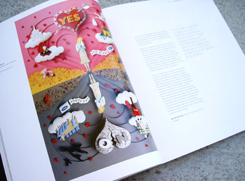
* Agency – In another series for a maternity ward Blake painted more swimming figures – this time naked mothers and babies. As well as providing a calm and happy scene of what was soon to happen – the meeting of mother and child – these pictures illustrate something which is so important in Quentin Blake’s work – agency. These are naked female figures with their own agenda and their priority is connecting with their babies – in each picture the mother and child make eye contact and seem oblivious of the viewer. Unlike the images of naked women we are so used to both in modern media and classic art, there is no male gaze here at all – like all Blake’s characters they have their own believable life, their own agenda, which ultimately, is much more useful an example for any kind of viewer – much better to hold up a mirror of a full life than a posing subject. I think perhaps this is the real fact of what makes Blake’s work so satisfying. And this immediacy is what good illustration is really capable of.
Categories ,Advice, ,AOI, ,Association of Illustrators, ,drawing, ,Eating Disorders Unit, ,Gordon Hospital, ,illustration, ,Jenny Robins, ,Nightingale Project, ,Quentin Blake, ,review, ,Royal Festival Hall, ,St Pancras Station, ,Talk, ,Tell Me a Picture, ,Vincent Square Eating Disorder Service
Similar Posts:
- In Conversation at the V&A: Peter Blake
- A Review of Mental by The Vacuum Cleaner
- What are you like?
- An interview with Jack Bailey: Amelia’s Colourful Colouring Companion featured artist.
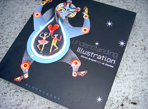
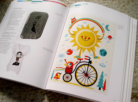
- Making Great Illustration, by Derek Brazell and Jo Davies: Book Review