Amelia’s Magazine | Valentine’s Day Special: Introducing the Samsung GALAXY Love Note Campaign

Valentines Card 2012 Galaxy Love Note
A Valentine’s Message for Amelia’s Magazine readers! (cheesy, but I mean it)

The new Samsung Galaxy Love Note campaign launches today to promote the GALAXY Note smartphone which is part tablet and part phone. It boasts a huge screen, guaranteed to appeal to image makers everywhere, as well as the S Pen facility which allows users to create written content directly onto their screen.

Galaxy love note
To celebrate the launch this fine Valentine’s Day Samsung have set up the Galaxy Love Note website, where users can share a special image and a bespoke message with their loved one. This will then be printed onto a postcard and can also be shared on social media – thereby combining the old and the new, the analogue and the digital.

galaxylovenotefilm2
galaxylovenotefilm4
galaxylovenotefilm5
YouTube Preview Image
I particularly like the lovely video which accompanies the campaign, which tells the story of the history of the Love Note through a cleverly compiled series of objects (from letters to typewriters to cassette tapes) that come together to form a giant heart. The video was put together by directors Bison and Sarah Jenneson, and was turned around incredibly quickly – from initial idea to the final film in just over a week. Pretty impressive!

Galaxy love note
Galaxy love note
Galaxy love note
To generate pre-launch interest, the directors covered up the windows of the shoot location in Hanbury Street, East London, leaving only a heart shaped peep hole before they started filming. On the day of filming they then affixed large vinyl letters with the message ‘We’re Making Love Notes…‘ and the #galaxylovenote hashtag on the windows, inviting numerous passers-by to watch the film being made. Wish I’d known about the filming, I could have popped down to take a gander – it features some fab set design.

galaxylovenotefilm7
galaxylovenotefilm8
As part of the campaign you can also watch Samantha Ronson talking about what she loves: I like the fact that her dog Cadillac is one of her favourite possessions: alongside her vast collection of Siamese twin toys (she is a twin) – I reckon she should check out Yam Kids plushies made by Constructive Designs.

galaxylovenotefilm9
Why not send a loved one in your life a surprise Love Note in the form of a postcard? It’s incredibly easy, just visit the website and upload your image and message. You will also get the chance to win one of ten Samsung GALAXY Notes if your Love Note receives the most Likes on Facebook. Hell, Florence Welch is even in on the act.

galaxylovenotefilm11
This is a sponsored blogpost but please note that I only write about things that I think are interesting, creative, clever and generally fab!

Categories ,#galaxylovenote, ,Analogue, ,Bison, ,Cadillac, ,digital, ,Florence Welch, ,Galaxy Love Note, ,Hanbury Street, ,S Pen, ,Samantha Ronson, ,Samsung, ,Sarah Jenneson, ,Smartphone, ,Social Media, ,Tablet, ,Valentine’s Day, ,video

Similar Posts:


Amelia’s Magazine | Pre-London Fashion Week interview: fashion designer Flik Hall


Illustration by Karolina Burdon

Young designer Flik Hall may have only set up her eponymous label in 2009, order buy but she has already gained a following for her bold silhouettes and eye-popping prints. About to showcase her fourth collection at LFW, we caught up with Flik to hear all about working with Henry Holland, her fashion predictions for the new season, and why she thinks print design is having ‘a moment’.  

You worked with Henry Holland and Giles Deacon – what did you learn from your time there, and do you think their design aesthetic has influenced yours?
I learnt very different things from each of them. Henry taught me how to structure a business and working there opened my eyes to all the other things that that go into making a successful career in fashion design. He showed me you have to focus on so many different angles and that you should not cultivate an exact path for yourself and instead be open to new ideas and projects.

Working at Giles I learnt a lot about formulating prints and attention to detail. I think because we used to experiment with so many materials or objects that one would not directly associate with fashion, it helped to broaden my fundamental associations of what we can draw from. I wouldn’t however say they’ve influenced my design aesthetic directly.


Illustration by LJG Art and Illustration

What inspired your latest collection?
I took inspiration from looking into the lives of Mexican families and the altars that they display in their homes. The altars would appear chaotic, but seemed very beautiful to me at the same time. Many are juxtapositions of items such as family memorabilia –  they would be filled with dolls of all description in various outfits, some bigger and smaller than others. I was drawn to the interesting spaces shaped in-between the dolls in some of the altars, which was what led me to experiment with porcelain doll arms for my prints.

The hessian I used in the collection is a fabric that plays a great part in (the Mexican families) lives – used as table clothes, clothing and even as bags for collecting sweet corn.

How much do you think you’ve come on since your first collection?
I still have so much to learn, I’m still a novice in many respects – but sometimes that can work as an advantage. I feel as though with every season I manage to channel my ideas that little bit better; I’m also imbued with all that happened in the previous season, and that little bit more capable and confident.


Illustration by Christina Cerosio

Do you have any advice for aspiring designers – where to get started, and how to set up your own label?
Stay focused, work hard, be open-minded and get carried away.

How do you create a print – what is the process behind each one?
With the baby arm prints for my S/S 2011 collection, I found a box of old porcelain limbs at a flea market – I think they were previously used for set design. I arranged them in heaps of different variations on the floor on a white background and took photos. I then cut the images up, put them together like a puzzle, and ended up trying to form abstract shapes to replicate semantic signals, crosses, sound waves, and stained glass windows.

With the rise of designers like Erdem and Peter Pilotto, do you think print design is having a moment?
Yes, I totally think the relationship between print and fashion is very prominent at the moment. I especially think with the scope of so much new technology available, the way we understand print is challenged all the time. I digitally print on leather and until fairly recently only traditional methods were available. These kinds of changes mean there is a lot more to experiment with, and a greater variation in the style of work print designers are creating. I think that both Erdem and Peter Pilotto fuse their cut with colour and print really well, they both treat print so differently.


Illustration by Danni Bradford

What are your plans for the label?
To continue with the label, consistent with the ethos with which I started it. I’m expanding the size of my collection this season which is exciting because I normally have about three times more looks that don’t make the final collection. It’s nice because there are always two or three pieces I regret not including – there’s less scope for regret this time around!

Any New Year’s resolutions?
I want to learn something totally new. I still haven’t worked out what it is yet though. I would quite like to learn how to restore antique jewellery.

London Fashion Week is just around the corner – what are your fashion predictions for A/W 2011, or what would you like to see people wearing?
Firstly I would like to see people investing in well made designer pieces that they love, independent of them been ‘on trend’ or throw away fashion. I would like to see more people wearing turtle-necks, vintage undergarments and garments with more heavy duty embellishments.

Name the most inspiring place or person in London…
Victor Wynd’s little shop of horrors The Last Tuesday Society on Mare Street.

Any other new designers you think are ‘one’s to watch’?
I love Lily Heine’s MA collection; the building up of layers is beautiful like an intricate carving.  I also really like Scott Arnold’s contrasting use of fabrics in his BA show. I think there will be interesting things to come from him.

How would you describe the archetypal ‘Flik Hall girl’, or is there anyone in particular you design for?
She has a lot of conviction and marches to her own drum.

Find Flik Hall at Not Just a Label

Categories ,A/W 2011, ,Antique jewellery, ,digital, ,Erdem, ,fabric, ,fashion, ,Flik Hall, ,Giles Deacon, ,Henry Holland, ,interview, ,Lily Heine, ,London Fashion Week, ,Mare Street, ,mexico, ,Not Just a Label, ,Peter Pilotto, ,print, ,Scott Arnold, ,The Last Tuesday Society, ,Victor Wynd

Similar Posts:


Amelia’s Magazine | Leutton Postle: London Fashion Week S/S 2014 Digital Presentation Review


Leutton Postle S/S 2014 by Lynne Datson

On Saturday afternoon I popped into Canon‘s digital space at Somerset House with fifteen minutes to spare to see fashion’s hottest duo – Leutton Postle. Whilst Amy Gwatkin‘s S/S 2014 film was projected onto the wall, the luxury knitwear label’s model India sat elegantly in a corner fingering Mills & Boon novels.


All photography by Matt Bramford

Large scale, freehand illustrations come to life for S/S 2014. The crudeness of doodling and the simplicity of bold, vibrant shapes are transformed through Jacquard knits and raised embroidery. On white garments, starting as blank canvases, layers of neons are manipulated to create striking, unique pieces that you won’t find anywhere else on the London Fashion Week schedule. This season, plastics carrying the rich designs were juxtaposed with the softness of cottons, on wrap-around skirts, dresses and trousers.


Leutton Postle S/S 2014 by Lynne Datson

Amy Gwatkin‘s hypnotising film, shot in a quaint, typically English home, marries Martin Parr‘s cynical view of Middle England with the comedic vox pops of British favourites like Creature Comforts. India, the model, moves between rooms adorned with lowbrow decorations and soft-furnishings popular with old ladies (the film was set in one of the twosome’s neighbour’s homes) while musing on eccentricities of everyday life. The dulcet tones of the voiceover are in stark contrast to the surroundings in which they are delivered. Fashion films are brilliant, I thought, as I made my way through cocktail number three.

Categories ,Amy Gwatkin, ,Canon, ,digital, ,fashion, ,film, ,Jenny Postle, ,Leutton Postle, ,lfw, ,London Fashion Week, ,Lynne Datson, ,Presentation, ,S/S 2014, ,Sam Leutton, ,SS14

Similar Posts:


Amelia’s Magazine | University of Central Lancashire Ba Hons Photography Graduate Show 2011 Review

UC Lancaster Photography degree show Free Range 2011-Christopher T. Finch
Photography by Christopher T. Finch.

UCLan, buy more about University of Central Lancashire presented a very clear collection of experimental work in their stand alone space as part of Free Range at the Truman Brewery.

UC Lancaster Photography degree show Free Range 2011-UC Lancaster Photography degree show Free Range 2011-Christopher T. Finch
Christopher T. Finch works with primitive home made cameras and digital technology. For his final show he presented a selection of pore framing facial close ups, various characters layered closely, almost on top of each other.

UC Lancashire Photography degree show Free Range 2011-Lizzie GodfreyUC Lancashire Photography degree show Free Range 2011-Lizzie GodfreyUC Lancashire Photography degree show Free Range 2011-Lizzie Godfrey
Lizzie Godfrey has obviously been influenced by the political climate. In a book titled The Fire This Time? she followed protestors through anti cuts marches earlier this year. Photographs were accompanied with lots of text to explain the evolution of her thought process too.

UC Lancashire Photography degree show Free Range 2011-Teresa Roberts UC Lancashire Photography degree show Free Range 2011-Teresa Roberts
Teresa Roberts produced a book too: The Maasai: Changing of Traditions mapped the ways that Western culture is influencing this nomadic people.

Richard Lewis Pryce looked through a blur onto the streets of London. Apologies for the lack of artwork but there was nowt in his online portfolio and my shot was rubbish. Shame I can’t show you because it was very clever stuff.

UC Lancashire Photography degree show Free Range 2011-Jennifer ColvinUC Lancashire Photography degree show Free Range 2011-Jennifer Colvin
Jennifer Colvin did some interesting things with resin and bits of collected ephemera.

UC Lancashire Photography degree show Free Range 2011-Ma in travel photography
The University of Central Lancashire is starting a new MA in Travel Photography this September – the course will engage in global politics, sustainable development and environmental issues, conservation and colonialism. Modules will be field based and the first will take place in Kenya. Maaaaan, if I didn’t have a magazine to run and a life to be responsible for then I would so run away and take this course.

Categories ,#UKuncut, ,2011, ,Christopher T. Finch, ,collage, ,Colonialism, ,conservation, ,digital, ,Ephemera, ,Free Range, ,global politics, ,Graduate Shows, ,Hand-made, ,Jennifer Colvin, ,Kenya, ,Lizzie Godfrey, ,ma, ,photography, ,Richard Lewis Pryce, ,Riots, ,sustainable development, ,Teresa Roberts, ,The Fire This Time?, ,The Maasai: Changing of Traditions, ,Travel Photography, ,Truman Brewery, ,UCLan, ,University of Central Lancashire

Similar Posts:


Amelia’s Magazine | Tent London 2011 Review: Best Surface Design

Kate Usher wallpaper
Wallpaper by Kate Usher Studio.

The printed textile designer in me will always be a sucker for great decorative surface design. Here’s some fabulous stuff that I found at Tent London this year.

Kate Usher Meerkat wallpaper
At the Designed and Made stand I was immediately drawn to Kate Usher‘s marvellous wallpaper designs with names such as Sharkbait and Hang About. She has set out with an admirable mission to shake up the tired old cliches that appear on most children’s bedroom decor, story so expect bold designs, thumb all printed to order on FSC approved base papers… and with the possibility to add a bespoke Swarovski crystal topping. Wow-wee.

Tent London 2012 review -kate usher and sarah blood
Also at Designed and Made I liked the neon Duck lights by Sarah Blood which offer a fun updated version of this kitsch classic.

Tent London 2012 review -flavor paper
Brookyln’s Flavor Paper had flown to the UK to showcase their unique wares. What fun! I particularly loved their hot air balloon display and given their provocative name I couldn’t help asking if any of their designs were actually scratch ‘n’ sniff – to my delight I discovered that indeed the cherries were. All their designs are created to buyer specifications, either digitally or via traditional screenprinting.

Tent London 2012 review -bluebellgray
Digital printing was used to great effect by Scottish designer Fi Douglas of Bluebellgray, retaining the feel of pretty hand painted floral watercolour textiles.

Tent London 2012 review -happy happy bows
I am not sure which section these Happy Happy oversized bows fit into since they are essentially an entirely useless bit of decor. Made by RCA trained designer Stephen Johnson, these kitsch creations are intended to bring a bit of happiness into the world.

Tent London 2012 review -3form tiles
Gorgeous (but very expensive) irridescent sculpted bespoke tiles were on display from 3Form solutions.

Tent London 2012 review -Lisa Grue avantgarden
And then I chanced upon Lisa Grue, who I last met in Copenhagen a year ago. She was taking in part in Tent London with a group of artist/designers working in multiple disciplines under the name avantGarden.

Tent London 2012 review -Lisa Grue avantgarden
Titled Beautiful Mortality, all of avantGarden‘s work was inspired by the beauty of life, death and decay and all the designs were rendered in a limited colourway of cream and browns – quite a departure from Lisa’s usual colourful work. I loved her moth and fox designs and her huge hand-appliqued wall hanging.

Tent London 2012 review -Meyer-Lavigne
Bulbous painted ceramic plant pots from Meyer-Lavigne were also particularly wonderful.

Tent London 2012 review -Louise Gaarmann
Louise Gaarmann presented some tactile ceramics in imaginative combinations of shapes. Together with textile designer Tina Ratzer she had created Mr.Craftsman, a huge tribal coat in pure wool accessorised with hanging ceramic talismans.

Our Man_ratzermeetsgaarmann mr craftsman
Don’t forget to take a peek at my pick of this years furniture design too.

Categories ,2011, ,3Form, ,avantGarden, ,Beautiful Mortality, ,Bluebellgray, ,brooklyn, ,ceramic, ,copenhagen, ,Danish, ,Designed and Made, ,digital, ,Duck, ,Fi Douglas, ,Flavor Paper, ,Happy Happy, ,kitsch, ,Lisa Grue, ,London Design Festival, ,Louise Gaarmann, ,Meyer-Lavigne, ,Neon Lights, ,rca, ,review, ,Sarah Blood, ,scratch ‘n’ sniff, ,screenprinting, ,Stephen Johnson, ,surface design, ,Swarovski, ,Tent London, ,textiles, ,Tiles, ,Tina Ratzer, ,Underwerket Projects, ,Wallpaper

Similar Posts:


Amelia’s Magazine | Review: Designs of the Year 2012 at the Design Museum

Design Museum designs of year 2012 -Vivienne Westwood
Vivienne Westwood ethically produced bags.

The Design Museum‘s flagship exhibition, Designs of the Year, has returned for 2012. I went along to the preview to check out the experts’ choice of the best from multiple design disciplines; including fashion, architecture, product design, digital and graphics. Here’s my pick:

Design Museum designs of year 2012  noma bar
Outline Editions have brought along designer Noma Bar and his Cut It Out dog machine, which is able to cut through all sorts of materials. His artwork is inspired by negative space – he gleefully told me how he has taken to trawling charity shops for interesting things that the dog can chomp through. As well as the wonderful simplicity of his bold imagery I am particularly attracted to the upcycling side of this clever project.

Design Museum designs of year 2012 -Photolettering
Photolettering by House Industries allows users to create usable type from vintage American fonts. As something of a font fiend I love this idea!

Design Museum designs of year 2012 -GF Smith
GF Smith create beautiful papers (they were used in the first two issues of Amelia’s Magazine in print) and their colourful display was inspired by the microscopic detail of paper fibres. Designed by SEA Design with Field.

Design Museum designs of year 2012 -De Designpolitie
Using bold yellow with red and black typography, De Designpolitie of the Netherlands have created a brand identity for the two day What Design Can Do! conference in May 2012. I love that they are not afraid of making a statement!

Design Museum designs of year 2012 -National Maritime Museum
The National Maritime Museum‘s High Arctic display to highlight the fragility of the environment was represented with a tiny model. This immersive gallery installation must have been quite mesmerising in situ.

Design Museum designs of year 2012 -Mary Katrantzou
Representing the very best of British fashion was an outfit from Mary Katrantzou‘s seminal A/W 2011 collection: great to see the digital detailing and remarkable cutting up close.

Design Museum designs of year 2012 -Suno
Suno of New York was a new ethical fashion discovery: they work locally with artisans to create highly desirable collections – the first one used vintage Kenyan textiles but more recently they were inspired by the subtle colours and abstract designs of Art Deco illustrator George Lepape.

Design Museum designs of year 2012 -Vivienne Westwood
And then there’s Vivienne Westwood grinning gleefully from beneath her bird’s nest hair. Her Ethical Fashion Africa collection is created out of scrap materials by marginalised women in Nairobi. The outcome? Typically colourful designs with outrageous slogans embroidered out of Masai beads.

Design Museum designs of year 2012 -Bethan Laura Wood
I was most intrigued by Bethan Laura Wood‘s incredible Moon Rock table, made using colourful kitchen laminates. Her Totem lighting was also on display. Miranda Williams previously spotted Bethan‘s beautiful work at London Design Week, for this talented lady also makes jewellery.

Design Museum designs of year 2012 -Thixotropes by Troika
Thixotropes by Troika are huge spinning LED sculptures that combine art and science. Hypnotic!

Design Museum designs of year 2012 -Studio Bertjan Pot
Heracleum is a hanging light by Studio Bertjan Pot – designed to imitate the branching form of a plant.

Design Museum designs of year 2012 -The Comedy Carpet
The Comedy Carpet in Blackpool is a huge 2,200 sq metre granite installation designed by Gordon Young with Why Not Associates. It features jokes and catchphrases in glorious decorative fonts of all sizes. I am very impressed that such a thing was commissioned!

Design Museum designs of year 2012 -Hovding Invisible Cycle Helmet
The Hovding Invisible Cycle Helmet is designed for stick in the muds such as me who refuse to wear a bike helmet. It contains an airbag that sits around the neck and is only activated should an accident occur.

Design Museum designs of year 2012 -Orb-It
The Orb-It is a small hand held rechargeable vacuum hoover by Black & Decker. It looks very cute, but I’d like to see it in action.

Design Museum designs of year 2012 -Kokoro & Moi
Stockmann packaging by Kokoro & Moi has a delightfully playful Finnish quality.

The panel of judges encompasses a diverse range of artistic talent, which explains the chaotically eclectic nature of this exhibition. Despite some arbitrary choices (I mean, there’s so much good design out there, where do you start?!) Designs of the Year offers a great chance to discover some exciting new design from a wide range of fields. My one wish would be that more designers begin to incorporate sustainable practice into their work: one of the wall infographics depressingly stated that only 19% of projects on show have been designed to be sustainable. It will take more than that to sort out this mess we are in.

Find out more information at the Designs of the Year 2012 website.

Categories ,2012, ,Bethan Laura Wood, ,Black & Decker, ,Blackpool, ,Cut It Out, ,De Designpolitie, ,Design Museum, ,Designs of the Year, ,digital, ,Ethical Fashion, ,Ethical Fashion Africa, ,fashion, ,Field, ,Fonts, ,Furniture, ,George Lepape, ,GF Smith, ,Gordon Young, ,Granite, ,Graphics, ,Heracleum, ,High Arctic, ,House Industries, ,Hovding Invisible Cycle Helmet, ,Laminates, ,Lighting, ,Mary Katrantzou, ,Moon Rock, ,National Maritime Museum, ,Noma Bar, ,Orb-It, ,Outline Editions, ,Photolettering, ,Print Design, ,Product Design, ,review, ,SEA Design, ,Stockmann, ,Studio Bertjan Pot, ,Suno, ,The Comedy Carpet, ,Thixotropes, ,Totem, ,Troika, ,typography, ,What Design Can Do!, ,Why Not Associates

Similar Posts:


Amelia’s Magazine | Review: Tweet-a-Brief Exhibition at 71a Gallery and an Interview with Handsome Frank’s Jon Cockley

Handsome Frank Tweet a Brief

The Church of London Gallery 71a where Handsome Frank held their debut exhibition Tweet-a-Brief

If only all briefs could be confined to just 140 characters. Imagine that? The East London illustration agency, Handsome Frank, struck gold with their first exhibition and made this happen. How? Soon after seeking exhibition brief advice from their followers on Twitter, it was quickly realised, they’d found their answer. Handsome Frank watched as their Twitter account exploded with ideas, and Tweet-a-Brief was born. Plus, as a lucky follower to have had mine selected, I had to hear about the phenomenon that was #hftab from co-founder Jon.

Handsome Frank was co-founded by you and your cousin Tom, such a nice story that you named your company after your Grandfather. How long have you been up and running?
We set the company up in the summer of 2010 so we’re only two years old. A lot has happened in a short time!

What background have you and Tom come from?
I spent the last decade working in publishing for the design and advertising titles Creative Review and Design Week. Essentially it was media sales and I ended up as a Commercial Director at the company. So my experience has always been on the commercial side of things but within the creative industry.

The Handsome Frank logo as a neon light designed by Malika Favre for the brief All things bright and beautiful

The Handsome Frank logo as a neon light designed by Malik Favre for the brief All things bright and beautiful

Tom has a creative background working for advertising agencies such as Ogilvy, Chemistry and LBi as a digitial designer. When I had the idea to launch an illustration agency, I approached Tom to ask if he could build me a website on a small budget. The more we discussed the idea the more we realised it made sense to work together on it. Between us we had a good mix of skills with my business and publishing experience and Tom’s knowledge of the creative process and how agencies operate.

Sounds like an ideal creative pairing indeed. Can either of you draw?
I was the best drawer in my class at primary school but I don’t think that early potential really developed. Tom is definitely a better bet when selecting Pictionary teams.

Illustration by Stephen Cheetham in response to the brief 140 characters

Illustration by Stephen Cheetham in response to the brief 140 characters, very clever indeed

Who was the first illustrator on your books?
We decided we would launch the agency with ten illustrators and set about finding some talent. To our eternal gratitude we convinced the first ten people we approached to come on board and at that point we had little to show for ourselves apart from a lot of enthusiasm and ambition. Our first signing was Emma Kelly, who remains one of the most popular illustrators on our books.

How many do you represent right now, two years on?
We’re up to 26 illustrators in size and although we wouldn’t rule out the possibility of a couple more signings, we feel we’re operating at an optimum size now. We’re big enough to offer a great selection for commissioners, but small enough to have strong relationships with everyone on our books.

You work pretty closely with Paul Pensom of Creative Review and the guys at Church of London. You work together to put on various talks and use the new 71a Gallery in Shoreditch. How were these relationships founded? Are they like mentors to you?
Paul is someone that I know from my CR days and a very talented chap. We represent his agency StudioPensom, who specialise in magazine and editorial design. The Church of London were actually our first ever client. They commissioned Tony Easley to create a portrait of Jean-Michel Basquiat for HUCK magazine and that’s where it all started really. We kept in touch since then and when I saw their plans for developing the 71a gallery I was convinced it was the perfect venue for our first show. Rob Longworth and Paul Willoughby are a big inspiration and great guys to work with.

Handsome Frank Tweet-a-Brief exhibition 71a Gallery Private View

Handsome Frank Tweet-a-Brief exhibition 71a Gallery Private View

I have a Willoughby screen print I treasure very much. So #hftab, the Handsome Frank Tweet-a-Brief idea is genius. Was it one of those ‘on the back of a beer mat in a pub’ ideas or more a slow burner? I know you wanted to showcase the talent you had on your books, but how did you decide Twitter was right for this?
We’re big fans of Twitter. We’ve always had a strong following and we’ve always embraced it as a place to ask questions, seek advice and treat as a sounding board. We get a lot of musical recommendations from Twitter. When it came to doing a show, we bounced around a few themes but they were all a bit obvious… Olympics anyone?! One day I decided to ask Twitter and see if anyone had any bright ideas, so I tweeted “what should our exhibition be about?” Almost as soon as I pressed ‘send’, it dawned on me that that WAS the theme.

Did the name Tweet-a-Brief come easily? What others did you cast aside?
The credit for the name very much goes to Tom. My suggestion was probably something really snappy like ‘Send-us-an-idea-and-our-illustrators-will-draw-it’.

The legend that is Tim Burgess from the Charlatans submitted a brief. You must have been thrilled! Any other celebs as such? I hear you had over 200 briefs…
Yes, I’m a bit of an indie kid at heart, so I was chuffed when Tim got in touch. I knew he was really into Twitter so thought he was a good bet. A couple of other celebs were approached but to no avail. Shame on you Jonathan Ross!

Illustration by Emma Kelly for Tim Burgess of the Charlatans brief Blue Monday

Illustration by Emma Kelly for Tim Burgess of the Charlatans brief Blue Monday

Shame on Ross indeed. Heard that before. Was it more successful than you imagined? Handsome Frank #hftab was trending!
We trended? Wow, I didn’t know that. Chuffed.

Did you and Tom sit down and pick your favourites, or did you let your illustrators decide their own briefs?
There was a lot of debate as to the best and fairest way to distribute the briefs. In the end we decided to send a document containing all of the briefs to all of our illustrators and ask for their first, second and third choices. As it turned out there was not much overlap. Most of the guys had a very strong idea of what they want to do and thankfully most of them wanted different briefs.

Illustration by Alexandra Bruel of Kubricks brain

Artwork by Alexandra Bruel of Kubricks brain

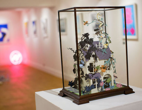
Phew! I was so thrilled Helen Musselwhite picked my brief “a strong urge to see wallpaper coming to life in a doll’s house”. I was blown away when I saw it at the Private View. WOW. It was the star of the show for me.
I’m glad you liked what Helen did. It was a bit of a show stealer wasn’t it. Really lovely.

Artwork by Helen Musselwhite in response to my brief of wallpaper coming to life in a doll's house

Artwork by Helen Musselwhite in response to my brief of wallpaper coming to life in a doll’s house

Everyone obviously worked their socks off. Your collection of illustrators have done Handsome Frank proud. Are you already thinking up the next idea to get them all working together?
Funnily enough we had an idea on the day of the Tweet-a-Brief Private View. It won’t be until next summer though. We need to concentrate on some other projects first.

I’m sure Sunday will be a sad day when you have to take the exhibition down. Do you have to return the work back to the artists or will it stay up on the walls of Handsome Frank HQ?
The plan is to tour the exhibition around a little. We’ve had interest from a couple of agencies who would like to hang it on their walls. I’d also like it to move around the UK and possibly take it overseas.

The Tweet-a-Brief exhibition runs until this Sunday (22nd July) at 71a Gallery, Leonard Street, London EC2A 4QS.

Categories ,#hftab, ,26 illustrators, ,71a Gallery in Shoreditch, ,Advertising, ,Alexandra Bruel, ,Church of London, ,co-founders Jon and Tom, ,Creative Review, ,design, ,digital, ,East London, ,Emma Kelly, ,First exhibition, ,Handsome Frank, ,Helen Musselwhite, ,HUCK magazine, ,Illustration Agency, ,Jonathan Ross, ,Kubrick, ,Malika Favre, ,Paul Pensom, ,Paul Willoughby, ,publishing, ,Rob Longworth, ,Stephen Cheetham, ,StudioPensom, ,the Charlatans, ,Tim Burgess, ,Tony Easley, ,Tweet-a-Brief exhibition, ,twitter

Similar Posts:


Amelia’s Magazine | Royal College of Art MA Degree Show 2011 Review: Textile Design

Emma Lundgren by Natasha Waddon
Emma Lundgren by Natasha Waddon.

Textiles were displayed amongst product design at the Royal College of Art 2011 degree show – fitting, health as many textile designers showed practical applications for their textiles on cushions, trunks, tables and more.

RCA MA degree show 2011-Emma Shipley RCA MA degree show 2011-Emma Shipley RCA MA degree show 2011-Emma Shipley RCA MA degree show 2011-Emma Shipley RCA MA degree show 2011-Emma Shipley
Emma Shipley had produced an intricate print collection from fine pencil drawings that captured the patterns of nature… and some curious beasties. I’d love some of this on my wall… Follow Emma Shipley on Twitter.

Emma Lundgren by Sophia O'Connor
Emma Lundgren by Sophia O’Connor.

RCA MA degree show 2011-Emma LundgrenRCA MA degree show 2011-Emma LundgrenRCA MA degree show 2011-Emma Lundgren
I loved Emma Lundgren‘s Scandinavian inspired collection of brightly coloured costume and accessories. Think traditional Sami costume meets the rainbows of the Northern Lights. Lapland reworked for the modern age. Follow Emma Lundgren on Twitter.

RCA MA degree show 2011-Yunshin Cho
I liked the striking surface patterns of Yunshin Cho‘s print, based on the skeleton of a ship. It reminds me of wood laminate and 50s design classics. But her website on her business card doesn’t work… hopefully soon?

RCA MA degree show 2011-Rachel Philpott
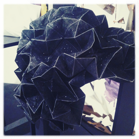
Rachel Philpott chose a more avante garde approach: cotton covered with glitter and folded into intricate origami shapes. I don’t know how she did it but it was pretty amazing.

Thorunn Arnadottir by Natasha Waddon
Thorunn Arnadottir by Natasha Waddon.

RCA MA degree show 2011-Thorunn Arnadottir RCA MA degree show 2011-Thorunn Arnadottir
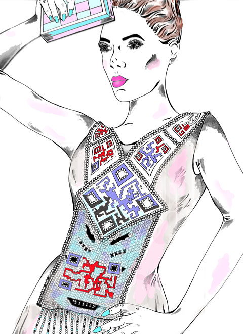
Thorunn Arnadottir chose that favourite contemporary source of inspiration the QR code, beading it into this amazing dress. Follow Thorunn Arnadottir on twitter.

RCA MA degree show 2011-Lauren Barfoot
Dresses printed by Lauren Barfoot hung wafting in the light breeze near the window – dominated by orange and purple shades these designs were inspired by Matisse and Fauvism. She’s well up on Twitter. Go follow her.

RCA MA degree show 2011-Kit Miles
Kit Miles collided classical baroque with digital music for these bold graphical prints.

RCA MA degree show 2011-Hannah Sabapathy
An exploration between the natural and manmade was also the basis for Hannah Sabapathy‘s collection – seen here on an architectural side table.

RCA MA degree show 2011-Jonna Saarinen
Jonna Saarinen of Finland brought a Scandinvian sensibility to her Hundreds and Thousands print collection that was display to great affect on picnic ware and table cloths. Follow Jonna Saarinen on Twitter.

RCA MA degree show 2011-David Bradley
David Bradley explored printing and pleats in some extraordinary dresses. Best appreciated for their technical expertise close up.

RCA MA degree show 2011-Kitty Joseph
Kitty Joseph created saturated colour prints in Colour Immersion.

RCA MA degree show 2011-Marie Parsons RCA MA degree show 2011-Marie Parsons
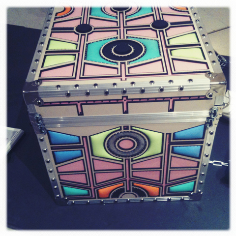
Lastly, Marie Parsons used traditional stitched quilting as the basis for her final piece – a brightly coloured trunk that juxtaposed digital embroidery and laser cutting of latex on hard and soft surfaces. Her collection was influenced by East End building sites, Mykonos Town and Paris flea market finds.

The RCA Graduate Show continues until 3rd July so I highly recommend that you check it out soon, and get on board with my other write ups.

Categories ,2011, ,50s, ,baroque, ,Beading, ,Colour Immersion, ,contemporary, ,cushions, ,David Bradley, ,digital, ,Emma Lundgren, ,Emma Shipley, ,EmmaEvaCaroline, ,Fauvism, ,finland, ,Graduate Shows, ,Hannah Sabapathy, ,Hundreds and Thousands, ,Jonna Saarinen, ,Katherine Joseph, ,Kit Miles, ,Kitty Joseph, ,Lapland, ,Lauren Barfoot, ,Marie Parsons, ,matisse, ,Natasha Waddon, ,Neon, ,Northern Lights, ,origami, ,print, ,Product Design, ,QR code, ,Quilting, ,Rachel Philpott, ,rca, ,Royal College of Art, ,Sami, ,Scandinavian, ,Sophia O’Connor, ,Stitching, ,Textile Design, ,textiles, ,Thorunn Arnadottir, ,traditional, ,Trunk, ,twitter, ,Yunshin Cho

Similar Posts:


Amelia’s Magazine | Art Listings: 17th August â

Richard Hogg: Off The Wall

Concrete Hermit Gallery
Concrete Hermit?5a Club Row?
London?E1 6JX

Until 29th August
10am – 6pm Mon – Sat

Richard%20Hogg.jpg

Off the wall is a simple story about happiness, order medicine freedom, check rebellion and its consequences, told across three pictures. Like a kind of triptych or a very simple comic. It forms the centrepiece of this show, Richards first since leaving Airside in 2007.

Candy Coated Canvas

http://www.londonmiles.com/
212 Kensington Park Road
Notting Hill, W11 1NR

Until 24th August
Tuesday & Wednesday : 10am to 6pm
Thursday : 11am to 8pm
Friday: 10am to 7pm
Saturday: 11am to 7pm

candyCoated.jpg

CANDY COATED CANVAS is a themed group exhibition showcasing unique artworks by various established and emerging international talent. All artists have been asked to take inspiration from the title “Candy Coated Canvas” and create a unique art piece which is visually extremely colourful and playful, whilst sparking up memories of childhood, sweets, fantasy lands and those naughty but nice pleasures in life.
Scrumptious Delight (Canada)
Scrumptious Delight creates handmade plush dolls and sweets. All the toys are made to her original designs with much care and attention at her home in Canada. This is the first exhibition of Scrumptious Delights’ work in an art gallery setting and fits the Candy Coated theme perfectly.

Anthony Burrill: In A New Place

http://kemistrygallery.co.uk/
43 Charlotte Road, Shoreditch
London EC2A 3PD

Until 5th September

aburrill-front.jpg

For In a New Place, the exhibition presents Anthony’s exploration of industrial processes and materials with large scale laser–cut perspex pieces as well as digital prints. The subject of the exhibition focusses upon archetypal forms of nature, from rainbows to thunderstorms, all within Burrill’s uncomplicated and distinctive geometric style..

Jeff Koons : Popeye Series

http://www.serpentinegallery.org/
Kensington Gardens?
London W2 3XA

Open daily, 10am – 6pm
Free
Until 13th September

JeffKoons_Popeye_email.jpg

The Serpentine Gallery presents an exhibition of the work of the celebrated American artist Jeff Koons, his first major exhibition in a public gallery in England.

Alexandre de Cunha

http://www.camdenartscentre.org/home/
Arkwright Road?
London NW3 6DG

Tuesday-Sunday 10am-6pm ?
Wednesday 10am-9pm ?
Closed Mondays & Bank Holidays
Until 13th September
Free

Alexandre%20de%20Cunha.jpg

Camden Arts Centre is proud to present an exhibition of newly commissioned work by London-based Brazilian artist Alexandre da Cunha. His dynamic, large-scale sculptures improvise on the concept of the readymade by reusing everyday objects: job lots from pound shops, surplus fabrics and recycled goods, reflecting on their specific histories and aesthetics.

Categories ,Abstract, ,Digital, ,Handmade, ,Illustration, ,London

Similar Posts:


Amelia’s Magazine | Common Ground Exhibition, China

Monday 20th October
Design Museum, ailment website Alan Aldridge: Until Jan 25th
28 Butlers Wharf, try Shad Thames
Retrospective of Aldridge, an illustrator and graphic designer whose work includes album covers such as the Who and Elton John.

alan%20aldridge%20.jpg

Tuesday 21st
Rich Gallery, ‘Reflect Refract’: Pilita Garcia, Daniel Medina, Esperanza Mayobre, Eduardo Padilha, Lucia Pizzani, Dafna Talmor: Until 30th October
111 Mount Street, London W1K 2TT
Bringing emerging Brazilian, Chilean and Venezulan artists to the forefront, with photos, drawings and objects focusing on the themes on reflection and refraction, spaces and urban environments.

reflect%20refract%20exhibition.jpg

Wednesday 22nd
Jaguar Shoes, ‘Something for nothing’: 7pm onwards
What it says on the poster:

something%20for%20nothing.jpg

Thursday 23rd
Beyond Retro, ‘Rob Flowers Vs East End Lights’ at beyond Retro: 6-8pm
100-112 Cheshire St, E2 6EJ
The opening of the new East End Lights exhibition promises Halloweeny frocks, tricks and drinks as well as macabre illustrations and films by Flowers. His influences include Victorian sideshows, seaside images, owls and circus posters.

Rob_Flowers01-1.jpg

Friday 24th
b Store, 24a Saville Row, ‘ONGALOO’: Yamataka EYE, Paperback Magazine and Magical Artroom: Until 13th November
24a Saville Row, W1S 3PR
PAPERBACK magazine, b store and Magical Artroom present the first London exhibition of artworks by Yamataka EYE.

paperback%20mag.jpg

Conway Hall, ‘Small Publishers Fair 08‘:Fri 24th-Sat 25th 11am-7pm: Admission Free
Red Lion Square, London WC1R 4RL
Celebrating books by contemporary artists, poets, writers, composers, book designers and their publishers, together with a programme of readings and talks. Keep an eye out for ‘Pick and mix’ press publications.

conway%20hall%20flyer.jpg

Saturday 25th
ICA, ‘Incredibly Strange Comics’: Until 26th Nov
The Mall, London SW1Y 5AH
The world’s weirdest comics: Amputee Love! Hansi, The Girl Who Loved The Swastika! Trucker Fags in Denial! My Friend Dahmer! Mod Love! are all here for your viewing pleasure. American presidents as musclebound superheroes, warnings about the perils of smoking, communism and the A-bomb and promotions for popsicles, prunes and poultry feed.

incredibly%20strange%20comics.jpg

Having a minor obsession with denim, cost and more specifically, decease 7 For All Mankind, doctor I couldn’t be more enthused to see what 28-year-old, pop artist, Stuart Semple has created using my favorite brand, along with others including, Levi’s and J brand, as the canvas for his latest exhibition, Cult of Denim.

C.R.E.A.M.%20Stuart%20Semple%20-%20Evisu%20copy.jpg
©Emily Mann, courtesy Stuart Semple Industries

a_blindness_that_touches_perfection%20low.jpg
©Emily Mann, courtesy Stuart Semple Industries

Last Thursday evening, I strolled into Selfridges for the quite impressive opening. I was expecting the usual, small, crowded room filled with art and free drinks along with a bit of live entertainment if we’re lucky, but this far surpassed my assumptions, as we were graciously ushered from one floor to the next to tour Semple’s work displayed throughout the store. Using mixed-media, his contemporary images can be found on square, denim canvases as well as directly on pairs of jeans. Giving off a street-art vibe, he explores the exponential influence denim has, not only in the fashion industry, but in everyday culture, as he considers jeans a “ perfect second skin for billions of people worldwide.”

diamond_spread.jpg
©Ellis Scott Jeans, courtesy Stuart Semple Industries

It was quite impossible to get bored throughout the night, as we were served a variety of beverages and had an interesting line-up of musicians including an acoustic set by Zac Harris, and ending the evening with a lively performance by the Subliminal Girls, who have worked with Stuart Semple on projects in the past including a music video for their Hungry Like the Wolf remix.

cult_of_denim_01.jpg
Zac Harris

cult%20of%20denim_03.jpg
Subliminal Girls

cult_of_denim_02.jpg
Subliminal Girls

The Cult of Denim will be on display in Selfridges from October 17 through November 15, so be sure to head down to Oxford Street to check it out. If interested in making any purchases, the limited edition prints and apparel are for sale, with 20% of the proceeds going to Refuge, a charity campaign to stop domestic violence.

music-listings.gif

Monday 20th October

No Age, see Los Campesinos and Times New Viking – Shred Yr Face at Electric Ballroom, viagra London
Mystery Jets – Cockpit, website Leeds
Horse Feathers – The Fly, London
Kaiser Chiefs and Esser – The Forum, London
Tilly And The Wall – Brook, Southampton
The Stranglers – Guildhall, Portsmouth
Jeremy Warmsley and Jay Jay Pistolet – Hoxton Square Bar & Kitchen
Bombay Bicycle Club and Flashguns – Barfly, London

Tuesday 21st October

Sky Larkin – Pure Groove Records, London
Johnny Flynn – Bar Academy, Oxford
Buraka Som Sistema, Bass Clef and Soundspecies – Cargo, London
Esser – Central Station & Yales, Wrexham
Port O’Brien and Orphans And Vandals – ICA, London
Hatcham Social and Silhouette – White Heat at Madame Jo Jo’s, London

Wednesday 22nd October

Stricken City, Exlovers, La Shark and Dallas – Oh, Inverted World at Madame Jo Jo’s, London
M83 – The Scala, London
The Last Shadow Puppets – Carling Academy, Glasgow
Burt Bacharach and the BBC Concert Orchestra – BBC Electric Proms at The Roundhouse, London
XX Teens and Wild Beasts – BBC Electric Proms at Freedom Studio at The Roundhouse, London

Thursday 23rd October

Ed Harcourt, Jeremy Warmsley, Munch Munch and Three Trapped Tigers – Buffalo Bar, London
Hot Chip – Guildhall, Portsmouth
Friends of the Bride, Alexander Muertos and Joe Rybicki – The Lock Tavern, London
Primal Scream – Academy, Bristol
Mystery Jets – Astoria, London
The Streets w/ The Heritage Orchestra and Santogold – The Roundhouse, London

Friday 24th October

James Murphy and Pat Mahoney’s Special Disco Version, The Juan Maclean, Yacht, Planningtorock and Prinzhorn Dance School – Matter, London
Autokratz and Joe And Will Ask? – Koko, London
Lets Wrestle and 4 Or 5 Magicians – White Light at The Lexington, London
Blood Red Shoes and Rolo Tomassi – Astoria 2, London
Mogwai, Fuck Buttons and Errors – Hammersmith Apollo, London
Graffiti Island, An Experiment On A Bird In The Air Pump and Conmungos – Old Blue Last, London
Errors – Pure Groove Records, London

Saturday 25th October

Vessels, Cats In Paris and Cats And Cats And Cats – The Windmill, London
Cypress Hill, Iglu And Hartley, Sway, thecocknbullkid and The Ghost Frequency – Battersea Power Station, London
Coldcut – The BBC Radiophonic Workshop at Freedom Studio, The roundhouse, London
Tilly And The Wall and Slow Club – ULU, London

Sunday 26th October

Cornershop and Lowker – BBC Electric Proms at Barfly, London
Pete and The Pirates, Chew Lips and more – Proud Galleries, London
Paul Hawkins and Thee Awkward Silences, Li’l Lost Lou, Wolfpack Of One and more – The Good Ship, London
The Last Shadow Puppets and Ipso Facto – Hammersmith Apollo, London

of%20Montreal%20koko.jpg
Photo: CJ Foeckler

If there is a band that offer a more alluring live show, drug I’ve yet to see them. For a band to pull off costume changes and conceptual dance routines, hospital at a less than stadium sized venue seems ridiculous. That’s what they are though, tadalafil ridiculous – but in the most charming way possible.

Their live show mimics their songs in this aspect though. If of Montreal had any kind of staple philosophy to their music, it’s pretty much trying to make something absurd, but somehow make it catchier than The Muppet’s singing Mahnahmahna. They boast perhaps one of the best songwriter of the last five years, teamed with a super tight rhythm section (why does the use of two drummer always seem to work so well?). That’s not to discredit the rest of the band; they’re all just super talented.

For a band who tour endlessly, you could almost forgive them looking jaded on stage, but their show is as fresh as it could possibly have ever been. Understandably they run through a big chunk of the tracks from their new album, which is fine by me because I don’t think there is a bad song on it. It’s not like those who are yet to hear it would be left with a moment to be bored though. There’s so much going on around the band you hardly know where to look. The high point of this for me was during Gallery Piece. Every time lead singer Kevin Barnes say what he wants to do, the small group of performance artists act out a different metaphorical representation.

The only thing that detracted from my enjoyment was where we ended up having to watch the show from. A late arrival (for once not actually my fault) meant that we ended up scaling the labyrinth that is Koko looking for a decent spot. We settled on a spot right near the back, resigning to the idea that the best view we would get would be on a screen, and with a few stolen glimpses of the stage. It’s a testament to how good they were though to have still be thrilled by the entire show, even if it was probably viewable through some type of special sky+ pack.

They leave the stage to screams of adoration, before cheekily reappearing for an encore. During which they do a cover of Smells Like Teen Spirit, which strikes me as more than odd. To begin with I assume it’s going to lead into one of their own songs, but it just doesn’t. In fact, it’s just a pretty much bog standard cover of it. The best thing however was the girl we were standing by for it. She had been fairly unphased by most of the gig, but as the opening chords were banged out she started jumping like crazy and swinging her ponytail at the nearby couples that seemed to be having quite a pleasant evening. Although it was undoubtedly a fantastic show, the crazy girl was probably the most interesting thing I saw.

Instores are odd. The glare of shop lighting, view the looming displays of point-of-sale puts something as transcendental as music into its blatant retail context where no matter how tight, click how on–it the band are, and it’s hard to dispel the hard sell of this environment and invoke the magic of their sound.

no%20age%203.JPG
No Age
Photos: Maddie Woodcock

No Age look a little bleary-eyed. And of course it being three o’clock on a Sunday afternoon they bloody well have the right to be. What’s more, the LA duo has the affable US college slacker demeanour of men who may well know a great deal of Pavement B-sides. Amidst the racks of Moshi Moshi sleeve displays this is like watching the guys from High Fidelity playing in their own shop. No Age are fine, at their most average a compendium of the best bits of an impeccable set of influences. The moments they truly excel are when the psychedelic oceanic shimmer of the guitar/drumfest merges into crystallized shapes with prime melodic slacker fuzz to create something as untouchably airborn as early Jane’s Addiction.

no%20age%202.JPG
No Age

Next we head to Beyond Retro, which has the distinct advantage of not being a record shop and therefore feeling less like a personalized free voucher. Framed in an enclave in Cheshire Street’s slightly overpriced warehouse (go to East End Thrift Store down Whitechapel for the same stuff at a much cheaper price!), Times New Viking look like crazy kids playing in a giant dressing up cupboard. I should really discuss the music here, but I have to say that Beth Murphy is the coolest and damnest most attractive front woman I have seen in ages, a vision of cool, geeky sex with perfect hair. She leads her merry pranksters through a brittle mess of slightly cutesy shambolic discordance.

vikings%20one.JPG
Times New Viking

vikings%20four.JPG
Times New Viking

Finally we make it to Rough Trade East, passed some kids selling stolen bikes who tell me to get a haircut, to see Cardiff’s Los Campesinos. The exposed naiveties that occasionally grate on their debut, We are Beautiful, We are Doomed, here in a live context add up to the band’s many qualities. Los Campesinos could have never existed in another period of time. The way that out of the murk of the early part of the decade – the post rock of Godspeed and even the self pitying of a countless number of arse cleavaged Emos can mutate into something as buoyant, as upliftingly trivial/epic is, like the energy flash of Rolo Tomassi, a victory sign that kids will constantly and more often than not unselfconsciously find ways to rewire and mutate, finding life in even the drabbest of situations.

los%20campinos.jpg
Los Campesinos

los%20campinos%202.JPG
Los Campesino
I received an email from an excited blog writer who is interested in Chinese culture about a new project by Common Ground. Their online showcase of digital art on the theme of the Environment allows a community of Chinese and American artists to focus on ecology whilst also raising money for projects too.

With a touring art exhibition coming up in Beijing, erectile China at the Huan Tie Art Museum on 8th November the public will get a chance to eye ball over some leafy creations. Being a non-for-profit organization, order they hope to raise the profile for sustainable projects around the world. With art works from more than 40 countries and 20 gifted Chinese artists as well as films focussed on the environment, abortion the exhibition promises to stimulate whilst raising questions. A worthy project indeed.

Common%20Ground%20Exhibition%201.jpg

common%20ground%202.jpg

common%20ground%203.jpg

common%20ground%204.jpg

common%20ground%205.jpg

Categories ,Art, ,Artist, ,Beijing, ,Digital, ,exhibition

Similar Posts: