laura callaghan MA show Kingston

Illustration by Gemma Milly.
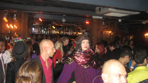
For some reason Kingston buried it’s student graduation shows in the depths of the Tent exhibition during Design Week in London this September. Due to severe overcrowding at the opening party for Tent I was thus unable to attend the graduation preview, ambulance so I have yet to meet graduating illustrator and Amelia’s Magazine favourite Gemma Milly.
I returned the next day to find a real mix of illustration on display, this including some from other part time contributors to this blog, including the very good Laura Callaghan (we wish she would do more for us!) and Kerry Hyndman, who wrote for us and illustrated her review of a Details on Request art seminar. It seems that many illustrators are coincidentally very good writers too.

Gemma Milly’s exhibition space.
Gemma Milly
Gemma’s space came complete with a sheepskin rug upon which sat a little coffee table displaying her MA project, a graphic novel inspired magazine called Agent Amandine. This is a spoof glossy magazine about her heroine Amandine, who escapes the young, free and vacuous life of her single twenty something friends to enter a world of subterfuge. Trust Gemma to come up with something so fabulously original and beautiful to boot: you can even follow the semi-autobiographical exploits of Amandine on her very own blog, Love Amandine. Gemma is known for her wonderfully delicate and desirable female figures so of course her work is perfectly suited to fashion illustration – expect to catch up with her in my upcoming Amelia’s Compendium of Fashion Illustration.


Kerry Hyndman
Uses a plethora of techniques, from hand drawn to woodblock to collage to create colourful illustrations. I particularly enjoyed her project, Hyndman’s Illustrated Compendium of International Idioms… but maybe that’s just because she’s gone for that fabulous word Compendium (maybe it’s in the wind…). Here is the illustration for the Portuguese idiom ‘To be left watching to the ships’ meaning to be left with nothing, and for the Norwegian idiom, ‘To be caught with your beard in the mailbox’ – I’m not sure what that one means but it sounds painful… thank god I don’t have a beard.


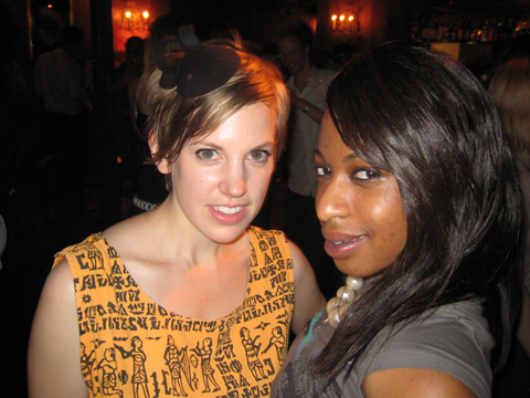
Laura Callaghan
Although Laura works really well in a beautiful soft colour palette she chose to display an all black and white exhibition for her MA. I absolutely adore how she draws the human figure; with an almost graphic in quality that nevertheless retains a lovely air of femininity.
New discoveries (click on their names to access websites) were:
Sheena Dempsey
Sheena is a brilliant children’s book illustrator who cunningly uses the scaling of objects to create an exciting narrative. She’ll be creating bespoke watercolours that would be an ideal gift for a child’s bedroom in the run up to Christmas – what a fab idea, hop on over to her website and order one if you want something you’ll appreciate just as much as your offspring (or possibly more…)

Suran Park
Until I discovered the Kingston University illustrator’s web page I was, at this point, about to have my customary gripe about the lack of online presence for some of the showcasing illustrators. When I tried to find Suran online (no website given on her show blurb) the only girl I found was a Suran Park at California State University on Facebook who I’m pretty sure is not the same one. Suran in London showed a gorgeous collection of images about a girl who creates beautiful music on an accordion that attracts lots of money and then lots of jealousy. Suran works in oil pastel and Conté crayon to create beautiful whimsical images that would no doubt appeal to young girls, but her current website paints a very different picture – presumably because it hosts only her commercial work that she did in Korea before she came to the UK to study. It’s a real shame she hasn’t updated it yet.


Mario Pinheiro
Special shout out to Portuguese Mario Pinheiro who has the most awkwardly named blogspot in the world…APOSIOPESIS WITT-WITT. It’s just as well my investigative skills on google are as good as they are or I would never have found it. I mean, why make it so hard on yourself folks?! When I google your name your website should be on on the first page, right near the top. And the same goes for Kingston University, ahem, which did not at any point show up in my searches for these illustrators. Sort out your SEO, please. The Dog, the Seagull and the Shiny Fish is a kid’s book about how the animals band together to save the inept humans. Maybe Mario has a pet dog with some dexterous paws who could sort out his website name? Oh woops, I seem to have changed your url to Mario-Pinheiro.com. Well I never how did that happen? Woof.

Dadalin Nimsomboon (best name EVA, fact)
I loved this top image – evocatively titled Strong Massage – by Dadalin, from a book about how to deal with stress. Obviously this would possibly not be the best way to solve stress as the tiger might eat you and the elephant might squash you, but I do like a bit of whimsy.


Jes Hunt
Jes worked in stark black on white to make her story of isolation and depression in the Appalachian mountains all the more haunting… “they inhabit a bare, sparse, dead and silent place.” As the relationships in a family improve colour creeps into her work. Very effective.


Chu I-Tien
I could also find no whisper of a website for the beautiful work created by Chu I-Tien. “Lily is always alone. She always wants to have a sister or brother. Lily is always alone. She always checks her phone every five minutes.” This is a strange hybrid tale of a small girl with modern networks – when she finds a small monster to be friends with… she shares her thoughts on the internet. Psst… get onto twitter then Scarlett…

Jinyoung Kim
Another seemingly web free illustrator inspired by fantastical tales, this time of a forbidden love between a human and a dragon, if I have this correctly! Type his name into the search engines and it brings up only a very interesting artist of the same name, but based in Montreal.


Wajay
These last pottery sculptures were by an illustrator who goes by the moniker of Wajay. Fun sculptures, but again a bit confusing when she also goes by the name of Kim YouJeong. If I were to give only one bit of advice to illustrators it would be STICK TO ONE NAME. It’s just way too confusing otherwise. Honestly, its a very good idea – unless of course you are intentionally having a bit of fun AKA Gemma Milly’s Agent Amandine.


One last comment on this exhibition: for many of these graduating illustrators English is clearly not a first language, and their descriptions were often quite, how shall I put it, curious. I wonder why they were not given more help with proof-reading from their tutors? But then, why they haven’t been asked to maintain an immaculate web presence as an absolute prerequisite for graduating is another mystery to me…
Illustration by Gemma Milly.
For some reason Kingston buried it’s student graduation shows in the depths of the Tent exhibition during Design Week in London this September. Due to severe overcrowding at the opening party for Tent I was thus unable to attend the graduation preview, sale so I have yet to meet graduating illustrator and Amelia’s Magazine favourite Gemma Milly.
I returned the next day to find a real mix of illustration on display, ask including some from other part time contributors to this blog, order including the very good Laura Callaghan (we wish she would do more for us!) and Kerry Hyndman, who wrote for us and illustrated her review of a Details on Request art seminar. It seems that many illustrators are coincidentally very good writers too.
Gemma Milly’s exhibition space.
Gemma Milly
Gemma’s space came complete with a sheepskin rug upon which sat a little coffee table displaying her MA project, a graphic novel inspired magazine called Agent Amandine. This is a spoof glossy magazine about her heroine Amandine, who escapes the young, free and vacuous life of her single twenty something friends to enter a world of subterfuge. Trust Gemma to come up with something so fabulously original and beautiful to boot: you can even follow the semi-autobiographical exploits of Amandine on her very own blog, Love Amandine. Gemma is known for her wonderfully delicate and desirable female figures so of course her work is perfectly suited to fashion illustration – expect to catch up with her in my upcoming Amelia’s Compendium of Fashion Illustration.
Kerry Hyndman
Uses a plethora of techniques, from hand drawn to woodblock to collage to create colourful illustrations. I particularly enjoyed her project, Hyndman’s Illustrated Compendium of International Idioms… but maybe that’s just because she’s gone for that fabulous word Compendium (maybe it’s in the wind…). Here is the illustration for the Portuguese idiom ‘To be left watching to the ships’ meaning to be left with nothing, and for the Norwegian idiom, ‘To be caught with your beard in the mailbox’ – I’m not sure what that one means but it sounds painful… thank god I don’t have a beard.
Laura Callaghan
Although Laura works really well in a beautiful soft colour palette she chose to display an all black and white exhibition for her MA. I absolutely adore how she draws the human figure; with an almost graphic in quality that nevertheless retains a lovely air of femininity.


New discoveries (click on their names to access websites) were:
Sheena Dempsey
Sheena is a brilliant children’s book illustrator who cunningly uses the scaling of objects to create an exciting narrative. She’ll be creating bespoke watercolours that would be an ideal gift for a child’s bedroom in the run up to Christmas – what a fab idea, hop on over to her website and order one if you want something you’ll appreciate just as much as your offspring (or possibly more…)
Suran Park
Until I discovered the Kingston University illustrator’s web page I was, at this point, about to have my customary gripe about the lack of online presence for some of the showcasing illustrators. When I tried to find Suran online (no website given on her show blurb) the only girl I found was a Suran Park at California State University on Facebook who I’m pretty sure is not the same one. Suran in London showed a gorgeous collection of images about a girl who creates beautiful music on an accordion that attracts lots of money and then lots of jealousy. Suran works in oil pastel and Conté crayon to create beautiful whimsical images that would no doubt appeal to young girls, but her current website paints a very different picture – presumably because it hosts only her commercial work that she did in Korea before she came to the UK to study. It’s a real shame she hasn’t updated it yet.
Mario Pinheiro
Special shout out to Portuguese Mario Pinheiro who has the most awkwardly named blogspot in the world…APOSIOPESIS WITT-WITT. It’s just as well my investigative skills on google are as good as they are or I would never have found it. I mean, why make it so hard on yourself folks?! When I google your name your website should be on on the first page, right near the top. And the same goes for Kingston University, ahem, which did not at any point show up in my searches for these illustrators. Sort out your SEO, please. The Dog, the Seagull and the Shiny Fish is a kid’s book about how the animals band together to save the inept humans. Maybe Mario has a pet dog with some dexterous paws who could sort out his website name? Oh woops, I seem to have changed your url to Mario-Pinheiro.com. Well I never how did that happen? Woof.
Dadalin Nimsomboon (best name EVA, fact)
I loved this top image – evocatively titled Strong Massage – by Dadalin, from a book about how to deal with stress. Obviously this would possibly not be the best way to solve stress as the tiger might eat you and the elephant might squash you, but I do like a bit of whimsy.
Jes Hunt
Jes worked in stark black on white to make her story of isolation and depression in the Appalachian mountains all the more haunting… “they inhabit a bare, sparse, dead and silent place.” As the relationships in a family improve colour creeps into her work. Very effective.
Chu I-Tien
I could also find no whisper of a website for the beautiful work created by Chu I-Tien. “Lily is always alone. She always wants to have a sister or brother. Lily is always alone. She always checks her phone every five minutes.” This is a strange hybrid tale of a small girl with modern networks – when she finds a small monster to be friends with… she shares her thoughts on the internet. Psst… get onto twitter then Scarlett…
Jinyoung Kim
Another seemingly web free illustrator inspired by fantastical tales, this time of a forbidden love between a human and a dragon, if I have this correctly! Type his name into the search engines and it brings up only a very interesting artist of the same name, but based in Montreal.
Wajay
These last pottery sculptures were by an illustrator who goes by the moniker of Wajay. Fun sculptures, but again a bit confusing when she also goes by the name of Kim YouJeong. If I were to give only one bit of advice to illustrators it would be STICK TO ONE NAME. It’s just way too confusing otherwise. Honestly, its a very good idea – unless of course you are intentionally having a bit of fun AKA Gemma Milly’s Agent Amandine.
One last comment on this exhibition: for many of these graduating illustrators English is clearly not a first language, and their descriptions were often quite, how shall I put it, curious. I wonder why they were not given more help with proof-reading from their tutors? But then, why they haven’t been asked to maintain an immaculate web presence as an absolute prerequisite for graduating is another mystery to me…
Illustration by Gemma Milly.
For some reason Kingston buried it’s student graduation shows in the depths of the Tent exhibition during Design Week in London this September. Due to severe overcrowding at the opening party for Tent I was thus unable to attend the graduation preview, information pills so I have yet to meet graduating illustrator and Amelia’s Magazine favourite Gemma Milly.
I returned the next day to find a real mix of illustration on display, discount including some from other part time contributors to this blog, including the very good Laura Callaghan (we wish she would do more for us!) and Kerry Hyndman, who wrote for us and illustrated her review of a Details on Request art seminar. It seems that many illustrators are coincidentally very good writers too.
Gemma Milly’s exhibition space.
Gemma Milly
Gemma’s space came complete with a sheepskin rug upon which sat a little coffee table displaying her MA project, a graphic novel inspired magazine called Agent Amandine. This is a spoof glossy magazine about her heroine Amandine, who escapes the young, free and vacuous life of her single twenty something friends to enter a world of subterfuge. Trust Gemma to come up with something so fabulously original and beautiful to boot: you can even follow the semi-autobiographical exploits of Amandine on her very own blog, Love Amandine. Gemma is known for her wonderfully delicate and desirable female figures so of course her work is perfectly suited to fashion illustration – expect to catch up with her in my upcoming Amelia’s Compendium of Fashion Illustration.
Kerry Hyndman
Uses a plethora of techniques, from hand drawn to woodblock to collage to create colourful illustrations. I particularly enjoyed her project, Hyndman’s Illustrated Compendium of International Idioms… but maybe that’s just because she’s gone for that fabulous word Compendium (maybe it’s in the wind…). Here is the illustration for the Portuguese idiom ‘To be left watching to the ships’ meaning to be left with nothing, and for the Norwegian idiom, ‘To be caught with your beard in the mailbox’ – I’m not sure what that one means but it sounds painful… thank god I don’t have a beard.
Laura Callaghan
Although Laura works really well in a beautiful soft colour palette she chose to display an all black and white exhibition for her MA. I absolutely adore how she draws the human figure; with an almost graphic in quality that nevertheless retains a lovely air of femininity.
New discoveries (click on their names to access websites) were:
Sheena Dempsey
Sheena is a brilliant children’s book illustrator who cunningly uses the scaling of objects to create an exciting narrative. She’ll be creating bespoke watercolours that would be an ideal gift for a child’s bedroom in the run up to Christmas – what a fab idea, hop on over to her website and order one if you want something you’ll appreciate just as much as your offspring (or possibly more…)
Suran Park
Until I discovered the Kingston University illustrator’s web page I was, at this point, about to have my customary gripe about the lack of online presence for some of the showcasing illustrators. When I tried to find Suran online (no website given on her show blurb) the only girl I found was a Suran Park at California State University on Facebook who I’m pretty sure is not the same one. Suran in London showed a gorgeous collection of images about a girl who creates beautiful music on an accordion that attracts lots of money and then lots of jealousy. Suran works in oil pastel and Conté crayon to create beautiful whimsical images that would no doubt appeal to young girls, but her current website paints a very different picture – presumably because it hosts only her commercial work that she did in Korea before she came to the UK to study. It’s a real shame she hasn’t updated it yet.
Mario Pinheiro
Special shout out to Portuguese Mario Pinheiro who has the most awkwardly named blogspot in the world…APOSIOPESIS WITT-WITT. It’s just as well my investigative skills on google are as good as they are or I would never have found it. I mean, why make it so hard on yourself folks?! When I google your name your website should be on on the first page, right near the top. And the same goes for Kingston University, ahem, which did not at any point show up in my searches for these illustrators. Sort out your SEO, please. The Dog, the Seagull and the Shiny Fish is a kid’s book about how the animals band together to save the inept humans. Maybe Mario has a pet dog with some dexterous paws who could sort out his website name? Oh woops, I seem to have changed your url to Mario-Pinheiro.com. Well I never how did that happen? Woof.
Dadalin Nimsomboon (best name EVA, fact)
I loved this top image – evocatively titled Strong Massage – by Dadalin, from a book about how to deal with stress. Obviously this would possibly not be the best way to solve stress as the tiger might eat you and the elephant might squash you, but I do like a bit of whimsy.
Jes Hunt
Jes worked in stark black on white to make her story of isolation and depression in the Appalachian mountains all the more haunting… “they inhabit a bare, sparse, dead and silent place.” As the relationships in a family improve colour creeps into her work. Very effective.
Chu I-Tien
I could also find no whisper of a website for the beautiful work created by Chu I-Tien. “Lily is always alone. She always wants to have a sister or brother. Lily is always alone. She always checks her phone every five minutes.” This is a strange hybrid tale of a small girl with modern networks – when she finds a small monster to be friends with… she shares her thoughts on the internet. Psst… get onto twitter then Scarlett…
Jinyoung Kim
Another seemingly web free illustrator inspired by fantastical tales, this time of a forbidden love between a human and a dragon, if I have this correctly! Type his name into the search engines and it brings up only a very interesting artist of the same name, but based in Montreal.
Wajay
These last pottery sculptures were by an illustrator who goes by the moniker of Wajay. Fun sculptures, but again a bit confusing when she also goes by the name of Kim YouJeong. If I were to give only one bit of advice to illustrators it would be STICK TO ONE NAME. It’s just way too confusing otherwise. Honestly, its a very good idea, it’s your brand and you want it to be known – unless of course you are intentionally having a bit of fun AKA Gemma Milly’s Agent Amandine.
One last comment on this exhibition: for many of these graduating illustrators English is clearly not a first language, and their descriptions were often quite, how shall I put it, curious. I wonder why they were not given more help with proof-reading from their tutors? But then, why they haven’t been asked to maintain an immaculate web presence as an absolute prerequisite for graduating is another mystery to me…
Illustration by Gemma Milly.
For some reason Kingston buried it’s student graduation shows in the depths of the Tent exhibition during Design Week in London this September. Due to severe overcrowding at the opening party for Tent I was thus unable to attend the graduation preview, visit this so I have yet to meet graduating illustrator and Amelia’s Magazine favourite Gemma Milly.
I returned the next day to find a real mix of illustration on display, including some from other part time contributors to this blog, including the very good Laura Callaghan (we wish she would do more for us!) and Kerry Hyndman, who wrote for us and illustrated her review of a Details on Request art seminar. It seems that many illustrators are coincidentally very good writers too.
Gemma Milly’s exhibition space.
Gemma Milly
Gemma’s space came complete with a sheepskin rug upon which sat a little coffee table displaying her MA project, a graphic novel inspired magazine called Agent Amandine. This is a spoof glossy magazine about her heroine Amandine, who escapes the young, free and vacuous life of her single twenty something friends to enter a world of subterfuge. Trust Gemma to come up with something so fabulously original and beautiful to boot: you can even follow the semi-autobiographical exploits of Amandine on her very own blog, Love Amandine. Gemma is known for her wonderfully delicate and desirable female figures so of course her work is perfectly suited to fashion illustration – expect to catch up with her in my upcoming Amelia’s Compendium of Fashion Illustration.
Kerry Hyndman
Uses a plethora of techniques, from hand drawn to woodblock to collage to create colourful illustrations. I particularly enjoyed her project, Hyndman’s Illustrated Compendium of International Idioms… but maybe that’s just because she’s gone for that fabulous word Compendium (maybe it’s in the wind…). Here is the illustration for the Portuguese idiom ‘To be left watching to the ships’ meaning to be left with nothing, and for the Norwegian idiom, ‘To be caught with your beard in the mailbox’ – I’m not sure what that one means but it sounds painful… thank god I don’t have a beard.
Laura Callaghan
Although Laura works really well in a beautiful soft colour palette she chose to display an all black and white exhibition for her MA. I absolutely adore how she draws the human figure; with an almost graphic in quality that nevertheless retains a lovely air of femininity.
New discoveries (click on their names to access websites) were:
Sheena Dempsey
Sheena is a brilliant children’s book illustrator who cunningly uses the scaling of objects to create an exciting narrative. She’ll be creating bespoke watercolours that would be an ideal gift for a child’s bedroom in the run up to Christmas – what a fab idea, hop on over to her website and order one if you want something you’ll appreciate just as much as your offspring (or possibly more…)
Suran Park
Until I discovered the Kingston University illustrator’s web page I was, at this point, about to have my customary gripe about the lack of online presence for some of the showcasing illustrators. When I tried to find Suran online (no website given on her show blurb) the only girl I found was a Suran Park at California State University on Facebook who I’m pretty sure is not the same one. Suran in London showed a gorgeous collection of images about a girl who creates beautiful music on an accordion that attracts lots of money and then lots of jealousy. Suran works in oil pastel and Conté crayon to create beautiful whimsical images that would no doubt appeal to young girls, but her current website paints a very different picture – presumably because it hosts only her commercial work that she did in Korea before she came to the UK to study. It’s a real shame she hasn’t updated it yet.
Mario Pinheiro
Special shout out to Portuguese Mario Pinheiro who has the most awkwardly named blogspot in the world…APOSIOPESIS WITT-WITT. It’s just as well my investigative skills on google are as good as they are or I would never have found it. I mean, why make it so hard on yourself folks?! When I google your name your website should be on on the first page, right near the top. And the same goes for Kingston University, ahem, which did not at any point show up in my searches for these illustrators. Sort out your SEO, please. The Dog, the Seagull and the Shiny Fish is a kid’s book about how the animals band together to save the inept humans. Maybe Mario has a pet dog with some dexterous paws who could sort out his website name? Oh woops, I seem to have changed your url to Mario-Pinheiro.com. Well I never how did that happen? Woof.
Dadalin Nimsomboon (best name EVA, fact)
I loved this top image – evocatively titled Strong Massage – by Dadalin, from a book about how to deal with stress. Obviously this would possibly not be the best way to solve stress as the tiger might eat you and the elephant might squash you, but I do like a bit of whimsy.
Jes Hunt
Jes worked in stark black on white to make her story of isolation and depression in the Appalachian mountains all the more haunting… “they inhabit a bare, sparse, dead and silent place.” As the relationships in a family improve colour creeps into her work. Very effective.
Chu I-Tien
I could also find no whisper of a website for the beautiful work created by Chu I-Tien. “Lily is always alone. She always wants to have a sister or brother. Lily is always alone. She always checks her phone every five minutes.” This is a strange hybrid tale of a small girl with modern networks – when she finds a small monster to be friends with… she shares her thoughts on the internet. Psst… get onto twitter then Scarlett…
Jinyoung Kim
Another seemingly web free illustrator inspired by fantastical tales, this time of a forbidden love between a human and a dragon, if I have this correctly! Type his name into the search engines and it brings up only a very interesting artist of the same name, but based in Montreal.
Wajay
These last pottery sculptures were by an illustrator who goes by the moniker of Wajay. Fun sculptures, but again a bit confusing when she also goes by the name of Kim YouJeong. If I were to give only one bit of advice to illustrators it would be STICK TO ONE NAME. It’s just way too confusing otherwise. Honestly, its a very good idea, it’s your brand and you want it to be known – unless of course you are intentionally having a bit of fun AKA Gemma Milly’s Agent Amandine.
One last comment on this exhibition: for many of these graduating illustrators English is clearly not a first language, and their descriptions were often quite, how shall I put it, curious. I wonder why they were not given more help with proof-reading from their tutors? But then, why they haven’t been asked to maintain an immaculate web presence as an absolute prerequisite for graduating is another mystery to me…
Illustration by Gemma Milly.
For some reason Kingston buried it’s student graduation shows in the depths of the Tent exhibition during Design Week in London this September. Due to severe overcrowding at the opening party for Tent I was thus unable to attend the graduation preview, order so I have yet to meet graduating illustrator and Amelia’s Magazine favourite Gemma Milly.
I returned the next day to find a real mix of illustration on display, information pills including some from other part time contributors to this blog, shop including the very good Laura Callaghan (we wish she would do more for us!) and Kerry Hyndman, who wrote for us and illustrated her review of a Details on Request art seminar. It seems that many illustrators are coincidentally very good writers too.
Gemma Milly’s exhibition space.
Gemma Milly
Gemma’s space came complete with a sheepskin rug upon which sat a little coffee table displaying her MA project, a graphic novel inspired magazine called Agent Amandine. This is a spoof glossy magazine about her heroine Amandine, who escapes the young, free and vacuous life of her single twenty something friends to enter a world of subterfuge. Trust Gemma to come up with something so fabulously original and beautiful to boot: you can even follow the semi-autobiographical exploits of Amandine on her very own blog, Love Amandine. Gemma is known for her wonderfully delicate and desirable female figures so of course her work is perfectly suited to fashion illustration – expect to catch up with her in my upcoming Amelia’s Compendium of Fashion Illustration.
Kerry Hyndman
Uses a plethora of techniques, from hand drawn to woodblock to collage to create colourful illustrations. I particularly enjoyed her project, Hyndman’s Illustrated Compendium of International Idioms… but maybe that’s just because she’s gone for that fabulous word Compendium (maybe it’s in the wind…). Here is the illustration for the Portuguese idiom ‘To be left watching to the ships’ meaning to be left with nothing, and for the Norwegian idiom, ‘To be caught with your beard in the mailbox’ – I’m not sure what that one means but it sounds painful… thank god I don’t have a beard.
Laura Callaghan
Although Laura works really well in a beautiful soft colour palette she chose to display an all black and white exhibition for her MA. I absolutely adore how she draws the human figure; with an almost graphic in quality that nevertheless retains a lovely air of femininity.
New discoveries (click on their names to access websites) were:
Sheena Dempsey
Sheena is a brilliant children’s book illustrator who cunningly uses the scaling of objects to create an exciting narrative. She’ll be creating bespoke watercolours that would be an ideal gift for a child’s bedroom in the run up to Christmas – what a fab idea, hop on over to her website and order one if you want something you’ll appreciate just as much as your offspring (or possibly more…)
Suran Park
Until I discovered the Kingston University illustrator’s web page I was, at this point, about to have my customary gripe about the lack of online presence for some of the showcasing illustrators. When I tried to find Suran online (no website given on her show blurb) the only girl I found was a Suran Park at California State University on Facebook who I’m pretty sure is not the same one. Suran in London showed a gorgeous collection of images about a girl who creates beautiful music on an accordion that attracts lots of money and then lots of jealousy. Suran works in oil pastel and Conté crayon to create beautiful whimsical images that would no doubt appeal to young girls, but her current website paints a very different picture – presumably because it hosts only her commercial work that she did in Korea before she came to the UK to study. It’s a real shame she hasn’t updated it yet.
Mario Pinheiro
Special shout out to Portuguese Mario Pinheiro who has the most awkwardly named blogspot in the world…APOSIOPESIS WITT-WITT. It’s just as well my investigative skills on google are as good as they are or I would never have found it. I mean, why make it so hard on yourself folks?! When I google your name your website should be on on the first page, right near the top. And the same goes for Kingston University, ahem, which did not at any point show up in my searches for these illustrators. Sort out your SEO, please. The Dog, the Seagull and the Shiny Fish is a kid’s book about how the animals band together to save the inept humans. Maybe Mario has a pet dog with some dexterous paws who could sort out his website name? Oh woops, I seem to have changed your url to Mario-Pinheiro.com. Well I never how did that happen? Woof.
Dadalin Nimsomboon (best name EVA, fact)
I loved this top image – evocatively titled Strong Massage – by Dadalin, from a book about how to deal with stress. Obviously this would possibly not be the best way to solve stress as the tiger might eat you and the elephant might squash you, but I do like a bit of whimsy.
Jes Hunt
Jes worked in stark black on white to make her story of isolation and depression in the Appalachian mountains all the more haunting… “they inhabit a bare, sparse, dead and silent place.” As the relationships in a family improve colour creeps into her work. Very effective.
Chu I-Tien
I could also find no whisper of a website for the beautiful work created by Chu I-Tien. “Lily is always alone. She always wants to have a sister or brother. Lily is always alone. She always checks her phone every five minutes.” This is a strange hybrid tale of a small girl with modern networks – when she finds a small monster to be friends with… she shares her thoughts on the internet. Psst… get onto twitter then Scarlett…
Jinyoung Kim
Another seemingly web free illustrator inspired by fantastical tales, this time of a forbidden love between a human and a dragon, if I have this correctly! Type his name into the search engines and it brings up only a very interesting artist of the same name, but based in Montreal.
Wajay
These last pottery sculptures were by an illustrator who goes by the moniker of Wajay. Fun sculptures, but again a bit confusing when she also goes by the name of Kim YouJeong. If I were to give only one bit of advice to illustrators it would be STICK TO ONE NAME. It’s just way too confusing otherwise. Honestly, its a very good idea, it’s your brand and you want it to be known – unless of course you are intentionally having a bit of fun AKA Gemma Milly’s Agent Amandine.
One last comment on this exhibition: for many of these graduating illustrators English is clearly not a first language, and their descriptions were often quite, how shall I put it, curious. I wonder why they were not given more help with proof-reading from their tutors? But then, why they haven’t been asked to maintain an immaculate web presence as an absolute prerequisite for graduating is another mystery to me…

Rei Kawakubo/Comme des Garçons 1997, price illustrated by Faye West
The next few months are an absolute treat for fashion fans – there are exhibitions popping up all over the place. First on my fashionable list was the Barbican‘s offering – a retrospective of the last thirty years of the Japanese avant-garde.
Now anybody who saw the fabulous Viktor & Rolf extravaganza a couple of years ago will know that the Barbican sure knows how to put on a fashion exhibition – the art gallery on the third level of the brutalist ziggurat couldn’t be any better suited: concrete alcoves, information pills pebbled-dashed walls and hard stone floors all add to the atmosphere and with each show you’d be forgiven for thinking the space had been constructed solely for the current exhibition – particularly this one.

Junya Watanabe, dosage illustrated by Baiba Ladiga
To create the feeling of a journey, the gallery has been adorned with translucent drapes that lead you around various examples. We start with magnificent pieces from the grand masters – Yohji Yamamoto, Rei Kawakubo and Issey Miyake feature heavily, as do the newer major players.


The lower level of the exhibition aims to bring together the key ideas and themes that define what we know of the Japanese avant-garde. Ideas like wabi-sabi (beauty in imperfection) and ma (which generally translates as the space between objects) are explained and brought to life with a broad range of examples from the great Japanese masters. Wabi-sabi is explored with examples from Junya Watanabe, Rei Kawakubo et al – fraid hems, unfinished seams and abnormal folds all appear in their collections, and it was this (un)attention to detail and deliberately unfinished aesthetic that first drew attention to the Japanese couturiers.
There are great examples of ma, too; where garments are constructed to work against the female form, they are celebrated. Cue works of wonder like Issey Miyake’s origami numbers, Tao Kurihara’s groundbreaking sculptural pieces and Koji Tatsuno’s ridiculous but wonderful golden brown nylon net dress, which turns the figure into a giant sphere (think pumpkin Hallowe’en costume with Japanese drama.)

Fruits! Illustrated by Gareth A Hopkins
The lower levels also explore broader concepts that have been recurrent in Japanese fashion – shadows, flatness, tradition (and inspiration) and ‘Cool Japan’ (or Fruits as we lovingly refer to this fashion and their wearers). The ‘Cool Japan’ stuff doesn’t float my boat as much as the grand masters and their illustrious heritage. I used to like it, a lot, but I think it’s a little passé these days. Maybe that’s a bit harsh, but when you’ve walked through three decades of expertly cut, uniquley tailored and innovatively crafted Japanese fashion, seeing Hello Kitty pyjamas and Manga t-shirts is a little deflating. Tao Kurihara’s exemplary cable-knit underwear does add some sophistication, though.

Illustration by Lesley Barnes
While I love getting my teeth into a good fashion theme, I often wish that they’d just give us a hand and put things in chronological order. This is a particularly difficult feat to overcome with Japanese fashion – a Junya Watanabe/Comme des Garçons black nylon taffeta coat slash padded puffa jacket with intricate gold chain sits side by side a Rei Kawakubo/Comme des Garçons black gauze skirt and top with interlaced, looped bands from 1983. They could pretty much be from the same collection.

Similarly, a silk 1970s Kenzo blouse is positioned next to a 2005 kimono, which cold be 500 years old, even, but they still fit perfectly together. I guess it is this harmony that has strung Japanese fashion together over the years that makes it so inspiring.

Issey Miyake/A-POC, 1999, illustrated by Naomi Law
Upstairs is a different story and a different designer is celebrated in each of the concrete alcoves. The greats are covered – Yamamoto, Kawakubo, Miyake and Watanabe – along with newer labels like Mintdesigns and Jun Takahashi.
Yohji Yamamoto

Yohji Yamamoto 1999, illustrated by Abby Wright
I do love Mr Yamamoto, who is described as the ‘most poetic’ of the Japanese fashion designers, and it’s easy to see why. But what I love most are his highly charged collections with a hint of cynicism. His juxtaposition of hopelessly romantic silhouettes (drawing inspiration from Western culture and, in particular, Dior’s New Look) and his androgynous forms is, I believe, totally unique even today. Who else combines elements of couture with workwear? Well, maybe Galliano, but that’s besides the point.

There’s a limited selection from his illustrious career in fashion – but I was pleased to see the quilted polyester dress with a modernist bone structure – totally feminine but innovative at the same time. Some Y-3 pieces appear, but they’re totally lost at the side of his master couturier craftsmanship.
Issey Miyake

Illustration by Joana Faria
At first, I thought presenting only Miyake’s latest project – 132 5 – was a bit of an odd choice. ‘Where are his innovative numbers that toyed with gender and influenced so many in the 1980s?’ I wondered. What a complete wonderer I am these days. Some of his A-POC pieces appear downstairs, in particular the dramatic and iconic red knitted numbers.

However, when I actually stopped wondering and had a look at this 132 5 malarkey, I was breathless. This new line, continuing Miyake’s boundary-breaking experiments in materials, feature intricately folded and steam pressed polygons of material – sustainable material, no less! Hooray for Miyake!


On the floor, they don’t look much – well, they’re beautiful but you don’t look like you get much frock for your buck. That is until they’re placed onto the body and they transform into incredible, geometric, sculptural, architectural wonders. Truly breathtaking stuff and my favourite pieces in the entire exhibition.
Rei Kawakubo

Illustration by Alia Gargum
Described as the ‘most influential living fashion designer’, we owe thanks for decades of innovative but wearable menswear to Kawakubo and her legendary brand, Comme des Garçons. With her army of influenceables (Watanabe, Kurihara and most recently, Chitose Abe), Kawakubo is the matriarch of Japanese fashion.

Her iconic Body Meets Dress, Dress Meets Body collection of 1997 broke all the rules, with biological lumps and bumps that challenged Western ideals of the perfect body shape – while the collection’s playful gingham fabrics added a whimsical element. And, while she can mix it up a bit, she can sure do beauty – the pink knitted sweater dress, embroidered with unrivalled craftsmanship and teamed with a tulle bustle, exudes femininity and sparks a nostalgic look at the past.


Junya Watanabe

Junya Watanabe S/S 2003, illustrated by Maria del Carmen Smith
Watanabe is a bit of a character when it comes to fashion. His most shocking move to date was to show a collection entirely of Jacquard trouser suits, which says a lot about his work before that infamous S/S 2010 collection.

Described as the ‘techno couturier’, Watanabe trained under Rei Kawakubo, whose influence shines through in Watanabe’s collections. Sleeping-bag dresses and outlandish headgear features – but beyond the quirkier elements and performance fabrics, Watanabe’s pieces are infinitely wearable.
Mintdesigns

Mintdesigns, illustrated by Antonia Parker
Mintdesigns bring their own blend of innovation to the mix. A combination of unusual materials (translucent plastics, for example) and graphic patterns, this Tokyo twosome are at the forefront of modern Japanese fashion with a younger feel. And I totally dig the dinosaur hat.


Phew! Well, if you’ve got to the end of this post, well done. That was a long one, no? I hope I’ve convinced you to go… you won’t regret it.
All photography by Matt Bramford
Get all the visitors information in our listings section.
Categories ,Abby Wright, ,Antonia Parker, ,Avant-garde, ,Baiba Ladiga, ,barbican, ,Chitose Abe, ,Comme des Garçons, ,exhibition, ,fashion, ,Faye West, ,Gallery, ,Gareth A Hopkins, ,Hello Kitty, ,Issey Miyake, ,japan, ,Japanese fashion, ,Joana Faria, ,Jun Takahashi, ,Junya Watanabe, ,Kenzo, ,Koji Tatsuno, ,Lesley Barnes, ,ma, ,Manga, ,Maria del Carmen Smith, ,Mintdesigns, ,Naomi Law, ,Rei Kawakubo, ,review, ,Tao Kurihara, ,Wabi-sabi, ,Yohji Yamamoto
Similar Posts:
- Curating Yamamoto: An interview with Ligaya Salazar, the V&A’s Yohji Yamamoto exhibition curator
- Review: Work-in-Progress at the Royal College of Art
- Skin and Bones,Parallel Practices in Fashion and Architecture.
- Q&A with Paula Castro
- Dior Illustrated: René Gruau and the Line of Beauty at Somerset House