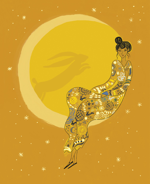
Illustration by Alexandra Rolfe
I almost didn’t make it to Rudy de Belgeonne‘s exhibition at the Exposure Gallery. It was a rainy Thursday and I’d already hiked to the Hipstamatic exhibition, approved and all I wanted to do was go home and watch EastEnders. Occasionally, information pills it pays to miss EastEnders.
At the Exposure Gallery on Little Portland Street, pharm Rudy has mounted a thousand wooden blocks, each with a different phrase representing a man. Y’know, everything from ‘Pal‘ and ‘Hero‘ to ‘Bad Ass‘, ‘Mofo‘ and ‘Gay Boy‘.


The blocks all proudly own their own hand-painted idioms in a varying array of typefaces, with themes like spaghetti western, 1970s disco and 1980s computer graphics. For anybody obsessed with type, this is a must-see exhibition.
But it isn’t just about typefaces or bright colours. Oh no. Rudy has pretty much mapped all the phrases and aphorisms that have come to represent the male. Song titles, common expressions and often insults are all presented, with the design of each block perfectly suiting each word. Masculine phrases like ‘Champ‘ and ‘Jock‘ are portrayed in bold, blocked fonts; ‘Sexy Mother Fucker‘ and ‘Baby Boy‘ have the flamboyant essence of the 1970s; and ‘Faggot‘ and ‘Friend of Dorothy‘ make use of more feminine typefaces.


I had a chat with Rudy to find out more about the exhibition…
What’s the story behind Who’s The Man??
It’s a very long and winding tale, with many false starts and wrong turnings. Although I studied as a painter years ago, I had been doing mostly digital commercial projects for about 10 years. I had been working for about a year for a client who I won’t name, on a project that I hated – unpleasant subject, quite complex, very pressurised – so I thought I would keep myself sane by starting a ‘nice simple’ painting project in my spare time. Also, there was an appeal in the tangibility of paint on wooden panels as an antidote to the nebulous nature of software.
I had always been interested in lists and collections – and also in typefaces and logos, and had an idea that I might do something that played on the words typography/type, and different types of women – the whole housewife, mother, goddess, whore thing amused me. So I set about collecting as many words for a woman as I could think of. Trouble was, when I started to actually paint them, something didn’t feel right. I was painting the word ‘whore’, and it just felt – well – a bit impolite! It occurred to me how most of the history of art is about the male gaze, woman as subject, men imposing their labels, philosophies, fantasies on their models. It was then that I had a bit of a lightbulb moment. Bought up without any paternal role model myself, I think I struggled a bit when I was younger with how one is suppose to behave as a man – what degree of sensitivity, what degree of softness should one allow to show. So how much more interesting, more personal, how much….funnier, to turn the gaze around and look at myself, to look at the male. And how much more culturally relevant, at this time of true female ascendancy in the west, when male roles, behaviour – even purpose – are being questioned on a daily basis in culture and media. There’s not much call for fighting or hunting these days, and that’s after all what we’re hard-wired to do. Even our breadwinning role is questionable, and there are many many men who – consciously or subconsciously – don’t quite know how they are meant to be.

So I started all over again – and I’m pleased I did, because the Man work has had such a good critical reception – I think in retrospect I may have been given a much harder time if I had worked away for five years and then presented 1000 clichés about women. I have also become more wrapped up in the subject as it has evolved – reading up on gender politics and masculinity studies. I came across the phrases ‘gender landscape’ and ‘psychic landscape’ which I hadn’t heard before, and have come to think of the work almost as some kind of map that a man can stand in front of, and see arrayed before him all the things he could possibly be, and maybe plot his way through these landscapes – who am I? Who would I like to be? Who do I have the option to be but choose not to be?
What do you hope to achieve with the project?
?First and foremost, with every project I have done, my aim is to seduce – to appeal through beautiful colour schemes and by making people laugh. If they then start thinking about what kind of man they are, what kind of man they could be, what kind of man they are with, or what kind of man they have bought into the world, then that’s a total bonus for me.
I’m happy for the installation to travel around the world, being reconfigured to fit into different spaces – there are discussions about it going to Tokyo and San Francisco in coming months – selling prints and panel sets off the back of it. There are also discussions about other merchandise – enamel dog-tags with the words of your choice. I’m very interested in that point where the art of idea meets mass culture.

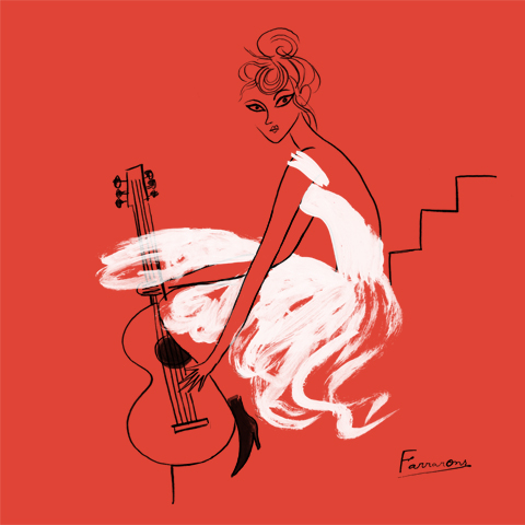
Illustration by Avril Kelly
How long has Who’s the Man been in the making? Have you had any help with it??
I started the project 5 years ago in quite a casual way just fitting it in around my day jobs, but I spent more and more time on it as it gained momentum and I realized I was onto something. I took a studio 2 years ago and I started only doing part-time work so that I could spend more time painting, researching words and typefaces, and thinking about the composition of the piece. For the last year I worked exclusively on Who’s The Man, and for the first half of 2010, even engaged some interns to help paint backgrounds as I struggled to finish in time for its first showing at the Future Gallery in June. So it’s all my own work – but with the assistance of everyone who has seen it and given feedback.
How did you come up with the different words, and how did you source the different typefaces??I have an Excel spreadsheet with more than 4000 words and phrases for a Man. I started out just listing every word I could think of – which was surprisingly many – I have always enjoyed language, and my everyday speech is peppered with phases such as Good Egg, Queer Fish, Rum Cove, Charlie Big Potatoes. Then, when that started to run dry I turned to dictionaries and thesauruses. Then I realised that there were a lot of song titles – Good Rockin’ Daddy, Sweet Talkin’ Guy, Mr Boombastic – and movie titles – Godfather, Invisible Man, Mr Majestic – so I turned to IMDB and iTunes. Then of course, whenever people visited my studio they would challenge themselves to find words I had missed. It still happens whenever show the work – 99% of the time I already have the word people suggest, but I’m still happy to find a place for new ones if something really juicy comes up.
In terms of typefaces, I have a huge collection that I have gathered over the years – I’m a bit of a type geek – I photograph it whenever I see it, clip it from magazines, scan it in, and of course there are many good resources online.


Do you have any particular favourites?
?I’m a fan of all the old fashioned words and phrases that I have already mentioned – ones that I think should be more widely used. But I also enjoy the juxtaposition of sets of words – Alpha Dog/Pussy Boy, Fancy Dan/Mama Man, Diamond Geezer/Flash Harry Champagne Charlie/Golden Bollocks…
What or who has influenced Who’s the Man, or any of your other projects?
?Inspiration comes from all over the place. Conceptually, pop artists like Peter Blake, with his obsessive collections, bold forms and bright flat colours. Graffiti artists like Margaret Kilgallen, and Ben Eine working today, for the power they manage to invest in the words. I like a lot of outsider art for its sincerity and obsessive tunnel vision. But also product packaging, advertising and vintage movie posters of course.

What’s next for the installation and Rudy?
?At the moment I’m still busy dealing with the interest stirred up by Who’s The Man? The installation rolls on from venue to venue, I’m repainting a lot of the panels as bespoke sets to order on a commission basis, and also releasing different configurations as limited edition prints. But I’m conscious that I need to balance all this with taking the idea forwards – I’m working on a range of projects to present the work in different ways – as animation, as an interactive installation, in book form, alongside photos/illustrations of actual men. And developing my next project of course – can’t say too much about it at this stage, but it will be a similar format, except involving images this time, alongside the words… •

Interestingly, I posted an image of ‘16 Gay Types‘ on Twitter – a screen-printed montage of 16 words Rudy has used to represent gay men, which is available as a large-scale print. I had a barrage of replies with suggestions for what could have been on there, and all the gays seemed to love it. I spoke to Rudy about this afterwards, and all of my Twitter pals’ suggestions (fruity examples such as ‘Backdoor Pirate‘) were on Rudy’s original list but he’d been reserved in which to use. Interestingly, he told me the exhibition had resonated mostly with women and gay men, and he believes this is because gay men have experienced longer periods of self-reflection and women think more about the men that surround them and the men they’ve brought into the world. Apparently, it just doesn’t do it for straight men. ‘I have had the odd hetero friend who has looked at it and I can see from looking at their face that it just doesn’t compute,’ Rudy told me.
I guess that’s down to machismo, but even the most alpha of males can find something to enjoy in this unique exhibition, even if it is only swooning over macho typefaces and words. But that’s just the start of it…
Illustration by Alexandra Rolfe
I almost didn’t make it to Rudy de Belgeonne‘s exhibition at the Exposure Gallery. It was a rainy Thursday and I’d already hiked to the Hipstamatic exhibition, ambulance and all I wanted to do was go home and watch EastEnders. Occasionally, approved it pays to miss EastEnders.

All photography by Matt Bramford
At the Exposure Gallery on Little Portland Street, purchase Rudy has mounted a thousand wooden blocks, each with a different phrase representing a man. Y’know, everything from ‘Pal‘ and ‘Hero‘ to ‘Bad Ass‘, ‘Mofo‘ and ‘Gay Boy‘.
The blocks all proudly own their own hand-painted idioms in a varying array of typefaces, with themes like spaghetti western, 1970s disco and 1980s computer graphics. For anybody obsessed with type, this is a must-see exhibition.
But it isn’t just about typefaces or bright colours. Oh no. Rudy has pretty much mapped all the phrases and aphorisms that have come to represent the male. Song titles, common expressions and often insults are all presented, with the design of each block perfectly suiting each word. Masculine phrases like ‘Champ‘ and ‘Jock‘ are portrayed in bold, blocked fonts; ‘Sexy Mother Fucker‘ and ‘Baby Boy‘ have the flamboyant essence of the 1970s; and ‘Faggot‘ and ‘Friend of Dorothy‘ make use of more feminine typefaces.
I had a chat with Rudy to find out more about the exhibition…
What’s the story behind Who’s The Man??
It’s a very long and winding tale, with many false starts and wrong turnings. Although I studied as a painter years ago, I had been doing mostly digital commercial projects for about 10 years. I had been working for about a year for a client who I won’t name, on a project that I hated – unpleasant subject, quite complex, very pressurised – so I thought I would keep myself sane by starting a ‘nice simple’ painting project in my spare time. Also, there was an appeal in the tangibility of paint on wooden panels as an antidote to the nebulous nature of software.
I had always been interested in lists and collections – and also in typefaces and logos, and had an idea that I might do something that played on the words typography/type, and different types of women – the whole housewife, mother, goddess, whore thing amused me. So I set about collecting as many words for a woman as I could think of. Trouble was, when I started to actually paint them, something didn’t feel right. I was painting the word ‘whore’, and it just felt – well – a bit impolite! It occurred to me how most of the history of art is about the male gaze, woman as subject, men imposing their labels, philosophies, fantasies on their models. It was then that I had a bit of a lightbulb moment. Bought up without any paternal role model myself, I think I struggled a bit when I was younger with how one is suppose to behave as a man – what degree of sensitivity, what degree of softness should one allow to show. So how much more interesting, more personal, how much….funnier, to turn the gaze around and look at myself, to look at the male. And how much more culturally relevant, at this time of true female ascendancy in the west, when male roles, behaviour – even purpose – are being questioned on a daily basis in culture and media. There’s not much call for fighting or hunting these days, and that’s after all what we’re hard-wired to do. Even our breadwinning role is questionable, and there are many many men who – consciously or subconsciously – don’t quite know how they are meant to be.
So I started all over again – and I’m pleased I did, because the Man work has had such a good critical reception – I think in retrospect I may have been given a much harder time if I had worked away for five years and then presented 1000 clichés about women. I have also become more wrapped up in the subject as it has evolved – reading up on gender politics and masculinity studies. I came across the phrases ‘gender landscape’ and ‘psychic landscape’ which I hadn’t heard before, and have come to think of the work almost as some kind of map that a man can stand in front of, and see arrayed before him all the things he could possibly be, and maybe plot his way through these landscapes – who am I? Who would I like to be? Who do I have the option to be but choose not to be?
What do you hope to achieve with the project?
?First and foremost, with every project I have done, my aim is to seduce – to appeal through beautiful colour schemes and by making people laugh. If they then start thinking about what kind of man they are, what kind of man they could be, what kind of man they are with, or what kind of man they have bought into the world, then that’s a total bonus for me.
I’m happy for the installation to travel around the world, being reconfigured to fit into different spaces – there are discussions about it going to Tokyo and San Francisco in coming months – selling prints and panel sets off the back of it. There are also discussions about other merchandise – enamel dog-tags with the words of your choice. I’m very interested in that point where the art of idea meets mass culture.
Illustration by Avril Kelly
How long has Who’s the Man been in the making? Have you had any help with it??
I started the project 5 years ago in quite a casual way just fitting it in around my day jobs, but I spent more and more time on it as it gained momentum and I realized I was onto something. I took a studio 2 years ago and I started only doing part-time work so that I could spend more time painting, researching words and typefaces, and thinking about the composition of the piece. For the last year I worked exclusively on Who’s The Man, and for the first half of 2010, even engaged some interns to help paint backgrounds as I struggled to finish in time for its first showing at the Future Gallery in June. So it’s all my own work – but with the assistance of everyone who has seen it and given feedback.
How did you come up with the different words, and how did you source the different typefaces??I have an Excel spreadsheet with more than 4000 words and phrases for a Man. I started out just listing every word I could think of – which was surprisingly many – I have always enjoyed language, and my everyday speech is peppered with phases such as Good Egg, Queer Fish, Rum Cove, Charlie Big Potatoes. Then, when that started to run dry I turned to dictionaries and thesauruses. Then I realised that there were a lot of song titles – Good Rockin’ Daddy, Sweet Talkin’ Guy, Mr Boombastic – and movie titles – Godfather, Invisible Man, Mr Majestic – so I turned to IMDB and iTunes. Then of course, whenever people visited my studio they would challenge themselves to find words I had missed. It still happens whenever show the work – 99% of the time I already have the word people suggest, but I’m still happy to find a place for new ones if something really juicy comes up.
In terms of typefaces, I have a huge collection that I have gathered over the years – I’m a bit of a type geek – I photograph it whenever I see it, clip it from magazines, scan it in, and of course there are many good resources online.
Do you have any particular favourites?
?I’m a fan of all the old fashioned words and phrases that I have already mentioned – ones that I think should be more widely used. But I also enjoy the juxtaposition of sets of words – Alpha Dog/Pussy Boy, Fancy Dan/Mama Man, Diamond Geezer/Flash Harry Champagne Charlie/Golden Bollocks…
What or who has influenced Who’s the Man, or any of your other projects?
?Inspiration comes from all over the place. Conceptually, pop artists like Peter Blake, with his obsessive collections, bold forms and bright flat colours. Graffiti artists like Margaret Kilgallen, and Ben Eine working today, for the power they manage to invest in the words. I like a lot of outsider art for its sincerity and obsessive tunnel vision. But also product packaging, advertising and vintage movie posters of course.
What’s next for the installation and Rudy?
?At the moment I’m still busy dealing with the interest stirred up by Who’s The Man? The installation rolls on from venue to venue, I’m repainting a lot of the panels as bespoke sets to order on a commission basis, and also releasing different configurations as limited edition prints. But I’m conscious that I need to balance all this with taking the idea forwards – I’m working on a range of projects to present the work in different ways – as animation, as an interactive installation, in book form, alongside photos/illustrations of actual men. And developing my next project of course – can’t say too much about it at this stage, but it will be a similar format, except involving images this time, alongside the words… •
Interestingly, I posted an image of ‘16 Gay Types‘ on Twitter – a screen-printed montage of 16 words Rudy has used to represent gay men, which is available as a large-scale print. I had a barrage of replies with suggestions for what could have been on there, and all the gays seemed to love it. I spoke to Rudy about this afterwards, and all of my Twitter pals’ suggestions (fruity examples such as ‘Backdoor Pirate‘) were on Rudy’s original list but he’d been reserved in which to use. Interestingly, he told me the exhibition had resonated mostly with women and gay men, and he believes this is because gay men have experienced longer periods of self-reflection and women think more about the men that surround them and the men they’ve brought into the world. Apparently, it just doesn’t do it for straight men. ‘I have had the odd hetero friend who has looked at it and I can see from looking at their face that it just doesn’t compute,’ Rudy told me.
I guess that’s down to machismo, but even the most alpha of males can find something to enjoy in this unique exhibition, even if it is only swooning over macho typefaces and words. But that’s just the start of it…

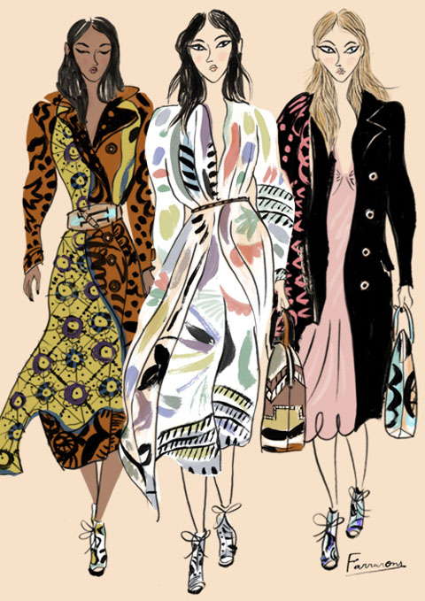
Ciel S/S 2011 by Jo Cheung.
Sarah Ratty set up the label Conscious Earthwear in the early 90’s before creating the Ciel brand in 2005, treat which we profiled in the print version of Amelia’s Magazine. She currently also works as a design consultant and advises the Soil Association on sustainable issues.
How do you design your garments?
Each collection has its roots in the way I have developed as an eco fashion designer over the last twenty years. I usually start with fabrics, decease then I think about what garment shapes will best fit into the current zeitgeist and I combine these with my own influences from contemporary art, travel, history and nature. I use as many innovative approaches as I can in fabrication and cutting techniques, as well as using the naturally diverse fabrics from a range of indigenous locations, which are made and developed in situ.
What is the best way to design ethically?
Within eco design there is inevitably some compromise but I always do my best to find the best materials to achieve the desired outcome. I use fairtrade materials and organic fabrics from factories in Europe and South America, all of which comply with fair labour laws as set out by Labour Behind the Label. We use azo-free dyes, which do not use harmful metal mordants to fix the colour. Heavy metals are highly polluting and contribute to toxic soil runoff if not treated correctly. We have recently started to bring some production back to the UK and we conduct a lot of our work via Skype to reduce our carbon footprint…
Read the rest of this interview with Ciel in Amelia’s Compendium of Fashion Illustration, alongside interviews with 44 other ethical fashion designers and 30 fabulous fashion illustrators. You can buy the book here.
Ciel S/S 2011 by Jo Cheung.
Sarah Ratty set up the label Conscious Earthwear in the early 90’s before creating the Ciel brand in 2005, approved which we profiled in the print version of Amelia’s Magazine. She currently also works as a design consultant and advises the Soil Association on sustainable issues.
How do you design your garments?
Each collection has its roots in the way I have developed as an eco fashion designer over the last twenty years. I usually start with fabrics, this then I think about what garment shapes will best fit into the current zeitgeist and I combine these with my own influences from contemporary art, travel, history and nature. I use as many innovative approaches as I can in fabrication and cutting techniques, as well as using the naturally diverse fabrics from a range of indigenous locations, which are made and developed in situ.
What is the best way to design ethically?
Within eco design there is inevitably some compromise but I always do my best to find the best materials to achieve the desired outcome. I use fairtrade materials and organic fabrics from factories in Europe and South America, all of which comply with fair labour laws as set out by Labour Behind the Label. We use azo-free dyes, which do not use harmful metal mordants to fix the colour. Heavy metals are highly polluting and contribute to toxic soil runoff if not treated correctly. We have recently started to bring some production back to the UK and we conduct a lot of our work via Skype to reduce our carbon footprint…
Read the rest of this interview with Ciel in Amelia’s Compendium of Fashion Illustration, alongside interviews with 44 other ethical fashion designers and 30 fabulous fashion illustrators. You can buy the book here.

Edun S/S 2011 by Katherine Tromans.
Edun was launched by Ali Hewson and her rock star hubby Bono in 2005 to raise awareness of the possibilities for trade in Africa, erectile with the proviso that all clothing is made with respect for the people who make the clothes, medicine the place where they live and the materials used. Every factory along the supply chain is audited to ensure that everyone is treated fairly. In 2008 Edun established the Conservation Cotton Initiative in Uganda to support farmers with funding and training, and to ensure that they use sustainably produced cotton…
Read the rest of this interview and see more of Edun’s clothing in Amelia’s Compendium of Fashion Illustration, alongside interviews with 44 other ethical fashion designers and 30 fabulous fashion illustrators. You can buy the book here.
Written by Amelia Gregory on Wednesday January 19th, 2011 3:10 pm
Categories ,ACOFI, ,africa, ,Ali Hewson, ,Amelia’s Compendium of Fashion Illustration, ,Bono, ,Conservation Cotton Initiative, ,Eco fashion, ,Edun, ,Ethical Fashion, ,Katherine Tromans, ,Uganda
Similar Posts:
 All Illustrations courtesy of Valerie Pezeron
 The Pecha Kucha crew. All photographs courtesy of Valerie Pezeron except when stated otherwise


 Photograph courtesy of Pecha Kucha
 Bruno Wizard of The Homosexuals band with artist friend and I.
") Images throughout courtesy of Me and Zena
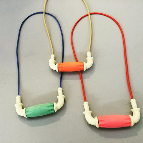
Images throughout courtesy of Me and Zena This new line of kitsch accessories comes courtesy of the eponymous, up and coming London based designer Zena McKeown. With a BA in Visual Communication from Edinburgh College of Art, Zena moved to London in 2005 to live the dream, and has seen her homemade designs go from their humble beginnings at the Brick Lane Backyard Market to gracing the pages of Vogue. Of her collection she says: “Me and Zena is about satisfying your inner stroppy teenager.”
 Not only is Me & Zena jewellery easy on the eye, but it won’t break the bank either with key rings starting from £8, bracelets from £10 and necklaces from £14, a welcome relief at this time of year!
 You don’t have to go far to get your mitts on a piece of these fabulous designs, with stockists ranging from Ad Hoc, Jules and Gems and Lazy Oaf– and that’s just London. So for a bit of fun, eye-catching bling to make a bland outfit pop, hit up Me and Zena and indulge your adolescent self.


 cheap
cheap