Amelia’s Magazine | Topman Design: London Collections: Men A/W 2014 Catwalk Review


Topman Design A/W 2014 by Dom&Ink

It was raining, men at the Old Sorting Office on Monday for my first show of this (awkwardly branded) London Collections: Men A/W 2014 season – Topman Design.


Topman Design A/W 2014 by Dom&Ink

I can’t be bothered to drone on about the usual fuss that preceded this event, but I’ll just say that my standing ticket offered zero VIP service. Inside I stood in a herd of people five rows deep, aiming my Canon zoom lens through heads while those around me took terrible photographs on point-and-shoot cameras, iPhones and iPads. There’s a whole other piece I could write here, touched on much more eloquently than I could by Michael over at Anastasia Duck, but I will say this: I’ve invested in a decent camera and pride myself on taking decent images that I hope offer a slightly different insight to the normal catwalking shots we’re all familiar with. This is why I continue to work with Amelia because we share the same values when it comes to documenting the shows, but it seems to be getting increasingly difficult to do the job and I left feeling somewhat frustrated.


All photography by Matt Bramford

I probably say the same thing every season, but I’m always reserved about Topman. Aesthetically they’ve upped their game, and whoever is in charge seems to know what they’re doing in the hope of offering a collection akin to the strong contenders on the LC:M schedule. This season relied heavily on a palette of black and red with an injection of pale blue pieces. Box-shaped overcoats offered a different silhouette, sharp tailored blazers worked effortlessly with plaid shirts and heavy knitwear pieces adopting a variety of techniques were exciting.

As usual there were some slightly off pieces – a red tee with graphic lettering (above) looked like something you’d buy on a whim in Kavos after two fishbowl cocktails and some of the double-breasted coats looked awkward on slight-framed models, but overall this was a coherent collection. A reasonable price point means it does offer something more interesting than the rest of the High Street without an outrageous price tag.

For the finale, the heavens (well, the rigging) opened to soak the models as they reappeared for the recap. Not for the first time in history but it was a spectacle none-the-less, but I sure as hell don’t fancy getting caught in the rain in one of those chunky knits. I’m not sure if there was a message here, or how it related to the clothes. Perhaps it was an unsubtle way of saying LOOK OUR THREADS WITHSTAND RAIN, WE’RE NOT CHEAP; maybe it was merely for the aesthetic, but I bloody enjoyed it and everybody else seemed to.

Categories ,A/W 2014, ,catwalk, ,Dom&Ink, ,Dominic Evans, ,fashion, ,knitwear, ,LCM, ,LCMAW2014, ,london, ,London Collections Men, ,Matt Bramford, ,Old Sorting Office, ,Rain, ,review, ,Topman Design, ,Weather Girls

Similar Posts:


Amelia’s Magazine | New S/S 2013 Season Interview: Martina Spetlova

Martina Spetlova S/S 2013 by Sharon Farrow
Martina Spetlova S/S 2013 by Sharon Farrow.

Innovative fashion designer Martina Spetlova introduces her new S/S 2013 collection and explains why you should help fund the movie to showcase her upcoming season on Kickstarter.

Marina Spetlova 'The Print & The Jacket' by Dom&Ink
Marina Spetlova ‘The Print & The Jacket‘ by Dom&Ink.

You are a textile innovator – what is it about different textures that you find so appealing?
Texture is like print for me, juxtaposing diferent textures together gives my designs the power I like to achieve in my collections. I tend to experiment with contrasting colours and opposing textures. I am always trying to find ways to treat standard fabrics to give them different structural properties – for instance by bonding, pleating and weaving satin through leathers – which helps me create a point of difference. That is how I can make my designs stand out but I also have lots of fun creating new collections. I am minimalist in shapes but maximalist in texture.

MartinaSpetlova_SS13_Look11
MartinaSpetlova_SS13_2
Your colour palette is also always very distinctive – what inspired this current season’s colour range?
My selection of colours is always little bit random. I usually start with 3 or 4 colours I like and are available and add more of them while working on my fabric samples.

Where did the graphic patterns come from?
From a photograph of my mum in the 70s.

Martina Spetlova by Alexandria Coe
Martina Spetlova by Alexandria Coe.

How do you source your fabrics?
This season I mainly worked with leather. My supplier in London has certain sustainable policies: I am concern about environment and I try to be as eco friendly as possible with my label.

Who creates your pieces?
All the knitwear is created in my studio in London, which does all samples and production at the moment. We work on domestic knitting machines.

MartinaSpetlova_SS13_Look4
MartinaSpetlova_SS13_1
What was the inspiration for the abstractions in your S/S 2013 film?
I wanted to create a land of Martina Spetlova. Shooting the collection froma microscopic view, showing the collection as a diverse landscape of bold colour and glistening mountains of fabric. It captures the detailed focus of this collection.

Martina Spetlova by Ashley Fauguel
Martina Spetlova by Ashley Fauguel.

Looking forward, what can we expect from the new collection?
The new collection is entirely leather and knitwear and features lots of textures and colours again… My simple twisted yarn knitted dresses and neckpieces accompany every look of 15 silhouettes and are a great compliment to raw edged, un-lined leather jackets, tops, skirts, shorts and trousers. Collars are created by patch-working fish skin leathers and off-cuts of sheep skin and no piece in the collection is flat. Amongst the techniques used are the playful exploration of accordion pleats on leather, cuts punched through soft leathers to create grids on the surface and my satin tape hand-woven technique from last season combined with graphic pattern (seen also on knits). I’m using softly twisted stretchy yarns for knitted neckpieces and dresses in black, light grey and graphic patterns. A/W 2013 uses soft colours of pale blue, moth green, mustard orange, white and black together with acid yellow and orange. I use a high quality of craftsmanship, making pieces by hand in the studio.

MartinaSpetlova_SS13_Look13
Martina Spetlova SS13 by Isher Dhiman
Martina Spetlova S/S 2013 by Isher Dhiman.

You are currently seeking funding on Kickstarter – what will these funds go towards and what can contributors expect in return?
I have set up Kickstarter to help me fund my film presentation in Somerset House during London Fashion Week, which will pay for the space to showcase my film in the Portico Rooms. Everyone who sponsors this event will be invited to Somerset House, and pieces from my collections will be gifted to generous backers. Of course there will also be a BIG THANK YOU to everyone who supports me!

There are six days left to help Martina Spetlova raise £1000 for her film presentation at the LFW – help out on Kickstarter here.

Categories ,Alexandria Coe, ,Ashley Fauguel, ,Dom & Ink, ,Dom&Ink, ,Dominic Evans, ,ethical, ,film, ,Isher Dhiman, ,Kickstarter, ,leather, ,London Fashion Week, ,Martina Spetlova, ,Portico Rooms, ,S/S 2013, ,Sharon Farrow, ,Somerset House, ,textiles

Similar Posts:


Amelia’s Magazine | Map My Heart: an interview with illustrator Dom and Ink

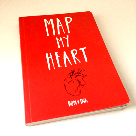
Map My Heart book cover by Dom&Ink

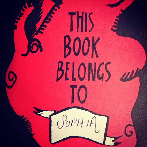
Dominic Evans, known as Dom and Ink, is a super talented illustrator who contributes brilliant fashion illustrations to Amelia’s Magazine. He’s also just secured his first book deal off the back of his brilliant zine, Batter My Heart, which I was lucky to receive a copy of some time ago. With an illustrative style that is perfectly suited to his idiosyncratic tales of love and heartbreak, this book would make the perfect Christmas gift for a single friend with a sense of humour. I caught up with Dom to find out more about the making of Map My Heart.

Author photo - Dom&Ink

What inspired you to start drawing about relationships and lurve?
I think I’m just really nosey. I really like to hear stories about how people meet, fall in love, break up, weird dates etc. They’ve always fascinated me. I just find relationships, dating and love really flipping interesting. I believe there is someone out there for everybody and for me, the whole point of this book is something people can pick up, have a laugh with and afterwards think, ‘You know what, stuff you Brett for leaving me for that stripper, I’m awesome!‘. I’ve said this to other people before but I really do think it’s down to my love of watching trashy American soaps when I was younger, ie, Sunset Beach. Maybe I just love drama and fierce shoulderpads!

Map My Heart 2 by Dom&Ink

Where do you draw your ideas from… had much experience yourself?
Being 27 and single I have had my fair share of dating disasters and extremely awkward experiences. In fact I’ve pretty much gone through every chapter of the book! When I put Map My Heart together I wanted to take ideas from everything, so some pages are inspired from conversations I’d overhear on the bus or in Tesco, others from friends. If I named them they may hunt me down, cut my quiff off and kill me.

Map My Heart by Dom and Ink 2013

Can you share any strange experiences that led to a page in the new book?
Hmmm. I’d say the spread called ‘How To Seduce‘ had an interesting starting point. The spread basically tells you how to ‘eyesex’ someone by looking from their lips to their eyes in a seductive manner. You then repeat these steps until they’re putty in your hands. The idea for the page came about when my best friend was teaching me about ‘eyesexing’ (something I had no idea even existed) and I literally didn’t have a clue what the hell she was on about. Next thing you know we were both sat in the pub practising ‘eyesexing’ on one another. Aside from terrifying the barmaid, I can easily say I’m an ‘eyesexing’ pro. Just call me casanova. So by the time it came around to putting Map My Heart together, I devoted a whole four pages to this amazing seductive exercise…

Map My Heart 5 by Dom&Ink

Why do you like to work in minimal colours?
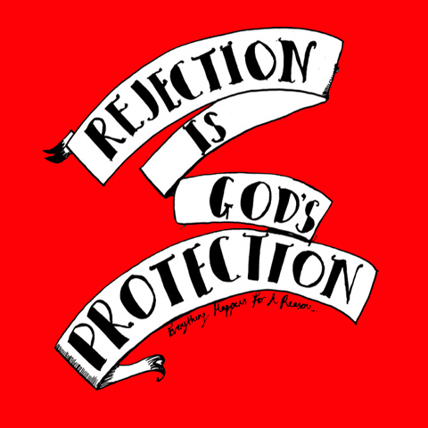
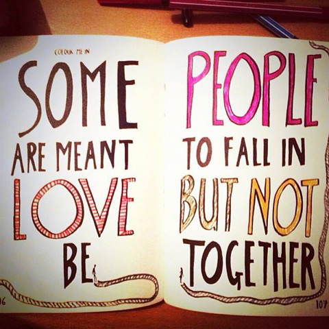
Not gonna lie, I used to be colour crazy. Every illustration looked like a rainbow had been sick on it. Then I thought about just keeping my  work to just a few colours and nothing too rainbow-tastic. However with the book though, I wanted the reader to embrace using colour, there are a few flecks of red throughout the pages, but other than that I really want readers to feel inspired and colour in whatever the hell they want! It’s interesting because when readers tweet me pictures of spreads they’ve doodled in, some pages a reader will colour in just some text and then other readers go all out on colouring in patterns, hair and unicorns. Yep, there’s unicorns in the book. In fact, readers can tweet me their crayola creations @dom_and_ink 

Map My Heart by Dom and Ink 2013

May My Heart is a fancier book version of your original self published Batter My Heart magazine, how did it come about?
I’d just put together Batter My Heart on my illustration MA at the University of Brighton (Sequential Design/illustration) and in all honesty, up until the degree show I hadn’t really thought about publishing it. I’d done a few limited self published copies of the original and my tutors put forward the idea of getting it published! So I sat down and emailed spreads to some publishers. I mean it was no easy task, I think some people may think it’s quite easy but it’s actually rather hard. When I met with the team at Huck And Pucker, everything just clicked into place. They understood the book, the content, they laughed at my awful jokes and puns and I knew straight away they’d do a bang tidy job with it. So the book went from 60 pages to 144, and changed sizes to a smaller hand held size, we added more chapters and quotes to really beef out each chapter. I had so much unused material already I wanted to use, so some stuff that was discarded from ‘Batter’ made it into ‘Map My Heart’. I did have to get rid of my Cheryl Cole spread though…poor Chezza.

Map My Heart 6 by Dom&Ink

Where next for Dom and Ink?
I’m still getting my head around a book deal, I find it really surreal when I see a copy, I’m thinking ‘Did I do that?!‘. It’s just been confirmed that the book will be hitting the USA next year so that’s rather mindblowing! I’m also working on a poetry anthology called Hell Creek based around dinosaurs with poet J.T Welsch. It’s different to anything I’ve done before, but I’m really enjoying it. I can’t reveal too much as it’s kinda top secret. Other than that I’m working on promoting the book, various commissions and maybe working with Huck And Pucker on a few other things also….

Map My Heart 3 by Dom&Ink

Map My Heart is available from Huck and Pucker here.

Categories ,@dom_and_ink, ,Batter My Heart, ,Dom and Ink, ,Dominic Evans, ,Hell Creek, ,Huck And Pucker, ,J.T Welsch, ,Map My Heart, ,University of Brighton

Similar Posts: