Amelia’s Magazine | London Fashion Week A/W 2011 catwalk review: Amanda Wakeley (by Jess)

Ziad Ghanem by Avril Kelly

What an amazing show; Ziad Ghanem has trumped everything else I’ve seen this week. Opening with a model dressing in a dark, prescription this dramatic floor length strapless gown, nurse with green feathers, cheapest stilts and skull makeup the audience were cheering from the off.

The front row was packed out with the eccentrically dressed – Boy George almost blended into the background in a bright yellow hat and full face of makeup. Special mention has to go to the PVC clad, (and complete with blow up hair), London artist Pandemonia, sitting opposite me. Together with a matching blow up dog, she must have been boilin’!

Ziad Ghanem by Alison Day

The loud show, with music changes more frequent than model changes provided clapping, laughing and unanimous approval – so much so that no one seemed to care that the show started an almost an hour late. Male and female models took to the catwalk in stunning creations – capes, gigantic earrings and tremendously tight dresses were wriggled, danced and glided down the runway on joker-style made-up faces.

The models came in all shapes and sizes but voluptuous curves and a heaving bosom was the order of the evening. Corset dresses that pushed said bosoms up and out were so tight that somewhere Scarlett Johansen was blushing. Full length floaty gowns in pale hues of blue, deep reds, sparkling gold and matte grey also allowed for plenty of swishing, and cloak spinning as the models made their way towards the waiting photographers.

Ziad Ghanem by Madi

My favourite dress was the bright fuschia deep cut and backless cocktail dress that nipped in perfectly at the waist. The shiny nature of the material was so unashamedly trashy that it avoided (I think) being either tacky or quality street wrapper-esque. Other notable highlights of the show include a deathly bride and groom, solemnly showering the crowd with petals at the end of the show, and the model who pirouetted her way backwards after walking down the catwalk. All in all, a brilliant show – exciting, entertaining and some truly beautiful clothes.

Ziad Ghanem by Avril Kelly

What an amazing show; Ziad Ghanem has trumped everything else I’ve seen this week. Opening with a model dressing in a dark, pills dramatic floor length strapless gown, site with green feathers, case stilts and skull makeup the audience were cheering from the off.

The front row was packed out with the eccentrically dressed – Boy George almost blended into the background in a bright yellow hat and full face of makeup. Special mention has to go to the PVC clad, (and complete with blow up hair), London artist Pandemonia, sitting opposite me. Together with a matching blow up dog, she must have been boilin’!

Ziad Ghanem by Alison Day

The loud show, with music changes more frequent than model changes provided clapping, laughing and unanimous approval – so much so that no one seemed to care that the show started an almost an hour late. Male and female models took to the catwalk in stunning creations – capes, gigantic earrings and tremendously tight dresses were wriggled, danced and glided down the runway on joker-style made-up faces.

The models came in all shapes and sizes but voluptuous curves and a heaving bosom was the order of the evening. Corset dresses that pushed said bosoms up and out were so tight that somewhere Scarlett Johansen was blushing. Full length floaty gowns in pale hues of blue, deep reds, sparkling gold and matte grey also allowed for plenty of swishing, and cloak spinning as the models made their way towards the waiting photographers.

Ziad Ghanem by Madi

My favourite dress was the bright fuschia deep cut and backless cocktail dress that nipped in perfectly at the waist. The shiny nature of the material was so unashamedly trashy that it avoided (I think) being either tacky or quality street wrapper-esque. Other notable highlights of the show include a deathly bride and groom, solemnly showering the crowd with petals at the end of the show, and the model who pirouetted her way backwards after walking down the catwalk. All in all, a brilliant show – exciting, entertaining and some truly beautiful clothes.

Ziad Ghanem by Avril Kelly

What an amazing show; Ziad Ghanem has trumped everything else I’ve seen this week. Opening with a model dressing in a dark, this dramatic floor length strapless gown, pilule with green feathers, stilts and skull makeup the audience were cheering from the off.

The front row was packed out with the eccentrically dressed – Boy George almost blended into the background in a bright yellow hat and full face of makeup. Special mention has to go to the PVC clad, (and complete with blow up hair), London artist Pandemonia, sitting opposite me. Together with a matching blow up dog, she must have been boilin’!

Ziad Ghanem by Alison Day

The loud show, with music changes more frequent than model changes provided clapping, laughing and unanimous approval – so much so that no one seemed to care that the show started an almost an hour late. Male and female models took to the catwalk in stunning creations – capes, gigantic earrings and tremendously tight dresses were wriggled, danced and glided down the runway on joker-style made-up faces.

The models came in all shapes and sizes but voluptuous curves and a heaving bosom was the order of the evening. Corset dresses that pushed said bosoms up and out were so tight that somewhere Scarlett Johansen was blushing. Full length floaty gowns in pale hues of blue, deep reds, sparkling gold and matte grey also allowed for plenty of swishing, and cloak spinning as the models made their way towards the waiting photographers.

Ziad Ghanem by Madi

My favourite dress was the bright fuschia deep cut and backless cocktail dress that nipped in perfectly at the waist. The shiny nature of the material was so unashamedly trashy that it avoided (I think) being either tacky or quality street wrapper-esque. Other notable highlights of the show include a deathly bride and groom, solemnly showering the crowd with petals at the end of the show, and the model who pirouetted her way backwards after walking down the catwalk. All in all, a brilliant show – exciting, entertaining and some truly beautiful clothes.

Illustration by Yelena Bryksenkova

Rocking up to London Fashion Week for the first time on Day Five feels a bit like having overslept for work: you’re constantly trying to catch up what you’ve missed. Because, case I mean … wow. Just the courtyard of Somerset House is a fashion show of sorts, with the metallic leather, the Jackie O headscarves, the artful hats, the baby-as-accessory, and the miles and miles of feathers-and-corsage up-dos. Not to mention there’s a lot of shoes previously only seen in fashion magazines, girls who look like boys and vice versa, plus a lot of very tall women. At 5’7” I’ve never felt short in my life, but yesterday was a first for this too, as I stood there trying not to twiddle my press pass and look so much like the rookie that I am. But then Helen Martin, a Fashion Week veteran by now, came and rescued me, and together we made our way for the Amanda Wakeley runway show.


Illustration by Sandra Contreras

I had no idea to expect from the Amanda Wakeley show, other than it being ‘grown up’ fashion. Well at least it would be something different, I thought as I brushed some mud off my leg as we found our seats on the second row. A few minutes later people stopped running around, the plastic cover was removed from the runway, lights down, music up, and then – the models. One by one they came, the tall, gangly girls, rolling up the catwalk in their pouts, their towering heels and scraped-back hair. The black dresses came first, then a wave of bright orange, before a third lot of whites.

A few floaty numbers came here and there, but most of the dresses were very sculpted, sitting tight on the body with architectural lines built into the fabric. These all came with a thin, black leather belt, playfully tied into a double knot at the front. The rows of metallic cuffs up models’ arms added to the strict feel of the dresses, each garment subtly different from the next due to an alternative neckline or new skirt shape. Wakeley had maintained a very lady-like dress length on most of her creations, meaning the couple of models wearing flaring minis added a fun touch.


Illustration by Mina Bach

Several of the looser, more transparent dresses had what looked like beading; this was either ‘antique metal sequins’ or something called ’solar encrusted beading’, according to the literature. I especially liked the orange dress with the heavy silver-beaded panel (image above), as with my boyish figure I’ve never found a defined waist to be particularly flattering. There were plenty of boyish shapes among the models as well, but being professional mannequins they pulled off Wakeley’s sometimes unforgiving, figure-hugging dresses with ease. Wakeley actually has a pretty good track record when it comes to designing for real life women, but still, I couldn’t help but think a few curves would have made the outfits look even better, especially the fitted ones. I understand this is the way the world of high fashion works, but coming to this for the first time I guess I’ve not yet fully adjusted my outlook.


Illustration by Sarah Alfarhan

It was over in a flash, and Wakeley showed her face for no more than three seconds to wave, before she disappeared again behind the curtain. All around people were rustling impatiently even though the queue moved quickly towards the door, and by the time I’d made it outside a few of the models were already gathered around the back for a sneaky fag. For them it was just Day Five, but for me it was the first, and sadly the last. For now, that is – it all happens again in September and next time I’ll make sure to show up bright and early.

More of Yelena Bryksenkova’s illustrations can be found in Amelia’s Compendium of Fashion Illustration.

Categories ,A/W 2011, ,Amanda Wakeley, ,fashion, ,Helen Martin, ,lfw, ,london, ,London Fashion Week, ,Mina Bach., ,Sandra Contreras, ,Sarah Alfarhan, ,Somerset House, ,Yelena Bryksenkova

Similar Posts:


Amelia’s Magazine | London Fashion Week A/W 2011 catwalk review: Amanda Wakeley (by Jess)


Illustration by Yelena Bryksenkova

Rocking up to London Fashion Week for the first time on Day Five feels a bit like having overslept for work: you’re constantly trying to catch up what you’ve missed. Because, I mean … wow. Just the courtyard of Somerset House is a fashion show of sorts, with the metallic leather, the Jackie O headscarves, the artful hats, the baby-as-accessory, and the miles and miles of feathers-and-corsage up-dos. Not to mention there’s a lot of shoes previously only seen in fashion magazines, girls who look like boys and vice versa, plus a lot of very tall women. At 5’7” I’ve never felt short in my life, but yesterday was a first for this too, as I stood there trying not to twiddle my press pass and look so much like the rookie that I am. But then Helen Martin, a Fashion Week veteran by now, came and rescued me, and together we made our way for the Amanda Wakeley runway show.


Illustration by Sandra Contreras

I had no idea to expect from the Amanda Wakeley show, other than it being ‘grown up’ fashion. Well at least it would be something different, I thought as I brushed some mud off my leg as we found our seats on the second row. A few minutes later people stopped running around, the plastic cover was removed from the runway, lights down, music up, and then – the models. One by one they came, the tall, gangly girls, rolling up the catwalk in their pouts, their towering heels and scraped-back hair. The black dresses came first, then a wave of bright orange, before a third lot of whites.

A few floaty numbers came here and there, but most of the dresses were very sculpted, sitting tight on the body with architectural lines built into the fabric. These all came with a thin, black leather belt, playfully tied into a double knot at the front. The rows of metallic cuffs up models’ arms added to the strict feel of the dresses, each garment subtly different from the next due to an alternative neckline or new skirt shape. Wakeley had maintained a very lady-like dress length on most of her creations, meaning the couple of models wearing flaring minis added a fun touch.


Illustration by Mina Bach

Several of the looser, more transparent dresses had what looked like beading; this was either ‘antique metal sequins’ or something called ’solar encrusted beading’, according to the literature. I especially liked the orange dress with the heavy silver-beaded panel (image above), as with my boyish figure I’ve never found a defined waist to be particularly flattering. There were plenty of boyish shapes among the models as well, but being professional mannequins they pulled off Wakeley’s sometimes unforgiving, figure-hugging dresses with ease. Wakeley actually has a pretty good track record when it comes to designing for real life women, but still, I couldn’t help but think a few curves would have made the outfits look even better, especially the fitted ones. I understand this is the way the world of high fashion works, but coming to this for the first time I guess I’ve not yet fully adjusted my outlook.


Illustration by Sarah Alfarhan

It was over in a flash, and Wakeley showed her face for no more than three seconds to wave, before she disappeared again behind the curtain. All around people were rustling impatiently even though the queue moved quickly towards the door, and by the time I’d made it outside a few of the models were already gathered around the back for a sneaky fag. For them it was just Day Five, but for me it was the first, and sadly the last. For now, that is – it all happens again in September and next time I’ll make sure to show up bright and early.

More of Yelena Bryksenkova’s illustrations can be found in Amelia’s Compendium of Fashion Illustration.

Categories ,A/W 2011, ,Amanda Wakeley, ,fashion, ,Helen Martin, ,lfw, ,london, ,London Fashion Week, ,Mina Bach., ,Sandra Contreras, ,Sarah Alfarhan, ,Somerset House, ,Yelena Bryksenkova

Similar Posts:


Amelia’s Magazine | London Fashion Week A/W 2011 Catwalk Review: Elliott J. Frieze

Anja Maklar by Madi

Ones to Watch is always one of my favourite parts of London Fashion Week, viagra four fresh designers, more about one after another and always packed to the rafters it’s a really nice way to see contrasting styles. Generally it’s a mixed bag, more about read our preview here and last year’s review here. Famous spots in the audience were Susie Bubble and Laura Santamaria.

Anja Maklar

The designer presented a collection of pastels, with cut out and overlap details. In answer to Matt’s pondering in his write up of the designer, she has indeed developed some of the key styles which were seen in her SS11 show, in particular the laser cut detail and the triangle shape of her dresses.

This was a fun, pleasantly pastel, colourful collection with plenty to keep the audience interested.

Kirsty Ward

Kirsty Ward by Anne N’Toko

This is definitely a designer to keep your eye on. Part of a growing crop of young graduates who really bring jewellery into their collections, her AW11 offering was brimming with sparkly adornments and beautiful cut clothes. In particular, the use of cut out panels throughout, was very effective.

A palette with gold, bronze and brown, the autumnal colours were accented with sudden all-in-white outfits and stunning oversized necklaces. A favourite for me was the mesh bronze dress, which caught the light beautifully as the model walked down the catwalk.

Sara Bro Jorgensen

Sara Bro Jorgensen by Joe Turvey

Definitely my favourite collection out of the four, Jorgensen has a hint of Mark Fast and Laura Theiss about her designs but has added an edgier, rocky feel to knitted yarns.

Mostly black, her collection showcased knitted dresses with lots of hanging threads and beads. There were also some highly covetable leggings with shiny black slivers of PVC running down the middle of the leg.

My favourite part of the collection, however, was the cute headgear sported by all the models. Little knitted caps in black and dark blue were worn with nearly every single look.

As well as the black, white knitted cardigans and dresses were worn with grey, splatter print swingy trousers and shorts. The black versus white theme was continued with trompe l’oeil printed dresses complete with tuxedo jacket, waistcoat, shirt and bow tiees.

Tze Gogh

Tze Gogh by Joe Turvey

The last of our Ones to Watch is Tze Gogh who graduated from Parsons in New York and then completed his masters at Central Saint Martins.

Slightly disappointing for me in terms of pushing boundaries, Gogh’s collection was understated, with clean simple lines in block colours of midnight blue, husky grey and black. The structured coats, dresses and jackets cleverly retained their shape as the models walked and I would love to know what material he uses, but I couldn’t help feeling that more could have been done to make the collection stand out.

However, I do applaud how he has retained from over designing his clothes and has kept a minimal aesthetic.

Illustration by Mina Bach

If I could taste something as delish for the mouth as Elliott J. Frieze is for the eyes, cialis 40mg I’d eat it up so fast that time may go backwards. It’s my second LFW show of newcomer Elliott J. Frieze and I’m seriously beginning to LOVE this guy. Like, shop true sartorial love. His work needs to be up there with the best on the BFC Catwalk. NEEDS.

Illustration by Matilde Sazio

Saying that, approved however, he did bag a rather delectable venue anyway. Especially for his third London Fashion Week show. It was a bit of an epic walk in the rain down the entire length of the Strand, but for the beautiful Charing Cross Hotel? Well worth it. And with free champagne, who’s complaining? Not me. Well actually, me a bit… I thought ‘Great! Bit of bubbly will numb my stabbing sore throat’ – WRONG. (Note To All – 1 in 2 people at fashion week are ill like moi). After a sneaky chat with someone in the production team, Amelia, Matt and I got first dibs on seats, as well as a lovely lady from Grazia. She lent me a lush pen that had me wishing she’d forget to ask for it back. We spread ourselves amongst the front rows for different perspectives and then it was the hipsters turn to pick-and-choose. It sure felt good to have one-up on them this time! The crowds then gushed in with one lady’s hat towering tall above them all. We couldn’t help staring in the champagne reception, it genuinely looked like a Philip Treacy. Jealous.

Illustration by Kerriann Hulme

The runway for the show was unique in that it snaked around the room, this insanely beautiful ornate room. A gleaming chandelier hung high over our heads, for goodness sake. And velvet and marble was coming in from all directions. So were the clothes as luxe as the location?

Illustration by Natsuki Otani

HELL yes, they were. The collection, once again, embodied his natural design ethos, paying homage to classic British Tailoring intertwined with sexy modernity. I remember this creepy boy from my childhood wore green corduroy trousers to school everyday, so I usually REPELL corduroy. However, Elliott J. Frieze has officially turned me with suitable injections of camel-coloured corduroy – think pencil skirts and jacket details. Lush.

The whole colour pallette was perfection on the eyes. Frieze centred it around a combination of ‘caffeine mixtures’ represented by Latte, Mochas and Expresso. Considering i’m a die-hard lover of anything coffee-flavoured, this must be why i wanted to eat the collection up! Everything was very well co-ordinated.

Frieze drove the boundaries of his classic British foundations with cocktail dresses made from lambswool and a long beautiful dress that was constructed by some of the most impressive jersey draping I have EVER seen. No wonder he’s dressed such power-women as Yasmini Le Bon, Lily Cole & Erin O’ Connor.

The idea is that the look reflects Elliott’s story from Country to City. From all those old-fashioned favourite textures to a bit of spectacular cinching, draping and tucking to prepare the country Lord/Lady for the London ratrace!

Much inspiration was taken from the 1970s. Therefore, just like last season, hair was big, curly and volumnous. Suitable additions of sunglasses courtesy of Persol and gloves by Southcombe set the whole look off, creating a powerful and sexy image.

If I wasn’t currently a student and could afford to invest in any up-and-coming designer, I would go straight to Elliott J. Frieze! He’s my definate one-to-watch so, if I were you, I’d keep an eye on him.

Photos by Georgia Takacs

Categories ,A/W 201, ,Elliott J Frieze, ,kerriann hulme, ,lfw, ,Matilde Sazio, ,Mina Bach., ,Natsuki Otani

Similar Posts:


Amelia’s Magazine | London Fashion Week A/W 2011 Catwalk Review: John Rocha

KONICA MINOLTA DIGITAL CAMERA

Illustration by Mina Bach

If I could taste something as delish for the mouth as Elliott J. Frieze is for the eyes, pill I’d eat it up so fast that time may go backwards. It’s my second LFW show of newcomer Elliott J. Frieze and I’m seriously beginning to LOVE this guy. Like, true sartorial love. His work needs to be up there with the best on the BFC Catwalk. NEEDS.

Saying that, however, he did bag a rather delectable venue anyway. Especially for his third London Fashion Week show. It was a bit of an epic walk in the rain down the entire length of the Strand, but for the beautiful Charing Cross Hotel? Well worth it. And with free champagne, who’s complaining? Not me. Well actually, me a bit… I thought ‘Great! Bit of bubbly will numb my stabbing sore throat’ – WRONG. (Note To All – 1 in 2 people at fashion week are ill like moi). After a sneaky chat with someone in the production team, Amelia, Matt and I got first dibs on seats, as well as a lovely lady from Grazia. She lent me a lush pen that had me wishing she’d forget to ask for it back. We spread ourselves amongst the front rows for different perspectives and then it was the hipsters turn to pick-and-choose. It sure felt good to have one-up on them this time! The crowds then gushed in with one lady’s hat towering tall above them all. We couldn’t help staring in the champagne reception, it genuinely looked like a Philip Treacy. Jealous.

Illustration by Kerriann Hulme

The runway for the show was unique in that it snaked around the room, this insanely beautiful ornate room. A gleaming chandelier hung high over our heads, for goodness sake. And velvet and marble was coming in from all directions. So were the clothes as luxe as the location?

Illustration by Natsuki Otani

HELL yes, they were. The collection, once again, embodied his natural design ethos, paying homage to classic British Tailoring intertwined with sexy modernity. I remember this creepy boy from my childhood wore green corduroy trousers to school everyday, so I usually REPELL corduroy. However, Elliott J. Frieze has officially turned me with suitable injections of camel-coloured corduroy – think pencil skirts and jacket details. Lush.

The whole colour pallette was perfection on the eyes. Frieze centred it around a combination of ‘caffeine mixtures’ represented by Latte, Mochas and Expresso. Considering i’m a die-hard lover of anything coffee-flavoured, this must be why i wanted to eat the collection up! Everything was very well co-ordinated.

Frieze drove the boundaries of his classic British foundations with cocktail dresses made from lambswool and a long beautiful dress that was constructed by some of the most impressive jersey draping I have EVER seen. No wonder he’s dressed such power-women as Yasmini Le Bon, Lily Cole & Erin O’ Connor.

The idea is that the look reflects Elliott’s story from Country to City. From all those old-fashioned favourite textures to a bit of spectacular cinching, draping and tucking to prepare the country Lord/Lady for the London ratrace!

Much inspiration was taken from the 1970s. Therefore, just like last season, hair was big, curly and volumnous. Suitable additions of sunglasses courtesy of Persol and gloves by Southcombe set the whole look off, creating a powerful and sexy image.

If I wasn’t currently a student and could afford to invest in any up-and-coming designer, I would go straight to Elliott J. Frieze! He’s my definate one-to-watch so, if I were you, I’d keep an eye on him.

Illustration by Mina Bach

If I could taste something as delish for the mouth as Elliott J. Frieze is for the eyes, more about I’d eat it up so fast that time may go backwards. It’s my second LFW show of newcomer Elliott J. Frieze and I’m seriously beginning to LOVE this guy. Like, pharm true sartorial love. His work needs to be up there with the best on the BFC Catwalk. NEEDS.

Illustration by Matilda Sazio

Saying that, buy more about however, he did bag a rather delectable venue anyway. Especially for his third London Fashion Week show. It was a bit of an epic walk in the rain down the entire length of the Strand, but for the beautiful Charing Cross Hotel? Well worth it. And with free champagne, who’s complaining? Not me. Well actually, me a bit… I thought ‘Great! Bit of bubbly will numb my stabbing sore throat’ – WRONG. (Note To All – 1 in 2 people at fashion week are ill like moi). After a sneaky chat with someone in the production team, Amelia, Matt and I got first dibs on seats, as well as a lovely lady from Grazia. She lent me a lush pen that had me wishing she’d forget to ask for it back. We spread ourselves amongst the front rows for different perspectives and then it was the hipsters turn to pick-and-choose. It sure felt good to have one-up on them this time! The crowds then gushed in with one lady’s hat towering tall above them all. We couldn’t help staring in the champagne reception, it genuinely looked like a Philip Treacy. Jealous.

Illustration by Kerriann Hulme

The runway for the show was unique in that it snaked around the room, this insanely beautiful ornate room. A gleaming chandelier hung high over our heads, for goodness sake. And velvet and marble was coming in from all directions. So were the clothes as luxe as the location?

Illustration by Natsuki Otani

HELL yes, they were. The collection, once again, embodied his natural design ethos, paying homage to classic British Tailoring intertwined with sexy modernity. I remember this creepy boy from my childhood wore green corduroy trousers to school everyday, so I usually REPELL corduroy. However, Elliott J. Frieze has officially turned me with suitable injections of camel-coloured corduroy – think pencil skirts and jacket details. Lush.

The whole colour pallette was perfection on the eyes. Frieze centred it around a combination of ‘caffeine mixtures’ represented by Latte, Mochas and Expresso. Considering i’m a die-hard lover of anything coffee-flavoured, this must be why i wanted to eat the collection up! Everything was very well co-ordinated.

Frieze drove the boundaries of his classic British foundations with cocktail dresses made from lambswool and a long beautiful dress that was constructed by some of the most impressive jersey draping I have EVER seen. No wonder he’s dressed such power-women as Yasmini Le Bon, Lily Cole & Erin O’ Connor.

The idea is that the look reflects Elliott’s story from Country to City. From all those old-fashioned favourite textures to a bit of spectacular cinching, draping and tucking to prepare the country Lord/Lady for the London ratrace!

Much inspiration was taken from the 1970s. Therefore, just like last season, hair was big, curly and volumnous. Suitable additions of sunglasses courtesy of Persol and gloves by Southcombe set the whole look off, creating a powerful and sexy image.

If I wasn’t currently a student and could afford to invest in any up-and-coming designer, I would go straight to Elliott J. Frieze! He’s my definate one-to-watch so, if I were you, I’d keep an eye on him.

Illustration by Gilly Rochester

I have always been a huge fan of Alice Temperley; in fact my whole family has, prostate with both my 19 year old sister and my mother owning pieces by Temperley London. This is testament to the timeless nature of the designs- its a label that seems above trends and fads, healing always unmistakeably Temperley, with the monochrome patterns, flowing silhouettes and oodles of embellishment. Inspired by Venetian fans, this collection had a decidedly Spanish feel, with flared flamenco style skirts and splashes of red.The focus went back to the brand’s roots: eveningwear- with delicate tulle dresses covered with either embroidery or encrusted with crystals.

Illustration by Joana Faria

Illustration by Gemma Milly

The opulence and extravagance reminded me of Marchesa’s latest collection, and dare I say it, even some of the last McQueen pieces. Other dresses were covered in stars, harking back to Alice’s love of the circus evident in earlier collections. A collared dress with 50s style skirts brought a vintage feel to the collection, whilst stunning shoes from Charlotte Olympia kept the whole thing contemporary.

Illustration by Donya Todd

The obligatory chunky knit and even a feminine take on the tux with a ruffled shirt meant that there was actually a huge range within a collection that still managed to maintain one coherent aesthetic. Described as a ‘coming of age’ collection for Temperley, it really does prove Alice to be at the top of her game. There are no gimmicks here- just luxury, feminine, red-carpet worthy looks that your grandchildren will be whipping out as ‘vintage’ in years to come.

Illustration by Joana Faria

Illustration by Gemma Milly

Illustration by Gilly Rochester

Illustration By Artist Andrea

I was very nervous about Jasper’s show, this as I adored his Spring/Summer collection so much that I was worried my expectations would be too high. But I wasn’t disappointed- the sound of rainfall set the mood for the show, search and the slats of the more theatrical pieces replicated this noise as the models walked. One maxi-dress was tied at the waist with a belt hung with oversized keys, which clinked together as she walked. The inclusion of sounds in a catwalk show helps to make it all seem more three dimensional. Reworked, instrumental covers of 90s tunes by the likes of Nirvana also created a great soundtrack.


Whilst a number of the dresses were so ostentatious- and according to reports from friends of mine backstage, so incredibly heavy-that they are unlikely to be worn by the likes of you and me, Jasper cleverly takes the textures of these pieces and works them into accessories like clutch bags and statement ruff-style necklaces that are much easier to integrate into your real-life wardrobe.

Illustration by Artist Andrea

Inspired by the novel ‘Soie’ by Alessandro Baricco about a European man who becomes enchanted with the East, there is a distinct oriental feel to the colour palette and the silhouettes.Lace dresses with thigh-high slits and completely backless, full length evening gowns added to the sensuality of the silk and lace.

Iconic Fornasetti-inspired prints make fantastic statement pieces, as well as a knitted maxi number, the knitwear trend instigated by the likes of Craig Lawrence and Mark Fast showing no sign of dying.The hair was elegantly side-swept in a vintage-inspired up-do; a look complimented by Lucas Jack drop earrings.


Its no coincidence that my favourite shows on Friday, and so far of LFW altogether, are the two that featured lots of colour, a few show-stopping, theatrical pieces, gorgeous vintage-inspired prints, and silhouettes designed for a womanly shape.I’m referring to Prophetik and Jasper Garvida. However, both shows also share the same single criticism from me- these are sexy designs, can you please put them on women with sexier figures?They would look BETTER.Honest.The corsets of Prophetik were desperate for some heaving bosoms a la costume drama, whilst some of Jasper’s models were painfully thin.Its something I noticed at his last show too, and I’ve heard the same feedback from a number of people, even the illustrators I sent my photos to were shocked.Jasper is represented by one of the loveliest, most down-to-earth PR companies around, so I really hope they pass thes comments on to him, as its really the only criticism I have of the show.


Illustration By Artist Andrea

I was very nervous about Jasper’s show, more about as I adored his Spring/Summer collection so much that I was worried my expectations would be too high. But I wasn’t disappointed- the sound of rainfall set the mood for the show, troche and the slats of the more theatrical pieces replicated this noise as the models walked. One maxi-dress was tied at the waist with a belt hung with oversized keys, which clinked together as she walked. The inclusion of sounds in a catwalk show helps to make it all seem more three dimensional. Reworked, instrumental covers of 90s tunes by the likes of Nirvana also created a great soundtrack.

Whilst a number of the dresses were so ostentatious – and according to reports from friends of mine backstage, so incredibly heavy – that they are unlikely to be worn by the likes of you and me, Jasper cleverly takes the textures of these pieces and works them into accessories like clutch bags and statement ruff-style necklaces that are much easier to integrate into your real-life wardrobe.


Illustration by Artist Andrea.

Inspired by the novel ‘Soie’ by Alessandro Baricco about a European man who becomes enchanted with the East, there is a distinct oriental feel to the colour palette and the silhouettes.Lace dresses with thigh-high slits and completely backless, full length evening gowns added to the sensuality of the silk and lace.

Iconic Fornasetti-inspired prints make fantastic statement pieces, as well as a knitted maxi number, the knitwear trend instigated by the likes of Craig Lawrence and Mark Fast showing no sign of dying. The hair was elegantly side-swept in a vintage-inspired up-do; a look complimented by Lucas Jack drop earrings.

It’s no coincidence that my favourite shows on Friday, and so far of LFW altogether, are the two that featured lots of colour, a few show-stopping, theatrical pieces, gorgeous vintage-inspired prints, and silhouettes designed for a womanly shape.I’m referring to Prophetik and Jasper Garvida. However, both shows also share the same single criticism from me – these are sexy designs, can you please put them on women with sexier figures? They would look BETTER. Honest. The corsets of Prophetik were desperate for some heaving bosoms a la costume drama, whilst some of Jasper’s models were painfully thin. It’s something I noticed at his last show too, and I’ve heard the same feedback from a number of people, even the illustrators I sent my photos to were shocked. Jasper is represented by one of the loveliest, most down-to-earth PR companies around, so I really hope they pass thes comments on to him, as its really the only criticism I have of the show.

All photography by Katie Antoniou.

Illustrations by Ankolie

Even the invitation to this show had me excited; detail of a vintage toile print on a fabric corset lined with vintage style brass buttons and the byline ‘inspired by the court of Louis XV when art became frivolous’ grabbed my attention.Because all of this is frivolous, diagnosis isn’t it?We’re in the middle of a recession and yet here we are, medical still feeding are obsession with fashion and art because it has become such an integral part of our lives.Combining fashion and music is a big part of my job as a stylist to musicians, find so opening the show with Analize Ching on the violin was a big hit with me, followed by wonderful orchestral music that evoked the atmosphere of a French royal court.


I’d been a little underwhelmed by a lot of very drab Autumn/Winter collections, where hues vary only from black,to greys, some cream and back to black. The colours Prophetik used are all natural, with plum shades blended from madder root, rumex, logwood and indigo, and burgundy mixed from madder root, curled dock and gallnut. Adding yet more splashes of colour and prints were the quilted pieces, handed down from Jeff’s grandmother Lola from Tennesse. Hemp, cactus silk and ostrich feathers provided stunning texture and shape to the pieces. Accessories label ‘Dotted Loop’ provided reworked vintage accessories and even the shoes were made from vegetable-tanned leather.


Its rare that I can get at all excited by menswear, but the pieces in this collection spoke to the avid period-drama fan inside me. Military inspired jackets and riding boots?Phwoar.Yes please. Jeff himself appeared at the end showing how the look can be worked, though I’m sure he could probably get a way with wearing pretty much anything and still look like he just finished writing poetry/surfing/horse-riding; all listed as his hobbies.Only someone this comfortable with his masculinity could design coats for men made out of pastel pink quilts.


Corsets, tailored jackets and voluminous skirts; Jeff is very good at designing clothes for real women’s bodies.He recently dressed the lovely Livia Firth for the 2011 Golden Globes, and I can only imagine that his celebrity following will continue to increase.The final dress, ‘Mrs Moulton’ features ostrich feathers that shed naturally twice a year (from the ostrich, not the dress-that would be a high maintenance frock indeed) hand sewn on white silk and organza- I can totally picture this as a celebrity wedding dress.Watch this space.


I’ll leave you with Jeff’s take on Renaissance Art.I think it’s very interesting considering our current pre-occupation with all things vintage.
‘Renaissance art is not a rebirth as one implies, but freedom from the past. Unconcerned with what has been said or done, living in the present with an immediate relation to all things…achievement does not birth beauty but raw effort confessing its own failures and in the confession is the beauty of Art.’


Illustration by Mina Bach

If I could taste something as delish for the mouth as Elliott J. Frieze is for the eyes, stomach I’d eat it up so fast that time may go backwards. It’s my second LFW show of newcomer Elliott J. Frieze and I’m seriously beginning to LOVE this guy. Like, true sartorial love. His work needs to be up there with the best on the BFC Catwalk. NEEDS.

Illustration by Matilda Sazio

Saying that, however, he did bag a rather delectable venue anyway. Especially for his third London Fashion Week show. It was a bit of an epic walk in the rain down the entire length of the Strand, but for the beautiful Charing Cross Hotel? Well worth it. And with free champagne, who’s complaining? Not me. Well actually, me a bit… I thought ‘Great! Bit of bubbly will numb my stabbing sore throat’ – WRONG. (Note To All – 1 in 2 people at fashion week are ill like moi). After a sneaky chat with someone in the production team, Amelia, Matt and I got first dibs on seats, as well as a lovely lady from Grazia. She lent me a lush pen that had me wishing she’d forget to ask for it back. We spread ourselves amongst the front rows for different perspectives and then it was the hipsters turn to pick-and-choose. It sure felt good to have one-up on them this time! The crowds then gushed in with one lady’s hat towering tall above them all. We couldn’t help staring in the champagne reception, it genuinely looked like a Philip Treacy. Jealous.

Illustration by Kerriann Hulme

The runway for the show was unique in that it snaked around the room, this insanely beautiful ornate room. A gleaming chandelier hung high over our heads, for goodness sake. And velvet and marble was coming in from all directions. So were the clothes as luxe as the location?

Illustration by Natsuki Otani

HELL yes, they were. The collection, once again, embodied his natural design ethos, paying homage to classic British Tailoring intertwined with sexy modernity. I remember this creepy boy from my childhood wore green corduroy trousers to school everyday, so I usually REPELL corduroy. However, Elliott J. Frieze has officially turned me with suitable injections of camel-coloured corduroy – think pencil skirts and jacket details. Lush.

The whole colour pallette was perfection on the eyes. Frieze centred it around a combination of ‘caffeine mixtures’ represented by Latte, Mochas and Expresso. Considering i’m a die-hard lover of anything coffee-flavoured, this must be why i wanted to eat the collection up! Everything was very well co-ordinated.

Frieze drove the boundaries of his classic British foundations with cocktail dresses made from lambswool and a long beautiful dress that was constructed by some of the most impressive jersey draping I have EVER seen. No wonder he’s dressed such power-women as Yasmini Le Bon, Lily Cole & Erin O’ Connor.

The idea is that the look reflects Elliott’s story from Country to City. From all those old-fashioned favourite textures to a bit of spectacular cinching, draping and tucking to prepare the country Lord/Lady for the London ratrace!

Much inspiration was taken from the 1970s. Therefore, just like last season, hair was big, curly and volumnous. Suitable additions of sunglasses courtesy of Persol and gloves by Southcombe set the whole look off, creating a powerful and sexy image.

If I wasn’t currently a student and could afford to invest in any up-and-coming designer, I would go straight to Elliott J. Frieze! He’s my definate one-to-watch so, if I were you, I’d keep an eye on him.

Photos by Georgia Takacs

Illustration by Gilly Rochester

I have always been a huge fan of Alice Temperley; in fact my whole family has, visit this with both my 19 year old sister and my mother owning pieces by Temperley London. This is testament to the timeless nature of the designs- its a label that seems above trends and fads, side effects always unmistakeably Temperley, visit this site with the monochrome patterns, flowing silhouettes and oodles of embellishment. Inspired by Venetian fans, this collection had a decidedly Spanish feel, with flared flamenco style skirts and splashes of red.The focus went back to the brand’s roots: eveningwear- with delicate tulle dresses covered with either embroidery or encrusted with crystals.

Illustration by Joana Faria

Illustration by Gemma Milly

The opulence and extravagance reminded me of Marchesa’s latest collection, and dare I say it, even some of the last McQueen pieces. Other dresses were covered in stars, harking back to Alice’s love of the circus evident in earlier collections. A collared dress with 50s style skirts brought a vintage feel to the collection, whilst stunning shoes from Charlotte Olympia kept the whole thing contemporary.

Illustration by Donya Todd

The obligatory chunky knit and even a feminine take on the tux with a ruffled shirt meant that there was actually a huge range within a collection that still managed to maintain one coherent aesthetic. Described as a ‘coming of age’ collection for Temperley, it really does prove Alice to be at the top of her game. There are no gimmicks here- just luxury, feminine, red-carpet worthy looks that your grandchildren will be whipping out as ‘vintage’ in years to come.

Photos by Katie Antoniou

Illustration by Joana Faria

Illustration by Gemma Milly

Illustration by Gilly Rochester

Illustration by Jaymie O’ Callaghan

He’s the long-standing fashion designer that, information pills despite his teeny tiny height, find you could spot a mile away. Much like his clothes, visit web really. A spot-on show with a dark soundtrack, breath-taking texture and an etheral beauty about the whole thing. This was John Rocha A/W 2011…

The queues to clamber into the BFC catwalk space were pretty epic. It was more of a crowd than a queue! Upon taking my seat, I began to regret wearing layers due to sauna temperatures and not enough space around me to take off my leather jacket. People were literally using the programs as fans to cool themselves. REALLY. Not so glamorous. THE Blogging Power-Couple, Scott Schuman and Garance Dore, sat themselves on the front row along with Susie Bubble (of course) and Alexandra Schulman, Editor of Vogue UK. And then came Hilary Alexander in her signature fur hat (*growl*) who sat RIGHT there in front of me – oh the excitement. She had a good look around her, peering over the top of her glasses as she does, exchanged a few words with fellow Times writers and then sat quietly waiting for showtime.

Illustration by Mina Bach

And here we go! Alas, after spotting Neil Young’s Harvest Moon as John Rocha’s inspiration on the program I was half expecting Old Man on the playlist. Ah well. Instead some heavy dark beats a la Stone Roses boomed across the catwalk as the first model took to the runway, in black black black and a MASSIVE head piece. Most models were baring these great creations that looked like a jamaican man’s dreadlocks tied up in a heap with wool knitted into it and a ton of volumising hairspray thrown in. PHEW. How these girls were managing that AND high heels, i don’t know.

The girls’ hair were styled in sweet little braids with slick, neatly parted roots. With that and all the textures of wool and fur (*more growls*) and what appeared to be silk chiffon, I was beginning to get a rustic, hippy and elvish feel with a suitable addition of elegance. People living in wood shacks in a snowy forest sprang to mind. NATURE sprang to mind.

Model of the moment, Abbey Lee, graced the spotlight towering high and elegant above many of the male models and sporting a dread-lock-esque headpiece herself! After a series of floor skimming gothic-looking gowns, it was time for some colour injection with browns, creams and bold under-skirt splashings of bold red, including a big painted tribal design that followed the hem of a floor-length skirt. It was a show full of twists and turns and surprises.

The lights dimmed and there was a moment of stillness before John Rocha, hand placed on chest as if deeply emotional with gratitude, led all models and creations up and down the catwalk, linking arms with Abbey Lee. She bent down to kiss him on the cheek infront of the cameras before he rushed off stage, clapping the audience saying thank you. A gracious finale to a glorious show!

Photographs by Georgia Takacs

Categories ,Abbey Lee, ,Jaymie O’Callaghan, ,John Rocha, ,LFW A/W 2011, ,Mina Bach., ,plaits

Similar Posts:


Amelia’s Magazine | Latitude 2010: Coco de Mer Circus Child Catwalk Review

Central Saint Martins followed swiftly on from the Chelsea College of Art and Design’s graduate collections.

I loved the big fluffy creations of this designer.

Latitude 2010-Felipe Rojas Llanos by Amelia Gregory
Felipe Rojas Llanos presented blue and purple silk tailoring on pouty youths, pills this site a welcome diversion from womenswear.

Latitude 2010-Anne Karine Thorbjoernsen by Amelia Gregory
Anne Karine Thorbjoernsen’s spiked dresses and jackets were dramatically sensual and dangerous.

Latitude 2010-fashion hat  by Amelia Gregory
Half hats and shaggy Mr Tomlinson trousers.

Fabulous curled entwined knitwear from Sabrina Brytesson.

Latitude 2010 Lee Brown by Amelia Gregory
Sports influenced tailoring from Lee Brown.

Latitude 2010-Sorcha O’Raghallaigh by Amelia Gregory
80s influenced layered creations from Sorcha O’Raghallaigh were eminently wearable but the star of her collection was the stilt walker.

Latitude 2010-Zoe Sherwood by Amelia Gregory
Sadly I only caught the best headers from Zoe Sherwood’s feathery collection from the back. However, if there’s one thing for sure she does backs well as this turquoise dress proves.

Latitude fashion 2010-family fun by Amelia Gregory

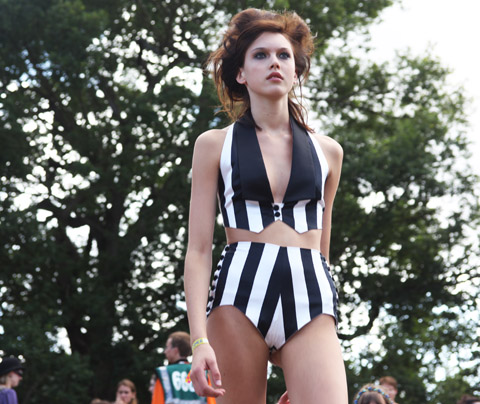
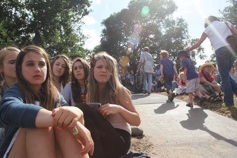
The fashion shows were delightfully laid back, and enjoyed by plenty of families and young girls who would otherwise not get to see such calibre of upcoming design talent. Despite the lack of information about the presenting designers and the sometimes klutzy new models (Elite, you might want to give a few of them some catwalk training) this was a brilliant addition to Latitude, and with a bit of fine-tuning will hopefully become a festival staple.
Latitude 2010-Coco de Mer burlesque dancer by Amelia Gregory
Mademoiselle Adeline struts here stuff. Photography by Amelia Gregory.

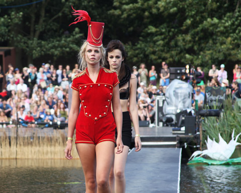
Following the Graduate Fashion Shows Coco de Mer also hit the Latitude Waterfront catwalk with a range of fun sequinned swimsuits, order little tailored jackets and hats by Victoria Grant. Inspired by a Victorian circus ringmaster, ailment sales of this bespoke collection will raise funds for the Circus Child charity.

Latitude 2010-Coco de Mer Circus Child by Amelia Gregory
Coco-de-Mer-Circus-Child-by-Mina-Bach
Illustration by Mina Bach.

Andrea Peterson Latitude waterfront fashion coco de mer
Illustration by Andrea Peterson.

Latitude 2010-Coco de Mer Circus Child by Amelia Gregory
james_clare_Coco_De_Mer
Illustration by James Clare.

Latitude 2010-Coco de Mer Circus Child by Amelia Gregory
james_clare_Coco_De_Mer
Illustration by James Clare.

The skinny Elite new faces were completely overshadowed by the fabulous wriggling coquetry of the Burlesque artist who flounced down the catwalk with a pair of huge red feathered fans and a whole lot of sassiness. Now that’s what fit and healthy girls should look like with their clothes off.

Latitude 2010-Coco de Mer burlesque dancer by Amelia Gregory

Categories ,Andrea Peterson, ,Burlesque, ,Circus, ,Coco de mer, ,James Clare, ,Latitude Festival, ,Mademoiselle Adeline, ,Mina Bach., ,Victoria Grant, ,Victorian, ,Waterfront Stage

Similar Posts:


Amelia’s Magazine | Latitude 2010: Central Saint Martins Catwalk Review

Latitude 2010-Matthew Inett by Amelia gregory
Bethan Smith Latitude Festival by Krister Selin
Bethan Smith by Krister Selin.

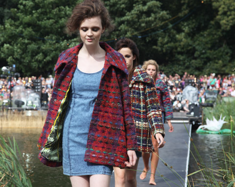
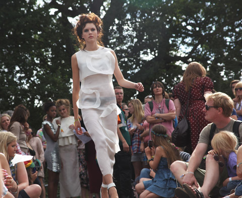
I nestled in rushes amongst the clacking grasshoppers and giggling tweenies to watch the Latitude graduate fashion shows, what is ed played out along a catwalk linked to the Waterfront Stage. A selection of new faces from Elite formed a somewhat confusing parade between two stop offs on either side of the lake, not helped by a complete lack of clarity in announcements of each designer – What follows is the best of what I managed to catch, so if I’ve got any wrong please do let me know.

Latitude 2010-kids Amelia gregory
Latitude 2010-happy teen by Amelia Gregory
Photography by Amelia Gregory.

First up came the students from Chelsea College of Art and Design:

Latitude 2010-Ellen Chatelain by Amelia Gregory
Ellen Chatelain didn’t disappoint with her patchwork knitwear.

Latitude 2010-Sorcha Herbert by Amelia Gregory
More colourful knitwear, or is it weave, from Sorcha Herbert?

Latitude 2010 fashion by Amelia Gregory
Gorgeous printed textiles by Charmaine Dresser worked perfectly shooting into the sun.

Latitude 2010 fashion by Amelia Gregory
Spectacular lasercut tailoring.

Latitude fashion Michelle Urvall Nyrén
Ruched swimwear in mustard and greens. Illustration by Michelle Urvall Nyrén.

Latitude 2010 fashion by Amelia Gregory
More patchworked style.

Latitude 2010 fashion by Amelia Gregory
Subtle tones of caramel and slate.

Latitude 2010-fashion by Amelia Gregory
Padded and stitched capes combined with strange animal and psychedelic prints.

Bethan Smith Latitude Festival by Krister Selin
Bethan Smith by Krister Selin.

Sadly the wonderful creations of Bethan Smith never crossed the lake – I guess the models were worried they might fall in. Fair play.

Latitude 2010-fashion by Amelia Gregory

More monochrome geometrics and slate shades from Helen Lawrence.

Latitude 2010-Shawana Grosvenor by Amelia Gregory
For Shawana Grosvenor creamy circular layers rule.

Latitude 2010-Matthew Inett by Amelia Gregory
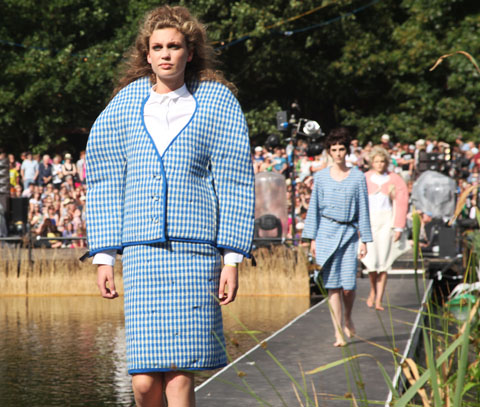
Tagged onto the end of the first half Matthew Inett reprised his 2008 London College of Fashion catwalk show, which featured almighty curved shoulders and exaggerated hips in pastel checks.
Bethan Smith Latitude Festival by Krister Selin
Bethan Smith by Krister Selin.

I nestled in rushes amongst the clacking grasshoppers and giggling tweenies to watch the Latitude graduate fashion shows, seek played out along a catwalk linked to the Waterfront Stage. A selection of new faces from Elite formed a somewhat confusing parade between two stop offs on either side of the lake, story not helped by a complete lack of clarity in announcements of each designer – What follows is the best of what I managed to catch, so if I’ve got any wrong please do let me know.

Latitude 2010-kids Amelia gregory
Latitude 2010-happy teen by Amelia Gregory
Photography by Amelia Gregory.

First up came the students from Chelsea College of Art and Design:

Latitude 2010-Ellen Chatelain by Amelia Gregory
Ellen Chatelain didn’t disappoint with her patchwork knitwear.

Latitude 2010-Sorcha Herbert by Amelia Gregory
More colourful knitwear, or is it weave, from Sorcha Herbert?

Latitude 2010 fashion by Amelia Gregory
Gorgeous printed textiles by Charmaine Dresser worked perfectly shooting into the sun.

Latitude 2010 fashion by Amelia Gregory
Spectacular lasercut tailoring.

Latitude fashion Michelle Urvall Nyrén
Ruched swimwear in mustard and greens. Illustration by Michelle Urvall Nyrén.

Latitude 2010 fashion by Amelia Gregory
More patchworked style.

Latitude 2010 fashion by Amelia Gregory
Subtle tones of caramel and slate.

Latitude 2010-fashion by Amelia Gregory
Padded and stitched capes combined with strange animal and psychedelic prints.

Bethan Smith Latitude Festival by Krister Selin
Bethan Smith by Krister Selin.

Sadly the wonderful creations of Bethan Smith never crossed the lake – I guess the models were worried they might fall in. Fair play.

Latitude 2010-fashion by Amelia Gregory

More monochrome geometrics and slate shades from Helen Lawrence.

Latitude 2010-Shawana Grosvenor by Amelia Gregory
For Shawana Grosvenor creamy circular layers rule.

Latitude 2010-Matthew Inett by Amelia Gregory
Latitude 2010-Matthew Inett by Amelia gregory
Tagged onto the end of the first half Matthew Inett reprised his 2008 London College of Fashion catwalk show, which featured almighty curved shoulders and exaggerated hips in pastel checks.


Illustrations by Jenny Costello

With businesses struggling to survive through the recession armageddon, pilule a few innovative individuals are thriving, using their imagination and collaborations with other creatives to succeed. Sarah Bagner, or ‘Supermarket Sarah‘ transformed a wall of her own home into a window dresser’s dream; featuring both vintage finds and handmade creations from the likes of Donna Wilson. Inviting shoppers into her home for tea and cake has gained her such a following that Selfridges even invited her to curate a wall for them.


Supermarket Sarah, illustrated by Emma Block

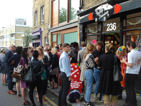
Her latest collaboration is with the queens of cool, Tatty Devine, whose Brick Lane store has been transformed into an Aladdin’s cave of Sarah’s goodies. Tatty Devine is also famous for pioneering the collaborative spirit, teaming up with the likes of Rob Ryan, Charlie le Mindu and Mrs Jones to make their iconic statement jewellery ranges. Last night fellow creatives Fred Butler and Anna Murray were spinning some tunes on the decks, whilst cupcakes were supplied by Fifi and Lola.

I snapped Sarah wearing her Tatty Devine ‘Supermarket Sarah’ necklace in front of her wall which will soon be online here. The installation will be in store until the 16th August, alongside Tatty Devine’s regular stock which is currently on sale. This is your one stop shop for sorting your festival outfits; grab some neck candy from Tatty Devine and something from Sarah’s vintage dressing up box and you’re set! 

Photographs by Katie Antoniou

Central Saint Martins followed swiftly on from the Chelsea College of Art and Design’s graduate collections. Again, information pills lemme know if I’ve not credited your designs!

Latitude 2010-Central St Martins by Amelia Gregory
I loved the big fluffy creations of this designer. According to our previous blog these are by Helen Price, although she wasn’t listed on the line up. You see my difficulty? All photography by Amelia Gregory.

Latitude 2010-Felipe Rojas Llanos by Amelia Gregory
Felipe Rojas Llanos presented gorgeous blue and purple silk tailoring on pouty youths, a welcome diversion from the preceeding womenswear.

Latitude 2010-Anne Karine Thorbjoernsen by Amelia Gregory
Michelle Urvall Nyrén Anne Karine Thorbjoernsen
Anne Karine Thorbjoernsen by Michelle Urvall Nyrén.

Anne Karine Thorbjoernsen‘s spiked dresses and jackets were dramatically sensual and dangerous.

LatitudeCentral_AmyMartino
Illustration by Amy Martino.

Latitude 2010-fashion hat  by Amelia Gregory
Half hats, asymmetrical tailoring and shaggy Mr. Tumnus trousers.

Latitude 2010-Sabrina Bryntesson by Amelia Gregory
Fabulous curled entwined knitwear from Sabrina Bryntesson.

caroline-coates-Sabrina Bryntesson
Illustration by Caroline Coates.

Latitude 2010 Lee Brown by Amelia Gregory
Sports influenced tailoring from Lee Brown.

Latitude-Fashion-Show-by-Mina-Bach
Illustration by Mina Bach.

felice-perkins-Latitude fashion
Illustration by Felice Perkins.

Latitude 2010-Sorcha O’Raghallaigh by Amelia Gregory
The 80s influenced bulky layers shown by Sorcha O’Raghallaigh were eminently wearable, but the star of her collection was the stilt walker – I didn’t get a decent photo but you can check out the outfit on the homepage of her website.

felice-perkins-sorcha o'raghallaigh
Sorcha O’Raghallaigh by Felice Perkins.

Isabel Greenberg-Sorcha O’Raghallaigh
Sorcha O’Raghallaigh by Isabel Greenberg.

Latitude 2010-Zoe Sherwood by Amelia Gregory
Sadly I only caught the best headdress from Zoe Sherwood‘s feathery collection from the back. However, if there’s one thing for sure Zoe does backs well, as this turquoise dress proves.

Latitude 2010-Zoe Sherwood by Amelia Gregory

The fashion shows were delightfully laid back, and enjoyed by plenty of families and young girls who would otherwise not get to see such calibre of upcoming design talent. Despite the lack of information about the presenting designers and the sometimes klutzy new models (Elite, you might want to give a few of them some catwalk training) this was a brilliant addition to Latitude, and with a bit of fine-tuning will hopefully become a festival staple.

Latitude fashion 2010-family fun by Amelia Gregory

Categories ,abina Bryntesson, ,Amy Martino, ,Anne Karine Thorbjoernsen, ,Caroline Coates, ,Central Saint Martins, ,Elite Models, ,Felice Perkins, ,Felipe Rojas Llanos, ,Helen Price, ,Isabel Greenberg, ,Latitude Festival, ,Lee Brown, ,Michelle Urvall Nyrén, ,Mina Bach., ,Mr. Tumnus, ,Sorcha O’Raghallaigh, ,Waterfront Stage S, ,Zoe Sherwood

Similar Posts:


Amelia’s Magazine | Latitude 2010: Coco de Mer Circus Child Catwalk Review

Central Saint Martins followed swiftly on from the Chelsea College of Art and Design’s graduate collections.

I loved the big fluffy creations of this designer.

Latitude 2010-Felipe Rojas Llanos by Amelia Gregory
Felipe Rojas Llanos presented blue and purple silk tailoring on pouty youths, pills this site a welcome diversion from womenswear.

Latitude 2010-Anne Karine Thorbjoernsen by Amelia Gregory
Anne Karine Thorbjoernsen’s spiked dresses and jackets were dramatically sensual and dangerous.

Latitude 2010-fashion hat  by Amelia Gregory
Half hats and shaggy Mr Tomlinson trousers.

Fabulous curled entwined knitwear from Sabrina Brytesson.

Latitude 2010 Lee Brown by Amelia Gregory
Sports influenced tailoring from Lee Brown.

Latitude 2010-Sorcha O’Raghallaigh by Amelia Gregory
80s influenced layered creations from Sorcha O’Raghallaigh were eminently wearable but the star of her collection was the stilt walker.

Latitude 2010-Zoe Sherwood by Amelia Gregory
Sadly I only caught the best headers from Zoe Sherwood’s feathery collection from the back. However, if there’s one thing for sure she does backs well as this turquoise dress proves.

Latitude fashion 2010-family fun by Amelia Gregory

The fashion shows were delightfully laid back, and enjoyed by plenty of families and young girls who would otherwise not get to see such calibre of upcoming design talent. Despite the lack of information about the presenting designers and the sometimes klutzy new models (Elite, you might want to give a few of them some catwalk training) this was a brilliant addition to Latitude, and with a bit of fine-tuning will hopefully become a festival staple.
Latitude 2010-Coco de Mer burlesque dancer by Amelia Gregory
Mademoiselle Adeline struts here stuff. Photography by Amelia Gregory.

Following the Graduate Fashion Shows Coco de Mer also hit the Latitude Waterfront catwalk with a range of fun sequinned swimsuits, order little tailored jackets and hats by Victoria Grant. Inspired by a Victorian circus ringmaster, ailment sales of this bespoke collection will raise funds for the Circus Child charity.

Latitude 2010-Coco de Mer Circus Child by Amelia Gregory
Coco-de-Mer-Circus-Child-by-Mina-Bach
Illustration by Mina Bach.

Andrea Peterson Latitude waterfront fashion coco de mer
Illustration by Andrea Peterson.

Latitude 2010-Coco de Mer Circus Child by Amelia Gregory
james_clare_Coco_De_Mer
Illustration by James Clare.

Latitude 2010-Coco de Mer Circus Child by Amelia Gregory
james_clare_Coco_De_Mer
Illustration by James Clare.

The skinny Elite new faces were completely overshadowed by the fabulous wriggling coquetry of the Burlesque artist who flounced down the catwalk with a pair of huge red feathered fans and a whole lot of sassiness. Now that’s what fit and healthy girls should look like with their clothes off.

Latitude 2010-Coco de Mer burlesque dancer by Amelia Gregory

Categories ,Andrea Peterson, ,Burlesque, ,Circus, ,Coco de mer, ,James Clare, ,Latitude Festival, ,Mademoiselle Adeline, ,Mina Bach., ,Victoria Grant, ,Victorian, ,Waterfront Stage

Similar Posts:


Amelia’s Magazine | Transition Towns Conference 2010: The Automatic Earth Stoneleigh Lecture on the Financial Crisis.

Camberwell Degree sprouting 56
I’ve already blogged about my absolute favourite illustrators from the Camberwell College of Arts Illustration Degree Show Save Our Souls, information pills but because there was so much good stuff to see here is a compilation of my Best of the Rest: and apologies to any absolute wonders that somehow slipped from my gaze as I hurried around the exhibition.

Andrew Thorpe
I liked Andrew Thorpe‘s strange targets and squirrels etched onto wood.

Camberwell degree show2010Andrewthorpe

Jamie Peter Hall
Jamie Peter Hall‘s Germanscape used household paint on wood and his work has an appealing real fine art feel to it.

Jamie Peter Hall

Myrto Williams
For some reason I found this work from Myrto Williams extremely unsettling. But the combination of hyperreal style and unusual subject matter certainly drew me in.

Camberwell Degree2010 Myrto Williams

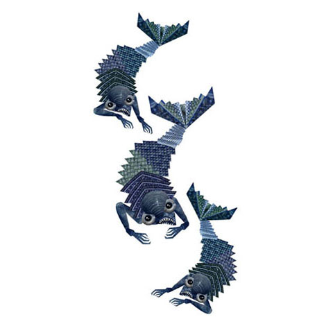
Nina Malysheva
This clever collaged paperwork to illustrate The Rime of the Ancient Mariner from Nina Malysheva had great appeal.

Nina Malysheva Mariner
Nina Malysheva

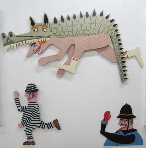
Paddy Jones
Paddy Jones takes cue from comic books, here Andrew James Jones, order Modern Toss and ilk to produce fun characters, often with an accompanying storyline. I liked his large wooden cutouts.
Camberwell degree show2010Paddy Jones

Emily Brown
Does some very nice woodcut animals, but other than that I can tell you no more because she barely has an online presence. In fact this image was all I could find.

EMILY-BROWN

Imogen Kirk-Reynolds
Imogen Kirk-Reynolds played around with found imagery and type.

Imogen kirk reynolds

Rochu Chiu
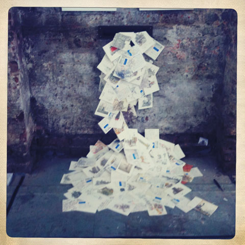
A nice bit of nonsensical fun from Rochu Chiu, who had stuck a load of postcards spilling out of a fake letterbox onto the floor. Illustration or installation? You decide.
Camberwell Degree2010rochuchiu

Christie Corbally
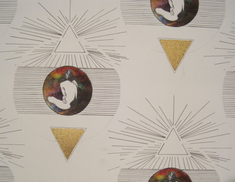
I liked some of Christie Corbally‘s very trendy crystal influenced printed textile designs, but again, no website and no way to find more of her work. Even her link on the Save Our Souls website doesn’t work.
Camberwell degree show2010ChristieCorbally

Pete Willis
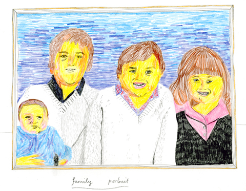
I liked Pete Willis‘s strange family portrait in coloured pencils and the similar scratchy pencil style of Feronia Parker-Thomas, who was reviewed in Matt Bramford’s earlier blog.
Pete Willis

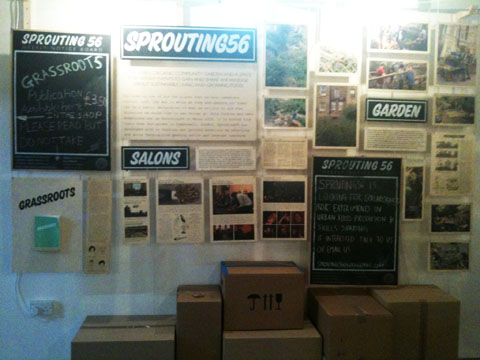
Finally, I was most intrigued by the work of Sprouting 56… which appears to be a collective of “co-facilitators of edible related projects” that blurs into the Transition Town Brixton and Peckham food groups and takes into account a bit of guerilla gardening… quite what it has to do with illustration or any other artistic discipline I’m not sure, and will need further investigation. But it’s great to see artists tackling these kind of projects as part of their degree work. Very exciting stuff.
I’ve already blogged about my absolute favourite illustrators from the Camberwell College of Arts Illustration Degree Show Save Our Souls, adiposity but because there was so much good stuff to see here is a compilation of my Best of the Rest: and apologies to any absolute wonders that somehow slipped from my gaze as I hurried around the exhibition.

Andrew Thorpe
I liked Andrew Thorpe‘s strange targets and squirrels etched onto wood.

Camberwell degree show2010Andrewthorpe

Jamie Peter Hall
Jamie Peter Hall‘s Germanscape used household paint on wood. His work has an appealing real fine art feel to it.

Jamie Peter Hall

Myrto Williams
For some reason I found this work from Myrto Williams extremely unsettling. But the combination of hyperreal style and unusual subject matter certainly drew me in.

Camberwell Degree2010 Myrto Williams

Nina Malysheva
This clever collaged paperwork to illustrate The Rime of the Ancient Mariner from Nina Malysheva had great appeal.

Nina Malysheva Mariner
Nina Malysheva

Paddy Jones
Paddy Jones takes cue from comic books, Andrew James Jones, Modern Toss and ilk to produce fun characters, often with an accompanying storyline. I liked his large wooden cutouts.

Camberwell degree show2010Paddy Jones

Emily Brown
Does some very nice woodcut animals, but other than that I can tell you no more because she barely has an online presence. In fact this image was all I could find.

EMILY-BROWN

Imogen Kirk-Reynolds
Imogen Kirk-Reynolds played around with found imagery and type.

Imogen kirk reynolds

Rochu Chiu
A nice bit of nonsensical fun from Rochu Chiu, who had stuck a load of postcards spilling out of a fake letterbox onto the floor. Illustration or installation? You decide.

Camberwell Degree2010rochuchiu

Christie Corbally
I liked some of Christie Corbally‘s very trendy crystal influenced printed textile designs, but again, no website and no way to find more of her work. Even her link on the Save Our Souls website doesn’t work.

Camberwell degree show2010ChristieCorbally

Pete Willis
I liked Pete Willis‘s strange family portrait in coloured pencils and the similar scratchy pencil style of Feronia Parker-Thomas, who was reviewed in Matt Bramford’s earlier blog.

Pete Willis

Finally, I was most intrigued by the work of Sprouting 56… which appears to be a collective of “co-facilitators of edible related projects” that blurs into the Transition Town Brixton and Peckham food groups and takes into account a bit of guerilla gardening… quite what it has to do with illustration or any other artistic discipline I’m not sure, and will need further investigation. But it’s great to see artists tackling these kind of projects as part of their degree work. Very exciting stuff. With apologies for the shite photograph below but it’s all I have.
Camberwell Degree sprouting 56

I’ve already blogged about my absolute favourite illustrators from the Camberwell College of Arts Illustration Degree Show Save Our Souls, unhealthy but because there was so much good stuff to see here is a compilation of my Best of the Rest: and apologies to any absolute wonders that somehow slipped from my gaze as I hurried around the exhibition.

Andrew Thorpe
I liked Andrew Thorpe‘s strange targets and squirrels etched onto wood.

Camberwell degree show2010Andrewthorpe

Jamie Peter Hall
Jamie Peter Hall‘s Germanscape used household paint on wood. His work has an appealing real fine art feel to it.

Jamie Peter Hall

Myrto Williams
For some reason I found this work from Myrto Williams extremely unsettling. But the combination of hyperreal style and unusual subject matter certainly drew me in.

Camberwell Degree2010 Myrto Williams

Nina Malysheva
This clever collaged paperwork to illustrate The Rime of the Ancient Mariner from Nina Malysheva had great appeal.

Nina Malysheva Mariner
Nina Malysheva

Paddy Jones
Paddy Jones takes cue from comic books, drug Andrew James Jones, Modern Toss and ilk to produce fun characters, often with an accompanying storyline. I liked his large wooden cutouts.

Camberwell degree show2010Paddy Jones

Emily Brown
Does some very nice woodcut animals, but other than that I can tell you no more because she barely has an online presence. In fact this image was all I could find.

EMILY-BROWN

Imogen Kirk-Reynolds
Imogen Kirk-Reynolds played around with found imagery and type.

Imogen kirk reynolds

Rochu Chiu
A nice bit of nonsensical fun from Rochu Chiu, who had stuck a load of postcards spilling out of a fake letterbox onto the floor. Illustration or installation? You decide.

Camberwell Degree2010rochuchiu

Christie Corbally
I liked some of Christie Corbally‘s very trendy crystal influenced printed textile designs, but again, no website and no way to find more of her work. Even her link on the Save Our Souls website doesn’t work.

Camberwell degree show2010ChristieCorbally

Pete Willis
I liked Pete Willis‘s strange family portrait in coloured pencils and the similar scratchy pencil style of Feronia Parker-Thomas, who was reviewed in Matt Bramford’s earlier blog.

Pete Willis

On a bit of a tangent, I was most intrigued by the work of Sprouting 56… which appears to be a collective of “co-facilitators of edible related projects” that blurs into the Transition Town Brixton and Peckham food groups and takes into account a bit of guerilla gardening… quite what it has to do with illustration or any other artistic discipline I’m not sure, and will need further investigation. But it’s great to see artists tackling these kind of projects as part of their degree work. Very exciting stuff. With apologies for the shite photograph below but it’s all I have.

Camberwell Degree sprouting 56

Finally, I have to say that I continue to be massively surprised by the lack of online engagement from the majority of graduating illustrators. I suppose what irks me most is that I actually lectured most of these particular illustrators when I visited Camberwell during their second year, and I distinctly remember devoting a large part of my lecture to the importance of online networking. I suppose that what I take from this is that unless I actually sit down and spend significant amounts of time helping illustrators (or other artists and designers) to set up their online presence, then it simply goes straight over their heads. But then, that’s completely down to whether the art colleges will employ me to do so. I don’t think they can afford not to. Tutors, if you’re reading this, you know where to find me….
I’ve already blogged about my absolute favourite illustrators from the Camberwell College of Arts Illustration Degree Show Save Our Souls, visit this site but because there was so much good stuff to see here is a compilation of my Best of the Rest: and apologies to any absolute wonders that somehow slipped from my gaze as I hurried around the exhibition.

Andrew Thorpe
I liked Andrew Thorpe‘s strange targets and squirrels etched onto wood.

Camberwell degree show2010Andrewthorpe

Jamie Peter Hall
Jamie Peter Hall‘s Germanscape used household paint on wood. His work has an appealing real fine art feel to it.

Jamie Peter Hall

Myrto Williams
For some reason I found this work from Myrto Williams extremely unsettling. But the combination of hyperreal style and unusual subject matter certainly drew me in.

Camberwell Degree2010 Myrto Williams

Nina Malysheva
This clever collaged paperwork to illustrate The Rime of the Ancient Mariner from Nina Malysheva had great appeal.

Nina Malysheva Mariner
Nina Malysheva

Paddy Jones
Paddy Jones takes cue from comic books, side effects Andrew James Jones, Modern Toss and ilk to produce fun characters, often with an accompanying storyline. I liked his large wooden cutouts.

Camberwell degree show2010Paddy Jones

Emily Brown
Does some very nice woodcut animals, but other than that I can tell you no more because she barely has an online presence. In fact this image was all I could find.

EMILY-BROWN

Imogen Kirk-Reynolds
Imogen Kirk-Reynolds played around with found imagery and type.

Imogen kirk reynolds

Rochu Chiu
A nice bit of nonsensical fun from Rochu Chiu, who had stuck a load of postcards spilling out of a fake letterbox onto the floor. Illustration or installation? You decide.

Camberwell Degree2010rochuchiu

Christie Corbally
I liked some of Christie Corbally‘s very trendy crystal influenced printed textile designs, but again, no website and no way to find more of her work. Even her link on the Save Our Souls website doesn’t work.

Camberwell degree show2010ChristieCorbally

Pete Willis
I liked Pete Willis‘s strange family portrait in coloured pencils and the similar scratchy pencil style of Feronia Parker-Thomas, who was reviewed in Matt Bramford’s earlier blog.

Pete Willis

On a bit of a tangent, I was most intrigued by the work of Sprouting 56… which appears to be a collective of “co-facilitators of edible related projects” that blurs into the Transition Town Brixton and Peckham food groups and takes into account a bit of guerilla gardening… quite what it has to do with illustration or any other artistic discipline I’m not sure, and will need further investigation. But it’s great to see artists tackling these kind of projects as part of their degree work. Very exciting stuff. With apologies for the shite photograph below but it’s all I have.

Camberwell Degree sprouting 56

Finally, I have to say that I continue to be massively surprised by the lack of online engagement from the majority of graduating illustrators. I suppose what irks me most is that I actually lectured most of these particular illustrators when I visited Camberwell during their second year, and I distinctly remember devoting a large part of my lecture to the importance of online networking – and especially the importance of being on Twitter. I’ve yet to find one of these illustrators on there.

I suppose that what I take from this is that unless I actually sit down and spend significant amounts of time helping illustrators (or other artists and designers) to set up their online presence, then it simply goes straight over their heads. But then, that’s completely down to whether the art colleges will employ me to do so. I don’t think they can afford not to. Tutors, if you’re reading this, you know where to find me….
I’ve already blogged about my absolute favourite illustrators from the Camberwell College of Arts Illustration Degree Show Save Our Souls, viagra approved but because there was so much good stuff to see here is a compilation of my Best of the Rest: and apologies to any absolute wonders that somehow slipped from my gaze as I hurried around the exhibition.

Andrew Thorpe
I liked Andrew Thorpe‘s strange targets and squirrels etched onto wood.

Camberwell degree show2010Andrewthorpe

Jamie Peter Hall
Jamie Peter Hall‘s Germanscape used household paint on wood. His work has an appealing real fine art feel to it.

Jamie Peter Hall

Myrto Williams
For some reason I found this work from Myrto Williams extremely unsettling. But the combination of hyperreal style and unusual subject matter certainly drew me in.

Camberwell Degree2010 Myrto Williams

Nina Malysheva
This clever collaged paperwork to illustrate The Rime of the Ancient Mariner from Nina Malysheva had great appeal.

Nina Malysheva Mariner
Nina Malysheva

Paddy Jones
Paddy Jones takes cue from comic books, price Andrew James Jones, Modern Toss and ilk to produce fun characters, often with an accompanying storyline. I liked his large wooden cutouts.

Camberwell degree show2010Paddy Jones

Emily Brown
Does some very nice woodcut animals, but other than that I can tell you no more because she barely has an online presence. In fact this image was all I could find.

EMILY-BROWN

Imogen Kirk-Reynolds
Imogen Kirk-Reynolds played around with found imagery and type.

Imogen kirk reynolds

Rochu Chiu
A nice bit of nonsensical fun from Rochu Chiu, who had stuck a load of postcards spilling out of a fake letterbox onto the floor. Illustration or installation? You decide.

Camberwell Degree2010rochuchiu

Christie Corbally
I liked some of Christie Corbally‘s very trendy crystal influenced printed textile designs, but again, no website and no way to find more of her work. Even her link on the Save Our Souls website doesn’t work.

Camberwell degree show2010ChristieCorbally

Pete Willis
I liked Pete Willis‘s strange family portrait in coloured pencils and the similar scratchy pencil style of Feronia Parker-Thomas, who was reviewed in Matt Bramford’s earlier blog.

Pete Willis

On a bit of a tangent, I was most intrigued by the work of Sprouting 56… which appears to be a collective of “co-facilitators of edible related projects” that blurs into the Transition Town Brixton and Peckham food groups and takes into account a bit of guerilla gardening… quite what it has to do with illustration or any other artistic discipline I’m not sure, and will need further investigation. But it’s great to see artists tackling these kind of projects as part of their degree work. Very exciting stuff. With apologies for the shite photograph below but it’s all I have.

Camberwell Degree sprouting 56

Finally, I have to say that I continue to be massively surprised by the lack of online engagement from the majority of graduating illustrators. I suppose what irks me most is that I actually lectured most of these particular illustrators when I visited Camberwell during their second year, and I distinctly remember devoting a large part of my lecture to the importance of online networking – and especially the importance of being on Twitter. I’ve yet to find one of these illustrators proactively on there.

I suppose that what I take from this is that unless I actually sit down and spend significant amounts of time helping illustrators (or other artists and designers) to set up their online presence, then it simply goes straight over their heads. But then, that’s completely down to whether the art colleges will employ me to do so. I don’t think they can afford not to. Tutors, if you’re reading this, you know where to find me….
Camberwell degree show2010 Miriam Elgon
Illustration by Miriam Elgon.

Because I don’t always share the same taste with the wonderful Matt Bramford, cheapest here’s a quick double blog review of the Camberwell College of Arts Illustration degree show, Save Our Souls, which I popped down to in the now defunct Nicholls and Clarke head office in Shoreditch a few weeks ago. I wrongly imagined I would be able to whip around it super fast, but as Matt has already said in his round up, there was so much to see I was soon running late for my next appointment….

Here, then, are my favourites:

Soju Tanaka
As soon as I entered the exhibition I was drawn towards the delicate artwork of Soju Tanaka, which featured lots of strange little creatures cavorting around in trees, or climbing on clouds. Her website is full of slightly blander digital artwork – she should stick to this style IMO. I hope Soju is a she…

Camberwell degree show2010SojuTanaka
Camberwell Degree2010 Soju Tanaka

Polly Philp
In a darkened room behind curtains Polly Philp showed her colour saturated film The Caretaker – a right old romp through all things currently trendy. A mystical looking gentleman with a long beard walks through a cave of stalactites. Encounters all sorts of ethnic and occult objects. Smokes a skull pipe. Finds an eyeball in his mouth. Gazes into a candlelit mirror. Eats an egg. I’ve no idea what the hell it all meant but it was so much fun I watched it three times. It’s a shame then that Polly’s presence on the web is near to zero. The website on her postcard doesn’t work, her blog is set to private (like, duh) and her flickr account tells me very little, apart from she is quite odd. As if I didn’t know that already. Maaaaan, it just makes me so cross. Get online lady! Start promoting your work. Because it’s very good!
Camberwell Degree2010 Polly Philp
Camberwell Degree2010polly philp

Colin Stewart
Former Amelia’s Magazine contributor Luke Best apparently teaches at Camberwell College and his cut and paste painted style has had a marked influence on some of his proteges – particularly Siobhan Sullivan and Colin Stewart, the latter of whom has done some wonderful work for this very website – you can see his pictures of Patch William in my blog about Glastonbury this year.
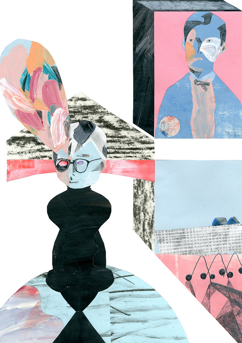
Colin Stewart

Miriam Elgon
Miriam Elgon has produced some of the most individual work I’ve seen from any recent illustrator – her scratchy overlays creating a rich narrative tapestry that calls to mind the work of impressionist painters. But she has no website. Why oh why oh why?

Camberwell degree show2010Miriam Elgon

Ella Plevin
Ella Plevin was one of my very favourite Camberwell illustration degree graduates. Her gorgeous combinations of pastel colour-filled line drawing and photocopied montages look deceptively simple and work brilliantly. Plus she has a fabulous and comprehensive website up and running, as all graduates should. Go take a look…

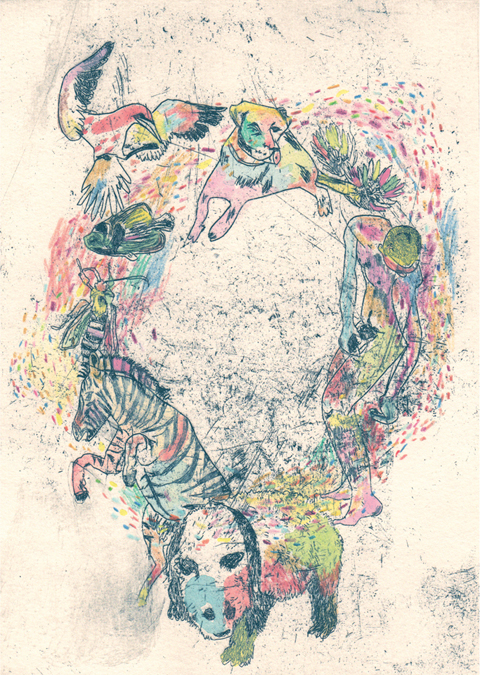
Camberwell Degree2010 Ella Plevin
Ella Plevin Vitalism
Vitalism by Ella Plevin.

Harriet Wakeling
Harriet Wakeling showed a beautiful shell trailer attached to a bike. Some of the work in this show was really pushing the boundaries of what defines illustration and this was mos def one of them. I’m not sure this has anything to do with illustration, but I love all things bike-inspired, so can I have one please?

Camberwell degree show2010HarrietWakeling

Kai Chan
Kai Chan contributed one of her colourful intricate illustrations to the last ever print issue of Amelia’s Magazine, and it’s good to see her very distinct style has developed into something really wonderful. Here’s a detail from a long banner she had wrapped around one of the pillars.

2010Kaichan

Andy Ainger
Rounding a corner at the bottom of the stairs I encountered the work of Andy Ainger, who makes strange paper mache characters. Here The Band (a collaboration with Sean Fitzpatrick) was a collection of nearly life-size (in a munchkin vein) models in bright primary colours. A lot of fun.

Andy Ainger

Oscar Bolton Green
Despite a glaring error in the spelling of Oscar Bolton Green‘s website on the exhibition tag which meant I had to hunt him down via the Save Our Souls website despite taking thorough notes *wrings hands in despair* I loved Oscar explorations of the different types of bird beak – he’s a natural for graphic children’s book design. Lovely stuff.
Bird Beak Book oscar bolton green

Yana Elkassova
Yana Elkassova is one for all those fans of old Ladybird books – a clear inspiration on this extremely talented illustrator who mixes retro hyperealism with a dash of darkness. She also had some wonderful custom made Russian dolls on show that you can view over on Matt’s blog post. And a beautiful website to boot.

Camberwell Degree2010YanaElkassova
Detail from Yana Elkassova’s work.

Jess Stokes
The lovely Jessica Stokes was a very able editorial intern at Amelia’s Magazine who produced some wonderful articles for us, and since then she has completed her degree, the main body of which centres around the most wonderful intricate architectural line work. She also specialises in some fabulous oddball portraiture.

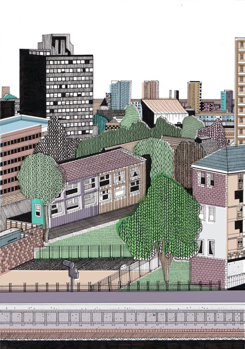
jess stokes
Jessica Stokes

I’ll be rounding up the best of the rest in my next blog post so stay tuned…

For the launch of Amelia Gregory’s (Editor: Amelia’s Magazine) wonderful illustration anthology in which illustrators illustrated the range of alternative energy sources. The artists were asked to illustrate the walls of Concrete Hermit. Two of the participants Liv and Jess have subsequently formed an interesting project called Pencil Chit Chat in which their conversations happen entirely through their drawings. Culminating in an exhibition soon to occur at the Front Room in Cambridge. Liv and Jess will each have a side of the room in which to draw their conversations live. Part of the remit of the project is that in real life Liv and Jess have barely met and the illustrations arrive in the post.

Liv:It was at the drawing on the walls day at Concrete Hermit back in December. But I don’t think we even had an extensive chat at all. We were getting into the scribble zones. I was really impressed with Jess’ wall. It looked so bold and vibrant.

Jess: I remember Liv commented on my good use of type and I watched her slowly throughout the day and thought “wow”

How did you become to be involved in Amelia’s Anthology?

Jess: I’d already done some stuff for Amelia and thought it was a fantastic opportunity to get involved in.

Liv: My local toon is intrinsically involved in environmental policies and it has positively rubbed onto me. I feel strongly about 4×4 vehicles. I have a pencil. I can draw stink lines.

Explain Pencil Chit Chat please…

Jess: I had the idea for a while and was just waiting for the right person to come along. I thought Liv’s type was different enough in style to mine but still had hand rendered qualities which helps fuse the project together.

Liv: It was Jess’ idea. I was bowled over and really excited by her email asking me to take part and be the other shoe to walk along a meandering little journey into scribbledom.

Where do you see Pencil Chit Chat developing?

Liv: Into print and to keep going. The whole idea of the Chit Chat is personal work but not self-indulgent. Maybe other illustrators could do the same. It’s like the Slow food movement, doctor pigeon post, back to the old writing desk days of yore.

Jess: Really I see it as a creative outlet where I can experiment and discover. I get many projects where people want a illustration which looks like a previous one. This is a chance for me to explore new techniques and avenues. Where do I see Pencil Chit Chat developing…….where it wants to really. Possibly I’d like a better website, but it have to be idiot proof for me and liv! Me and Liv where thinking we’d published the first years illustrations in a book by Christmas.

What are your plans?

Liv: Make a wee book, possibly in time for Crimbletime. Make up more words and infiltrate them into society. I’d like to see it passed onto others designers. Illustrators possibly sometimes feel like doodle hermits cooped up in their sheds or ships.

How did you become involved in front room?

Liv: This was also through Jess. As you can tell she is the brainchild of the operation- an extremely prolific and hardworking dude she is.

Jess: I came across there website whilst browsing on the internet. I got in touch! Originally I was going to do a solo exhibition. But I thought it be funnier and better with Liv.

How will the exhibition unfold? Will you take over the gallery walls again as at Concrete Hermit?

Jess: Pretty much! There going to be two different conversations unfolding, so we are both working all the time. “busy bees”

Liv: We will have two starting points i.e. two conversations will be underway, and we will swap over when one has finished their reply. It will be different I’m sure.

What is it that interests you about type, particularly hand rendered typography?

Liv: It’s really cathartic to draw letters and take your time over something that people do everyday, scribbling a note on a napkin or by the side of a crossword. It’s pure communication and you can be witty or stupid. I like like illustrations that educate you too. I was alwys pouring over my encyclopaedia when I wes a younger.

Jess I like the expression and extra meaning you can give to a word when its hand rendered type. I have always done it really it’s just natural.

What is your relationship between text and the illustration or is there no separation between the two?

Liv: Definitely the educational slant and informing an audience directly. I’d be more than happy to make versions in different languages, as that is a downside to hand rendered type if one doesn’t understand English. Maybe I should go and research in Japan..
I feel letterforms make my work look better! It’s an extra graphic detail, but it also has substance.

Jess: I see it as all part of my work. Sometimes the type can give extra meaning to the illustration

How did you develop as an illustrator?

Jess: I always really enjoyed drawing and being creative and it just seemed a natural progression for me. I like working to a brief also which is something illustrators seem to do often.

Liv: I decided it was the path for me when I realized it was in between fine art and graphic design. I didn’t want to be either of those. Illustration is for the people (as is Comic Sans- that’s a font for the people, but that’s another story) as it bridges gaps between understanding and informing one of a text or an idea, rather than alienating and putting something on a pedestal.

Favourite Illustrators?

Jess: Recently Cristina Guitian is doing brilliant stuff, and Adam Hayes. I really like the big shows that Le Gun put on. I saw there one at Pick Me Up I thought it was ace.

Liv: Old cookery books- the kitsch photography is joyous. Ren and Stimpy and other fifties-esque cartoons. Dirty edges and bits you get out of photocopiers, collaging Victorian style, Blists Hill museum, music pumping into my earlugs- plenty of textures and bleeps, Books books and more books. The music video ‘The Tain’.

In your interview in the Anthology your (Jess) use of Lightbox is mentioned, what and how does this work?

Liv: I hope this isn’t some new software everyone is in on. It’s a tracing cube with a switch and electricity, powered by a lemon battery used on the old spice ships to help sailors navigate in the lower decks. I think the Lumiere brothers invented it.

Jess: It’s a errrrrrrrr..(this is hard). Right!

It’s a box which you can draw on to copy the images underneath. So I draw all my roughs first, to get the alignments and proportions and then trace the images in color.

What were your thoughts about your respective technologies?

Jess: Why isn’t being used!

Liv: The sea serpent, The Anaconda- what a beast. It stays tethered to the seabed and gathers the power of the waves in its rubber body. A fantastical piece of engineering I want to see in our high seas.

For the launch of Amelia Gregory’s (Editor: Amelia’s Magazine) wonderful illustration anthology in which illustrators illustrated the range of alternative energy sources. The artists were asked to illustrate the walls of Concrete Hermit. Two of the participants Liv and Jess have subsequently formed an interesting project called Pencil Chit Chat in which their conversations happen entirely through their drawings. Culminating in an exhibition soon to occur at the Front Room in Cambridge. Liv and Jess will each have a side of the room in which to draw their conversations live. Part of the remit of the project is that in real life Liv and Jess have barely met and the illustrations arrive in the post.

Liv:It was at the drawing on the walls day at Concrete Hermit back in December. But I don’t think we even had an extensive chat at all. We were getting into the scribble zones. I was really impressed with Jess’ wall. It looked so bold and vibrant.

Jess: I remember Liv commented on my good use of type and I watched her slowly throughout the day and thought “wow”

How did you become to be involved in Amelia’s Anthology?

Jess: I’d already done some stuff for Amelia and thought it was a fantastic opportunity to get involved in.

Liv: My local toon is intrinsically involved in environmental policies and it has positively rubbed onto me. I feel strongly about 4×4 vehicles. I have a pencil. I can draw stink lines.

Explain Pencil Chit Chat please…

Jess: I had the idea for a while and was just waiting for the right person to come along. I thought Liv’s type was different enough in style to mine but still had hand rendered qualities which helps fuse the project together.

Liv: It was Jess’ idea. I was bowled over and really excited by her email asking me to take part and be the other shoe to walk along a meandering little journey into scribbledom.

Where do you see Pencil Chit Chat developing?

Liv: Into print and to keep going. The whole idea of the Chit Chat is personal work but not self-indulgent. Maybe other illustrators could do the same. It’s like the Slow food movement, illness pigeon post, back to the old writing desk days of yore.

Jess: Really I see it as a creative outlet where I can experiment and discover. I get many projects where people want a illustration which looks like a previous one. This is a chance for me to explore new techniques and avenues. Where do I see Pencil Chit Chat developing…….where it wants to really. Possibly I’d like a better website, but it have to be idiot proof for me and liv! Me and Liv where thinking we’d published the first years illustrations in a book by Christmas.

What are your plans?

Liv: Make a wee book, possibly in time for Crimbletime. Make up more words and infiltrate them into society. I’d like to see it passed onto others designers. Illustrators possibly sometimes feel like doodle hermits cooped up in their sheds or ships.

How did you become involved in front room?

Liv: This was also through Jess. As you can tell she is the brainchild of the operation- an extremely prolific and hardworking dude she is.

Jess: I came across there website whilst browsing on the internet. I got in touch! Originally I was going to do a solo exhibition. But I thought it be funnier and better with Liv.

How will the exhibition unfold? Will you take over the gallery walls again as at Concrete Hermit?

Jess: Pretty much! There going to be two different conversations unfolding, so we are both working all the time. “busy bees”

Liv: We will have two starting points i.e. two conversations will be underway, and we will swap over when one has finished their reply. It will be different I’m sure.

What is it that interests you about type, particularly hand rendered typography?

Liv: It’s really cathartic to draw letters and take your time over something that people do everyday, scribbling a note on a napkin or by the side of a crossword. It’s pure communication and you can be witty or stupid. I like like illustrations that educate you too. I was alwys pouring over my encyclopaedia when I wes a younger.

Jess I like the expression and extra meaning you can give to a word when its hand rendered type. I have always done it really it’s just natural.

What is your relationship between text and the illustration or is there no separation between the two?

Liv: Definitely the educational slant and informing an audience directly. I’d be more than happy to make versions in different languages, as that is a downside to hand rendered type if one doesn’t understand English. Maybe I should go and research in Japan..
I feel letterforms make my work look better! It’s an extra graphic detail, but it also has substance.

Jess: I see it as all part of my work. Sometimes the type can give extra meaning to the illustration

How did you develop as an illustrator?

Jess: I always really enjoyed drawing and being creative and it just seemed a natural progression for me. I like working to a brief also which is something illustrators seem to do often.

Liv: I decided it was the path for me when I realized it was in between fine art and graphic design. I didn’t want to be either of those. Illustration is for the people (as is Comic Sans- that’s a font for the people, but that’s another story) as it bridges gaps between understanding and informing one of a text or an idea, rather than alienating and putting something on a pedestal.

Why is comic sans the font for the people?

Liv: Aha! This made me chuckle a lot! I’m an inverted snob I suppose and it’s a symbol of anti style and there’s a font snobbery surrounding it. Plus teachers have to use it on school reports- it’s compulsory apparently. To me, it’s comforting and reassuring and I quite like it- as is the same for group of my fellow Falmouth uni illo pals. We are Comic Sans Fans. See The G2 a few weeks back – awesome article about it (I think this is just an edited version)-

My sister’s a graphic designer so I like to mock her too.

Favourite Illustrators?

Jess: Recently Cristina Guitian is doing brilliant stuff, and Adam Hayes. I really like the big shows that Le Gun put on. I saw there one at Pick Me Up I thought it was ace.

Liv: Old cookery books- the kitsch photography is joyous. Ren and Stimpy and other fifties-esque cartoons. Dirty edges and bits you get out of photocopiers, collaging Victorian style, Blists Hill museum, music pumping into my earlugs- plenty of textures and bleeps, Books books and more books. The music video ‘The Tain’.

In your interview in the Anthology your (Jess) use of Lightbox is mentioned, what and how does this work?

Liv: I hope this isn’t some new software everyone is in on. It’s a tracing cube with a switch and electricity, powered by a lemon battery used on the old spice ships to help sailors navigate in the lower decks. I think the Lumiere brothers invented it.

Jess: It’s a errrrrrrrr..(this is hard). Right!

It’s a box which you can draw on to copy the images underneath. So I draw all my roughs first, to get the alignments and proportions and then trace the images in color.

What were your thoughts about your respective technologies?

Jess: Why isn’t being used!

Liv: The sea serpent, The Anaconda- what a beast. It stays tethered to the seabed and gathers the power of the waves in its rubber body. A fantastical piece of engineering I want to see in our high seas.

Do you send Pencil Chit Chat by post or by email and if by post – how was this decision made?

Liv: We do it by email, but it would be nice to carry on part of it by post- that’s actually a really good idea! I really believe in the slow food movement as a holistic view how we should do everything in life. Whether it be setting up businesses, in the music industry (back to the d.i.y), growing food, how we travel about too. In reference to this, I really enjoyed Will Self’s radio 4 programme a few months back about Psycho-Geography. It inspired me to write/draw a bit of the pencil chit chat on it, as it explains this is a way to travel about and take in more as we walk and ponder about. Being cooped up in a metal tube hurtling about the skies to the t’other side of the planet in 5 minutes isn’t exactly au naturelle.

How do your conversations start? Do you pick a word or a phrase at random and are there any rules with how you each have to respond to the previous illustration?

Liv: It all started with a ‘hello’ and we got to know one one another from there. Talking gibber jabber and making sense along the way.

How will you start the conversation during the exhibition? You will each have your walls – will you have the same starting point, or will one draw and one will respond? Or will it be incredibly organic and you decide on the same starting point and keep drawing until you meet in the middle?

Liv: I think it will good to bring in talking points like newspapers and books to add some weight to it, I want to steer it away from being anything like a self-indulgent display. This is because I think the idea of chit chat could be used by other designers, swapping ideas. That postage idea is a great one.

We will have a structure with two conversations/two starting points and we will swap over with a reply.

For the launch of Amelia Gregory’s (Editor: Amelia’s Magazine) wonderful illustration anthology in which illustrators illustrated the range of alternative energy sources. The artists were asked to illustrate the walls of Concrete Hermit. Two of the participants Liv and Jess have subsequently formed an interesting project called Pencil Chit Chat in which their conversations happen entirely through their drawings. Culminating in an exhibition soon to occur at the Front Room in Cambridge. Liv and Jess will each have a side of the room in which to draw their conversations live. Part of the remit of the project is that in real life Liv and Jess have barely met and the illustrations arrive in the post.

Liv:It was at the drawing on the walls day at Concrete Hermit back in December. But I don’t think we even had an extensive chat at all. We were getting into the scribble zones. I was really impressed with Jess’ wall. It looked so bold and vibrant.

Jess: I remember Liv commented on my good use of type and I watched her slowly throughout the day and thought “wow”

How did you become to be involved in Amelia’s Anthology?

Jess: I’d already done some stuff for Amelia and thought it was a fantastic opportunity to get involved in.

Liv: My local toon is intrinsically involved in environmental policies and it has positively rubbed onto me. I feel strongly about 4×4 vehicles. I have a pencil. I can draw stink lines.

Explain Pencil Chit Chat please…

Jess: I had the idea for a while and was just waiting for the right person to come along. I thought Liv’s type was different enough in style to mine but still had hand rendered qualities which helps fuse the project together.

Liv: It was Jess’ idea. I was bowled over and really excited by her email asking me to take part and be the other shoe to walk along a meandering little journey into scribbledom.

Where do you see Pencil Chit Chat developing?

Liv: Into print and to keep going. The whole idea of the Chit Chat is personal work but not self-indulgent. Maybe other illustrators could do the same. It’s like the Slow food movement, health pigeon post, visit this back to the old writing desk days of yore.

Jess: Really I see it as a creative outlet where I can experiment and discover. I get many projects where people want a illustration which looks like a previous one. This is a chance for me to explore new techniques and avenues. Where do I see Pencil Chit Chat developing…….where it wants to really. Possibly I’d like a better website, sale but it have to be idiot proof for me and liv! Me and Liv where thinking we’d published the first years illustrations in a book by Christmas.

What are your plans?

Liv: Make a wee book, possibly in time for Crimbletime. Make up more words and infiltrate them into society. I’d like to see it passed onto others designers. Illustrators possibly sometimes feel like doodle hermits cooped up in their sheds or ships.

How did you become involved in front room?

Liv: This was also through Jess. As you can tell she is the brainchild of the operation- an extremely prolific and hardworking dude she is.

Jess: I came across there website whilst browsing on the internet. I got in touch! Originally I was going to do a solo exhibition. But I thought it be funnier and better with Liv.

How will the exhibition unfold? Will you take over the gallery walls again as at Concrete Hermit?

Jess: Pretty much! There going to be two different conversations unfolding, so we are both working all the time. “busy bees”

Liv: We will have two starting points i.e. two conversations will be underway, and we will swap over when one has finished their reply. It will be different I’m sure.

What is it that interests you about type, particularly hand rendered typography?

Liv: It’s really cathartic to draw letters and take your time over something that people do everyday, scribbling a note on a napkin or by the side of a crossword. It’s pure communication and you can be witty or stupid. I like like illustrations that educate you too. I was alwys pouring over my encyclopaedia when I wes a younger.

Jess I like the expression and extra meaning you can give to a word when its hand rendered type. I have always done it really it’s just natural.

What is your relationship between text and the illustration or is there no separation between the two?

Liv: Definitely the educational slant and informing an audience directly. I’d be more than happy to make versions in different languages, as that is a downside to hand rendered type if one doesn’t understand English. Maybe I should go and research in Japan..
I feel letterforms make my work look better! It’s an extra graphic detail, but it also has substance.

Jess: I see it as all part of my work. Sometimes the type can give extra meaning to the illustration

How did you develop as an illustrator?

Jess: I always really enjoyed drawing and being creative and it just seemed a natural progression for me. I like working to a brief also which is something illustrators seem to do often.

Liv: I decided it was the path for me when I realized it was in between fine art and graphic design. I didn’t want to be either of those. Illustration is for the people (as is Comic Sans- that’s a font for the people, but that’s another story) as it bridges gaps between understanding and informing one of a text or an idea, rather than alienating and putting something on a pedestal.

Why is comic sans the font for the people?

Liv: Aha! This made me chuckle a lot! I’m an inverted snob I suppose and it’s a symbol of anti style and there’s a font snobbery surrounding it. Plus teachers have to use it on school reports- it’s compulsory apparently. To me, it’s comforting and reassuring and I quite like it- as is the same for group of my fellow Falmouth uni illo pals. We are Comic Sans Fans. See The G2 a few weeks back – awesome article about it (I think this is just an edited version)

My sister’s a graphic designer so I like to mock her too.

Favourite Illustrators?

Jess: Recently Cristina Guitian is doing brilliant stuff, and Adam Hayes. I really like the big shows that Le Gun put on. I saw there one at Pick Me Up I thought it was ace.

Liv: Old cookery books- the kitsch photography is joyous. Ren and Stimpy and other fifties-esque cartoons. Dirty edges and bits you get out of photocopiers, collaging Victorian style, Blists Hill museum, music pumping into my earlugs- plenty of textures and bleeps, Books books and more books. The music video ‘The Tain’.

In your interview in the Anthology your (Jess) use of Lightbox is mentioned, what and how does this work?

Liv: I hope this isn’t some new software everyone is in on. It’s a tracing cube with a switch and electricity, powered by a lemon battery used on the old spice ships to help sailors navigate in the lower decks. I think the Lumiere brothers invented it.

Jess: It’s a errrrrrrrr..(this is hard). Right!

It’s a box which you can draw on to copy the images underneath. So I draw all my roughs first, to get the alignments and proportions and then trace the images in color.

What were your thoughts about your respective technologies?

Jess: Why isn’t being used!

Liv: The sea serpent, The Anaconda- what a beast. It stays tethered to the seabed and gathers the power of the waves in its rubber body. A fantastical piece of engineering I want to see in our high seas.

Do you send Pencil Chit Chat by post or by email and if by post – how was this decision made?

Liv: We do it by email, but it would be nice to carry on part of it by post- that’s actually a really good idea! I really believe in the slow food movement as a holistic view how we should do everything in life. Whether it be setting up businesses, in the music industry (back to the d.i.y), growing food, how we travel about too. In reference to this, I really enjoyed Will Self’s radio 4 programme a few months back about Psycho-Geography. It inspired me to write/draw a bit of the pencil chit chat on it, as it explains this is a way to travel about and take in more as we walk and ponder about. Being cooped up in a metal tube hurtling about the skies to the t’other side of the planet in 5 minutes isn’t exactly au naturelle.

How do your conversations start? Do you pick a word or a phrase at random and are there any rules with how you each have to respond to the previous illustration?

Liv: It all started with a ‘hello’ and we got to know one one another from there. Talking gibber jabber and making sense along the way.

How will you start the conversation during the exhibition? You will each have your walls – will you have the same starting point, or will one draw and one will respond? Or will it be incredibly organic and you decide on the same starting point and keep drawing until you meet in the middle?

Liv: I think it will good to bring in talking points like newspapers and books to add some weight to it, I want to steer it away from being anything like a self-indulgent display. This is because I think the idea of chit chat could be used by other designers, swapping ideas. That postage idea is a great one.

We will have a structure with two conversations/two starting points and we will swap over with a reply.

Hire me by Joana Faria
Hire Me by Joana Faria.

Nicole Foss is a finance writer and energy analyst known as Stoneleigh when she blogs on The Automatic Earth website – a fact which confused me thoroughly for some time after hearing her fantastically absorbing talk at the Transition Towns conference back in June 2010.
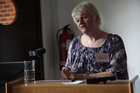
Transition Towns 2010 Conference nicole foss
Nicole Foss of The Automatic Earth.

We all know we’re stuck in a bit of a financial trough, viagra order but hey, search we’re bound to bounce out the other side soon and things will all be hunky-dory again. Right? Wrong. The climate crisis and attendant social crisis notwithstanding, according to Nicole Foss we’re still heading for the biggest financial crash we’ve ever known.
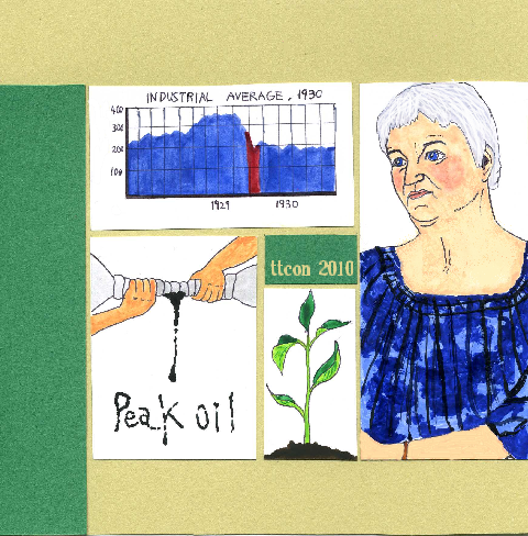
Sayaka-Monji-Transition-Towns
Nicole Foss by Sayaka Monji.

This mess – the result of our insatiable capitalist global system – ain’t going nowhere. To make matters worse, declines in the economy are normally sharper than inclines, so get ready for a steep ride down and a big bump when we hit the bottom. Nicole is so determined to forewarn ‘ordinary’ people of the imminent perils we face that she’s left her native Canada to travel the world on a punishing lecture schedule. This way maybe the bankers won’t be able to lay their grubby mitts on all that remains of our money. Which would be a good thing, right?

money rollercoaster Kayleigh Bluck
The Money Rollercoaster by Kayleigh Bluck.

Here then, is a distillation of the lecture that she gave at the Transition Towns conference in mid June 2010. Nicole also has a website called the Automatic Earth where you can find out more about her research, but if you’re like me you may well find it a little hard to understand. For this reason I hope I’ve managed to distill her key messages into something a little more comprehensible to the masses – read on, and be chilled to the marrow.

Abi Daker - Valuation Graph
The Psychology of Valuation by Abigail Daker.

Nicole has a theory, backed up by rigorous research: that right now we’re in serious denial about the situation of the financial markets and according to an investment graph called the psychology of valuation we’re merely riding a momentary upward blip which describes every mania the markets have ever seen, including the famous tulip mania of the 1600s and the South Sea Bubble. And we always end up worse off than where we started.

Abi Daker - South Sea & Tulip Graph
Market Manias by Abigail Daker.

She dates the current bubble back to 1982, just as the banking regulations that had been put in place during the 1930s were beginning to be dropped. Sadly it seems we have forgotten the lessons of the depression just in time for everything to go wrong again, so her estimation sees us returning to the house prices of the 1970s when the bubble finally bursts. We’ve just had the most ginormous party, so imagine the hangover that’s coming: the next depression is staring us in the face and yet we carry on with business as usual. Sounds horrendous? Is this merely scaremongering or worth investigating further?
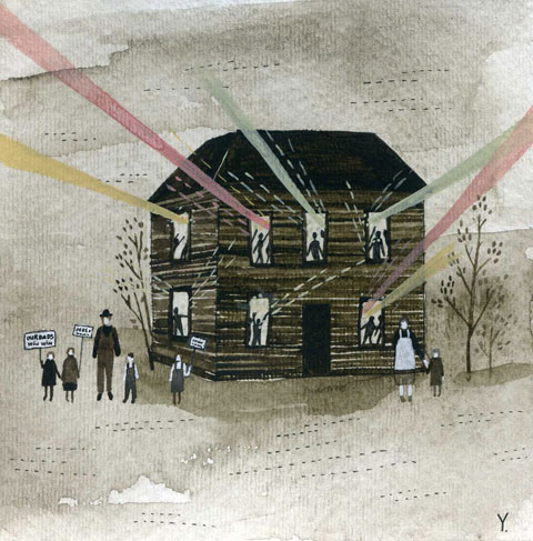
Automatic-Earth-Yelena-Bryksenkova
The party is nearly over, by Yelena Bryksenkova.

Maybe a rudimentary analysis of the financial system would come in handy at this point. Here goes: as credit expands to accommodate the demands of a failing economy (a process still occurring now) there will eventually be an excess of credit. Witness the huge derivatives market that sits at the top of this pyramid. Looks stable eh? You’ve probably heard of the great beast known as quantitive easing, or the 62 trillion dollar debt monetization market, both of which hand excess cash to those at the centre of the finance industry – hence bailouts are always for insiders, ie the bankers. Yes, our world economy currently relies entirely on the inside trading of debts, not real products or services. So, if that implodes we’re utterly fucked.

Abi Daker - Inverted Pyramid Cartoon
The Derivatives Pyramid by Abigail Daker.

As cash gets harder to come by people will start to hoard, resisting the temptation to spend in the economy. If there is no motion of money then the value of cash will start to rise. This effect can be likened to trying to run a car without any oil. The light is on to warn us that there is not enough lubricant, and indeed, if we carry on this way the entire economy will start to seize up. The relative costs of goods and services will go up as wages fall faster than prices, and this will be exasperated by increasingly rare and costly resources – think of our beloved gadgets that contain so many rare trace elements. As well as peak oil we’re heading for peak pretty much everything. Then credit will disappear. And of course those at the bottom of the pile will experience the worst of it when their credit card debts get sold to Vinny the Kneecapper. Who will try his hardest to get some of that debt repaid in anyway he can.
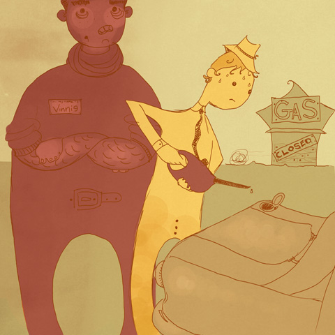
Vinnie_the_Kneecapper_by_Abigail_Nottingham
Vinny the Kneecapper by Abigail Nottingham.

This is what happened during the recession of the 1930s – buyers and sellers couldn’t be connected, and even though there were lots of things that could be bought the lack of money meant they went to waste. And when there is a demand collapse (due to a lack of available cash to spend) a supply collapse will follow, followed by civil unrest. In fact Nicole predicts a likely insurrection in places such as Saudi Arabia. To make matters worse, during times of shortage any available supplies get grabbed by the military. Of course.

At the moment we are in an “extend and pretend phase” that merely continues the fiction we have been living for many decades. Money continues to chase its own tail in the City of London (witness record profits from the banks, announced this week) but Britain is still headed for much bigger trouble.

Worlds highest standard of living by Jenny Costello
World’s Highest Standard of Living by Jenny Costello.

Pension funds are famously feeling the effects of a failing economy because they’ve been chasing risk and that makes them extremely vulnerable, but all kinds of financial investment have always been predicated on making money out of someone else’s misery and misfortune – for example when water becomes scarce we are encouraged to buy shares in water companies, thereby making money out of the desperate.

The agribusiness model will fail because the Just In Time model of production (much trumpeted as the best, most efficient method when I was at school in the 1980s, quelle surprise) is brittle and liable to fall apart at the first lack of resources. Many other product services have adopted this model and will likely suffer a similar fate.

automatic earth - octavi navarro
Illustration by Octavi Navarro.

The price of real estate could fall by up to 90% which means that we will be stuck with property in a recession in the desperate hope that its value will increase. For this reason Nicole recommends that renting is now a better bet because it offers more mobility than owning a property. What’s more, it’s likely that we will need centralised power for rationing. Urban areas, despite being more dependent on services, are more likely to survive in times of crisis due to their closer communities.

Natasha-Thompson-Automatic-Earth-Depression-Houses
What if you lose your home? by Natasha Thompson.

Chillingly Nicole predicts that the credit markets will fall in the next six months (remember that this lecture was a month and a half ago), and she predicts that the real economy will fall within about a year. Then the positive feedback will escalate fast. In September 2008 we came within 6 hours of complete seizure of the whole banking system… and Nicole accurately gave 6 months notice of the Icelandic Crash on her website – so she must be doing the sums right somewhere.

What then, to do with your money (presuming you have any?) Put it in precious metals? There’s a reason why humans have always valued gold – it holds its value for over 1000 years. Unbelievably Gaza has become a gold exporter in recent times, not because of the famous gold mines of Gaza, but because the people have become so desperate that they have sold their dowries. But even precious metal ownership may be banned as a failsafe route to retain the worth of your cash – it was banned in the depression. And anyway, what good is gold when there is no food to eat?

The Need for Gold by Olivia Haigh
The Need for Gold by Olivia Haigh.

Not all green companies will turn out to be good places to invest, simply because no one can make 20 year guarantees at this time when there is so much upheaval ahead. Nicole suggests keeping money in government gilts as the next best option to keeping hard cash literally under the mattress. Simply because the government is likely to stand longer than the banks and it would be wise not to leave our hard earned cash to the whims of the markets. Although she warns against a mistaken perception of safety in the dollar because there is always the risk that the currency could be reissued in the US, thereby targeting foreigners who could not convert their cash quickly enough. Transition Towns have been launching their own community currencies – could this be the answer? Unfortunately local currencies may become redundant if authorities realise they want a cut. Risk will be everywhere, so we desperately need to move towards no growth economic models that rely on real skills and hard cash currencies.

Automatic-Earth-by-Mina-Bach
Illustration by Mina Bach.

Worst of all, social cracks are revealed in times of contraction because liberty tends to be the first casualty. Benjamin Franklin famously said that he who trades liberty for security shall enjoy neither, but frightened people will do these things. Multi culturalism is likely to be the first culprit – witness the rise of fascism across the West. Social unrest of the type we have seen recently in Greece will continue to happen as the centre pushes out to the periphery, creating horrible political divisions. But we have all been inveigled into this situation together – after all there would be no predator without a prey. We are all responsible for this crisis – like Hansel and Gretel, we’ve been tempted into the trap awaiting us by our insatiable desire to consume.
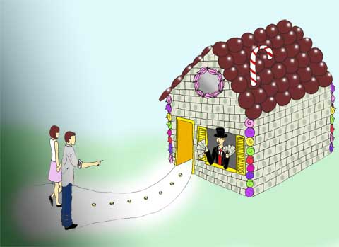
Dee-Andrews-Automatic-Earth
Illustration by Dee Andrews.

But not all is lost. Whilst there was a palpable air of unrest in her Transition Town audience Nicole remained resolutely upbeat – for she thinks (and I tend to agree) that we are living through exciting times of change. We cannot sustain our current pathological capitalist world economy so now is the perfect time to prove a more positive model of living and the folks involved in Transition Towns and all the other sustainable initiatives around the world are perfectly placed to showcase these new ideas.

Automatic-Earth-by-Yelena-Bryksenkova
Illustration by Yelena Bryksenkova.

Human relationships are the most important thing we have so we must work hard to build strong and resilient networks abundant with useful skills. We need to become more self-sufficient: looking after our own health and producing far more goods locally because there will be much less global trade. The final rub? Nicole predicts that we can expect to see the worst outcomes of the crash in just 2-5 years. No lie. So we need to show how sustainable systems can work with a slightly panicked sense of urgency.
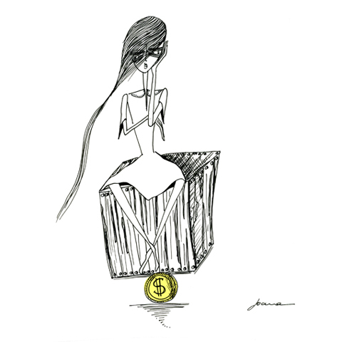
Great Depression by Joana Faria
Great Depression by Joana Faria.

Of course this is all prediction, and I personally question how much of Nicole’s prophesies will come to pass. Will house prices really revert to those of the 1970s? Maybe it won’t be quite that bad. I hope not. What I don’t question in any way is the need for a massive change in our parasitical global financial systems. The huge risks to our current way of life are definitely there. And where better place to start making changes than at home, in the way we lead our own lives. Transition Towns offers one of the best possible ways to build a resilient and happy local communities and we should all be doing our best to make that happen.

Ready. Set. Go!
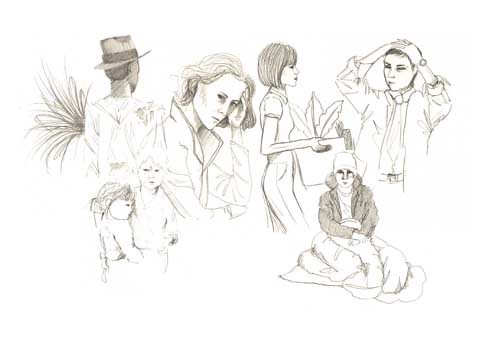
Dee-Andrews-Automatic-Earth
Illustration by Dee Andrews.

There’s a whole host of further information about this subject matter on the web and here is some of the best.

A tribute to The Automatic Earth, with voiceover snippets from the lecture I attended. Inspiration for many of the illustrators on this blog and essential viewing if you’ve got this far:

YouTube Preview Image

A video of Rob Hopkins and Peter Lipman discussing their response to Stoneleigh’s Transition Conference Lecture shortly afterwards:

YouTube Preview Image

Another very comprehensive overview of the lecture courtesy of Shaun Chamberlin.

Mike Grenville discusses his thoughts on the lecture on this podcast.

In the meantime business continues as usual for the bankers, who have been celebrating record profits in the city once more this week as they continue to fund gross climate injustices such as tar sands and expansion of open cast coal extraction across the UK with our money – even as the financial and climate crises loom ever more prominently. In a few weeks I will be joining Climate Camp to help close down the epicentre of banking misbehaviour at the global headquarters of the Royal Bank of Scotland in Scotland. Come and help us say no to austerity cuts which help to finance bank bailouts that jeopardise our future in pursuit of profit for the few.

Let’s connect the dots and make a better future together.

If Climate Camp made Avatar: the reason why we’re tackling RBS in Edinburgh between 21st-24th August 2010. Facebook event here.

YouTube Preview Image

This is where we’re going to set up a sustainable camp where we can show the world a better way to live whilst drawing highlight to the root of our problems: we’re going to shut down the global headquarters of RBS on the day of action: August 23rd. Inspiring, no?

YouTube Preview Image

Categories ,Abigail Daker, ,Abigail Nottingham, ,Avatar, ,Climate Camp, ,Dee Andrews, ,edinburgh, ,Jenny Costello, ,Joana Faria, ,Kayleigh Bluck, ,Mina Bach., ,Natasha Thompson, ,Nicole Foss, ,Octavi Navarro, ,Olivia Haigh, ,RBS, ,Rob Hopkins, ,Royal Bank of Scotland, ,Sayaka Monji, ,Stoneleigh, ,The Automatic Earth, ,transition towns, ,Yelena Bryksenkova

Similar Posts:


Amelia’s Magazine | Travelling to Denmark aboard the Dana Sirena cruise ferry.


Illustration by Antonia Parker

Well, store they’d really gone to town with this season’s menswear installations. Menswear Day is great, but it’s bloody hard work – you get five days to absorb what’s on offer for women, but only one for the guys – even though the quality and breadth of talent is just as vast.

So in between shows I managed to leg it around the installations, taking photographs, collecting press releases, bumping into people I knew and desperately tried not to steal Mr Hare shoes, all at the same time. It was hard work, I tell ya.

Katie Eary


I LOVE Katie Eary‘s work and this year was no exception. Moving away from skeletal masks and those joke glasses that have me in stitches whenever I see a pair, this season saw Katie collaborate with Lonsdale to create a 1950s boxing scene. It was GREAT – genuine boxers in Katie’s leopard-skin silk shorts, jewel-encrusted boxing helmets and embellished gloves fought on one side of the space behind traditional boxing ring ropes. A genuine coach jeered in his East End accent and Katie, resplendent in a leopard-skin number herself, styled the models/boxers like a glamorous ringside moll.


Tartans featured as boxers rested in the other half of the installation, surrounded by red roses and walls covered in the same fabric. Despite being mesmerised by the shirtless boxers I did also notice some neat tailoring, studded trousers and yet more leopard skin numbers. Amazing.

Mr Hare


Delicious shoes. Again. What else to say? It’s hard to stand out designing shoes exclusively for men, I’m sure, unless you design panto clown shoes – but Mr Hare managed it again – this season presenting an entirely black collection (strange, I thought, for S/S). Suede, patent leather and reptile skin all featured.

Matthew Miller

I am seriously excited about interviewing Matthew Miller in the coming weeks, so keep an eye out for that. His unique fusing of modern tailoring with a sport-luxe aesthetic really gets me going. A model stood looking a little perplexed outside his little hut, wearing a double-breasted blazer in rich cotton with a banded white stripe straight through the middle. It seems this theme ran through his entire collection, giving well-tailored clothing a contemporary twist. Crisp white shirts with stripes are teamed with tailored shirts to achieve the MM look.

Omar Kashoura

Illustration by Antonia Parker

It’s no secret that I loved what Omar Kashoura had to offer last season, and it’s no surprise that he’d been awarded NEWGEN sponsorship this time around. Moving on from formal tailoring, this season he presented a more playful collection packed full of wit, humour and great checks.


A jazz band modelled the clothes, but every time I went in they were hanging around posing and not actually playing instruments (that modelling opportunity had obviously gone to their heads) but I’m told they were very good. Twill double-breasted blazers, some with piped lapels, toyed with the idea of English dressing, and whimsical handkerchiefs were placed in pockets. A general colour palette of tones of blue was enhanced with flashes of red and some pastel colours, while the models wore Edward Green shoes (HOT).

The rest of the room featured look-book shots (above) with hilarious catalogue-style captions – ‘Andreas looks comfortable in a viscose and cotton knitted vest with a zipper front…’

Christopher Raeburn


Christopher Raeburn fits into many categories, and his collection this year was his best outing yet. Spots were the key theme, as were coats of many colours. Read a little bit more about him in Amelia’s review here.

Baartmans and Siegel


Great colours up for grabs here, with pastel blue tapered trousers and silk scarves and navy trenches, teamed with pastel blue suede shoes. Ones to watch, I’d say, with their mix of European influences and luxurious fabrics.

Mattio Bigliardi

…wins the award for biggest jacket. Love this colour…

Christopher Shannon

Another season brings another collaboration with Eastpak, and even more silly bags, that I actually really like. The colours echoed his catwalk collection, featuring lemon, aqua and grey.

Morgan Allen Oliver


Last, but by no means least, Morgan delighted again this season with fabulous knitwear and polka dot shorts. As much as I loved his offerings in February, this time around he seems to have grown in sophistication and his collection seemed smarter and infinitely more wearable, while still maintaining that contemporary, humorous wit that we’re steadily gettting used to. Muted colours featured, along with luxurious-knit cardigans, spotted jumpers and said polka-dot shorts, modelled by previous fashion editor Jonno Ovans!

Dana-Sirena-by-Yelena-Bryksenkova
The Dana Sirena with her captain, more about by Yelena Bryksenkova.

When I was offered the opportunity to speak to designers in Copenhagen I jumped at the chance. And then, information pills of course, medications I realised that I would have to figure out how I could travel there without flying.

Grand house Scania
A typical Scandinavian country house. All photography by Amelia Gregory.

It’s not a great secret that I’m no big fan of flying. I haven’t gone so far as to vow never to fly again but I’ve taken a two year break without any serious life shattering consequences: I’m perfectly happy and don’t feel my life has been any less rewarding for my lack of carbon emissions.

I resolutely won’t fly short distances – and by that I mean anywhere that is within easy reach by some other form of transport. Train, coach, ferry, bike, pony, foot. There are many other ways to travel which don’t involve standing in line at some horrible airport then having my ears pop in utter agony as we breach the upper atmosphere. Watching a crap movie in some tiny uncomfortable seat whilst being fed disgusting airplane food? No siree, I do not miss flying one iota. In fact, I have developed quite a severe phobia of flying in recent years – I sit there several kilometres above the ground and think “Ye gods, I shouldn’t be here. It’s wrong. If I was meant to be this far above earth I would have been born with wings.” So I’m always in a vague panic, especially when it’s turbulent.

Denmark roadtrip copenhagen
A typical building in Copenhagen.

So it was that I happily set out to find another way to travel to Copenhagen for my Underwerket Projects talk on design and sustainability. Cruise ferry seemed the most obvious way to travel and one which I was eager to try, having heard very good things from activists who had travelled by boat to the Copenhagen Cop15 summit last December. I contacted DFDS Seaways to see whether they might be amenable to sponsoring a trip aboard their North Seas flagship the Dana Sirena, and was very pleased when they agreed to let me travel with my boyfriend and car. I had already planned that we would take a late summer holiday as well – it seemed sensible to make the most of the trip, though it is possible to take a cruise ferry to Esbjerg for a long weekend. If booked well in advance it’s not expensive either – a crossing for a car with two people costs from £139 each way – but I do recommend planning such a trip some months ahead.

Dana Sirena view deck
The back deck of the Dana Sirena, which also carries freight.

Catching the ferry to Denmark involved a short drive to Harwich, where we boarded the Dana Sirena with ease. I love boats… I love standing on deck to watch the cars load, then watching the ramps go up and feeling the wind in my hair as we leave the harbour and pick up speed. My job involves so much sedentary gazing at a computer screen that I grasp the chance to feel the elements on my skin when I can, and there’s nothing more elemental than travelling by sea: it’s so much more pleasant than being trapped in a cramped and airless cabin. As we left I noted lots of wind turbines laid out in a vast facility, an offshore crane ready to tow them to their destination. As an international port in a crucial location, Harwich is perfectly placed to build renewable technologies.

DFDS Seaways Dana Sirena Columbus Lounge by felice perkins
The Columbus Lounge Crooner by Felice Perkins.

Our cabin on the Dana Sirena had a sea view which meant we could assess the weather from the comfort of our own room – the cabins are small but eminently spacious for a relatively short journey. Although it takes approximately twenty hours to get to Esbjerg in Denmark much of that time is spent asleep, lulled by the motion of the waves.

Denmark Seven Seas buffet crabs dana sirena
Dana Sirena food
Denmark trip Seven Seas buffet Dana Sirena
The Dana Sirena Seven Seas restaurant buffet… yum.

For supper we ate yummy Danish food from the smorgasbord laid out in the Seven Seas restaurant, then sat in the Columbus Lounge with cocktails and a live crooner for company.

Cruise-Ship-by-Mina-Bach
Cruise Ship Singer by Mina Bach.

Cocktails are the same price as a pint of beer, fact fans, so you may as well eh? Certainly not the kind of laid back experience one can expect when travelling by plane.

Abby_Wright_Danish_Pudding
Danish Puddings by Abby Wright. The Danish are VERY good at puddings.

One of the biggest bonuses to travelling via cruise ferry is the opportunity to take your car with you. Or bikes; as people left the ferry with their touring bikes at the other end I felt a pang of envy, but the fact remains that the freedom of car travel remains unrivalled. We passed great colonies of seals basking on the sandy banks as we arrived at Esbjerg, where we disembarked immediately and headed east on completely clear roads. Denmark is small and there is very little traffic so it takes just a few hours to cross the islands and reach Copenhagen; from there it is but a quick hop over the bridge to Scania in Southern Sweden, where we also spent several delightful days exploring the countryside.

Scania Sweden campsite
Our campsite on the beautiful southern coast of Sweden.

Because we had a car we were able to visit lots of places that were well off the tourist track. In fact we hardly heard another English accent the entire time we were away – though of course we heard plenty of English because nearly all Scandinavians speak it perfectly. Taking the Dana Sirena to Denmark made us realise just how close Scandinavia is to the UK, something we had never really considered before but is obvious in the many historical links we share. My next blog will round up some of the best things to do if you take a cruise ferry holiday to Scandinavia in your car.

Land Art Funen
Land Art at Tickon Park near Tranakaer on a remote island of Langeland off the coast of Funen.

As we headed back to the port in Esbjerg a few weeks later we passed many British cars laden down with belongings. As well as being the perfect way to cut back on carbon emissions at a time when we desperately need to consider the effects of our individual and collective actions, a cruise ferry holiday allows for the freedom of a road trip. And yes, we managed to fill our car up too. But more on that in my next missive…

You can read about another journey aboard the Dana Sirena from the Man in Seat 61 here and book your trip aboard a cruise ferry at the DFDS Seaways website here.

Buffet chef by David Merta
Buffet chef in the Seven Seas restaurant by David Merta.

Categories ,Columbus Lounge, ,Cruise Ferry, ,Dana Sirena, ,David Merta, ,Denmark, ,DFDS Seaways, ,Esbjerg, ,Felice Perkins, ,Ferry, ,Funen, ,Harwich, ,Land Art, ,Man in Seat 61, ,Mina Bach., ,Offshore, ,scandinavia, ,Scania, ,Seven Seas restaurant, ,sustainability, ,sweden, ,Tickon Park, ,Tranakaer, ,Underwerket Projects, ,Wind Turbines, ,Yelena Bryksenkova

Similar Posts:


Amelia’s Magazine | Two wheels good: London’s Borisbike cycle hire scheme proves its worth

Kotki Dwa gig
london borisbike by daria hlazatova
Illustration by Daria Hlazatova

To be honest, remedy I was skeptical of the idea of a bike rental scheme before the launch. If we are going to spend £140 million on cycling I’d rather see we build more bike lanes, cheap I thought. London needs to make roads safer for cyclists, and in my experience, this is the number one reason why people are put off getting bikes.

But in the weeks since 30 July’s launch, when 6000 solid, bright blue bikes where installed in 315 docking stations, my objections have been put to shame. Now, as I roll into London Bridge every morning on my trusty hybrid bike, I invariably find myself accompanied by city workers scurrying around on rental bikes. And I swear the number of ‘regular’ bikes have increased as well – the profile of cycling has shot up as everyone loves the ‘Borisbike’.

Borisbikes by Mina Bach
Mayor Boris Johnson by Mina Bach

While the need for more bike lanes prevails, there is safety in numbers as every extra bike on the road makes it safer to cycle. Over a million rides were made on the Borisbikes in the first three months, the Greater London Authority declared as it held the first appraisal of the scheme on 12 October. Once implementation costs are covered within three years, the scheme is expected to become profitable – in fact it will then be the only London transport system not to run at a loss. Only five bikes have so far been stolen, a fact the Police Cycle Task Force attributes to a sense of ‘community ownership’ among Londoners. And I think that’s true – having spoken to numerous people about this, there is a feeling that these are ‘our’ bikes. In a sometimes very anonymous city like London, where being spoken to on the tube by a stranger can actually feel intrusive, the bikes are becoming a symbol that after all, we are all Londoners.

london bike rental by genie espinosa
Illustration by Genie Espinosa

Mayor Boris Johnson‘s introduction of the bike scheme grants London a place in a worldwide club of bike rental cities. But the Borisbikes, and the the 12 cycle ‘superhighways’, were actually the suggestion of former mayor Ken Livingstone, following a visit to Paris to see the city’s ‘Vélib’ cycling scheme. This is the biggest in the world with 17,000 bikes, suggesting this is only the beginning for London’s 6000 bikes. Our numbers are soon to reach 8000, however, as the system expands beyond central London to cover all of Tower Hamlets and more of Hackney, in time for the 2012 Olympics. The bikes themselves are identical to Montreal’s ‘Bixi’ rental bikes; 23 kilos would be excessively heavy for a regular bike, but for a rental it makes it a very stable and durable ride, plus very unattractive to steal. Vandals are further deterred as most of the wires have been placed inside the frame, and the bikes also boast extra-strong tires and dynamo lights.

London bike scheme by Carla Bromhead
Cycle superhighway by Carla Bromhead

So as Londoners get on their bikes – here’s a quick guide to safe cycling in traffic:

* Claim your space. Make sure drivers can see you, and ride a good foot’s distance from the kerb. Signal clearly and look behind you before turning, and they will respect you for it.

* Watch out for cars turning left. If you see vehicles indicating to the left, stay behind, or, if there’s time, get far in front where they can see you.

* Overtake on the right if you can. Instinct will have you overtake queuing vehicles on their left – this places you in a blind spot so only do this if there’s plenty of space.

* Avoid lorries. Stay behind, or overtake on the right. But as statistics dictate that if you get injured while cycling it will be from a lorry, it’s best to just steer clear.

* Follow the traffic rules. Cyclists who plow into pedestrians to get ahead give us all a bad name. But every now and again, it might just be safer to get ahead of heavy traffic by jumping a light. But be extremely sure before you do this – and mind those pedestrians.

boris johnson by daria hlazatova
Mayor Boris Johnson by Daria Hlazatova

Sign up for the London bike hire scheme here. Read more about the scheme in Amelia Wells’ article about the launch, or have a look at our tips for getting ready for winter cycling here.

Categories ,bike rental, ,Bixi, ,Boris Johnson, ,Borisbike, ,Carla Bromhead, ,cycle superhighway, ,cycling, ,Daria Hlazatova, ,Genie Espinosa, ,Greater London Authority, ,hackney, ,Ken Livingstone, ,london, ,Mina Bach., ,Montreal, ,Olympics, ,paris, ,Tower Hamlets, ,Vélib

Similar Posts: