Amelia’s Magazine | The Porridge Cafe opens in Old Street, featuring TWWDNU and True Romance prints on the walls

Porridge Cafe Review
The much hyped Porridge Cafe opened at 70 Paul Street in East London this week: the healthy antidote to the equally hyped Cereal Killer Cafe which is just a stones throw from where I live on Brick Lane. The Cereal Killer Cafe has been ridiculously successful, with queues around the block on busy days, but surely Londoners would like something a bit more tasty and nutritious for breakfast? Step forward Nik and Elly of the Porridge Cafe. Their street food business began in 2013 as the Bow Street Kitchen, specialising in feeding the hungry tech hordes of Hoxton and the surrounding environs. Having concentrated on the provision of modern ‘British’ comfort food: think bacon butties and steak and mash, they decided that a logical next step would be to set up a (slightly) more permanent base with a pop up cafe dedicated to the most healthy comfort food of all. Plus they knew it might be a savvy move, what with oats and porridge so much in vogue.

Porridge Cafe-TWWDNU artwork
We went along to check out the cafe today, which is housed in the same pop up space where our TWWDNU prints were on show just a few weeks ago, and I am delighted to report that the very finest artworks (our A2 prints featuring 24 carat gold leaf by Cristian Grossi, Daria Hlazatova, Niall Grant and Mateusz Napieralski) are now on the walls of the cafe alongside some of the True Romance alternative cinema prints commissioned by East End Prints.

Porridge Cafe-parsley aubergine caper risotto
I tried to tempt Snarfle with some porridge mixed with a tiny bit of apple, to no avail, so I ended up paying for another plain portion which luckily he ate when liberally topped with honey (it’s his usual breakfast but we abstained this morning). For my lunch I opted for the parsley, aubergine and caper risotto (above), a colourful and intriguingly flavoured affair. I was left a wee bit hungry – maybe I’ll blame that on being pregnant – but the portions are relatively small, so make sure you top up with one of the delicious sounding fresh smoothies if you visit for lunch.

Porridge Cafe-pepper chorizo chilli barley
Roasted red pepper, chorizo and chilli barley porridge for lunch.

The porridge options for breakfast come with an assortment of fresh fruit, nuts, berries and milk: all of which sound delicious. Busy Londoners are used to splashing out on tasty food so I hope this place will become a success. If the Cereal Killer Cafe can do it surely Nik and Elly can? Make sure you check out our beautiful limited edition prints when you visit.

The Porridge Cafe offers a rotating menu that includes 11 different grains and is open until the end of March. The full menu can be found here. Read more about the story behind the TWWDNU prints here.
Opening times: Mon-Fri 7am-6pm, Sat 8am-5pm, Sun 9am-4pm

Categories ,#TWWDNU, ,70 Paul Street, ,Bow Street Kitchen, ,Brick Lane, ,Cafe, ,Cereal Killer Cafe, ,Cristian Grossi, ,Daria Hlazatova, ,East End Prints, ,Food Review, ,Mateusz Napieralski, ,Niall Grant, ,Opening times, ,Pop Up Cafe, ,Porridge, ,Porridge Cafe, ,Restaurant, ,review, ,Snarfle, ,Street Food, ,True Romance

Similar Posts:


Amelia’s Magazine | Valentines Open Brief: Submissions Part 1

Chantelle Bell
I was thrilled to receive over 40 submissions for my Valentines Open Brief, nine of which were chosen by East End Prints to appear in their True Romance exhibition, open now (full listing here). Here is my first round up of the other submissions with text by the artists and links to their websites – I’m sure you will agree there are some stunning images here.

Chantelle Bell (above)
I heard this quote in a Twilight film and found it really sweet, no matter how cheesy it is. I think that the time we spend with our loved ones isn’t what is important, however what happens during this time is. We don’t have limitless lifespans, unlike some film characters, so we can only offer what we have, with the promise that if we had more, we would spend it with the one we love. I created this paper cut illustration with bright colours to keep it cheerful and drew the text with a fine liner before gluing it all down. The love hearts continue off the page to signify the infinite aspect of love. However childish or naive it may seem to believe love can last, there are the hopeful few who do, and these are the few who keep the hope alive.

owlpussycat print
Eugenia Tsimiklis
The Owl and the Pussycat: The poem is about an unlikely union between owl and pussy cat. It speaks of their complete devotion to one another and willingness to sail away together towards adventures unknown. The poem suggests the couple sacrifice their most worldly possessions to escape together and concludes as they dance by the light of the moon hand in hand. It’s a nursery rhyme with romantic sentiment, and I wanted the illustration to reflect this with a stark yet organic feel. I wanted the illustration to have a fluid quality with its linear linework and limited palette.

PRETTY WOMAN-Faye West
Faye West
I love the concept of alternative film posters. And a lot of my illustrative influences come from cult film poster artists such as Robert McGinnis. I wanted to depict romance via the classic film Pretty Woman (1990) and it’s more modern use of romantic language. We like our romances with a certain edge these days, and this is a film that is close to the hearts of many generations, not only because it stands the test of time, but also because it’s such a colourful representation of it’s era. I think this iconic film deserves referencing in fashion and art for future generations to come. And for me, is the ultimate romantic film.

for walls
For Walls
A print inspired by the Valentine’s Day tradition of giving flowers. I like to capture little domestic scenes in my prints, and these flowers are somehow in keeping with this. The print is designed to be celebratory and noisy, so I’ve included some process colours (and clashing colours) to really make it pop! The print is designed in Illustrator, and is made by creating lots of individual shapes to build up the image, then overlaying the outlines so the structure is visible. I like to show off the digital elements and background of a composition in a lot of my work. I’ve also played with transparency to add a bit of extra depth.

hello_DODO_Love_Beards_Design
Hello Dodo
Here at hello DODO we love creating simple graphic tricks that make people smile. We are a husband and wife team and are self-taught screen printers based in Brighton, designing and printing from our home studio. Over the years we’ve been hugely influenced by design legends such as Alan Fletcher & Milton Glaser and their witty eye for creating fun, timeless designs. This particular design was actually born when we sent Milton Glaser himself a little Christmas greeting with our own adaptation of his timeless ‘I heart NY’ design including this little bearded guy. Milton’s response is still one of our most treasured things and continues to encourage and inspire us:  
Thank you for your greeting, it is by far the best and cleverest adaptation of my time-worn logo and a Merry Christmas to you as well. Milton

together...JennyKadis
lovebirds...JennyKadis
Jenny Kadis
After graduating from Leeds Metropolitan University with a First Class (Hons), Jenny has developed a quirky and unique style based upon her pencil drawings which she combines with bold acrylic paint markings and collage.

jenny robins - VALENTINES ART
Jenny Robins
This is a re-working of a collage piece I did a few years ago, that’s where the text is from. I have hand rendered the found text in this version, but evoke the cut and paste aesthetic by keeping it in irregular boxes. The imagery is inspired by classic romance movies like those ones with Fred Astaire, Katherine Hepburn, suits, dresses, dancing dancing dancing and oh so meaningful glances. I painted everything first and just suggested some tones before adding the outline at the end, I like to do this with watercolour and ink as it keeps a sense of fluidity and motion in the work and it doesn’t get too exact or cartoony. The serendipity which led to the original wording was perfect, and I like how it adds a second reading to the picture as the cynical aside both laughs at the romance of the image and to some extent grounds it, as these onomatopoeic breathy words remind us of the physicality of love – heart racing, palms sweating etc. and certainly of dancing too. 

Karina Jarv
Karina Jarv
I’ve always loved this film – How to Steal a Million. Since I was a child I always thought this is the best way to start a relationship. Hah, of course I do not think so now. But I think Audrey Hepburn and Peter O’Toole were such a great and beautiful couple. The ARE such a great and beautiful couple even after almost 50 years later. And when I feel myself sad in some cold winter evening I adore to watch this film seating in my chair with a cup of my Earl Grey.

Lorna_Scobie_Park
Lorna Scobie
My illustration, entitled ‘I smelt you from across the park’ is about True Love. Although the scene centres around two dogs who have found romance in a busy park, it also shows love in other forms. A man reads his favourite newspaper, a group of friends share a picnic, and a dog chases deer despite the wishes of his owner (Fentooooonnn!). Rather than planning an image before I start, I paint as ideas come into my head, which I hope makes the illustration feel more alive. My inspiration for this drawing came from a walk in St James’s Park in London last weekend, where I noticed that everyone seemed to be having a really, really good time. I don’t think love is limited to the feeling felt between two people, and this is what I hope to show in this illustration.

Netina
Netina
When I started thinking of a Valentine’s day illustration I immediately decided to base it around a heart image. But I didn’t want this heart to be a conventional one. Then for no particular reason I remembered how I had noticed in the past that two question marks facing each other look very much like a heart.That was it! That would be my idea for the Valentine’s illustration. Everyone’s familiar with the feeling of wondering whether a person you love/like/fancy has some feelings for you too. Well a question mark can easily be a symbol of that feeling. The characters in the illustration aren’t human for two reasons. Mainly because animal characters are sometimes more fun and secondly as a small tribute to one my most favourite romantic movie scenes: the candlelight dinner from Disney’s Lady and the Tramp. When it comes to the technical details now the illustration has been hand drawn with water colours and scanned. Hope you like the result.

Rosie Bowery
Rosie Bowery
This piece was inspired by a love of Eastern European Folk Art- it’s colours, patterns and forms. My process is rooted in the tactile, my love of drawing and painting.

SarahUnderwood_ameliasmag
Sarah Underwood
More recently my work is based upon a love of nature, and constant observational drawing, an environment in which I can explore narrative and new techniques in my artistic practices. I use both traditional drawing skills and a digital environment to create my final pieces. This piece was inspired by my early teenage obsession with the 1960′s, and the music, illustrations and clothes from that era. Particularly, The Beatles and The Yellow Submarine, my favourite film at the time

Suzanne Walker
Susie La Fou
My work is a combination of pencil drawing / water colour / and digital art.  
The inspiration behind my work, is how two hearts find each other and fall in love in a seemingly random way. With so many hearts around us – i think its amazing that somehow we manage to seek out the one thats right for us. 

Victoria Wright Valentines art
Victoria Wright
This quote is based on a line from Baz Lurhman’s film version of ‘The Great Gatsby’, spoken by Daisy to Jay Gatsby “I wish I’d done everything on earth with you”.  It was apparently a line taken from a letter that Zelda Fitzgerald had written to her husband, F. Scott Fitzgerald (the books’ author). It’s so romantic but has an element of sadness in the context of the story so I altered it to the slightly more hopeful phrase “Lets do everything on earth together”.  I wanted to create a simple image to encapsulate the idea of the scope and expanse of love, and the idea of hope and adventure.
My work always begins in a sketchbook. In this case the typography is hand painted and digitally coloured and the imagery began as a cut paper collage, which I have manipulated and layered digitally with different textures. I love reading classic fiction, and I am inspired by bold simple shapes and patterns. happy colours and the fun and excitement in the world all around me.

More to come in Part 2 tomorrow!

Categories ,Chantelle Bell, ,East End Prints, ,Eugenia Tsimiklis, ,Faye West, ,For Walls, ,Hello Dodo, ,Jenny Kadis, ,Jenny Robins, ,Karina Jarv, ,Lorna Scobie, ,Netina, ,Pretty Woman, ,Rosie Bowery, ,Sarah Underwood, ,Susie La Fou, ,The Owl and the Pussycat, ,True Romance, ,twilight, ,Valentine’s Day, ,Valentines, ,Valentines Open Brief, ,Victoria Wright

Similar Posts:


Amelia’s Magazine | Valentines Open Brief: Submissions Part 2

REALITY_BITES_Eugenia Tsmilkis
Valentine’s Day is nearly upon us! Here are the rest of the submissions for my Valentines Open Brief, see more here, and see the ones which were chosen by East End Prints to appear in their True Romance exhibition here. I hope you’ll all be feeling the lurve this weekend.

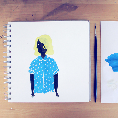
Eugenia Tsimiklis (above)
Reality Bites: This film has significance for me as a romantic comedy because it encapsulated awkward post-university faltering relationships. It’s a movie about connecting with people, being emotionally vulnerable and a search for identity, and opportunity during economic recession. Reality Bites is the archetypal slacker romantic comedy and is concerned with not being a “sell out” and choosing integrity over financial gains and choosing the slacker penniless hot musician Ethan Hawke over the earnest suited TV executive, Ben Stiller. Stylistically, I love Reality Bites, because Ethan Hawke and Winona Ryder are the ultimate nineties pin ups, wearing grunge thrift store clothes and hanging out in dirty bars, driving beat up old cars, working in jobs they hate and smoking cigarettes and feeling misunderstood.
I drew this based on the movie poster but I wanted it to have more of a comic feel. I drew it in pencil and added Indian ink, and a splash of red. I like the starkness of a limited palette and black and white poster art.

Valentines Art_Alison Day
Alison Day Designs
The inspiration for my Valentines Art illustration came to me one evening by chance. I have worked for many years as editor and designer of an expatriate magazine in the Netherlands. In 2013, I decided that it was time to take the plunge and put all my energies into my business: Alison Day Designs. I am inspired by imagery and the world around me, and I enjoy working in my garden studio on personal design and illustration projects.

Florence Zealey
Florence Zealey
My piece is inspired by the french film, Le fabuleux destin d’Amélie Poulain – probably one of my all time favourites. The line “Even artichokes have hearts” immediately sprung to my mind when first approaching the design, appearing within the scene where Amelie confronts the bully of a greengrocer. Although not seemingly the most romantic line, or scene, within the film, I thought that it perfectly captured the charm and romance of the story without being too obvious. The film is simplistic, lighthearted and doesn’t take itself too seriously, so I have tried to keep that theme within my own work. I originally drew out the artichoke and the title by hand and then decided to progress with the design digitally. I have always admired simplistic and graphic posters, such as the work by Saul Bass, and have recently tried to bring this approach back to my own work. There is something incredibly difficult about keeping a design so simple and making it still look good whilst still having a clear meaning. 

helendodsworth
Helen Dodsworth
I’ve never been keen on romantic/soppy declarations and find it all a bit naff to be honest. My friend was eating some love hearts and I noticed that one of them had MINE stamped on it. This struck me as a little too possessive and controlling for my liking, and left me with an image of a little cartoon love heart being told off for being a little too keen. I sketched out a few rough drawings until I had it looking the way I wanted it, then scanned my favourite sketch into Photoshop, blew it up to the right size (as I naturally sketch quite small), then polished it up and added colour in Photoshop, using a photo of love hearts I found online for colour reference.

HollyFarmer-Valentinesart
Holly Farmer
This illustration is a mixed media piece that was originally inspired by the Russian artist duo – The Popovy Sisters and their beautiful artist dolls. I wanted to portray a sense of fragility and melancholy through the form of a slim, breakable doll. Although she has a dolls body, I feel I captured something hauntingly human about her expression and mood. I painted the girl using watercolours in an impasto method by mixing white acrylic paint to the colours. I also hand painted each individual moth in watercolour. Originally during my planning of this work I painted two girls facing each other in a romantic or sisterly way. I wanted to express the way love is universal and mostly, indiscriminate. I erased the second girl and instead drew two red flowers in a vase to simply suggest a romantic aura. I feel I captured the theme of love in a subtle way.

joanna long
Joanna Long
Love is all around, sometimes you just have to look a little bit harder to see it!

laura barrett
Laura Barrett
The design I’ve created is inspired by traditional folk art and takes inspiration from nature. I’ve always been drawn to folk and fairy tales, which is something that runs through most of my work and the illustrations I choose to create. This design is based on floral folk art, in particular ‘Scherenschnitte’, the German art of creating intricate cut paper designs. These need to be designed in a way that every piece is connected so that the whole design is held together- I like this idea of everything being connected, which seems appropriate for such a romantic theme. 

myfanwy tristram
Myfanwy Tristram
Although I work a lot with inks, and prize them for their vibrancy, this piece is super-saturated in colour even by my standards. When I thought of love, I wanted to show it bursting out all over, with flowers springing up spontaneously, trumpets playing triumphant fanfares, and everything – seed heads, rainbows, hearts and flowers – just exploding with the sheer exhilaration of it all.
In retrospect, I suspect the colour theme is influenced by a childhood exposure to Sesame Street and Seventies cartoons, where pink, purple and orange could, and did, co-exist in harmony. For those who didn’t grow up in that decade, I apologise, and hope that your retinas recover soon.
I sketched this piece out in pencil initially, which allowed for some crazy sweeping lines, then coloured it, via a lightbox, onto a new page. It’s barely touched up in Photoshop, hence the uneveness in some of the colouration – hopefully all adding to the general feeling of being swept up in the moment of irrepressible, undeniable, exuberant love.

Rich banks queen of hearts
Rich Banks
Queen of Hearts was created using Staedtdler Fine Liners and Uni Posca marker pens. It is the next in a series of illustrations I am producing on playing cards. 

Sarah Stendel
Sarah Stendel
My inspiration was one of the most romantic movies of all that I know: An Affair to Remember starring lovely Deborah Kerr and Cary Grant as Terry and Nickie, who gently fall in love with each other during their trip on a ferry. Although both are actually involved with someone else, after their journeythey decide  to leave each others’ partners and meet in 6 months time on top of the Empire State Building in New York. After watching the movie again and making some sketches and notes during the film, I started painting a remake of the movieposter. I went for an old poster format, like some french theatres (particularly Folies-Bergère) or events used to have around the 20s/30s. And some british illustrative posters of the 50 inspired me as well.

ScottWMason-VALENTINES-ART
Scott Mason
Illustrated film posters from past romance movies inspired this illustration, with those a single image had to depict a story and intrigue viewers to come and watch the film, so I wanted to include just enough to entice the viewers imagination and curiosity and let their mind run wild with creating a story, situation and relationship for these two. This image started off with a couple of quick layout sketches to try and plan out the colours, but that all went out the window when I started the actual drawing and just coloured it in what I felt looked decent and worked. I wanted the image to have an almost screen printed retro feel to it with the flat bold colours, clashing just enough to get your attention but hopefully not so much you need to pop on a pair of sunglasses mid winter.  

Vicky Bentham-Green
Vicky Bentham-Green
My two greatest passions in Art are line and colour; I grew up on Dartmoor surrounded by a dramatic landscape and hardy livestock and would go out with a sketchbook to draw – I liked the challenge of capturing the ‘essence’ of the animals and the scenery. At secondary school my art teacher recommended I attend life-drawing classes. I enjoyed being able to draw the full human form but found I missed portraying movement. I love location drawing, sketching people going about their business and creating ‘characters’ in just a few lines.
I chose the tale of the Frog Prince as my female figures tend to have a whimsical air and my animals a personality of their own; so when brought together I felt they represented well the ridiculous and yet wonderful sentiment of the tale.
I start my illustrations by drawing subjects from reference or moving image, sometimes I will capture a subject in one drawing, another time it will take dozens of attempts, but I will know when an image is the right one; it feels like a type of magic! I then work over the drawings, and create textured backgrounds, using watercolour or watercolour pencil.

Will Broomfield
Will Broomfield
The valentines theme took me straight towards a heart so I started with a basic outline, white on black. I wanted to make this piece unique with randomness, simply because you never know who you might fall in love with, it’s random. Having added colour to the individual heart, I thought it looked bare by itself, therefore I used the same illustration without colour with different opacity which created a heart series which I think has worked well.

Categories ,2015, ,Alison Day Designs, ,An Affair to Remember, ,art, ,East End Prints, ,Eugenia Tsimiklis, ,Florence Zealey, ,Helen Dodsworth, ,Holly Farmer, ,illustration, ,Joanna Long, ,Laura Barrett, ,Le fabuleux destin d’Amélie Poulain, ,Love, ,Myfanwy Tristram, ,Open brief, ,Queen of Hearts, ,Reality Bites, ,Rich Banks, ,Romance, ,Sarah Stendel, ,Scott Mason, ,True Romance, ,Valentine’s Day, ,Valentines Open Brief, ,Vicky Bentham-Green, ,Will Broomfield

Similar Posts:


Amelia’s Magazine | Introducing True Romance: Print Designs chosen for an exhibition curated by East End Prints

True Romance East End Prints Flyer
I am really pleased to share the designs that have been chosen by East End Prints to appear as part of the True Romance exhibition opening today at 70 Paul Street (full listing info here). Helen Edwards of East End Prints has picked the following work, made in response to my Valentines Art Open Brief, to feature on a specially curated wall alongside the rest of her prints. She will offer the ones which are best received during the show a publishing deal to be sold online, and all works will also be available to buy at True Romance. Scroll down to read more about the inspiration behind these pieces and the process of creating them. I’ll be sharing the rest of the designs that were sent in over the following week.

Wuthering Heights by Ashley Le Quere
Ashley Le Quere: Wuthering Heights
My submission is based on Wuthering Heights. I wanted to create something that was a bit whimsical as well referring to what happens in the story, so I started to draw icons that I thought represents parts of the book and the different parts of the story and I loved this quote! It feels very deep and reflects the obsessive, passionate and doomed romance that is the focus of the book. I hand drew the text so it would feel like the diary that Catherine writes about Heathcliff. I think that the texture in the ink reflects the stormy and miserable nature of the book but wanted the icons to be quite whimsical.

Ashley Le Quere is an Illustrator and Surface Pattern Designer. You can see more of her work here.

onlyloversleftalive_by_Carly_Watts
Carly Watts: Only Lovers Left Alive
My illustration is based on Jim Jarmusch’s ‘Only Lovers Left Alive’. The movie is based on two, centuries old vampire lovers called Adam and Eve. Adam is a musician who reconnects with Eve after a period of separation after he becomes depressed and melancholy. I wanted to create a highly stylised and graphic piece that would capture the main themes of the movie, Adam’s darkness, his love of music, and the quest to find where we fit into society. On a more visual level, Adam is primarily dressed in dark colours, and Eve in light throughout the course of the film; I thought this could be portrayed well through the guitar graphic.

See more work by Carly Watts here.

Death Valley Illustration Annie Hall
Death Valley Illustration: Annie Hall
The poster is designed to resemble a minimalist book cover, and includes the most romantic quote from the film, delivered in Woody’s inimitable style.  The paired back design also reflects the way that both of the characters approach their relationship throughout the film, and the cold reasoning that Alvy uses to reflect back on their time together.  The glimmers of romance in the film are shown by the sparing use of the vibrant pink. The fonts used were Rockwell, Futura and Georgia.

Gavin Shepherdson of Death Valley Illustration has been working as a freelance illustrator and designer since graduating from an Animation degree in 2009. See more work here.

emma russell casablanca
Emma Russell: Casablanca
For this print, I started by making line drawings of Humphrey Bogart and Ingrid Bergman at various points in the airport scene of Casablanca. I added colour and hand drawn type. As I worked I pared down and simplified the image until the two figures made a single silhouette framing Bogart’s parting words.

Emma Russell is a London-based freelance illustrator specialising in line drawings, flat colour, patterns and 3D paper sculptures. Her work often features unlikely champions, jokes and puns, memory, animals and fairy tales. Find Emma at www.helloemma.co.uk 

Jessica_Courtney_Tickle_My_Fair_Lady
Jessica Courtney-Tickle: My Fair Lady
I have recreated the film poster for the 1964 film and musical, ‘My Fair Lady’. At the heart of this love story there are (in my opinion) two very different characters with very different morals, lifestyles and ideas about falling in love. I wanted to describe how free and expressive Eliza the flower girl is compared to the upper classes who are shocked by her accent and way of life. But as you can see if you look closely at Professor Higgins he is actually intrigued by her character rather than put off. The florals are inspired by the very first scene of the film where Eliza is selling flowers in Covent Garden Market. This is the very first place the two characters meet. I created the work using gouache which I then scanned in and played around with on the computer. I added some digital colouring to give the poster more vibrancy and a smoother texture. I was most inspired by vintage picture book illustrations and posters which are rich in colour and character.

See more work by Freelance Illustrator and Designer Jessica Courtney-Tickle here.

jordana_globerman_edward_scissorhands
Jordana Globerman: Edward Scissorhands
Growing up, I thought Edward Scissorhands was the most romantic film. It captures the fairy-tale feeling of a first love so perfectly. I created my homage to this wonderful film with a mix of media, laying out and ink drawing first before incorporating elements of collage and painted-in details. Different brush work was used to achieve the splashed figure of Edward and the lightly falling snow. I wanted to capture both how the town begins to see Edward and how Kim sees Edward. His figure looms ominously, evoking the fear he instills in the town toward the end of the film. Despite this, Kim can only think of him with a real love and devotion, which is why I made this same figure of Edward hunched into the shape of a heart. This was a fun image to create because the film is so nostalgic and romantic to me. I enjoyed playing with different textures and line quality to create a graphic, yet painterly poster.”

See more work by Jordana Globerman here.

Katie Edwards - True Romance
Katie Edwards: True Romance
I love animals, who doesn’t, I decided they were a great way to convey the idea of Love, Affection and Companionship. I think most people could relate to the imagery I used and feel some emotions. Using traditional photographic and screen printing techniques to produce my conceptual screen prints, which are occasionally combined with collage or freehand textures. My work is largely influenced by the animal world focusing on photographic representation, what images symbolise and their use metaphorically. Objects are often isolated and placed in unusual compositions to result in a surreal, humorous or thought-provoking illustration. Animals often feature in my illustrations because they are very symbolic, as they don’t change with time or technology. They will always stay the same, and so will their symbolic meanings.

See more work from Katie Edwards here.

lindsay_lombard_the_notebook
Lindsay Lombard: The Notebook
The Notebook is one of my all time favourite love films, I love the setting of the film and the whole premise of the movie. The first quote that came to mind from the film was ‘If you’re a bird, I’m a bird’; meaning I’ll be whatever you need me to be to allow us to be together. I then set about creating the imagery – I developed some pencil drawings of two birds taking to flight. I then scanned these in, and set them upon a light background just to soften them slightly. I wanted the placement of the birds to be a representation of them flying freely away together. I added text and the cut out of an open book at the bottom, I tried drawing the book first but I couldn’t get the right amount of detail into the image so I decided to go with a white cut out – I think it works well to have the suggestion of a book but not be too obvious about it.

See more work by Lindsay Lombard here.

La-vie-en-rose by Sophie-Heywood
Sophie Heywood: La Vie En Rose

La Vie En Rose is probably my favourite love song. The melody is enchanting and somewhat haunting, uplifting yet sad, and I feel it conveys the different emotions of being in love more accurately than any other song. I love the original Edith Plaf version, but I think the Louis Armstrong version is my favourite rendition. When painting the hand drawn lettering, I let the soulful vocals dictate the shape of the composition. I wanted to create something simple, yet with an eye-catching pop of colour, creating a piece that can easily be framed and hung in someone’s home. The trouble with the theme of Valentines is creating something timeless and relevant all year long, but I feel this song is something everyone can relate to.

See more work by Sophie Heywood here.

All are welcome to attend the Private View on Thursday 12th February, 6-9pm. Don’t forget, the exhibition also features the beautiful gold leaf prints made for That Which We Do Not Understand.

Categories ,180, ,Annie Hall, ,Ashley Le Quere, ,Carly Watts, ,Casablanca, ,Death Valley Illustration, ,East End Prints, ,Edward Scissorhands, ,Emma Russell, ,Film Posters, ,Gavin Shepherdson, ,Helen Edwards, ,Jessica Courtney-Tickle, ,Jim Jarmusch, ,Jordana Globerman, ,Katie Edwards, ,La Vie en Rose, ,Lindsay Lombard, ,Movie Posters, ,Movie Prints, ,My Fair Lady, ,Only Lovers Left Alive, ,Sophie Heywood, ,That Which We Do Not Understand, ,The Notebook, ,True Romance, ,Wuthering Heights

Similar Posts:


Amelia’s Magazine | An interview with Ashley Le Quere: Amelia’s Colourful Colouring Companion featured artist.

Ashley Le Quere_Sketchbook_1
Ashley Le Quere creates colourful artwork with a twist, often accompanied by her beautiful typography, learnt from a master calligraphist in Australia. Here she shares her lovely ‘peeping cat’ colouring book artwork and tells us more about her design practice.

Ashley Le Quere_At Studio Desk Pic
How would you describe your style and what art materials can you not live without?
I always find it so hard to describe my style, but I would say it is hand drawn, as it looks natural and flowing. My favourite material would have to be my black Winsor and Newton ink, which I use for every project! I hand draw everything with my ink and my favourite paintbrush, which is now very old so I probably need a new one.

Ashley Le Quere_Sketchbook_2
Where do you find most of your inspiration?
If I’m really stuck for inspiration I tend to have a look though a magazine and pick out a few of my favorite books like Paris Kitchens, and if all else fails I go take a walk in the park. While I’m walking I tend to look for bits and bobs to collect, like really big leaves, petals or flowers that I find interesting and sometimes I make a collage of them!

Ashley Le Quere_At Studio Screen Printing Pic
What do you find so special about the screen printing process?
I love to screen print really because it is such a quick process; you can have an idea and by the end of the day (if all goes to plan) you will have a beautiful print or product.

Ashley Le Quere_colouring book pages
How did a peeping cat inspire your colouring book pages?
I drew the peeping cat in my sketchbook first off and it was playing on my mind… I wanted to take it further but I didn’t know how. That’s when I saw your open brief and thought it would be amazing opportunity to make more out of my peeping cat sketch.

Ashley Le Quere_Cat doodles
What did you learn at Ella Doran?
Working in Ella Doran’s studio was such a great experience but I think my favourite time was while I was helping her set up for the Home show in 2012. I think the main lesson I took from her was to keep calm under pressure and when working to tight deadlines… keep working through it and it will all work out eventually.

Ashley Le Quere_suitcase project
How did your time in Australia inform your work?
I think the time that most influenced my work while I was in Australia was while I was living near Byron Bay working on a coffee farm. I was in the middle of this tropical, beautiful country side and alone with my thoughts and all the flora and fauna for most of the day: I think that was the calmest time of my life.

Wuthering-Heights-by-Ashley-Le-Quere
You were chosen as one of the featured artists for the East End Prints Valentines exhibition, what inspired that artwork?
I illustrated a quote from one my favourite books for the True Romance Valentines Exhibition, which is Wuthering Heights. I love a good romantic period drama! (read more about Ashley’s artwork here)

Ashley Le Quere_suitcase project_2
How did you come to work with a suitcase company and what has been the best part of the project so far?
They approached me to create designs for their ‘Artist Create’ range. I think the best part of the project was that they trusted me and let me create whatever I wanted. I left very relaxed and enjoyed creating the designs: I think that it shows through in your work when you have fun doing it.

Ashley Le Quere_Hand Drawn Lettering
Your typography is beautiful, how did you learn this art?
Thank you, I have been playing with typography and lettering for years now but it was when I was in Melbourne that I really fell in love with it. I had a studio space in an converted warehouse where I met an amazing calligraphist called Maria Montes, so when she started to do workshops I couldn’t say no. I joined up and learnt so much from her: now I can’t stop!

Ashley Le Quere_My Firends Pattern
How exciting that you are taking part in the Crafty Fox Market for LDF. Can you tell us anymore about your products?
Yes, I’m working on creating cushions and some tableware textiles. My Gran (who I called Nanina) was a huge inspiration to me; she was an amazing women who I spent a lot of my child hood with. She died a couple of years ago and since then I have found myself drawn to the things she was passionate about or things she loved, like Ferns! So this project has been a very personal project, full of love.

There are many more interviews with Amelia’s Colourful Colouring Companion artists to come, so stay tuned.

Categories ,#ameliasccc, ,Adult Colouring Book, ,Amelia’s Colourful Colouring Companion, ,Artist Create, ,Ashley Le Quere, ,australia, ,Byron Bay, ,Coloring Book, ,Colouring Book, ,Crafty Fox Market, ,East End Prints, ,Ella Doran, ,Home show, ,interview, ,Maria Montes, ,Paris Kitchens, ,Peeping cat, ,screenprint, ,True Romance, ,typography, ,Winsor and Newton, ,Wuthering Heights

Similar Posts: