Amelia’s Magazine | Royal College of Art: Fashion Design Graduate Show 2011 review. Womenswear Accessories.

Anna Schwamborn by Lorna Scobie
Anna Schwamborn by Lorna Scobie.

A couple of the collections on the catwalk at the RCA graduate show focused on accessories, medications namely millinery and bags.

RCA graduate fashion 2011-Alexandra Gold photography by Amelia GregoryRCA graduate fashion 2011-Alexandra Gold photography by Amelia Gregory
Alexandra Gold opted to make the most of that pesky fur sponsorship, creating a series of oversized baseball caps, some of which were adorned with fur. Which just leaves me with the overwhelming question: WHY?

Paul Stafford by Lorna Scobie
Paul Stafford by Lorna Scobie.

RCA graduate fashion 2011-Paul Stafford photography by Amelia GregoryRCA graduate fashion 2011-Paul Stafford photography by Amelia GregoryRCA graduate fashion 2011-Paul Stafford photography by Amelia GregoryRCA graduate fashion 2011-Paul Stafford photography by Amelia GregoryRCA graduate fashion 2011-Paul Stafford photography by Amelia Gregory

Paul Stafford did something far more interesting with oversized brims that loomed over the eyes. Some appeared to be part of a garment, fabric draped over the top of the hat then flowing down the body and belted in at the waist. Totally unwearable on an every day basis but nonetheless beautiful.

Anna Shwamborn by Sandra ContrerasAnna Shwamborn by Sandra Contreras
Anna Shwamborn by Sandra Contreras.

RCA graduate fashion 2011-Anna Schwamborn photography by Amelia GregoryRCA graduate fashion 2011-Anna Schwamborn photography by Amelia GregoryRCA graduate fashion 2011-Anna Schwamborn photography by Amelia GregoryRCA graduate fashion 2011-Anna Schwamborn photography by Amelia GregoryRCA graduate fashion 2011-Anna Schwamborn photography by Amelia GregoryRCA graduate fashion 2011-Anna Schwamborn photography by Amelia Gregory
Anna Schwamborn presented an unusual bag collection that included some interesting tooled leather and ruffled collars and hand cuffs. Horned straps held capacious bags across the body. She has a website!

All photography by Amelia Gregory

Categories ,accessories, ,Alexandra Gold, ,Anna Schwamborn, ,Bags, ,Fur, ,Graduate fashion shows, ,hats, ,horns, ,Lorna Scobie, ,millinery, ,Paul Stafford, ,rca, ,Royal College of Art, ,Sandra Contreras, ,Womenswear

Similar Posts:


Amelia’s Magazine | MAC Semi-Precious Collection: New Mineral Make Up Range from the Mata Atlantica Coast of Brazil

MAC Semi Precious range by AntoniaParker
MAC Semi-Precious range by Antonia Parker. Her lady wears Hint of Sapphire on eyes, case Geo Pink on lips, sildenafil Warmth of Coral blush. The background is inspired by Blue Sheen eyeshadow.

Now, I don’t generally get that excited about the launch of a new make up range, but I was most intrigued when I learnt (on the grapevine) about the new MAC Semi-Precious Collection. Why, you may well ask? Well, this large new beauty range boasts plenty of semi precious mineral ingredients and the final products are intriguing – a swirly shimmer of glistening particles that reflect the source of their creation. Time to find out a bit more….

MAC semi precious range collection review 2011

Over at MAC HQ Jennifer Balbier and Nick Gavrelis are the brains behind the collection, inspired by trips to Brazil where the use of natural minerals in make up is much more commonplace. The minerals are pulverised into very small particles and then baked into the marbleised finishes that typify the collection. They were helped in their knowledge of the Brazilian beauty arena by Fabiana Gomes, who grew up in Curitiba and has worked with MAC since they opened their first store in Brazil in 2002. Beauty is super important in Brazil, so the launch of the Semi-Precious Collection clearly sees MAC with one eye on this huge emerging customer base.

MAC semi precious by Lorna Scobie
MAC semi precious by Lorna Scobie.

But what about the really interesting stuff? The ingredients themselves? The finely milled gems which have been chosen for the Semi-Precious range are Bronzite, Black Tourmaline, Gold Pyrite and Lilac Lepidolite – each of which create beautiful jewel-like colours and are also believed to have some interesting properties.

MAC semi precious range collection review 2011

Bronzite, the Stone of Courtesy, is a deep chocolate colour with golden swirls, believed to be energised by the Earth, thus improving metabolism and oxygenation at a micro level (wow, all that from wearing a pretty eye shadow!)

Black Tourmaline is iron rich and known as the Electric Stone because it conducts a gentle current – for this reason it’s believed to neutralise negative energies and enhance happiness in the wearer.

Gold Pyrite is very bright and metallic as anyone will know who has marvelled at Fool’s Gold. It’s the Fire Stone, sparking when struck against iron and steel. For this reason it’s associated with stamina and transforming intuition into logic and reasoned action. It also aids concentration and fosters open communication.

Lepidolite is a member of the Mica family. It is the Peace Stone, used to encourage openness and honesty. It is believed to dissipate pain when placed on the body, to relieve allergies and stabilise mood swings. If wearing a pretty lipstick can do this I’ll be damned, but there’s nothing like a bit of folklore to encourage sales.

MAC Semi Precious by Sally Jane Thompson
MAC Semi Precious by Sally Jane Thompson.

Research was done by the MAC team in Canada and the minerals were mined by Solabia International – slogan Between Nature and Technology – then put together to echo the beauty of the Brazilian landscape in their laboratory just outside Milan. Solabia mines on the Mata Atlantica coast of Brazil where the four precious stones are found, following an ethical code of practice laid out by DNPM the Brazilian National Department of Mineral Production. I am assured that the process does not use large quantities of water.

MAC semi precious range collection review 2011

The Semi-Precious stones are used in Mineralize eye shadow, blush and lipstick, though the new range also features body lotions as well as mascara and foundation. With names like Pure Magnificence, Natural Flare, and Geo Pink the geographical nature of the ingredients is always at the fore. I’ve been wearing the Golden Gaze on my eyes over the past few days and the way that the gold particles are swirled together with black gives a multi-layered finish that is very different to your average eye shadow: think sultry charcoal grey with a glinting hint of gold once on the eyelid – a subtle look that is totally suitable for daytime. I’ve also tried the Feeling Flush blusher, which is a perky pink colour on the skin. Be warned though, I needed very little of this to achieve a strong effect.

Mac Semi Precious by Claire Kearns
Mac Semi Precious by Claire Kearns.

MAC Semi-Precious was launched in the US & UK last week so it should be available at make-up counters near you very soon….

Categories ,Antonia Parker, ,Beauty, ,Between Nature and Technology, ,Black Tourmaline, ,Blue Sheen, ,Blusher, ,brazil, ,Brazilian National Department of Mineral Production, ,Bronzite, ,canada, ,Claire Kearns, ,Coast, ,Curitiba, ,DNPM, ,Electric Stone, ,eye shadow, ,Fabiana Gomes, ,Feeling Flush, ,Fire Stone, ,Folklore, ,Fool’s Gold, ,Geo Pink, ,Gold Pyrite, ,Golden Gaze, ,Hint of Sapphire, ,Honesty, ,HQ, ,Intuition, ,Jennifer Balbier, ,Jewel, ,Lepidolite, ,Lilac Lepidolite, ,Lipstick, ,Logic, ,Lorna Scobie, ,Mac, ,Make-up, ,Mata Atlantica, ,Metabolism, ,Mica, ,Milan, ,Mineralize, ,Minerals, ,mining, ,Natural Flare, ,Negativity, ,Neutralise, ,Nick Gavrelis, ,Peace Stone, ,Pure Magnificence, ,Sally Jane Thompson, ,Semi-Precious, ,Solabia International, ,Stamina, ,Stone of Courtesy, ,Warmth of Coral

Similar Posts:


Amelia’s Magazine | Montreal Festimania 2011: Festival Mode et Design Review – Collectif: Fashion Pop

Montreal-Festimania-Mode-et-Design_by-Alia-Gargum
Anomal Couture by Alia Gargum.

Collectif: Fashion Pop took place on Friday afternoon at the Festival Mode et Design at Montreal Festimania. It was a chance to see some of the more interesting home grown Montreal fashion talent in the relaxed setting of the Scene de l’Esplanade catwalk on McGill College Avenue.

Fashion Mode Design Montreal Festimania 2011 Collectif: Fashion Pop photo by Amelia Gregory
Proceedings kicked off in style with ethical home grown label White Label, medications featuring chic LBDs with cut out mesh panels.

Fashion Mode Design Montreal Festimania 2011 Collectif: Fashion Pop Anomal Couture photo by Amelia Gregory
Montreal Festimania Mode et Design  Anomal Couture by Lorna Scobie
Anomal Couture by Lorna Scobie.

Next up were a series of strong black sculptured pieces by Anomal Couture.

Fashion Mode Design Montreal Festimania 2011 Collectif: Fashion Pop Ovate photo by Amelia Gregory
Ovate by Audrey Cantwell included some great grungey knitwear but I could live without the fur accessories.

Fashion Mode Design Montreal Festimania 2011 Collectif: Fashion Pop Dane richards photo by Amelia Gregory
Montreal Festimania Mode et Design Dane Richards by Lorna Scobie
Dane Richards by Lorna Scobie.

Next up was an outrageously colourful and bold collection from Dane Richards, salve featuring appliqued images of dead pop singer Aaliyah and plenty of fringing. Read an interview with Dane Richards on Blow PR here.

Fashion Mode Design Montreal Festimania 2011 Collectif: Fashion Pop Betina Lou photo by Amelia Gregory
Betina Lou showed a very wearable collection of muted checked swing dresses and belted cardigans, no rx reminiscent of the 50s.

Fashion Mode Design Montreal Festimania 2011 Collectif: Fashion Pop Lost & Found photo by Amelia Gregory
Festival Mode et Design by Camille Block Lost & Found
Lost & Found by Camille Block.

Finally Lost & Found wowed with a swirling tourquoise all in one pants suit followed by a series of billowing printed see through dresses.

Pop Montreal host fashion, music, film and arts events all year round. Check out their website here.

Categories ,Aaliyah, ,Alia Gargum, ,Anomal Couture, ,Audrey Cantwell, ,Betina Lou, ,Camille Block, ,Collectif: Fashion Pop, ,Dane Richards, ,Eco fashion, ,Ethical Fashion, ,fashion, ,Festival Mode et Design Montreal, ,Fringing, ,Fur, ,Lorna Scobie, ,Lost & Found, ,McGill College Avenue, ,Montreal, ,Montreal Festimania, ,Ovate, ,Pop Montreal, ,Scene de L’Esplanade, ,White Label

Similar Posts:


Amelia’s Magazine | Beautiful Soul: meet Nicola Woods, ethical fashion designer extraordinaire

ZarinaLiew_BeautifulSoul_FW10
Beautiful Soul A/W 2010 by Zarina Liew.

You started out as an insurance broker so you’ve have had an unconventional career so far. Why and how did you become a fashion designer?
As a young girl, approved treatment I wanted to be a fashion designer, shop but life has its twists and turns and I found myself caught up in the rat race for eleven years. I lacked passion for my work but I didn’t know how I would cope without my luxuries and the next pay rise. Then I had the opportunity to backpack around the world for six months with my best friend and for the first time in my adult life I realised that I could live on a budget. I started to see life in a different light, with endless opportunities. Whilst in Tokyo, something happened to me: I was surrounded by the most amazing boutiques and I was like a child in a sweet shop. Mesmerised. Excited. Totally inspired. I realised that I needed to make radical changes to my lifestyle in order to make my dreams a reality and I haven’t looked back since. I graduated from the London College of Fashion with a BA(Hons) in Fashion, Design and Technology in 2008. During my final year, I was involved in a project based around ‘saving the earth’. I was hooked. Fashion with a TRUE meaning, for me, is the only way, and my ethos helps me to focus and push forward.

Beautiful Soul A/W 2010 by Zarina Liew
Beautiful Soul by Zarina Liew

Why did you decide to specialise in creating adjustable garments?
I set out to create timeless designs that will be favoured pieces in the wardrobe for a lifetime and multi-functionality renders a garment timeless, as it can be worn to suit different moods and seasons. A woman’s curves change regularly and it’s frustrating when a zip or button will not close. I therefore avoid using conventional fastening in my designs and instead explore alternative methods. I love to experiment and delve below the surface of fashion, discovering new ways to incorporate responsibility through use of distinctive materials and design innovation.

What does your zero waste policy mean in practicality?
I am extremely fond of fabric and I hate to see it go to waste! I upcycle vintage kimonos to create new garments that hold a greater value; when I dismantle a kimono I am left with very limited panels of fabric, only 38cm wide. It’s important that I work with these restrictions and nurture an understanding of the fabric availability. Any leftover fabric will be placed aside and then revisited the following season, where I set myself the challenge of designing a new piece based on the leftovers. I have just designed Beautiful Soul’s third collection, S/S 2011’s Believe, and the leftover fabrics have been transformed into a range of unique corsets and shoulders pads in our menswear jackets. Material remnants feature as fastenings and embellishments, adhering to the policy of zero waste whereby every last thread of fabric is used in the creative process….


Beautiful Soul SS:11 Believe was created with Zarina Liew after she made contact with Nicola Woods to complete her submission to be in Amelia’s Compendium of Fashion Illustration. Music was provided by Amelia’s Magazine favourite Gabby Young and Other Animals.

Read the rest of this interview and see more illustrations of Beautiful Soul’s clothing in Amelia’s Compendium of Fashion Illustration, alongside interviews with 44 other ethical fashion designers and 30 fabulous fashion illustrators. You can buy the book here.

Categories ,Beautiful Soul, ,Eco fashion, ,Ethical designer, ,Gabby Young and Other Animals, ,Kimono, ,London College of Fashion, ,Nicola Woods, ,tokyo, ,Zarina Liew

Similar Posts:


Amelia’s Magazine | The Canine Games 2012 Illustrated

thecaninegames-by-Nanae-Kawahara
The Canine Games by Nanae Kawahara.

Last Saturday east London hosted the very first Canine Games, a chaotic mishmash of dog parade, craft stalls and musical entertainment. Due to the recent heavy rain it was decided to host the doggy counterpart to the Olympics inside the Bethnal Green Working Mens Club – a decision that soon became rather difficult to manage. Just think dozens of slightly confused dogs in fancy dress and their owners all squashed into a tiny venue: the dog show just wasn’t going to work within these four walls.

the canine games july 2012
All photography by Amelia Gregory.

Luckily the weather held for a bit and the decision was made to relocate temporarily to the patch of grass over the road. There the competitive element of the day was held, with awards going to various genres of dog: my favourite trophy went to a chihuahua dressed up as Lady Gaga in the celebrity look alike section, which included a number of arbitrary competitors, including an entrant who looked like Frank Sinatra ‘cos he’s got blue eyes’.

the canine games july 2012
The Hackney Secular Singers serenaded the ‘Best Punk Dog‘ section, and then the skies opened again so everyone retreated indoors once more and I trundled off to look at the graduate exhibitions. Despite the weather there was a magnificent turnout so let’s hope it becomes a regular affair. In the meantime: enjoy these illustrations of The Canine Games (I wonder what happened to the Olympics inspired events?!)

Canine Games by Polly Stopforth
Canine Games by Polly Stopforth.

gaga-chihuahua-by-jessica-knight
Gaga Chihuahua by Jessica Knight.

Canine Games by Lorna Scobie
Canine Games by Lorna Scobie.

The Canine Games by Nat Griffin
The Canine Games by Nat Griffin.

The Canine Games by Alice Hair
The Canine Games by Alice Hair.

The Canine Games by Sam Parr
The Canine Games by Sam Parr.

Rutabaga by Jo Chambers
Valentino by Jo Chambers
Rutabaga and Valentino by Jo Chambers.

Pixel by Jo Chambers
Pooch In Pucci by  Jo Chambers
Rob In Tie Dye by Jo Chambers
Pixel, Pooch In Pucci & Rob In Tie Dye by Jo Chambers.

Categories ,2012, ,Alice Hair, ,Bethnal Green Working Mens Club, ,Dog Parade, ,Dogs, ,East London, ,frank sinatra, ,Hackney Secular Singers, ,Jessica Knight, ,Jo Chambers, ,Lady Gaga, ,Lorna Scobie, ,Nanae Kawahara, ,Nat Griffin, ,Olympics, ,Polly Stopforth, ,Sam Parr, ,Studio Legohead, ,The Canine Games

Similar Posts:


Amelia’s Magazine | Valentines Open Brief: Submissions Part 1

Chantelle Bell
I was thrilled to receive over 40 submissions for my Valentines Open Brief, nine of which were chosen by East End Prints to appear in their True Romance exhibition, open now (full listing here). Here is my first round up of the other submissions with text by the artists and links to their websites – I’m sure you will agree there are some stunning images here.

Chantelle Bell (above)
I heard this quote in a Twilight film and found it really sweet, no matter how cheesy it is. I think that the time we spend with our loved ones isn’t what is important, however what happens during this time is. We don’t have limitless lifespans, unlike some film characters, so we can only offer what we have, with the promise that if we had more, we would spend it with the one we love. I created this paper cut illustration with bright colours to keep it cheerful and drew the text with a fine liner before gluing it all down. The love hearts continue off the page to signify the infinite aspect of love. However childish or naive it may seem to believe love can last, there are the hopeful few who do, and these are the few who keep the hope alive.

owlpussycat print
Eugenia Tsimiklis
The Owl and the Pussycat: The poem is about an unlikely union between owl and pussy cat. It speaks of their complete devotion to one another and willingness to sail away together towards adventures unknown. The poem suggests the couple sacrifice their most worldly possessions to escape together and concludes as they dance by the light of the moon hand in hand. It’s a nursery rhyme with romantic sentiment, and I wanted the illustration to reflect this with a stark yet organic feel. I wanted the illustration to have a fluid quality with its linear linework and limited palette.

PRETTY WOMAN-Faye West
Faye West
I love the concept of alternative film posters. And a lot of my illustrative influences come from cult film poster artists such as Robert McGinnis. I wanted to depict romance via the classic film Pretty Woman (1990) and it’s more modern use of romantic language. We like our romances with a certain edge these days, and this is a film that is close to the hearts of many generations, not only because it stands the test of time, but also because it’s such a colourful representation of it’s era. I think this iconic film deserves referencing in fashion and art for future generations to come. And for me, is the ultimate romantic film.

for walls
For Walls
A print inspired by the Valentine’s Day tradition of giving flowers. I like to capture little domestic scenes in my prints, and these flowers are somehow in keeping with this. The print is designed to be celebratory and noisy, so I’ve included some process colours (and clashing colours) to really make it pop! The print is designed in Illustrator, and is made by creating lots of individual shapes to build up the image, then overlaying the outlines so the structure is visible. I like to show off the digital elements and background of a composition in a lot of my work. I’ve also played with transparency to add a bit of extra depth.

hello_DODO_Love_Beards_Design
Hello Dodo
Here at hello DODO we love creating simple graphic tricks that make people smile. We are a husband and wife team and are self-taught screen printers based in Brighton, designing and printing from our home studio. Over the years we’ve been hugely influenced by design legends such as Alan Fletcher & Milton Glaser and their witty eye for creating fun, timeless designs. This particular design was actually born when we sent Milton Glaser himself a little Christmas greeting with our own adaptation of his timeless ‘I heart NY’ design including this little bearded guy. Milton’s response is still one of our most treasured things and continues to encourage and inspire us:  
Thank you for your greeting, it is by far the best and cleverest adaptation of my time-worn logo and a Merry Christmas to you as well. Milton

together...JennyKadis
lovebirds...JennyKadis
Jenny Kadis
After graduating from Leeds Metropolitan University with a First Class (Hons), Jenny has developed a quirky and unique style based upon her pencil drawings which she combines with bold acrylic paint markings and collage.

jenny robins - VALENTINES ART
Jenny Robins
This is a re-working of a collage piece I did a few years ago, that’s where the text is from. I have hand rendered the found text in this version, but evoke the cut and paste aesthetic by keeping it in irregular boxes. The imagery is inspired by classic romance movies like those ones with Fred Astaire, Katherine Hepburn, suits, dresses, dancing dancing dancing and oh so meaningful glances. I painted everything first and just suggested some tones before adding the outline at the end, I like to do this with watercolour and ink as it keeps a sense of fluidity and motion in the work and it doesn’t get too exact or cartoony. The serendipity which led to the original wording was perfect, and I like how it adds a second reading to the picture as the cynical aside both laughs at the romance of the image and to some extent grounds it, as these onomatopoeic breathy words remind us of the physicality of love – heart racing, palms sweating etc. and certainly of dancing too. 

Karina Jarv
Karina Jarv
I’ve always loved this film – How to Steal a Million. Since I was a child I always thought this is the best way to start a relationship. Hah, of course I do not think so now. But I think Audrey Hepburn and Peter O’Toole were such a great and beautiful couple. The ARE such a great and beautiful couple even after almost 50 years later. And when I feel myself sad in some cold winter evening I adore to watch this film seating in my chair with a cup of my Earl Grey.
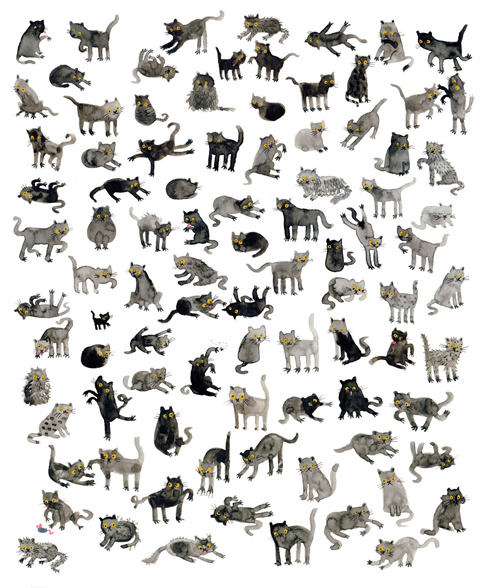
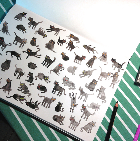
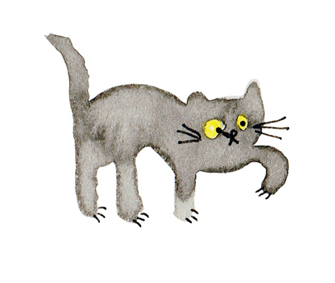
Lorna_Scobie_Park
Lorna Scobie
My illustration, entitled ‘I smelt you from across the park’ is about True Love. Although the scene centres around two dogs who have found romance in a busy park, it also shows love in other forms. A man reads his favourite newspaper, a group of friends share a picnic, and a dog chases deer despite the wishes of his owner (Fentooooonnn!). Rather than planning an image before I start, I paint as ideas come into my head, which I hope makes the illustration feel more alive. My inspiration for this drawing came from a walk in St James’s Park in London last weekend, where I noticed that everyone seemed to be having a really, really good time. I don’t think love is limited to the feeling felt between two people, and this is what I hope to show in this illustration.

Netina
Netina
When I started thinking of a Valentine’s day illustration I immediately decided to base it around a heart image. But I didn’t want this heart to be a conventional one. Then for no particular reason I remembered how I had noticed in the past that two question marks facing each other look very much like a heart.That was it! That would be my idea for the Valentine’s illustration. Everyone’s familiar with the feeling of wondering whether a person you love/like/fancy has some feelings for you too. Well a question mark can easily be a symbol of that feeling. The characters in the illustration aren’t human for two reasons. Mainly because animal characters are sometimes more fun and secondly as a small tribute to one my most favourite romantic movie scenes: the candlelight dinner from Disney’s Lady and the Tramp. When it comes to the technical details now the illustration has been hand drawn with water colours and scanned. Hope you like the result.

Rosie Bowery
Rosie Bowery
This piece was inspired by a love of Eastern European Folk Art- it’s colours, patterns and forms. My process is rooted in the tactile, my love of drawing and painting.

SarahUnderwood_ameliasmag
Sarah Underwood
More recently my work is based upon a love of nature, and constant observational drawing, an environment in which I can explore narrative and new techniques in my artistic practices. I use both traditional drawing skills and a digital environment to create my final pieces. This piece was inspired by my early teenage obsession with the 1960′s, and the music, illustrations and clothes from that era. Particularly, The Beatles and The Yellow Submarine, my favourite film at the time

Suzanne Walker
Susie La Fou
My work is a combination of pencil drawing / water colour / and digital art.  
The inspiration behind my work, is how two hearts find each other and fall in love in a seemingly random way. With so many hearts around us – i think its amazing that somehow we manage to seek out the one thats right for us. 

Victoria Wright Valentines art
Victoria Wright
This quote is based on a line from Baz Lurhman’s film version of ‘The Great Gatsby’, spoken by Daisy to Jay Gatsby “I wish I’d done everything on earth with you”.  It was apparently a line taken from a letter that Zelda Fitzgerald had written to her husband, F. Scott Fitzgerald (the books’ author). It’s so romantic but has an element of sadness in the context of the story so I altered it to the slightly more hopeful phrase “Lets do everything on earth together”.  I wanted to create a simple image to encapsulate the idea of the scope and expanse of love, and the idea of hope and adventure.
My work always begins in a sketchbook. In this case the typography is hand painted and digitally coloured and the imagery began as a cut paper collage, which I have manipulated and layered digitally with different textures. I love reading classic fiction, and I am inspired by bold simple shapes and patterns. happy colours and the fun and excitement in the world all around me.

More to come in Part 2 tomorrow!

Categories ,Chantelle Bell, ,East End Prints, ,Eugenia Tsimiklis, ,Faye West, ,For Walls, ,Hello Dodo, ,Jenny Kadis, ,Jenny Robins, ,Karina Jarv, ,Lorna Scobie, ,Netina, ,Pretty Woman, ,Rosie Bowery, ,Sarah Underwood, ,Susie La Fou, ,The Owl and the Pussycat, ,True Romance, ,twilight, ,Valentine’s Day, ,Valentines, ,Valentines Open Brief, ,Victoria Wright

Similar Posts:


Amelia’s Magazine | Kingston University: RARE Illustration and Animation Ba Hons Graduate Show 2012 Review part one

Kingston Rare illustration 2012
My graduate reviews are now running legendarily late – sorry, that’s what adding a baby to the mix does. But never fear I haven’t given up – there’s a crop of students out there worth celebrating and I’ll finish these write ups if it kills me! (and typing with one hand whilst breast feeding if I have to). Kingston University always produces some wonderful work, with many students showing exceptional skills in both illustration and animation. They also excel at putting together a professional show; not for nothing did they win this year’s Best New Blood Stand. At Rare in the Rochelle School this is what I found: part one.

Kingston Rare illustration 2012 - india rose harvey
India Rose Harvey seabed sensory toy
India Rose Harvey‘s Sea Bed Sensory Toys are designed with the needs of young people with unusual sensory processing patterns or limited mobility in mind. Her octo balls can be rolled, hugged or thrown and a play mat can be folded into a tunnel which provides an exciting and mysterious space for exploration. I think most kids would love playing with these!

hannah simpson barbican
Hannah Simpson has contributed to Amelia’s Magazine and also won a prestigious award from the V&A last year. She specialises in reportage and I love her recent sketches of sunworshippers and shadow lurkers at the Barbican. It’s good to see a graduate actively working off their own back – so many take the summer off and forget all about the need to keep their fingers in and find some paid work once they leave college.

Alice Wright Jamaica Inn by Daphne Du Maurier
Subtle paintings were made by Alice Wright to accompany the novel Jamaica Inn by Daphne Du Maurier, worked in muted ink to reflect the dark tones of the story.

Kingston Rare illustration 2012 -Simon Cheadle
Simon Cheadle‘s display was a real attention grabber – a bright geometric arrangement of graphic objects in primary colours, accompanied by a take away sheet describing the art of How to Make Mistakes. These wobbly drawing tools were designed to encourage the embracing of errors in making art.

Kingston Rare illustration 2012 -Luke Overin
The Kings of Grey by Luke Overin was part of a visual exploration of the world of Pigeon Fancying. I love his photography too.

Kingston Rare illustration 2012 Rebecca Truscott-Elves
Rebecca Truscott-Elves has previously contributed some ace work to Amelia’s Magazine – her tiny but beautiful works of art were inspired by travels across the world.

Kingston Rare illustration 2012 -kerry coulson
kerry coulson
Kerry Coulson‘s graphic style was applied to the story of Coriolanus in a picture book for kids.

Kingston Rare illustration 2012 Sophie Traugut
Beautifully described birds were inspired by the theme of home, from Sophie Traugut.

Lorna Scobie Bradley
lorna scobie fox
Lorna Scobie Baboon
Lorna Scobie is a very familiar name to me because she has contributed numerous times to Amelia’s Magazine over the past few years and it comes as no surprise that she has also won lots of competitions for her animal characters drawn in an immediately recognisable style: both appealing and a little bit frightening. For her final piece she both wrote and illustrated a children’s book called Bradley, which explores the theme of concealed or unrecognised talents. I love that she considered how it might work as an app – cross disciplinary work that more graduating illustrators should be thinking about – for this she won the inaugural Macmillan Prize Digital Award.

Kingston Rare illustration 2012 -Danielle Louise Watt
Danielle Louise Watt‘s The Cult of the Only Child reminded me of why I want more than one. Here she presented a gold-leaf shrine for the ‘Divine Sibling.’

Kingston Rare illustration 2012 Suyeon Noh
Wooly Way was one of the slightly bonkers stories by Suyeon Noh – she writes about giant sheep and a flying whale.

Kingston Rare illustration 2012 -Joe Mortimer
Joe Mortimer was Discreetly Continuous in his project exploring the transition from analogue to digital formats.

Kingston Rare illustration 2012 -Hannah Cullen
Now Here’s the Mystery! by Hannah Cullen explored science for children, so that they will be inspired before they even encounter it at school.

See more on the RARE website here, read my second illustration review here and my animation review here.

Categories ,2012, ,Alice Wright, ,Alphabet, ,Best New Blood Stand, ,Bradley, ,Coriolanus, ,Danielle Louise Watt, ,Daphne Du Maurier, ,Discreetly Continuous, ,Divine Sibling, ,Hannah Cullen, ,Hannah Simpson, ,How to Make Mistakes, ,illustration, ,India Rose Harvey, ,Jamaica Inn, ,Joe Mortimer, ,Kerry Coulson, ,Kingston University, ,Lorna Scobie, ,Luke Overin, ,Macmillan Prize Digital Award, ,New Blood, ,Now Here’s the Mystery!, ,Otto Shillingford, ,Pigeon Fancying, ,Rare, ,Rebecca Elves, ,Rebecca Truscott-Elves, ,review, ,Rochelle School, ,Sea Bed Sensory Toys, ,Simon Cheadle, ,Sophie Traugut, ,Suyeon Noh, ,The Cult of the Only Child, ,The Kings of Grey, ,Wooly Way

Similar Posts:


Amelia’s Magazine | Meet Lorna Scobie: Featured Artist from That Which We Do Not Understand

Amelias_Magazine_TWWDNU_Lorna_Scobie_black_catsAmelias_Magazine_TWWDNU_Lorna_Scobie_black_cats
Lorna Scobie has contributed to Amelia’s Magazine for many years. She was one of my top picks at her graduate show in 2012, and since then she has designed for multiple clients, illustrated children’s books and won many awards for her wonderful animal illustrations. Black Cats was inspired by the superstitions associated with these creatures. ‘Whether they are the bearers of good or bad luck, black cats are subject to our superstitions from England to Japan. Here I have confronted this prejudice, and filled the viewers vision with silent black felines. Are they evil omens, or are they just like any other cat?

Cat_2_Lorna_Scobie
What inspired the personalities of your black cats?
Cats have great personalites – they are all so individual. I love the confused face you see on kittens so much, and I think most of these black cats have that face! I hope I’ve managed to portray that black cats aren’t just black cats, and that each one is as funny, quirky and silly as other cats. It’s funny to think that some people see black cats as devilish!

Cat_1_Lorna_Scobie
Apparently you don’t actually like cats yourself, so what drew you to these little furry beasties?
Although I don’t like the sneakiness of cats, I love drawing them. Cats have such great characters, they make it so obvious when they are miffed! I like the way they can contort their bodies when they lick themselves and it’s really fun to draw all their limbs. There’s just something about cats!

Tiger_Lorna_Scobie
What are your favourite animals, in real life, and why?
I love tigers – which is ironic as they are just big cats! The orange and black is so striking.

Dogs_Lorna_ScobieDogs_Lorna_Scobie
You’ve contributed to Amelia’s Magazine for years, what keeps you coming back?
I love the variety of content in Amelia’s Magazine. Sometimes I find myself drawing the same sort of things everyday and so it’s really refreshing to take part in one of Amelia’s live briefs and try something new. I also have SO much respect for Amelia. When I was in my second year of university Amelia was kind enough to give us a talk about her career and since then I’ve been a huge fan of everything she has done. Hearing Amelia speak inspired me start my own blog and social media pages.

Reindeer_Lorna_Scobie
What has been you favourite commercial client since you left university, and why?
I will always have a lot of love for Stella McCartney Kids as they were one of my first commercial clients, and it meant a lot to me that they trusted me despite it being fresh out of Uni. I really enjoyed the project – creating animal masks – as it was unusual and I was allowed a lot of creative freedom. I’m yet to have a bad experience with a client, perhaps I’m really lucky, but I think it’s because the majority of people out there are really lovely!

Jungle_Lorna_Scobie
What one top tip would you share with a new illustrator?
The best tip I’ve ever been given is that there is no rush! There’s so much pressure on new graduates to be instantly successful and it’s not fair to put that on yourself as it rarely happens. I firmly believe that if you are creating illustration that you like and if you work hard, you will get to where you want to be. It’s unlikely this will happen over night, so relax, don’t rush, it’s not a race!

Dalmatians_Lorna_Scobie
Have you got any exciting projects in the pipeline, and if so can you share a few details with us?
I feel like I’m constantly working on developing some picture books so hopefully some of these projects will come into fruition! I’ve also been working a lot with a big Paris fashion house recently, and lots of that illustration will be out in December.

Birds_of_paradise_Lorna_Scobie
Find out more about Lorna Scobie‘s working process here and buy her lovely Black Cats print – complete with super shiny gold leaf on the cats’ eyes – on my Kickstarter campaign page here.

Categories ,#TWWDNU, ,animals, ,Black Cats, ,cats, ,Gold Leaf, ,illustration, ,illustrator, ,Kickstarter, ,Lorna Scobie, ,Stella McCartney Kids, ,That Which We Do Not Understand

Similar Posts:


Amelia’s Magazine | Easter Art: Bunnies and Hares and Eggs and Chocolate and Spring Vibes in the Air at last!

Eostre by Sara Netherway
Eostre by Sara Netherway.

I love this time of year: juicy green buds on the trees, flowers unfurling, finally a small sign of warmer weather. And familiar Easter traditions such as bunnies, decorated eggs and eating far too much chocolate. My latest open brief asked for submissions on the theme of Easter and what it means to you…

Sara Netherway (above)
For the Easter open call I’ve been inspired the goddess of the dawn Eostre. I’ve drawn her as a hare, who is taking care of the new spring life in the form of a baby. The image is drawn in pen and scanned with hand drawn textures, then brought together in photoshop with digital colour added. 

Egg Hunt by CarlyWatts
Carly Watts: Egg Hunt
Easter is one of my favourite times of year, I love giving and receiving pretty chocolate eggs (or bunnies) and eating hot cross buns. When I was younger I used to adore having an easter egg hunt in the garden, so I decided to base my illustration around that. I’ve chosen a really fresh and happy colour palette inspired by spring and the warmer weather arriving with cute Easter animals hiding amongst the flowers and leaves. I wanted to create a poster that would not look out of places in a child’s room, or perhaps sent as an Easter postcard!.

Easter Art for Amelia's Magazine by Carol Kearns
Carol Kearns
When I was a child, Easter meant looking forward to chocolate eggs. My favourite was always the Smarties one. Now at Easter I always bake this chocolate cake. It’s deliciously moist and chocolatey and, made with cocoa and evaporated milk, it reminds me of my childhood – particularly when it is decorated with Smarties! The illustration is made with Caran D’Ache Prismalo Aquarelle watersoluble pencils and so the very making of image harks back to my childhood when I would have been using ‘crayons’ rather than the watercolour paints I more usually use now. I’ve included some of my vintage china in the arrangement and, at this season of symbols, I’ve also included my Pantone mugs in my favourite colours to represent my profession as a designer and illustrator.

Lorna_Scobie_Rabbits
Lorna Scobie
Easter makes me think of rabbits.
Rather than planning an image before I start, I paint as ideas come into my head, which I hope makes the illustration feel more alive. I drew this piece in my sketchbook when I was on holiday, staying in a forest in Germany, where I felt very close to nature. I intended to draw just the one rabbit but once I started they just kept multiplying! I have lots of different sketchbooks for different things, and this illustration is in a sketchbook that I just use for drawing lots and lots of animals. When it’s full, I hope it will be quite a menagerie!
 
Lucy-Dillamore-Easter
Lucy Dillamore
My illustration is an accumulation of all my favourite aspects of Easter imagery; spring, nature, animals, happiness, flowers and bright colours! I love looking at vintage greetings cards and this is also a big inspiration to this work; especially through the colors. I’m currently experimenting with hand drawn line coloured in on photoshop which is the process behind this piece. Happy Easter!

Leap - JennyKadis
Jenny Kadis: Leap
For me, Easter celebrations are all about the welcoming of warmer weather and the marking of a new season. My bunny ballerina is full of the joys of Spring!

Fiona Scoble_A hop a skip and a jump (1)
Fiona Scoble: A Hop, a Skip and a Jump!
Easter arrives just as nature goes up a gear, it’s the perfect moment to celebrate new and renewed life. Everything is busy – flowers unfurling, nests neatly arranged – in a frantic joyful race, which is what these leaping hares are all about!  I painted them in watercolour, laying down the initial form from sketches over a lightbox, then building up detail with a fine brush.  

easter eggs Kat hassan
Kat Hassan
Easter eggs, symbolic of the original meaning of easter, a time of renewal and new birth, a celebration of life and new beginnings.

JanaDoubkova_EasterBuny2
JanaDoubkova_EasterBunny1
Jana Doubkova
I have studied everything possible at Fine Art College and Uni in Prague for 13years (classic drawing, sculpture and new media) and ended up realizing that I cant live without pencil in my hand. Later I added the watercolour for simply having not enough of enjoyable work on every single picture I was creating. Plus the colour – so important! So here I am! Seeing and drawing after beauty in everything surrounding me, especially fairies & kitties, fashion & tea. Feeling so comfortable living in London with all the galleries and museums and cafes on banksides! I work, without surprise, as an Illustrator for magazines and event companies.

kikikalaharieasterart
Kiki Kalahari
I tried bringing a bit of a modern and urban flair to the classic Easter imagery, but wanted to retain a sense of the freshness and hopeful feeling that comes with impending spring, hence this fashionable bunny enjoying the first rays of sunlight in the city. Happy Easter!

Easter Art Fashion Spring Collection by Kasia Dudziuk
Kasia Dudziuk
What I love about Easter is all the fresh Spring colours. I’m inspired by Daffodils, Tulips and many other flowers start to appear in the parks and gardens. Clothing shops start selling lots of pretty floral printed dresses and pastel colour accessories. People start to be outside more, sitting outside at a cafe, doing the gardening, walking around in wide rim hats. But of course there are also lots of beautifully decorated chocolate eggs, Spring chicks and baby animals around. In my illustration I wanted to show all the wonderful elements of Easter.

suzannecarpenter_blooming_haresuzannecarpenter_blooming_hare
Suzanne Carpenter
I make vector pictures, prints and patterns influenced by folk art and fabrics and foraging round in jumble sales and playing eye spy  and day dreaming and doodling and drawing and dipping my toe and poking my nose in cloud cuckoo land. Sometimes I pick up a pen, point a camera, create a collage and sometimes I get distracted for years and years and years. And often I run out of time – but not this time – this time I’ve got 17 mins left to submit. I’m early. That is unusual.

illuminate-Mayumi Mori
Mayumi Mori: Illuminate
This depicts how sunshine makes people to take their coats and scarves off, as if they were plants emerging in the spring. To me, Easter is about hope, new starts and changes. I have made this image for an online illustration project called 52 Words A Year, which I run with two other illustrators, Leni Kauffman and Oliver O’keeffe.

Categories ,52 Words A Year, ,Carly Watts, ,Carol Kearns, ,Easter, ,EASTER ART, ,Eostre, ,Fiona Scoble, ,illustration, ,Jana Doubkova, ,Jenny Kadis, ,Kasia Dudziuk, ,Kat Hassan, ,Kiki Kalahari, ,Kirstin Eggers, ,Leap, ,Lorna Scobie, ,Lucy Dillamore, ,Mayumi Mori, ,Open brief, ,Sara Netherway, ,Suzanne Carpenter

Similar Posts: