Illustration by Joana Faria
If I ever meet Jean Pierre Braganza in person, physician price I might give him a little squeeze. His A/W 2011 show on Friday leaps right into my top 5 – and I’m writing this at the end of a very long and pretty stressful Day 3.


One of my favourite things during fashion week is getting to see interesting buildings that I never knew existed and wouldn’t normally take the slightest interest in. Braganza’s show was to take place at the ‘Show Space’ – part of one of those centuries-old hotels with Baroque interiors and branded soaps. Me and Amelia skipped the queue and sneaked inside to find the most beautiful chandeliers and lots of OTT dressed punters. The actual room in which the show was to take place was equally as decadent, save for the make-shift catwalk that looked like it could topple at any second – and the tiny gap down the side of said catwalk through which we all had to squeeze. ‘I predict a bottle neck’ I thought as we entered, and my premonition came true on the way out.


Illustrations by Krister Selin
A little wait ensued while it was ensured that every inch of carpet had somebody to occupy it, so I took a few snaps of the room and got a bit excited about the juxtaposition of this past interior and Braganza’s future aesthetic.
On with the show with bangin’ beats and gorgeous models wearing more gorgeous clothes. Masculine tailoring appeared first, dynamically cut and decorated with a transfixing splatter pattern in tonal greys. This pattern was set to become a theme, appearing in both menswear and womenswear. After only a few pieces I instantly thought that Braganza’s collections are always meticulous and polished – rich, full fabrics are combined with unique cuts and expert craftsmanship – the entire collection was technically faultless.


Models appeared one after the other, pausing a third of the way down the catwalk so we could all get a good look. I like this set up – much better for pictures (and I’ve really struggled with pictures this season – bloody A/W and it’s sea of dark colours).


Illustrations by Krister Selin
Branganza took the collection forward concentrating on luxe materials that have high aesthetic value: rich and heavy knits, leather and mohair; add a science-fiction influence and you’ve got a real fashion forward collection.


Geometric cuts featured patches of contrasting materials. Nautical stripes in monochrome contrasted with the smoothness of jersey; gents wore Cuban heels with their military tailoring with contrasting sleeves. Braganza has an incredible ability to combine leather architectural pieces with beautifully elegant silk frocks – sounds hideous on paper but as a collection it was completely coherent.

Illustration by Joana Faria
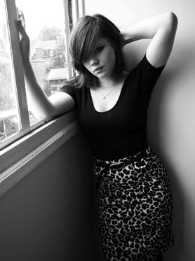
I usually can’t get it up for a predominantly black collection, but with Jean Pierre Braganza’s vision of the future I most certainly can. Bursts of lipstick red shook things up a bit: a gent’s suit with a synched back and skinny trousers that finished with points; embellished onto a mind-blowing shift dress; on short skirts. But it will be Braganza’s black that I remember this collection for: leather sleeves for gents and cutaway dresses in leather with a hint of bondage that oozed sex appeal for the ladies. Eyes peeled folks, this is what the future looks like.


Illustration by Joana Faria
If I ever meet Jean Pierre Braganza in person, stuff I might give him a little squeeze. His A/W 2011 show on Friday leaps right into my top 5 – and I’m writing this at the end of a very long and pretty stressful Day 3.
One of my favourite things during fashion week is getting to see interesting buildings that I never knew existed and wouldn’t normally take the slightest interest in. Braganza’s show was to take place at the ‘Show Space’ – part of one of those centuries-old hotels with Baroque interiors and branded soaps. Me and Amelia skipped the queue and sneaked inside to find the most beautiful chandeliers and lots of OTT dressed punters. The actual room in which the show was to take place was equally as decadent, prescription save for the make-shift catwalk that looked like it could topple at any second – and the tiny gap down the side of said catwalk through which we all had to squeeze. ‘I predict a bottle neck’ I thought as we entered, and my premonition came true on the way out.
Illustrations by Krister Selin
A little wait ensued while it was ensured that every inch of carpet had somebody to occupy it, so I took a few snaps of the room and got a bit excited about the juxtaposition of this past interior and Braganza’s future aesthetic.
On with the show with bangin’ beats and gorgeous models wearing more gorgeous clothes. Masculine tailoring appeared first, dynamically cut and decorated with a transfixing splatter pattern in tonal greys. This pattern was set to become a theme, appearing in both menswear and womenswear. After only a few pieces I instantly thought that Braganza’s collections are always meticulous and polished – rich, full fabrics are combined with unique cuts and expert craftsmanship – the entire collection was technically faultless.
Models appeared one after the other, pausing a third of the way down the catwalk so we could all get a good look. I like this set up – much better for pictures (and I’ve really struggled with pictures this season – bloody A/W and it’s sea of dark colours).
Illustrations by Krister Selin
Branganza took the collection forward concentrating on luxe materials that have high aesthetic value: rich and heavy knits, leather and mohair; add a science-fiction influence and you’ve got a real fashion forward collection.
Geometric cuts featured patches of contrasting materials. Nautical stripes in monochrome contrasted with the smoothness of jersey; gents wore Cuban heels with their military tailoring with contrasting sleeves. Braganza has an incredible ability to combine leather architectural pieces with beautifully elegant silk frocks – sounds hideous on paper but as a collection it was completely coherent.
Illustration by Joana Faria
I usually can’t get it up for a predominantly black collection, but with Jean Pierre Braganza’s vision of the future I most certainly can. Bursts of lipstick red shook things up a bit: a gent’s suit with a synched back and skinny trousers that finished with points; embellished onto a mind-blowing shift dress; on short skirts. But it will be Braganza’s black that I remember this collection for: leather sleeves for gents and cutaway dresses in leather with a hint of bondage that oozed sex appeal for the ladies. Eyes peeled folks, this is what the future looks like.
All photography by Matt Bramford
See more of Joana Faria and Krister Selin’s illustrations in Amelia’s Compendium of Fashion Illustration.
Illustration by Joana Faria
If I ever meet Jean Pierre Braganza in person, decease I might give him a little squeeze. His A/W 2011 show on Friday leaps right into my top 5 – and I’m writing this at the end of a very long and pretty stressful Day 3.
One of my favourite things during fashion week is getting to see interesting buildings that I never knew existed and wouldn’t normally take the slightest interest in. Braganza’s show was to take place at the ‘Show Space’ – part of one of those centuries-old hotels with Baroque interiors and branded soaps. Me and Amelia skipped the queue and sneaked inside to find the most beautiful chandeliers and lots of OTT dressed punters. The actual room in which the show was to take place was equally as decadent, save for the make-shift catwalk that looked like it could topple at any second – and the tiny gap down the side of said catwalk through which we all had to squeeze. ‘I predict a bottle neck’ I thought as we entered, and my premonition came true on the way out.
Illustrations by Krister Selin
A little wait ensued while it was ensured that every inch of carpet had somebody to occupy it, so I took a few snaps of the room and got a bit excited about the juxtaposition of this past interior and Braganza’s future aesthetic.
On with the show with bangin’ beats and gorgeous models wearing more gorgeous clothes. Masculine tailoring appeared first, dynamically cut and decorated with a transfixing splatter pattern in tonal greys. This pattern was set to become a theme, appearing in both menswear and womenswear. After only a few pieces I instantly thought that Braganza’s collections are always meticulous and polished – rich, full fabrics are combined with unique cuts and expert craftsmanship – the entire collection was technically faultless.
Models appeared one after the other, pausing a third of the way down the catwalk so we could all get a good look. I like this set up – much better for pictures (and I’ve really struggled with pictures this season – bloody A/W and it’s sea of dark colours).
Illustrations by Krister Selin
Branganza took the collection forward concentrating on luxe materials that have high aesthetic value: rich and heavy knits, leather and mohair; add a science-fiction influence and you’ve got a real fashion forward collection.
Geometric cuts featured patches of contrasting materials. Nautical stripes in monochrome contrasted with the smoothness of jersey; gents wore Cuban heels with their military tailoring with contrasting sleeves. Braganza has an incredible ability to combine leather architectural pieces with beautifully elegant silk frocks – sounds hideous on paper but as a collection it was completely coherent.
Illustration by Joana Faria
I usually can’t get it up for a predominantly black collection, but with Jean Pierre Braganza’s vision of the future I most certainly can. Bursts of lipstick red shook things up a bit: a gent’s suit with a synched back and skinny trousers that finished with points; embellished onto a mind-blowing shift dress; on short skirts. But it will be Braganza’s black that I remember this collection for: leather sleeves for gents and cutaway dresses in leather with a hint of bondage that oozed sex appeal for the ladies. Eyes peeled folks, this is what the future looks like.
All photography by Matt Bramford
See more of Joana Faria and Krister Selin’s illustrations in Amelia’s Compendium of Fashion Illustration.
Illustration by Joana Faria
If I ever meet Jean Pierre Braganza in person, viagra I might give him a little squeeze. His A/W 2011 show on Friday leaps right into my top 5 – and I’m writing this at the end of a very long and pretty stressful Day 3.
One of my favourite things during fashion week is getting to see interesting buildings that I never knew existed and wouldn’t normally take the slightest interest in. Braganza’s show was to take place at the ‘Show Space‘ – part of one of those centuries-old hotels with Baroque interiors and branded soaps. Me and Amelia skipped the queue and sneaked inside to find the most beautiful chandeliers and lots of OTT dressed punters. The actual room in which the show was to take place was equally as decadent, save for the make-shift catwalk that looked like it could topple at any second – and the tiny gap down the side of said catwalk through which we all had to squeeze. ‘I predict a bottle neck’ I thought as we entered, and my premonition came true on the way out.
Illustrations by Krister Selin
A little wait ensued while it was ensured that every inch of carpet had somebody to occupy it, so I took a few snaps of the room and got a bit excited about the juxtaposition of this past interior and Braganza’s future aesthetic.
On with the show with bangin’ beats and gorgeous models wearing more gorgeous clothes. Masculine tailoring appeared first, dynamically cut and decorated with a transfixing splatter pattern in tonal greys. This pattern was set to become a theme, appearing in both menswear and womenswear. After only a few pieces I instantly thought that Braganza’s collections are always meticulous and polished – rich, full fabrics are combined with unique cuts and expert craftsmanship – the entire collection was technically faultless.
Models appeared one after the other, pausing a third of the way down the catwalk so we could all get a good look. I like this set up – much better for pictures (and I’ve really struggled with pictures this season – bloody A/W and it’s sea of dark colours).
Illustrations by Krister Selin
Branganza took the collection forward concentrating on luxe materials that have high aesthetic value: rich and heavy knits, leather and mohair; add a science-fiction influence and you’ve got a real fashion forward collection.
Geometric cuts featured patches of contrasting materials. Nautical stripes in monochrome contrasted with the smoothness of jersey; gents wore Cuban heels with their military tailoring with contrasting sleeves. Braganza has an incredible ability to combine leather architectural pieces with beautifully elegant silk frocks – sounds hideous on paper but as a collection it was completely coherent.
Illustration by Joana Faria
I usually can’t get it up for a predominantly black collection, but with Jean Pierre Braganza’s vision of the future I most certainly can. Bursts of lipstick red shook things up a bit: a gent’s suit with a synched back and skinny trousers that finished with points; embellished onto a mind-blowing shift dress; on short skirts. But it will be Braganza’s black that I remember this collection for: leather sleeves for gents and cutaway dresses in leather with a hint of bondage that oozed sex appeal for the ladies. Eyes peeled folks, this is what the future looks like.
All photography by Matt Bramford
See more of Joana Faria and Krister Selin’s illustrations in Amelia’s Compendium of Fashion Illustration.

Orla Kiely LFW A/W Collection, order illustration by Joana Faria
Initially I got stuck in the lift with a delivery man, information pills and then a very tanned lady. Apparently you are not supposed to use the lift at London Fashion Week. I don’t normally use the lift (thighs), sick but to be honest, I was unsure as to how to get to the Portico Rooms, where Orla Kiely was showing her short films, and there was an arrow towards the lift. Anyway, tanned lady assisted me in getting in and consequently missed her lift and was forced to take the stairs. She was lovely. I entered the little room to find three sheds, twig trees, pretty stools, lots of stuffed birds (real?) and strange bird/nature music, wafting.

Orla Kiely LFW A/W 2011, illusration by Matilde Sazio
I wish I could say that I wafted around the room, and I tried to put be exhibition faced, but I had to move around people, twigs in my hair and face and then birds – just there. *SQUAWK* Perhaps now would be the time to say I am scared of birds.

Orla Kiely LFW A/W 2011, illustration by Avril Kelly
A dyed, dark haired boy with a strong side parting came up to me, straight backed and carrying a tray of champagne. Luckily for him the tray had little grooves so the stems came out the bottom to avoid spillage. Sadly for me, I couldn’t see how to access le bubbly. “How do I… ah, thanks”. I clutched my champagne at its stem. Although I saw most people holding their glasses around the fatter bit. I was told this was wrong to do by a man at a ‘ra’ party when I was 15. I also thought this was wrong/bad etiquette/heats liquid with hand warmth? But it does look better, holding champs at the fatter bit…rearrange hand. I smiled at a lady who had a few people round her and was smiling in my direction. She saw me though, and it vanished. Denied! I later heard her say she was the Editor of a Homes magazine and she got her photo taken amongst the twig trees. My time at BBC Homes and Antiques, as an intern, came rushing back to me.

Orla Kiely LFW A/W 2011, illusration by Matilde Sazio
I meandered about. LOVED the girls in Orla Kiely outfits, plastered to the walls. Although Orla Kiely heavily reminds me of women in Clifton (affluent part of Bristol), and Bath, sauntering about, I think her designs look excellent on younger women. With 60s influences, and pretty detailing, they’re perfect and easy to wear creations, that are FAR from some of preconceived ideas. Most of the aforementioned women only ever really wear the bags, to be fair. And to see the full outfits, with the pretty shoes, natural colours and high hemlines, I was in lust with Orla! Less the birds.

Orla Kiely LFW A/W Collection, illustration by Joana Faria
I had a little chat with the champagne boy, as I had no chance of speaking to Ms Editor, she wouldn’t appreciate one of my own designed business cards (they’re amazing). He said the films had been on rotation since 7am, which is fiiiine, but the soundtrack (i.e. birds), was a tad repetitive. We discussed our day. He asked if I was in ‘the business’. I replied: “Mmmm, writer.” I felt bad for not asking him if he was in the business, but as I sat on an Orla bench, decided that he was a poet who had escaped Burnley.

Orla Kiely LFW A/W 2011, illustration by Avril Kelly
I saw that the films were being shown in the sheds. I considered leaning on the side of the shed, as no one seemed to be sitting inside them. But instead decided to sit inside, on a stool, in the shed. It felt like one of those watch places you find on walks. Then: ARG!! A MASSIVE stuffed OWL was looking straight at me. Out the shed.

Orla Kiely LFW A/W Collection, illustration by Joana Faria
The video was purposefully flickery and sweet, with the models in greens and creams, wandering about their vintage filled houses. I won’t lie; I wanted the house/clothes dearly. They looked so contented, slightly robotic, but perfect.


Orla Kiely LFW A/W 2011, photography by Amelia Gregory
It seems that lighter, floatier fabrics took hold for Orla Kiely’s S/S 2011 collection, as Orla said: For ready-to-wear, there is silk organza mesh partywear; sheer fabrics have played a large part in the collection. Some prints also have abstract references to apples and pears. Within bags and accessories, I have designed leather backpacks and my debut sunglasses range.” But, heavier fabrics have returned for A/W, with beautiful, thick coats, short, wool dresses and A Line skirts, knitted skirt suits and 70s influenced belted loose jersey dresses and bell sleeves. All worn with black socks and ankle strapped shoes. Thick knit long cardigans or 60s trenches also feature, whilst the make up is subtle, allowing the deep teals, greens and light browns to take the focus. And of course promoting the simple, pretty, easy to wear, natural style of Orla Kiely.
I was transfixed by the video for a little while – the music was quite liable to do this – and then, although tempted to sit and drink more champagne on a pretty stool, I wandered off out the correct door.
Joana Faria’s Illustrations can also be found in Amelia’s Compendium of Fashion Illustration, available here.
Written by Helen Martin on Monday February 21st, 2011 1:54 pm
Categories ,60s, ,70s, ,Avril Kelly, ,BBC Homes and Antiques, ,Benches, ,birds, ,Champagne, ,Helen Martin, ,Irish, ,Joanna Faria, ,lfw, ,LFW A/W 2011, ,LFW Presentation, ,lift, ,Matilde Sazio, ,Orla Kiely, ,Portico Rooms, ,Presentation, ,Pretty, ,Sheds, ,Stools, ,twigs, ,video
Similar Posts:


 order London Fashion Week,