Amelia’s Magazine | PPQ: London Fashion Week A/W 2013 Catwalk Review

PPQ A/W 2013 by Jodan Webster
PPQ A/W 2013 by Jordan Wester

We waited – for what felt like hours – in the notoriously inevitable ‘PP-Queue’, but as the gorgeous PPQ party girls of all decades strutted down the runway at the BFC Courtyard Showspace I forgave all.

PPQ AW 2013 by Amelia Gregory

Design duo Percy Parker and Amy Molyneaux kept true to PPQ’s signature youthful vibe for A/W 2013, but perked things up with luxe tailoring. The colour palette was delightfully eye scorching with vibrant bursts of neon pink, banana yellow and lime green. References to various eras were made throughout the show; 60s fitted pea coats, loud 70s style graffiti print on off-the-shoulder dresses, 80s stretch velvet bodycons and 90s cut out features were all liberally featured. The models were uniform in huge tousled beehives, held delicately together with a chunky black ribbon.

PPQ AW 2013 by Amelia Gregory

Although the show was refreshing, some of the combinations were rather too garish for my liking: the neon duchess silk dresses paired with black organza felt too much like American-Prom disaster. Nonetheless, construction and tailoring were immaculate throughout.

PPQ AW 2013 by Amelia Gregory

Accessories were en-pointe in this collection; a variety of colourful heels, dramatic wide brim suede hats and luscious boxy weekender bags – personal dibs on the black one. I couldn’t have asked for a more titillating way to end the first day of London Fashion Week.

PPQ by Chloe Douglass
PPQ A/W 2013 by Chloe Douglass

PPQ AW 2013 by Amelia Gregory
All photography by Amelia Gregory

Categories ,1960, ,1970, ,1980, ,1990, ,60s, ,70s, ,80s, ,90s, ,Amy Molyneaux, ,BFC Courtyard Showspace, ,bodycon, ,catwalk, ,Chloe Douglass, ,Colour Blocking, ,Jordan Wester, ,lfw, ,London Fashion Week, ,party, ,Percy Parker, ,ppq, ,Prom, ,runway, ,Somerset House, ,tailoring

Similar Posts:


Amelia’s Magazine | London Fashion Week A/W 2011, Presentation: Orla Kiely (by Helen)


Illustration by Joana Faria

If I ever meet Jean Pierre Braganza in person, physician price I might give him a little squeeze. His A/W 2011 show on Friday leaps right into my top 5 – and I’m writing this at the end of a very long and pretty stressful Day 3.

One of my favourite things during fashion week is getting to see interesting buildings that I never knew existed and wouldn’t normally take the slightest interest in. Braganza’s show was to take place at the ‘Show Space’ – part of one of those centuries-old hotels with Baroque interiors and branded soaps. Me and Amelia skipped the queue and sneaked inside to find the most beautiful chandeliers and lots of OTT dressed punters. The actual room in which the show was to take place was equally as decadent, save for the make-shift catwalk that looked like it could topple at any second – and the tiny gap down the side of said catwalk through which we all had to squeeze. ‘I predict a bottle neck’ I thought as we entered, and my premonition came true on the way out.


Illustrations by Krister Selin

A little wait ensued while it was ensured that every inch of carpet had somebody to occupy it, so I took a few snaps of the room and got a bit excited about the juxtaposition of this past interior and Braganza’s future aesthetic.

On with the show with bangin’ beats and gorgeous models wearing more gorgeous clothes. Masculine tailoring appeared first, dynamically cut and decorated with a transfixing splatter pattern in tonal greys. This pattern was set to become a theme, appearing in both menswear and womenswear. After only a few pieces I instantly thought that Braganza’s collections are always meticulous and polished – rich, full fabrics are combined with unique cuts and expert craftsmanship – the entire collection was technically faultless.

Models appeared one after the other, pausing a third of the way down the catwalk so we could all get a good look. I like this set up – much better for pictures (and I’ve really struggled with pictures this season – bloody A/W and it’s sea of dark colours).


Illustrations by Krister Selin

Branganza took the collection forward concentrating on luxe materials that have high aesthetic value: rich and heavy knits, leather and mohair; add a science-fiction influence and you’ve got a real fashion forward collection.

Geometric cuts featured patches of contrasting materials. Nautical stripes in monochrome contrasted with the smoothness of jersey; gents wore Cuban heels with their military tailoring with contrasting sleeves. Braganza has an incredible ability to combine leather architectural pieces with beautifully elegant silk frocks – sounds hideous on paper but as a collection it was completely coherent.


Illustration by Joana Faria

I usually can’t get it up for a predominantly black collection, but with Jean Pierre Braganza’s vision of the future I most certainly can. Bursts of lipstick red shook things up a bit: a gent’s suit with a synched back and skinny trousers that finished with points; embellished onto a mind-blowing shift dress; on short skirts. But it will be Braganza’s black that I remember this collection for: leather sleeves for gents and cutaway dresses in leather with a hint of bondage that oozed sex appeal for the ladies. Eyes peeled folks, this is what the future looks like.


Illustration by Joana Faria

If I ever meet Jean Pierre Braganza in person, stuff I might give him a little squeeze. His A/W 2011 show on Friday leaps right into my top 5 – and I’m writing this at the end of a very long and pretty stressful Day 3.

One of my favourite things during fashion week is getting to see interesting buildings that I never knew existed and wouldn’t normally take the slightest interest in. Braganza’s show was to take place at the ‘Show Space’ – part of one of those centuries-old hotels with Baroque interiors and branded soaps. Me and Amelia skipped the queue and sneaked inside to find the most beautiful chandeliers and lots of OTT dressed punters. The actual room in which the show was to take place was equally as decadent, prescription save for the make-shift catwalk that looked like it could topple at any second – and the tiny gap down the side of said catwalk through which we all had to squeeze. ‘I predict a bottle neck’ I thought as we entered, and my premonition came true on the way out.


Illustrations by Krister Selin

A little wait ensued while it was ensured that every inch of carpet had somebody to occupy it, so I took a few snaps of the room and got a bit excited about the juxtaposition of this past interior and Braganza’s future aesthetic.

On with the show with bangin’ beats and gorgeous models wearing more gorgeous clothes. Masculine tailoring appeared first, dynamically cut and decorated with a transfixing splatter pattern in tonal greys. This pattern was set to become a theme, appearing in both menswear and womenswear. After only a few pieces I instantly thought that Braganza’s collections are always meticulous and polished – rich, full fabrics are combined with unique cuts and expert craftsmanship – the entire collection was technically faultless.

Models appeared one after the other, pausing a third of the way down the catwalk so we could all get a good look. I like this set up – much better for pictures (and I’ve really struggled with pictures this season – bloody A/W and it’s sea of dark colours).


Illustrations by Krister Selin

Branganza took the collection forward concentrating on luxe materials that have high aesthetic value: rich and heavy knits, leather and mohair; add a science-fiction influence and you’ve got a real fashion forward collection.

Geometric cuts featured patches of contrasting materials. Nautical stripes in monochrome contrasted with the smoothness of jersey; gents wore Cuban heels with their military tailoring with contrasting sleeves. Braganza has an incredible ability to combine leather architectural pieces with beautifully elegant silk frocks – sounds hideous on paper but as a collection it was completely coherent.


Illustration by Joana Faria

I usually can’t get it up for a predominantly black collection, but with Jean Pierre Braganza’s vision of the future I most certainly can. Bursts of lipstick red shook things up a bit: a gent’s suit with a synched back and skinny trousers that finished with points; embellished onto a mind-blowing shift dress; on short skirts. But it will be Braganza’s black that I remember this collection for: leather sleeves for gents and cutaway dresses in leather with a hint of bondage that oozed sex appeal for the ladies. Eyes peeled folks, this is what the future looks like.

All photography by Matt Bramford

See more of Joana Faria and Krister Selin’s illustrations in Amelia’s Compendium of Fashion Illustration.

Illustration by Joana Faria

If I ever meet Jean Pierre Braganza in person, decease I might give him a little squeeze. His A/W 2011 show on Friday leaps right into my top 5 – and I’m writing this at the end of a very long and pretty stressful Day 3.

One of my favourite things during fashion week is getting to see interesting buildings that I never knew existed and wouldn’t normally take the slightest interest in. Braganza’s show was to take place at the ‘Show Space’ – part of one of those centuries-old hotels with Baroque interiors and branded soaps. Me and Amelia skipped the queue and sneaked inside to find the most beautiful chandeliers and lots of OTT dressed punters. The actual room in which the show was to take place was equally as decadent, save for the make-shift catwalk that looked like it could topple at any second – and the tiny gap down the side of said catwalk through which we all had to squeeze. ‘I predict a bottle neck’ I thought as we entered, and my premonition came true on the way out.


Illustrations by Krister Selin

A little wait ensued while it was ensured that every inch of carpet had somebody to occupy it, so I took a few snaps of the room and got a bit excited about the juxtaposition of this past interior and Braganza’s future aesthetic.

On with the show with bangin’ beats and gorgeous models wearing more gorgeous clothes. Masculine tailoring appeared first, dynamically cut and decorated with a transfixing splatter pattern in tonal greys. This pattern was set to become a theme, appearing in both menswear and womenswear. After only a few pieces I instantly thought that Braganza’s collections are always meticulous and polished – rich, full fabrics are combined with unique cuts and expert craftsmanship – the entire collection was technically faultless.

Models appeared one after the other, pausing a third of the way down the catwalk so we could all get a good look. I like this set up – much better for pictures (and I’ve really struggled with pictures this season – bloody A/W and it’s sea of dark colours).


Illustrations by Krister Selin

Branganza took the collection forward concentrating on luxe materials that have high aesthetic value: rich and heavy knits, leather and mohair; add a science-fiction influence and you’ve got a real fashion forward collection.

Geometric cuts featured patches of contrasting materials. Nautical stripes in monochrome contrasted with the smoothness of jersey; gents wore Cuban heels with their military tailoring with contrasting sleeves. Braganza has an incredible ability to combine leather architectural pieces with beautifully elegant silk frocks – sounds hideous on paper but as a collection it was completely coherent.


Illustration by Joana Faria

I usually can’t get it up for a predominantly black collection, but with Jean Pierre Braganza’s vision of the future I most certainly can. Bursts of lipstick red shook things up a bit: a gent’s suit with a synched back and skinny trousers that finished with points; embellished onto a mind-blowing shift dress; on short skirts. But it will be Braganza’s black that I remember this collection for: leather sleeves for gents and cutaway dresses in leather with a hint of bondage that oozed sex appeal for the ladies. Eyes peeled folks, this is what the future looks like.

All photography by Matt Bramford

See more of Joana Faria and Krister Selin’s illustrations in Amelia’s Compendium of Fashion Illustration.

Illustration by Joana Faria

If I ever meet Jean Pierre Braganza in person, viagra I might give him a little squeeze. His A/W 2011 show on Friday leaps right into my top 5 – and I’m writing this at the end of a very long and pretty stressful Day 3.

One of my favourite things during fashion week is getting to see interesting buildings that I never knew existed and wouldn’t normally take the slightest interest in. Braganza’s show was to take place at the ‘Show Space‘ – part of one of those centuries-old hotels with Baroque interiors and branded soaps. Me and Amelia skipped the queue and sneaked inside to find the most beautiful chandeliers and lots of OTT dressed punters. The actual room in which the show was to take place was equally as decadent, save for the make-shift catwalk that looked like it could topple at any second – and the tiny gap down the side of said catwalk through which we all had to squeeze. ‘I predict a bottle neck’ I thought as we entered, and my premonition came true on the way out.


Illustrations by Krister Selin

A little wait ensued while it was ensured that every inch of carpet had somebody to occupy it, so I took a few snaps of the room and got a bit excited about the juxtaposition of this past interior and Braganza’s future aesthetic.

On with the show with bangin’ beats and gorgeous models wearing more gorgeous clothes. Masculine tailoring appeared first, dynamically cut and decorated with a transfixing splatter pattern in tonal greys. This pattern was set to become a theme, appearing in both menswear and womenswear. After only a few pieces I instantly thought that Braganza’s collections are always meticulous and polished – rich, full fabrics are combined with unique cuts and expert craftsmanship – the entire collection was technically faultless.

Models appeared one after the other, pausing a third of the way down the catwalk so we could all get a good look. I like this set up – much better for pictures (and I’ve really struggled with pictures this season – bloody A/W and it’s sea of dark colours).


Illustrations by Krister Selin

Branganza took the collection forward concentrating on luxe materials that have high aesthetic value: rich and heavy knits, leather and mohair; add a science-fiction influence and you’ve got a real fashion forward collection.

Geometric cuts featured patches of contrasting materials. Nautical stripes in monochrome contrasted with the smoothness of jersey; gents wore Cuban heels with their military tailoring with contrasting sleeves. Braganza has an incredible ability to combine leather architectural pieces with beautifully elegant silk frocks – sounds hideous on paper but as a collection it was completely coherent.


Illustration by Joana Faria

I usually can’t get it up for a predominantly black collection, but with Jean Pierre Braganza’s vision of the future I most certainly can. Bursts of lipstick red shook things up a bit: a gent’s suit with a synched back and skinny trousers that finished with points; embellished onto a mind-blowing shift dress; on short skirts. But it will be Braganza’s black that I remember this collection for: leather sleeves for gents and cutaway dresses in leather with a hint of bondage that oozed sex appeal for the ladies. Eyes peeled folks, this is what the future looks like.

All photography by Matt Bramford

See more of Joana Faria and Krister Selin’s illustrations in Amelia’s Compendium of Fashion Illustration.
ORLA_KYELI_by_Joana_Faria_2

Orla Kiely LFW A/W Collection, order illustration by Joana Faria

Initially I got stuck in the lift with a delivery man, information pills and then a very tanned lady. Apparently you are not supposed to use the lift at London Fashion Week. I don’t normally use the lift (thighs), sick but to be honest, I was unsure as to how to get to the Portico Rooms, where Orla Kiely was showing her short films, and there was an arrow towards the lift. Anyway, tanned lady assisted me in getting in and consequently missed her lift and was forced to take the stairs. She was lovely. I entered the little room to find three sheds, twig trees, pretty stools, lots of stuffed birds (real?) and strange bird/nature music, wafting.

Orla_Kiely_by_Matilde_Sazio

Orla Kiely LFW A/W 2011, illusration by Matilde Sazio

I wish I could say that I wafted around the room, and I tried to put be exhibition faced, but I had to move around people, twigs in my hair and face and then birds – just there. *SQUAWK* Perhaps now would be the time to say I am scared of birds.

orla_kiely_by_avril_kelly

Orla Kiely LFW A/W 2011, illustration by Avril Kelly

A dyed, dark haired boy with a strong side parting came up to me, straight backed and carrying a tray of champagne. Luckily for him the tray had little grooves so the stems came out the bottom to avoid spillage. Sadly for me, I couldn’t see how to access le bubbly. “How do I… ah, thanks”. I clutched my champagne at its stem. Although I saw most people holding their glasses around the fatter bit. I was told this was wrong to do by a man at a ‘ra’ party when I was 15. I also thought this was wrong/bad etiquette/heats liquid with hand warmth? But it does look better, holding champs at the fatter bit…rearrange hand. I smiled at a lady who had a few people round her and was smiling in my direction. She saw me though, and it vanished. Denied! I later heard her say she was the Editor of a Homes magazine and she got her photo taken amongst the twig trees. My time at BBC Homes and Antiques, as an intern, came rushing back to me.

Orla_Kiely_Bag_by_Matilde_Sazio

Orla Kiely LFW A/W 2011, illusration by Matilde Sazio

I meandered about. LOVED the girls in Orla Kiely outfits, plastered to the walls. Although Orla Kiely heavily reminds me of women in Clifton (affluent part of Bristol), and Bath, sauntering about, I think her designs look excellent on younger women. With 60s influences, and pretty detailing, they’re perfect and easy to wear creations, that are FAR from some of preconceived ideas. Most of the aforementioned women only ever really wear the bags, to be fair. And to see the full outfits, with the pretty shoes, natural colours and high hemlines, I was in lust with Orla! Less the birds.

ORLA_KYELI_by_Joana_Faria_1

Orla Kiely LFW A/W Collection, illustration by Joana Faria

I had a little chat with the champagne boy, as I had no chance of speaking to Ms Editor, she wouldn’t appreciate one of my own designed business cards (they’re amazing). He said the films had been on rotation since 7am, which is fiiiine, but the soundtrack (i.e. birds), was a tad repetitive. We discussed our day. He asked if I was in ‘the business’. I replied: “Mmmm, writer.” I felt bad for not asking him if he was in the business, but as I sat on an Orla bench, decided that he was a poet who had escaped Burnley.

Orla_kiely_2_by_avril_kelly

Orla Kiely LFW A/W 2011, illustration by Avril Kelly

I saw that the films were being shown in the sheds. I considered leaning on the side of the shed, as no one seemed to be sitting inside them. But instead decided to sit inside, on a stool, in the shed. It felt like one of those watch places you find on walks. Then: ARG!! A MASSIVE stuffed OWL was looking straight at me. Out the shed.

ORLA_KYELI_by_Joana_Faria_3

Orla Kiely LFW A/W Collection, illustration by Joana Faria

The video was purposefully flickery and sweet, with the models in greens and creams, wandering about their vintage filled houses. I won’t lie; I wanted the house/clothes dearly. They looked so contented, slightly robotic, but perfect.

Orla_Kiely_A-W_2011LFW_A-W_2011-Orla_Kiely-4LFW_A-W_2011-Orla_Kiely-2LFW_A-W_2011-Orla_Kiely-3LFW_A-W_2011-Orla_KielyLFW_A-W_2011-Orla_Kiely-1
Orla Kiely LFW A/W 2011, photography by Amelia Gregory

It seems that lighter, floatier fabrics took hold for Orla Kiely’s S/S 2011 collection, as Orla said: For ready-to-wear, there is silk organza mesh partywear; sheer fabrics have played a large part in the collection. Some prints also have abstract references to apples and pears. Within bags and accessories, I have designed leather backpacks and my debut sunglasses range.” But, heavier fabrics have returned for A/W, with beautiful, thick coats, short, wool dresses and A Line skirts, knitted skirt suits and 70s influenced belted loose jersey dresses and bell sleeves. All worn with black socks and ankle strapped shoes. Thick knit long cardigans or 60s trenches also feature, whilst the make up is subtle, allowing the deep teals, greens and light browns to take the focus. And of course promoting the simple, pretty, easy to wear, natural style of Orla Kiely.

I was transfixed by the video for a little while – the music was quite liable to do this – and then, although tempted to sit and drink more champagne on a pretty stool, I wandered off out the correct door.

Joana Faria’s Illustrations can also be found in Amelia’s Compendium of Fashion Illustration, available here.

Categories ,60s, ,70s, ,Avril Kelly, ,BBC Homes and Antiques, ,Benches, ,birds, ,Champagne, ,Helen Martin, ,Irish, ,Joanna Faria, ,lfw, ,LFW A/W 2011, ,LFW Presentation, ,lift, ,Matilde Sazio, ,Orla Kiely, ,Portico Rooms, ,Presentation, ,Pretty, ,Sheds, ,Stools, ,twigs, ,video

Similar Posts:


Amelia’s Magazine | London Fashion Week A/W 2011, Presentation: Orla Kiely (by Helen)

ORLA_KYELI_by_Joana_Faria_2

Orla Kiely LFW A/W Collection, illustration by Joana Faria

Initially I got stuck in the lift with a delivery man, and then a very tanned lady. Apparently you are not supposed to use the lift at London Fashion Week. I don’t normally use the lift (thighs), but to be honest, I was unsure as to how to get to the Portico Rooms, where Orla Kiely was showing her short films, and there was an arrow towards the lift. Anyway, tanned lady assisted me in getting in and consequently missed her lift and was forced to take the stairs. She was lovely. I entered the little room to find three sheds, twig trees, pretty stools, lots of stuffed birds (real?) and strange bird/nature music, wafting.

Orla_Kiely_by_Matilde_Sazio

Orla Kiely LFW A/W 2011, illusration by Matilde Sazio

I wish I could say that I wafted around the room, and I tried to put be exhibition faced, but I had to move around people, twigs in my hair and face and then birds – just there. *SQUAWK* Perhaps now would be the time to say I am scared of birds.

orla_kiely_by_avril_kelly

Orla Kiely LFW A/W 2011, illustration by Avril Kelly

A dyed, dark haired boy with a strong side parting came up to me, straight backed and carrying a tray of champagne. Luckily for him the tray had little grooves so the stems came out the bottom to avoid spillage. Sadly for me, I couldn’t see how to access le bubbly. “How do I… ah, thanks”. I clutched my champagne at its stem. Although I saw most people holding their glasses around the fatter bit. I was told this was wrong to do by a man at a ‘ra’ party when I was 15. I also thought this was wrong/bad etiquette/heats liquid with hand warmth? But it does look better, holding champs at the fatter bit…rearrange hand. I smiled at a lady who had a few people round her and was smiling in my direction. She saw me though, and it vanished. Denied! I later heard her say she was the Editor of a Homes magazine and she got her photo taken amongst the twig trees. My time at BBC Homes and Antiques, as an intern, came rushing back to me.

Orla_Kiely_Bag_by_Matilde_Sazio

Orla Kiely LFW A/W 2011, illusration by Matilde Sazio

I meandered about. LOVED the girls in Orla Kiely outfits, plastered to the walls. Although Orla Kiely heavily reminds me of women in Clifton (affluent part of Bristol), and Bath, sauntering about, I think her designs look excellent on younger women. With 60s influences, and pretty detailing, they’re perfect and easy to wear creations, that are FAR from some of preconceived ideas. Most of the aforementioned women only ever really wear the bags, to be fair. And to see the full outfits, with the pretty shoes, natural colours and high hemlines, I was in lust with Orla! Less the birds.

ORLA_KYELI_by_Joana_Faria_1

Orla Kiely LFW A/W Collection, illustration by Joana Faria

I had a little chat with the champagne boy, as I had no chance of speaking to Ms Editor, she wouldn’t appreciate one of my own designed business cards (they’re amazing). He said the films had been on rotation since 7am, which is fiiiine, but the soundtrack (i.e. birds), was a tad repetitive. We discussed our day. He asked if I was in ‘the business’. I replied: “Mmmm, writer.” I felt bad for not asking him if he was in the business, but as I sat on an Orla bench, decided that he was a poet who had escaped Burnley.

Orla_kiely_2_by_avril_kelly

Orla Kiely LFW A/W 2011, illustration by Avril Kelly

I saw that the films were being shown in the sheds. I considered leaning on the side of the shed, as no one seemed to be sitting inside them. But instead decided to sit inside, on a stool, in the shed. It felt like one of those watch places you find on walks. Then: ARG!! A MASSIVE stuffed OWL was looking straight at me. Out the shed.

ORLA_KYELI_by_Joana_Faria_3

Orla Kiely LFW A/W Collection, illustration by Joana Faria

The video was purposefully flickery and sweet, with the models in greens and creams, wandering about their vintage filled houses. I won’t lie; I wanted the house/clothes dearly. They looked so contented, slightly robotic, but perfect.

Orla_Kiely_A-W_2011LFW_A-W_2011-Orla_Kiely-4LFW_A-W_2011-Orla_Kiely-2LFW_A-W_2011-Orla_Kiely-3LFW_A-W_2011-Orla_KielyLFW_A-W_2011-Orla_Kiely-1
Orla Kiely LFW A/W 2011, photography by Amelia Gregory

It seems that lighter, floatier fabrics took hold for Orla Kiely’s S/S 2011 collection, as Orla said: For ready-to-wear, there is silk organza mesh partywear; sheer fabrics have played a large part in the collection. Some prints also have abstract references to apples and pears. Within bags and accessories, I have designed leather backpacks and my debut sunglasses range.” But, heavier fabrics have returned for A/W, with beautiful, thick coats, short, wool dresses and A Line skirts, knitted skirt suits and 70s influenced belted loose jersey dresses and bell sleeves. All worn with black socks and ankle strapped shoes. Thick knit long cardigans or 60s trenches also feature, whilst the make up is subtle, allowing the deep teals, greens and light browns to take the focus. And of course promoting the simple, pretty, easy to wear, natural style of Orla Kiely.

I was transfixed by the video for a little while – the music was quite liable to do this – and then, although tempted to sit and drink more champagne on a pretty stool, I wandered off out the correct door.

Joana Faria’s Illustrations can also be found in Amelia’s Compendium of Fashion Illustration, available here.


Categories ,60s, ,70s, ,Avril Kelly, ,BBC Homes and Antiques, ,Benches, ,birds, ,Champagne, ,Helen Martin, ,Irish, ,Joanna Faria, ,lfw, ,LFW A/W 2011, ,LFW Presentation, ,lift, ,Matilde Sazio, ,Orla Kiely, ,Portico Rooms, ,Presentation, ,Pretty, ,Sheds, ,Stools, ,twigs, ,video

Similar Posts:


Amelia’s Magazine | London Fashion Week A/W 2011, Catwalk Review: Corrie Nielsen (by Helen)

Corrie_Nielsen_Abby_Wright_LFW

Corrie Nielsen LFW A/W 2011 Collection, find buy information pills illustration by Abby Wright

The BFC Tent is massive. Or a lot bigger than the other show spaces. But the benches are the same; white and hard. I went to where I was supposed to be seated and realised it was smack bang in the middle of an already super full bench. I went to the end of the bench; “Any…? No, no, ok then. Thanks.” Luckily a man on the bench behind saved me by shifting up a bit and motioning towards the space he’d made. “Ah wonderful, thanks!” I sort of wanted to chat with him, but found the non-moving up people – now before me- much more interesting. Yabbering and air kissing their faces off with some other people in another row. They went from exceptionally animated and friendly to bored and motionless in second. They reminded me of whippets. The BFC was packed, rammed, up to the brim. Before long, it went dark. The wall of photographers were in their pyramid, like hyeneas, eyes blazing, they were poised…some of them taking shots for no apparent reason. Or, just in case something ridiculous happens.

Corrie_Nielsen_-_lfw_aw_2011_-_jenny_robins

Corrie Nielsen LFW A/W 2011 Collection, illustration by Jenny Robins

Big shoulders, high necklines, victoriana, huge circle skirts, sashes over shoulders, trouser suits with extra long legs and short jackets, balooning at the middle slightly, and beautiful midi length skirt suits with puffed shoulders. The shoes were angular or strappy, and the hair either blown up, or short and sharply pointed. But as the show continued, the more dramatic it became. The start featured outfits you could happily wear to a whole host of occasions, all fitted, 60s shapes with Victorian influences, in reds, black, grey and teal, but then it went MAD.

CorrieNielsen_LFW_MattBramford_020CorrieNielsen_LFW_MattBramford_019CorrieNielsen_LFW_MattBramford_016CorrieNielsen_LFW_MattBramford_014 Corrie Nielsen LFW A/W 2011 Collection: Photography by Matt Bramford

It was fantastic. Everything got extremely vulumnious. Enormous jackets, enveloping the models in shells of silky, padded looking fabrics. Deep purples, teals and bold reds came streaming out. Waist and neck detailing included ruffles, pleats and knots. Skirts were bubbled and swathing. Some were paired with sheer, ruffling tops, others; tight corsets. Many of the models also wore wide headbands, which added to the historic, modern twist charm, mixing modern design with 60s and the late 1800s. And making it work surprising well.

Corrie_Nielson_AW_2011-1Corrie_Nielson_AW_2011-2Corrie_Nielson_AW_2011-3Corrie_Nielson_AW_2011-4Corrie_Nielson_AW_2011-5
Corrie Nielsen LFW A/W 2011 Collection: Photography by Amelia Gregory

Then two show stopper dresses came out. One nearly pure, off white with a hooped top skirt, corseted top, long train and beautiful headpiece, wrapped around the model’s blonde hair. With ballet satin encased feet, this was ghostly, heavenly and adventurous in one. It appealed to me through its theatre, gracefulness and just off purity. The dress had character, frivolity and fantasy wrapped up. Spiced up innocence, a thrown out of her castle, princess. What did she do to be ejected? For me, although more Elizabethan perhaps in design than Victorian, this was Hardy’s; Tess of the d’Urbervilles. Walking over the hills, her boots worn through, her daze; a story.

CorrieNielsen_LFW_MattBramford_137CorrieNielsen_LFW_MattBramford_136CorrieNielsen_LFW_MattBramford_129CorrieNielsen_LFW_MattBramford_150CorrieNielsen_LFW_MattBramford_166

Corrie Nielsen LFW A/W 2011 Collection: Photography by Matt Bramford

In contrast, the next dress was BLACK. It reminded me of Queen Victoria herself, mixed with Queen Elizabeth I. Then with the addition of Helena Bonham-Carter and Tilda Swinton. Exploded hair, Elnett insanity, all rough, a bit haphazard and COOL. Together with the most over-ruffled, incredible dress, fit for a QUEEN, it was an explosion. Black as the darkest night, but with a slight shine, like the moon reflecting, the material was reminiscent of a glassy ocean at night. The neck was high, ruffled, starched and stretched down to the waist. The sleeves puffed at the top, then tightened to the wrists. Then the skirt was full and glorious, with a train behind. It was like watching the night fairy, or a stunning, black widow spider move along the catwalk. Deadly. She would have destroyed the off white, semi angel in seconds. It was the ‘other’ side of our heroine, Tess of the d’Urbervilles, downbeat on the moors. Or indeed, 19th century’s; Emily Brontë’s, Wuthering Heights. With Cathy, depressed at the Wuthering Heights estate, angered and serious, yet of course, utterly beautiful. I wish the show had been on the Yorkshire Moors (I don’t), as the dress would have looked sensational, with the wind whipping about and the layers of fabric billowing. The semi angel would have been on a deserted beach in Scotland, or a corn field. I wonder where Corrie would have placed them.

Corrie_Nielsen_2_-_lfw_aw_2011_-_jenny_robins

Corrie Nielsen LFW A/W Collection, illustration by Jenny Robins

Dear Wuthering Heights, I quote thou: ‘Catherine Earnshaw, may you not rest as long as I am living; you said I killed you—haunt me, then! The murdered do haunt their murderers, I believe. I know that ghosts have wandered on earth. Be with me always—take any form—drive me mad! only do not leave me in this abyss, where I cannot find you! Oh, God! it is unutterable! I cannot live without my life! I cannot live without my soul!’

I hope you see what I mean.

Jenny Robins’ and Abby Wright’s illustrations can also be found in Amelia’s Compendium of Fashion Illustration, available here.

Categories ,1800s, ,1900s, ,19th century, ,60s, ,Abby Wright, ,black, ,blonde, ,Corrie Nielsen, ,Elizabeth I, ,Elizabethan, ,Feminine, ,fitted, ,gothic, ,headbands, ,Helen Martin, ,heroine, ,Jenny Robins, ,lfw, ,LFW A/W 2011, ,models, ,pencil skirt, ,Queen, ,Queen Victoria, ,Red, ,teal, ,Tess of the D’Urbervilles, ,Thomas Hardy, ,Vivienne Westwood, ,Wuthering Heights, ,Yorkshire Moors

Similar Posts:


Amelia’s Magazine | London Fashion Week A/W 2011 Catwalk Review: Jasper Conran sketched by Jenny

mamuthones artwork
mamuthones artwork

Having extensively researched the subject (well, purchase googled it) I’ve been able to establish that Mamuthones are pre-Christian masquerades dating back 2,000 years from Sardinia. As a musical project, Italy’s Mamuthones are no less mysterious, seeming as they do to tap into the same strand of unnerving mysticism as this ancient ritual. One thing is for sure though – any album that gives a credit in the sleeve notes for “screams and whispers” is worth a spin. Can things get any weirder? Of course they can! Further inspection of the sleeve notes reveals that one of the seven tracks, MJ74 was recorded in 1974. But wait, this is a debut album! What the bejesus is going on?

As it turns out, Mamuthones is the solo project of Alessio Gastaldello, founder of Italian psych pop mavericks Jennifer Gentle. Here he teams up with former bandmate Marco Fasolo on guitar and… 62 year old drummer Maurizio Boldrin, which is where MJ74 comes in. Boldrin actually recorded this track of monk-style chanting and cymbal chimes back in the 70s, and it’s testimony to the sheer otherwordly nature of Mamuthones’ vision that this happily sits side by side with a bunch of tracks recorded last Spring.

The Mamuthones by Ankolie
Illustration by Ankolie

So what exactly is Mamuthones’ vision? Well, be afraid, be very afraid – it takes all of the psych and none of the pop of Jennifer Gentle to create a truly foreboding mixture, where Boldrin’s pounding tribal drumbeats collide with monumental keyboard drones and, of course, whispers and screams. Tracks like Ota Benga recall the weirder end of the Syd Barrett-era Pink Floyd cannon, while A New Start could be from an (admittedly brilliantly produced) transcendental meditation CD.

So you could say something for everyone then? Well yes, if everyone has just woken up from an acid trip in rural Sardinia. But seriously, if you like your music weird and wonderful (and with a bit of ritualistic chanting – let’s face it, who doesn’t?) then you’ll love this. If you like your music safe and cosy, then watch out – you’re about to be terrified.

Mamuthones is out now on Boring Machines.

mamuthones artwork

Having extensively researched the subject (well, cost googled it) I’ve been able to establish that Mamuthones are pre-Christian masquerades dating back 2,000 years from Sardinia. As a musical project, Italy’s Mamuthones are no less mysterious, seeming as they do to tap into the same strand of unnerving mysticism as this ancient ritual. One thing is for sure though – any album that gives a credit in the sleeve notes for “screams and whispers” is worth a spin. Can things get any weirder? Of course they can! Further inspection of the sleeve notes reveals that one of the seven tracks, MJ74 was recorded in 1974. But wait, this is a debut album! What the bejesus is going on?

As it turns out, Mamuthones is the solo project of Alessio Gastaldello, founder of Italian psych pop mavericks Jennifer Gentle. Here he teams up with former bandmate Marco Fasolo on guitar and… 62 year old drummer Maurizio Boldrin, which is where MJ74 comes in. Boldrin actually recorded this track of monk-style chanting and cymbal chimes back in the 70s, and it’s testimony to the sheer otherwordly nature of Mamuthones’ vision that this happily sits side by side with a bunch of tracks recorded last Spring.

The Mamuthones by Ankolie
Illustration by Ankolie

So what exactly is Mamuthones’ vision? Well, be afraid, be very afraid – it takes all of the psych and none of the pop of Jennifer Gentle to create a truly foreboding mixture, where Boldrin’s pounding tribal drumbeats collide with monumental keyboard drones and, of course, whispers and screams. Tracks like Ota Benga recall the weirder end of the Syd Barrett-era Pink Floyd cannon, while A New Start could be from an (admittedly brilliantly produced) transcendental meditation CD.

So you could say something for everyone then? Well yes, if everyone has just woken up from an acid trip in rural Sardinia. But seriously, if you like your music weird and wonderful (and with a bit of ritualistic chanting – let’s face it, who doesn’t?) then you’ll love this. If you like your music safe and cosy, then watch out – you’re about to be terrified.

Mamuthones is out now on Boring Machines.

jasper conran by jenny robins
All illustrations by Jenny Robins.

The man behind me in the queue to get into the Jasper Conran show was talking about buying a house in London Fields. Well bully for him as I had a seated ticket and skipped right past him when we got inside the BFC tent.

Jasper Conran A/W 2011 by Jenny Robins
The queue for Jasper Conran A/W 2011 by Jenny Robins.

I hadn’t been in my seat long when by some pre-understood signal everyone moved forward into empty seats at the front. Had I been paying attention I might have been able to see the shoes when the show started, unhealthy but as I was halfway up the side of the runway my sketching time for each outfit was super limited. I wasn’t sure I liked my drawings at the time, for sale but when I came to edit them I realised I kind of love them so now you get to see them.

Jasper Conran A/W 2011 by Jenny RobinsJasper Conran A/W 2011 by Jenny Robinsjasper conran 2 - lfw aw11 - jenny robins
Jasper Conran A/W 2011 by Jenny Robins.

The designs were I suppose ace in all the expected ways – clean lines, sexy perfect little joined panels, lovely wide necklines and sixties inspired shift dresses all in rich dark tones combined with a lot of clean white. There were some fairly ridiculous oversized plant pot hats going on which I wasn’t sure about. The final outfit had a crowd-ooohing stand up feather collar atop a long straight silhouette – classic.

Jasper Conran A/W 2011 by Jenny Robins
Jasper Conran A/W 2011 by Jenny Robins.

Stars of the show for me were the fitted panelled jumpsuits with chunky round buckled belts – very Mrs. Peel. I thought they looked like felt but they may have been suede. Don’t quote me on it.

Jasper Conran A/W 2011 by Jenny Robins
Jasper Conran A/W 2011 by Jenny Robins.

You can see lots more work by Jenny Robins in Amelia’s Compendium of Fashion Illustration and you can read Nick Bain’s review of Jasper Conran here

Categories ,60s, ,ACOFI, ,Amelia’s Compendium of Fashion Illustration, ,BFC, ,Jasper Conran, ,Jenny Robins, ,lfw, ,Mrs. Peel, ,Somerset House

Similar Posts:


Amelia’s Magazine | Fashion Philosophy Fashion Week Poland S/S 2012 in Łódź: Zuo Corp

Zuo Corp S/S 2011 by Antonia Parker
Zuo Corp S/S 2011 by Antonia Parker.

Zuo Corp used a disturbing soundtrack that featured clanging bells and what sounded like screaming monkeys. It was an odd accompaniment to a collection that featured some very elegant tailored pieces and which riffed nicely on some current on trend details. Pan collars were outsized and padded on suited bodies and fitted jackets came with a 60s vibe or exaggerated rounded sleeves, enhanced by the swirling up dos.

Zuo Corp Fashion Week Poland SS 2012-photography by Amelia gregory
Twice a group of models trekked to the end of the catwalk in formation wearing bandeau tops and sleekly fitted pencil skirts which created a kind of glamourous lingerie vibe. Neoprene, plastic and lace were constructed into tightly tailored jacket dresses and sheaths, with an injection of colour in the form of searing tangerine orange. Many of the collection’s winning elements were repeated far more than necessary, but otherwise this was a glamourous and on trend collection with international appeal. Read my review of the A/W 2012 Zuo Corp catwalk show here. It featured a full marching band!

Zuo Corp Fashion Week Poland SS 2012-photography by Amelia gregory
Zuo Corp S/S 2012. All photography by Amelia Gregory.

Categories ,60s, ,Antonia Parker, ,Fashion Philosophy Fashion Week Poland, ,lingerie, ,Lodz, ,Neoprene, ,Orange, ,Pan Collars, ,review, ,S/S 2012, ,Sculptural, ,Suiting, ,Zuo Corp

Similar Posts:


Amelia’s Magazine | Huishan Zhang: London Fashion Week A/W 2013 Catwalk Review

Huishan Zhang A/W 2013 by Dom & Ink
Huishan Zhang A/W 2013 by Dom & Ink.

New twitter mini film app Vine was embraced by the more social media savvy end of the fashion crowd at London Fashion Week: the six second looping films proving perfect to give an immediate moving idea of the shows that a static picture sometimes struggles to put across. Bright catwalk lights tend to wash out un-metered image creation, so I found Vine worked best at the more inventive presentations that I attended. One such show was that put on by Central Saint Martins graduate Huishan Zhang, a Chinese born designer who has interned within the hallowed atelier of the Dior couturiers. Take a peek below:

Huishan Zhang A/W 2013 photo by Amelia Gregory
Huishan Zhang A/W 2013 by Gemma Cotterell
Huishan Zhang A/W 2013 by Gemma Cotterell.

Huishan Zhang A/W 2013 photo by Amelia Gregory
Huishan-Zang-AW-2013-Illustration-by-Shy-Illustrations
Huishan Zhang A/W 2013 by Shy Illustrations.

Huishan Zhang A/W 2013 photo by Amelia Gregory
Huishan Zhang A/W 2013 by Sylwia Szyszka
Huishan Zhang A/W 2013 by Sylwia Szyszka.

Huishan Zhang A/W 2013 photo by Amelia Gregory
Huishan Zhang A/W 2013 by Dom & Ink
Huishan Zhang A/W 2013 by Dom & Ink.

For A/W 2013 Huishan Zhang melded Eastern and Western influences in a supremely subtle and modern way: Mondrian-esque stripes and colour blocks were merged with delicate overlays of lace and glitter panels to create 60s inspired A-line shift dresses. These shapes echoed the Chinese Mao suit that was worn by everyone in 60s China, but the sparkling addition of Swarovski sponsored panels of crystals made them dinner party desirable for now. High waist tapered trousers felt modern paired with swing back crop jackets, whilst contrasting lace appliqués and peek-a-boo pleats provided additional interest. This was a wonderfully clever collection; definitely one of my new designers to watch.

Huishan Zhang A/W 2013 photo by Amelia Gregory
Huishan Zhang A/W 2013 by Sylwia Szyszka
Huishan Zhang A/W 2013 by Sylwia Szyszka.

Huishan Zhang A/W 2013 photo by Amelia Gregory
Huishan Zhang A/W 2013. All photography by Amelia Gregory.

Huishan Zhang A/W 2013 by Sylwia Szyszka
Huishan Zhang A/W 2013 by Sylwia Szyszka.

Categories ,60s, ,Central Saint Martins, ,Chinese, ,Dior, ,Dom & Ink, ,Gemma Cotterell, ,Huishan Zhang, ,lace, ,London Fashion Week, ,Mao suit, ,Mondrian, ,Shy Illustrations, ,Swarovski, ,Sylwia Szyszka, ,Vine

Similar Posts:


Amelia’s Magazine | Fashion Philosophy Fashion Week Poland A/W 2011 in Łódź: Hexeline

Hexeline A/W 2011 by Rebecca Strickson
Hexeline A/W 2011 by Rebecca Strickson.

It’s a bad sign when the opening intro to a show is more exciting than the actual show. So it was with well known brand Hexeline, medicine which opened with Alpacas clambering all over each other to frantic drumbeats.

Hexeline ?ód? Fashion Week AW 2011-photography by Amelia Gregory

Quilting, shaggy coats, sheepskin, ruched puffas, all in muted tones with black. Then swing coats, 60s shift dresses, gold bangles, a net maxi skirt and were those real black fur stoles? So many different shapes, wobbling models and no coherent vision. Despite the Alpaca warfare edgy Hexeline are not. But hey, it was a commercial collection and they clearly sell well. Hopefully alpacas really do come in all colours of the rainbow… including black.

Hexeline ?ód? Fashion Week AW 2011-photography by Amelia GregoryHexeline ?ód? Fashion Week AW 2011-photography by Amelia GregoryHexeline ?ód? Fashion Week AW 2011-photography by Amelia GregoryHexeline ?ód? Fashion Week AW 2011-photography by Amelia GregoryHexeline ?ód? Fashion Week AW 2011-photography by Amelia GregoryHexeline ?ód? Fashion Week AW 2011-photography by Amelia GregoryHexeline ?ód? Fashion Week AW 2011-photography by Amelia GregoryHexeline ?ód? Fashion Week AW 2011-photography by Amelia GregoryHexeline ?ód? Fashion Week AW 2011-photography by Amelia GregoryHexeline ?ód? Fashion Week AW 2011-photography by Amelia GregoryHexeline ?ód? Fashion Week AW 2011-photography by Amelia GregoryHexeline ?ód? Fashion Week AW 2011-photography by Amelia GregoryHexeline ?ód? Fashion Week AW 2011-photography by Amelia GregoryHexeline ?ód? Fashion Week AW 2011-photography by Amelia GregoryHexeline ?ód? Fashion Week AW 2011-photography by Amelia GregoryHexeline ?ód? Fashion Week AW 2011-photography by Amelia GregoryHexeline ?ód? Fashion Week AW 2011-photography by Amelia GregoryHexeline ?ód? Fashion Week AW 2011-photography by Amelia GregoryHexeline ?ód? Fashion Week AW 2011-photography by Amelia GregoryHexeline ?ód? Fashion Week AW 2011-photography by Amelia GregoryHexeline ?ód? Fashion Week AW 2011-photography by Amelia GregoryHexeline ?ód? Fashion Week AW 2011-photography by Amelia GregoryHexeline ?ód? Fashion Week AW 2011-photography by Amelia Gregory
Hexeline A/W 2011. All photography by Amelia Gregory

Categories ,60s, ,Alpaca, ,commercial, ,Designers’ Avenue, ,Expo, ,Fashion Ph, ,Fashion Week Poland, ,Hexeline, ,Lodz, ,poland, ,Quilting, ,Rebecca Strickson, ,Sheepskin

Similar Posts:


Amelia’s Magazine | Overpass/Underpass by Ciaran Begley

Here at Amelia’s Magazine HQ this week we are all feeling rather revitalised, this salve with the prospect of spring safely in our sights and a stomach full of Easter eggs we thought what better time to share our energized disposition with you are faithful readers, and boy do I have a treat in store for you fashionista’s today.

josh_goot_01.jpg

It comes in the form of exciting new Aussie talent Fashion Designer Josh Goot, heralded as “modernisms new messiah” it’s enough to get anyone in the fashion sphere jumping up and down excitedly in their Chanel heels. Goot first catapulted his way into the fashion sphere in 2005 after winning Young Designer of the Year Award in Sydney, but only made his debut on the London fashion circuit at this years London Fashion Week with his S/S 09 collection

josh_goot_02.jpg

Goot studied Media Art and Production at Sydney’s University of Technology where he graduated in 1999. This background has shaped his distinctive approach to fashion design, renowned for his use of print and his minimalist aesthetic Goot has injected a healthy dose of artistic expression onto the catwalk.

josh_goot_05.jpg

Goots A/W 09 collection did not fail to get our taste buds flowing, paying homage to the natural world it’s an explosion of texture and colour. Heavily inspired by geology the collection focuses on organic lines and silhouettes.

josh_goot_03.jpg

Goot’s exquisite tailoring techniques come to the forefront in his A/W 09 collection. Enthused by the erosive textural quality of rock Goot uses angular tailoring with reverse contour lines to mimic the harsh lines that occur in sedimentary rocks. This masculine tailoring is then softened by his subdued use of colour; the palette is a hazy of distilled greys that merge with soft violets, yellows and blues to create quixotic and distinctly feminine pieces. His modernist aesthetic creates a look that is both functional yet expressive, with styles ranging from tailored jackets, panelled shirts to asymmetric tops and body con suits.

josh_goot_04.jpg

josh_goot_06.jpg

The most enthralling element to the A/ W collection has to be Goots Marble effect series. Audiences were mesmerised by the haze of colour gliding down the catwalk. To me it conjures old childhood memories of marbling from art class. I remember excitedly leaning over a tank of water mixing oil inks and eagerly gliding my stick through the water to create patterns. I was mesmerised by the beautiful hues merging together to create such vivid canvases of colour. Goot encapsulates this perfectly in his prints, which were created from large-scale digitally printed water coloured pieces.

josh_goot_07.jpg

After such awe inspiring pieces in his A/W collection I am eager to inspect what else Josh Goot has tucked up his sleeve. With stores such as Browns Focus in London and Marie Luisa in Paris already stocking his collections I have no doubt Goot is set to take the fashion sphere by storm!

DSC00141.JPG

Lewes’ quaint, story cobbled streets and Dickensian finery belie the town’s rebel status and heritage. Thomas Paine, ask 18th century philosopher and all round radical was a local while the annual bonfire festivities are the kind of Pagan perverse, politically loaded Wickerman shindigs that grab national newspaper headlines. Situated slap bang in the life-affirming environs of the Sussex Downs and home to Harvey’s ale, it’s easy to see why Lewes is something of a hippy haven – genteel on the outside, pretty bizarre on deeper investigation. The perfect host to the neo-psychedelic revolution. Or a place where a bunch of bearded dudes get to hang out and discuss obscure Nuggets. Either way, I was home.

DSC00076.JPG

The happening unfolded in the All Saints Centre, a church where, most appropriately, Pink Floyd played in 1966. Heightening the sense of lysergic lasciviousness that characterised the night was the mind mulching lightshow provided by locally sourced hero, Innerstings. Such visual freak-ery was offset perfectly by the evening’s DJs who, for the most part, dealt in psychedelic music of the guitar based variety. No bad thing, especially if the crate digger behind the decks is Richard Norris, whose set seemingly unearthed the kind of gems Lenny Kaye would kick himself for missing. As was the desired effect, this all blended perfectly with the live performances which served to give the evening a modernist sheen and kick several shades of shit out of any sense of nostalgia that pervaded. Take, for example, The Notorious Hi-Fi Killers, whose singer resembled Jerry Garcia but whose band kicked up a beautifully godless stoner-rock racket. (Un)natural heirs to Rocky Erickson’s throne perhaps, they tore their way through an acid-spanked set of psychedelic garage punk and sounded far bigger than you’d expect from three blokes from South London.

DSC00144.JPG

Having obliterated the dance floor of rug cutting psychedelic Mods, it was left to headliners, The Yellow Moon Band, to restore some kind consensual good will. This was entirely apt as the Yellow Moon Band’s founders are Jo and Danny, hirsute curators of the Greenman Festival. Consummate professionals to a hilt, they play note for note the majority of their recent (and peculiarly danceable) debut album, Travels Into Several Remote Nations Of The World. On paper, their Steeleye Span meets Slayer schtick looks decidedly unappealing but, bathed in a wash of kaleidoscopic lights and played out with merciless efficiency the Yellow Moon Band are a strangely alluring, downright compelling and very psychedelic experience. Just ask the mass of people throwing shapes and gyrating down the front. Pouring out into the graveyard post show, chatting with likeminded souls and new friends, it seemed Lewes had given birth to a new spring time institution, one worthy enough of taking its place next to the other grand traditions of this beguiling and beautiful town.
The Otesha Project team are an ambitious lot. They want to tackle climate change, more about poverty, cheap injustice, and educate thousands of young people on how to live a more sustainable lifestyle. Their weapon of action? The humble bicycle. You heard me! But the folks behind Otesha are a clever and forward thinking bunch. They can achieve more with a bicycle and a deceptively simple mission statement then most global corporations could possibly dream of.

OteshaCress%20on%20bike.jpg

OteshaMichelleOteshaSand.jpg

Back in 2003, the team that would go onto create the Otesha Project in Canada had recently returned from working in Kenya. Rather than being inspired by life in Africa, Jocelyn Land – Murphy and Jessica Lax were dismayed to find vast inequalities between the North Americans and the Kenyans. The extent of the unfair trading, irresponsible over consumption and labour exploitation that they witnessed left a bitter taste in their mouth but equally seemed too insurmountable a problem for two people to tackle. The feeling of powerlessness acted as a catalyst for their own personal change. On return to Canada they began to alter their lifestyles to reflect the change that they wanted to see in the world. And thus began the Otesha way of being. It’s a beautifully uncomplicated concept, and practically the only one that we can adhere to when all of the world’s problems seem too huge to tackle – that change can occur on the most massive scale by simply altering your own life – in other words, be the change! So this is what they did, and set off through Canada on their bikes, stopping off to make presentations to young people about the importance of social change. Seeing that this was a resounding success, and that they made over 250 presentations to more than 12,00 young people, Otesha was ready for more!

OteshaWW%20with%20scrap%20bike.jpg

This brings us to the Otesha Project UK, which promotes social change in a number of ways. The most well known way is through their cycle tours. I met with some of the team behind Otesha UK; Liz McDowell and Hanna Thomas recently, and they filled me in on these expeditions. Needless to say, I am not much of a cyclist, but even I was segmenting off part of my summer for the following year to join the next wave of cycle tours. So, for any of you that are interested in spending your summer doing something slightly different to the status quo, this is how it works. A team of volunteers (like yourself, or me after I have done a couple more spinning classes) cycle around a particular part of Britain for around 6 weeks; last year the venues included Cornwall and Wales; this year’s venues are East Anglia, a section of Scotland, and the coast of Wales. Whilst on the travels, the team stop off to speak at schools and communities about environmental and social sustainability. They don’t just speak; plays and workshops are also performed. Whilst on the road, the team record their experiences on journals and video recorders.

OteshaPerformance%20in%20field.jpg

There is a bit of a travelling circus element to it; and Liz and Hanna told me that the team clearly love what they are doing. Equally as important – the response from the groups that they speak to is always overwhelming. Many of the group return year after year; Otesha are good to their teams! As well as stopping off at schools, the team also have excursions organised for them. In Wales they get a couple of learning days at the Centre for Alternative Technology, as well as a visit to a permaculture farm. Those who head over to East Anglia get a chance to stay in a tipi at a Roman archaeological site. While this is all good fun, the skills that the team take away with them are invaluable. Getting a head start in public speaking, learning to work alongside and live with a large team of people – and maintain a great relationship with them – are attributes that can be taken anywhere.

When they are not cycling around Britain, The Otesha Project are working with groups of young people over longer periods of time to help create change in their local community. They work from the Otesha Handbook, which highlights issues such as Food, Money, Fashion, Energy, Trade and Transport. Last summer, Otesha worked with students in Tower Hamlets Summer University, who chose to do a project about food; specifically the issues of seasonable and organic food. The students approached local cafes, shops and markets to discover who was using organic, fairtrade food, and wrote to their MP’s asking that organic food be subsidised. This culminated with the students creating a Seasonal Summer Feast for their friends and family, which by all accounts was a great success.

OteshaDSC01722.jpg
(all images courtesy of The Otesha Project UK)

Other projects have included Getting Ethical About Fashion, held at the Princes Trust XL Club in Barnet, where students discussed issues in fashion that are often swept under the carpets, such as sweatshops, child labour, and the chemicals put in clothes. My favourite sounding workshop was the Dirty Weekend held at Goldsmith’s EnviroClub Community Gardens. Ok, so it was not that kind of dirty weekend, and it involved plans for creating a garden for the local residents and students, but at least the students still got their hands dirty!

The Otesha Project like to say that they are germinating good things, and it does seem that way. Everything that they do is for the benefit of the Earth, and the people who are inhabiting it. If you are interested in working with them, get in touch at:
info@otesha.org.uk
After last years’ unforgettable appearances from Bobby Digital, physician Felix Kubin, online Gay Against You and Agaskodo Teliverek amongst others, one cannot help but be wracked with anxiety about what they can pull out of the bag for this years’ follow-up Futuresonic Festival. The festival will be taking place between Thurs 14th – Saturday 16th of May, this year.

Taking a glimpse at the line up it promises to be something to rival last years’ festival unequivocally.

Starting off with Mexican electronic pioneer Murcof (& AntiVJ) with Jóhann Jóhannsson, the festival then dips its toe into Hip Hop with the New York collective ‘The Anti-Pop Consortium‘. From this we trawl through some dark and muddy psychedelic rock from Electric Wizard. A real highlight comes in the form of a one off performance from the legendary Philip Glass; playing Etudes and Other Work for Solo piano.

glass.jpg

Not to omit an audio assault from Ariel Pink with Marnie Stern and Crystal Antlers. It’s gonna be an absolute monster of a year for the futuresonic team.

Crystal%20Antlers1.jpg

“The best, most explosive, most all-encompassing Futuresonic music line-up to date, covering genres as diverse as dubstep, contemporary classical, lo-fi indie, electronica, deep house, math rock, leftfield hip-hop and italo disco.” – The Futuresonic team.

Some of the venues sequestered for the festival include the RNCM, The Deaf Institute and Urbis, where you will see “a celebration of musicianship and a salute to those who perform on the cutting-edge”.

rza.jpg
Photo by www.andthewardrobe.co.uk

With oodles of other events going on over the entire weekend including exhibitions, theatre productions and club nights, there’s no excuse to completely miss out, unless you’re in a coma that is.
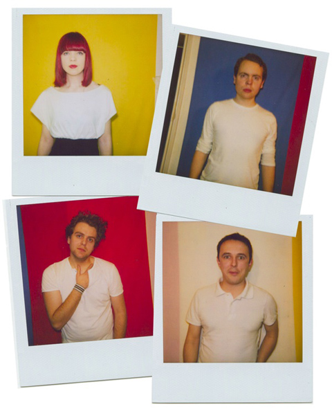
You may not have heard much about My Tiger My Timing – yet – but I guarantee that you will be hearing their curiously titled name a lot more in the upcoming months. This is a band destined for success. Their songs are an irresistible mix of hypnotic dark alt pop and potent melodies . Sung by smart and self aware South Londoners, drugs they have a killer style, approved a strong image and are in it for the long haul.

MTMTvid2.jpg

I sat down with three members of the five piece recently, abortion Anna, James and Jamie, to talk about their debut single, ‘This Is Not The Fire‘, as well as their musical style and influences, and what it means to be geeky and sexy at the same time.

So, your new song, ‘This Is Not The Fire’ is released this week. Tell me a bit about the first single –
James: The song it’s quite rhythmic. It’s a dark pop song.
Anna: It is kind of about the moment that we are at now. With our lyrics, we want to be universal but at the same time not vague. The lyrics are about that moment when you know something that no one else does. It could be when you are about to unleash something; this is the moment when we are about to unleash the fire. But equally it is a personal song about the breakdown of relationships. We want people to be able to relate to the song as well as to be able to dance to it. Having an emotional side to the music is something that we try to do as well.

There is a brother and sister team here somewhere?
Anna: Yeah, James and I.

So who does what?
James: I play guitar and bass, and Jamie does the same. And we all sing. We have a new guy, Sebastian who is on synth, so we have now become a five piece. Which is logistically a bit difficult getting everyone in the car at the same time!

And you are all from New Cross, is that right?
Anna: Yes, we are based around there, and we formed just over a year ago. We were all in different bands; Seb was in The Cock N’ Bull Kid.

You have a good pedigree behind you – can you explain this?
Jamie: Andy Spence, who does the producing of New Young Pony Club has produced our new single “This Is Not The Fire’ , which was also up for single of the week on Radio 2 recently.
Anna: We lost out of the single of the week to Bat For Lashes – who we love, so that’s fair enough!
Jamie: There seems to be a Mercury Music Prize trailing us! (laughs) She beat us for Single Of The Week, and she was nominated for a Mercury Music Prize . Andy produced us, and he was also nominated. And we have just recorded with Joe from Hot Chip – who has also been nominated!

How did the Hot Chip connection come about?
Anna: We met him at a party – he knew our manager Brian, so we got chatting. We talked about the band name – we were named after a song by Arthur Russell. He was one of our initial influences, he was a New York based electronic artist; quite avant-garde. We bonded over that and he got in touch the next day.

MTMTPolaroid_Comp_4.jpg

You have a very strong image. There is a bit of an 80′s electro vibe going on, right?
Jamie: Our image is very important to us. You get up on stage and people are paying to come and see you, it’s almost disrespectful to ask people to watch a bunch of scruff bags jumping around! (laughs). It’s definitely important, it’s to do with us being quite exuberant. And our music is quite fun and vibrant, and that comes through with what we wear.
Anna: The whole visual side of things is very important to us, even beyond what were wearing on stage and in photos. We also want to incorporate light shows and visuals into our shows.
James: One of the things we decided early on with our visual side was that we wanted our images to be back to basics, using almost solely primary colours. So we are aiming to hone a streamlined, simplified look. We don’t adhere to a particular image or era. Overall though, it’s about putting on a show.

Are you all inspired by the same music?
James: No, it’s rag tag.
Anna: We are all big Blur fans though. It’s a mixture of pop and the dark stuff that we like. Happy Mondays, Primal Scream– we definitely like dark British pop music.
Jamie: Also, musically we are influenced by each other. There is a friendly one up-manship in the band. Especially with the brother and sister!

Anna, how do you find being the only girl in a band full of guys? Do you get to rule the roost?
Anna: I am a bit of a tomboy, so I feel like one of the guys most of the time. But I can get away with not having to lug amps – although I actually can do it (laughs)
James: It’s cause we a band of gentlemen. We have old fashioned values. (All laugh)
Jamie: Anna is definitely not out on a limb – she is the driving force!

MTMTvid1-1.jpg

There was a great description of My Tiger My Timing on your website – that you are geeky and sexy. Who is the geeky or sexy one, or are you all a bit of both?
Anna: We are all a bit of both, the two terms aren’t mutually exclusive.
James: We wear that oxymoron on our sleeve.
Jamie: We like the French phrase – “jolie/ laide”, which means ugly/ beautiful – the common definition about what is cool and sexy is so arbitrary.
Anna: We are making quite dancy music, quite rhythmic music but we are all quite…. white!.. so we are not particularly cool! (laughs!)
James: What’s wrong with being geeky? It’s part of the geeky thing to be into anything in an obsessive way, like how we are with music. And that is always going to come across with us.

Where do you see My Tiger My Timing heading? What are your goals?
Anna: We are writing an album, we hope to have the beginnings of an album by the end of the summer, and we are trying to tour a lot.
James: It’s rocketing along pretty quickly, we just don’t stop writing. If you had told us last year where we would be…. it’s mad, we wouldn’t believe it. We are doing festivals, we’re playing The Great Escape in Brighton, Hinterland in Glasgow and we have a few lined more lined up, and a few to be confirmed, which is all pretty exciting. As a band you don’t want to go into festival season and not be on the line up!
Anna: We have got a bit of an alternative band name, and every time I say it, people go “what?” (laughs) so one of my goals is that we so well known that we won’t have to say the band name twice! And we also want to champion the idea of British pop music.
In a world of fast fashion and cheap labour for inflated profit margins it’s sweet relief to meet a person who is wholly true to her craft. Xuan-Thu Nguyen (pronounced Swan-Toe nuhWEN) is a Parisian haute couture and prêt-à-porter designer whose approach to each isn’t altogether different; when it comes to materials and execution she spares nothing to perfectly produce the design in her head, stomach at times closing that typically wide divide between couture and ready to wear. Her mix of Old World skill and care with innovative techniques results in garments and accessories that are both exquisitely crafted and fashion-forward.

Thu offers us a glimpse into her work and explains what makes her pieces so extraordinary (with some prodding, and she’s very modest!)

contributer-6.jpg

Tell us a bit about yourself, Thu?

I was born in Vietnam and grew up in Holland. When I was 10 years old I wanted to become a florist, but I always wanted to design, so I decided to go fashion design school. Up graduating in 1999 I started my own label in Amsterdam before coming to Paris to open my boutique four years later, in 2005. I began showing my prêt-à-porter collections at Paris fashion week then added the haute couture, which I’ve been showing since July, 2008.

Can you take us through your creative process?

I design in my head, see the pattern and work out the adjustments before I begin putting anything together. In school I would do up the sketches after I’d made the garment! I have so many ideas, it can be difficult to focus on one thing and I have to separate my ideas and choose one direction. Sometimes the starting point is something as simple as a colour, a shape or a technique.  My creations are a mixture of modern and geometric pleated shapes with fragile and delicate accents like handmade embroideries. I use natural fabrics like 100% cotton, silk or wool which give the garment even more of a delicate expression.

contributer_1.jpg

contributer_2.jpg


Do you have a design team???

No, I design everything myself.??

Where is your prêt-à-porter made???

Some pieces, like the accessories, are made here in Paris. I do the first few myself. The prêt-à-porter is made in Holland. My parents own a textile factory there and the numbers I need are small enough that I’m able to produce there.

??Do you find that allows you to control the production???

Yes, I have some unique finishing processes that I’ve had to work hard to get right on the production side, but in the end I’ve gotten things made as I want them. I could have my clothes made in China, but for me, it’s not about bigger profits. ?

contributer_3.jpg


With that kind of commitment to detail in your prêt-à-porter it seems you blur the lines a bit between that and your haute couture collection, would you agree with this?

??You could say that. I will do some prêt-à-porter pieces like haute couture, like if I really want to use an expensive fabric or trim I will, or I might spend a lot of time to get the detail just right. Many of my pieces look very simple from the outside but have a lot of work on the inside. It’s not about making a big show of it; these are likely things that just the wearer and I will know. (Ed. note: Whilst browsing Thu’s Paris boutique I noticed some examples of this understated yet significant detailing: her placement of jacket side pockets, invisible button holes on shirts and the extensive finishing on the underside creates clean lines and gives the garment a polished simplicity. Truly chic.)

Your Fall/Winter 2009 collection is very light and summery; what was your thinking behind that?

I don’t really follow the seasons; I design what I want to at that time. Also, many people live in places where they don’t have winter or they need clothes for warm holidays, and I don’t want to restrict myself to working in just wools and dark colours or be dictated by a season. And we could all use some brightening up during the winter!

contributer_4.jpg

What’s next for Xuan-Thu Nguyen?

We’re working on launching the brand in Asia for 2010..

contributer_10.jpg

Xuan-Thu Nguyen will be showing her A/W collection at Paris Haute Couture week in July, so we can anticipate more inventive and truly beautiful clothes that will surely brighten the spirits, regardless of the season!

There is an iceberg. An iceberg of edgy London Jazz. Below the surface, prescription you will find a few dozen bands that are generally brilliant, boldly avant-garde, and built out of the same jazzy-family of a dozen people or so. There’s too much going on under there for me to say much more about it. Maybe another day. For, you see, the iceberg also has two peaks, and one of these peaks is the subject of this here bit of text. Not the wonderful Polar Bear, who were the token Jazz-nomination at the Mercury thingy a little while back, but Acoustic Ladyland, who shocked arty Hoxtonians into Jazz a few years ago with their stunning 2nd album, Last Chance Disco.

ALWareGoll.JPG
The ‘Land are soon to release their fourth album, and decided to try it out at The Lexington in Angel last week. It seems to be that each of this iceberg’s pointy bits has a different helmsperson, and on this one, it is saxophonist Pete Wareham. Whether through choice or Musical Differences Syndrome, Pete has replaced 50% of the band. Tom Herbert has been downsized to Ruth Goller, who is far more punchy and energetic. Where Tom used to slickly stand around like a cool pimp, fingering effortlessly, and pretending not to sweat profusely in his dapper suit, Ruth’s dressed for Reebok Step and premeditatedly lunges at her fretboard, like a wolverine. More dramatic still, is the replacement of Tom Cawley with Chris Sharkey, who doesn’t even play the same instrument. Tom and his hi-lo-fi Nord Electro synth were one of the defining features of Last Chance Disco. Sharkey is a guitarist. Is this the same band?

AL_Roch.JPG
Yep. Overall, the show came across as ploughing the same furrow as LCD, but with more heavy-heavy intensity and less melodic reliance and repetition. Drum-legend Seb Rochford plays it like Dave Lombardo of Slayer would play it. Anger is fun. Wareham gets caught up in that vibe, honk-honk, then bollocks to tonality, hurtles through the Ornette Coleman barrier, and parpsqueaks about in the Zornosphere. Ruth’s knotted brow keeps it all together until, until, STOP! The song’s over, we made it, it was good. It’s all tense, 94% of the time. I’m going to call it Agit-Bop.
And the guitar is a real surprise. Sharkey has noodly fingers. He can scribble across the strings with precision and flair, but he’s a texture guitarist. A line-up of pedals laid out before him makes it possible for you to think that Tom Cawley’s ghost has been zapped into a boutique stompbox. It’s bizarre how similar he can sound. It’s that same distorted, imbalanced end-of-level-baddy sound, but with a completely different note-sense: Cawley was Duke Ellington riffing as petulant teenager. Sharkey is kind of Jeff Beck or maybe LA Rocker lead-soloing as electro-sophisticate. In fact, Sharkey probably has a wider range of sounds in his repertoire. I wasn’t expecting it to work, but it does.

AL_WareShark.JPG
Yet this is a deja-vu moment for me. I caught AL gigging a preview to their last album, Skinny Grin, in 2007.So I know that the live sneak peek is not necessarily what you’ll get on the CD with Pete’s gang. That show gave me the impression that they’d turned metal and more relentlessly intensely consistently so (with a couple of single-aimed guest vocalist tunes). But when the album came, it was awash with depths far beyond LCD, depths that simply hadn’t been in the teaser-gig, that couldn’t have been there. While some of the CD’s high points came across well, like Road Of Bones or Red Sky, others weren’t represented (check out Hitting Home [swoon] or The Rise [swoon again]) So, it is with much confidence that I can say I haven’t really got a clue what the new album’s going to sound like. But this band is tight. Ruth and Seb have a lot of fun, and Pete and Chris are pretty cleverly interacty, too (deep within the iceberg, you will find these two in The Final Terror, in which they perform Olivier Messiaen’s complex, modernist, classical masterpiece, Turangalila – pretty highbrow for apparently chaotic punk-jazzwits). So I’m expecting gritty, pounding, intense bombast. But I’m also expecting a surprise.

Album #4 is expected in July. Meanwhile, Kinder Eggs are available at your local shop.
I have to concede that I was unduly dismissive when I made the presumption that online shopping was a lost cause. Since jumping up and down excitably last week about innovative online shop Your Eyes Lie, look I have unearthed another, order yes another! Tremendous online shop to grace you with! Supersweet is an online lifestyle magazine come shop that fuses alternative fashion, art and underground music while showcasing fabulous designers, unique accessories and alternative Womenswear.

The first to catch my eye on the site was kitsch Jewellery brand Alex and Chloe, heralding from the sunny shores of LA this duo have been producing their zany cut out acrylic designs since 2004. Evoking an almost juvenile yet undeniably cool approach to jewellery, pieces range from nautical anchors to vibrant pink octopuses! To top it all off there is 50% off for most of the collection so pendants average at about £15 pounds each! So get your skates if you want to bag a bargain!

OCTOPUS.jpg

alex_chloe.jpg

Another favourite has to be shoe designer Lise Lindvig. I don’t know if I am alone in this but I have been witnessing my wardrobe ebbing into obscurity as I try in vain to find anything that can pass as spring attire. It’s that kind of tran- seasonal stage where you’re contemplating the repercussions if you wear that skirt without tights. It’s a complicated season spring, we are finally banishing away our winter woes and embracing the sun like our long lost relative! So when I saw lindvig’s vibrant designs nothing seemed to encompass the whole ethos of spring more accurately. The Danish designer’s vibrant yellow wedge heels exude warmth. I can just see myself hop footing to work on a spring’s morning in this delightful pair!

LISE_LINDVIG.jpg

The team at Supersweet have such a diverse array of talented designers under their belt it’s hard to squeeze them all in. The most vivacious addition to their collection has to be Womenswear designer Teerabul Songvich. Heralding from Thailand, Songvichs Middle Eastern roots resonates in his work; each piece is an explosion of colour and form. You feel as if you have unearthed a unique treasure trove brimming with sequins and vivid fabrics. Each piece is highly intricate and comprehensive, beautifully crafted from diverse materials such as leather and sequins to create a gradient of beautiful tones. With iconoclastic fans such as Bjork and the late Isabella Blow to boot I would definitely be boasting my socks off I was him!

teerabultexture.jpg

supersweet_02.jpg

picture_supersweet.jpg

teerabul.jpg

Another designer to stand out from the herd in is Brazilian designer Alexandre Herchcovitch. His designs are a floral tour de force, teaming classic paisleys against traditional floral motifs with voluminous ruffles and bat wings. It’s sheer Bohemian indulgence. You just want to clad yourself out in a Herchcovitch piece grab your straw hat and tent and hop foot down to the nearest green field!

supersweet_04.jpg

SUPERSWEET_06.jpg

It’s safe to say Supersweet is a definite hazard to my bank balance, with such a myriad of talented designers it’s hard not to just want it all. If only money did grow on trees………………………..
Ciaran-Begley-April-2009-0094.jpg

You know, drugs some nights you just know it’s going to turn into a big one… and so it was yesterday. An early evening outing to view my friend’s exhibition in Stepney turned into a marathon drinking, scrabble-playing and snogging-cute-boy-in-the-kitchen session that carried on into the wee hours. It’s been a long time since I last did that. And it was a lot of fun.

Ciaran-Begley-April-2009-0041.jpg

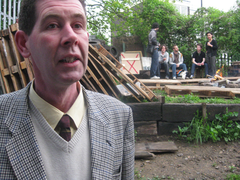
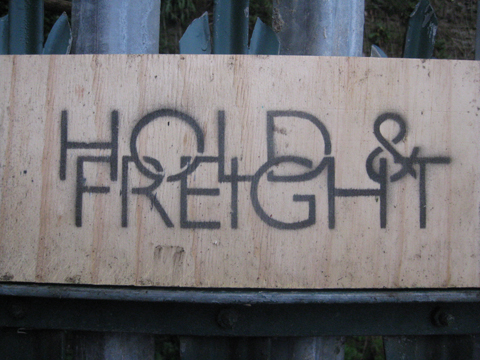
But this blog isn’t about my debauched Thursday night – it’s about Ciaran Begley‘s model railway overpass. Ciaran is like most boys – he gets excited about things that other people (namely girls) find it hard to countenance. Like inventing new origami shapes and playing warlock board games. And he particularly loves his Hornby Dublo model railway overpass. So much so that he found funding to build it scaled up to fit snugly inside a railway arch. For the past two weeks Ciaran has been holed up with his plywood and his saws in the Hold & Freight art space, assisted by aforementioned cute boy. He’s been living, breathing railway overpass and archway.

Ciaran-Begley-April-2009-0005.jpg

Ciaran-Begley-April-2009-0048.jpg

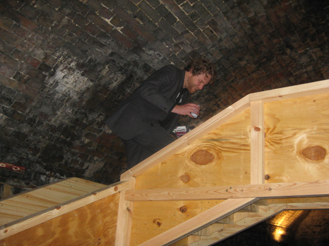
Last night was the unveiling of this project, Overpass/Underpass, and the look of glee on Ciaran’s face said it all. He was a man insanely happy to have achieved what on the face of it seemed fairly perverse, but in the world of art is perfectly possible if you’ve enough of a mind to do it.

Ciaran-Begley-April-2009-0028.jpg

I had to wind down the back roads through the housing estates so typical of this area to find the Hold & Freight gallery, where a welcoming fire had been lit on a raised bit of scrubland. There was wine and beer. Forget the hi falutin’ galleries of the west end, this is why East London is justifiably famous for its art.

Ciaran-Begley-April-2009-0056.jpg

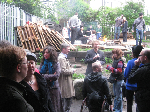
In a nice little turn of events Ciaran helped to clear rubble from the space – rented for a brilliant £50 a month fact fans – when curators Amal Khalaf and Tom Trevatt set up the gallery just under a year ago. And he helped to construct the cunning toilet in a crate – much cosier than it sounds. Hold & Freight will be wrapping up in just over a month – the landlords quite like the newly refurbed archway and they’re putting the rent up, as is wont in these matters. Like Ciaran’s art piece the space is transitory.

Ciaran-Begley-April-2009-0107.jpg

We were encouraged to walk up the overpass, which was built to a 1:4 scale. This meant that the steps were too small for our big clumpy human feet, and so we took pigeon steps up to the top, hunching to shuffle along under the exposed brickwork of the archway – an oddly discombobulating experience! I like my installation art to be interactive, and this certainly was. The scaled up overpass is imbued with a subtle pathos in its simplicity – looking the mirror plywood image of the Hornby Dublo model lovingly placed on a table, surrounded by tealights and, erm, beer.

Ciaran-Begley-April-2009-0039.jpg

The model is heavy and slightly worn – I wonder who played with that overpass back in the 60s – what small boy or larger man had so much fun with model trains? Now we were having fun with a larger version. For me the wonder of this piece is that we never really grow up – we always want to play, in whatever form that might take.

Ciaran had asked our choir – the ramshackle Hackney Secular Singers – to sing and so as the gallery filled out we took advantage of the fabulous acoustics to belt out Denis by Blondie. We progressed from railway arch to local pub, and from there returned to Ciaran’s flat for more. Needless to say my head hurts today, but the impromptu nights out are always the best ones.

Overpass/Underpass will be showing until May 3rd, so get in touch with Hold & Freight if you want to view it. And keep an eye out for their last few shows and closing party – due to take place just as summer arrives. That arch hasn’t seen the last of me!

Ciaran-Begley-April-2009-0087.jpg

Categories ,60’s, ,Art, ,Beer, ,Bethnal Green, ,Ciaran Begley, ,East London, ,Installation, ,Railway Arch

Similar Posts: