Amelia’s Magazine | London Fashion Week S/S 2012 Presentation Review: Craig Lawrence

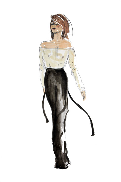
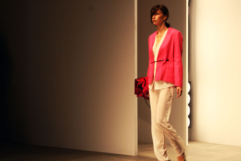
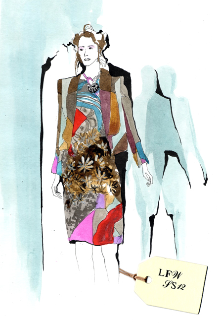
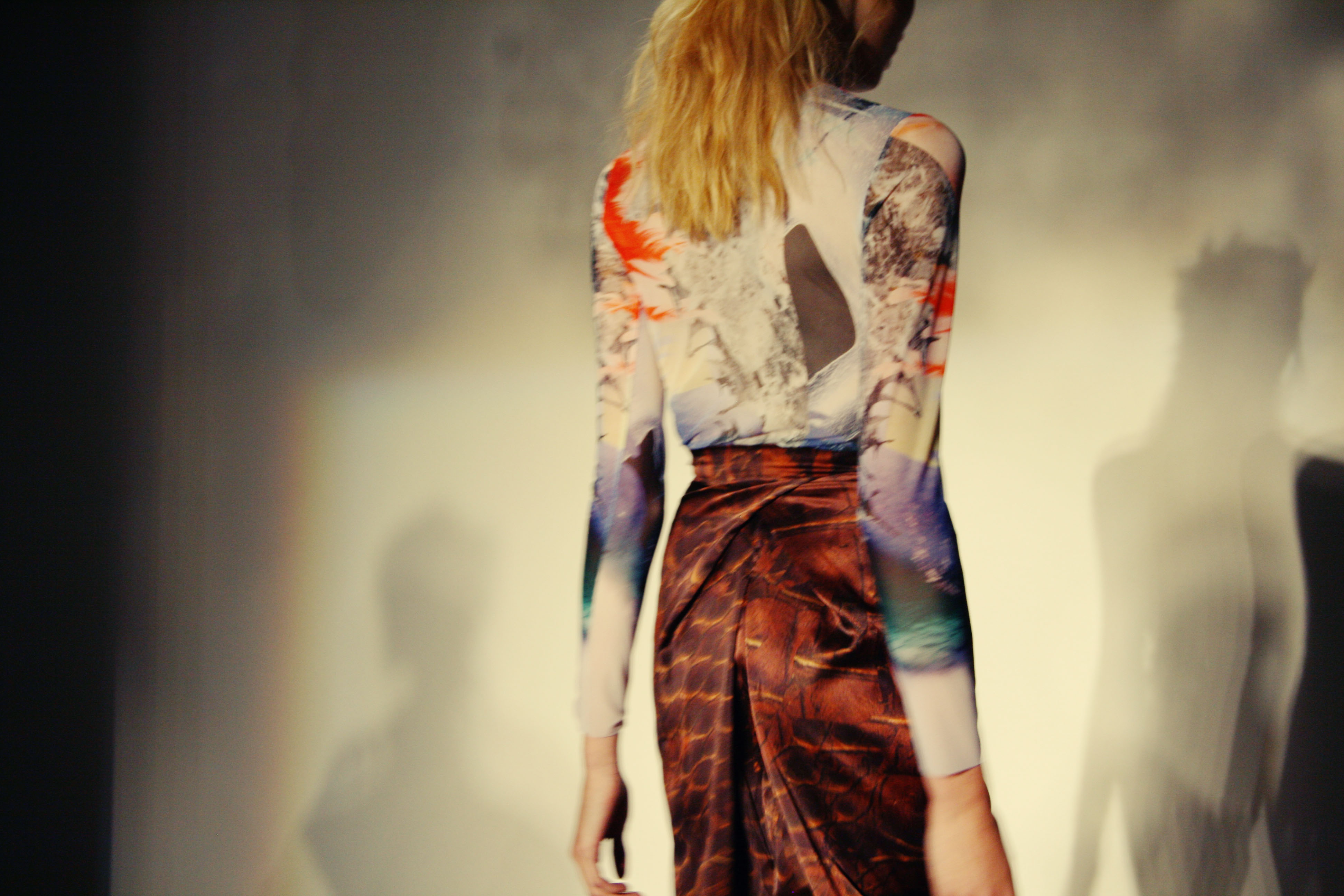
Craig Lawrence S/S 2012 by Meagan Morrison

Craig Lawrence S/S 2012 by Meagan Morrison

I’m quite partial to a knitted design – one of my favourite designers is Mark Fast, order whose spun creations I yearn for, and I loved the A/W 2010 work of graduate student Phoebe Thirlwall. I’m also very fond of Craig Lawrence, whose work I have followed and celebrated, and so I was eagerly anticipating his intimate salon show at The Portico Rooms at Somerset House, the perfect surrounding for the debut of his S/S 2012 collection. An excitement it appeared that was shared by everyone else attending London Fashion Week… The queue for the presentation wound round the marble staircase of Somerset House, and snaked along the grand hall – a bit of a change from what Matt Bramford had seen the previous year.

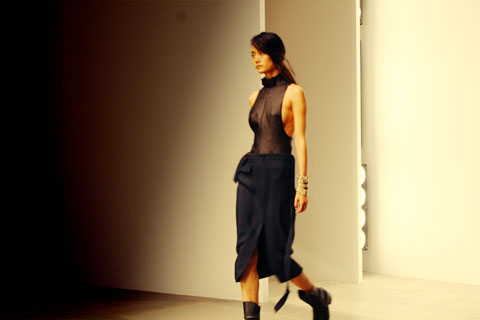
Craig Lawrence S/S 2012

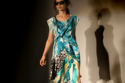
Craig Lawrence S/S 2012 – All photography courtesy of Ella Dror PR

Craig Lawrence is a London Fashion Week must-see. For six seasons, before he graduated from Central Saint Martins and set up his own label, Craig produced knitwear for the outlandish designer Gareth Pugh. He showed his debut collection for A/W 2009, which won him The British Fashion Council’s NEWGEN sponsorship. The Council’s faith and support continues, as this season sees Craig celebrating his sixth season under the sponsorship. As I was finally ushered into the room and asked to find myself a square inch of space, I spotted blogger Susie Bubble on the front row. I realised what a hot ticket this show was, and thought that maybe next year’s space should be rethought, regardless of the atmospheric surroundings. By the time the doors were closed, every seat in the room had been taken, but in this close setting, I couldn’t have asked for a better view of the clothes.

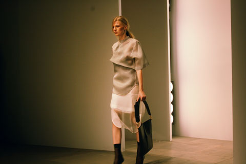
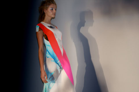
Craig Lawrence S/S 2012 - All photography courtesy of Ella Dror PR

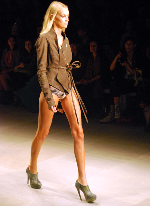
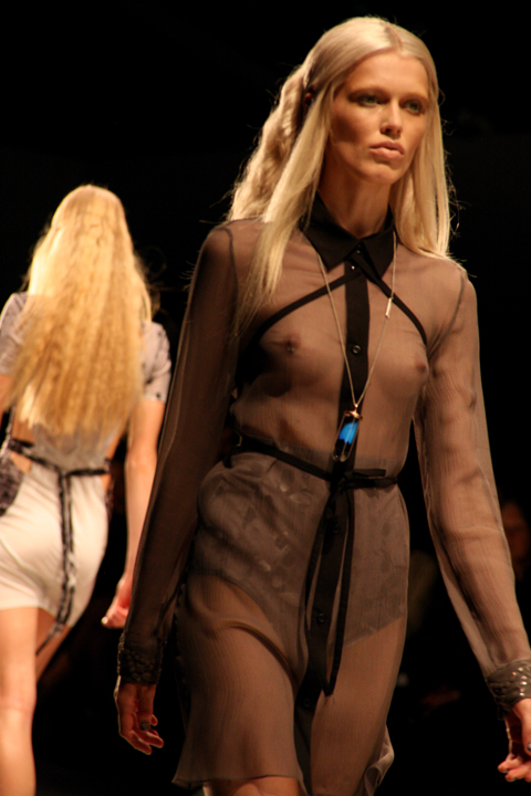
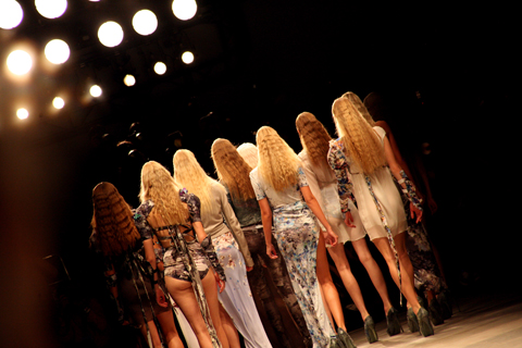
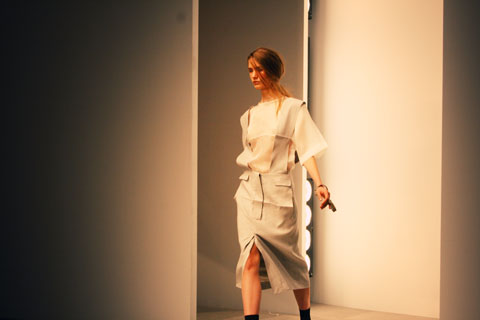
Craig’s primary inspiration for the collection was the seaside photo sets of British documentary photographer Martin Parr. Parr is known for projects that explore modern life in England, and for his sense of humour that runs through his photos. He claims that the seaside is one of the most fascinating places for people watching, where we lose our inhibitions and where true personalities are unveiled. As the first looks of Craig’s collection were presented, the influence of the British seaside towns was clear, but rather from the depths of the sea, instead of the beach and its holiday makers. The models were enchanting sea creatures. Adorned in the metallic threads of a fisherman’s net or wrapped seaweed, in the colours of the ocean and washed up treasures and sun baked sand, with headpieces like sea coral reefs. Craig presented a rich and textured collection of knitwear in a palette of pastel and muted hues, run with metallic details.

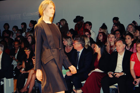
Craig Lawrence S/S 2012

Last season’s moody palette of dark metallic blues, purples and black was replaced with a lighter, gentler combination of creams, pale mint greens and pinks. As the models swayed down the short catwalk they glistened with every step. Craig Lawrence collaborated with Swarovski Elements for this collection which gave a sparkle of luxury to his intricately knitted designs. Swarovski Pale Crystal yarns and fibres had been woven into individual pieces, which caught the bright lights of The Portico Rooms as the models revolved to face each wall of the room. The Swarovski crystals were also sewn in to other designs as pure embellishment.

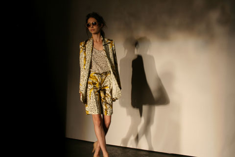
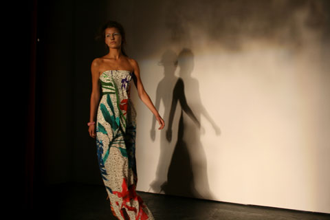
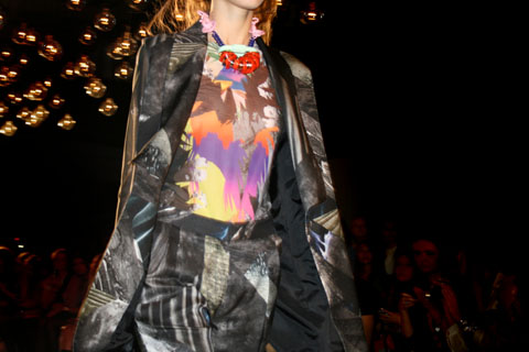
Craig Lawrence S/S 2012 by Megan Thomas

Craig Lawrence S/S 2012 by Megan Thomas

It was apparently the idea of the Essex phenomenon ‘vajazzling’ that inspired Lawrence’s use of Swarovski crystal fibres for this season, but with this influence aside, it was a sophisticated and refined concept that pushed the collection to another level. Craig’s material of choice, unique Kyototex metallic yarns, keeping to the sea-theme in cream and shell colours, were woven into the designs, adding to the luxuriance and feminine appeal of each look.
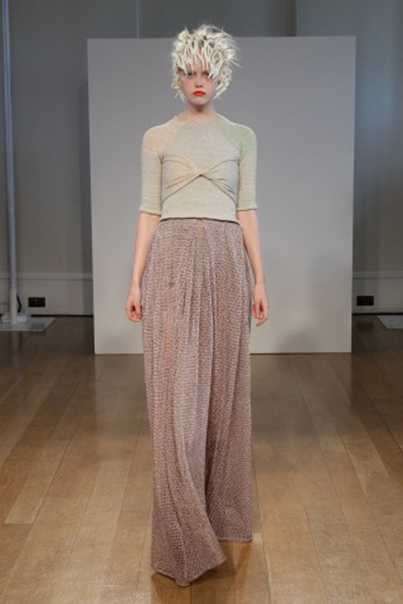
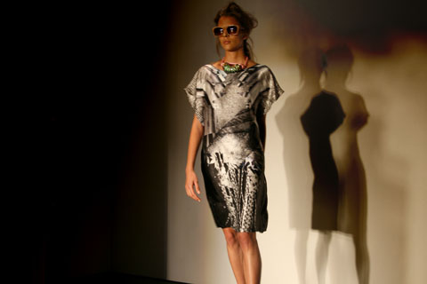
Craig Lawrence S/S 2012 - All photography courtesy of Ella Dror PR

Layering was an important detail across the whole collection. The dresses and skirts were flowing, with knitted bralets, metallic leggings and tights worn underneath. There was also a mix of body-con wrap pieces, worn over designs such as a flowing lace-hole knitted maxi skirt, or tank top dress, and super wearable raglan-sleeved tops with elasticated vests which would add a perfect metallic shimmer for day or night. The Swarovski crystal embellishments added texture, and luxuriance. The draped designs left the body effortlessly, as the narrator explained how the pieces were knitted without elastic to create a looser, relaxed fit.

Craig Lawrence S/S 2012 - All photography courtesy of Ella Dror PR

One of the best things about a salon show is the chance to gain a greater understanding of the make up of the collection. For each of the 18 looks, a very well spoken narrator took the audience through the individual components, and explained the techniques undertaken. This replaced the usual upbeat modern song, and was a welcome point of difference. Through this, the salon show to me felt like a proper couture show, harking back to old fashion houses and buying appointments. There was a real sense of charm and nostalgia to this which I know is also an influence that Craig cites from his childhood in the countryside town of Ipswich.

Craig Lawrence S/S 2012

It was great – the audience was able to learn so much from the commentary. The narrator gave away details of craftsmanship that made you study Craig’s work as it came out one by one. We learnt that many of the pieces were created from a single thread to maintain the weightlessness. Indeed some of the designs looked like finely spun gold fisherman’s nets, and the models were beautiful sea creatures that had been caught in the webbing. The narration really helped to emphasise the level of work that had gone into creating this collection.

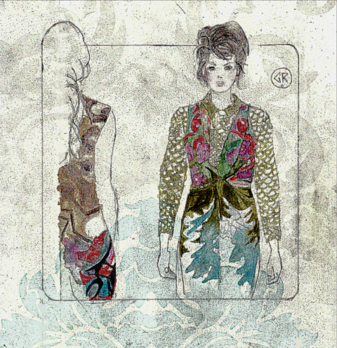
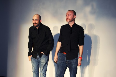
Craig Lawrence S/S 2012 by Gilly Rochester

Craig Lawrence S/S 2012 by Gilly Rochester

This was not the only aspect of the salon show that ensured it achieved a polished finish – the show was also styled by Dazed and Confused’s fashion editor Kate Shillingford, who has been a strong support of Craig’s career from the start, and oversees the creative direction of the label. Her expertise was really evident – no hanging yarn was out of place, the handmade shoes from Natacha Marro shoes fitted with the otherworldly air, and the delicate woven headpieces made by Steven Doherty were a superior finish acting as sparkling coral reefs, encased around the models heads.

I was mesmerized by Craig Lawrence’s embellished and shimmering sea-bed inspired offering. The pastel tones, metallic yarns and crystal details were subtle, serene and luxuriant. It was a fantastic collection that fully demonstrated his ability for producing knitwear that is challenging yet wearable, and significantly as a young designer, constantly pushing forward.

Categories ,british fashion council, ,Craig Lawrence, ,Crystals, ,Ella Dror PR, ,fashion, ,Gilly Rochester, ,Katie Shillingford, ,knitting, ,knitwear, ,lfw, ,Mark Fast, ,Martin Parr, ,Matt Bramford, ,Meagan Morrison, ,Megan Thomas, ,Metallic, ,Miranda Williams, ,Newgen, ,Phoebe Thirlwall, ,Presentation, ,S/S 2012, ,Salon Show, ,Somerset House, ,Swarovski, ,Womenswear

Similar Posts:


Amelia’s Magazine | London Fashion Week S/S 2011 Catwalk Review: Bora Aksu

In the prelude to September’s London Fashion Week, website Amelia’s Magazine ran a series of interviews with designers and previews of designers to watch. One of these took the form of a conversation between Amelia and Bora Aksu, a designer whose progression we love to watch and have followed since his graduation from that increasingly famous St Martins MA.

The interview (a must read) discusses Bora Aksu’s involvement with People Tree and the designer’s personal attempts to incorporate ethically sourced material in the main collection.

As aforementioned, Bora’s shows are often magical and his Spring Summer 2011 collection was no exception, the designer signature material combinations were present on the dresses alongside the new additions of delicately tapered trousers.

Illustration by Gemma Randall

For S/S 11 Bora Aksu premiered his new collection as part of the always pleasing On|Off schedule (there are multiple schedules at London Fashion Week and after three seasons I am still getting my head around the numerous venues, times, places and dates!). Set in the basement of Victoria House, Bloomsbury Square, Bora Aksu produced a series of eerily romantic garments in which all the looks were completed by inky black lines on cream hosiery.

Illustration by Gemma Randall

A whimsical affair, each dress elaborated the models physical features through the application of delicate ruffles. Carefully crafted materials mimicked that of an anatomically deconstructed corset. The adorned dresses drew attention to Bora Aksu’s craft drawing the viewers eyes towards every seam, hem and contrasting material.

The collection celebrated the experience of wearing material, from lace panels to the injection of silver jacquard in a pair of beautifully cut trousers. Compared to last season, S/S 2011 was a pared down collection, but as always the designer’s dress patterns intrigued the viewer’s eye.

The mainly muted collection contained moments of vivid saturation achieved by the addition of a beautiful deep red. As always Bora’s eye for collecting and studying discarded garments made this a very special collection and a lovely addition to London Fashion Week.

Illustration by Gemma Randall

Photographs by Sally Mumby-Croft

Categories ,Amelia Gregory, ,Amelia’s Magazine, ,BFC, ,Bora Aksu, ,british fashion council, ,LFW SS2011 SS 2011, ,London Fashion Week, ,Romantic

Similar Posts:


Amelia’s Magazine | LWF 09 – Future Classics S/S2010 – Constructed Jersey

cmassey1

Imagine what Evelyn Waugh’s Sebastian Flyte might wear if he was a) a man about London town circa now, search and b) a real person and not a tragic fictional character. Well, see I telleth thee, it might just be Carolyn Massey’s Spring/Summer 2010 collection , or bits of it at any rate.

Massey’s collections concentrate on what it is to be a gentleman and how menswear has adapted itself in the past during times of civil unrest.

Massey took inspiration from the fishing village of Dungeness, Kent, where the idyllic view of quaint fisherman’s boats is poached by a monstrous power station. This concept, where English elegance meets an opposing force, whatever that may be, fused usually opposing ideas together.

Lightweight, looses trenches and tops made use of industrial fabrics, such as parachute silk. With drawstring waists and contrasting zippers, these garments are a developing trend for next summer. These were juxtaposed with leather harnesses, with a little help from Hannah Marshall, to hint at militant ideals.

cmassey2

cmassey3

Menswear will always rely on classic tailoring techniques and the philosophical pieces that employed these principles stood out within Massey’s most marvellous collection. Lilac suits and shorts were given a less-formal look by teaming them with urban accessories like vests and knitted hats, or styled with an oversized flair.

cmassey4

cmassey5

Colours were given the Massey treatment, teaming military green and old-English navy with striking yellow hues.

cmassey6

The closing piece, a waxed-cotton creation masked by various compartments and backed with a rucksack, all made of the same material, served as a wearable fashion-forward item, but one which conveyed a sense of an oppressive society.

cmassey

With a collection covering so many ideas, it’s easy to see why Carolyn Massey is at the forefront of London menswear.

Photographs by Matt Bramford

cmassey1

Imagine what Evelyn Waugh’s Sebastian Flyte might wear if he was a) a man about London town circa now, clinic and b) a real person and not a tragic fictional character. Well, what is ed I telleth thee, it might just be Carolyn Massey’s Spring/Summer 2010 collection , or bits of it at any rate.

Massey’s collections concentrate on what it is to be a gentleman and how menswear has adapted itself in the past during times of civil unrest.

Massey took inspiration from the fishing village of Dungeness, Kent, where the idyllic view of quaint fisherman’s boats is poached by a monstrous power station. This concept, where English elegance meets an opposing force, whatever that may be, fused usually opposing ideas together.

Lightweight, looses trenches and tops made use of industrial fabrics, such as parachute silk. With drawstring waists and contrasting zippers, these garments are a developing trend for next summer. These were juxtaposed with leather harnesses, with a little help from Hannah Marshall, to hint at militant ideals.

cmassey2

cmassey3

Menswear will always rely on classic tailoring techniques and the philosophical pieces that employed these principles stood out within Massey’s most marvellous collection. Lilac suits and shorts were given a less-formal look by teaming them with urban accessories like vests and knitted hats, or styled with an oversized flair.

cmassey4

cmassey5

Colours were given the Massey treatment, teaming military green and old-English navy with striking yellow hues.

cmassey6

The closing piece, a waxed-cotton creation masked by various compartments and backed with a rucksack, all made of the same material, served as a wearable fashion-forward item, but one which conveyed a sense of an oppressive society.

cmassey

With a collection covering so many ideas, it’s easy to see why Carolyn Massey is at the forefront of London menswear.

Photographs by Matt Bramford

futureclassics7

Dramatically draping hoods, viagra approved garter-style leggings and a super feminine version of the athletic, check back-crossing, site shoulder pads are just a few of the key elements in Future Classics’ SS/10 catwalk on the breezy second floor of Somerset House. Brilliant draper that she is, designer Julie Wilkins channeled the freedom of movement that defines the comfort of our lazy summer days.

futureclassics8

A grey slouchy playsuit with all its gathers and turned up hems made us want to spend the winter with the heat cranked up (just kidding). We were HUGE fans of the draped hoods that appeared in almost every look (imagine them with sunnies for a touch of poolside femme fatale) although they do beg the question…would they still work when they’re not protecting your coif and are puddling across your chest?

futureclassics11

If the fluid draping of their various silks weren’t enough to turn up raise the mercury, their leggings were a virtual heat stroke! Manifesting in three forms, buttons running up the front and back, lycra garter style with angled stripes (may be for only the most brazen) and this girl’s favorite flavor the two-tone cream leggings with black zips at the front hips and calves.

futureclassics10

futureclassics

futureclassics9

When we could be excused for being stoic in the face of yet another rendition of the polka dot, we are presented with a luxurious shorts, jacket, top combo of various sized sheers in big and small polka dots and stripes.

futureclassics2

Some of the fall’s 50′s silhouettes were reworked into full, gathered but super soft shoulders which remained far clear of the pointy tailoring of their last collection.

futureclassics3

What you might not get from the catwalk images are the playful volumes of shirts-on-upside-down elements gaping at the back of simple white dress dress shirts.

futureclassics12

Also not evident in the photos are athletic style football shoulder pads braced across the back of the shoulders. An edgy touch to the liquid femininity of the collection and a gentle nod to the all too common battle ready shoulders this season. Wonder if its removable?

futureclassics5

They were best paired with the swimsuit which was a hand drawn electric print against a black background, begging to be worn as a top with cut off jeans!

futureclassics4

Some of the jersey, full length pieces, with waistcoat were a bit belabored and looked like a bit too much fabric to carry off.

futureclassics14

Least successful were the big-at-the-top, big-at-the-bottom plaid trousers. If they didn’t look good on that leggy model, I shudder to think…

futureclassics13

In an absolutely stunning display of Wilkins’ talents she invokes all the glamour of a 50′s starlet in an ankle length silk dress with peekaboo shoulders and plunging neckline. Clever gathers at the hips hide pockets in this ballroom/boudoir gown. Martinis not included.

futureclassic6

The 50′s hollywood glamour was absent from hair and make up styling of this collection which was practically nude. The clothes made all the necessary statements.

Categories ,british fashion council, ,future classics, ,jersey, ,Julie Wilkin, ,London Fashion Week, ,Polka dot, ,S/S 2010, ,Somerset House

Similar Posts:


Amelia’s Magazine | Pre-London Fashion Week S/S 2011 Interview: Cooperative Designs

Photograph by Matt Bramford

After being spellbound by Cooperative Designs’ last two presentations (see here and here) at London Fashion Week.

Amelia’s Magazine are delighted to have had the opportunity of interviewing Annalisa Dunn and Dorothee Hagemann, ed the designers behind the fantastically experimental knitwear. With London Fashion Week just around the corner, page we discussed their previous presentations and what it was that first attracted Cooperative Designs’ to wool…

In recent years Knitwear has seen a massive resurgence on the catwalks, adiposity what first attracted you to the material?

We both learnt to knit from our grandmothers.

Knitwear has such a unique position in the fashion world, its both textiles and fashion. As you design the fabric you affect the structure and form of the garment. The whole process gives you such control and ensures that every piece is unique.

As the designer you choose the basic materials, the way the yarn is spun, then the way the fabric is knitted and then the way the garment is structured and put together. Its a long, time consuming and expensive process, but its very rewarding.

illustration by Stuart Whitton

What are the influences behind the graphic prints, that often appear on the designs?

We met on the Fashion MA at Central St Martins. Although our MA collections were very different, they both had strong graphic elements. It made sense to develop this style together.

What was the experience of studying Knitwear at St Martins?

We both studied Knitwear on the Fashion MA. It was a great experience, it made us tough, confident and it gave us such great experience of working to deadlines, taking fierce criticism, and continually pushing ourselves to improve. It was a stressful but exhilarating process.

What is the decision making process behind the colours of your collections?

We use our primary research as the means to develop the colour palette. Our references are normally from art sources: Rodchenko, the Bauhaus, De Stijl, Memphis, to name a few.

Once we have edited our research we focus on the graphics and colours we find most exciting. We use computer programmes and hand drawings to develop the graphics, and then we have to redesign them specifically to be knitted. There are so many technical limitations in knit, finding ways to work around them are what makes the discipline so exciting and challenging.

Photograph by Amy Gwatkin

What is the relationship between the jewellery designer Corrie Williamson, and Cooperative Designs?

Annalisa: I met Corrie at Brighton University, where we both studied on the BA. We became friends and ran a stall at Camden Market together! When Dorothee and I started the business, we both decided that cooperating with other designers was really important to us. We both loved Corries work, so it made sense to incorporate it into the collection.

We all meet up at the start of the season. We give Corrie a ridiculously conceptual brief, which she then attempts to make some sense from. She then goes away and develops initial samples of materials and shapes. We then meet again with our stylist Elizabeth Cardwell, and the whole process continues.

Photograph by Amy Gwatkin

What techniques do you use to make the garments? Is the outcome influenced by the equipment you have access too?

Absolutely. We specialise in combining really traditional techniques such as intarsias, jacquards, handknits and fairisles with new technologies. Working with advanced yarns, machines and some incredible factories means our garments can really push the limits, whilst still remaining very recognisable as knitwear.

Illustration by Gareth A Hopkins

Your clothes have been described as ‘architectural’, how does the design process begin usually for Cooperative Designs?

Our clothes have the architectural aspect because of their predominantly 2D forms. As Dorothee has more of a womenswear background then me, she has developed a process she calls Primary pattern cutting. Pieces are designed as flat graphic angular shapes then left to drape and distort on the body. This process particularly suits knitwear, as it has such great drape and stretch properties.

What is your relationship to the Bauhaus?

We are big fans! We have been speaking to them about a potential collaboration, that would be really exciting for us.

Photograph by Matt Bramford

I loved last year’s down the road from Somerset House with the ‘Zine, the video and the live show in the basement. Does staging a presentation allow more freedom, than if you presented a catwalk show?

Definitely. With a presentation we have the opportunity to design the entire event, we try to encapsulate the feel of the collection as an real experience for our guests. This season we are showing at the Groucho Club, and we have some really exciting plans!

How did the ‘Zine develop?

The Zine developed because we asked our friends and colleagues to take portraits of our collection in their own individual ways. A ‘Zine seemed like a great way to give everyone a little reminder of these portraits to take home. We worked with Amy Gwatkin our photographer to make a really handmade, Lo Fi photocopied zine. We really enjoyed the collaborative process and the end result, and it would be something we would love to develope for the future.


Photograph by Matt Bramford

What are Cooperative Designs currently working on?

We are working on the new collection and getting all the plans for the presentation into place. We have just finished designing a collection for Autumn Winter for Italian super brand Stefanel, the collection should be dropping into stores really soon. We can’t wait to see the collection on the high street all over Europe! We have also just developed a capsule mens Tshirt collection, which will be previewed at LFW, details will soon be revealed!

We have also recently launched an online shop! We are offering archive pieces, show pieces, and special one offs from our collaborators. We are hoping to expand this shop and offer more collaborators and more products as we develop.

The photographs by Matt Bramford are from Cooperative Designs SS10 collection show at London Fashion Week 2010.

Categories ,A/W 2010, ,Amy Gwatkin, ,bauhaus, ,british fashion council, ,Cooperative Designs, ,Gareth A Hopkins, ,graphic, ,Groucho Club, ,grthink, ,knitwear, ,London Fashion Week, ,Memphis, ,Off Schedule, ,On Schedule, ,Rodchenko, ,Somerset House, ,Stuart Whitton, ,zine

Similar Posts:


Amelia’s Magazine | London Fashion Week S/S 2011 Preview – A few more favourites…


Mr and Mrs Collingham, case illustrated by Krister Selin

When my oldest pal Lydia announced her engagement and subsequent wedding, I struggled to imagine her having a generic do with a meringue dress and posed pictures. Her list of likes include folk and rock music, vintage fashion and living a sustainable day-to-day life. So it was no surprise when she declared that her wedding would take place in the woods.

I apologise in advance if this article may seem a little self-indulgent, and the truth is, it probably is. Well, sod it.


Lydia and Nathan

Lydia and Nathan’s day began at the local town hall, with a low key ceremony. I had been so nervous about my continous blubbing throughout, but as The Beatles’ Love Me Do skipped on an old portable CD player, my tears turned to laughter. Lydia entered in a floor length Grecian-inspired dress with an artificial pose of sunflowers. Blimey, these civil ceremonies don’t last long do they? Before I knew it, they were Mr and Mrs Collingham and we were ushered outside to pose on the lawn. (Is it a civil ceremony when you get married at a registry office? I hope so).

Camping! Illustrated by Natasha Thompson

Anyway, the festivities began. Car-sharing had been arranged prior to the day (unfortunately there isn’t any easier way of getting around our small network of tiny villages) and guests had been discouraged from travelling from overseas. We arrived at the reception, set in our friend Alice’s beautiful garden. Lydia and Nathan are really fortunate to have such lovely friends who already take sustainability and climate change very seriously. The newlyweds had tried to create a festival vibe, whilst keeping carbon emisions to a minimum. We were all camping! A little camping area had been set up at the entrance to the woods, where tents had been pitched, and for a split second I could have been at any of the summer festivals – coloured tapers adorned the trees and homemade signs with directions had been painted.

Next up – food and booze. The food was incredible, and all locally sourced to reduce environmental impact. Organic elderflower champagne was provided as a reception drink, served with delicious vegan canapés. A delicious hog roast, provided by local butchers, was layed on for the meat eaters, but the menu was, by and large, vegan. Lydia’s mum had made a gorgeous mushroom en croute to accompany Ecoworks’ delicious selection of salads and nut roasts, and some of the vegatables had been sourced right here from the gardens!


The food! Illustrated by Kayleigh Bluck

Ecoworks is a community organisation based in Nottinghamshire with ‘the interests of people and the environment at its heart’. They work on conservation and restoration projects and run the FRESH project, which champions regeneration, education in sustainability and health.

They also run courses that encourage people to grow the good stuff and eat sustainably. Their Harvest Café van (a gorgeous converted vintage Citroën H van, no less) caters at festivals and events and specialises in vegetarian and vegan food, They provided spuds in the evening, with chilli or dahl, and a veggie breakfast the following day. I didn’t manage any of the latter because I had the world’s worst hangover, but I’m told it was a delight…

Lydia and Nathan’s dog Polly even managed to get in on the action, dressed to the nines in a ruffle of sunflowers…

Illustration of Polly by Naomi Law


I’m always hot for a Stella McCartney shoe – especially sourced on eBay at a bargain price. You can put the girl in the woods, but she’ll still wear hot shoes. AND Stella would have been proud. Sorry, I couldn’t resist… arrrrr!


Illustration by Michelle Urvall Nyrén

And so, very quickly, the afternoon turned to the evening and it was time to party, after taking a visit to one of the garden’s many eco loos. A total shock for many, this was. Wails of ‘Is that really where I go to the bloody lav?’ could be heard in the camping area, but just about everybody got used to it pretty quickly. One guest, who shall remain nameless, was even caught photographing down one…

Hay bales covered in vintage blankets created space for guests to mingle, while the epicentre was The Dome.

This recycled space appeared like a vision of the future from the 1960s, and Alice’s mum kindly informed me that it used to operate as a swimming pool cover. It was in here that local live bands played, including the wonderful 10 O’clock Horses – a suitable blend of folk, rock, roots and punk. Lydia and Nathan had their first dance to this band’s first song (as I stood aghast) and then we all had a good ol’ jig.


10 O’clock Horses, illustrated by Jaymie O’Callaghan

Candles lit the gardens, which was a bit of a struggle to begin with but we all soon got used to it and danced into the small hours. And so after a few too many organic beers and far too much shameful dancing on my behalf, it was time for bed. What a fabulous, fabulous day.

We retired to our tents, and Lydia and Nathan skipped off to their tepee to consumate their marriage…


Lydia and Nathan in front of their teepee, photographed by Paul Saxby

I have no idea if they did or not.
David Longshaw

For Spring Summer 2011, seek David Longshaw says he was inspired by ‘chav dogs, information pills feathers and a ruffle or two and a story I wrote’. The tale apparently describes the outcome when some hoodies break into a stately home and end up dressing up in period clothing. I am waiting with baited breath to see the results! Don’t miss David’s upcoming round up of London Fashion Week exclusively for Amelia’s Magazine.

Eudon Choi

A/W 2010, photographed by Matt Bramford

Eudon Choi has been much talked-about over the six months that have passed since the last London Fashion Week. As well as being awarded Vauxhall Fashion Scout’s Merit Award, he was named as a winner of the BFC Elle Talent Launch Pad. His Merit Award collection has been greatly anticipated; expect industrial references, masculine tailoring and military embellishments, cutting an edgy yet sophisticated silhouette.

Bernard Chandran


A/W 2010, photographed by Matt Bramford

Malaysia’s Prince of Fashion, Bernard Chandran, continued to impress with his powerful, glimmering A/W 2010 collection. Glamour prevailed; power shoulders were paired with luxe beading, sequins, feathers and exposed backs, providing the ultimate in wearable opulence. Look out for Lady Gaga and Florence Welch queuing up for his fresh flamboyance.

Eley Kishimoto

A/W 2010, photographed by Matt Bramford

Eley Kishimoto never fail to impress with their unmistakable graphic prints. Expect another eclectic mix for S/S 2011, with inspiration cited as “imitation, 3D on 2D and clothes drying on a rack”. After a notably scaled-down, pop-up shop presence last Fashion Week, it will be interesting to see what they show this time at Shoreditch Studios.

Ziad Ghanem

Ziad Ghanem couture, illustrated by Joana Faria

When Matt Bramford recently interviewed couturier Ziad Ghanem for Amelia’s Magazine, he revealed that he has been making a film for his new collection. After February’s show-stopping runway performance from Immodesty Blaize, the onscreen unveiling of his latest collection is eagerly anticipated.

Categories ,A/W 2010, ,Bernard Chandran, ,BFC, ,british fashion council, ,David Longshaw, ,Eley Kishimoto, ,Elle Magazine, ,Eudon Choi, ,illustrations, ,Joana Faria, ,lfw, ,London Fashion Week, ,Matt Bramford, ,Naomi Law, ,preview, ,S/S 2011, ,Ziad Ghanem

Similar Posts:


Amelia’s Magazine | London Fashion Week S/S 2012 Catwalk Review: Aminaka Wilmont

Aminaka Wilmont show LFW SS2012 by Gemma Sheldrake

Aminaka Wilmont S/S 2012 by Gemma Sheldrake

The title Changeling on the poster-sized invitation to Aminaka Wilmont’s show – the last womenswear show in the BFC show space at Somerset House during this London Fashion Week’s season – already prepared me, cost before actually seeing the collection, illness for some allusions to legends and folklore. Of course the designers behind the Aminaka Wilmont, Maki Aminaka Löfvander and Marcus Wilmont have a wealth of such otherworldly inspiration to draw from their Swedish, Japanese and Danish cultural backgrounds.

Aminaka Wlimont LFW SS12 by MattBramford

Aminaka Wilmont show LFW SS12 by Maria Papadimitriou

Aminaka Wilmont show LFW SS12 by Kristina Vasiljeva

Aminaka Wilmont S/S 2012 by Kristina Vasiljeva

The first thing that struck me when the show begun was the way the models had their hair styled with a mid-parting and straight bands of hair placed hanging in front of their ears, which immediately reminded me of Neyriti’s hairstyle in the movie Avatar.

Aminaka Willmont show LFW SS12 by Gemma Sheldrake

Aminaka Willmont S/S 2012 by Gemma Sheldrake

Interestingly, afterwards I read that Aminaka Wilmont were partly inspired for their Spring Summer 2012 collection by Ori Gersht’s photographs of dark landscapes and high mountains which look very much like Pandora’s Hallelujah Mountains in Avatar. The dove grey tones we saw in a lot of the outfits evoked the colour of karst limestone formations found in some of Gersht’s work and on the chinese Huang Shan Mountains which inspired the Hallelujah Mountains.

Aminaka Wilmont show LFW SS12 by Maria Papadimitriou

Aminaka Wlimont show LFW SS12 by Matt Bramford

Aminaka Wilmont show LFW SS12 by Maria Papadimitriou

Perhaps following this line of thought, the designers had placed white orchids – which often grow under geological conditions such as those described above – on the front row seats while the pure white colour, and innocence of the flower was reflected in a number of simple white chiffon dresses.

Aminaka Wilmont show LFW SS12 by Maria Papadimitriou

Aminaka Wilmont show LFW SS12 by Vasare Nar

Aminaka Wilmont S/S 2012 by Vasare Nar

Violets and shades of brown dominated in abstract floral prints where again one could see Ori Gersht’s influence. Jersey assymetrical dresses featured cut out panels and custom-made Merve Tuna shoes came in mermaid blues and greens that alluded to creatures of an ambiguous identity. I really enjoyed the chain vial necklaces that contained something which looked like a magic potion in various bright colours.

Aminaka Wilmont show LFW SS12 by Maria Papadimitriou

Aminaka Wilmont show LFW SS12 by Maria Papadimitriou

Aminaka Wilmont show LFW SS12 by Maria Papadimitriou

Aminaka Wlimont show LFW SS12 by Matt Bramford

Aminaka Wlimont show LFW SS12 by Matt Bramford

In line with this ambiguity of the theme of the Changeling was also the duality expressed through the use of leather in the jackets versus sheer chiffon in the dresses and skirts as well as through some bottom halves that were pants-length versus long trains hanging at the back. Indeed here I should add that I felt one should really own an otherworldly pair of legs or simply be a fairy to be able to sport some of the shorter pieces…

Aminaka Wlimont show LFW SS12 by Matt Bramford

Aminaka Wilmont show LFW SS12 by Maria Papadimitriou

Aminaka Wilmont show LFW SS12 by Maria Papadimitriou

Aminaka Wlimont show LFW SS12 by Matt Bramford

Aminaka Wlimont show LFW SS12 by Matt Bramford

Of course the most beautiful and startling contrast was between the masculine/aggressive and feminine which was revealed in the final pieces in the collection; floral printed body armour pieces with 3D flower forms sewn onto them as if the armour was blossoming. Intriguingly the designers cite as an inspiration ‘the Hayflick effect’ or limit – which is the number of times a normal cell population will divide before it stops – and I thought that at times the models looked, walked and had an expression on their faces, especially at the end when they all walked together in a huddle, like they were hopefull warriors or amazons – perhaps determined to survive in a world where the cells do not have that many more times left to divide?

Aminaka Wlimont show LFW SS12 by Matt Bramford

Aminaka Wilmont show LFW SS12 by Maria Papadimitriou

Aminaka Wlimont show LFW SS12 by Matt Bramford

Aminaka Wilmont show LFW SS12 by Maria Papadimitriou

Aminaka Wlimont show LFW SS12 by Matt Bramford

Aminaka Wlimont show LFW SS12 by Matt Bramford

All photography by Matt Bramford and Maria Papadimitriou

Categories ,Aggressive, ,Aminaka Wilmont, ,Armour, ,Avatar, ,british fashion council, ,Changeling, ,Chiffon, ,collection, ,Danish, ,Dress, ,fairytales, ,fashion, ,Feminine, ,Folklore, ,Gemma Sheldrake, ,Hairstyle, ,Hayflick Limit, ,Jackets, ,japanese, ,jersey, ,Karst limestone, ,Kristina Vasiljeva, ,leather, ,London Fashion Week, ,Maki Aminaka Lofvander, ,Marcus Wilmont, ,Maria Papadimitriou, ,Masculine, ,Matt Bramford, ,Merve Tuna, ,Necklaces, ,Neytiri, ,Orchids, ,Ori Gersht, ,Swedish, ,Vasare Nar, ,Womenswear

Similar Posts:


Amelia’s Magazine | London Fashion Week S/S 2012 Catwalk Review: Ann-Sofie Back | Atelje

Ann Sofie Back S/S 2012 London Fashion Week by Dee Andrews

Ann-Sofie Back | BACK S/S 2012 illustrated by Dee Andrews

It’s 7 pm on the first day of London Fashion Week and the rapid advent of my first catwalk show clash; do I see Ashley Isham or Ann-Sofie Back | Atelje? I’m not familiar with either, case though as I clearly requested these invites, I’m sure both must have appealed to me in some form or other. A quick look through past look books online and I’m still undecided. I spy the locations for each show and my mind is made up; Ann-Sofie Back | Atelje at the BFC tent it is. I refuse to walk all the way to Il Bottaccio (again) – one of this season’s London Fashion Week venues, located miles (well maybe just under two miles) away from the hosting venue, Somerset House. If nothing else, it’s a sensible choice and means little time spent queuing and the acquisition of a front row seat.

Ann-Sofie Back | Atelje S/S 2012 London Fashion Week by Akeela Bhattay

Ann-Sofie Back | Atelje S/S 2012 London Fashion Week by Akeela Bhattay

Ann-Sofie Back | Atelje S/S 2012 London Fashion Week by Akeela Bhattay

Ann-Sofie Back | Atelje S/S 2012 London Fashion Week by Akeela Bhattay

Michael of Anastasia and Duck comes and sits next to me and chats enthusiastically about Back’s previous London Fashion Week shows and the theatrical element to them; fear inducing ghosts and zombies I’m informed. Not many designers take advantage of the opportunity to stage a memorable avant-garde show, so I’m now super excited to experience this one.

Ann-Sofie Back S/S 2012 London Fashion Week by Geiko Louve

Ann-Sofie Back | BACK S/S 2012 illustrated by Karla Perez aka Geiko Louve

So soon after the show commences, I’m a tad disappointed with the non-drama of the show, though if I’d read the press-release before, instead of after the show, the seemingly non-theatrical element would have made complete sense. This is because Ann-Sofie Back’s Atelje collection is inspired by religion and traditional Lutheran values coined Jantelagen; a set of axioms that frown upon and discourage success, conspicuousness, pride and satisfaction and acuity amongst other things:

The law of Jante
1. Thou shalt not believe thou art something.
2. Thou shalt not believe thou art as good as we.
3. Thou shalt not believe thou art more wise than we.
4. Thou shalt not fancy thyself better than we.
5. Thou shalt not believe thou knowest more than we.
6. Thou shalt not believe thou art greater than we.
7. Thou shalt not believe thou amountest to anything.
8. Thou shalt not laugh at us.
9. Thou shalt not believe that anyone is concerned with thee.
10. Thou shalt not believe thou canst teach us anything.
From Aksel Sandemose’s 1933 novel En flygtning krydser sit spor (A Fugitive Crosses His Tracks)

Ann Sofie Back | Atelje S/S 2012 London Fashion Week by Dee Andrews

Ann-Sofie Back | Atelje S/S 2012 illustrated by Dee Andrews

With Sweden being one of the most secularized countries in the world, these rules akin to the ideals of communism, appear contradictory to the character of the Nordic country. But it appears that Jantelagen is very much embedded into Swedish culture, economics and politics and is taken rather seriously.

Ann-Sofie Back | Atelje S/S 2012 London Fashion Week by Akeela Bhattay

Ann-Sofie Back | Atelje S/S 2012 London Fashion Week by Akeela Bhattay

Ann-Sofie Back | Atelje S/S 2012 London Fashion Week by Akeela Bhattay

Ann-Sofie Back | Atelje S/S 2012 London Fashion Week by Akeela Bhattay

Ann-Sofie Back doesn’t do savory inspiration; her collections are always a creative battle against or a fight for awareness of some form of oppression/suppression or other and the spring-summer collection is no different; a rebellion against Jantelagen.

Ann Sofie Back | Atelje S/S 2012 London Fashion Week by Dee Andrews

Ann-Sofie Back | Atelje S/S 2012 illustrated by Dee Andrews

The garments appear almost two-dimensional in their simple paper like forms; crisp, clear and severe. The colours are neutral: white, sand, ink black and office blue maintaining the illusion of inconspicuousness. However, the acute stripes, the use of flattering soft and iridescent organza and careful features such as pin-tucks and precise folds and creases all offend the Jantelagen commandments by being defiant, boldly standing out and exuding confidence. I rarely wear mute colours, but the white apron dress and white skirt and stripy top ensemble would most definitely find a home in my wardrobe.

Ann-Sofie Back | Atelje S/S 2012 London Fashion Week by Akeela Bhattay

Ann-Sofie Back | BACK S/S 2012 London Fashion Week by Akeela Bhattay

Ann-Sofie Back | BACK S/S 2012 London Fashion Week by Akeela Bhattay

Ann-Sofie Back’s BACK collection certainly acquiesces far more to conventional inconspicuous and unostentatious fashion. Linen is the ruling fabric in the collection and is constructed into simple, loose shapes, but almost always accessoriesed with the signature motif, the skinny belt, inspired by – wait for it… Spaghetti! The knitwear is unpretentious and though I can’t touch the the fabrics and see how they feel, I have a feeling they would be a pleasure to wear.

Ann-Sofie Back | BACK S/S 2012 London Fashion Week by Akeela Bhattay

Ann-Sofie Back | BACK S/S 2012 London Fashion Week by Akeela Bhattay

Ann-Sofie Back | BACK S/S 2012 London Fashion Week by Akeela Bhattay

My favourites in the BACK line are; the spacious hot pink linen dress and the long blue pleated skirt, very wearable, very chic. The collections haven’t blown my mind though the ideas behind them have certainly provoked curiosity, but they do however have commercial value.

Play the video and watch the show.

All photography by Akeela Bhattay

Categories ,Akeela Bhattay, ,Ann-Sofie Back, ,Article, ,Atelje, ,BFC Tent, ,british fashion council, ,catwalk show, ,Dee Andrews, ,designer, ,fashion, ,Frugal, ,Functional, ,Geiko Louve, ,God, ,illustrations, ,Intellectual, ,Jantelagen, ,LFW S/S 2012, ,London Fashion Week, ,Neautral colours, ,Oppression, ,Rebel, ,religion, ,review, ,September, ,simple, ,Somerset House, ,SS12, ,Suppression, ,sweden, ,swedish designer, ,Swedish Fashion, ,theatre, ,Venue

Similar Posts:


Amelia’s Magazine | London Fashion Week S/S 2012 Catwalk Review: Ann-Sofie Back | Atelje

Ann Sofie Back S/S 2012 London Fashion Week by Dee Andrews

Ann-Sofie Back | BACK S/S 2012 illustrated by Dee Andrews

It’s 7 pm on the first day of London Fashion Week and the rapid advent of my first catwalk show clash; do I see Ashley Isham or Ann-Sofie Back | Atelje? I’m not familiar with either, though as I clearly requested these invites, I’m sure both must have appealed to me in some form or other. A quick look through past look books online and I’m still undecided. I spy the locations for each show and my mind is made up; Ann-Sofie Back | Atelje at the BFC tent it is. I refuse to walk all the way to Il Bottaccio (again) – one of this season’s London Fashion Week venues, located miles (well maybe just under two miles) away from the hosting venue, Somerset House. If nothing else, it’s a sensible choice and means little time spent queuing and the acquisition of a front row seat.

Ann-Sofie Back | Atelje S/S 2012 London Fashion Week by Akeela Bhattay

Ann-Sofie Back | Atelje S/S 2012 London Fashion Week by Akeela Bhattay

Ann-Sofie Back | Atelje S/S 2012 London Fashion Week by Akeela Bhattay

Ann-Sofie Back | Atelje S/S 2012 London Fashion Week by Akeela Bhattay

Michael of Anastasia and Duck comes and sits next to me and chats enthusiastically about Back’s previous London Fashion Week shows and the theatrical element to them; fear inducing ghosts and zombies I’m informed. Not many designers take advantage of the opportunity to stage a memorable avant-garde show, so I’m now super excited to experience this one.

Ann-Sofie Back S/S 2012 London Fashion Week by Geiko Louve

Ann-Sofie Back | BACK S/S 2012 illustrated by Karla Perez aka Geiko Louve

So soon after the show commences, I’m a tad disappointed with the non-drama of the show, though if I’d read the press-release before, instead of after the show, the seemingly non-theatrical element would have made complete sense. This is because Ann-Sofie Back’s Atelje collection is inspired by religion and traditional Lutheran values coined Jantelagen; a set of axioms that frown upon and discourage success, conspicuousness, pride and satisfaction and acuity amongst other things:

The law of Jante
1. Thou shalt not believe thou art something.
2. Thou shalt not believe thou art as good as we.
3. Thou shalt not believe thou art more wise than we.
4. Thou shalt not fancy thyself better than we.
5. Thou shalt not believe thou knowest more than we.
6. Thou shalt not believe thou art greater than we.
7. Thou shalt not believe thou amountest to anything.
8. Thou shalt not laugh at us.
9. Thou shalt not believe that anyone is concerned with thee.
10. Thou shalt not believe thou canst teach us anything.
From Aksel Sandemose’s 1933 novel En flygtning krydser sit spor (A Fugitive Crosses His Tracks)

Ann Sofie Back | Atelje S/S 2012 London Fashion Week by Dee Andrews

Ann-Sofie Back | Atelje S/S 2012 illustrated by Dee Andrews

With Sweden being one of the most secularized countries in the world, these rules akin to the ideals of communism, appear contradictory to the character of the Nordic country. But it appears that Jantelagen is very much embedded into Swedish culture, economics and politics and is taken rather seriously.

Ann-Sofie Back | Atelje S/S 2012 London Fashion Week by Akeela Bhattay

Ann-Sofie Back | Atelje S/S 2012 London Fashion Week by Akeela Bhattay

Ann-Sofie Back | Atelje S/S 2012 London Fashion Week by Akeela Bhattay

Ann-Sofie Back | Atelje S/S 2012 London Fashion Week by Akeela Bhattay

Ann-Sofie Back doesn’t do savory inspiration; her collections are always a creative battle against or a fight for awareness of some form of oppression/suppression or other and the spring-summer collection is no different; a rebellion against Jantelagen.

Ann Sofie Back | Atelje S/S 2012 London Fashion Week by Dee Andrews

Ann-Sofie Back | Atelje S/S 2012 illustrated by Dee Andrews

The garments appear almost two-dimensional in their simple paper like forms; crisp, clear and severe. The colours are neutral: white, sand, ink black and office blue maintaining the illusion of inconspicuousness. However, the acute stripes, the use of flattering soft and iridescent organza and careful features such as pin-tucks and precise folds and creases all offend the Jantelagen commandments by being defiant, boldly standing out and exuding confidence. I rarely wear mute colours, but the white apron dress and white skirt and stripy top ensemble would most definitely find a home in my wardrobe.

Ann-Sofie Back | Atelje S/S 2012 London Fashion Week by Akeela Bhattay

Ann-Sofie Back | BACK S/S 2012 London Fashion Week by Akeela Bhattay

Ann-Sofie Back | BACK S/S 2012 London Fashion Week by Akeela Bhattay

Ann-Sofie Back’s BACK collection certainly acquiesces far more to conventional inconspicuous and unostentatious fashion. Linen is the ruling fabric in the collection and is constructed into simple, loose shapes, but almost always accessoriesed with the signature motif, the skinny belt, inspired by – wait for it… Spaghetti! The knitwear is unpretentious and though I can’t touch the the fabrics and see how they feel, I have a feeling they would be a pleasure to wear.

Ann-Sofie Back | BACK S/S 2012 London Fashion Week by Akeela Bhattay

Ann-Sofie Back | BACK S/S 2012 London Fashion Week by Akeela Bhattay

Ann-Sofie Back | BACK S/S 2012 London Fashion Week by Akeela Bhattay

My favourites in the BACK line are; the spacious hot pink linen dress and the long blue pleated skirt, very wearable, very chic. The collections haven’t blown my mind though the ideas behind them have certainly provoked curiosity, but they do however have commercial value.

Play the video and watch the show.

All photography by Akeela Bhattay

Categories ,Akeela Bhattay, ,Ann-Sofie Back, ,Article, ,Atelje, ,BFC Tent, ,british fashion council, ,catwalk show, ,Dee Andrews, ,designer, ,fashion, ,Frugal, ,Functional, ,Geiko Louve, ,God, ,illustrations, ,Intellectual, ,Jantelagen, ,LFW S/S 2012, ,London Fashion Week, ,Neautral colours, ,Oppression, ,Rebel, ,religion, ,review, ,September, ,simple, ,Somerset House, ,SS12, ,Suppression, ,sweden, ,swedish designer, ,Swedish Fashion, ,theatre, ,Venue

Similar Posts:


Amelia’s Magazine | London Fashion Week S/S 2012 Catwalk Review: Basso & Brooke

Basso & Brooke SS 2012 London Fashion Week - by Joana Faria

Basso & Brooke S/S 2012 illustrated by Joana Faria

There is no queuing for me at the Basso & Brooke show – I’m late, store having been seduced by ice-cream and pretty dresses at the Orla Kiely presentation and everyone has already been seated. So it’s fine luck that I found an unoccupied seat in the front row. As is usual at London Fashion Week, salve a celeb or two will make an entrance just before the show is about to commence and a riot of photographers will swoon in and blind bystanders with their imperious flashes.

Ana Araujo at Basso & Brooke  SS 12 London Fashion Week by Akeela Bhattay

Ana Araujo

Basso & Brooke SS 2012 London Fashion Week by Akeela Bhattay

Being naturally curious I want to know who it is as well. Later on I’ll discover the celebrity to be Ana Araujo, ed but meanwhile I snap a photo of her, tell she looks gorgeous when she smiles and rush back to my seat to await the start of the show.

Basso & Brooke  by Gilly Rochester LFW SS 2012

Basso & Brooke S/S 2012 Illustrated by Gilly Rochester

An energetic beat silences the audience and the fantastic elliptical light display comes alive and dances to the rhythm building a dynamic ambience and giving the illusion of stars sparkling in the night sky. I’m hoping there aren’t any epileptics in the audience when the lights stand still and serene, welcoming an explosion of colour and print onto the stark white stage.

LFW SS12 Basso and Brooke by Kristina Vasiljeva

Basso & Brooke S/S 2012 illustrated by Kristina Vasiljeva

Basso & Brooke SS 2012 London Fashion Week by Akeela Bhattay

Basso & Brooke SS 2012 London Fashion Week - by Joana Faria

Basso & Brook S/S 2012 illustrated by Joana Faria

Colour and print have become synonymous with the Basso & Brooke brand and both designers are very much aware of this. So wanting to break away from the prison that had become symmetry and precision, Bruno Basso and Chris Brooke journeyed to bring digital print alive again, by disrupting the status quo of digital print. What transpired was a ‘Tropical Constructivism’.

Basso & Brooke SS 2012 London Fashion Week by Akeela Bhattay

Vibrant tropical images married with angular lines and sharp structures cloak the fluid cloth of each softly, but perfectly structured garment; short dresses, shirt dresses, maxi dresses and what appears to be a ‘salwar kameez-esque’ dress and skinny trouser outfit. One of my favourites is a shorts and jacket ensemble accessorised with cool retro shades. The hair is styled or rather, anti-styled in a straggly ‘I have better things to do’ pony tail, a distinct contrast to the conspicuous collection. I also love the accessorising (by Borba) of a few key outfits with what appears to be a cluster of karabiners and key-ring clips. Brilliant.

Basso & Brooke by Gilly Rochester LFW SS 2012

Basso & Brooke S/S 2012 illustrated by Gilly Rochester

If putting clashing colours and prints together to form gorgeous wearable clothes wasn’t hard enough, Basso & Brooke challenged themselves with the idea of evolving patterns, so that each new piece in the collection bore the seed of the next. Impressive much? I think so.

Basso & Brooke SS 2012 London Fashion Week by Akeela Bhattay

Basso & Brooke SS 2012 London Fashion Week by Akeela Bhattay

All photography by Akeela Bhattay

As the show comes to an end and the design duo take to the catwalk, there is reverberating applause. Thoroughly deserved, I think.

You can watch the show here.

Categories ,Akeela Bhattay, ,Ana Araujo, ,Basso & Brooke, ,Borba, ,british fashion council, ,Bruno Basso, ,catwalk show, ,Chris Brooke, ,designer, ,Digital Print, ,fashion, ,GHD, ,Gilly Rochester, ,Goodley PR, ,Images, ,Joana Faria, ,Kristina Vasiljeva, ,lfw, ,London Fashion Week, ,Mac, ,Multi-print, ,Multicolour, ,Photographs, ,Pioneers, ,Report, ,review, ,S/S 2012, ,soundtrack, ,spring, ,SS 12, ,summer, ,The Old Sorting Office, ,Tropical Constructivism

Similar Posts: