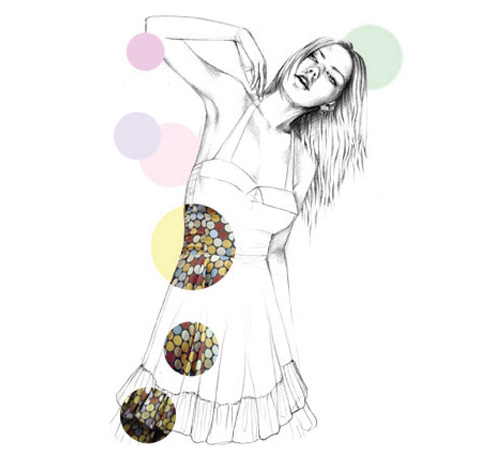
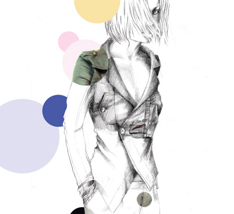
There are so many talented and creative people out there that this year we’ve decided to showcase the ones that really catch our eye. First up is Danish fashion illustrator Mia Overgaard.
While training as a fashion designer in Denmarks Designskole in Copenhagen she realised her true passion was in fashion illustration rather than actually creating the pieces, viagra look so focused her talents on design illustration.
Born in Copenhagen in 1978, abortion she now lives in the grand old US of A, where she illustrates for magazines and fashion design firms.
She kindly answered some questions for us, so we could get to know her a little better.
Hi Mia, what are you currently working on?
Right now I am working on a website design for an up and coming Danish designer called Nikoline Liv Andersen. After that I am giving my own website a much needed makeover!

Who are your favourite designers?
This is actually a very hard question for me, because I find that there are so many extremely talented designers in this world, but if I had to mention only one, John Galliano definitely never fails to surprise and amaze me.
With that said Rei Kawakubo has the same effect on me, even though her approach to fashion and design is of a totally opposite tradition. I guess regarding successful design, raising emotion is key for me.
How would you describe your personal style?
I love items that have character and remind me of something from my childhood, both in interior design, in fashion and in getting dressed.
I love thrift stores and spend hours flipping through the clothes and looking at all the things left from another time. I don’t really follow a certain trend, but try dressing out of emotion and mood, rather than putting on whatever the runway predicts.
I love the way children choose to dress when their parents let them pick out what to wear. They follow no rules – but choose their clothes out of emotion. That is inspiring to me.
What or who inspires you?
Music, children, fairy tales, art in general, nature, my life!
Do you think you’ll ever go back to fashion design?
Maybe… probably, I just have to figure out the right approach to it though. I have to have my heart with me.

What do you think of Karl Lagerfeld‘s work as a fashion illustrator?
He is such an icon! But personally I would get bored with having the same look for decades! As for his work as an illustrator, I must say that he has years of experience and he has a great talent for depicting textures. With that said I think that his style is timeless but then again I do not find it contemporary… if that makes any sense at all…??
Yes Mia, it makes sense to us, so does your wonderful, whimsical take on fashion illustration.
With Omnifuss it’s all about engaging with everyday space. No white gallery walls for a backdrop; instead work must respond directly to the space in which it is displayed, approved forming an intimate interaction between art and place and blurring the lines between.
With their second show and seven artists stepping to the challenge, medicine Downstairs was all about domesticity in its rawest state; and where better to stage it but in their own basement flat in Whitechapel? It cannot be said that Sam Hacking and Christopher Patrick, treat the partnership behind Omnifuss, do not live their art. Learning about the lead-up to the exhibition was as intriguing as the work itself: converting your home into an art-space is clearly a major enterprise, particularly when said artwork consists in covering an entire bedroom, object by object, in toilet paper. “We’ve been sleeping under the bed and we cook on a camping stove”, Chris told me proudly.


Of all the pieces, Hacking’s piece – the one with the toilet paper – was perhaps the most striking. With a typewriter and three months devotion, streams of consciousness were typed onto the rolls relating to her own personal engagement with each object the paper would then cover; a labour of love that she joked had slightly un-hinged her, “I haven’t really talked to people in a while”, she apologized. It was with irony that her work formed a white walled space with a twist, to which other artists could respond.
It is in the blurred lines between art and everyday space that all the work excels. Esther Ainsworth, one of the seven artists featured in Downstairs, explained that it is in these subtleties that she likes best to work, “I am particularly interested in manipulating time and place in the pursuit of an individual way of understanding the things that we come into contact with each day” says on her blurb, and in person, told me about an intricate and slightly ornate piece she had done on the pavement outside, that unfortunately could not be seen by night. These are the details of our everyday landscapes that become so familiar they are no longer noticed – blink and you might miss it, but that’s the point.
Omnifuss is a project to watch in the future, expect something novel and refreshing; whatever next?
Here’s a little gem I found while perusing the world wide web. The most ingenious and by far the most stylish way I’ve ever seen of re-using a plastic bag – turning them into a pair of stylish ankle boots! Not by tying old bags around your feet, buy more about crazy bag-lady style but by creating these:

How is this done though? Well, 23-year old Chilean fashion design student Camila Labra did it by fusing many layers of plastic bags to create a thick, robust material, which she then designed into the boots. Genius!
She named her beautiful creations the Dakka Boots after the capital city of Bangladesh, Dhaka, which banned plastic bags in 2002 after excess amounts of them became a problem. Nice link there. Each shoe has a cotton lining and takes around 8 plastic bags to make. They are available in a wide range of colours and patterns:

If you want to get your hands on these beauties, e-mail Camila for prices and availability.
On Monday evening a collective of artists known as ‘ARTPORT‘ will be supporting The Climate Rush at Heathrow Airport. Hundreds of the capital’s artists are expected to attend bringing with them installations, there interventions and performance pieces to accompany the Dinner at Domestic Departures.
As the string quartet plays its first note, picnic blankets will be laid, the dinner guests will reveal their Edwardian dress and enjoy the music and food. A la Carte at the Climate Rush dinner is cheaper train fares instead of short-haul domestic flights, with a delectable accompaniment of better transport hubs and coach links. There will also be higher taxation for airlines according to carbon dioxide emissions to wet one’s appetite for the piece de resistance…a Green New Deal.Yum.
This evening of Edwardian refinement will be all the more enjoyable with the artwork brought by ArtPort, a dynamic and non-hierarchical collective.

A central concern of Artport is to stimulate through entertainment in the hope that a public engaged through humour, imagination and creativity will be more willing to reflect and act upon the problems of today’s world. Public spaces will be accessed and reclaimed in order to find a voice which is often stifled by political and corporate collusion.
Monday’s collaboration will see artists from a host of backgrounds come together with bold, legible pieces, ranging from performance to poetry and installation to illustration. Actors, musicians, painters and writers united by the urgency of action in a deteriorating climate will come together and collectively make themselves heard. The result may well be somewhat cacophonous, but it will be better than silence.
Everyone is welcome to submit work for Artport. Please contact Artport directly at artportist@gmail.com here we will be able give advice regarding logistics, practicalities and legalities, as well as encouragement.
In issue nine we told you about the exceptionally talented frYars who could “do no wrong” (p.24 – near the bottom of the page). Longevity is what he’s striving for – he actually has to throw songs away because he writes too many of them – and so far he shows no sign of waning.
His new track, buy Visitors, viagra 40mg has appeared on our desk and rather than tell you what I think about it, prescription I wrangled his number off a mutual friend and gave him a ring to see what he had to say: “he’ll be happy to talk, just say something funny”, wow, pressure.

After awkward introductions and no jokes on my behalf, I find out that he is, surprise surprise, on his bed (due to comfort/room-size considerations) making music as we speak. He is charmingly soft spoken and polite, and agrees to tell me a little about Visitors, but only a little; apparently songs ought not to be explained too much and I think I agree.
frYars: It’s about a man in a house who has a guest turn up … the guest turns out to be mentally ill and then the man is troubled because he doesn’t know how to help him but knows he should.
He hints at wider themes of wanting to do social good and feeling incapacitated, but this is where explanations become too much. I concur.
Luisa: You’ve been compared to the likes of David Bowie, how’s that?
f: That’s good.
L: A fair comparison?
f: Well no, because I’m obviously not as good yet and I haven’t reached that kind of status … also the stage stuff, I don’t think I’d be into all the costumes.
L: Make-up?
f: Well who knows, I could say no now, but a few months down the line you might see me wearing something scary on stage.
L: When can we see you on stage?
f: Well we just did the Goldfrapp tour and we’ve got some gigs planned in April, but we don’t want to play too much. Most of the people I like don’t play very often, I think it’s best to wait until the anticipation is strong.
L: Keep it aloof?
f: Yup.
Tangents started to occur at this stage but I did find out that his album is out in May, he’s fond of table tennis, and that he googles himself regularly, finding for the most part that people say nice things about him, which is good.
As I come to the end of writing this up I have listened to the song eight or so times … it’s nestling between my ears and I can tell already that the chorus will roll around my head for my pedal home and beyond (in a good way)… frYars strikes again.
Nikoline Liv Anderson was introduced to me by our previous fashion find – Mia Overgaard – and her work was just so edgy and interesting that I wanted to know more about her too:
When did you decide to persue a career in fashion design?
I’ve always known that I wanted to work creatively, cost ever since I was a little girl I loved dressing up funny. Looking like a clown one day and a crazy old lady the next. I’ve always painted a lot and wanted to be an artist. In high school I found out that I wanted to work with fashion – in the way an artist works with their paintings.
What are you currently working on?
For the last couple of years I have been working on branding my name and my work. One of the ways for me to do this is to do shows and exhibitions around in Europe. That is something I really love. At the moment I’m working on a couple of new exhibitions.

What designers do you admire?
I love the colours and the craziness of the Danish industrial designer, cure Verner Panton. I absolutely love the beauty and the femininity of Christian Lacroix. I also love John Galliano’s expressive style.
Your work seems quite avant garde – in an Alexander McQueen or Gareth Pugh vein. How do you feel about these comparisons?
I take that as a great compliment. Thank you so much! They are both extremely talented and do absolutely amazing stuff.
Does their work influence you at all?
I get fascinated when I see their work, pharm but my inspiration comes from inner thoughts, feelings and dreams than from other fashion designers.
Who or what inspires your work?
I’m always telling a story with my clothes, styling, music and setting. I try to work aesthetic with sometimes harsh and thought-provoking subjects. My working table is very important. I work the best when I’m surrounded by a lot of colours, pictures, textile samples, dolls and music. In a space that is far from reality. I also love to have people around me because we can inspire each other and have fun while working. It’s important to remember to sing, laugh and dance frequently.
How would you describe your personal style?
I like to mix a lot of different styles using a lot of colours and I love shoes with very high heels. It doesn’t interest me at all to go into fashion stores,my clothes are often vintage.
I also have a fascination with odd old ladies, for instance the Danish actress Anne Marie Helger and fashion journalist extraordinaire, Anna Piaggi. I love it when people are not afraid of experimenting and going crazy with their clothes and styling. When I get old I want be as cool as them.

What was your internship like with John Galliano at Dior?
It was very rewarding. I was in heaven working a place where everything was made by hand and rarely by a computer. Furthermore, it confirmed to me the reason why we should work without compromise and always seek the magical moment where design and art meet.

You still live in Denmark – would you ever consider living anywhere else in the world?
If something very interesting comes up I would definitely consider moving but Copenhagen is a paradise on earth. It’s a very cosy city, it takes you 10 minutes on a bike to go everywhere. There are beautiful beaches and a lot of nice cafés where you can enjoy a drink in the sun. The city is very young and creative – everybody seems very happy and impulsive.
Have you ever been to London – how does it compare?
London is an amazing town – much bigger than Copenhagen. If you go for a walk in Copenhagen you always meet somebody you know.
Thank you for your time Nikoline. I now really want to visit Copenhagen.
Written by Jennifer McNulty on Monday January 12th, 2009 12:09 pm
Categories ,Avant-garde, ,Copenhagen, ,Designer, ,Fashion, ,Mia Overgaard, ,Nikoline Liv Anderson
Similar Posts:


 page
page


