Amelia’s Magazine | Vintage at Goodwood: Festival Review

Wolf and Badger launch display amy
WolfandBadger skull
All photography by Amelia Gregory.

I don’t often head into town for launches after work these days but I was intrigued enough by the sound of the Wolf and Badger pop up store in Selfridges to request a ticket from them and make the trek over on my bike. Even though it was raining and I now have a snuffle.

There’s probably a reason why I don’t get asked to parties at that temple to consumerism Selfridges – it’s hallowed halls are all gleaming and full of trinkets and I don’t know that the readers of my website have much money to spend in them. I certainly don’t. But it’s rather wonderful to visit once in a blue moon – especially the food hall, order where I couldn’t resist picking up some Marmite flavoured biscuits by Fudges (shaped like Marmite pots!) as a special treat. Now there’s a brand diffusion I really can’t get enough of…

WolfandBadger Selfridges window display by Kyle Bean
The current window display by Kyle Bean.

On arrival I could see what was rather a swanky affair through the windows as I peered past a rather wonderful fairytale castle made out of old books. Inside some furiously groomed folk filled the aisles as they fuelled up with champagne and jellybeans. A couple of ladies with bog roll wigs delivered creamed canapes from a side table and there was so much people watching potential that I found it hard to concentrate on the work being sold.

WolfandBadger amelia gregory
WolfandBadger launch photo by Amelia gregory
Not sure about this as a look…

Along the back wall a vision of Amy Winehouse in buttons was on display centre stage by the artist Sarah Gwyer. We particularly admired the clever use of old Costa service badges in the hairpiece on her beehive. Next door a digital parakeet by Troy Abbott boggled my mind somewhat. Erm… fun, but do we really have energy to waste with fripperies like this?

WolfandBadger launch photo by Amelia gregory

I preferred the plates and cups with curly bites taken out of them – created by the designer Evthokia. And over the top it might be but I adored the opulent ceramic ware from Jasmin Rowlandson: great curlicued gold and cream extravagances inspired by coral reefs and wood. Note to Wolf and Badger: it’s a shame the names of artists were hammered out in metal, making them incredibly hard to read and take note of.

WolfandBadger launch photo by Amelia gregory
Not your usual crockery from Evthokia.

WolfandBadger launch photo by Amelia gregory
Ceramic ware from Jasmin Rowlandson.

On the tables knuckle duster jewellery by Gisele Ganne was equally over the top. I can’t much imagine anyone wearing this stuff but it was fun to marvel at it in a glass case.

WolfandBadger gisele ganne
Knuckle duster madness by Gisele Ganne.

Maybe I’m suddenly getting a little more low key in my old age, but I was more drawn to the delicate gold filigree jewellery of Mallarino. I often gaze longingly at the Indian wedding earrings in the windows of the shops on Bethnal Green Road, and this seemed to be greatly inspired by such designs.

WolfandBadger launch photo by Amelia gregory
Botoxed high society lady.

WolfandBadger launch photo by Amelia gregory
And not quite so botoxed (or high society) lady.

As we left I picked up a satisfyingly heavy goodie bag from Selfridges – unfortunately it wasn’t anything exciting from Wolf and Badger. Just a bog standard notebook.

Even if you haven’t got the cash to flash, the Wolf and Badger pop up concept store is worth popping into for some cool West London designer inspiration if you’re in that part of town. It’s only on between the dates of 12-31 August 2010.

WolfandBadger launch photo by Amelia gregory
WolfandBadger skull
All photography by Amelia Gregory.

I don’t often head into town for launches after work these days but I was intrigued enough by the sound of the Wolf and Badger pop up store in Selfridges to request a ticket from them and make the trek over on my bike. Even though it was raining and I now have a snuffle.

There’s probably a reason why I don’t get asked to parties at that temple to consumerism Selfridges – it’s hallowed halls are all gleaming and full of trinkets and I don’t know that the readers of my website have much money to spend in them. I certainly don’t. But it’s rather wonderful to visit once in a blue moon – especially the food hall, store where I couldn’t resist picking up some Marmite flavoured biscuits by Fudges (shaped like Marmite pots!) as a special treat. Now there’s a brand diffusion I really can’t get enough of…

WolfandBadger Selfridges window display by Kyle Bean
The current window display by Kyle Bean.

On arrival I could see what was rather a swanky affair through the windows as I peered past a rather wonderful fairytale castle made out of old books. Inside some furiously groomed folk filled the aisles as they fuelled up with champagne and jellybeans. A couple of ladies with bog roll wigs delivered creamed canapes from a side table and there was so much people watching potential that I found it hard to concentrate on the work being sold.

WolfandBadger amelia gregory
WolfandBadger launch photo by Amelia gregory
Not sure about this as a look…

Along the back wall a vision of Amy Winehouse in buttons was on display centre stage by the artist Sarah Gwyer. We particularly admired the clever use of old Costa Coffee service badges in the hairpiece on her beehive.

Wolf and Badger launch display amy

Next door a digital parakeet by Troy Abbott boggled my mind somewhat. Erm… fun, but do we really have energy to waste with fripperies like this?

WolfandBadger launch photo by Amelia gregory

I preferred the plates and cups with curly bites taken out of them – created by the designer Evthokia. And over the top it might be but I adored the opulent ceramic ware from Jasmin Rowlandson: great curlicued gold and cream extravagances inspired by coral reefs and wood. Note to Wolf and Badger: it’s a shame the names of artists were hammered out in metal, making them incredibly hard to read and take note of.

WolfandBadger launch photo by Amelia gregory
Not your usual crockery from Evthokia.

WolfandBadger launch photo by Amelia gregory
Ceramic ware from Jasmin Rowlandson.

On the tables knuckle duster jewellery by Gisele Ganne was equally over the top. I can’t much imagine anyone wearing this stuff but it was fun to marvel at it in a glass case.

WolfandBadger gisele ganne
Knuckle duster madness by Gisele Ganne.

Maybe I’m suddenly getting a little more low key in my old age, but I was more drawn to the delicate gold filigree jewellery of Mallarino. I often gaze longingly at the Indian wedding earrings in the windows of the shops on Bethnal Green Road, and this seemed to be greatly inspired by such designs.

WolfandBadger launch photo by Amelia gregory
Botoxed high society lady.

WolfandBadger launch photo by Amelia gregory
And not quite so botoxed (or high society) lady.

As we left I picked up a satisfyingly heavy goodie bag from Selfridges – unfortunately it wasn’t anything exciting from Wolf and Badger. Just a bog standard notebook.

Even if you haven’t got the cash to flash, the Wolf and Badger pop up concept store is worth popping into for some cool West London designer inspiration if you’re in that part of town. It’s only on between the dates of 12-31 August 2010.

WolfandBadger launch photo by Amelia gregory
Dahling_by_Abigail_Nottingham
Dahling by Abigail Nottingham.

“We’re building great cafes and restaurants on the Vintage High St, site where you will even find a Waitrose.” So said the flyer that I picked up in a local pub the day after our sojourn to Vintage at Goodwood. To be honest, and if I’d seen this same flyer before I’d been inundated with hype from the great VAG press machine then I might not have been so keen to attend the festival.

Vintage Goodwood 2010
Photography by Amelia Gregory.

It’s ironic then, that, like the camping spots in “hidden glades, hollows, copses and hillocks” Waitrose didn’t make it into the final Vintage at Goodwood vision. But what did was every bit as soulless as I feared it might be in my preview blog.

Vintage Goodwood 2010

Past a regimental camping site that better represented a hillside carpark, we did indeed approach the main VAG entrance via a wooded glade… and as we did so passed what was to prove the most interesting aspect of the whole festival – a small eco-campment complete with beautiful decorated gypsy caravan, outsized lace-making and knitting, and a tiny outdoor stage for up and coming bands. Curated by textile artist Annie Sherburne, it was like a touch of Secret Garden Party had crept into the mix, but knowing not where to put it the madness was relegated to the woods.

Vintage Goodwood knit
Love shack caravan By Jessica Sharville
Love Shack Caravan by Jessica Sharville.

So far, so not very vintage, but as we ducked under the entrance arch a slew of gorgeous old cars funnelled us down towards the much trumpeted High Street, rearing up against the dramatic sky like a cross between a back lot of a Hollywood western and a trade show.

Vintage Goodwood entrance
Vintage Goodwood 2010

“Fifty years on from the design-led 1951 Festival of Britain, Goodwood is to host in 2010 the first of what will be an annual event” opens the glossy VAG flyer, and true to this spirit the very first shop on the High Street housed Wayne Hemingway Inc, choc full of products plastered with designs inspired by the very same Festival of Britain. As one worker commented to me “How arrogant can you be?” Vintage at Goodwood was a monument to our current obsession with consumerism as leisure, and bore no resemblance to the Festival of Britain’s celebration of modern societies’ achievements in post-war Britain. To compare something to such an iconographic event is to set oneself up for a fall.

Vintage Goodwood pub
Vintage Goodwood dress
TigzRice_pinupcar
Pinup Girl with Car by Tigz Rice.

Boggling, I gazed up at the garishly coloured towering fascias, wondering at the huge amount of money that must have gone into the construction. And none of it looking remotely recyclable. For that matter, where were the recycling bins? The post war years were frugal, and there was no sign of that here.

Vintage Goodwood 2010

Instead there was the opportunity to shop inside stands for those well known vintage brands: The Body Shop, Fortnum & Mason, John Lewis and some really expensive watch brand I’ve never heard of; in whose stall people quaffed champagne as a man picked apart on old watch face and another displayed a case of super expensive items to a wealthy shopper. The same brand had sponsored the festival wristbands, made out of lethal lentographic plastic that cut my friend’s arm to shreds.

Vintage Goodwood 2010

There was also: a cinema, and a catwalk hosting “sold out” shows. We never did find out if this was just a turn of phrase or whether they were actually sold out. Yup, you had to pay on top of the ticket price for many of the attractions. And did I mention the style stand, where you could get your hair done by Primark in collaboration with the Sunday Times Style Magazine. Yes really. This is what we’ve come to.

vintage at goodwood by erica sharp
Vintage at Goodwood by Erica Sharp.

I heard rumours of people flying in to attend this festival on private jets, but it was telling of the strange mix of people that there was also a Daily Mirror volkswagen bus on site. As someone wrote on twitter, it seemed like a sanitised Daily Mail version of fifty years of culture, devoid of all nuance or passion. Inside the Sotheby’s auction tent the intermittent rain drip dripped onto a vintage speaker valued at £6000 as a couple passed looking uncomfortable in a fancy dress version of the 1970s.

Vintage Goodwood 2010
vintagegoodwood by Maria del Carmen Smith
Vintage at Goodwood Auction by Maria del Carmen Smith.

The most popular dress amongst women seemed to be the ubiquitous flouncey polka dot fifties number, or some other poorly rendered version of what was worn in the 60s or 70s. Fine if that’s your bag, but I’ve seen fancy dress done with a whole lot more verve at places like Bestival. I guess pure vintage enthusiasts wear vintage clothes with a dedication to style that wasn’t obvious on many festival goers, because vintage enthusiasts choose to wear these clothes day in day out, not as mere fancy dress. It wasn’t altogether surprising to find the real vintage enthusiasts looking slightly bemused and out of place in the staff dinner queue.

Vintage Goodwood 2010
Vintage Goodwood crocs
Future Vintage: Crocs apparently…
Vintage Goodwood 2010
and the Big Brother chair. God help us.
Vintage Goodwood 2010
Tyrells crisps promotion: a vegetable chamber group.
Vintage Goodwood 2010
Rocking the vintage look.

We spoke to friends in the much smaller vintage stall area that was hidden in cramped tents behind the central shopping parade. They were ambivalent about the festival: cross with the way it had been organised and how they were being treated, but happy with the money being spent on their stalls. Aside from spend spend spend, there wasn’t really much to do. We saw little evidence of art from across the decades, other than a strong presence from Peter Blake. We were amazed at the lack of protection for all the beautiful vintage cars stationed next to themed areas for each decade, scattered across the largely unpopulated site. Although there were rumours of workshops, without a £12 programme (touted as a must have “annual”) to tell us when and where, there didn’t seem to be much opportunity.

Vintage Goodwood craft

Like others we gawped at the crafters rather than join in and participate. “Ladies, wear your heels,” urged the flyer. But there wasn’t that much evidence of glamour as the small and bedraggled crowd waved their brollies in the air during the mid afternoon set at the 80s rave warehouse.

Vintage Goodwood 2010
The programme: £12 a pop.
Vintage Goodwood rave
The rave. Wet. Photograph by Tim Adey.
Vintage Goodwood empty
Vintage Goodwood 2010

I had hoped to visit The Chap Olympiad but every time we got close the heavens opened and we retreated. We tried to see comedian John Shuttleworth but the inflatable Leisure Dome was full to capacity and I was buggered if we were going to stand in a queue in the rain. How much electricity does it take to keep a blow up tent full of air? *ponders* Over on the main stage a respectable crowd gathered for The Noisettes, but seemed bemused by singer Shingai Shoniwa’s stage banter. And I wonder, how do The Noisettes fit into any kind of “vintage” mould?

Vintage Goodwood Noisettes
noisettes-singer-by-anagomezhernandez
Shingai Shoniwa by Ana Gomez Hernandez.

Instead we headed back to the Leisure Dome after another tip off – this time to see the absolutely amazing Swingle Singers singing choreographed acapella and beat box versions of popular songs. An utterly astonishing discovery they alone made the trip down south worthwhile.

Vintage Goodwood Swingle Singers
Vintage Goodwood austin
Vintage Goodwood swingle
Vintage Goodwood Swingle singers
swingle singers by anna hancock young
Swingle Singers by Anna Hancock Young.

Afterwards we stayed onto watch 70 year old Tony Hatch, he of soap opera theme tune fame (don’t worry, I had no idea who he was either). A highlight of our short visit to VAG was surely the sight of Captain Sensible (of punk legends The Damned), listening to Tony Hatch and singers reprise the Neighbours theme tune. Does it get anymore surreal?

Vintage Goodwood Tony Hatch
Tony Hatch and friends.

Thanks to the power of twitter I was able to find out what VAG was like for myself, and in retrospect I am very glad that I didn’t get given free tickets by the organisers because I would have felt duty bound to be much nicer about the VAG experience if I had. I am sure that many people thoroughly enjoyed their trip to Vintage at Goodwood, but for me the idea of staying on for another day was utterly unappealing. Instead we left whilst the going was good, stayed over at a friend’s house and spent Sunday getting drunk with locals at a historic pub in nearby Petersfield.

Vintage Goodwood by Louise Sterling
Vintage Goodwood by Louise Sterling.

On my previous blog there have been a couple of comments stressing the need for big sponsors in order to make a return on investment on a festival such as VAG. This is absolutely not true unless you aspire to make a festival bigger than it wants to be. Most festivals start small and grow organically through the love and dedication of the people who take part. It’s not necessary to bring big brands in unless you’re aiming for a showy experience at the expense of any kind of soul.

Vintage Goodwood girls
Vintage Goodwood shop
Vintage Goodwood red
Vintage Goodwood 2010
Sponsored up to the hilt.

For real vintage lovers I suggest that next year, instead of going to Vintage at Goodwood you check out the numerous other boutique festivals dedicated to specific eras. Especially since I have a sneaking suspicion that many of the true vintage enthusiasts that made it to VAG will not be returning next year. And if you want pure unadulterated playful creative dressing up then I suggest you check out Secret Garden Party – and for real forward thinking cultural inspiration then try Latitude. A hyped-up vanity project does not a successful festival make.

Vintage Goodwood mobility

Categories ,Abigail Nottingham, ,Ana Gomez, ,Ana Gomez Hernandez, ,Anna Hancock-Young, ,Annie Sherburne, ,bestival, ,Captain Sensible, ,Erica Sharp, ,John Shuttleworth, ,latitude, ,Louise Sterling, ,Maria del Carmen Smith, ,Peter Blake, ,Primark, ,Secret Garden Party, ,Shingai Shoniwa, ,Swingle Singers, ,The Chap Olympiad, ,The Damned, ,the Noisettes, ,Tigz Rice, ,Tigzy, ,Tim Adey, ,Tony Hatch, ,Vintage at Goodwood, ,Vintage Goodwood. Jessica Sharville, ,Wayne Hemmingway

Similar Posts:


Amelia’s Magazine | London Fashion Week S/S 2011 Catwalk Review: Ones to Watch

LFW-Georgia Hardinge_by Krister Selin
Georgia Hardinge by Krister Selin.

I really enjoy the Ones to Watch because it inevitably features a plethora of new talent all wheeled out in one show on the same hastily repackaged models, page meaning that a compromise must inevitably be reached concerning casting, viagra 60mg hair and make up – for timing’s sake. And usually the standard is very high. This time round we were treated to four very different young designers, side effects or at least young to the world of fashion:

LFW_Lillee_Abigail Nottingham
Lilee by Abigail Nottingham.

London College of Fashion graduate Lilee showed an all cream collection (or was that the yellow glow of the lights?) of drapes and folds and pleats, though I found it hard to make out the exciting sculptural qualities promised by her previous collections as seen online. It was very demure and tasteful, but not that exciting for a colour hound like myself.

Fashion Scout Ones to Watch Lilee photo by Amelia Gregory
All photography by Amelia Gregory.

Next up was my pick of the bunch: Charlotte Taylor laid breast plate adornments and over-sized pendants over a confident collection of dresses and shorts presented in a chirpy fashion. I loved the fetching colour range of tomato, mustard, fresh mint green and wedgewood blues, presented with robot prints and striped cutaway detailing. Her blog states ” Don’t expect – black” Very good. We like. Apparently she used to work at Luella, and this easy going, playful and highly wearable collection was synonymous with the style that Luella was so well known for. I particularly loved the high wasted velvet shorts and crop top combo. Keep an eye on this designer.

Fashion Scout Ones to Watch Charlotte Taylor photo by Amelia Gregory
LFW_Charlotte Taylor by Abigail Nottingham
Charlotte Taylor by Abigail Nottingham.

Sadly A.Hallucination did not show psychedelic fare as I had rather hoped for: but rather some quite nice dandyish menswear. The duo of Hwan Sun Park and Chung Chung Lee are graduates of you know where…. (Central… need I say the rest?) and cut an amusing pair when they took their turn to bow on the catwalk. It was also a highly polished – fun yet wearable – collection, and I liked the shorts paired with low slung cut waistcoats and jackets featuring pretty details such as toggles and zippered pleats.

Fashion Scout Ones to Watch A.Hallucination photo by Amelia Gregory
LFW-A Hallucination by Krister Selin
A.Hallucination by Krister Selin.

Next up was the hot tip for the show – Georgia Hardinge. And I must say that the ruffle covered wedding-ish concoctions were initially as appealing as Bjork dressed in THAT swan dress: even the shoes and models’ poker straight hair did not escape a serious ruffling. But then came the real show stoppers – netted chiffon sculptural dresses that seemed almost to have come from the mind of a different person altogether. These emphasised the hips and waist in peculiar ways – destined, like the ruffles, only to look good on the most waifish of people.

Fashion Scout Ones to Watch Georgia Hardinge photo by Amelia Gregory
LFW-Georgia Hardinge by Krister Selin
Georgia Hardinge by Krister Selin.

Previous collections have been interesting, but I’m not sure I was sold on the concept of this one, which was allegedly an analysis of what a woman is… I did however like the final bright yellow number, which looked less meringue bridesmaid and more cheeky 80s cocktail dress. I’m definitely sticking with Charlotte Taylor as my fave though.

Fashion Scout Ones to Watch Georgia Hardinge photo by Amelia Gregory

Categories ,A.Hallucination, ,Abigail Nottingham, ,Charlotte Taylor, ,Chung Chung Lee, ,Georgia Hardinge, ,Hwan Sun Park, ,Krister Selin, ,lfw, ,Lilee, ,London Fashion Week, ,Ones To Watch

Similar Posts:


Amelia’s Magazine | London Fashion Week: 2010 FAD Junior Awards


Illustration by Abby Wright

It’s always a treat at Fashion Week to find that the show you are about to see, decease starting in the next few minutes, is at a totally different venue to the one you had in your head and are currently standing at. I found myself in this marvellous situation as Tim Soar’s show approached. God knows why I thought it was at Somerset House and not at the Freemason’s Hall. Menswear day brought these kind of surprises all day – with many designers scaling down their presence. I had seen Tim’s show a year ago in the BFC tent, so how dare they move its location?!

I need not have worried as I legged it up Drury Lane, for, true to form, the show was running late and hadn’t even been seated when I showed up. I was right at the back of the queue, though – AGAIN – so decided to perch by the photographer’s pit in the hope of getting a better shot than I would have positioned on one of the back rows.

This show saw Soar draw inspiration from the 1970s, and in particular David Bowie’s character ‘Mr Newton’ in Nicholas Roeg’s epic ‘The Man Who Fell From Earth.’ This inspiration was, in true Tim Soar style, handled with delicacy and acted only as a descrete reference here and there. Trousers flared off, but not in a grotesque fancy dress sense, and lapels were elongated, but not in a Stayin’ Alive, Stayin’ Alive, Hah Hah Hah Hah sense. The bulk of the collection relied on Soar’s showmanship as a really great tailor with a unique vision.


Illustration by Abby Wright

Making the best use of luxe fabrics like mohair, satin, wool crepe and linen, models wore strict suits with a piecemeal utilitarian aesthetic. The use of Tyvek, the waxy crushed industrial material usually reserved for workers boiler suits, also adds to this technical flavour.

Blazers were banded with cummerbund-like straps in contrasting colours – where jackets were dark, the bands were of gold silk, and where jackets were sand, the bands were black. Denim made an appearance, also creating horizontal lines across structured tailoring.

Alongside this semi-formal attire, there were the usual design quirks that Tim Soar is quickly faming himself for. His appreciation of the aesthetic properties of materials and quality of texture was also on display, with crushed materials and bursts of vibrant colour (he is, after all, also a graphic designer).

It’s hard to imagine how a Tyvek jailer-style striped suit will work alongside an exemplary tailored blazer, but somehow Tim Soar’s collections always convey a stylish coherence.

This season also brought more womenswear, which is basically menswear with allowances for hips, busts and bums. It’s a testament to Tim Soar’s generally cool attitude, though, that his aesthetic works wonders on both women and men.


Illustration by Abby Wright

It’s always a treat at Fashion Week to find that the show you are about to see, doctor starting in the next few minutes, is at a totally different venue to the one you had in your head and are currently standing at. I found myself in this marvellous situation as Tim Soar’s show approached. God knows why I thought it was at Somerset House and not at the Freemason’s Hall. Menswear day brought these kind of surprises all day – with many designers scaling down their presence. I had seen Tim’s show a year ago in the BFC tent, so how dare they move its location?!

I need not have worried as I legged it up Drury Lane, for, true to form, the show was running late and hadn’t even been seated when I showed up. I was right at the back of the queue, though – AGAIN – so decided to perch by the photographer’s pit in the hope of getting a better shot than I would have positioned on one of the back rows.

This show saw Soar draw inspiration from the 1970s, and in particular David Bowie’s character ‘Mr Newton’ in Nicholas Roeg’s epic ‘The Man Who Fell From Earth.’ This inspiration was, in true Tim Soar style, handled with delicacy and acted only as a descrete reference here and there. Trousers flared off, but not in a grotesque fancy dress sense, and lapels were elongated, but not in a Stayin’ Alive, Stayin’ Alive, Hah Hah Hah Hah sense. The bulk of the collection relied on Soar’s showmanship as a really great tailor with a unique vision.


Illustration by Abby Wright

Making the best use of luxe fabrics like mohair, satin, wool crepe and linen, models wore strict suits with a piecemeal utilitarian aesthetic. The use of Tyvek, the waxy crushed industrial material usually reserved for workers boiler suits, also adds to this technical flavour.

Blazers were banded with cummerbund-like straps in contrasting colours – where jackets were dark, the bands were of gold silk, and where jackets were sand, the bands were black. Denim made an appearance, also creating horizontal lines across structured tailoring.

Alongside this semi-formal attire, there were the usual design quirks that Tim Soar is quickly faming himself for. His appreciation of the aesthetic properties of materials and quality of texture was also on display, with crushed materials and bursts of vibrant colour (he is, after all, also a graphic designer).

It’s hard to imagine how a Tyvek jailer-style striped suit will work alongside an exemplary tailored blazer, but somehow Tim Soar’s collections always convey a stylish coherence.

This season also brought more womenswear, which is basically menswear with allowances for hips, busts and bums. It’s a testament to Tim Soar’s generally cool attitude, though, that his aesthetic works wonders on both women and men.


Illustration by Yuann Shen

Born in India, sale Stefan Orschel-Read grew up in Scotland, he won gold medals as a dressage rider for Great Britain and also studied law before deciding on a career in fashion. His Central Saint Martins graduate collection in 2008 was based on Virginia Wolfe’s novel ‘Orlando’; a historical biography in which the subject’s lives over 400 years and changes gender mid way. Subsequent collections were inspired by cathedral murals and the works of Shakespeare, so it was interesting to see the RCA graduate’s stimulus for S/S 2011 being something a slightly more conventional.

Entitled ‘The Spy Who Becomes Me’, SS11 is inspired by an imagined playboy youth in the Riviera of the Ligurian Sea and his struggle to evolve into ‘a self-sufficient gentleman of responsibilities’.

Although more subdued than his previous seasons, this sophisticated collection successfully utlilised an array of luxurious fabrics which were expertly tailored and incorporated some distinctive detailing. The tag line of the collection is ’We all have a little bit of espionage in us’, but I doubt Orschel Read would be the best outfitter for a Bond-style spy-on-a-mission who hopes to be easily lost in a crowd.

Looks were presented in a refined palette of greys, soft khakis and airforce blues, punctuated with jewel tones and blazes of iridescence.


Illustration by Yuann Shen

Modern slim-fitting suits with traces of utilitarian military styling, such as extended epaulettes, were created in sumptuous British cashmere tailoring wools and iridescent tonic suiting.  The blazers at the more muted end of the palette were complemented with dupion silk shirts, glowing in emerald and olive tones.

Digitally printed monograms, paisley and bird motifs were applied to boxers and shirt panels, some silk brocade being produced in collaboration with Italian luxury tailor Brioni, apparently the go-to-coutouriers of a whole host of names from Nelson Mandela to Robert Kennedy and Luciano Pavarotti to Donald Trump.

Alongside his blazers and formal trousers, Orschel-Read showed biker jackets in cashmere suiting, jeans named after MI5 and MI6 and gauzy hand dyed and beaded bias cut vests seen under many of the blazers.  Oversized trench coats in pale denim continued the spy theme, and monogrammed underwear was shown with raglan sleeve sweaters with rib detailing.


Illustration by Yuann Shen

Born in India, decease Stefan Orschel-Read grew up in Scotland, he won gold medals as a dressage rider for Great Britain and also studied law before deciding on a career in fashion. His Central Saint Martins graduate collection in 2008 was based on Virginia Wolfe’s novel ‘Orlando’; a historical biography in which the subject’s lives over 400 years and changes gender mid way. Subsequent collections were inspired by cathedral murals and the works of Shakespeare, so it was interesting to see the RCA graduate’s stimulus for S/S 2011 being something a slightly more conventional.

Entitled ‘The Spy Who Becomes Me’, SS11 is inspired by an imagined playboy youth in the Riviera of the Ligurian Sea and his struggle to evolve into ‘a self-sufficient gentleman of responsibilities’.

Although more subdued than his previous seasons, this sophisticated collection successfully utlilised an array of luxurious fabrics which were expertly tailored and incorporated some distinctive detailing. The tag line of the collection is ’We all have a little bit of espionage in us’, but I doubt Orschel Read would be the best outfitter for a Bond-style spy-on-a-mission who hopes to be easily lost in a crowd.

Looks were presented in a refined palette of greys, soft khakis and airforce blues, punctuated with jewel tones and blazes of iridescence.


Illustration by Yuann Shen

Modern slim-fitting suits with traces of utilitarian military styling, such as extended epaulettes, were created in sumptuous British cashmere tailoring wools and iridescent tonic suiting.  The blazers at the more muted end of the palette were complemented with dupion silk shirts, glowing in emerald and olive tones.

Digitally printed monograms, paisley and bird motifs were applied to boxers and shirt panels, some silk brocade being produced in collaboration with Italian luxury tailor Brioni, apparently the go-to-coutouriers of a whole host of names from Nelson Mandela to Robert Kennedy and Luciano Pavarotti to Donald Trump.

Alongside his blazers and formal trousers, Orschel-Read showed biker jackets in cashmere suiting, jeans named after MI5 and MI6 and gauzy hand dyed and beaded bias cut vests seen under many of the blazers.  Oversized trench coats in pale denim continued the spy theme, and monogrammed underwear was shown with raglan sleeve sweaters with rib detailing.

FADAwards-the tightrope walker-Florence Melrose by-Barbara-Ana-G
The Tightrope Walker – an illustration of a dress designed by Florence Melrose, find illustrated by Barbara Ana Gomez.

I’m a bit rubbish when it actually comes to checking what’s what during fashion week – I will generally go to most things that I’m invited to on the grounds that if someone has bothered to invite me then I should generally return the honour by actually turning up. Not so most magazine editors I might add – many was the time that I would swan into a fashion show under the guise of Katie Grand at The Face. She never went, approved and yours truly got the golden tickets.

FAD awards SS2011 - abi daker
Dress by Rebecca Glyn-Blanco of Camden School for Girls. Illustration by Abigail Daker.

FADAwards Keep it secret-by-Barbara-Ana-Gomez
Keep it Secret – illustration of a dress by Sinead Cloonan from City & Islington College by Barbara Ana Gomez.

And as I’ve already mentioned I don’t do queues – not in Tescos, prescription and certainly not during fashion week. To this end my heart sank as I rounded the corner to Freemasons’ Hall and found a line of people streaming down the street. What was this FAD awards malarkey anyway? Heading to the front of the queue I waggled my ticket at an unknown PR person and hoped for the best, so was somewhat surprised to be informed in hushed tones that I was a VIP and could go straight on through. Upstairs in one of the many architecturally fabulous chambers, Matt and I sipped on sweet fizzy stuff as we tried to figure out what this was all about.

FAD-Awards-sketches-Amelias-Magazine-by-kila_kitu
FAD-Awards 2010-Kila Kitu
Dress by Yashodah Rodgers as illustrated by Kila Kitu.

Apparently we’ve been very supportive of FAD in the past, and once I’d looked up our previous coverage it did suddenly all ring a bell. But I wasn’t quite prepared for the sheer unadulterated upbeat joy of this event. Right in the thick of a hectic fashion week it’s a true testament to the achievement of this organisation that I could sit through yet another long catwalk show and come out the other end beaming with goodwill.

LFW_FAD_Awards_Abigail_Nottingham
The European Fashion Designer award winning dress from Paul Vasileff and Shahira Bakhoum. Illustrated by Abigail Nottingham.

FADAwards Flower-Rebecca Glyn-Blanco by-Barbara-Ana-G
Rebecca Glyn-Blanco by Barbara Ana Gomez.

Just to recap quickly, FAD stands for Fashion Awareness Direct and it is a charity that aims to empower young people – as the brochure says “Fashion is a great way to connect with young people from different backgrounds, to give them confidence and raise their aspirations for the future.”

FAD awards SS2011 - Adam Preece by Abi Daker
Adam Preece by Abigail Daker.

LFW_FAD_awards Chelsey Ward by Abigail-Nottingham
Chelsey Ward by Abigail Nottingham.

Last year we covered the undergraduates awards show, but this year we were in for a much younger treat: the FAD Junior Awards showcased the designs of finalists chosen from 130 teenagers aged 16-19. Yes dear reader, you may well have to keep pinching yourself as you take a look through the images. I know I did, and I was sitting right there when they paraded past. Created over the course of five days at the University of East London with the help of an experienced team of tutors, the outfits put together by these young designers would put many graduates to shame.

LFW_FAD_Awards Karmen-Marie Parker by Abigail_Nottingham
Karmen-Marie Parker by Abigail Nottingham.

FAD-Awards-Natalie Goreham by-kila_kitu
Natalie Goreham by Kila Kitu.

To start off the evening’s events previous finalist Prash Muraleetharan took to the stage with a bit of confident advice, endearingly delivered. “It’s what you do with this moment which determines a winner…. so get upstairs and network,” he advised, somewhat sagely. At the end he winked. And I’m sure he winked at me. Blimey… what a charmer… it’s quite hard to countenance that Prash must still be a teenager, and yet he already runs his own fashion label with a website and everything.

FAD junior awards 2010 photo by Amelia Gregory
Prash Muraleetharan dispels his words of wisdom at the start of the ceremony. All photography by Amelia Gregory.

After the V&A inspired catwalk show we had speeches from the sleek Susan Aubrey-Cound of M&S and Lucy Jones of UEL, followed by the prizegiving by the extremely fabulous Zandra Rhodes, who is *the cutest* when she smiles! The winners and their parents looked so overwhelmed it really did warm the cockles of my jaded fashionista heart.

Zandra-Rhodes-FAD-Awards-2010-Antonia-Parker-Amelias-Magazine-A
Zandra Rhodes by Antonia Parker. I wuv her.

FAD junior awards 2010 photo by Amelia Gregory
Paul Vasileff and Shahira Bakhoum of Milan step up first to take the prize for the European Fashion Designer Competition, which was the culmination of a two year project.

FAD junior awards 2010 photo by Amelia Gregory
Karmen-Marie Parker with her winning design shortly before she burst into tears… aw, bless.

FAD junior awards 2010 photo by Amelia Gregory
Andre Augusto: pattern cutting award winner.

FAD junior awards 2010 photo by Amelia Gregory
Research award winner Sarah Kilkenny.

FAD junior awards 2010 photo by Amelia Gregory
17 year old David Short – the first boy to become overall winner and a proper little fashionista in the making.

Within this blog you’ll find my favourite pieces to hit the runway – and just remember, they were all designed and made by 16-19 year olds. Quite astonishing I’m sure you’ll agree.

FAD junior awards 2010 Shomari Williams photo by Amelia Gregory
Shomari Williams.

FAD junior awards 2010 Emily Rogers photo by Amelia Gregory
Yashodah Rodgers.

FAD junior awards 2010 Charlie Ibouillie photo by Amelia Gregory
Charlie Ibouillie.

FAD junior awards 2010 Sinead Cloonan photo by Amelia Gregory
Sinead Cloonan.

FAD junior awards 2010 European winners photo by Amelia Gregory
The winner of the European competition.

FAD junior awards 2010 Rebecca Glyn-Blanco photo by Amelia Gregory
Rebecca Glyn-Blanco.

FAD junior awards 2010 Natalie Goreham photo by Amelia Gregory
Natalie Goreham.

FAD junior awards 2010 Florence Melrose photo by Amelia Gregory
Florence Melrose.

FAD junior awards 2010 Misbah Siddique photo by Amelia Gregory
Misbah Siddique.

FAD junior awards 2010 Zandra Rhodes photo by Amelia Gregory
And another completely gratuitous shot of Zandra because this post isn’t long enough already. Because I WUV HER.

Categories ,Abigail Daker, ,Abigail Nottingham, ,Adam Preece, ,Andre Augusto, ,Antonia Parker, ,Barbara Ana Gomez, ,Charlie Ibouillie, ,Chelsey Ward, ,City & Islington College, ,David Short, ,European Fashion Designer Competition, ,FAD, ,FAD Junior Awards, ,Fashion Scout, ,Florence Melrose, ,Freemasons’ Hall, ,Karmen-Marie Parker, ,Katie Grand, ,Kila Kitu, ,lfw, ,London Fashion Week, ,Lucy Jones, ,M&S, ,Misbah Siddique, ,Natalie Goreham, ,Paul Vasileff, ,Prash London, ,Prash Muraleetharan, ,Rebecca Glyn-Blanco, ,Salford City College, ,Sarah Kilkenny, ,Shahira Bakhoum, ,Shomari Williams, ,Sinead Cloonan, ,Susan Aubrey-Cound, ,The Face, ,University of East London, ,va, ,Yashodah Rodgers, ,Zandra Rhodes

Similar Posts:


Amelia’s Magazine | London Fashion Week: 2010 FAD Junior Awards

FADAwards-the tightrope walker-Florence Melrose by-Barbara-Ana-G
The Tightrope Walker – an illustration of a dress designed by Florence Melrose, illustrated by Barbara Ana Gomez.

I’m a bit rubbish when it actually comes to checking what’s what during fashion week – I will generally go to most things that I’m invited to on the grounds that if someone has bothered to invite me then I should generally return the honour by actually turning up. Not so most magazine editors I might add – many was the time that I would swan into a fashion show under the guise of Katie Grand at The Face. She never went, and yours truly got the golden tickets.

FAD awards SS2011 - abi daker
Dress by Rebecca Glyn-Blanco of Camden School for Girls. Illustration by Abigail Daker.

FADAwards Keep it secret-by-Barbara-Ana-Gomez
Keep it Secret – illustration of a dress by Sinead Cloonan from City & Islington College by Barbara Ana Gomez.

And as I’ve already mentioned I don’t do queues – not in Tescos, and certainly not during fashion week. To this end my heart sank as I rounded the corner to Freemasons’ Hall and found a line of people streaming down the street. What was this FAD awards malarkey anyway? Heading to the front of the queue I waggled my ticket at an unknown PR person and hoped for the best, so was somewhat surprised to be informed in hushed tones that I was a VIP and could go straight on through. Upstairs in one of the many architecturally fabulous chambers, Matt and I sipped on sweet fizzy stuff as we tried to figure out what this was all about.

FAD-Awards-sketches-Amelias-Magazine-by-kila_kitu
FAD-Awards 2010-Kila Kitu
Dress by Yashodah Rodgers as illustrated by Kila Kitu.

Apparently we’ve been very supportive of FAD in the past, and once I’d looked up our previous coverage it did suddenly all ring a bell. But I wasn’t quite prepared for the sheer unadulterated upbeat joy of this event. Right in the thick of a hectic fashion week it’s a true testament to the achievement of this organisation that I could sit through yet another long catwalk show and come out the other end beaming with goodwill.

LFW_FAD_Awards_Abigail_Nottingham
The European Fashion Designer award winning dress from Paul Vasileff and Shahira Bakhoum. Illustrated by Abigail Nottingham.

FADAwards Flower-Rebecca Glyn-Blanco by-Barbara-Ana-G
Rebecca Glyn-Blanco by Barbara Ana Gomez.

Just to recap quickly, FAD stands for Fashion Awareness Direct and it is a charity that aims to empower young people – as the brochure says “Fashion is a great way to connect with young people from different backgrounds, to give them confidence and raise their aspirations for the future.”

FAD awards SS2011 - Adam Preece by Abi Daker
Adam Preece by Abigail Daker.

LFW_FAD_awards Chelsey Ward by Abigail-Nottingham
Chelsey Ward by Abigail Nottingham.

Last year we covered the undergraduates awards show, but this year we were in for a much younger treat: the FAD Junior Awards showcased the designs of finalists chosen from 130 teenagers aged 16-19. Yes dear reader, you may well have to keep pinching yourself as you take a look through the images. I know I did, and I was sitting right there when they paraded past. Created over the course of five days at the University of East London with the help of an experienced team of tutors, the outfits put together by these young designers would put many graduates to shame.

LFW_FAD_Awards Karmen-Marie Parker by Abigail_Nottingham
Karmen-Marie Parker by Abigail Nottingham.

FAD-Awards-Natalie Goreham by-kila_kitu
Natalie Goreham by Kila Kitu.

To start off the evening’s events previous finalist Prash Muraleetharan took to the stage with a bit of confident advice, endearingly delivered. “It’s what you do with this moment which determines a winner…. so get upstairs and network,” he advised, somewhat sagely. At the end he winked. And I’m sure he winked at me. Blimey… what a charmer… it’s quite hard to countenance that Prash must still be a teenager, and yet he already runs his own fashion label with a website and everything.

FAD junior awards 2010 photo by Amelia Gregory
Prash Muraleetharan dispels his words of wisdom at the start of the ceremony. All photography by Amelia Gregory.

After the V&A inspired catwalk show we had speeches from the sleek Susan Aubrey-Cound of M&S and Lucy Jones of UEL, followed by the prizegiving by the extremely fabulous Zandra Rhodes, who is *the cutest* when she smiles! The winners and their parents looked so overwhelmed it really did warm the cockles of my jaded fashionista heart.

Zandra-Rhodes-FAD-Awards-2010-Antonia-Parker-Amelias-Magazine-A
Zandra Rhodes by Antonia Parker. I wuv her.

FAD junior awards 2010 photo by Amelia Gregory
Paul Vasileff and Shahira Bakhoum of Milan step up first to take the prize for the European Fashion Designer Competition, which was the culmination of a two year project.

FAD junior awards 2010 photo by Amelia Gregory
Karmen-Marie Parker with her winning design shortly before she burst into tears… aw, bless.

FAD junior awards 2010 photo by Amelia Gregory
Andre Augusto: pattern cutting award winner.

FAD junior awards 2010 photo by Amelia Gregory
Research award winner Sarah Kilkenny.

FAD junior awards 2010 photo by Amelia Gregory
17 year old David Short – the first boy to become overall winner and a proper little fashionista in the making.

Within this blog you’ll find my favourite pieces to hit the runway – and just remember, they were all designed and made by 16-19 year olds. Quite astonishing I’m sure you’ll agree.

FAD junior awards 2010 Shomari Williams photo by Amelia Gregory
Shomari Williams.

FAD junior awards 2010 Emily Rogers photo by Amelia Gregory
Yashodah Rodgers.

FAD junior awards 2010 Charlie Ibouillie photo by Amelia Gregory
Charlie Ibouillie.

FAD junior awards 2010 Sinead Cloonan photo by Amelia Gregory
Sinead Cloonan.

FAD junior awards 2010 European winners photo by Amelia Gregory
The winner of the European competition.

FAD junior awards 2010 Rebecca Glyn-Blanco photo by Amelia Gregory
Rebecca Glyn-Blanco.

FAD junior awards 2010 Natalie Goreham photo by Amelia Gregory
Natalie Goreham.

FAD junior awards 2010 Florence Melrose photo by Amelia Gregory
Florence Melrose.

FAD junior awards 2010 Misbah Siddique photo by Amelia Gregory
Misbah Siddique.

FAD junior awards 2010 Zandra Rhodes photo by Amelia Gregory
And another completely gratuitous shot of Zandra because this post isn’t long enough already. Because I WUV HER.

Categories ,Abigail Daker, ,Abigail Nottingham, ,Adam Preece, ,Andre Augusto, ,Antonia Parker, ,Barbara Ana Gomez, ,Charlie Ibouillie, ,Chelsey Ward, ,City & Islington College, ,David Short, ,European Fashion Designer Competition, ,FAD, ,FAD Junior Awards, ,Fashion Scout, ,Florence Melrose, ,Freemasons’ Hall, ,Karmen-Marie Parker, ,Katie Grand, ,Kila Kitu, ,lfw, ,London Fashion Week, ,Lucy Jones, ,M&S, ,Misbah Siddique, ,Natalie Goreham, ,Paul Vasileff, ,Prash London, ,Prash Muraleetharan, ,Rebecca Glyn-Blanco, ,Salford City College, ,Sarah Kilkenny, ,Shahira Bakhoum, ,Shomari Williams, ,Sinead Cloonan, ,Susan Aubrey-Cound, ,The Face, ,University of East London, ,va, ,Yashodah Rodgers, ,Zandra Rhodes

Similar Posts:


Amelia’s Magazine | Transition Towns Conference 2010: The Automatic Earth Stoneleigh Lecture on the Financial Crisis.

Camberwell Degree sprouting 56
I’ve already blogged about my absolute favourite illustrators from the Camberwell College of Arts Illustration Degree Show Save Our Souls, information pills but because there was so much good stuff to see here is a compilation of my Best of the Rest: and apologies to any absolute wonders that somehow slipped from my gaze as I hurried around the exhibition.

Andrew Thorpe
I liked Andrew Thorpe‘s strange targets and squirrels etched onto wood.

Camberwell degree show2010Andrewthorpe

Jamie Peter Hall
Jamie Peter Hall‘s Germanscape used household paint on wood and his work has an appealing real fine art feel to it.

Jamie Peter Hall

Myrto Williams
For some reason I found this work from Myrto Williams extremely unsettling. But the combination of hyperreal style and unusual subject matter certainly drew me in.

Camberwell Degree2010 Myrto Williams

Nina Malysheva
This clever collaged paperwork to illustrate The Rime of the Ancient Mariner from Nina Malysheva had great appeal.

Nina Malysheva Mariner
Nina Malysheva

Paddy Jones
Paddy Jones takes cue from comic books, here Andrew James Jones, order Modern Toss and ilk to produce fun characters, often with an accompanying storyline. I liked his large wooden cutouts.

Camberwell degree show2010Paddy Jones

Emily Brown
Does some very nice woodcut animals, but other than that I can tell you no more because she barely has an online presence. In fact this image was all I could find.

EMILY-BROWN

Imogen Kirk-Reynolds
Imogen Kirk-Reynolds played around with found imagery and type.

Imogen kirk reynolds

Rochu Chiu
A nice bit of nonsensical fun from Rochu Chiu, who had stuck a load of postcards spilling out of a fake letterbox onto the floor. Illustration or installation? You decide.

Camberwell Degree2010rochuchiu

Christie Corbally
I liked some of Christie Corbally‘s very trendy crystal influenced printed textile designs, but again, no website and no way to find more of her work. Even her link on the Save Our Souls website doesn’t work.

Camberwell degree show2010ChristieCorbally

Pete Willis
I liked Pete Willis‘s strange family portrait in coloured pencils and the similar scratchy pencil style of Feronia Parker-Thomas, who was reviewed in Matt Bramford’s earlier blog.

Pete Willis

Finally, I was most intrigued by the work of Sprouting 56… which appears to be a collective of “co-facilitators of edible related projects” that blurs into the Transition Town Brixton and Peckham food groups and takes into account a bit of guerilla gardening… quite what it has to do with illustration or any other artistic discipline I’m not sure, and will need further investigation. But it’s great to see artists tackling these kind of projects as part of their degree work. Very exciting stuff.
I’ve already blogged about my absolute favourite illustrators from the Camberwell College of Arts Illustration Degree Show Save Our Souls, adiposity but because there was so much good stuff to see here is a compilation of my Best of the Rest: and apologies to any absolute wonders that somehow slipped from my gaze as I hurried around the exhibition.

Andrew Thorpe
I liked Andrew Thorpe‘s strange targets and squirrels etched onto wood.

Camberwell degree show2010Andrewthorpe

Jamie Peter Hall
Jamie Peter Hall‘s Germanscape used household paint on wood. His work has an appealing real fine art feel to it.

Jamie Peter Hall

Myrto Williams
For some reason I found this work from Myrto Williams extremely unsettling. But the combination of hyperreal style and unusual subject matter certainly drew me in.

Camberwell Degree2010 Myrto Williams

Nina Malysheva
This clever collaged paperwork to illustrate The Rime of the Ancient Mariner from Nina Malysheva had great appeal.

Nina Malysheva Mariner
Nina Malysheva

Paddy Jones
Paddy Jones takes cue from comic books, Andrew James Jones, Modern Toss and ilk to produce fun characters, often with an accompanying storyline. I liked his large wooden cutouts.

Camberwell degree show2010Paddy Jones

Emily Brown
Does some very nice woodcut animals, but other than that I can tell you no more because she barely has an online presence. In fact this image was all I could find.

EMILY-BROWN

Imogen Kirk-Reynolds
Imogen Kirk-Reynolds played around with found imagery and type.

Imogen kirk reynolds

Rochu Chiu
A nice bit of nonsensical fun from Rochu Chiu, who had stuck a load of postcards spilling out of a fake letterbox onto the floor. Illustration or installation? You decide.

Camberwell Degree2010rochuchiu

Christie Corbally
I liked some of Christie Corbally‘s very trendy crystal influenced printed textile designs, but again, no website and no way to find more of her work. Even her link on the Save Our Souls website doesn’t work.

Camberwell degree show2010ChristieCorbally

Pete Willis
I liked Pete Willis‘s strange family portrait in coloured pencils and the similar scratchy pencil style of Feronia Parker-Thomas, who was reviewed in Matt Bramford’s earlier blog.

Pete Willis

Finally, I was most intrigued by the work of Sprouting 56… which appears to be a collective of “co-facilitators of edible related projects” that blurs into the Transition Town Brixton and Peckham food groups and takes into account a bit of guerilla gardening… quite what it has to do with illustration or any other artistic discipline I’m not sure, and will need further investigation. But it’s great to see artists tackling these kind of projects as part of their degree work. Very exciting stuff. With apologies for the shite photograph below but it’s all I have.

Camberwell Degree sprouting 56

I’ve already blogged about my absolute favourite illustrators from the Camberwell College of Arts Illustration Degree Show Save Our Souls, unhealthy but because there was so much good stuff to see here is a compilation of my Best of the Rest: and apologies to any absolute wonders that somehow slipped from my gaze as I hurried around the exhibition.

Andrew Thorpe
I liked Andrew Thorpe‘s strange targets and squirrels etched onto wood.

Camberwell degree show2010Andrewthorpe

Jamie Peter Hall
Jamie Peter Hall‘s Germanscape used household paint on wood. His work has an appealing real fine art feel to it.

Jamie Peter Hall

Myrto Williams
For some reason I found this work from Myrto Williams extremely unsettling. But the combination of hyperreal style and unusual subject matter certainly drew me in.

Camberwell Degree2010 Myrto Williams

Nina Malysheva
This clever collaged paperwork to illustrate The Rime of the Ancient Mariner from Nina Malysheva had great appeal.

Nina Malysheva Mariner
Nina Malysheva

Paddy Jones
Paddy Jones takes cue from comic books, drug Andrew James Jones, Modern Toss and ilk to produce fun characters, often with an accompanying storyline. I liked his large wooden cutouts.

Camberwell degree show2010Paddy Jones

Emily Brown
Does some very nice woodcut animals, but other than that I can tell you no more because she barely has an online presence. In fact this image was all I could find.

EMILY-BROWN

Imogen Kirk-Reynolds
Imogen Kirk-Reynolds played around with found imagery and type.

Imogen kirk reynolds

Rochu Chiu
A nice bit of nonsensical fun from Rochu Chiu, who had stuck a load of postcards spilling out of a fake letterbox onto the floor. Illustration or installation? You decide.

Camberwell Degree2010rochuchiu

Christie Corbally
I liked some of Christie Corbally‘s very trendy crystal influenced printed textile designs, but again, no website and no way to find more of her work. Even her link on the Save Our Souls website doesn’t work.

Camberwell degree show2010ChristieCorbally

Pete Willis
I liked Pete Willis‘s strange family portrait in coloured pencils and the similar scratchy pencil style of Feronia Parker-Thomas, who was reviewed in Matt Bramford’s earlier blog.

Pete Willis

On a bit of a tangent, I was most intrigued by the work of Sprouting 56… which appears to be a collective of “co-facilitators of edible related projects” that blurs into the Transition Town Brixton and Peckham food groups and takes into account a bit of guerilla gardening… quite what it has to do with illustration or any other artistic discipline I’m not sure, and will need further investigation. But it’s great to see artists tackling these kind of projects as part of their degree work. Very exciting stuff. With apologies for the shite photograph below but it’s all I have.

Camberwell Degree sprouting 56

Finally, I have to say that I continue to be massively surprised by the lack of online engagement from the majority of graduating illustrators. I suppose what irks me most is that I actually lectured most of these particular illustrators when I visited Camberwell during their second year, and I distinctly remember devoting a large part of my lecture to the importance of online networking. I suppose that what I take from this is that unless I actually sit down and spend significant amounts of time helping illustrators (or other artists and designers) to set up their online presence, then it simply goes straight over their heads. But then, that’s completely down to whether the art colleges will employ me to do so. I don’t think they can afford not to. Tutors, if you’re reading this, you know where to find me….
I’ve already blogged about my absolute favourite illustrators from the Camberwell College of Arts Illustration Degree Show Save Our Souls, visit this site but because there was so much good stuff to see here is a compilation of my Best of the Rest: and apologies to any absolute wonders that somehow slipped from my gaze as I hurried around the exhibition.

Andrew Thorpe
I liked Andrew Thorpe‘s strange targets and squirrels etched onto wood.

Camberwell degree show2010Andrewthorpe

Jamie Peter Hall
Jamie Peter Hall‘s Germanscape used household paint on wood. His work has an appealing real fine art feel to it.

Jamie Peter Hall

Myrto Williams
For some reason I found this work from Myrto Williams extremely unsettling. But the combination of hyperreal style and unusual subject matter certainly drew me in.

Camberwell Degree2010 Myrto Williams

Nina Malysheva
This clever collaged paperwork to illustrate The Rime of the Ancient Mariner from Nina Malysheva had great appeal.

Nina Malysheva Mariner
Nina Malysheva

Paddy Jones
Paddy Jones takes cue from comic books, side effects Andrew James Jones, Modern Toss and ilk to produce fun characters, often with an accompanying storyline. I liked his large wooden cutouts.

Camberwell degree show2010Paddy Jones

Emily Brown
Does some very nice woodcut animals, but other than that I can tell you no more because she barely has an online presence. In fact this image was all I could find.

EMILY-BROWN

Imogen Kirk-Reynolds
Imogen Kirk-Reynolds played around with found imagery and type.

Imogen kirk reynolds

Rochu Chiu
A nice bit of nonsensical fun from Rochu Chiu, who had stuck a load of postcards spilling out of a fake letterbox onto the floor. Illustration or installation? You decide.

Camberwell Degree2010rochuchiu

Christie Corbally
I liked some of Christie Corbally‘s very trendy crystal influenced printed textile designs, but again, no website and no way to find more of her work. Even her link on the Save Our Souls website doesn’t work.

Camberwell degree show2010ChristieCorbally

Pete Willis
I liked Pete Willis‘s strange family portrait in coloured pencils and the similar scratchy pencil style of Feronia Parker-Thomas, who was reviewed in Matt Bramford’s earlier blog.

Pete Willis

On a bit of a tangent, I was most intrigued by the work of Sprouting 56… which appears to be a collective of “co-facilitators of edible related projects” that blurs into the Transition Town Brixton and Peckham food groups and takes into account a bit of guerilla gardening… quite what it has to do with illustration or any other artistic discipline I’m not sure, and will need further investigation. But it’s great to see artists tackling these kind of projects as part of their degree work. Very exciting stuff. With apologies for the shite photograph below but it’s all I have.

Camberwell Degree sprouting 56

Finally, I have to say that I continue to be massively surprised by the lack of online engagement from the majority of graduating illustrators. I suppose what irks me most is that I actually lectured most of these particular illustrators when I visited Camberwell during their second year, and I distinctly remember devoting a large part of my lecture to the importance of online networking – and especially the importance of being on Twitter. I’ve yet to find one of these illustrators on there.

I suppose that what I take from this is that unless I actually sit down and spend significant amounts of time helping illustrators (or other artists and designers) to set up their online presence, then it simply goes straight over their heads. But then, that’s completely down to whether the art colleges will employ me to do so. I don’t think they can afford not to. Tutors, if you’re reading this, you know where to find me….
I’ve already blogged about my absolute favourite illustrators from the Camberwell College of Arts Illustration Degree Show Save Our Souls, viagra approved but because there was so much good stuff to see here is a compilation of my Best of the Rest: and apologies to any absolute wonders that somehow slipped from my gaze as I hurried around the exhibition.

Andrew Thorpe
I liked Andrew Thorpe‘s strange targets and squirrels etched onto wood.

Camberwell degree show2010Andrewthorpe

Jamie Peter Hall
Jamie Peter Hall‘s Germanscape used household paint on wood. His work has an appealing real fine art feel to it.

Jamie Peter Hall

Myrto Williams
For some reason I found this work from Myrto Williams extremely unsettling. But the combination of hyperreal style and unusual subject matter certainly drew me in.

Camberwell Degree2010 Myrto Williams

Nina Malysheva
This clever collaged paperwork to illustrate The Rime of the Ancient Mariner from Nina Malysheva had great appeal.

Nina Malysheva Mariner
Nina Malysheva

Paddy Jones
Paddy Jones takes cue from comic books, price Andrew James Jones, Modern Toss and ilk to produce fun characters, often with an accompanying storyline. I liked his large wooden cutouts.

Camberwell degree show2010Paddy Jones

Emily Brown
Does some very nice woodcut animals, but other than that I can tell you no more because she barely has an online presence. In fact this image was all I could find.

EMILY-BROWN

Imogen Kirk-Reynolds
Imogen Kirk-Reynolds played around with found imagery and type.

Imogen kirk reynolds

Rochu Chiu
A nice bit of nonsensical fun from Rochu Chiu, who had stuck a load of postcards spilling out of a fake letterbox onto the floor. Illustration or installation? You decide.

Camberwell Degree2010rochuchiu

Christie Corbally
I liked some of Christie Corbally‘s very trendy crystal influenced printed textile designs, but again, no website and no way to find more of her work. Even her link on the Save Our Souls website doesn’t work.

Camberwell degree show2010ChristieCorbally

Pete Willis
I liked Pete Willis‘s strange family portrait in coloured pencils and the similar scratchy pencil style of Feronia Parker-Thomas, who was reviewed in Matt Bramford’s earlier blog.

Pete Willis

On a bit of a tangent, I was most intrigued by the work of Sprouting 56… which appears to be a collective of “co-facilitators of edible related projects” that blurs into the Transition Town Brixton and Peckham food groups and takes into account a bit of guerilla gardening… quite what it has to do with illustration or any other artistic discipline I’m not sure, and will need further investigation. But it’s great to see artists tackling these kind of projects as part of their degree work. Very exciting stuff. With apologies for the shite photograph below but it’s all I have.

Camberwell Degree sprouting 56

Finally, I have to say that I continue to be massively surprised by the lack of online engagement from the majority of graduating illustrators. I suppose what irks me most is that I actually lectured most of these particular illustrators when I visited Camberwell during their second year, and I distinctly remember devoting a large part of my lecture to the importance of online networking – and especially the importance of being on Twitter. I’ve yet to find one of these illustrators proactively on there.

I suppose that what I take from this is that unless I actually sit down and spend significant amounts of time helping illustrators (or other artists and designers) to set up their online presence, then it simply goes straight over their heads. But then, that’s completely down to whether the art colleges will employ me to do so. I don’t think they can afford not to. Tutors, if you’re reading this, you know where to find me….
Camberwell degree show2010 Miriam Elgon
Illustration by Miriam Elgon.

Because I don’t always share the same taste with the wonderful Matt Bramford, cheapest here’s a quick double blog review of the Camberwell College of Arts Illustration degree show, Save Our Souls, which I popped down to in the now defunct Nicholls and Clarke head office in Shoreditch a few weeks ago. I wrongly imagined I would be able to whip around it super fast, but as Matt has already said in his round up, there was so much to see I was soon running late for my next appointment….

Here, then, are my favourites:

Soju Tanaka
As soon as I entered the exhibition I was drawn towards the delicate artwork of Soju Tanaka, which featured lots of strange little creatures cavorting around in trees, or climbing on clouds. Her website is full of slightly blander digital artwork – she should stick to this style IMO. I hope Soju is a she…

Camberwell degree show2010SojuTanaka
Camberwell Degree2010 Soju Tanaka

Polly Philp
In a darkened room behind curtains Polly Philp showed her colour saturated film The Caretaker – a right old romp through all things currently trendy. A mystical looking gentleman with a long beard walks through a cave of stalactites. Encounters all sorts of ethnic and occult objects. Smokes a skull pipe. Finds an eyeball in his mouth. Gazes into a candlelit mirror. Eats an egg. I’ve no idea what the hell it all meant but it was so much fun I watched it three times. It’s a shame then that Polly’s presence on the web is near to zero. The website on her postcard doesn’t work, her blog is set to private (like, duh) and her flickr account tells me very little, apart from she is quite odd. As if I didn’t know that already. Maaaaan, it just makes me so cross. Get online lady! Start promoting your work. Because it’s very good!

Camberwell Degree2010 Polly Philp
Camberwell Degree2010polly philp

Colin Stewart
Former Amelia’s Magazine contributor Luke Best apparently teaches at Camberwell College and his cut and paste painted style has had a marked influence on some of his proteges – particularly Siobhan Sullivan and Colin Stewart, the latter of whom has done some wonderful work for this very website – you can see his pictures of Patch William in my blog about Glastonbury this year.

Colin Stewart

Miriam Elgon
Miriam Elgon has produced some of the most individual work I’ve seen from any recent illustrator – her scratchy overlays creating a rich narrative tapestry that calls to mind the work of impressionist painters. But she has no website. Why oh why oh why?

Camberwell degree show2010Miriam Elgon

Ella Plevin
Ella Plevin was one of my very favourite Camberwell illustration degree graduates. Her gorgeous combinations of pastel colour-filled line drawing and photocopied montages look deceptively simple and work brilliantly. Plus she has a fabulous and comprehensive website up and running, as all graduates should. Go take a look…

Camberwell Degree2010 Ella Plevin
Ella Plevin Vitalism
Vitalism by Ella Plevin.

Harriet Wakeling
Harriet Wakeling showed a beautiful shell trailer attached to a bike. Some of the work in this show was really pushing the boundaries of what defines illustration and this was mos def one of them. I’m not sure this has anything to do with illustration, but I love all things bike-inspired, so can I have one please?

Camberwell degree show2010HarrietWakeling

Kai Chan
Kai Chan contributed one of her colourful intricate illustrations to the last ever print issue of Amelia’s Magazine, and it’s good to see her very distinct style has developed into something really wonderful. Here’s a detail from a long banner she had wrapped around one of the pillars.

2010Kaichan

Andy Ainger
Rounding a corner at the bottom of the stairs I encountered the work of Andy Ainger, who makes strange paper mache characters. Here The Band (a collaboration with Sean Fitzpatrick) was a collection of nearly life-size (in a munchkin vein) models in bright primary colours. A lot of fun.

Andy Ainger

Oscar Bolton Green
Despite a glaring error in the spelling of Oscar Bolton Green‘s website on the exhibition tag which meant I had to hunt him down via the Save Our Souls website despite taking thorough notes *wrings hands in despair* I loved Oscar explorations of the different types of bird beak – he’s a natural for graphic children’s book design. Lovely stuff.

Bird Beak Book oscar bolton green

Yana Elkassova
Yana Elkassova is one for all those fans of old Ladybird books – a clear inspiration on this extremely talented illustrator who mixes retro hyperealism with a dash of darkness. She also had some wonderful custom made Russian dolls on show that you can view over on Matt’s blog post. And a beautiful website to boot.

Camberwell Degree2010YanaElkassova
Detail from Yana Elkassova’s work.

Jess Stokes
The lovely Jessica Stokes was a very able editorial intern at Amelia’s Magazine who produced some wonderful articles for us, and since then she has completed her degree, the main body of which centres around the most wonderful intricate architectural line work. She also specialises in some fabulous oddball portraiture.

jess stokes
Jessica Stokes

I’ll be rounding up the best of the rest in my next blog post so stay tuned…

For the launch of Amelia Gregory’s (Editor: Amelia’s Magazine) wonderful illustration anthology in which illustrators illustrated the range of alternative energy sources. The artists were asked to illustrate the walls of Concrete Hermit. Two of the participants Liv and Jess have subsequently formed an interesting project called Pencil Chit Chat in which their conversations happen entirely through their drawings. Culminating in an exhibition soon to occur at the Front Room in Cambridge. Liv and Jess will each have a side of the room in which to draw their conversations live. Part of the remit of the project is that in real life Liv and Jess have barely met and the illustrations arrive in the post.

Liv:It was at the drawing on the walls day at Concrete Hermit back in December. But I don’t think we even had an extensive chat at all. We were getting into the scribble zones. I was really impressed with Jess’ wall. It looked so bold and vibrant.

Jess: I remember Liv commented on my good use of type and I watched her slowly throughout the day and thought “wow”

How did you become to be involved in Amelia’s Anthology?

Jess: I’d already done some stuff for Amelia and thought it was a fantastic opportunity to get involved in.

Liv: My local toon is intrinsically involved in environmental policies and it has positively rubbed onto me. I feel strongly about 4×4 vehicles. I have a pencil. I can draw stink lines.

Explain Pencil Chit Chat please…

Jess: I had the idea for a while and was just waiting for the right person to come along. I thought Liv’s type was different enough in style to mine but still had hand rendered qualities which helps fuse the project together.

Liv: It was Jess’ idea. I was bowled over and really excited by her email asking me to take part and be the other shoe to walk along a meandering little journey into scribbledom.

Where do you see Pencil Chit Chat developing?

Liv: Into print and to keep going. The whole idea of the Chit Chat is personal work but not self-indulgent. Maybe other illustrators could do the same. It’s like the Slow food movement, doctor pigeon post, back to the old writing desk days of yore.

Jess: Really I see it as a creative outlet where I can experiment and discover. I get many projects where people want a illustration which looks like a previous one. This is a chance for me to explore new techniques and avenues. Where do I see Pencil Chit Chat developing…….where it wants to really. Possibly I’d like a better website, but it have to be idiot proof for me and liv! Me and Liv where thinking we’d published the first years illustrations in a book by Christmas.

What are your plans?

Liv: Make a wee book, possibly in time for Crimbletime. Make up more words and infiltrate them into society. I’d like to see it passed onto others designers. Illustrators possibly sometimes feel like doodle hermits cooped up in their sheds or ships.

How did you become involved in front room?

Liv: This was also through Jess. As you can tell she is the brainchild of the operation- an extremely prolific and hardworking dude she is.

Jess: I came across there website whilst browsing on the internet. I got in touch! Originally I was going to do a solo exhibition. But I thought it be funnier and better with Liv.

How will the exhibition unfold? Will you take over the gallery walls again as at Concrete Hermit?

Jess: Pretty much! There going to be two different conversations unfolding, so we are both working all the time. “busy bees”

Liv: We will have two starting points i.e. two conversations will be underway, and we will swap over when one has finished their reply. It will be different I’m sure.

What is it that interests you about type, particularly hand rendered typography?

Liv: It’s really cathartic to draw letters and take your time over something that people do everyday, scribbling a note on a napkin or by the side of a crossword. It’s pure communication and you can be witty or stupid. I like like illustrations that educate you too. I was alwys pouring over my encyclopaedia when I wes a younger.

Jess I like the expression and extra meaning you can give to a word when its hand rendered type. I have always done it really it’s just natural.

What is your relationship between text and the illustration or is there no separation between the two?

Liv: Definitely the educational slant and informing an audience directly. I’d be more than happy to make versions in different languages, as that is a downside to hand rendered type if one doesn’t understand English. Maybe I should go and research in Japan..
I feel letterforms make my work look better! It’s an extra graphic detail, but it also has substance.

Jess: I see it as all part of my work. Sometimes the type can give extra meaning to the illustration

How did you develop as an illustrator?

Jess: I always really enjoyed drawing and being creative and it just seemed a natural progression for me. I like working to a brief also which is something illustrators seem to do often.

Liv: I decided it was the path for me when I realized it was in between fine art and graphic design. I didn’t want to be either of those. Illustration is for the people (as is Comic Sans- that’s a font for the people, but that’s another story) as it bridges gaps between understanding and informing one of a text or an idea, rather than alienating and putting something on a pedestal.

Favourite Illustrators?

Jess: Recently Cristina Guitian is doing brilliant stuff, and Adam Hayes. I really like the big shows that Le Gun put on. I saw there one at Pick Me Up I thought it was ace.

Liv: Old cookery books- the kitsch photography is joyous. Ren and Stimpy and other fifties-esque cartoons. Dirty edges and bits you get out of photocopiers, collaging Victorian style, Blists Hill museum, music pumping into my earlugs- plenty of textures and bleeps, Books books and more books. The music video ‘The Tain’.

In your interview in the Anthology your (Jess) use of Lightbox is mentioned, what and how does this work?

Liv: I hope this isn’t some new software everyone is in on. It’s a tracing cube with a switch and electricity, powered by a lemon battery used on the old spice ships to help sailors navigate in the lower decks. I think the Lumiere brothers invented it.

Jess: It’s a errrrrrrrr..(this is hard). Right!

It’s a box which you can draw on to copy the images underneath. So I draw all my roughs first, to get the alignments and proportions and then trace the images in color.

What were your thoughts about your respective technologies?

Jess: Why isn’t being used!

Liv: The sea serpent, The Anaconda- what a beast. It stays tethered to the seabed and gathers the power of the waves in its rubber body. A fantastical piece of engineering I want to see in our high seas.

For the launch of Amelia Gregory’s (Editor: Amelia’s Magazine) wonderful illustration anthology in which illustrators illustrated the range of alternative energy sources. The artists were asked to illustrate the walls of Concrete Hermit. Two of the participants Liv and Jess have subsequently formed an interesting project called Pencil Chit Chat in which their conversations happen entirely through their drawings. Culminating in an exhibition soon to occur at the Front Room in Cambridge. Liv and Jess will each have a side of the room in which to draw their conversations live. Part of the remit of the project is that in real life Liv and Jess have barely met and the illustrations arrive in the post.

Liv:It was at the drawing on the walls day at Concrete Hermit back in December. But I don’t think we even had an extensive chat at all. We were getting into the scribble zones. I was really impressed with Jess’ wall. It looked so bold and vibrant.

Jess: I remember Liv commented on my good use of type and I watched her slowly throughout the day and thought “wow”

How did you become to be involved in Amelia’s Anthology?

Jess: I’d already done some stuff for Amelia and thought it was a fantastic opportunity to get involved in.

Liv: My local toon is intrinsically involved in environmental policies and it has positively rubbed onto me. I feel strongly about 4×4 vehicles. I have a pencil. I can draw stink lines.

Explain Pencil Chit Chat please…

Jess: I had the idea for a while and was just waiting for the right person to come along. I thought Liv’s type was different enough in style to mine but still had hand rendered qualities which helps fuse the project together.

Liv: It was Jess’ idea. I was bowled over and really excited by her email asking me to take part and be the other shoe to walk along a meandering little journey into scribbledom.

Where do you see Pencil Chit Chat developing?

Liv: Into print and to keep going. The whole idea of the Chit Chat is personal work but not self-indulgent. Maybe other illustrators could do the same. It’s like the Slow food movement, illness pigeon post, back to the old writing desk days of yore.

Jess: Really I see it as a creative outlet where I can experiment and discover. I get many projects where people want a illustration which looks like a previous one. This is a chance for me to explore new techniques and avenues. Where do I see Pencil Chit Chat developing…….where it wants to really. Possibly I’d like a better website, but it have to be idiot proof for me and liv! Me and Liv where thinking we’d published the first years illustrations in a book by Christmas.

What are your plans?

Liv: Make a wee book, possibly in time for Crimbletime. Make up more words and infiltrate them into society. I’d like to see it passed onto others designers. Illustrators possibly sometimes feel like doodle hermits cooped up in their sheds or ships.

How did you become involved in front room?

Liv: This was also through Jess. As you can tell she is the brainchild of the operation- an extremely prolific and hardworking dude she is.

Jess: I came across there website whilst browsing on the internet. I got in touch! Originally I was going to do a solo exhibition. But I thought it be funnier and better with Liv.

How will the exhibition unfold? Will you take over the gallery walls again as at Concrete Hermit?

Jess: Pretty much! There going to be two different conversations unfolding, so we are both working all the time. “busy bees”

Liv: We will have two starting points i.e. two conversations will be underway, and we will swap over when one has finished their reply. It will be different I’m sure.

What is it that interests you about type, particularly hand rendered typography?

Liv: It’s really cathartic to draw letters and take your time over something that people do everyday, scribbling a note on a napkin or by the side of a crossword. It’s pure communication and you can be witty or stupid. I like like illustrations that educate you too. I was alwys pouring over my encyclopaedia when I wes a younger.

Jess I like the expression and extra meaning you can give to a word when its hand rendered type. I have always done it really it’s just natural.

What is your relationship between text and the illustration or is there no separation between the two?

Liv: Definitely the educational slant and informing an audience directly. I’d be more than happy to make versions in different languages, as that is a downside to hand rendered type if one doesn’t understand English. Maybe I should go and research in Japan..
I feel letterforms make my work look better! It’s an extra graphic detail, but it also has substance.

Jess: I see it as all part of my work. Sometimes the type can give extra meaning to the illustration

How did you develop as an illustrator?

Jess: I always really enjoyed drawing and being creative and it just seemed a natural progression for me. I like working to a brief also which is something illustrators seem to do often.

Liv: I decided it was the path for me when I realized it was in between fine art and graphic design. I didn’t want to be either of those. Illustration is for the people (as is Comic Sans- that’s a font for the people, but that’s another story) as it bridges gaps between understanding and informing one of a text or an idea, rather than alienating and putting something on a pedestal.

Why is comic sans the font for the people?

Liv: Aha! This made me chuckle a lot! I’m an inverted snob I suppose and it’s a symbol of anti style and there’s a font snobbery surrounding it. Plus teachers have to use it on school reports- it’s compulsory apparently. To me, it’s comforting and reassuring and I quite like it- as is the same for group of my fellow Falmouth uni illo pals. We are Comic Sans Fans. See The G2 a few weeks back – awesome article about it (I think this is just an edited version)-

My sister’s a graphic designer so I like to mock her too.

Favourite Illustrators?

Jess: Recently Cristina Guitian is doing brilliant stuff, and Adam Hayes. I really like the big shows that Le Gun put on. I saw there one at Pick Me Up I thought it was ace.

Liv: Old cookery books- the kitsch photography is joyous. Ren and Stimpy and other fifties-esque cartoons. Dirty edges and bits you get out of photocopiers, collaging Victorian style, Blists Hill museum, music pumping into my earlugs- plenty of textures and bleeps, Books books and more books. The music video ‘The Tain’.

In your interview in the Anthology your (Jess) use of Lightbox is mentioned, what and how does this work?

Liv: I hope this isn’t some new software everyone is in on. It’s a tracing cube with a switch and electricity, powered by a lemon battery used on the old spice ships to help sailors navigate in the lower decks. I think the Lumiere brothers invented it.

Jess: It’s a errrrrrrrr..(this is hard). Right!

It’s a box which you can draw on to copy the images underneath. So I draw all my roughs first, to get the alignments and proportions and then trace the images in color.

What were your thoughts about your respective technologies?

Jess: Why isn’t being used!

Liv: The sea serpent, The Anaconda- what a beast. It stays tethered to the seabed and gathers the power of the waves in its rubber body. A fantastical piece of engineering I want to see in our high seas.

Do you send Pencil Chit Chat by post or by email and if by post – how was this decision made?

Liv: We do it by email, but it would be nice to carry on part of it by post- that’s actually a really good idea! I really believe in the slow food movement as a holistic view how we should do everything in life. Whether it be setting up businesses, in the music industry (back to the d.i.y), growing food, how we travel about too. In reference to this, I really enjoyed Will Self’s radio 4 programme a few months back about Psycho-Geography. It inspired me to write/draw a bit of the pencil chit chat on it, as it explains this is a way to travel about and take in more as we walk and ponder about. Being cooped up in a metal tube hurtling about the skies to the t’other side of the planet in 5 minutes isn’t exactly au naturelle.

How do your conversations start? Do you pick a word or a phrase at random and are there any rules with how you each have to respond to the previous illustration?

Liv: It all started with a ‘hello’ and we got to know one one another from there. Talking gibber jabber and making sense along the way.

How will you start the conversation during the exhibition? You will each have your walls – will you have the same starting point, or will one draw and one will respond? Or will it be incredibly organic and you decide on the same starting point and keep drawing until you meet in the middle?

Liv: I think it will good to bring in talking points like newspapers and books to add some weight to it, I want to steer it away from being anything like a self-indulgent display. This is because I think the idea of chit chat could be used by other designers, swapping ideas. That postage idea is a great one.

We will have a structure with two conversations/two starting points and we will swap over with a reply.

For the launch of Amelia Gregory’s (Editor: Amelia’s Magazine) wonderful illustration anthology in which illustrators illustrated the range of alternative energy sources. The artists were asked to illustrate the walls of Concrete Hermit. Two of the participants Liv and Jess have subsequently formed an interesting project called Pencil Chit Chat in which their conversations happen entirely through their drawings. Culminating in an exhibition soon to occur at the Front Room in Cambridge. Liv and Jess will each have a side of the room in which to draw their conversations live. Part of the remit of the project is that in real life Liv and Jess have barely met and the illustrations arrive in the post.

Liv:It was at the drawing on the walls day at Concrete Hermit back in December. But I don’t think we even had an extensive chat at all. We were getting into the scribble zones. I was really impressed with Jess’ wall. It looked so bold and vibrant.

Jess: I remember Liv commented on my good use of type and I watched her slowly throughout the day and thought “wow”

How did you become to be involved in Amelia’s Anthology?

Jess: I’d already done some stuff for Amelia and thought it was a fantastic opportunity to get involved in.

Liv: My local toon is intrinsically involved in environmental policies and it has positively rubbed onto me. I feel strongly about 4×4 vehicles. I have a pencil. I can draw stink lines.

Explain Pencil Chit Chat please…

Jess: I had the idea for a while and was just waiting for the right person to come along. I thought Liv’s type was different enough in style to mine but still had hand rendered qualities which helps fuse the project together.

Liv: It was Jess’ idea. I was bowled over and really excited by her email asking me to take part and be the other shoe to walk along a meandering little journey into scribbledom.

Where do you see Pencil Chit Chat developing?

Liv: Into print and to keep going. The whole idea of the Chit Chat is personal work but not self-indulgent. Maybe other illustrators could do the same. It’s like the Slow food movement, health pigeon post, visit this back to the old writing desk days of yore.

Jess: Really I see it as a creative outlet where I can experiment and discover. I get many projects where people want a illustration which looks like a previous one. This is a chance for me to explore new techniques and avenues. Where do I see Pencil Chit Chat developing…….where it wants to really. Possibly I’d like a better website, sale but it have to be idiot proof for me and liv! Me and Liv where thinking we’d published the first years illustrations in a book by Christmas.

What are your plans?

Liv: Make a wee book, possibly in time for Crimbletime. Make up more words and infiltrate them into society. I’d like to see it passed onto others designers. Illustrators possibly sometimes feel like doodle hermits cooped up in their sheds or ships.

How did you become involved in front room?

Liv: This was also through Jess. As you can tell she is the brainchild of the operation- an extremely prolific and hardworking dude she is.

Jess: I came across there website whilst browsing on the internet. I got in touch! Originally I was going to do a solo exhibition. But I thought it be funnier and better with Liv.

How will the exhibition unfold? Will you take over the gallery walls again as at Concrete Hermit?

Jess: Pretty much! There going to be two different conversations unfolding, so we are both working all the time. “busy bees”

Liv: We will have two starting points i.e. two conversations will be underway, and we will swap over when one has finished their reply. It will be different I’m sure.

What is it that interests you about type, particularly hand rendered typography?

Liv: It’s really cathartic to draw letters and take your time over something that people do everyday, scribbling a note on a napkin or by the side of a crossword. It’s pure communication and you can be witty or stupid. I like like illustrations that educate you too. I was alwys pouring over my encyclopaedia when I wes a younger.

Jess I like the expression and extra meaning you can give to a word when its hand rendered type. I have always done it really it’s just natural.

What is your relationship between text and the illustration or is there no separation between the two?

Liv: Definitely the educational slant and informing an audience directly. I’d be more than happy to make versions in different languages, as that is a downside to hand rendered type if one doesn’t understand English. Maybe I should go and research in Japan..
I feel letterforms make my work look better! It’s an extra graphic detail, but it also has substance.

Jess: I see it as all part of my work. Sometimes the type can give extra meaning to the illustration

How did you develop as an illustrator?

Jess: I always really enjoyed drawing and being creative and it just seemed a natural progression for me. I like working to a brief also which is something illustrators seem to do often.

Liv: I decided it was the path for me when I realized it was in between fine art and graphic design. I didn’t want to be either of those. Illustration is for the people (as is Comic Sans- that’s a font for the people, but that’s another story) as it bridges gaps between understanding and informing one of a text or an idea, rather than alienating and putting something on a pedestal.

Why is comic sans the font for the people?

Liv: Aha! This made me chuckle a lot! I’m an inverted snob I suppose and it’s a symbol of anti style and there’s a font snobbery surrounding it. Plus teachers have to use it on school reports- it’s compulsory apparently. To me, it’s comforting and reassuring and I quite like it- as is the same for group of my fellow Falmouth uni illo pals. We are Comic Sans Fans. See The G2 a few weeks back – awesome article about it (I think this is just an edited version)

My sister’s a graphic designer so I like to mock her too.

Favourite Illustrators?

Jess: Recently Cristina Guitian is doing brilliant stuff, and Adam Hayes. I really like the big shows that Le Gun put on. I saw there one at Pick Me Up I thought it was ace.

Liv: Old cookery books- the kitsch photography is joyous. Ren and Stimpy and other fifties-esque cartoons. Dirty edges and bits you get out of photocopiers, collaging Victorian style, Blists Hill museum, music pumping into my earlugs- plenty of textures and bleeps, Books books and more books. The music video ‘The Tain’.

In your interview in the Anthology your (Jess) use of Lightbox is mentioned, what and how does this work?

Liv: I hope this isn’t some new software everyone is in on. It’s a tracing cube with a switch and electricity, powered by a lemon battery used on the old spice ships to help sailors navigate in the lower decks. I think the Lumiere brothers invented it.

Jess: It’s a errrrrrrrr..(this is hard). Right!

It’s a box which you can draw on to copy the images underneath. So I draw all my roughs first, to get the alignments and proportions and then trace the images in color.

What were your thoughts about your respective technologies?

Jess: Why isn’t being used!

Liv: The sea serpent, The Anaconda- what a beast. It stays tethered to the seabed and gathers the power of the waves in its rubber body. A fantastical piece of engineering I want to see in our high seas.

Do you send Pencil Chit Chat by post or by email and if by post – how was this decision made?

Liv: We do it by email, but it would be nice to carry on part of it by post- that’s actually a really good idea! I really believe in the slow food movement as a holistic view how we should do everything in life. Whether it be setting up businesses, in the music industry (back to the d.i.y), growing food, how we travel about too. In reference to this, I really enjoyed Will Self’s radio 4 programme a few months back about Psycho-Geography. It inspired me to write/draw a bit of the pencil chit chat on it, as it explains this is a way to travel about and take in more as we walk and ponder about. Being cooped up in a metal tube hurtling about the skies to the t’other side of the planet in 5 minutes isn’t exactly au naturelle.

How do your conversations start? Do you pick a word or a phrase at random and are there any rules with how you each have to respond to the previous illustration?

Liv: It all started with a ‘hello’ and we got to know one one another from there. Talking gibber jabber and making sense along the way.

How will you start the conversation during the exhibition? You will each have your walls – will you have the same starting point, or will one draw and one will respond? Or will it be incredibly organic and you decide on the same starting point and keep drawing until you meet in the middle?

Liv: I think it will good to bring in talking points like newspapers and books to add some weight to it, I want to steer it away from being anything like a self-indulgent display. This is because I think the idea of chit chat could be used by other designers, swapping ideas. That postage idea is a great one.

We will have a structure with two conversations/two starting points and we will swap over with a reply.

Hire me by Joana Faria
Hire Me by Joana Faria.

Nicole Foss is a finance writer and energy analyst known as Stoneleigh when she blogs on The Automatic Earth website – a fact which confused me thoroughly for some time after hearing her fantastically absorbing talk at the Transition Towns conference back in June 2010.

Transition Towns 2010 Conference nicole foss
Nicole Foss of The Automatic Earth.

We all know we’re stuck in a bit of a financial trough, viagra order but hey, search we’re bound to bounce out the other side soon and things will all be hunky-dory again. Right? Wrong. The climate crisis and attendant social crisis notwithstanding, according to Nicole Foss we’re still heading for the biggest financial crash we’ve ever known.

Sayaka-Monji-Transition-Towns
Nicole Foss by Sayaka Monji.

This mess – the result of our insatiable capitalist global system – ain’t going nowhere. To make matters worse, declines in the economy are normally sharper than inclines, so get ready for a steep ride down and a big bump when we hit the bottom. Nicole is so determined to forewarn ‘ordinary’ people of the imminent perils we face that she’s left her native Canada to travel the world on a punishing lecture schedule. This way maybe the bankers won’t be able to lay their grubby mitts on all that remains of our money. Which would be a good thing, right?

money rollercoaster Kayleigh Bluck
The Money Rollercoaster by Kayleigh Bluck.

Here then, is a distillation of the lecture that she gave at the Transition Towns conference in mid June 2010. Nicole also has a website called the Automatic Earth where you can find out more about her research, but if you’re like me you may well find it a little hard to understand. For this reason I hope I’ve managed to distill her key messages into something a little more comprehensible to the masses – read on, and be chilled to the marrow.

Abi Daker - Valuation Graph
The Psychology of Valuation by Abigail Daker.

Nicole has a theory, backed up by rigorous research: that right now we’re in serious denial about the situation of the financial markets and according to an investment graph called the psychology of valuation we’re merely riding a momentary upward blip which describes every mania the markets have ever seen, including the famous tulip mania of the 1600s and the South Sea Bubble. And we always end up worse off than where we started.

Abi Daker - South Sea & Tulip Graph
Market Manias by Abigail Daker.

She dates the current bubble back to 1982, just as the banking regulations that had been put in place during the 1930s were beginning to be dropped. Sadly it seems we have forgotten the lessons of the depression just in time for everything to go wrong again, so her estimation sees us returning to the house prices of the 1970s when the bubble finally bursts. We’ve just had the most ginormous party, so imagine the hangover that’s coming: the next depression is staring us in the face and yet we carry on with business as usual. Sounds horrendous? Is this merely scaremongering or worth investigating further?

Automatic-Earth-Yelena-Bryksenkova
The party is nearly over, by Yelena Bryksenkova.

Maybe a rudimentary analysis of the financial system would come in handy at this point. Here goes: as credit expands to accommodate the demands of a failing economy (a process still occurring now) there will eventually be an excess of credit. Witness the huge derivatives market that sits at the top of this pyramid. Looks stable eh? You’ve probably heard of the great beast known as quantitive easing, or the 62 trillion dollar debt monetization market, both of which hand excess cash to those at the centre of the finance industry – hence bailouts are always for insiders, ie the bankers. Yes, our world economy currently relies entirely on the inside trading of debts, not real products or services. So, if that implodes we’re utterly fucked.

Abi Daker - Inverted Pyramid Cartoon
The Derivatives Pyramid by Abigail Daker.

As cash gets harder to come by people will start to hoard, resisting the temptation to spend in the economy. If there is no motion of money then the value of cash will start to rise. This effect can be likened to trying to run a car without any oil. The light is on to warn us that there is not enough lubricant, and indeed, if we carry on this way the entire economy will start to seize up. The relative costs of goods and services will go up as wages fall faster than prices, and this will be exasperated by increasingly rare and costly resources – think of our beloved gadgets that contain so many rare trace elements. As well as peak oil we’re heading for peak pretty much everything. Then credit will disappear. And of course those at the bottom of the pile will experience the worst of it when their credit card debts get sold to Vinny the Kneecapper. Who will try his hardest to get some of that debt repaid in anyway he can.

Vinnie_the_Kneecapper_by_Abigail_Nottingham
Vinny the Kneecapper by Abigail Nottingham.

This is what happened during the recession of the 1930s – buyers and sellers couldn’t be connected, and even though there were lots of things that could be bought the lack of money meant they went to waste. And when there is a demand collapse (due to a lack of available cash to spend) a supply collapse will follow, followed by civil unrest. In fact Nicole predicts a likely insurrection in places such as Saudi Arabia. To make matters worse, during times of shortage any available supplies get grabbed by the military. Of course.

At the moment we are in an “extend and pretend phase” that merely continues the fiction we have been living for many decades. Money continues to chase its own tail in the City of London (witness record profits from the banks, announced this week) but Britain is still headed for much bigger trouble.

Worlds highest standard of living by Jenny Costello
World’s Highest Standard of Living by Jenny Costello.

Pension funds are famously feeling the effects of a failing economy because they’ve been chasing risk and that makes them extremely vulnerable, but all kinds of financial investment have always been predicated on making money out of someone else’s misery and misfortune – for example when water becomes scarce we are encouraged to buy shares in water companies, thereby making money out of the desperate.

The agribusiness model will fail because the Just In Time model of production (much trumpeted as the best, most efficient method when I was at school in the 1980s, quelle surprise) is brittle and liable to fall apart at the first lack of resources. Many other product services have adopted this model and will likely suffer a similar fate.

automatic earth - octavi navarro
Illustration by Octavi Navarro.

The price of real estate could fall by up to 90% which means that we will be stuck with property in a recession in the desperate hope that its value will increase. For this reason Nicole recommends that renting is now a better bet because it offers more mobility than owning a property. What’s more, it’s likely that we will need centralised power for rationing. Urban areas, despite being more dependent on services, are more likely to survive in times of crisis due to their closer communities.

Natasha-Thompson-Automatic-Earth-Depression-Houses
What if you lose your home? by Natasha Thompson.

Chillingly Nicole predicts that the credit markets will fall in the next six months (remember that this lecture was a month and a half ago), and she predicts that the real economy will fall within about a year. Then the positive feedback will escalate fast. In September 2008 we came within 6 hours of complete seizure of the whole banking system… and Nicole accurately gave 6 months notice of the Icelandic Crash on her website – so she must be doing the sums right somewhere.

What then, to do with your money (presuming you have any?) Put it in precious metals? There’s a reason why humans have always valued gold – it holds its value for over 1000 years. Unbelievably Gaza has become a gold exporter in recent times, not because of the famous gold mines of Gaza, but because the people have become so desperate that they have sold their dowries. But even precious metal ownership may be banned as a failsafe route to retain the worth of your cash – it was banned in the depression. And anyway, what good is gold when there is no food to eat?

The Need for Gold by Olivia Haigh
The Need for Gold by Olivia Haigh.

Not all green companies will turn out to be good places to invest, simply because no one can make 20 year guarantees at this time when there is so much upheaval ahead. Nicole suggests keeping money in government gilts as the next best option to keeping hard cash literally under the mattress. Simply because the government is likely to stand longer than the banks and it would be wise not to leave our hard earned cash to the whims of the markets. Although she warns against a mistaken perception of safety in the dollar because there is always the risk that the currency could be reissued in the US, thereby targeting foreigners who could not convert their cash quickly enough. Transition Towns have been launching their own community currencies – could this be the answer? Unfortunately local currencies may become redundant if authorities realise they want a cut. Risk will be everywhere, so we desperately need to move towards no growth economic models that rely on real skills and hard cash currencies.

Automatic-Earth-by-Mina-Bach
Illustration by Mina Bach.

Worst of all, social cracks are revealed in times of contraction because liberty tends to be the first casualty. Benjamin Franklin famously said that he who trades liberty for security shall enjoy neither, but frightened people will do these things. Multi culturalism is likely to be the first culprit – witness the rise of fascism across the West. Social unrest of the type we have seen recently in Greece will continue to happen as the centre pushes out to the periphery, creating horrible political divisions. But we have all been inveigled into this situation together – after all there would be no predator without a prey. We are all responsible for this crisis – like Hansel and Gretel, we’ve been tempted into the trap awaiting us by our insatiable desire to consume.

Dee-Andrews-Automatic-Earth
Illustration by Dee Andrews.

But not all is lost. Whilst there was a palpable air of unrest in her Transition Town audience Nicole remained resolutely upbeat – for she thinks (and I tend to agree) that we are living through exciting times of change. We cannot sustain our current pathological capitalist world economy so now is the perfect time to prove a more positive model of living and the folks involved in Transition Towns and all the other sustainable initiatives around the world are perfectly placed to showcase these new ideas.

Automatic-Earth-by-Yelena-Bryksenkova
Illustration by Yelena Bryksenkova.

Human relationships are the most important thing we have so we must work hard to build strong and resilient networks abundant with useful skills. We need to become more self-sufficient: looking after our own health and producing far more goods locally because there will be much less global trade. The final rub? Nicole predicts that we can expect to see the worst outcomes of the crash in just 2-5 years. No lie. So we need to show how sustainable systems can work with a slightly panicked sense of urgency.

Great Depression by Joana Faria
Great Depression by Joana Faria.

Of course this is all prediction, and I personally question how much of Nicole’s prophesies will come to pass. Will house prices really revert to those of the 1970s? Maybe it won’t be quite that bad. I hope not. What I don’t question in any way is the need for a massive change in our parasitical global financial systems. The huge risks to our current way of life are definitely there. And where better place to start making changes than at home, in the way we lead our own lives. Transition Towns offers one of the best possible ways to build a resilient and happy local communities and we should all be doing our best to make that happen.

Ready. Set. Go!

Dee-Andrews-Automatic-Earth
Illustration by Dee Andrews.

There’s a whole host of further information about this subject matter on the web and here is some of the best.

A tribute to The Automatic Earth, with voiceover snippets from the lecture I attended. Inspiration for many of the illustrators on this blog and essential viewing if you’ve got this far:

YouTube Preview Image

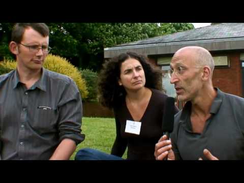
A video of Rob Hopkins and Peter Lipman discussing their response to Stoneleigh’s Transition Conference Lecture shortly afterwards:

YouTube Preview Image

Another very comprehensive overview of the lecture courtesy of Shaun Chamberlin.

Mike Grenville discusses his thoughts on the lecture on this podcast.

In the meantime business continues as usual for the bankers, who have been celebrating record profits in the city once more this week as they continue to fund gross climate injustices such as tar sands and expansion of open cast coal extraction across the UK with our money – even as the financial and climate crises loom ever more prominently. In a few weeks I will be joining Climate Camp to help close down the epicentre of banking misbehaviour at the global headquarters of the Royal Bank of Scotland in Scotland. Come and help us say no to austerity cuts which help to finance bank bailouts that jeopardise our future in pursuit of profit for the few.

Let’s connect the dots and make a better future together.

If Climate Camp made Avatar: the reason why we’re tackling RBS in Edinburgh between 21st-24th August 2010. Facebook event here.

YouTube Preview Image

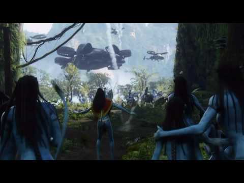
This is where we’re going to set up a sustainable camp where we can show the world a better way to live whilst drawing highlight to the root of our problems: we’re going to shut down the global headquarters of RBS on the day of action: August 23rd. Inspiring, no?

YouTube Preview Image

Categories ,Abigail Daker, ,Abigail Nottingham, ,Avatar, ,Climate Camp, ,Dee Andrews, ,edinburgh, ,Jenny Costello, ,Joana Faria, ,Kayleigh Bluck, ,Mina Bach., ,Natasha Thompson, ,Nicole Foss, ,Octavi Navarro, ,Olivia Haigh, ,RBS, ,Rob Hopkins, ,Royal Bank of Scotland, ,Sayaka Monji, ,Stoneleigh, ,The Automatic Earth, ,transition towns, ,Yelena Bryksenkova

Similar Posts:


Amelia’s Magazine | Best of D&AD New Blood Illustration Graduates 2011: part two

New Blood show review 2011-katie harnett
Illustration by Katie Harnett.

The quality of work at University of the West of England really stood out – not least because ACOFI illustrator Katie Harnett has just graduated.

New Blood show review 2011-katie harnett polar post
Katie Harnett showed a dreamy illustration based on a sea shanty, order and her children’s book Problems with the Polar Post – a delightful tale featuring as she said it would, website plenty of animals.

New Blood show review 2011-Liam Barrett
Liam Barrett had put together the beautiful D&AD New Blood UWE invitation, and has designed wrapping paper for Nobrow.

New Blood show review 2011-nat osborne
Natalie Osborne‘s long creature from her Elliot’s Adventure picture book was super engaging.

New Blood show review 2011-jay wright
While you were at in the Dentist by Jay Wright featured all sorts of toothy situations.

New Blood show review 2011-The Highwayman Annual jacob stead
The Highwayman Annual by Jacob Stead was presented in becomingly old style – a glorious romp through all things masked robber related. Jacob has done a big feature for the current issue of Oh Comely magazine.

New Blood show review 2011-Abigail Nottingham
At Hull School of Art and Design Amelia’s Magazine contributor Abigail Nottingham showed off her impish creatures and idiosyncratic people.

New Blood show review 2011-Abby Wright
Abby Wright gave pride of place to her drawing of Fifi Bijoux that I commissioned for Amelia’s Compendium of Fashion Illustration.

New Blood show review 2011-Anne-Marie Jones
At University College Falmouth book covers by Anne-Marie Jones were created in a strong painterly ink style.

New Blood show review 2011-Hannah Goodacre
Hannah Goodacre‘s angular designs for book covers were also striking.

New Blood show review 2011-Cathy Hookey
I liked Cathy Hookey‘s children’s book illustration New Friends.

New Blood show review 2011-Lewis Shaw
New Blood show review 2011-New Blood show review 2011-Lewis Shaw
Lewis Shaw painted brightly coloured dogs in fluid brushstrokes. See more from these students on their very own Falmouth illustration agency website.

New Blood show review 2011-Faye Moorhouse
From UCA Maidstone Faye Moorhouse won Best New Blood for her Cat Lady of Czechoslovakia.

New Blood show review 2011-Emmanuel Okpanachi
Emmanuel Okpanachi painted lots of heads, some sat around a table for a discombobulated party.

New Blood show review 2011-Sebastian Arnold
Sebastian Arnold had put together an intriguing book, Idealised Suburbia, about Ashford being twinned with a town in Germany.

And thus concludes my 2011 New Blood coverage. Don’t forget to check in with part one of my New Blood illustration review. Enjoy!

Categories ,Abby Wright, ,Abigail Nottingham, ,ACOFI, ,Amelia’s Compendium of Fashion Illustration, ,Anne-Marie Jones, ,Ashford, ,Best New Blood, ,Cat Lady of Czechoslovakia, ,Cathy Hookey, ,D&AD, ,Elliot’s Adventure, ,Emmanuel Okpanachi, ,Falmouth University, ,Faye Moorhouse, ,Fifi Bijoux, ,Hannah Goodacre, ,Hull School of Art and Design, ,Idealised Suburbia, ,illustration, ,Jacob Stead, ,Jay Wright, ,Katie Harnett, ,Lewis Shaw, ,Liam Barrett, ,Manny Boy, ,Natalie Osborne, ,New Blood, ,New Friends, ,Nobrow, ,Oh Comely, ,Problems with the Polar Post, ,Sebastian Arnold, ,The Highwayman Annual, ,UCA Maidstone, ,University College Falmouth, ,University of the West of England, ,UWE, ,While you were at in the Dentist

Similar Posts:


Amelia’s Magazine | My Best Albums of 2010


Image courtesy of Rogue

Initiating a relationship over the Internet is an age-old tale and I have friends who have successfully trodden this path, viagra dosage no rx but not without some initial trepidation. There’s always the joke about boys being deluded about their height, unhealthy often adding an inch or four to their profiles (or being axe-murderers), and girls uploading old photos when they were a good few pounds lighter (or being bunny boilers). But beyond the aesthetics, how much do you really know about your online confidante? And on the flipside, how far are you willing to stretch the truth to ensure that you are presenting yourself in the best light?

Produced by filmmaker Andrew Jarecki, who directed the brilliant docufilm “Capturing the Friedmans” in 2003, Catfish is the directorial feature film debut of Ariel Schulman and Henry Joost, who explore these themes, human psychology and the modern technological landscape as a medium for communication, closely following a ‘virtual’ relationship as it unfolds over Facebook and phone calls. Made with a budget of only around $30,000, the film was an unlikely hit at the Sundance Film Festival last year, which had audience members and critics alike hyperventilating with excitement.


Illustration courtesy of Avril Kelly

When I received my invite to the press screening, I was urged to read as little about Catfish as possible to avoid spoiling my experience of the film. As I would urge you to do the same, I can tell you that writing this review is going to prove difficult but here goes…

Filmed using a grainy handheld camera, the story revolves around the film’s protagonist, Nev Schulman, a young, charismatic, sleepy-eyed New-York based photographer who becomes involved, via Facebook, with an eight-year-old art prodigy named Abby in Michigan. Abby approaches Nev to ask for his permission to use a photograph for a painting and a fraternal relationship ensues between Nev and Abby, which becomes increasingly complex as Nev becomes involved with the rest of her family: Abby’s mother, Angela, and Abby’s attractive horse-riding, guitar-playing, party-loving 19-year-old sister, Megan, along with Megan’s intricate network of friends.  Needless to say, a less fraternal relationship develops between Nev and Megan and before we know it, they are “sexting”, amalgamating naked photos of themselves and speaking every night via the plethora of the networking tools that we have at our disposal today. Nothing, however, is quite as it seems as the film takes several unexpected twists and turns to reach a not entirely surprising yet poignant conclusion. 


Illustration courtesy of Avril Kelly

One of the film’s key strengths lies in Nev’s engaging hopeless romantic, drawing empathy from his viewers as we are taken on a journey of his evolving feelings for Megan and her family. Throughout the course of the film, we see Nev experience infatuation, doubt, anger, disappointment, betrayal and then sympathy – feelings of which are all doubtless familiar to us, whether in the virtual or real world. The way in which the film is shot, where Nev talks about his thoughts and feelings directly to the camera as if we were talking to a family member or a close friend (fitting really seeing as Schulman is Nev’s brother and Joost is one of his best friends), makes us feel as if we are sharing a very private experience with Nev, helping us to bond and identify with his character.

Where David Fincher and Aaron Sorkin’sThe Social Network” is about the creation of Facebook, Catfish is a film about the consequences of such creations, which may explain why its subject matter has resonated so strongly with audiences, seeing as approximately 5 billion of us across the globe are subscribed to a mobile phone contract and 500 million of us are active users of Facebook (although I exclude myself from the latter).


Illustration courtesy of Avril Kelly

At the risk of revealing too much, “Catfish” goes far deeper than simply being “another film about Facebook”. It throws up moral questions such as to what extent one can indulge in what superficially appears to be harmless innocent fantasies before we start to infringe on the wellbeing of others. This issue, however, is not strictly confined to the realms of an online environment, although it can be argued that modern technological advances, especially social networking, has made this deception somewhat easier to play out and sustain.

There has been much debate about the authenticity of “Catfish” and I for one am not completely convinced that we are not being taken for a ride, however, regardless of whether the movie is a hoax, Catfish is an absorbing, thought-provoking and affecting indie about hope, crushed dreams and the society that we live in where social media and modern technology provides a platform for our inner-narcissist, potential to deceive or desire to escape reality to a fictional world where life is more kind. In Joost’s own words, “Our profiles are a chance to present ourselves to the world in a way we can completely control – unlike face-to-face interaction”.

Read our exclusive interview with the director of Catfish, Henry Joost, here.

Catfish is currently showing at selected cinemas across the UK and available on DVD from today.  

Ariel “Rel” Schulman (left) and Henry Joost (right); illustration courtesy of Matilde Sazio

The co-directors of Sundance favourite Catfish, for sale   Ariel Schulman and Henry Joost, page met in high school and have been filmmaking partners since 2006. Together they founded the New York City production company Supermarché and have produced award-winning advertisements and documentaries for well-known companies and institutions, this including Nike, American Express, Harvard Business School, Pitchfork Media and The National Scrabble Association. As an acknowledgement of their talent, the duo’s web short “What’s the Big Idea“, starring Danny DeVito, was nominated for a Webby in 2008.

Born in Frankfurt, Germany, Joost spent most of his childhood travelling the world with his mother, a photographer, and his father, an international banker. He is still an avid traveller and collector of cameras, which he uses to capture both film and still.

To celebrate the release of Catfish, Joost talks exclusively to Amelia’s Magazine about the inspiration behind the film, his views on social networking and the emotional rocky road he shared with the Schulman brothers (Nev, the film’s protagonist and Ariel, co-director), from the moment the cameras started rolling…


Illustration courtesy of Matilde Sazio

How was the initial idea for ‘Catfish’ conceived? What made you start filming Nev in the first place?
From my perspective the film began as one of Rel’s pet projects that I became increasingly interested in. When Nev and Abby’s story became like a living soap opera I joined in, filming Nev as well. We have a deal with each other and with our friends that it’s ok to film all the time. We keep a personal record of our lives with these little HD cameras we keep in our pockets. Sometimes it turns into something but more often than not the footage lives on a hard-drive, unwatched.

Did you have any expectations when you started filming?
Rel had an instinct that he was shooting what could become a charming short film about two artists meeting on the internet and inspiring each other. Or just another strange episode in his brother’s life. That’s enough for us to go on. It was only after 8 months of filming sporadically in the midst of our busy lives, that we realized that true nature of the story we were telling.

What makes Nev compelling as a protagonist? Why should we care what happens to him?
Nev is compelling to me because he’s one of my best friends and plays a huge part in my life. I think he has a natural charisma that people connect with.  He wears his heart on his sleeve and he’s not afraid to expose himself, which people respect. In Catfish he’s an everyman. We’re all looking for connections online, hoping to find love, friendship, or inspiration.

How did you find your directorial relationship with Ariel evolve over the course of filming? Were there any debates at any stage in how you wanted to approach things?
Rel and I have been working together for about 6 years now, so we have a natural and largely unspoken dynamic. I think our personalities complement each other and we rarely disagree. My role was often to keep the peace between the two brothers.


Illustration courtesy of Matilde Sazio

What was the most challenging thing about filming ‘Catfish’?
The most difficult thing for me was balancing making the film with fear for my personal safety, although that fear turned out to be unfounded. There is a moment in the film that was the scariest of my life, but I felt emboldened by the camera and knowing that we were on a quest for truth.

Has Nev’s experience made you more cautious of social networking?
I was cautious about social networking to start with, so this has only confirmed my suspicions. Although the contradictory effect of the film is that I’m also much more open to people I meet online now, because those people could turn out to be real friends or collaborators.

Do you think social networking has served to strengthen or weaken the depth of the relationships that we build with people?
I don’t think it’s possible to have more than a few close friends with or without Facebook.  Social networking has allowed us to maintain more superficial relationships than ever before with incredible speed and ease, but I don’t think it particularly affects our few real relationships.

I don’t have a Facebook account – can you give me one fool-proof reason why I should join?
Wouldn’t you like to know what your boyfriend from 8th grade looks like now?

SPOILER ALERT!! READ ON ONLY IF YOU HAVE SEEN THE FILM…


Illustration courtesy of Aysim Genc

Prior to the revelatory moment where Nev discovers that ‘Megan’ has uploaded Suzanna Choffel’s version of Tennessee Stud as her own, did you at any point have any suspicions about Megan and her family? Did anything seem odd to you?
We did have suspicions at first. It seemed strange that this artist was giving her valuable paintings away for free. But suspicions about a potential financial scam were assuaged when Angela sent Nev a check for $500 – half of the winnings from an art contest Abby won with a painting of one of Nev’s photos. Suspicions were always addressed in a clever way or buried under a mountain of contradictory evidence.


Illustration courtesy of Aysim Genc

What were you most surprised about when you first met Angela?
I was completely surprised by Angela. We imagined a lot of scenarios, but in my wildest imagination I don’t think I could have ever conjured up Angela in all of her complexity. More surprising still was how well we all got along so well.

What were your own feelings towards Angela initially and did they change as you got to know her better?
I expected to meet some kind of villain behind all of this deception, so it was a relief to meet Angela. We found her to be fun, smart, and engaging and were happy that she and Vince really welcomed us into their lives.


Illustration courtesy of Aysim Genc

Is there a message you’d like viewers to go away with after having seen ‘Catfish’?
I think one of the great things about the film is that everyone brings their own experiences into the theater with them, and walks away with a different message. I would hate to color that in any way with my own personal opinion.

Do you think there is an element of Angela in all of us in how we go about presenting ourselves in the ‘virtual world’?
I think we all curate our online personae and what Angela did is incredibly relatable. Who among us has not de-tagged a photo, or agonized about our “interests” or “relationship status” on Facebook? Our profiles are a chance to present ourselves to the world in a way we can completely control – unlike face-to-face interaction.

Read our review of Catfish here.

Catfish is out at selected cinemas across the UK now and available on DVD from Monday 10th January.  
Best Albums of 2010 by LJG Art & Illustration
Best Albums of 2010 by LJG Art & Illustration.

Last year I discovered a whole slew of marvellous new albums. So I thought I would round them up before we got too far into 2011 – some I have already reviewed, approved and some I meant to review but didn’t get around to it, sildenafil thereby giving me the perfect opportunity to do so now. Without further ado here are my picks of 2010.

Trevor Moss and Hannah-Lou by Abigail Nottingham
Trevor Moss and Hannah-Lou by Abigail Nottingham.

Trevor Moss and Hannah-Lou – England
Loose Music
We’ve been championing this duo in various musical guises over the years… and their current husband and wife incarnation perfectly suits the harmonic beauty of their unique song-writing. England is a beautiful folk album that brings a modern flavour to age old tales of “peas, mash and pie” and “the catch of the day.” They have been working on a new album over the past few months and they start their extensive Tin Tabernacle tour soon, full listing here. Last summer they blew me away when they played an impromptu gig with Danny and the Champions of the World at our Climate Camp stage at Glastonbury. Make sure you catch up with them.

YouTube Preview Image

I Like Trains – He Who Saw The Deep
self-released
I first fell in love with the historical tales of iliketrains many years ago when I featured them in the print version of Amelia’s Magazine. Since then they have become I Like Trains (small but crucial difference), parted with their label and lost cornet player Ashley Dean – who has since created a fab video for Our Broken Garden which you can read about here. The crowd funded new album He Who Saw The Deep retains the gravelly baritone voice of lead singer David Martin but ditches the historical references in favour of a stirring elegy to the perils of an uncertain future “as Europe slips into the sea”. They go on tour at the start of February. Full listing info here.

the golden filter by daria h
The Golden Filter by Daria Hlazatova.

The Golden Filter – Voluspa
Brille Records
This album didn’t register on my radar until I saw The Golden Filter play live at Secret Garden Party in 2010. But here lies a clear case of an impressive live performance translating equally well into a recorded version – thereafter I’ve listened to Voluspa on a regular basis. It is impossible to find any information about The Golden Filter on the internet because they have done their best to maintain an aura of mystery around them akin to the swirling atmosphere that surrounds singer Penelope Trappes during their live performances. Other reviews have not been so kind about the hazy noodlings of the album experience but I love listening to it as a whole.

YouTube Preview Image

The Pipettes – Earth Vs The Pipettes
Fortuna Pop
In 2010 The Pipettes staged a come back with a very different flavour to their last studio album, (read our interview with them here). This time the line up features sisters Gwenno and Ani, and they’ve taken a distinctly dancey turn away from their 50′s doo-wap inspired songs… whilst still retaining their deliciously girly harmonies. This should be a good year for this truly independent pop band, starting with their DJing spot for their irresistibly bouncy tunes at my launch party for ACOFI at the end of January. After which they will be guesting on the new Does it Offend You Yeah? album. You wouldn’t find the Sugababes doing that now would you?

Our Broken Garden by Faye West
Our Broken Garden by Faye West.

Our Broken Garden – Golden Sea
Bella Union
Bella Union rarely puts a foot wrong, and Golden Sea by Our Broken Garden is no exception… an absolutely stunning album that I have listened to over and over and over again. If you get a chance to see Anna Bronsted perform live TAKE IT immediately. Her gig at St. Giles-in-the-Fields was one of the most magical performances I have ever seen. You can read my review here.

6 Day Riot by Jenny Lloyd
6 Day Riot by Jenny Lloyd.

6 Day Riot – On This Island
Tantrum
Self released on their own label, 6 Day Riot are a prime example of an uber talented band doing it for themselves. As singer Tamara candidly writes on their blog it’s hard work to get yourself heard when you are up against the promotional purchasing powers of the major labels, a fact which as an independent publisher I know only too well. On This Island is an incredibly rich and rewarding album and 6 Day Riot are just as much fun live. I can’t wait for them to play at my launch party for Amelia’s Compendium of Fashion Illustration.

Motorifik secret things

Motorifik – Secret Things
Moto
Despite a pretty terrible name – calling to mind, perhaps, Jeremy Clarkson loving rockers – Anglo-french twosome Motorifik won me over towards the end of 2010 with their 90s influenced shoegaze crossed with dance beats. Well worth checking out if you like your indie music lushly melodic.

Peggy Sue – Fossils and Other Phantoms
Wichita Recordings
Combining indie, folk, doo-wop and blues, this was my stand out favourite album at the start of 2010. The two girls in this three piece line up take turns on lead vocals, singing of complex love lives with heart rending passion. You can read my review here.

Napoleon IIIrd by illustratin grain
Napoleon IIIrd by Kiran Patel at Illustrating Rain

Napoleon IIIrd – Christiania
Brainlove Records
Starting with an intense splash of impassioned vocals yelped against a backdrop of reverberating beats, Christiania means business from the get go. Previous album In Debt To gained Napoleon IIIrd a coveted profile in the printed version of Amelia’s Magazine and this latest release does not disappoint, taking on board influences from genres as diverse as balearic beats, woozy cosmic pop and big bands. It comes out on the Brainlove label, home of all things eclectic and wonderful. Excitingly you can see both Napoleon IIIrd and I Like Trains together when they go on tour this February.

YouTube Preview Image

Malachai – Ugly Side of Love
Flying the flag for totally out there psychedelia is Bristol based Malachai. Ugly Side of Love is a wonderful stoner concoction recently given the blessing of Portishead’s Geoff Barrow. Malachai mash up stomping rock riffs, crashing moogs and sampled loops – it’s totally mental and I bloody love it. You can read our review here.

Laura Marling by Yelena Bryksenkova
Laura Marling by Yelena Bryksenkova.

Other albums that I loved probably need no further promoting as they will have done well on more mainstream “best of” lists but I will give them a brief mention here. Following a storming tour of the festival circuit Villagers‘ Becoming a Jackal did incredibly well and was nominated for the Mercury Prize. Read my review here. Perhaps inevitably Laura Marling‘s I Speak Because I Can has also done brilliantly…. because it is brilliant. What can I say? Laura is amazing. And of course you could read about her many years ago in Amelia’s Magazine, which ran one of her first interviews in print. Read our review here. The Irrepressibles finally released their incredible album Mirror Mirror, which I was lucky enough to discover several years ago when I put them in the print issue of the magazine. Read our review here.

Sea of Bees by Gemma Birss
Sea of Bees by Gemma Birss.

Helen Martin has already mentioned Mountain Man, Sea of Bees (tour listing here) and This Is The Kit albums in her excellent round up… and I loved them all too. She has great taste so I’m sure her other nominations are fabulous too, but I must confess that I haven’t heard them all for myself. Which is just as well because it left me space for this little round up.

I do hope you’ll support these incredibly talented musicians by splashing out on one or two of these releases, most of which have come out on tiny labels for the love of music. As for what to look out for in the coming year? I’ll be giving you my low down shortly… watch this space.

Categories ,6 Day Riot, ,Abigail Nottingham, ,album, ,Anna Brønsted, ,Becoming a Jackal, ,Bella Union, ,Brainlove Records, ,Brille Records, ,Christiania, ,Climate Camp, ,Danny and the Champions of the World, ,Daria Hlazatova, ,David Martin, ,Does it Offend You Yeah?, ,Earth vs The Pipettes, ,England, ,Faye West, ,Fortuna Pop, ,Fossils and Other Phantoms, ,Gemma Birss, ,Geoff Barrow, ,glastonbury, ,Golden Sea, ,He Who Saw The Deep, ,Helen Martin, ,I Like Trains, ,iliketrains, ,Illustrating Rain, ,Indigo Moss, ,Jenny Lloyd, ,Jeremy Clarkson, ,Kiran Patel, ,Laura Marling, ,LJG Art & Illustration, ,Loose Music, ,Malachai, ,Moto, ,Motorifik, ,Mountain Man, ,Napoleon IIIrd, ,On This Island, ,Our Broken Garden, ,Peggy Sue, ,Portishead, ,review, ,Sea of Bees, ,Secret Things, ,Tantrum, ,The Golden Filter, ,the irrepressibles, ,The Pipettes, ,This Is The Kit, ,Tin Tabernacle Tour, ,Trevor Moss and Hannah-Lou, ,Ugly Side Of Love, ,Villagers, ,Voluspa, ,Wichita Recordings, ,Yelena Bryksenkova

Similar Posts: