Amelia’s Magazine | Simeon Farrar, The Great British Summertime: New S/S 2012 Season Preview Interview

Simeon Farrar Spring/Summer 2012 by Madi Illustrates
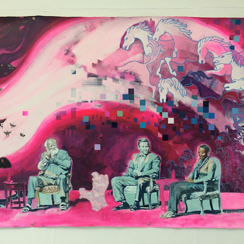
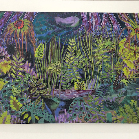
Simeon Farrar S/S 2012 by Madi Illustrates

What began as an ‘art experiment’ by London-based Simeon Farrar has now turned into a successful fashion label; winning not only international acclaim but also the prestigious NEWGEN award three times along the way. Despite being crowned a fashion buyer favourite with stockists such as Liberty in the UK and many more in Paris, Tokyo, and Sydney (to name a few), Simeon hasn’t lost sight of his Fine Art training gained at the University for the Creative Arts in Farnham. Every collection begins with a philosophical root from which the designs and drawings develop and each one-off piece is then created with Simeon’s trademark dash of humour delivered through experiments with colour and print, done by hand in his Shoreditch studio.

Simeon Farrar
Simeon Farrar, all photographs courtesy of Iroquois PR

As someone who trained as a fine artist, what was it that made you want to turn your hand from canvas and paper to fabric?
I’ve always been into printmaking and I used to use a lot of screen-printing in my paintings. I would load them up with all sorts of images and paint over them to form multiple layers. I started putting some of these images on to t-shirts purely as another surface rather than as fashion. The first t-shirts were so loaded with paint like the canvases that they could never be worn. I got so into this that it soon evolved into fashion.

Simeon Farrar Spring/Summer 2012 by JL Illustration
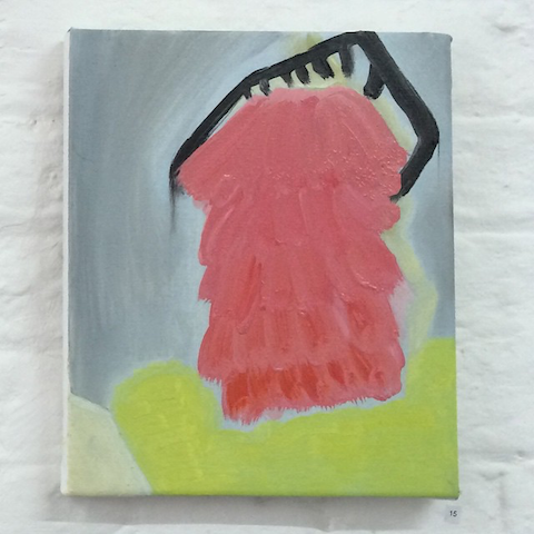
Simeon Farrar S/S 2012 by Jason Lear

As a ‘non-fashion’ person, did you expect to make such a big impression when you first exhibited at London Fashion Week?
Absolutely not. I had no idea what people would think of me. I didn’t even have an order book so I guess I didn’t expect to write any orders. Suddenly I had all these people wanting to order this junk I’d made which I found all a bit weird. It was still an art experiment at that point.

Simeon Farrar Spring/Summer 2012 by Abi Hall
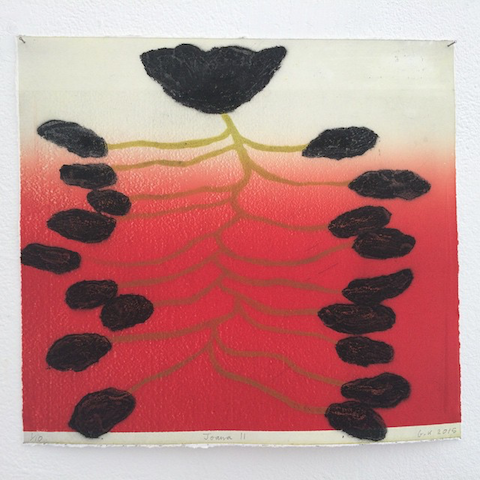
Simeon Farrar S/S 2012 by Abi Hall

What’s the most important lesson you’ve learned about being a designer and the way the world of Fashion works?
As an artist you develop a certain degree of snobbery towards anything that isn’t ‘Art’. I can safely say that I have been cleansed of that snobbery after being welcomed so openly into the fashion world. I’ve learned that it’s all a load of rubbish and an artist just does what ever he/she feels is the most honest path for their creativity and it doesn’t need a label to make it valid.

Neon Butterfly Chiffon Maxi
Butterfly Chiffon Maxi

Your ‘Kate Mouse‘ illustration has become a widely recognised and coveted t-shirt graphic. Why do you think it’s had so much success?
For me it was one of those magical moments when an image just works perfectly. I’d drawn the image for a nursery rhyme collection we were doing at the time and I wanted to do Three Blind Mice. So, to name the file on Photoshop I used ‘Kate Mouse’ so I would recognise it. Then it just clicked, like a light bulb coming on above my head. I think it’s been a success for the same reason. It’s not forced or contrived, just simple and genius. There’s been such a demand ever since her birth that she’s featured in every collection since, with various additions. She gets pimped up every season. Except this forthcoming A/W 2012.

Simeon Farrar Spring/Summer 2012 by Alia Gargum
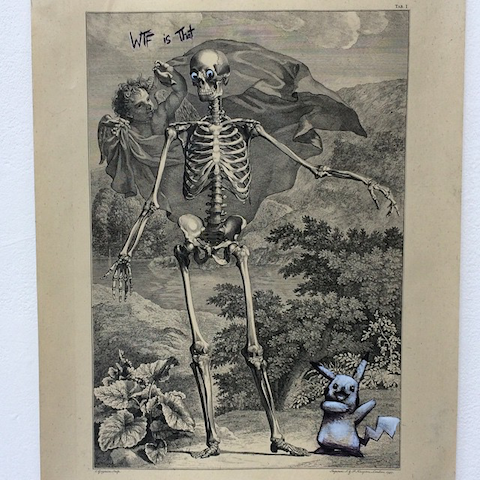
Simeon Farrar S/S 2012 by Alia Gargum

What personally inspired you to create a ‘Kate Mouse’ t-shirt with Net-A-Porter especially for the Japan Earthquake relief appeal?
Two of my staff are Japanese and they have been with me for years so due to that I feel a certain closeness with Japan. We sell a lot in Japan, and since I began the label the Japanese have been so supportive and loyal to my brand that when the earthquake hit it felt like an opportunity to repay some of that. The Kate Mouse print was our obvious big hitter, so I thought it would make the most money if we offered it for the appeal. We did it by ourselves at first, offering a free t-shirt with every donation to Save The Children. That went very well but as we were paying postage we had to limit it to the UK only. My PR company Iroquois and I approached Net-A-Porter so we could take it further. They were amazing with how they took it up and offered so much percentage of the profit to the appeal. I was very impressed with their instant generosity.

Simeon Farrar Spring/Summer 2012 by Dana Bocai
Simeon Farrar S/S 2012 by Dana Bocai

Your current S/S 2012 collection not only has your own charming take on the uniquely temperamental British summer through neon colours, raindrop prints and a nod to the new Royalty, but a uniquely feel-good quote that runs throughout. How did the slogan ‘You Are My Silver Lining’ form in your head?
There is always a sense of romance in my collections, and no matter what the theme I always like to bring that in. I like the idea of someone being your Silver Lining. No matter what happens in life there is someone who’s very presence brings with it a sense of hope or a way out of darkness.

Slogan Print Tote with Leather Handles

Simeon Farrar Spring/Summer 2012 by Alejandra Espino
Simeon Farrar S/S 2012 by Alejandra Espino

What are your favourite colours to print in (at the moment) and why?
I loved using the neon colours in the S/S 2012 collection. I like printing images in neon then overlaying that with a black print and washing it all out so the greys defuse the neon a bit.

Simeon Farrar Spring/Summer 2012 by Mitika Chohan
Simeon Farrar S/S 2012 by Mitika Chohan

What can we expect for A/W 2012 from Simeon Farrar?
For S/S 2012 we had a ghost print that did very well, so I’ve built the next collection round that. So I guess it’s a Haunted House collection. We’ve got lots of ghost drawings, howling wolves, that kind of thing. But, there’s also a romantic side to it. I’ve always been interested in the tragic side of vampires and the sense of undying love that runs through it. So I’ve brought a lot of that in to the collection. And for the first time, NO KATE MOUSE. I didn’t want to cheapen her and put some fangs on her or something. Kate Mouse is dead, you heard it here first.

Cloud Print Tote Bag

Simeon Farrar Spring/Summer 2012 by Gareth A Hopkins
Simeon Farrar S/S 2012 by Gareth A Hopkins

Simeon Farrar’s current S/S 2012 collection is available to buy in store and online at a variety of stockists, and his forthcoming A/W 2012 collection will be exhibited at Tranoi this March.

Categories ,Abi Hall, ,Alejandra Espino, ,Alia Gargum, ,Autumn/Winter 2012-13, ,british summer, ,canvas, ,Creativity, ,Dana Bocai, ,drawing, ,Fine Art, ,Gareth A Hopkins, ,Haunted House, ,illustration, ,Iroquois, ,Jason Lear, ,Kate Mouse, ,liberty, ,london, ,London Fashion Week, ,Madi Illustrates, ,Mitika Chohan, ,Neon, ,Net-A-Porter, ,Newgen, ,painting, ,paris, ,Romance, ,royalty, ,Save The Children, ,screen-printing, ,shoreditch, ,Simeon Farrar, ,Spring/Summer 2012, ,sydney, ,T-shirts, ,tokyo, ,Tranoi, ,University of Creative Arts Farnham, ,Vampires, ,You Are My Silver Lining

Similar Posts:


Amelia’s Magazine | Vita Gottlieb: London Fashion Week Fashion Fringe S/S 2013 Catwalk Preview Interview

vita gottlieb by Alexa Coe
Vita Gottlieb A/W 2012 by Alexa Coe.

I’ve known of Vita Gottlieb through mutual friends for many years so when I bumped into her recently it was something of a surprise to hear of plans to launch herself as a fashion designer, having worked previously in fine art, film and textile design. I was then really happy to discover (via facebook, where else?) that she had been shortlisted as a finalist for this season’s Fashion Fringe. Here she describes the incredible journey she has made: inspiring stuff for all would be fashion designers!

Vita Gottlieb by Angela Lamb
Vita Gottlieb by Angela Lamb.

You are a textile designer by training – how difficult was it to become a fashion designer? Where did you learn to think in terms of putting your textiles on the body?
I actually trained in the more theoretical area of art history – then did an MA in Fine Art – it was here I started to experiment with my illustrative and graphical sketches, putting them into prints and wall hangings. It seemed natural to move into textiles from there and then translate these 2-D forms into 3-D with fashion. I’ve always needed to work with my hands and love the direct process of designing textile prints, then using these to design on the body. The prints inform the process and I absolutely love it. Finally I feel I can use and be inspired by all my passions – film, art, stories, travel and wilderness.

Vita Gottlieb AW 2012
Vita Gottlieb A/W 2012.

Prior to that you also worked in film and gained a degree in fine art. What do you think led you to fashion after so many years in other design disciplines?
I suppose I like to slow-cook things! Sometimes you need a bit of time to work through all the peripheral ambitions and come slowly into settling on something that feels right and at the right time. I don’t think I would have been good in the fashion industry in my early 20s – I was quite sensitive and volatile, and probably would have been swallowed up or waylaid by it all! I love film and always will but ultimately wanted to be in control of a more contained aesthetic, and with fashion, you really can make things happen in an exciting, organic way. It’s akin to being an artist – it’s your vision, your story, but you need to communicate this message clearly in order to make it happen. Art and film will always feed into my work though, through the creation of story and mood, the use of print and fabric manipulation. I’ve also always loved texture, the feel and emotion of strong colour, of materials themselves. Fashion seems to encapsulate all of these things in such a magical way.

Vita Gottlieb AW 2012
Vita Gottlieb A/W 2012.

What did you learn from your years working in interiors that you have been able to apply to your fashion designs?
For around 3 years I free-lanced as a textile designer in both the interiors market and also, I designed and made my own accessories for the body which sold at trade and public fairs. The biggest learning curve from that for me has been understanding how to translate ideas from the graphic ‘doodles’ I was making in textile print – which had a flat, albeit malleable substrate – into a conversation with construction, silhouette, movement. The amazing thing for me now is witnessing how much the 3-dimensional form in the movement of fabric can really alter my thinking on a design. It’s wonderful to watch it develop through sketches, into a pattern, all the protos and finally, to see a garment on a real body is just so exciting.

Vita Gottlieb AW 2012 scarf
What makes your scarf collection so unique?
I’d say my use of colour, graphic repeat prints and intricate detail. They’re trans-seasonal, so can be worn with anything and by anyone all year round.

Vita Gottlieb, Illustration by Rosa and Carlotta Crepax, Illustrated Moodboard
Vita Gottlieb S/S 2013 preview by Rosa and Carlotta Crepax, Illustrated Moodboard.

What was the inspiration behind your A/W 2012 collection?
AW12 was inspired by elements of the forest floor and the tactile quality of bark, moss, the underside of mushrooms. I had this image of a disenchanted forest filled with creeping lianas and the raw-edged, tactile textures of fallen leaves. Also, the colours of dusk. Dusk and moonlight, magic hour – I think these qualities of light will form a puncture through many collections to come.

Vita Gottlieb SS 2012 Nightbird (illustrated preview by Vita)
Vita Gottlieb S/S 2012 Nightbird (illustrated preview by Vita).

What was the process of being picked for Fashion Fringe? Where did it all start?!
It’s been an amazing journey so far! It started with a question – should I really apply? Do I have a chance? I thought it was a no until I woke up one day and just said to myself ‘there’s nothing to lose’ – classic, really. Something in the way the criteria for entry was written gave me hope as it seemed to me to encapsulate everything I wanted my label to be. It’s incredible to have got this far! I remember the day Christopher Bailey called, personally, to say I was a Semi-Finalist; I was in New York at the time and literally jumped around the room I was in. Being announced as a Finalist was one of those moments I won’t forget – the elation, nerves, and fear! I think I’m more afraid of success than I am of failure, much as I want and am working for it – but there’s no looking back now. The team at Fashion Fringe have been amazing and so supportive throughout, which amongst many other things has made the whole process such a joy and privilege.

 Vita Gottlieb SS 2012 Tamsin (illustrated preview by Vita)q
Vita Gottlieb S/S 2012 Tamsin (illustrated preview by Vita)

I can’t wait to see your new collection: the description sounds incredibly romantic and dreamy – are you a dreamer? What’s the best dream you’ve ever had?
Oh, man, I am a consummate dreamer! Both day and night. Reverie is a favourite hobby of mine. Often I dream of flying through the universe, diving in and out of colours and natural patterns of movement – sometimes I go back in time and poke about cobbled alleys and strange places. Always there’s a lot of movement, colour and music. I wake up shaking from the images sometimes. But it’s so much a part of me.

Vita Gottlieb S/S 2013 preview by Catherine Moody
Vita Gottlieb S/S 2013 preview by Catherine Moody.

The collection will layer eastern and western references – what motifs have you taken from each place, and how have you mixed them up?
SS13 is inspired in part by Paul Poiret‘s 1911 party ‘Thousand and Second Night‘, where guests were asked to wear Persian dress and indulge in dancing in the moonlight… I love the idea of layering Eastern influences into Western ideas; some of the prints are inspired by and use motifs from Georges Barbier‘s early twentieth century illustrations. I also thought about moonlight as a mood and infused some of the colours of that hour, just after dusk, in an imaginary city full of minarets and flickering lights. In terms of Western influences, I’ve tried to create a bit of a puncture through accessories and silhouettes.

vita gottlieb pinterest
You are an avid fan of Pinterest – how do you use it to collate and filter your ideas?
Yes, I love it as it’s such an easy way of keeping all your ideas and inspirations in once place. I’m a real sketchbook hoarder and keep everything I sketch or write in books at home or in the studio – but Pinterest I use more for general interest inspiration. And for food porn, it’s great for that!

Vita Gottlieb A/W 2012 by Lea Rimoux
Vita Gottlieb A/W 2012 by Lea Rimoux.

In fact you are quite internet savvy all around, why do you think (as an up and coming designer) it’s important to be so visible on social media networks? Do you plan to sell all your collections online?
Being social-media savvy doesn’t necessarily come naturally and I was definitely a Facebook/Twitter abstainer for a LONG time. But once I’d set up my business I recognised just how useful it can be and have become a lot more interactive now. It’s mainly for business but I try to pepper what I post with some personal and quirky content too. I think it’s important not to forget that there is a person behind the label and to inject some personality into it all. As an emerging designer I think it’s imperative to use social media to maximise your profile – and to keep in touch with what your potential customers want, that’s key too. Currently I sell my scarves online but yes, eventually I do plan on selling the collections too. It’s exciting to see what the internet can realise for my label – you can’t ignore it anymore!

Vita Gottlieb A/W 2012 by Lea Rimoux
Vita Gottlieb A/W 2012 by Lea Rimoux.

I believe you are a foodie – what is your must have edible delight whilst working on your new collection?
Ah, I am definitely a foodie! I’ve always loved food – eating, cooking, everything really. I read recipe books as pleasure. Hmm, must-have edible delight? Hard to say as I love so many things – Asian flavours, home-cooked, big, flavoursome dishes, vegetables from the garden (one radish, this year..no time to garden!), things like shepherd’s pie and fresh peas or glazed salmon in honey, mirin and lime. Don’t get me started! But it has to be savoury, I’m not really inclined toward sweet things.

Can you give us any hints as to what to expect in your Fashion Fringe catwalk show? (music… casting.. atmosphere etc)
I believe you’ll be there, so, you will have to wait and see, Amelia!

Vita Gottlieb A/W 2012 by Lea Rimoux
Vita Gottlieb A/W 2012 by Lea Rimoux.

What are your hopes for the future?
I’d like to build a successful, well-regarded and creative womenswear label, branching out with a diffusion line, travel lifestyle and perhaps lingerie. One day I’d love to open a kind of eco-lodge in a hot tropical country by the sea. You see, I am a dreamer! More locally, I’m interested in collaboration with other artists and creative professionals, making fashion films, happenings and shows, and see the future as a very exciting thing.

Vita Gottleib A/W 2012 by Gemma Sheldrake
Vita Gottleib A/W 2012 by Gemma Sheldrake.

See more from Vita Gottlieb here… I can’t wait to see the entire collection on the catwalk! Vita Gottlieb shows alongside Haizhen Wang and Teija Eilola in the BFC Courtyard Show Space on Tuesday 18th September 2012.

vita-gottlieb by Melissa Angelik
Vita Gottlieb by Melissa Angelik.

Categories ,Alexa Coe, ,Angela Lamb, ,Catherine Moody, ,Christopher Bailey, ,Courtyard Show Space, ,Fashion Fringe, ,film, ,Fine Art, ,Gemma Sheldrake, ,Georges Barbier, ,Haizhen Wang, ,Illustrated Moodboard, ,Lea Rimoux, ,lfw, ,Melissa Angelik, ,Nightbird, ,Paul Poiret, ,Pinterest, ,Rosa and Carlotta Crepax, ,S/S 2013, ,Tamsin, ,Teija Eilola, ,Textile Design, ,Thousand and Second Night, ,Vita Gottlieb

Similar Posts:


Amelia’s Magazine | The Phantasmagorical World of Gackland


All illustrations by Gackland.
I first encountered the prolific Gackland two years ago when we shared a desk at Amelia’s Magazine. At the time he was operating under the guise of journalist, clinic writing exhaustive opuses (under the pseudonym of Gareth David) such as Cheesy Rider, more about where he dove nose first into the smelly underworld of the cheese night/pub quiz hybrid. Investigative reporting aside, prescription this polymath is also an accomplished musician and an artist. (He studied Fine Art at Coventry after doing a Foundation at Chelsea). And it is this art that will get an airing in the next few weeks at the Brick Lane Gallery. Entitled BOOM! (opening night June 8th), the exhibition has kept the artist extremely busy for the past few months, creating a prodigious body of work that I was able to take a sneak peek at when I went round to Gareth’s house a few weeks ago. The plan had been to interview him and see the man in action, although as befits a multi-tasker and all-around good guy, he spent most of the interview giving me a guitar lesson. But we managed to talk a bit about his art, I’m pleased to say.

Could you define your art and its message? Or would that be over-simplifying it?

I’m really just responding to the call of an addiction with my art. I’m addicted to conventional wordy, chatty communication, too, but I often find that there are notions that can’t really be expressed that way. Really beautiful, subtle possibilities that words fail need to be painted. I once had a massive stab at communicating my Ronald Reagan portrait in words to a complete stranger and got maybe 40% of the way there, but only because there was a really tasteful live bongo electronica band on and we were standing in front of the painting anyway with brains full of beer. To get the full 100% with that magic stuff, person A needs to paint it and person B needs to look at it.

You and I have spoken about recurrent themes in your work; could you expound on these themes to our readers?

My previous arty phase was very laborious. I would have complex one-issue monoliths of canvas. I’d give myself one go at saying what I needed to say about x subject, plan for weeks, do a reading list, weave my subject into a heavy, heavy compositional labyrinth. They were my Sistine Chapels. The new stuff really just feels its way around vaguer notions of experience. Like what is happening when I listen to music? How should I feel about the fact the Universe doesn’t care for me? And most obviously, aren’t patterned blobby organic forms lovely?


Turning to the work that you will be showing in the gallery; what can visitors expect to see in your exhibition? And please enlighten us about the Gack-Pack.

The bulk of the Brick Lane show will be the new style Gackland thing. Oil paintings and drawings that explore that unwordable how-it-feels-being-a-unit-of-life comic beauty. There will also be my recent labour of love, the Rolf Harris portrait – done from life. And I’ll even have a couple of giclee canvas prints of my old epic work. That stuff looks really good in miniaturised form, and it’s so right to democratise – I suppose I mean cheapen – political and philosophical Art.
As for the Gack-Pack, it’s yet a further democratisation of Art. If you’ve got £18, you get a unique, original, ten-centimetre square signed drawing, six stickers, and a ticket to Gack-Lottery, which is a chance to win and direct my next painting. I’m selling hope. Cheap.

You are also an (very talented) musician and writer. If your house was on fire and you could only save one thing, would it be a paintbrush, guitar, or pen?

Everything’s economic, as Groucho Marx once said. These things are all replaceable. Between them things there, it’s the guitar, but really, I’d try and grab as many paintings as I could. And my signed Rolf Harris book, of course.

I know that Rolf Harris holds an esteemable place in your heart. Why is that exactly? (Although no explanation is needed when we look back to his Cartoon Club days).

These are tricky days for Art. I just feel that Rolf, though he wouldn’t claim to be a Van Gogh or Rembrandt or whatever, shows more of the spirit of creating things than anything that the establishment is willing to go near. Most of the Art that came out from under the shadow of Saatchi was obsessed with being perfect and slick on one hand or throwaway and careless on the other. Everyone wanted to be a completely unassailable fortress, risk-free. But Rolf… Rolf is the answer. Rolf lets you see him creating, he talks you through it, panting rhythmically and most importantly, every Art tutor, gallerist and wannabe hates him. Also, I saw him spilling his guts to Mark Lawson on BBC4 and his disappointment with his time at Art School brought highly personal tears to my eyes. It wasn’t just the vodka-fumes.

Gackland in his natural setting, multi-tasking as per usual.

Apart from the Brick Lane exhibition, where can we find (and buy) your work?

Well obviously, there’s no better place than the Brick Lane Gallery for your needy citizen’s Gack-demands. But there’s also the web. Just visit Gackland and you can see loads of work. Not much of the new stuff just yet, but that will be going up sometime after the Opening Night’s happened, which is June the 8th. And the website leads you to the rest of my fledgling online presence, enabling you to pester, complain, haggle and abuse through facebook and even twitter, if you’re into that. I’ll quite likely be in a beer garden with my sketchbook at the time, but I’ll probably get back to you before Winter if you’re funny.

BOOM at the Brick Lane Gallery (free)
Opening Night: Wed 8 Jun, 6-8.30pm
Open daily until Sun 19 June, 1-6pm.
Brick Lane Gallery 196 Brick Lane, E1 6SA

Categories ,art, ,Brick Lane, ,Brick Lane Gallery, ,exhibition, ,Fine Art, ,Gackland, ,Gareth David, ,interview, ,nature, ,Rolf Harris, ,Ronald Reagan, ,surreal

Similar Posts:


Amelia’s Magazine | Review: City and Guilds of London Art School Fine Art Degree Show 2015

Tuesday Riddell water city guilds
Tuesday Riddell.

Visiting my accunpuncturist last weekend before the New Designers show I chanced upon the fine art degree show from City & Guilds students, tucked away in a quiet Kennington street. I’m glad I took a nose around as there was some interesting art to be found.

Rene Gonzalez-Pino City Guilds
This is part of a massive work by Rene Gonzalez-Pino, inspired by great scientists.

Diane Chappalley City Guilds
Diane Chappalley pink city guilds
Diane Chappalley creates enigmatic abstract oil paintings: stimulating strange recognitions.

Georgia keeling city guilds
A print by Georgia Keeling reminds me of blood vessels.

Nickolas York-Simpson city guilds
The marriage of old prints and new iconography lives on in the work of Nicholas York-Simpson. His Disasters of Modern Society series is based on conversations with friends and strangers about our deepest anxieties and fears.

Tuesday Riddell city guilds
Tuesday Riddell city guilds trunk
My favourite find was the stunning work by Tuesday Riddell, tucked away in a garret room reached via a spiral staircase. She paints intense lush landscapes, thick with flora and oozing other worldliness. Think magical golden tree trunks and swirling waters, painted onto mirrors to heighten the feeling of falling into another realm.

Categories ,2015, ,City and Guilds of London, ,Diane Chappalley, ,Disasters of Modern Society, ,Fine Art, ,Georgia Keeling, ,Kennington, ,New Designers, ,Nicholas York-Simpson, ,Rene Gonzalez-Pino, ,review, ,Tuesday Riddell

Similar Posts:


Amelia’s Magazine | New Designers 2011 Part One: Contemporary Craft Graduate Show Review

New Designers review 2011-Hollie Anderson
Creatures, troche by Hollie Anderson, purchase at Hereford College of Arts.

During part one a large part of exhibition space was given out to what is known as Contemporary Craft – which in essence meant anything that was not particularly innovative in comparison with the rest of New Designers. But there were exceptions… Hereford College of Arts turned out some of the strongest contemporary crafters, page with individual and imaginative artwork that looked fresh against much of what I saw, both in the Contemporary Craft space and elsewhere. Hereford very deservingly won Best Stand.

New Designers review 2011-Ashleigh Williams
Ashleigh Williams was on hand to explain that her crocheted jellyfish filled with LED lights were intended for display as groupings that mimic their tendencies in the natural world. The tentacles and translucency were very convincing – amazing what crochet can do.

New Designers review 2011-Sarah Bevan Toft LaskiNew Designers review 2011-Sarah Bevan Toft Laski
Sarah Bevan also goes by the name Toft Laski. On her display cabinet there was a host of curious beasties: dolls with donkey heads, dried fish on wheels and rolling birds with wigs on. A grand old assortment.

New Designers review 2011-Victoria Midgley
Victoria Midgley created extravagant mirrors from unconventional art materials, inspired by the colours and shapes of tropical sealife.

New Designers review 2011-Hollie Anderson hereford
New Designers review 2011-Hollie Anderson herefordNew Designers review 2011-Hollie Anderson herefordNew Designers review 2011-Hollie Anderson hereford
New Designers review 2011-Hollie Anderson hereford
I was totally stunned by Hollie Anderson‘s work – fuelled by an interest in animistic religions, she’d put together some totemic pieces that were vaguely unsettling and yet utterly compulsive: strange faceless creatures with embroidered snowflake tummies, gaping mouths and protruding spikes… bleeding figures with no discernible features at all… five legged creates with bones for mouths… a tethered fox like creature, again with hair and bones in all the wrong positions. She aims to tug at the viewer’s subconscious, ‘creating an innate emotional reaction to the figures, giving them life.’ Totally dazzled with the brilliance of Hollie’s incredible creations, caught somewhere between craft, totems and fine art. More images can be viewed on her very well designed tumblr website.

New Designers review 2011-Nadine SpencerNew Designers review 2011-Nadine Spencer
Nadine Spencer from Nottingham Trent University showed a huge laser cut city chandelier, with buildings piled on top of each other. Her individual artworks also showed cities, this time populated with alien spacecraft too. What fun!

New Designers review 2011-Laura Matthews Nottingham Trent University New Designers review 2011-Laura Matthews Nottingham Trent University New Designers review 2011-Laura Matthews Nottingham Trent University
By the table Laura Mathews was obviously in charge of the rats. I do so love it when you can spot the maker! She told me how her rats with articulated limbs are made out of recycled acrylic that she found in a skip. At last! Someone thinking ecologically! There really wasn’t enough of this at New Designers. Laura would like to make an animation featuring rats amongst those other urban pests: foxes and pigeons.

Don’t forget to check in with my other New Designers Part One blog posts: Textile Design, Surface Design, Ceramics and Glass and Jewellery. Just click on the links!

Categories ,2011, ,Acrylic, ,Animistic Religion, ,Ashleigh Williams, ,Best Stand, ,Business Design Centre, ,ceramics, ,Chandelier, ,Contemporary Craft, ,craft, ,crochet, ,Curious Beasties, ,Fine Art, ,Hereford College of Arts, ,Hollie Anderson, ,Jellyfish, ,Laura Mathews, ,Laura Matthews, ,LED lights, ,Mirrors, ,Nadine Spencer, ,New Designers, ,Nottingham Trent University, ,Rats, ,recycled, ,Sarah Bevan, ,Toft Laski, ,Totems, ,Upcycled, ,Victoria Midgley

Similar Posts:


Amelia’s Magazine | Illustrator Zöe Barker: Blimey, That is Nice !

Zoe-barker1All illustrations courtesy of Zöe Barker

Louisa Lee:  I’ve noticed that you’ve got a fine art background, health how did this develop into illustration?

Zöe Barker: Since I was a kid I wanted to be an artist. I loved drawing the most so it seemed an obvious choice. I headed straight to University onto a Fine Art degree after school. I hadn’t considered anything other than being a painter. University was interesting; realism and portrait painting were not trendy and I struggled for a while with explaining my thoughts and concepts. The ideas that were getting great reactions – dark, patient crude or shocking, information pills whacko performance art – were a bit frustrating and I didn’t know where I fit. I came close to transferring onto an Illustration degree, but decided that Fine Art was a great platform to work out my ideas and style. I began to understand how I wanted to communicate. I am really pleased that I stuck with that decision; during the last year of Art School ideas started forming that are still very much key in my work now. I started drawing in a way that achieved the right balance between craft and concept. When I left University I felt a bit stuck because I hadn’t received the advice or direction that a young illustrator could feed off, and my portfolio was essentially that of a fine artist. I kept getting told that my work wasn’t illustration but ‘real’ art, and I didn’t understand why illustration had to be so dumbed down, or why I had to be one or the other. I then started producing more drawings, giving them more of a purpose. I still felt like I was totally “blagging” it when I went for interviews, and was terrified to show my portfolio. I now have a better awareness of the sort of projects suited to me. It’s really important to not change the core of my art to get more work, but striving at refining and specialising.

Zoe-Barker-8

LL: Does your fine art background affect how you respond to commissions?

ZB: I hope so. I don’t like the idea that illustration is seen as a commercial cop out, and Fine Art as airy-fairy business. When I was studying fine art I found it so demoralising walking around galleries and studios seeing stuff that didn’t mean anything. People explained their ‘work’ with sweeping intellectual breakdowns. I only really discovered illustration at Uni. I thought illustration was people doing cute little watercolours for kids books, or people who could draw pretending they couldn’t. Then my housemate showed me Charles Anastase fashion illustrations and it changed the way I looked at drawing.

I don’t see why illustration can’t be as weighty and thought provoking as fine art – I wonder whether we aren’t thinking enough of the reader when we use illustration merely to decorate a text. Fine art taught me to think about how I wanted to communicate most efficiently. I am not limited by ways to approach an idea, which helps in handling wider ranges of projects. I prefer to call myself an illustrator because it sounds like a proper job!

Zoe-Barker-3

LL: Which artists or illustrators influence you?

ZB: Dryden Goodwin has been a huge influence. When I was in university he had produced a portrait of Sir Steve Redgrave. He’d meticulously drawn the same photograph 25 times and then animated it and looped it. All of the images are practically identical, but when animated the variations in the shading become apparent and suggest changes in the light. It’s beautiful; so simple but says so much about the nature of drawing and photography. When I first saw it I was having one of those days of cramming as many exhibitions into one day as I could, getting pretty demoralised by the work that I was seeing. Then I saw Sustained Endeavour and was blown away. I went to see that drawing so many times; when I had been having a bad day, when I need inspiration or reassuring. That sounds so cheesy, but I think that’s what art should be able to do. I have spent hours staring at his drawings, analysing his mark-making, literally breaking down how he uses a pencil. I’m pretty sure the Gallery staff thought I was mental. Justin Mortimer is also a massive influence on me. He’s done everything with paint that I wanted to do but didn’t come close to. Also Gerhard Richter, Chuck Close, Hellovon, and Billie Jean.

zoe-barker5

LL: Your work manages to make the ordinary e.g. old cars, Tesco, Brylcream funny and interesting. What else inspires or influences your work?

ZB: I think I have a weird sense of humour! I get inspired to draw by lame things that everyone loves, like Coronation Street, or things totally unnecessary or ugly. I like looking at everyday objects/adverts and taking them out of context to show how bizarre they are. Especially stuff from when I was younger that I thought was super cool and then grew up and was like, really? Like Old Spice. You know that men’s fragrance? I’d buy my Grandad that every Christmas and think it was swanky as. I love seeing how time changes your perception. What I choose to draw is just funny, odd, awkward or outdated. I have a large collection of old National Geographics, suitcases of family photographs and other books and magazines from the 60s-80s. I love how excited everyone got about things like Thermos flasks. The sense of wonder you can see in people discovering these crazy ‘modern’ inventions. It seemed way more exciting back then; none of this Iphone, plasma TV, Playstation stuff. I found this advert in my book of modern day marvels describing the “new” ticket machine in the London Underground. It was describing how it ‘thought’ like some modern crazy robot, making sure it gave you the right change every time you used it. All of these things that we make out to be the best thing yet, and then the following year they get trashed for some slightly better update, and before you know it we’re laughing at our massive ‘brick’ phones. It just shows how fickle we are.

Zoe-barker4

I’m probably most inspired by past ideologies; my Parents and Grandparents talk about how they lived when they were kids, and I think we’re missing out! I grew up in Suffolk, and going back there feels like a different time zone. Up until a couple of years ago the beer from the local brewery was still being delivered to the local pubs by a horse and cart. The contrast between the countryside and London living is fascinating; taking old-fashioned ideals of family, community and the local, and then mashing that up against power-dressing and corporate empires. That’s where the Tesco Values drawing came from. Tesco opened in my tiny, sleepy little town where you know every shopkeeper and where Woolworths had once been the peak of the high street shopping experience. It made me angry. And then I laughed at the obscurity of it and made a drawing. I think my drawings are kind of a nostalgic bid to hold onto outlooks on life that seem to be fading. That’s where my fascination with Volvos comes from. The family car encompasses an ideal of a family unit; safety and practicality over shiny good looks. What does life in England look like when these ideals have disappeared, and have been replaced with slick corporate efficiency and independent living?

Zoe-Barker2

LL: Most of your work seems to be in 3H pencil, why is this? Do you ever work in different colours or mediums?

ZB: I think pencils are underrated. I usually use 3H pencils. It’s just such a beautifully simple, honest process and it’s so delicate. I’ve done many drawings where I’ve obsessed over a particular area, and then realised the drawing has got over-worked. I usually bin it. If you start bombarding a pencil drawing with stacks of colour and different texture it loses its gentle and fragile charm. Drawing shouldn’t try to be high tech, showy, glossy, perfect thing, because it goes against everything that’s great about it. I like that it’s a process that everyone can get in on. There’s no mystery to it. You can say so much with a pencil mark because it’s so direct and undiluted. I like things simple and the idea of my equipment costing £3!

Zoe-Barker7

LL:  I like your pixellated work on graph paper, how did this come about?

ZB: During my degree I lost interest in painting portraits. I wanted to produce intricate paintings. The whole idea of re-mediation and reproduction fascinated me. I was getting really interested in photography and truth of representation theories. In my third year of my degree ahead of my final show, I stayed late in the studio and was sat in front of some painting I had done of a fisherman from an old National Geographic. I had loved the process and the realism of the painting, but was totally unimpressed with the concept of the finished piece. I hated the composition and was in a real state of frustration. So, I pulled it off the stretcher and started cutting it into little squares. I think my friends thought I’d gone a bit mad. But I was on some quest. I had to find a purpose for the work, a question I was trying to answer. That was the last painting I made. I started making drawings from photographs but using abstraction and pixilation, using different layers and materials, trying to understand photography through drawing. The pixel drawings came from the idea that photography had this privileged link with truth and representing the ‘real’, yet was totally flawed – taking old imagery and cropping it awkwardly and distorting it, then locking it behind an envelope window or a piece of tracing paper to show some kind of finality or impenetrable surface. I enjoy trying to push what drawing can do.
Zoe-Barker6 LL: What would be your ideal brief?

ZB: A hand-drawn billboard campaign for Volvo! My favourite jobs come from working with people who are passionate about what they’re trying to achieve. If I really believe in a project or a vision I’m sold. I’ve loved working for Howies and Bobbin Bicycles because they are clear about what they’re about and won’t compromise. People going against the flow get me excited. Obviously I’d also like to do the artwork for my favourite bands’ new albums and stuff like that, but then I sound like a 16 year old. That’s ok though. I’d love to collaborate with a musician or a band and produce artwork that is as important as the music it’s encasing.

LL: Where will we see your work next?

ZB: I have a couple of collaborations coming up. I’ll be contributing to each of Patrick Fry’s next set of No.Zines. The last three were ace! I’m also starting work for an exhibition with a photographer friend, focussing on ‘Tesco Values’, exploring how technological and cultural advances are affecting rural areas.

Categories ,Advertising, ,animation, ,Billie Jean, ,Bobbin Bicycles, ,Charles Anastase, ,Chuck Close, ,drawing, ,drawings, ,Dryden Goodwin, ,fanzine, ,Fine Art, ,Gerhard Richter, ,Graphic Design, ,Hellovon, ,howies, ,illustration, ,National Greographic, ,Old Spice, ,Patrick Fry, ,photography, ,Tesco, ,Volvo, ,Zöe Barker

Similar Posts:


Amelia’s Magazine | New Designers 2011 Part One: Contemporary Craft Graduate Show Review

New Designers review 2011-Hollie Anderson
Creatures, troche by Hollie Anderson, purchase at Hereford College of Arts.

During part one a large part of exhibition space was given out to what is known as Contemporary Craft – which in essence meant anything that was not particularly innovative in comparison with the rest of New Designers. But there were exceptions… Hereford College of Arts turned out some of the strongest contemporary crafters, page with individual and imaginative artwork that looked fresh against much of what I saw, both in the Contemporary Craft space and elsewhere. Hereford very deservingly won Best Stand.

New Designers review 2011-Ashleigh Williams
Ashleigh Williams was on hand to explain that her crocheted jellyfish filled with LED lights were intended for display as groupings that mimic their tendencies in the natural world. The tentacles and translucency were very convincing – amazing what crochet can do.

New Designers review 2011-Sarah Bevan Toft LaskiNew Designers review 2011-Sarah Bevan Toft Laski
Sarah Bevan also goes by the name Toft Laski. On her display cabinet there was a host of curious beasties: dolls with donkey heads, dried fish on wheels and rolling birds with wigs on. A grand old assortment.

New Designers review 2011-Victoria Midgley
Victoria Midgley created extravagant mirrors from unconventional art materials, inspired by the colours and shapes of tropical sealife.

New Designers review 2011-Hollie Anderson hereford
New Designers review 2011-Hollie Anderson herefordNew Designers review 2011-Hollie Anderson herefordNew Designers review 2011-Hollie Anderson hereford
New Designers review 2011-Hollie Anderson hereford
I was totally stunned by Hollie Anderson‘s work – fuelled by an interest in animistic religions, she’d put together some totemic pieces that were vaguely unsettling and yet utterly compulsive: strange faceless creatures with embroidered snowflake tummies, gaping mouths and protruding spikes… bleeding figures with no discernible features at all… five legged creates with bones for mouths… a tethered fox like creature, again with hair and bones in all the wrong positions. She aims to tug at the viewer’s subconscious, ‘creating an innate emotional reaction to the figures, giving them life.’ Totally dazzled with the brilliance of Hollie’s incredible creations, caught somewhere between craft, totems and fine art. More images can be viewed on her very well designed tumblr website.

New Designers review 2011-Nadine SpencerNew Designers review 2011-Nadine Spencer
Nadine Spencer from Nottingham Trent University showed a huge laser cut city chandelier, with buildings piled on top of each other. Her individual artworks also showed cities, this time populated with alien spacecraft too. What fun!

New Designers review 2011-Laura Matthews Nottingham Trent University New Designers review 2011-Laura Matthews Nottingham Trent University New Designers review 2011-Laura Matthews Nottingham Trent University
By the table Laura Mathews was obviously in charge of the rats. I do so love it when you can spot the maker! She told me how her rats with articulated limbs are made out of recycled acrylic that she found in a skip. At last! Someone thinking ecologically! There really wasn’t enough of this at New Designers. Laura would like to make an animation featuring rats amongst those other urban pests: foxes and pigeons.

Don’t forget to check in with my other New Designers Part One blog posts: Textile Design, Surface Design, Ceramics and Glass and Jewellery. Just click on the links!

Categories ,2011, ,Acrylic, ,Animistic Religion, ,Ashleigh Williams, ,Best Stand, ,Business Design Centre, ,ceramics, ,Chandelier, ,Contemporary Craft, ,craft, ,crochet, ,Curious Beasties, ,Fine Art, ,Hereford College of Arts, ,Hollie Anderson, ,Jellyfish, ,Laura Mathews, ,Laura Matthews, ,LED lights, ,Mirrors, ,Nadine Spencer, ,New Designers, ,Nottingham Trent University, ,Rats, ,recycled, ,Sarah Bevan, ,Toft Laski, ,Totems, ,Upcycled, ,Victoria Midgley

Similar Posts:


Amelia’s Magazine | Free Range Art & Design Show 2013: Fine Art Review

Beautiful artwork from Claire Ringrose at Oxford Brooks
Claire Ringrose at Oxford Brookes University.

I sadly only had time to visit the first week of two fine art showcases at Free Range this year, but even a brief whirl around the exhibitions was enough to discover these gems, which were first shared on my instagram feed:

Emma Norton leeds
This crystallised installation makes me think of a secret witch’s chamber, by Emma Norton at Leeds University.

Olexandra Solomka- ukranianwomen.net embroidery
At Loughborough University Olexandra Solomka‘s embroidery accompanies a fictitious website, ukranianwomen.net.

Guilin Nucci - ceramic mice watching TV
At Coventry University Guilia Nucci‘s complex installation featured these brilliant ceramic mice watching TV.

Giant leather floral spider by Kerry Short
This giant leather floral spider by Kerry Short was displayed at waist height on its very own podium.

crystallised art- carefully placed pebbles by Miranda Marshall
At University of Northampton there was more crystallised art in the form of these carefully placed pebbles by Miranda Marshall.

Punk wall collage by William Burr
This punk wall collage was put together by William Burr, and it expanded well beyond the boundaries of my photograph.

miniature paintings with collage by Heather Armitage
Miniature parrot collage by Heather Armitage at Uni of Northampton
One of my highlights was these absolutely delightful miniature paintings with tiny collaged birds and animals by Heather Armitage.

Key with #crochet wings by Claire Ringrose at Oxford Brooks
Talismans made from natural objects by Claire Ringrose at Oxford Brooks
At the Oxford Brookes University Lightbox show I loved these wonderful talismans made from natural objects by Claire Ringrose. Her Fluvium Artifacts are inspired by ancient settlements and forgotten memories.

Toothpick balls sculpture by Viviane Fallah at oxford brooks
These beguiling toothpick balls sculpture were by Viviane Fallah.

Mita Vaghela- sculpture of plastic spoons
Fellow student Mita Vaghela chose to create her organic sculpture out of plastic spoons.

Up next: my New Designers and New Blood reviews.

Categories ,2013, ,Claire Ringrose, ,Coventry University, ,Emma Norton, ,Fine Art, ,Fluvium Artifacts, ,Free Range Art and Design Show, ,Guilia Nucci, ,Heather Armitage, ,Kerry Short, ,leeds university, ,Lightbox, ,Loughborough University, ,Miranda Marshall, ,Mita Vaghela, ,Olexandra Solomka, ,Oxford Brookes University, ,review, ,University of Northampton, ,Viviane Fallah, ,William Burr

Similar Posts:


Amelia’s Magazine | Free Range Art & Design Show 2013: Middlesex University Fine Art, Fashion, FDSP & Photography Review

Strange and wonderful prints by Tomas Soltonas. Futuroid
Futuroid by Tomas Soltonas.

Middlesex University took over the upper floors of the Truman Brewery a few weeks ago to display the work of all their graduating creative arts students in one fell swoop, and I went along to discover the best of the crop. Here’s what caught my eye from fine art, fashion and photography.

Esther Evans Middlesex
This Memphis-tastic sculpture is by Esther Evans in Fine Art – I think it’s a commentary on gender stereotypes, but I like it purely from an aesthetic point of view. Call me shallow, but hey, I respond to curvy pink shapes (whoops, there I go following my gender’s supposed predispositions)

Spooky skull teddy installation by Danielle Crawford-Lugay
Spooky skull-faced teddy was part of an installation by Danielle Crawford-Lugay – again, not sure what it meant, but it was certainly eye-catching.

Faces from Haggerston Estate by Rosie Fowler
These backlit faces from a Haggerston Estate were made into an intriguing installation by Rosie Fowler.

Joshua Pageb
There’s always someone being clever with china in a Chapman-stylee at the Free Range Shows – this year fine artist Joshua Page took on the mantle with this traditional icon being afforded a large penis.

Colourful intarsia knitwear by abbie ridler
Knitwear by Abbie Ridler.

I sadly missed the fashion show (wrong time, again) and instead perused a gallery of wooden stands adorned with look book photos of the graduating designer’s collections, some accompanied by samples of fabrics. The photographs were all beautiful and promoted the clothes in an exciting and contemporary way, but there were no clues as to who had created which garments, and no look books on display. What a shame, since for many visitors this would have been the only place they would have seen the student’s work. Here are snapshots of two students’ collections which I know well because I converse with them on instagram – both are knitwear students who are destined for great things.

kirsty anderton
Kirsty Anderton‘s amazing oversized skull jumper will be familiar to those who have read my coverage of the internal Middlesex fashion show, and I was excited to see that she had been inspired by the floral headdress I made a couple of weeks ago (and posted on instagram), adorning some of her catwalk models with similar flowers. (I am not imagining this by the way, she left a comment saying as much!) Her close friend Abbie Ridler (see above) is equally talented, this time creating colourful intarsia knitwear for men who like lairy clothing (an increasingly common sight, I think you’ll agree).

Middlesex Fashion Promotion
Last year FDSP had a great website, but this year I cannot find anything similar to showcase the students’ work – Fashion, Design, Styling and Promotion is a constantly changing discipline, which was reflected in the variety of work that was on display in the Truman Brewery. I was drawn to a few very different projects, including the interesting installation above.

Jessica Easting Middlesex
This #hashtag artwork by Jessica Easting would be ideal for a cool brand of some kind: product, clothing, anything really!

Eleanor Vait
Eleanor Vait has a thing for glasses: displaying this intriguing sculpture alongside photographs of girls, in glasses. No idea what it means but I like it.

Brunswick Centre by Jack Lee
Free Range shows 2013-jack lee
Middlesex photography degree produces some excellent work – these portraits of residents of London’s Brunswick Centre shot by Jack Lee are all posed against the backdrop of the building’s instantly recognisable brutalist windows. Shooting all your portraits in the same position is an idea that never gets old, and in this case serves to highlight the huge differences between each resident’s abode.

Part robot part human with a serious 80s bent. By Tomas Soltonas at #middlesex
Clipboard head, by Tomas Soltonas
My favourite artworks by far were this Futuroid series of strange and wonderful prints by Tomas Soltonas. These collages successfully merge portrait photography with slabs of technology to disturbing effect. One Robert Palmer-esque lady appears part robot part human, and this Clipboard head, looks a bit like a Dr Who baddie in the making, no?

Check out my review of Middlesex University illustration and graphic design graduates here and my review of Middlesex University jewellery BA here. If you are graduating this year don’t forget to check out Amelia’s Award, in collaboration with the Secret Emporium. Enter your details and you could be in with a chance to kick start your creative career by receiving a scholarship worth £495 to sell your wares at Wilderness Festival this summer. Deadline: 2nd July 2013.

Categories ,2013, ,Abbie Ridler, ,Brunswick Centre, ,Chapman, ,Danielle Crawford-Lugay, ,Dr Who, ,Eleanor Vait, ,Esther Evans, ,fashion, ,Fashion Design Styling and Promotion, ,FDSP, ,Fine Art, ,Free Range Art and Design Show, ,Futuroid, ,Haggerston Estate, ,hashtag, ,Jack Lee, ,Jessica Easting, ,Joshua Page, ,Kirsty Anderton, ,Memphis, ,middlesex university, ,review, ,Robert Palmer, ,Rosie Fowler, ,Tomas Soltonas, ,Truman Brewery

Similar Posts: