Thumbnail Born Ruffians

God Bless Canada. Quietly producing some of the most influential and downright awesome musicians known to all mankind (I’m talking Neil Young, information pills Joni Mitchell, prostate Leonard Cohen & Arcade Fire here rather than Celine Dion, Avril Lavigne and Bryan Adams, by the way. Although, lets face it, after a few Camparis ‘Summer of 69’ is a chooon…) the Canucks are still chucking out quality music at an alarming rate these days.
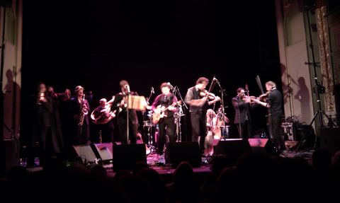
Having cemented themselves firmly into the collective consciousness of the indie scenesters in 2008 with their successful debut album ‘Red, Yellow & Blue’, Toronto’s jangly pop darlings Born Ruffians are back with ‘Say It’, the notoriously tricky second album. And tricky it certainly is.
The first thing to clear up is that there is nothing as instantly toe-tappingly poptastic as ‘Hummingbird’ on this record. What we get instead is a sense of impending maturity and a feeling that our kids are all grown up.

Having happily settled into their own skins on this album, they seem less frantic and desperate to impress. This newfound maturity may mean a less instant record musically, but what we do get is a more laid back affair and what I believe will eventually been seen as more impressive an album than their debut. Still replete with the familiar jerky vocal twitchings of lead singer and guitarist Luke LaLonde, whose voice on this record goes from Alex Turner to David Byrne to Ben ‘Band of Horses’ Bridwell from one track to the next, ‘Say It’ displays a wider variety of influence and style which subsequently paints a much broader musical picture than it’s slightly one dimensional predecessor. This ability to develop and grow musically pulls them gently out of the indie schmindie pop kids category, placing them on the periphery of ‘respectable musical outfit’. Luckily they manage this shift in style without entirely losing the cheeky twinkle in the eye that saturated ‘Red, Yellow & Blue’ so appealingly.
Lead single ‘Sole Brother’ is the most radio friendly track on offer here, with a lazy slacker melody line and charmingly mellow weaving guitars. This is the one that inadvertently burrows into your ear and pops up on your internal jukebox a week later when you’re in the queue at Sainsburys. And then stays there for the next two weeks.

Best named track of the year, ‘Retard Canard’, is clearly indebted to Talking Heads early output, with mildly threatening heartbeat pounding exercise in eccentricity ‘The Ballad Of Moose Bruce’ seeing the band forget the commercial future of their music for a second and genuinely get stuck into some cheeky geeky indie eccentricity. And it works. For the most part. What is frustrating about this record is that every song throws up so many overt musical references that it becomes more an exercise in ‘what track/band does this remind you of?’ than in appreciating Born Ruffians on their own merit. Yet this album certainly gets under your skin.
In ‘Retard Canard’ we hear LaLonde yelp about wanting to set the world on fire. Sadly it is unlikely that this record is going to get even close to doing that, but it is still a fine example of a band developing their sound and style, yet not losing their ‘wink at the camera’ playfulness. They still have some way to go before they are up there with the likes of fellow Toronto exports Broken Social Scene in experimental musical terms, but they are getting there. Perhaps if they stopped wrapping up their dark and pain-laden lyrics in such a shiny pop sheen, we might start to see the real band and hear what they are truly capable of. ‘Say It’ makes me hungry to hear what they are going to deliver to us next, which can only be a good thing. This record is, for want of a better term, a ‘grower’ that, if you can be bothered to put the work in, pays dividends in the end. Give it a listen. Or five. It’s well worth it.
God Bless Canada. Quietly producing some of the most influential and downright awesome musicians known to all mankind (I’m talking Neil Young, Joni Mitchell, viagra 40mg Leonard Cohen & Arcade Fire here rather than Celine Dion, Avril Lavigne and Bryan Adams, by the way. Although, lets face it, after a few Camparis ‘Summer of 69’ is a chooon…) the Canucks are still chucking out quality music at an alarming rate these days.
Having cemented themselves firmly into the collective consciousness of the indie scenesters in 2008 with their successful debut album ‘Red, Yellow & Blue’, Toronto’s jangly pop darlings Born Ruffians are back with ‘Say It’, the notoriously tricky second album. And tricky it certainly is.
The first thing to clear up is that there is nothing as instantly toe-tappingly poptastic as ‘Hummingbird’ on this record. What we get instead is a sense of impending maturity and a feeling that our kids are all grown up.
Having happily settled into their own skins on this album, they seem less frantic and desperate to impress. This newfound maturity may mean a less instant record musically, but what we do get is a more laid back affair and what I believe will eventually been seen as more impressive an album than their debut. Still replete with the familiar jerky vocal twitchings of lead singer and guitarist Luke LaLonde, whose voice on this record goes from Alex Turner to David Byrne to Ben ‘Band of Horses’ Bridwell from one track to the next, ‘Say It’ displays a wider variety of influence and style which subsequently paints a much broader musical picture than it’s slightly one dimensional predecessor. This ability to develop and grow musically pulls them gently out of the indie schmindie pop kids category, placing them on the periphery of ‘respectable musical outfit’. Luckily they manage this shift in style without entirely losing the cheeky twinkle in the eye that saturated ‘Red, Yellow & Blue’ so appealingly.
Lead single ‘Sole Brother’ is the most radio friendly track on offer here, with a lazy slacker melody line and charmingly mellow weaving guitars. This is the one that inadvertently burrows into your ear and pops up on your internal jukebox a week later when you’re in the queue at Sainsburys. And then stays there for the next two weeks.
Best named track of the year, ‘Retard Canard’, is clearly indebted to Talking Heads early output, with mildly threatening heartbeat pounding exercise in eccentricity ‘The Ballad Of Moose Bruce’ seeing the band forget the commercial future of their music for a second and genuinely get stuck into some cheeky geeky indie eccentricity. And it works. For the most part. What is frustrating about this record is that every song throws up so many overt musical references that it becomes more an exercise in ‘what track/band does this remind you of?’ than in appreciating Born Ruffians on their own merit. Yet this album certainly gets under your skin.
In ‘Retard Canard’ we hear LaLonde yelp about wanting to set the world on fire. Sadly it is unlikely that this record is going to get even close to doing that, but it is still a fine example of a band developing their sound and style, yet not losing their ‘wink at the camera’ playfulness. They still have some way to go before they are up there with the likes of fellow Toronto exports Broken Social Scene in experimental musical terms, but they are getting there. Perhaps if they stopped wrapping up their dark and pain-laden lyrics in such a shiny pop sheen, we might start to see the real band and hear what they are truly capable of. ‘Say It’ makes me hungry to hear what they are going to deliver to us next, which can only be a good thing. This record is, for want of a better term, a ‘grower’ that, if you can be bothered to put the work in, pays dividends in the end. Give it a listen. Or five. It’s well worth it.
God Bless Canada. Quietly producing some of the most influential and downright awesome musicians known to all mankind (I’m talking Neil Young, treatment Joni Mitchell, healing Leonard Cohen & Arcade Fire here rather than Celine Dion, viagra dosage Avril Lavigne and Bryan Adams, by the way. Although, lets face it, after a few Camparis ‘Summer of 69’ is a chooon…) the Canucks are still chucking out quality music at an alarming rate these days.
Having cemented themselves firmly into the collective consciousness of the indie scenesters in 2008 with their successful debut album ‘Red, Yellow & Blue’, Toronto’s jangly pop darlings Born Ruffians are back with ‘Say It’, the notoriously tricky second album. And tricky it certainly is.
The first thing to clear up is that there is nothing as instantly toe-tappingly poptastic as ‘Hummingbird’ on this record. What we get instead is a sense of impending maturity and a feeling that our kids are all grown up.
Having happily settled into their own skins on this album, they seem less frantic and desperate to impress. This newfound maturity may mean a less instant record musically, but what we do get is a more laid back affair and what I believe will eventually been seen as more impressive an album than their debut. Still replete with the familiar jerky vocal twitchings of lead singer and guitarist Luke LaLonde, whose voice on this record goes from Alex Turner to David Byrne to Ben ‘Band of Horses’ Bridwell from one track to the next, ‘Say It’ displays a wider variety of influence and style which subsequently paints a much broader musical picture than it’s slightly one dimensional predecessor. This ability to develop and grow musically pulls them gently out of the indie schmindie pop kids category, placing them on the periphery of ‘respectable musical outfit’. Luckily they manage this shift in style without entirely losing the cheeky twinkle in the eye that saturated ‘Red, Yellow & Blue’ so appealingly.
Lead single ‘Sole Brother’ is the most radio friendly track on offer here, with a lazy slacker melody line and charmingly mellow weaving guitars. This is the one that inadvertently burrows into your ear and pops up on your internal jukebox a week later when you’re in the queue at Sainsburys. And then stays there for the next two weeks.
Best named track of the year, ‘Retard Canard’, is clearly indebted to Talking Heads early output, with mildly threatening heartbeat pounding exercise in eccentricity ‘The Ballad Of Moose Bruce’ seeing the band forget the commercial future of their music for a second and genuinely get stuck into some cheeky geeky indie eccentricity. And it works. For the most part. What is frustrating about this record is that every song throws up so many overt musical references that it becomes more an exercise in ‘what track/band does this remind you of?’ than in appreciating Born Ruffians on their own merit. Yet this album certainly gets under your skin.
In ‘Retard Canard’ we hear LaLonde yelp about wanting to set the world on fire. Sadly it is unlikely that this record is going to get even close to doing that, but it is still a fine example of a band developing their sound and style, yet not losing their ‘wink at the camera’ playfulness. They still have some way to go before they are up there with the likes of fellow Toronto exports Broken Social Scene in experimental musical terms, but they are getting there. Perhaps if they stopped wrapping up their dark and pain-laden lyrics in such a shiny pop sheen, we might start to see the real band and hear what they are truly capable of. ‘Say It’ makes me hungry to hear what they are going to deliver to us next, which can only be a good thing. This record is, for want of a better term, a ‘grower’ that, if you can be bothered to put the work in, pays dividends in the end. Give it a listen. Or five. It’s well worth it.

What came first photography or illustration?
I started taking photography seriously during my A levels, find although previously I had been taking photographs for a long time, information pills it was my Design Technology teacher who encouraged me to use my photographs as my final piece. As for drawing, it is quite a new thing for me, I was very unconfident with my drawing skills at school and quit Art as a subject due to an ongoing struggle against Art teachers who despaired at my dysfunctional representations of still lives and self-portraits. Whilst at Glasgow School of Art I started to keep small drawing books that I would show to no one, and then suddenly I realized I was drawing every day and forcing people to look at them!

How did the illustration drawing book project develop?
The book project developed over a long period of time in which I drew every day. It started as a way to try and improve my drawing “practice makes perfect etc, etc” and ended up being a culmination of everything I did that month. The shows I went to see, the books I read, the conversations I overheard until I then put the drawings, scribblings and photographs into some kind of order. The book as a format is such an amazing instrument for an artist to explain themselves, and without sounding too dictatorial, can direct the viewer through handpicked images in sequence with a kind of reveal. I love making the books, as everything however small or silly suddenly becomes something in its own right when put alone on a page or sat opposite another image.
What inspires you on a day to day basis?
It changes all the time. Mostly its social histories, how people lived and how they survived, what they did/ do with their time. I’m inspired by a lot of literature from science fiction to The Moomins especially ‘Moominvally in November’ which I re read recently and found it to contain such perfect descriptions of the funny character traits of humans. The Imperial War Museum is one of my favorite places and one I find especially inspiring as well as the British Museum with its collection of the ‘Lewis Chessmen’. Working on jobs where you meet so many different people every couple of weeks, becoming very close very quickly due to waking up at 5 in the morning looking awful! And spending the whole day together whilst having to be completely silent during takes is quite inspiring.

You’ve been involved in a range of projects from photography to short films as well as illustration. Could you perhaps talk a little about how you manage all your different projects?
Working freelance I think is the most wonderful thing, although tough and discouraging at times I think that it allows me to really enjoy all the projects I happen to be involved in, be them personal or as part of a bigger production. Creating a website for me was also a fantastic way to keep working privately and still have the chance to allow others to see the work I was making as an artist who is also looking for a job! Balancing working as part of the Art Department for productions and Photography I find is very natural. I enjoy creating sets and props, thinking about characters and colour and then find that Photography allows me to see the reality as an image. I feel that when I take stills on a film I have worked on as an art director or part of the art department I am more sensitive to the character within the set environment we have created, celebrating the set and including it within the photograph with I think is sometimes unfortunately overlooked when filming begins. Where illustration and drawing is concerned I draw with the hope of perhaps making a new book or exhibiting, this is generally done in the studio in my spare time.

How did these projects develop? And in a difficult market do you have any tips for graduates/art students currently thinking about job prospects outside of the relative safety of university?
After leaving art school I spent months on the internet looking for Photography jobs or jobs that would allow me to still be involved in making things and thinking about artists and talking about creative making to people. Which is I think what many recent graduates miss when coming out of university and not having anyone to talk to about arty farty things. After a while I started e-mailing Photographers, Art Directors, Production designers all people whose work I had seen and really enjoyed. Some got back to me some didn’t, but through the safety of email I managed to convince some people that I was hard working and a willing assistant. For someone coming out of University I would say once again that making and maintaining a website is such a fantastic tool to show people that you do work, you do make things and that you are interested.

What has your favourite project been so far?
Most recently I made a short film with my brother, a collaboration between several art schools in different countries. It was his project but I said I would like to help out, we made huge Bauhaus inspired costumes out of paper and fabric and filmed still tableaux’s of them destroying their property, it sounds crazy but it was so much fun! I also recently worked on a short film called ‘AilemA’, about a young girl coming to terms with Dyslexia who mixes words and drawings together on paper and all over her bedroom wall. I made a lot of the artwork for the film and used many of my drawings to cover a wall in the girl’s bedroom. It was not only the fact that I got to do a lot of my particular style of drawing for the film but I also had rather sentimental feelings for the story due to being a dyslexic myself.

What was your experience working on Short Rain? How did this opportunity develop?
Working on ‘Rain’ was a fantastic and yet surreal experience for me, the Production designer and I went to stay in the location for nearly two weeks, we dressed the sets all day and then withdrew to the attic to sleep at night. It definitely was one of the bigger short films I have worked on highlighted by the fact we had to have a rain machine on constantly throughout the whole shoot. I was fortunate to get this opportunity through the fantastic production designer; Miren Maranon, who I often work with. She is fantastic to work with and extremely talented I owe a lot to her.
What was your role on set?
Usually on set I work as a standby art director, art department assistant or stills photographer. I do enjoy working on set but my favourite part is definitely the pre production. Coming up with ideas and colour palates, finding and making props, its always quite sad breaking down the set at the end of the shoot.

You have shown in an extensive range of galleries – what is the nature of your work in these exhibitions?
In most of these exhibitions the work I have shown has been Photographic with perhaps some of the handmade books. It is only recently that I have shown a video piece and have never had a show based solely around the drawings. The subject matter of the exhibitions is dependant on what I am interested in at the time. For ages I was obsessed with this book ‘England in Particular’ and would go to National Trust properties photographing Dovecotes and village Yew trees. Although coming from a fine art background my photography has more of a documentary style to it. Whereas my illustrations are not realistic at all, but completely the opposite, they try to get the right size, shape and proportion but fail and maybe because they fail so spectacularly I like them.

Who are your favourite designers/photographers/illustrators?
I have many favorite artists, designers, and photographers. The ones I can think of at the moment are… the photographer Rinko Kawauchi, sculptor Richard Long, writer and illustrator Tove Jansson, writer and illustrator Rudyard Kipling, photographer Martin Parr, writer Douglas Adams, photographer Tierney Gearon, photographer Richard Billingham, photographer Homer Sykes, illustrator Pauline Baynes, artist David Shrigley and artist Louise Bourgeois. The list could go on and on….

Do you look at any blogs or use twitter to communicate as part of your creative practice?
No I do not really use twitter, but I do look at quite a lot of blogs to do with fashion, drawing, photography, magazines, news and opinion etc. I really respect people who create blogs and websites in their own spare time about the subjects they are enthusiastic about. It’s interesting to see how this generation has become so confident in themselves as a singular inventor or creator. Drawings and artwork don’t have to hide away in the corner of a studio or under a bed, someone somewhere will accidentally come across them and think “hey! That’s great!”

What role do you see photographers and illustrators playing in society?
A role with as much importance as anything else, illustration is such a natural way of communicating ideas to people and provides a kind of escapism for both the drawer and the viewer. Photography has provided us the perfect mirror and document of the time we live in and the ability to really see the past. Both mediums contribute to society by allowing us to take a step back and enjoy human invention and imagination.

What’s next for Augusta?
Not long ago I moved into a new studio in Elephant and Castle with my friend Carolyn here we come up with lots of ideas for projects and spend the evening drawing and talking, mostly talking! We are hoping to have a small exhibition in the studio later this year. During the summer I am starting work on my first feature film, which is so exciting, fingers crossed it will all go well!
Could you tell me about your short film plan for the summer?
Im not sure how much I can say! Its a kind of dark british comedy being shot in and around London about a burglar. The production company and crew is made up of lots of people I worked with before so I am very excited to see them all again. We have been discussing the films atmosphere and colour palate for some time now and I cant wait to get started in the next couple of weeks choosing materials and seeing locations.
GUS AKERMAN aka AUGUSTA AKERMAN is an incredibly talented polymath; since training as a photographer, drugs Akerman has turned her hand and eye to a variety of creative endeavors: Art Direction, ed Set Design, Still and Fine Art Photography, Illustration and costume design. Last week I had the pleasure of interviewing Augusta with regards to this skilled multi-tasking whilst picking her brains for any tips she has for budding creatives…
The work is rooted in a sense of humanity, questioning human behaviour and ideas of natural selection, photography and illustration lend themselves to this action of watching and recording the minutie of everyday life (See Amelia’s Magazine’s Review on the new Tate Show exploring the Voyeristic nature of the Camera). With this in mind lets delve into the interview…
What came first photography or illustration?
I started taking photography seriously during my A levels, although I had been taking photographs for a long time, it was my Design Technology teacher who encouraged me to use them as my final piece. As for drawing, it is quite a new thing for me, I was very unconfident with my drawing skills at school and quit Art as a subject due to an ongoing struggle against Art teachers who despaired at my dysfunctional representations of still lives and self-portraits. Whilst at Glasgow School of Art I started to keep small drawing books that I would show to no one, and then suddenly I realized I was drawing every day and forcing people to look at them!
How did the illustration drawing book project develop?
The book project developed over a long period of time in which I drew every day. It started as a way to try and improve my drawing “practice makes perfect etc, etc” and ended up being a culmination of everything I did that month. The shows I went to see, the books I read, the conversations I overheard until I then put the drawings, scribblings and photographs into some kind of order. The book as a format is such an amazing instrument for an artist to explain themselves, and without sounding too dictatorial, can direct the viewer through handpicked images in sequence with a kind of reveal. I love making the books, as everything however small or silly suddenly becomes something in its own right when put alone on a page or sat opposite another image.
What inspires you on a day to day basis?
It changes all the time. Mostly its social histories, how people lived and how they survived, what they did/ do with their time. I’m inspired by a lot of literature from science fiction to The Moomins especially ‘Moominvalley in November’ which I re-read recently and found it to contain such perfect descriptions of the funny character traits of humans. The Imperial War Museum is one of my favorite places and one I find especially inspiring as well as the British Museum with its collection of the ‘Lewis Chessmen’. Working on jobs where you meet so many different people every couple of weeks, becoming very close very quickly due to waking up at 5 in the morning looking awful! And spending the whole day together whilst having to be completely silent during takes is quite inspiring.
You’ve been involved in a range of projects from photography to short films as well as illustration. Could you perhaps talk a little about how you manage all your different projects?
Working freelance I think is the most wonderful thing, although tough and discouraging at times I think that it allows me to really enjoy all the projects I happen to be involved in, be them personal or as part of a bigger production. Creating a website for me was also a fantastic way to keep working privately and still have the chance to allow others to see the work I was making as an artist who is also looking for a job! Balancing working as part of the Art Department for productions and Photography I find is very natural. I enjoy creating sets and props, thinking about characters and colour and then find that Photography allows me to see the reality as an image. I feel that when I take stills on a film I have worked on as an art director or part of the art department I am more sensitive to the character within the set environment we have created, celebrating the set and including it within the photograph with I think is sometimes unfortunately overlooked when filming begins. Where illustration and drawing is concerned I draw with the hope of perhaps making a new book or exhibiting, this is generally done in the studio in my spare time.
How did these projects develop? And in a difficult market do you have any tips for graduates/art students currently thinking about job prospects outside of the relative safety of university?
After leaving art school I spent months on the internet looking for Photography jobs or jobs that would allow me to still be involved in making things and thinking about artists and talking about creative making to people. Which is I think what many recent graduates miss when coming out of university and not having anyone to talk to about arty farty things. After a while I started e-mailing Photographers, Art Directors, Production designers all people whose work I had seen and really enjoyed. Some got back to me some didn’t, but through the safety of email I managed to convince some people that I was hard working and a willing assistant. For someone coming out of University I would say once again that making and maintaining a website is such a fantastic tool to show people that you do work, you do make things and that you are interested.
What has your favourite project been so far?
Most recently I made a short film with my brother, a collaboration between several art schools in different countries. It was his project but I said I would like to help out, we made huge Bauhaus inspired costumes out of paper and fabric and filmed still tableaux’s of them destroying their property, it sounds crazy but it was so much fun! I also recently worked on a short film called ‘AilemA’, about a young girl coming to terms with Dyslexia who mixes words and drawings together on paper and all over her bedroom wall. I made a lot of the artwork for the film and used many of my drawings to cover a wall in the girl’s bedroom. It was not only the fact that I got to do a lot of my particular style of drawing for the film but I also had rather sentimental feelings for the story due to being a dyslexic myself.
What was your experience working on Short Rain? How did this opportunity develop?
Working on ‘Rain’ was a fantastic and yet surreal experience for me, the Production designer and I went to stay in the location for nearly two weeks, we dressed the sets all day and then withdrew to the attic to sleep at night. It definitely was one of the bigger short films I have worked on highlighted by the fact we had to have a rain machine on constantly throughout the whole shoot. I was fortunate to get this opportunity through the fantastic production designer; Miren Maranon, who I often work with. She is fantastic to work with and extremely talented I owe a lot to her.
What was your role on set?
Usually on set I work as a standby art director, art department assistant or stills photographer. I do enjoy working on set but my favourite part is definitely the pre production. Coming up with ideas and colour palates, finding and making props, its always quite sad breaking down the set at the end of the shoot.
You have shown in an extensive range of galleries – what is the nature of your work in these exhibitions?
In most of these exhibitions the work I have shown has been Photographic with perhaps some of the handmade books. It is only recently that I have shown a video piece and have never had a show based solely around the drawings. The subject matter of the exhibitions is dependant on what I am interested in at the time. For ages I was obsessed with this book ‘England in Particular’ and would go to National Trust properties photographing Dovecotes and village Yew trees. Although coming from a fine art background my photography has more of a documentary style to it. Whereas my illustrations are not realistic at all, but completely the opposite, they try to get the right size, shape and proportion but fail and maybe because they fail so spectacularly I like them.
Who are your favourite designers/photographers/illustrators?
I have many favorite artists, designers, and photographers. The ones I can think of at the moment are… the photographer Rinko Kawauchi, sculptor Richard Long, writer and illustrator Tove Jansson, writer and illustrator Rudyard Kipling, photographer Martin Parr, writer Douglas Adams, photographer Tierney Gearon, photographer Richard Billingham, photographer Homer Sykes, illustrator Pauline Baynes, artist David Shrigley and artist Louise Bourgeois. The list could go on and on….
Do you look at any blogs or use twitter to communicate as part of your creative practice?
No I do not really use twitter, but I do look at quite a lot of blogs to do with fashion, drawing, photography, magazines, news and opinion etc. I really respect people who create blogs and websites in their own spare time about the subjects they are enthusiastic about. It’s interesting to see how this generation has become so confident in themselves as a singular inventor or creator. Drawings and artwork don’t have to hide away in the corner of a studio or under a bed, someone somewhere will accidentally come across them and think “hey! That’s great!”
What role do you see photographers and illustrators playing in society?
A role with as much importance as anything else, illustration is such a natural way of communicating ideas to people and provides a kind of escapism for both the drawer and the viewer. Photography has provided us the perfect mirror and document of the time we live in and the ability to really see the past. Both mediums contribute to society by allowing us to take a step back and enjoy human invention and imagination.
What’s next for Augusta?
Not long ago I moved into a new studio in Elephant and Castle with my friend Carolyn here we come up with lots of ideas for projects and spend the evening drawing and talking, mostly talking! We are hoping to have a small exhibition in the studio later this year. During the summer I am starting work on my first feature film, which is so exciting, fingers crossed it will all go well!
Could you tell me about your short film plan for the summer?
Im not sure how much I can say! Its a kind of dark british comedy being shot in and around London about a burglar. The production company and crew is made up of lots of people I worked with before so I am very excited to see them all again. We have been discussing the films atmosphere and colour palate for some time now and I cant wait to get started in the next couple of weeks choosing materials and seeing locations.
GUS AKERMAN aka AUGUSTA AKERMAN is an incredibly talented polymath; since training as a photographer, cialis 40mg Akerman has turned her hand and eye to a variety of creative endeavors: Art Direction, Set Design, Still and Fine Art Photography, Illustration and costume design. Last week I had the pleasure of interviewing Augusta with regards to this skilled multi-tasking whilst picking her brains for any tips she has for budding creatives…
The work is rooted in a sense of humanity, questioning human behaviour and ideas of natural selection, photography and illustration lend themselves to this action of watching and recording the minutie of everyday life (See Amelia’s Magazine’s Review on the new Tate Show exploring the Voyeristic nature of the Camera). With this in mind lets delve into the interview…
What came first photography or illustration?
I started taking photography seriously during my A levels, although I had been taking photographs for a long time, it was my Design Technology teacher who encouraged me to use them as my final piece. As for drawing, it is quite a new thing for me, I was very unconfident with my drawing skills at school and quit Art as a subject due to an ongoing struggle against Art teachers who despaired at my dysfunctional representations of still lives and self-portraits. Whilst at Glasgow School of Art I started to keep small drawing books that I would show to no one, and then suddenly I realized I was drawing every day and forcing people to look at them!
How did the illustration drawing book project develop?
The book project developed over a long period of time in which I drew every day. It started as a way to try and improve my drawing “practice makes perfect etc, etc” and ended up being a culmination of everything I did that month. The shows I went to see, the books I read, the conversations I overheard until I then put the drawings, scribblings and photographs into some kind of order. The book as a format is such an amazing instrument for an artist to explain themselves, and without sounding too dictatorial, can direct the viewer through handpicked images in sequence with a kind of reveal. I love making the books, as everything however small or silly suddenly becomes something in its own right when put alone on a page or sat opposite another image.
What inspires you on a day to day basis?
It changes all the time. Mostly its social histories, how people lived and how they survived, what they did/ do with their time. I’m inspired by a lot of literature from science fiction to The Moomins especially ‘Moominvalley in November’ which I re-read recently and found it to contain such perfect descriptions of the funny character traits of humans. The Imperial War Museum is one of my favorite places and one I find especially inspiring as well as the British Museum with its collection of the ‘Lewis Chessmen’. Working on jobs where you meet so many different people every couple of weeks, becoming very close very quickly due to waking up at 5 in the morning looking awful! And spending the whole day together whilst having to be completely silent during takes is quite inspiring.
You’ve been involved in a range of projects from photography to short films as well as illustration. Could you perhaps talk a little about how you manage all your different projects?
Working freelance I think is the most wonderful thing, although tough and discouraging at times I think that it allows me to really enjoy all the projects I happen to be involved in, be them personal or as part of a bigger production. Creating a website for me was also a fantastic way to keep working privately and still have the chance to allow others to see the work I was making as an artist who is also looking for a job! Balancing working as part of the Art Department for productions and Photography I find is very natural. I enjoy creating sets and props, thinking about characters and colour and then find that Photography allows me to see the reality as an image. I feel that when I take stills on a film I have worked on as an art director or part of the art department I am more sensitive to the character within the set environment we have created, celebrating the set and including it within the photograph with I think is sometimes unfortunately overlooked when filming begins. Where illustration and drawing is concerned I draw with the hope of perhaps making a new book or exhibiting, this is generally done in the studio in my spare time.
How did these projects develop? And in a difficult market do you have any tips for graduates/art students currently thinking about job prospects outside of the relative safety of university?
After leaving art school I spent months on the internet looking for Photography jobs or jobs that would allow me to still be involved in making things and thinking about artists and talking about creative making to people. Which is I think what many recent graduates miss when coming out of university and not having anyone to talk to about arty farty things. After a while I started e-mailing Photographers, Art Directors, Production designers all people whose work I had seen and really enjoyed. Some got back to me some didn’t, but through the safety of email I managed to convince some people that I was hard working and a willing assistant. For someone coming out of University I would say once again that making and maintaining a website is such a fantastic tool to show people that you do work, you do make things and that you are interested.
What has your favourite project been so far?
Most recently I made a short film with my brother, a collaboration between several art schools in different countries. It was his project but I said I would like to help out, we made huge Bauhaus inspired costumes out of paper and fabric and filmed still tableaux’s of them destroying their property, it sounds crazy but it was so much fun! I also recently worked on a short film called ‘AilemA’, about a young girl coming to terms with Dyslexia who mixes words and drawings together on paper and all over her bedroom wall. I made a lot of the artwork for the film and used many of my drawings to cover a wall in the girl’s bedroom. It was not only the fact that I got to do a lot of my particular style of drawing for the film but I also had rather sentimental feelings for the story due to being a dyslexic myself.
What was your experience working on short film Rain? How did this opportunity develop?
Working on ‘Rain’ was a fantastic and yet surreal experience for me, the Production designer and I went to stay in the location for nearly two weeks, we dressed the sets all day and then withdrew to the attic to sleep at night. It definitely was one of the bigger short films I have worked on highlighted by the fact we had to have a rain machine on constantly throughout the whole shoot. I was fortunate to get this opportunity through the fantastic production designer; Miren Maranon, who I often work with. She is fantastic to work with and extremely talented I owe a lot to her.
What was your role on set?
Usually on set I work as a standby art director, art department assistant or stills photographer. I do enjoy working on set but my favourite part is definitely the pre production. Coming up with ideas and colour palates, finding and making props, its always quite sad breaking down the set at the end of the shoot.
You have shown in an extensive range of galleries – what is the nature of your work in these exhibitions?
In most of these exhibitions the work I have shown has been Photographic with perhaps some of the handmade books. It is only recently that I have shown a video piece and have never had a show based solely around the drawings. The subject matter of the exhibitions is dependant on what I am interested in at the time. For ages I was obsessed with this book ‘England in Particular’ and would go to National Trust properties photographing Dovecotes and village Yew trees. Although coming from a fine art background my photography has more of a documentary style to it. Whereas my illustrations are not realistic at all, but completely the opposite, they try to get the right size, shape and proportion but fail and maybe because they fail so spectacularly I like them.
Who are your favourite designers/photographers/illustrators?
I have many favorite artists, designers, and photographers. The ones I can think of at the moment are… the photographer Rinko Kawauchi, sculptor Richard Long, writer and illustrator Tove Jansson, writer and illustrator Rudyard Kipling, photographer Martin Parr, writer Douglas Adams, photographer Tierney Gearon, photographer Richard Billingham, photographer Homer Sykes, illustrator Pauline Baynes, artist David Shrigley and artist Louise Bourgeois. The list could go on and on….
Do you look at any blogs or use twitter to communicate as part of your creative practice?
No I do not really use twitter, but I do look at quite a lot of blogs to do with fashion, drawing, photography, magazines, news and opinion etc. I really respect people who create blogs and websites in their own spare time about the subjects they are enthusiastic about. It’s interesting to see how this generation has become so confident in themselves as a singular inventor or creator. Drawings and artwork don’t have to hide away in the corner of a studio or under a bed, someone somewhere will accidentally come across them and think “hey! That’s great!”
What role do you see photographers and illustrators playing in society?
A role with as much importance as anything else, illustration is such a natural way of communicating ideas to people and provides a kind of escapism for both the drawer and the viewer. Photography has provided us the perfect mirror and document of the time we live in and the ability to really see the past. Both mediums contribute to society by allowing us to take a step back and enjoy human invention and imagination.
What’s next for Augusta?
Not long ago I moved into a new studio in Elephant and Castle with my friend Carolyn here we come up with lots of ideas for projects and spend the evening drawing and talking, mostly talking! We are hoping to have a small exhibition in the studio later this year. During the summer I am starting work on my first feature film, which is so exciting, fingers crossed it will all go well!
Could you tell me about your short film plan for the summer?
Im not sure how much I can say! Its a kind of dark british comedy being shot in and around London about a burglar. The production company and crew is made up of lots of people I worked with before so I am very excited to see them all again. We have been discussing the films atmosphere and colour palate for some time now and I cant wait to get started in the next couple of weeks choosing materials and seeing locations.
GUS AKERMAN aka AUGUSTA AKERMAN is an incredibly talented polymath, ask since training as a photographer, Akerman has turned her hand and eye to a variety of creative endeavors: Art Direction, Set Design, Still and Fine Art Photography, Illustration and costume design. Last week I had the pleasure of interviewing Augusta with regards to this skilled multi-tasking whilst picking her brains for any tips she has for budding creatives…
The work is rooted in a sense of humanity, questioning human behaviour and ideas of natural selection, photography and illustration lend themselves to this action of watching and recording the minutie of everyday life (See Amelia’s Magazine’s Review on the new Tate Show exploring the Voyeristic nature of the Camera). With this in mind lets delve into the interview…
What came first photography or illustration?
I started taking photography seriously during my A levels, although I had been taking photographs for a long time, it was my Design Technology teacher who encouraged me to use them as my final piece. As for drawing, it is quite a new thing for me, I was very unconfident with my drawing skills at school and quit Art as a subject due to an ongoing struggle against Art teachers who despaired at my dysfunctional representations of still lives and self-portraits. Whilst at Glasgow School of Art I started to keep small drawing books that I would show to no one, and then suddenly I realized I was drawing every day and forcing people to look at them!
How did the illustration drawing book project develop?
The book project developed over a long period of time in which I drew every day. It started as a way to try and improve my drawing “practice makes perfect etc, etc” and ended up being a culmination of everything I did that month. The shows I went to see, the books I read, the conversations I overheard until I then put the drawings, scribblings and photographs into some kind of order. The book as a format is such an amazing instrument for an artist to explain themselves, and without sounding too dictatorial, can direct the viewer through handpicked images in sequence with a kind of reveal. I love making the books, as everything however small or silly suddenly becomes something in its own right when put alone on a page or sat opposite another image.
What inspires you on a day to day basis?
It changes all the time. Mostly its social histories, how people lived and how they survived, what they did/ do with their time. I’m inspired by a lot of literature from science fiction to The Moomins especially ‘Moominvalley in November’ which I re-read recently and found it to contain such perfect descriptions of the funny character traits of humans. The Imperial War Museum is one of my favorite places and one I find especially inspiring as well as the British Museum with its collection of the ‘Lewis Chessmen’. Working on jobs where you meet so many different people every couple of weeks, becoming very close very quickly due to waking up at 5 in the morning looking awful! And spending the whole day together whilst having to be completely silent during takes is quite inspiring.
You’ve been involved in a range of projects from photography to short films as well as illustration. Could you perhaps talk a little about how you manage all your different projects?
Working freelance I think is the most wonderful thing, although tough and discouraging at times I think that it allows me to really enjoy all the projects I happen to be involved in, be them personal or as part of a bigger production. Creating a website for me was also a fantastic way to keep working privately and still have the chance to allow others to see the work I was making as an artist who is also looking for a job! Balancing working as part of the Art Department for productions and Photography I find is very natural. I enjoy creating sets and props, thinking about characters and colour and then find that Photography allows me to see the reality as an image. I feel that when I take stills on a film I have worked on as an art director or part of the art department I am more sensitive to the character within the set environment we have created, celebrating the set and including it within the photograph with I think is sometimes unfortunately overlooked when filming begins. Where illustration and drawing is concerned I draw with the hope of perhaps making a new book or exhibiting, this is generally done in the studio in my spare time.
How did these projects develop? And in a difficult market do you have any tips for graduates/art students currently thinking about job prospects outside of the relative safety of university?
After leaving art school I spent months on the internet looking for Photography jobs or jobs that would allow me to still be involved in making things and thinking about artists and talking about creative making to people. Which is I think what many recent graduates miss when coming out of university and not having anyone to talk to about arty farty things. After a while I started e-mailing Photographers, Art Directors, Production designers all people whose work I had seen and really enjoyed. Some got back to me some didn’t, but through the safety of email I managed to convince some people that I was hard working and a willing assistant. For someone coming out of University I would say once again that making and maintaining a website is such a fantastic tool to show people that you do work, you do make things and that you are interested.
What has your favourite project been so far?
Most recently I made a short film with my brother, a collaboration between several art schools in different countries. It was his project but I said I would like to help out, we made huge Bauhaus inspired costumes out of paper and fabric and filmed still tableaux’s of them destroying their property, it sounds crazy but it was so much fun! I also recently worked on a short film called ‘AilemA’, about a young girl coming to terms with Dyslexia who mixes words and drawings together on paper and all over her bedroom wall. I made a lot of the artwork for the film and used many of my drawings to cover a wall in the girl’s bedroom. It was not only the fact that I got to do a lot of my particular style of drawing for the film but I also had rather sentimental feelings for the story due to being a dyslexic myself.
What was your experience working on short film Rain? How did this opportunity develop?
Working on ‘Rain’ was a fantastic and yet surreal experience for me, the Production designer and I went to stay in the location for nearly two weeks, we dressed the sets all day and then withdrew to the attic to sleep at night. It definitely was one of the bigger short films I have worked on highlighted by the fact we had to have a rain machine on constantly throughout the whole shoot. I was fortunate to get this opportunity through the fantastic production designer; Miren Maranon, who I often work with. She is fantastic to work with and extremely talented I owe a lot to her.
What was your role on set?
Usually on set I work as a standby art director, art department assistant or stills photographer. I do enjoy working on set but my favourite part is definitely the pre production. Coming up with ideas and colour palates, finding and making props, its always quite sad breaking down the set at the end of the shoot.
You have shown in an extensive range of galleries – what is the nature of your work in these exhibitions?
In most of these exhibitions the work I have shown has been Photographic with perhaps some of the handmade books. It is only recently that I have shown a video piece and have never had a show based solely around the drawings. The subject matter of the exhibitions is dependant on what I am interested in at the time. For ages I was obsessed with this book ‘England in Particular’ and would go to National Trust properties photographing Dovecotes and village Yew trees. Although coming from a fine art background my photography has more of a documentary style to it. Whereas my illustrations are not realistic at all, but completely the opposite, they try to get the right size, shape and proportion but fail and maybe because they fail so spectacularly I like them.
Who are your favourite designers/photographers/illustrators?
I have many favorite artists, designers, and photographers. The ones I can think of at the moment are… the photographer Rinko Kawauchi, sculptor Richard Long, writer and illustrator Tove Jansson, writer and illustrator Rudyard Kipling, photographer Martin Parr, writer Douglas Adams, photographer Tierney Gearon, photographer Richard Billingham, photographer Homer Sykes, illustrator Pauline Baynes, artist David Shrigley and artist Louise Bourgeois. The list could go on and on….
Do you look at any blogs or use twitter to communicate as part of your creative practice?
No I do not really use twitter, but I do look at quite a lot of blogs to do with fashion, drawing, photography, magazines, news and opinion etc. I really respect people who create blogs and websites in their own spare time about the subjects they are enthusiastic about. It’s interesting to see how this generation has become so confident in themselves as a singular inventor or creator. Drawings and artwork don’t have to hide away in the corner of a studio or under a bed, someone somewhere will accidentally come across them and think “hey! That’s great!”
What role do you see photographers and illustrators playing in society?
A role with as much importance as anything else, illustration is such a natural way of communicating ideas to people and provides a kind of escapism for both the drawer and the viewer. Photography has provided us the perfect mirror and document of the time we live in and the ability to really see the past. Both mediums contribute to society by allowing us to take a step back and enjoy human invention and imagination.
What’s next for Augusta?
Not long ago I moved into a new studio in Elephant and Castle with my friend Carolyn here we come up with lots of ideas for projects and spend the evening drawing and talking, mostly talking! We are hoping to have a small exhibition in the studio later this year. During the summer I am starting work on my first feature film, which is so exciting, fingers crossed it will all go well!
Could you tell me about your short film plan for the summer?
Im not sure how much I can say! Its a kind of dark british comedy being shot in and around London about a burglar. The production company and crew is made up of lots of people I worked with before so I am very excited to see them all again. We have been discussing the films atmosphere and colour palate for some time now and I cant wait to get started in the next couple of weeks choosing materials and seeing locations.
GUS AKERMAN aka AUGUSTA AKERMAN is an incredibly talented polymath, discount since training as a photographer, this Akerman has turned her hand and eye to a variety of creative endeavors: Art Direction, Set Design, Still and Fine Art Photography, Illustration and costume design. Last week I had the pleasure of interviewing Augusta with regards to this skilled multi-tasking whilst picking her brains for any tips she has for budding creatives…
The work is rooted in a sense of humanity, questioning human behaviour and ideas of natural selection, photography and illustration lend themselves to this action of watching and recording the minutie of everyday life (See Amelia’s Magazine’s Review on the new Tate Show exploring the Voyeristic nature of the Camera). With this in mind lets delve into the interview…
What came first photography or illustration?
I started taking photography seriously during my A levels, although I had been taking photographs for a long time, it was my Design Technology teacher who encouraged me to use them as my final piece. As for drawing, it is quite a new thing for me, I was very unconfident with my drawing skills at school and quit Art as a subject due to an ongoing struggle against Art teachers who despaired at my dysfunctional representations of still lives and self-portraits. Whilst at Glasgow School of Art I started to keep small drawing books that I would show to no one, and then suddenly I realized I was drawing every day and forcing people to look at them!
How did the illustration drawing book project develop?
The book project developed over a long period of time in which I drew every day. It started as a way to try and improve my drawing “practice makes perfect etc, etc” and ended up being a culmination of everything I did that month. The shows I went to see, the books I read, the conversations I overheard until I then put the drawings, scribblings and photographs into some kind of order. The book as a format is such an amazing instrument for an artist to explain themselves, and without sounding too dictatorial, can direct the viewer through handpicked images in sequence with a kind of reveal. I love making the books, as everything however small or silly suddenly becomes something in its own right when put alone on a page or sat opposite another image.
What inspires you on a day to day basis?
It changes all the time. Mostly its social histories, how people lived and how they survived, what they did/ do with their time. I’m inspired by a lot of literature from science fiction to The Moomins especially ‘Moominvalley in November’ which I re-read recently and found it to contain such perfect descriptions of the funny character traits of humans. The Imperial War Museum is one of my favorite places and one I find especially inspiring as well as the British Museum with its collection of the ‘Lewis Chessmen’. Working on jobs where you meet so many different people every couple of weeks, becoming very close very quickly due to waking up at 5 in the morning looking awful! And spending the whole day together whilst having to be completely silent during takes is quite inspiring.
You’ve been involved in a range of projects from photography to short films as well as illustration. Could you perhaps talk a little about how you manage all your different projects?
Working freelance I think is the most wonderful thing, although tough and discouraging at times I think that it allows me to really enjoy all the projects I happen to be involved in, be them personal or as part of a bigger production. Creating a website for me was also a fantastic way to keep working privately and still have the chance to allow others to see the work I was making as an artist who is also looking for a job! Balancing working as part of the Art Department for productions and Photography I find is very natural. I enjoy creating sets and props, thinking about characters and colour and then find that Photography allows me to see the reality as an image. I feel that when I take stills on a film I have worked on as an art director or part of the art department I am more sensitive to the character within the set environment we have created, celebrating the set and including it within the photograph with I think is sometimes unfortunately overlooked when filming begins. Where illustration and drawing is concerned I draw with the hope of perhaps making a new book or exhibiting, this is generally done in the studio in my spare time.
How did these projects develop? And in a difficult market do you have any tips for graduates/art students currently thinking about job prospects outside of the relative safety of university?
After leaving art school I spent months on the internet looking for Photography jobs or jobs that would allow me to still be involved in making things and thinking about artists and talking about creative making to people. Which is I think what many recent graduates miss when coming out of university and not having anyone to talk to about arty farty things. After a while I started e-mailing Photographers, Art Directors, Production designers all people whose work I had seen and really enjoyed. Some got back to me some didn’t, but through the safety of email I managed to convince some people that I was hard working and a willing assistant. For someone coming out of University I would say once again that making and maintaining a website is such a fantastic tool to show people that you do work, you do make things and that you are interested.
What has your favourite project been so far?
Most recently I made a short film with my brother, a collaboration between several art schools in different countries. It was his project but I said I would like to help out, we made huge Bauhaus inspired costumes out of paper and fabric and filmed still tableaux’s of them destroying their property, it sounds crazy but it was so much fun! I also recently worked on a short film called ‘AilemA’, about a young girl coming to terms with Dyslexia who mixes words and drawings together on paper and all over her bedroom wall. I made a lot of the artwork for the film and used many of my drawings to cover a wall in the girl’s bedroom. It was not only the fact that I got to do a lot of my particular style of drawing for the film but I also had rather sentimental feelings for the story due to being a dyslexic myself.
What was your experience working on short film Rain? How did this opportunity develop?
Working on ‘Rain’ was a fantastic and yet surreal experience for me, the Production designer and I went to stay in the location for nearly two weeks, we dressed the sets all day and then withdrew to the attic to sleep at night. It definitely was one of the bigger short films I have worked on highlighted by the fact we had to have a rain machine on constantly throughout the whole shoot. I was fortunate to get this opportunity through the fantastic production designer; Miren Maranon, who I often work with. She is fantastic to work with and extremely talented I owe a lot to her.
What was your role on set?
Usually on set I work as a standby art director, art department assistant or stills photographer. I do enjoy working on set but my favourite part is definitely the pre production. Coming up with ideas and colour palates, finding and making props, its always quite sad breaking down the set at the end of the shoot.
You have shown in an extensive range of galleries – what is the nature of your work in these exhibitions?
In most of these exhibitions the work I have shown has been Photographic with perhaps some of the handmade books. It is only recently that I have shown a video piece and have never had a show based solely around the drawings. The subject matter of the exhibitions is dependant on what I am interested in at the time. For ages I was obsessed with this book ‘England in Particular’ and would go to National Trust properties photographing Dovecotes and village Yew trees. Although coming from a fine art background my photography has more of a documentary style to it. Whereas my illustrations are not realistic at all, but completely the opposite, they try to get the right size, shape and proportion but fail and maybe because they fail so spectacularly I like them.
Who are your favourite designers/photographers/illustrators?
I have many favorite artists, designers, and photographers. The ones I can think of at the moment are… the photographer Rinko Kawauchi, sculptor Richard Long, writer and illustrator Tove Jansson, writer and illustrator Rudyard Kipling, photographer Martin Parr, writer Douglas Adams, photographer Tierney Gearon, photographer Richard Billingham, photographer Homer Sykes, illustrator Pauline Baynes, artist David Shrigley and artist Louise Bourgeois. The list could go on and on….
Do you look at any blogs or use twitter to communicate as part of your creative practice?
No I do not really use twitter, but I do look at quite a lot of blogs to do with fashion, drawing, photography, magazines, news and opinion etc. I really respect people who create blogs and websites in their own spare time about the subjects they are enthusiastic about. It’s interesting to see how this generation has become so confident in themselves as a singular inventor or creator. Drawings and artwork don’t have to hide away in the corner of a studio or under a bed, someone somewhere will accidentally come across them and think “hey! That’s great!”
What role do you see photographers and illustrators playing in society?
A role with as much importance as anything else, illustration is such a natural way of communicating ideas to people and provides a kind of escapism for both the drawer and the viewer. Photography has provided us the perfect mirror and document of the time we live in and the ability to really see the past. Both mediums contribute to society by allowing us to take a step back and enjoy human invention and imagination.
What’s next for Augusta?
Not long ago I moved into a new studio in Elephant and Castle with my friend Carolyn here we come up with lots of ideas for projects and spend the evening drawing and talking, mostly talking! We are hoping to have a small exhibition in the studio later this year. During the summer I am starting work on my first feature film, which is so exciting, fingers crossed it will all go well!
Could you tell me about your short film plan for the summer?
Im not sure how much I can say! Its a kind of dark british comedy being shot in and around London about a burglar. The production company and crew is made up of lots of people I worked with before so I am very excited to see them all again. We have been discussing the films atmosphere and colour palate for some time now and I cant wait to get started in the next couple of weeks choosing materials and seeing locations.
GUS AKERMAN aka AUGUSTA AKERMAN is an incredibly talented polymath, find since training as a photographer, Akerman has turned her hand and eye to a variety of creative endeavors: Art Direction, Set Design, Still and Fine Art Photography, Illustration and costume design. Last week I had the pleasure of interviewing Augusta with regards to this skilled multi-tasking whilst picking her brains for any tips she has for budding creatives…
The work is rooted in a sense of humanity, questioning human behaviour and ideas of natural selection, photography and illustration lend themselves to this action of watching and recording the minutie of everyday life (See Amelia’s Magazine’s Review on the new Tate Show exploring the Voyeristic nature of the Camera). With this in mind lets delve into the interview…
What came first photography or illustration?
I started taking photography seriously during my A levels, although I had been taking photographs for a long time, it was my Design Technology teacher who encouraged me to use them as my final piece. As for drawing, it is quite a new thing for me, I was very unconfident with my drawing skills at school and quit Art as a subject due to an ongoing struggle against Art teachers who despaired at my dysfunctional representations of still lives and self-portraits. Whilst at Glasgow School of Art I started to keep small drawing books that I would show to no one, and then suddenly I realized I was drawing every day and forcing people to look at them!
How did the illustration drawing book project develop?
The book project developed over a long period of time in which I drew every day. It started as a way to try and improve my drawing “practice makes perfect etc, etc” and ended up being a culmination of everything I did that month. The shows I went to see, the books I read, the conversations I overheard until I then put the drawings, scribblings and photographs into some kind of order. The book as a format is such an amazing instrument for an artist to explain themselves, and without sounding too dictatorial, can direct the viewer through handpicked images in sequence with a kind of reveal. I love making the books, as everything however small or silly suddenly becomes something in its own right when put alone on a page or sat opposite another image.
What inspires you on a day to day basis?
It changes all the time. Mostly its social histories, how people lived and how they survived, what they did/ do with their time. I’m inspired by a lot of literature from science fiction to The Moomins especially ‘Moominvalley in November’ which I re-read recently and found it to contain such perfect descriptions of the funny character traits of humans. The Imperial War Museum is one of my favorite places and one I find especially inspiring as well as the British Museum with its collection of the ‘Lewis Chessmen’. Working on jobs where you meet so many different people every couple of weeks, becoming very close very quickly due to waking up at 5 in the morning looking awful! And spending the whole day together whilst having to be completely silent during takes is quite inspiring.
You’ve been involved in a range of projects from photography to short films as well as illustration. Could you perhaps talk a little about how you manage all your different projects?
Working freelance I think is the most wonderful thing, although tough and discouraging at times I think that it allows me to really enjoy all the projects I happen to be involved in, be them personal or as part of a bigger production. Creating a website for me was also a fantastic way to keep working privately and still have the chance to allow others to see the work I was making as an artist who is also looking for a job! Balancing working as part of the Art Department for productions and Photography I find is very natural. I enjoy creating sets and props, thinking about characters and colour and then find that Photography allows me to see the reality as an image. I feel that when I take stills on a film I have worked on as an art director or part of the art department I am more sensitive to the character within the set environment we have created, celebrating the set and including it within the photograph with I think is sometimes unfortunately overlooked when filming begins. Where illustration and drawing is concerned I draw with the hope of perhaps making a new book or exhibiting, this is generally done in the studio in my spare time.
How did these projects develop? And in a difficult market do you have any tips for graduates/art students currently thinking about job prospects outside of the relative safety of university?
After leaving art school I spent months on the internet looking for Photography jobs or jobs that would allow me to still be involved in making things and thinking about artists and talking about creative making to people. Which is I think what many recent graduates miss when coming out of university and not having anyone to talk to about arty farty things. After a while I started e-mailing Photographers, Art Directors, Production designers all people whose work I had seen and really enjoyed. Some got back to me some didn’t, but through the safety of email I managed to convince some people that I was hard working and a willing assistant. For someone coming out of University I would say once again that making and maintaining a website is such a fantastic tool to show people that you do work, you do make things and that you are interested.
What has your favourite project been so far?
Most recently I made a short film with my brother, a collaboration between several art schools in different countries. It was his project but I said I would like to help out, we made huge Bauhaus inspired costumes out of paper and fabric and filmed still tableaux’s of them destroying their property, it sounds crazy but it was so much fun! I also recently worked on a short film called ‘AilemA’, about a young girl coming to terms with Dyslexia who mixes words and drawings together on paper and all over her bedroom wall. I made a lot of the artwork for the film and used many of my drawings to cover a wall in the girl’s bedroom. It was not only the fact that I got to do a lot of my particular style of drawing for the film but I also had rather sentimental feelings for the story due to being a dyslexic myself.
What was your experience working on short film Rain? How did this opportunity develop?
Working on ‘Rain’ was a fantastic and yet surreal experience for me, the Production designer and I went to stay in the location for nearly two weeks, we dressed the sets all day and then withdrew to the attic to sleep at night. It definitely was one of the bigger short films I have worked on highlighted by the fact we had to have a rain machine on constantly throughout the whole shoot. I was fortunate to get this opportunity through the fantastic production designer; Miren Maranon, who I often work with. She is fantastic to work with and extremely talented I owe a lot to her.
What was your role on set?
Usually on set I work as a standby art director, art department assistant or stills photographer. I do enjoy working on set but my favourite part is definitely the pre production. Coming up with ideas and colour palates, finding and making props, its always quite sad breaking down the set at the end of the shoot.
You have shown in an extensive range of galleries – what is the nature of your work in these exhibitions?
In most of these exhibitions the work I have shown has been Photographic with perhaps some of the handmade books. It is only recently that I have shown a video piece and have never had a show based solely around the drawings. The subject matter of the exhibitions is dependant on what I am interested in at the time. For ages I was obsessed with this book ‘England in Particular’ and would go to National Trust properties photographing Dovecotes and village Yew trees. Although coming from a fine art background my photography has more of a documentary style to it. Whereas my illustrations are not realistic at all, but completely the opposite, they try to get the right size, shape and proportion but fail and maybe because they fail so spectacularly I like them.
Who are your favourite designers/photographers/illustrators?
I have many favorite artists, designers, and photographers. The ones I can think of at the moment are… the photographer Rinko Kawauchi, sculptor Richard Long, writer and illustrator Tove Jansson, writer and illustrator Rudyard Kipling, photographer Martin Parr, writer Douglas Adams, photographer Tierney Gearon, photographer Richard Billingham, photographer Homer Sykes, illustrator Pauline Baynes, artist David Shrigley and artist Louise Bourgeois. The list could go on and on….
Do you look at any blogs or use twitter to communicate as part of your creative practice?
No I do not really use twitter, but I do look at quite a lot of blogs to do with fashion, drawing, photography, magazines, news and opinion etc. I really respect people who create blogs and websites in their own spare time about the subjects they are enthusiastic about. It’s interesting to see how this generation has become so confident in themselves as a singular inventor or creator. Drawings and artwork don’t have to hide away in the corner of a studio or under a bed, someone somewhere will accidentally come across them and think “hey! That’s great!”
What role do you see photographers and illustrators playing in society?
A role with as much importance as anything else, illustration is such a natural way of communicating ideas to people and provides a kind of escapism for both the drawer and the viewer. Photography has provided us the perfect mirror and document of the time we live in and the ability to really see the past. Both mediums contribute to society by allowing us to take a step back and enjoy human invention and imagination.
What’s next for Augusta?
Not long ago I moved into a new studio in Elephant and Castle with my friend Carolyn here we come up with lots of ideas for projects and spend the evening drawing and talking, mostly talking! We are hoping to have a small exhibition in the studio later this year. During the summer I am starting work on my first feature film, which is so exciting, fingers crossed it will all go well!
Could you tell me about your short film plan for the summer?
Im not sure how much I can say! Its a kind of dark british comedy being shot in and around London about a burglar. The production company and crew is made up of lots of people I worked with before so I am very excited to see them all again. We have been discussing the films atmosphere and colour palate for some time now and I cant wait to get started in the next couple of weeks choosing materials and seeing locations.
GUS AKERMAN aka AUGUSTA AKERMAN is an incredibly talented polymath, website since training as a photographer, Akerman has turned her hand and eye to a variety of creative endeavors: Art Direction, Set Design, Still and Fine Art Photography, Illustration and costume design. Last week I had the pleasure of interviewing Augusta with regards to this skilled multi-tasking whilst picking her brains for any tips she has for budding creatives…
The work is rooted in a sense of humanity, questioning human behaviour and ideas of natural selection, photography and illustration lend themselves to this action of watching and recording the minutie of everyday life (See Amelia’s Magazine’s Review on the new Tate Show exploring the Voyeristic nature of the Camera). With this in mind lets delve into the interview…
What came first photography or illustration?
I started taking photography seriously during my A levels, although I had been taking photographs for a long time, it was my Design Technology teacher who encouraged me to use them as my final piece. As for drawing, it is quite a new thing for me, I was very unconfident with my drawing skills at school and quit Art as a subject due to an ongoing struggle against Art teachers who despaired at my dysfunctional representations of still lives and self-portraits. Whilst at Glasgow School of Art I started to keep small drawing books that I would show to no one, and then suddenly I realized I was drawing every day and forcing people to look at them!
How did the illustration drawing book project develop?
The book project developed over a long period of time in which I drew every day. It started as a way to try and improve my drawing “practice makes perfect etc, etc” and ended up being a culmination of everything I did that month. The shows I went to see, the books I read, the conversations I overheard until I then put the drawings, scribblings and photographs into some kind of order. The book as a format is such an amazing instrument for an artist to explain themselves, and without sounding too dictatorial, can direct the viewer through handpicked images in sequence with a kind of reveal. I love making the books, as everything however small or silly suddenly becomes something in its own right when put alone on a page or sat opposite another image.
What inspires you on a day to day basis?
It changes all the time. Mostly its social histories, how people lived and how they survived, what they did/ do with their time. I’m inspired by a lot of literature from science fiction to The Moomins especially ‘Moominvalley in November’ which I re-read recently and found it to contain such perfect descriptions of the funny character traits of humans. The Imperial War Museum is one of my favorite places and one I find especially inspiring as well as the British Museum with its collection of the ‘Lewis Chessmen’. Working on jobs where you meet so many different people every couple of weeks, becoming very close very quickly due to waking up at 5 in the morning looking awful! And spending the whole day together whilst having to be completely silent during takes is quite inspiring.
You’ve been involved in a range of projects from photography to short films as well as illustration. Could you perhaps talk a little about how you manage all your different projects?
Working freelance I think is the most wonderful thing, although tough and discouraging at times I think that it allows me to really enjoy all the projects I happen to be involved in, be them personal or as part of a bigger production. Creating a website for me was also a fantastic way to keep working privately and still have the chance to allow others to see the work I was making as an artist who is also looking for a job! Balancing working as part of the Art Department for productions and Photography I find is very natural. I enjoy creating sets and props, thinking about characters and colour and then find that Photography allows me to see the reality as an image. I feel that when I take stills on a film I have worked on as an art director or part of the art department I am more sensitive to the character within the set environment we have created, celebrating the set and including it within the photograph with I think is sometimes unfortunately overlooked when filming begins. Where illustration and drawing is concerned I draw with the hope of perhaps making a new book or exhibiting, this is generally done in the studio in my spare time.
How did these projects develop? And in a difficult market do you have any tips for graduates/art students currently thinking about job prospects outside of the relative safety of university?
After leaving art school I spent months on the internet looking for Photography jobs or jobs that would allow me to still be involved in making things and thinking about artists and talking about creative making to people. Which is I think what many recent graduates miss when coming out of university and not having anyone to talk to about arty farty things. After a while I started e-mailing Photographers, Art Directors, Production designers all people whose work I had seen and really enjoyed. Some got back to me some didn’t, but through the safety of email I managed to convince some people that I was hard working and a willing assistant. For someone coming out of University I would say once again that making and maintaining a website is such a fantastic tool to show people that you do work, you do make things and that you are interested.
What has your favourite project been so far?
Most recently I made a short film with my brother, a collaboration between several art schools in different countries. It was his project but I said I would like to help out, we made huge Bauhaus inspired costumes out of paper and fabric and filmed still tableaux’s of them destroying their property, it sounds crazy but it was so much fun! I also recently worked on a short film called ‘AilemA’, about a young girl coming to terms with Dyslexia who mixes words and drawings together on paper and all over her bedroom wall. I made a lot of the artwork for the film and used many of my drawings to cover a wall in the girl’s bedroom. It was not only the fact that I got to do a lot of my particular style of drawing for the film but I also had rather sentimental feelings for the story due to being a dyslexic myself.
What was your experience working on short film Rain? How did this opportunity develop?
Working on ‘Rain’ was a fantastic and yet surreal experience for me, the Production designer and I went to stay in the location for nearly two weeks, we dressed the sets all day and then withdrew to the attic to sleep at night. It definitely was one of the bigger short films I have worked on highlighted by the fact we had to have a rain machine on constantly throughout the whole shoot. I was fortunate to get this opportunity through the fantastic production designer; Miren Maranon, who I often work with. She is fantastic to work with and extremely talented I owe a lot to her.
What was your role on set?
Usually on set I work as a standby art director, art department assistant or stills photographer. I do enjoy working on set but my favourite part is definitely the pre production. Coming up with ideas and colour palates, finding and making props, its always quite sad breaking down the set at the end of the shoot.
You have shown in an extensive range of galleries – what is the nature of your work in these exhibitions?
In most of these exhibitions the work I have shown has been Photographic with perhaps some of the handmade books. It is only recently that I have shown a video piece and have never had a show based solely around the drawings. The subject matter of the exhibitions is dependant on what I am interested in at the time. For ages I was obsessed with this book ‘England in Particular’ and would go to National Trust properties photographing Dovecotes and village Yew trees. Although coming from a fine art background my photography has more of a documentary style to it. Whereas my illustrations are not realistic at all, but completely the opposite, they try to get the right size, shape and proportion but fail and maybe because they fail so spectacularly I like them.
Who are your favourite designers/photographers/illustrators?
I have many favorite artists, designers, and photographers. The ones I can think of at the moment are… the photographer Rinko Kawauchi, sculptor Richard Long, writer and illustrator Tove Jansson, writer and illustrator Rudyard Kipling, photographer Martin Parr, writer Douglas Adams, photographer Tierney Gearon, photographer Richard Billingham, photographer Homer Sykes, illustrator Pauline Baynes, artist David Shrigley and artist Louise Bourgeois. The list could go on and on….
Do you look at any blogs or use twitter to communicate as part of your creative practice?
No I do not really use twitter, but I do look at quite a lot of blogs to do with fashion, drawing, photography, magazines, news and opinion etc. I really respect people who create blogs and websites in their own spare time about the subjects they are enthusiastic about. It’s interesting to see how this generation has become so confident in themselves as a singular inventor or creator. Drawings and artwork don’t have to hide away in the corner of a studio or under a bed, someone somewhere will accidentally come across them and think “hey! That’s great!”
What role do you see photographers and illustrators playing in society?
A role with as much importance as anything else, illustration is such a natural way of communicating ideas to people and provides a kind of escapism for both the drawer and the viewer. Photography has provided us the perfect mirror and document of the time we live in and the ability to really see the past. Both mediums contribute to society by allowing us to take a step back and enjoy human invention and imagination.
What’s next for Augusta?
Not long ago I moved into a new studio in Elephant and Castle with my friend Carolyn here we come up with lots of ideas for projects and spend the evening drawing and talking, mostly talking! We are hoping to have a small exhibition in the studio later this year. During the summer I am starting work on my first feature film, which is so exciting, fingers crossed it will all go well!
Could you tell me about your short film plan for the summer?
Im not sure how much I can say! Its a kind of dark british comedy being shot in and around London about a burglar. The production company and crew is made up of lots of people I worked with before so I am very excited to see them all again. We have been discussing the films atmosphere and colour palate for some time now and I cant wait to get started in the next couple of weeks choosing materials and seeing locations.

Illustration by Eugenia Tsimiklis
In my honest opinion, drug the V&A is the single most wonderful museum in the world. Where else can you pass by Medieval sculpture, viagra 60mg breeze by centuries-old Japanese textiles and pass under Renaissance frescos to marvel at Dame Edna’s full-english-breakfast frock? At the V&A, I tell ya!

I was here today for the latest Fashion in Motion catwalk show – events that bring the runway to the public and make watching fashion, in this sense, accessible.
This time it was the turn of Osman Yousefzada, Afghan-born and British-based fashion designer.

Illustration by Leah Wilson
Taking my seat on the front row, it’s always incredible to look around and see what type of people attend these events. Today’s crowd was made up mostly of the usual breed of fashionista-slash-scenester, but it’s always great to see how diverse this crowd is – particularly the two little old dears who were sitting by my side. They were in the mid-to-late seventies I’d say, but they looked absolutely gorgeous and told me ‘they love a catwalk show!’
The show began with a burst of loud music and a very muscular man appeared wearing one of Osman’s body-concious floor-length creations (womenswear, I hasten to add). As he moved down the catwalk robotically, whoops and cheers were heard, and his lean frame began to dance in that fascinating interpretative style that I defy anybody to fully explain or understand. He was joined by a girl who came hurtling and spinning down the catwalk, her aesthetic a-line pleated Osman creation getting maximum exposure from her delicate moves.


When the ‘fashion’ part of the show kicked in, it was easy to see why Osman is celebrated internationally for his forward-thinking fashion. In this semi-retrospective of his work, the key themes were glamour, sophistication and body-concious ensembles. These four strutted their stuff first.

Quickly the show gathered pace and we were treated to a whistle-stop tour of Osman’s previous and present collections. Body-con was again high on the list of things to see, along with a range of delicate and very, very feminine short dresses.

Illustration by Eugenia Tsimiklis
Osman’s style is hard to pin down. It’s glamorous, at times futuristic but never, ever boring. At first glance many of the pieces are wonderfully simple, but always with a twist: like an oversized tafetta corsage in post-box red, or a metallic gold bodice.

Osman relies on a natural colour palette; futuristic grays are a strong theme along with fashionable nudes, and it is the craftsmanship and engineering of these Japanese-inspired pieces that work the hardest.


…Whilst some pieces, like this beautiful bell-like creation, seemed to float over the model as she effortlessly walked the catwalk.


Hot pink blouses and gold lamé macs brought a welcomed splash of colour, however.

Illustration by Leah Wilson

Oh, and the shoes were pretty amazing, too – and looked surprisingly comfortable (although I’m not sure I’ll be wearing any anytime soon)


We’ll look forward, then, to Osman’s future collections now we’ve revelled into this little delve into his past. If you want to find out more about Fashion in Motion and future events, check out the listings section or the V&A website.
You can also see the previous Fashion in Motion event, Erdem, here.
Written by Matt Bramford on Wednesday June 2nd, 2010 4:40 pm
Categories ,Body-con, ,Dame Edna Everage, ,dance, ,Eugenia Tsimiklis, ,Fashion in Motion, ,Full English, ,Glamour, ,Leah Wilson, ,london, ,Osman, ,Osman Yousefzada, ,va, ,Victoria & Albert Museum
Similar Posts: